1
DE-BOTTLENECKING OPEN INNOVATION: TURNING PATENT-BASED TECHNOLOGY NETWORK ANALYSIS INTO VALUE
Manfred Stadlbauer
Techmeter
Gerhard Drexler
Mondi Uncoated Fine Paper
1.1 Methods of Patent Analysis and Data Mining
Open Innovation is a paradigm that combines internal and external ideas into processes whose requirements are defined by specific business models. Firms spend significant effort sourcing and integrating external knowledge and ideas from customers, suppliers, universities, and research organizations, and also competitors. Thus, competitive intelligence and technology forecasts are high on the agenda of leading-edge enterprises. Furthermore, in the fast-paced and complex world we face, the need to solve problems and develop new products as quickly and efficiently as possible is of paramount importance.
One of the challenges of starting new innovation initiatives is the need to see beyond the current time horizon in order to identify the most promising future technologies and products. In addition, acquiring the tangible and intangible assets required for meeting these challenges often exceeds a company's resources, and successful product development is usually realized through the joint contribution of several disciplines, including engineering, marketing, design, and manufacturing.
The practice-oriented approach we present in this chapter is about the application of novel tools and techniques for the support of some of the most crucial steps in Open Innovation, namely the identification of both new opportunities and prospective internal and external partners. Starting from the exploration of ideas and enriching them with quantitative data derived from internal and external networks and competence maps, this chapter describes how promising new technologies and best-in-class candidates for co-development can be identified.
The first part reviews extant methods of patent analysis and data mining. Classical methods of patent monitoring are time consuming and only reveal what someone is definitively looking for. More sophisticated approaches involve a number of analytical methods that have been made possible by recent progress in information technology.
Subsequently, the second part of the chapter provides an insight into novel methods for patent analytics with a special focus on Open Innovation. It covers topics such as patent dynamics, emerging technology analysis, geographic proximity, and collaboration networks. Each example is described briefly and supported by flow charts and special graphics. This second section shows how state-of-the-art patent analysis holds the potential to assist throughout the whole innovation chain.
Finally, the third part of the chapter is a case study from the nanotechnology industry. Depicting a number of real-case results demonstrates how the emerging landscape of nanotechnology can be evaluated by means of advanced patent analysis, how the most dynamic technologies are identified, and how collaboration networks are visualized and utilized for identifying prospective external collaboration partners.
Patents as a Lead Indicator of Innovation
In the search for cutting-edge global innovation trends, one may consider a variety of different information sources, each of them having advantages and disadvantages. Among the most important sources are scientific publications such as the academic literature and conference papers as well as interview panels, direct conversations and workshops with internal experts, consumers, or experts from customers and suppliers. Another important source for trend scouting is the patent literature.
Compared to alternatives for deriving information about technology trends, the patent literature offers a range of specific benefits that makes it a preferred source. For example, the patent literature is indisputably very current and accurate. Earlier than other publications such as scientific publications from the academic literature, or marketing communications such as Internet appearance or sales brochures, patent applications provide signals of emerging technology trends. This is because of a patent's requirement of novelty at the point of filing. Any other earlier publication would prohibit the granting of a patent. For that reason, patent applications are always filed substantially earlier than scientific publications and even well before any marketing communication is put in place. Consequently, patent applications are a very early indicator of technology changes. Figure 1.1 illustrates patents as the lead trend indicator compared to scientific publications.
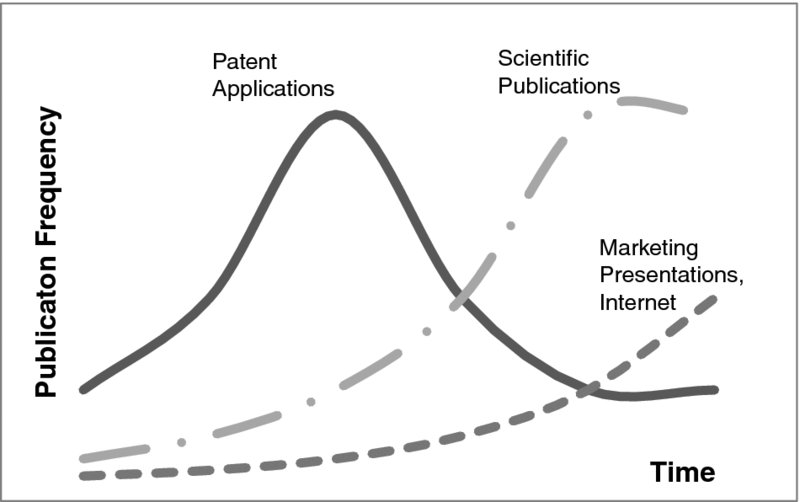
Figure 1.1: Information from Patent Literature as Lead Trend Indicator
In addition to the lead time gained, patents are very structured, making them more accurate than other alternatives. With the patent publication, there is a technology classification from the patent classification scheme [such as the International Patent Classification, (IPC)], date, information about authors (inventors), and assignees (Faust and Schedl, 1984). The formal features of the patent literature are summarized in Table 1.1.
Table 1.1 Outline—Formal Features of Patent Literature
| Accessibility | Very easy, e.g., from patent offices such as the U.S. Patent Office, European Patent Office*, Japan Patent Office, etc. |
| Technology Classification | Yes, built-in via patent classification |
| Time Accuracy | Yes, due to the requirement of novelty when filing a patent, i.e., no prior printed publication allowed |
| Information Density | High: structured technology classification, technology description, inventors, assignees, citations |
| Reviewed | Yes |
*EPO Patent Database: http://worldwide.espacenet.com
In conclusion, while a trend analysis based on the academic literature or Internet sources shows delayed results and challenges in the structured analysis, patents offer a significant lead time, as well as structured metadata on technology area, inventors, assignees, and citations. Furthermore, the patent literature utilizes a standardized “review scheme” and, due to the costs of patent maintenance, there is a significant quality barrier to filing.
In contrast to the abovementioned advantages of patent analysis over other sources for forecasting technology trends, in the recent past, patent analysis presented several drawbacks. The most prominent drawback is the vast amount of time required for interpretation. Studying the patents, assembling all the technical details into a holistic picture, and learning the relevant information about technology trends from it, used to be very time consuming.
Addressing the earlier drawbacks of patent analysis, a number of patent analysis tools have evolved, from standard document-search systems to tools attempting to derive metadata such as technology trends from the large amount of data inherent to patents. For example, patent classification schemes such as the International Patent Classification (IPC) scheme are hierarchical indexing schemes for categorizing technologically similar patents. Table 1.2 shows an example of this hierarchy for a tree down to three levels. There is a main category, in this example “D,” describing a patent class at its highest level. In this particular case it stands for “paper.” Then there is a second level, in this case “D21,” which is a subcategory of paper, to be specific, paper-making. Yet there is a third level, which is shown as well, “D21H,” which is about pulp compositions. So the full tree for “D21H” reads “Paper → Paper-Making → Pulp Compositions.” There are further, more detailed levels (typically there are five or six levels of granularity, depending on the particular classification scheme), which provide a very suitable database search field for performing a more semantic search for patents. The results obtained from such classification-based searches are independent of the keywords used in the patents. Search options exist for full-text search in the title/abstract or the full publication, the patent classification, the date, the inventor, and the assignee.
Table 1.2 Sample International Patent Classification Scheme
| D | Paper
(Level 1) |
| . D21 | Paper→ Paper-Making; Production of Cellulose
(Level 2) |
| . . D21H | Paper→ Paper-Making; Production of Cellulose→Pulp Compositions
(Level 3) |
Network Analysis Tools and Relevant Features
Network analysis tools are commonly used in the field of sociology. Due to the high degree of interconnections of the data to be investigated, they also turn out to be a powerful accelerator for preparing a comprehensive picture of the patent literature. They allow visualizing some of the most essential information, such as co-inventor networks, citation networks, and technology clusters (Rastogi et al., 2008; Sternitzke et al., 2008). Many network analysis tools are available, ranging from commercial to free publicly licensed software. Table 1.3 provides a short overview of some of the many software packages suitable for the present purpose. Readers aspiring to a more thorough overview of software packages are referred to Internet sources retrieved from the search string Social Network Analysis Software. With those building blocks, i.e., the patent data source, the network analysis software, and a standard spreadsheet program, one can start the journey and take some essential learning from the patent literature for Open Innovation in practice.
Table 1.3 Some Examples of Suitable Network Analysis Tools
| Gephi
|
www.gephi.org
Wide range of input formats, including .csv Direct access to possible databases (existing databases can be directly connected and visualized by graphs) |
| Cuttlefish
|
cuttlefish.sourceforge.net/
Some common input formats (e.g., .cxf, .net, .graphml) Direct access to possible databases |
| Pajek
|
pajek.imfm.si
Wide range of input formats, including .net, .paj, .dat (UCINET), .ged, .bs, .mac, .mol |
| UCINET
|
www.analytictech.com
.dat input format Commercial Software |
For the present chapter, network graphs have been made with Gephi (Bastian et al., 2009). The process to obtain technology networks from this program involves three steps: (1) specifying the connected elements, called network nodes; (2) specifying the connections between the elements, called edges; and (3) laying out the network graph.
The first preparatory step is to create a list of network nodes with a unique identifier, such as a number, a description, and the property for scaling the node size. A technology network, for example, has technology areas (such as patent classes) as the node identifier, the description of the technology as a node description, and a scaling property, such as the patent application frequency of this patent classification. Subsequently, the edges are defined in a second spreadsheet, connecting two nodes. Edges also have attributes, which are typically the frequency of patent applications listing both of the connected technologies. Finally, those two spreadsheets are imported in the network program and laid out with built-in algorithms.
These two data sources are used by the network software to create the network. The output from the analysis is the network graph, which enables a user to quickly assess the connectivity and patenting frequencies of and between technologies. Thereby, central technologies with high patenting frequencies become transparent.
Applications of Patent Analysis
Basic evaluations involve the following processes:
- Time-series of patent-application frequencies and clustering technology areas in their typical phases from the very first inventions over an induction period to exponential growth to saturation and stagnation (Figure 1.2)
- Network analyses to identify central technologies (Figure 1.3)
- 3-D charts visualizing emerging combinations of technology areas (Figure 1.4)
- Competitive positioning of certain topics in a company matrix
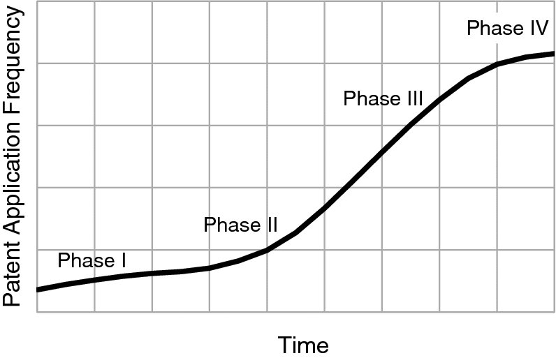
Figure 1.2: Patent Application Frequencies in Technology Areas over Time
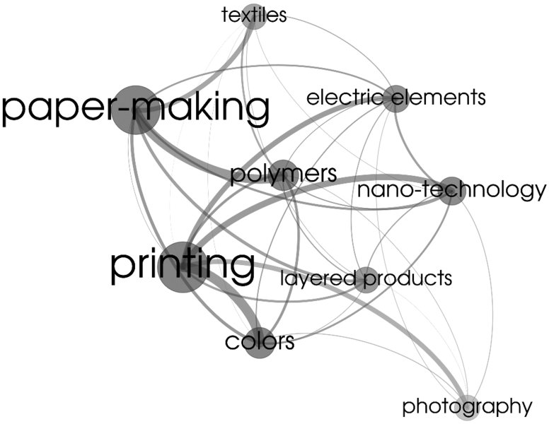
Figure 1.3: Technology Network with Network Nodes and Connecting Lines Scaled1
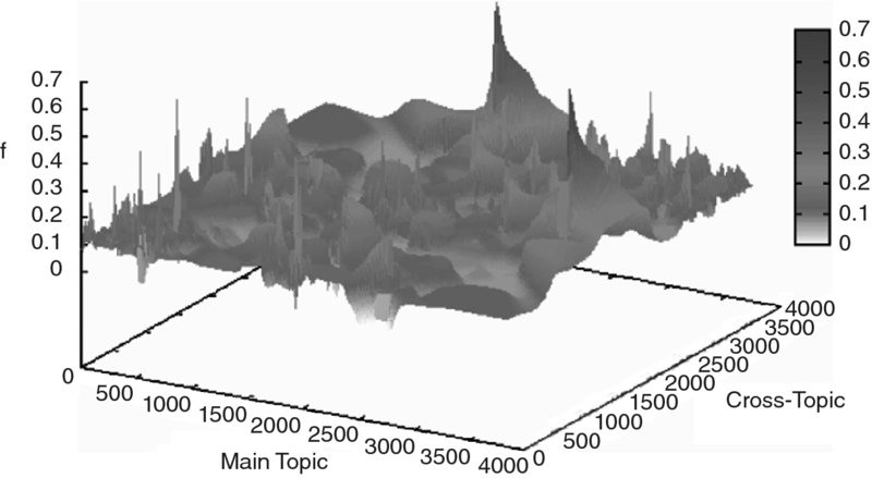
Figure 1.4: Connected Technologies in a 3-D Chart; Rising Peaks Show Emerging Technologies2
All of these steps provide some major information about technology and industrial landscapes. They provide specific input into the product innovation process, such as enhanced creativity, and really feed the process with new ideas derived from patents. To link the information elements to innovation processes, Figure 1.5 shows a flow chart that visualizes where patent-based information can provide substantial input to the innovation process. In the subsequent sections, the analyses for (1) technology trend monitoring, (2) competitive landscape analysis with respect to emerging technologies, and (3) ongoing technology SWOT analysis are outlined.

Figure 1.5: Patent-Based, External Input Linked to the Innovation Cycle by PDMA
Technology Trend Monitoring
The objective of trend monitoring is to detect early signs of innovation in defined technology areas. Using the classifications of the patent literature, one obtains very significant and early information about technology trends (Park et al., 2013).
The simplest and easiest approach is to monitor the patent application frequency in a defined field of patent classifications over a period of time. The shape of the curve indicates the maturity of the technology areas (Figure 1.2). Very often, the patent application frequency starts to pick up for a short period of time (Phase I: very first inventions by a small number of organizations), before the patent application frequency growth decelerates (Phase II: the induction period). Successful inventions first turn into a third phase, where patent application frequencies virtually explode due to the large number of followers in the technology (Phase III: high levels of patent applications from a large number of organizations), which is followed by a phase of stagnation which can be either a fairly constant level of patent application frequency or even a reduction of the patent application frequency (Phase IV: saturation and/or decline).
Evaluations such as those shown in Figure 1.2 are easily performed with standard spreadsheet software, evaluating a defined set of patent applications filtered by technology area. Patent applications are counted in constant time intervals and patent application frequencies (patent applications per time interval) are thereby calculated. These patent application frequencies are plotted versus time. Such plots allow a quick assessment of the phase of technology and a division of technologies by their maturity (Technology Lifecycle Assessment). Hence, they allow spotlighting emerging technology areas.
When larger technology areas or more complex technologies need to be monitored, multivariate metrics and more advanced visualization methods may be introduced. Instead of focusing on single technology concepts, IPC combinations are monitored. This is the concept of innovation through combination, i.e., radical innovations stemming from the new combination of technologies. In IPC terms, this means that two or more IPC classifications are combined and mentioned in a common patent application.
Network analysis is a superior method for analyzing the set of patent applications. The network nodes are the technologies in terms of international patent classification codes, and the connecting edges are the patent applications that connect those patent classes (Figure 1.3). This means that every node stands for a technology, and every line stands for at least one specific patent application connecting those technologies. In an aggregated mode, some descriptive metrics can be introduced to allow scaling both the node size (bigger nodes indicate larger numbers of patents within that IPC) as well as the width of the connecting lines (wider lines indicate larger numbers of joint patents between the two IPCs). Optionally, color codes can be used to indicate other facets of information. In practice, several simple metrics turn out to be useful, such as the average frequency of patent applications for certain technology combinations, the count of technologies, or the network density of certain technologies as scaling factors for either the edges or the nodes. As a result, a network graph is obtained showing central and frequently patented technologies.
Another way to visualize technology combinations (i.e., the connections as shown in Figure 1.3) is to use 3-D charting with the connected technologies positioned along the x- and y-axis, and the metrics, such as patent application frequencies, as the z-axis (Figure 1.4). From such a 3-D chart, plotting the frequencies of patent applications combining two specific technologies, emerging technology combinations are identified. Bearing in mind the most frequent concept of innovation, i.e., innovation through combination, these peaks show emerging new technology trends.
With these very basic tools, trend technologies can be derived from patent application behavior. Beyond the identification of emerging technologies, the industrial structure behind those technology trends also is highly relevant. Consequently, one can go beyond and evaluate the metadata to understand the industrial structure behind those emerging technology areas. Particularly, the assignees of patent applications can be evaluated to derive information about the competitive landscape. This is the field of technology analysis, which is outlined in the next section.
Competitive Landscape Analysis with Respect to Emerging Technologies
The objective of competitive analysis is to map the key players in certain technology areas or to identify emerging technologies within a certain set of organizations, such as suppliers, major customers, peer companies, leading universities, etc. For that purpose, one needs to define the parameters of the monitoring area. This can be as simple as defining the organizations that shall be tracked, or one can define sets of technologies that are continuously monitored.
Thus, basically a matrix of technologies versus organizations is developed. As with the network analysis, it is about identifying and calculating adequate metrics for a description of the activity of certain organizations in specific technologies. These metrics need to be simple and transparent. They can be as straightforward as the patent application frequencies of certain organizations in certain technologies, or the number of inventors in certain organizations in those technologies. Either of those metrics precisely describes the activity level of certain parts of industries in certain fields of technologies. This is exactly what is needed to get a comprehensive picture of the competitive landscape in certain technology areas.
An example for competitive positioning is shown using the average patent application frequency as the key metric. For each preselected company and topic, two measures—size and dynamic—are determined. “Size” refers to a score derived from the firm's average patent application frequency such as patent applications per month, and “dynamic” is a score derived from the slope of the firm's patent application frequency over time (in this case, one month), as shown in Table 1.4. This enables one to quickly assess the competitive positioning. Further, Table 1.4 is extended with new companies (beyond the preselected ones), provided that those companies showed patent activities in the prioritized topics. Therefore, updates in the topic structure, as well as updates in the company structure are easily detected with very little effort.
Table 1.4 Competitive Positioning on Topics*
| Topic/Company | Topic 1 | Topic 2 | Topic 3 | Topic 4 | Topic 5 | Topic 6 |
| Company 1 | Size: 5
Dynamic: 2 |
Size: 3
Dynamic: 1 |
Size: 10
Dynamic: 4 |
|||
| Company 2 | Size: 5
Dynamic: 2 |
Size: 5
Dynamic: 2 |
Size: 7
Dynamic: 9 |
Size: 8
Dynamic: 9 |
||
| Company 3 | Size: 6
Dynamic: 1 |
Size: 2
Dynamic: 1 |
Size: 5
Dynamic: 3 |
|||
| Company 4 | Size: 10
Dynamic: 10 |
|||||
| Company 5 | Size: 10
Dynamic: 10 |
*Size = Patenting Rate Score [0–10], Dynamic = Change in Patenting Rate Score [0–10]
From such evaluations one can quickly derive the industrial structure behind certain technologies. This is a major prerequisite for setting up open innovation projects with the most capable partners without overlooking major emerging technology areas. In the specific example, achieving an innovation objective requires combining competences in six topics. The size and dynamics metrics allow a quick assessment of each potential partner's ability to accomplish the aspired competences as an Open Innovation team. For example, combining Companies 1 and 2, in a two-company collaboration, covers all the topics, but wouldn't include the top-scored potential partners. The combination of Companies 1, 3, and 5 also provides the set of competences. Beyond this, it may also be recommendable to check whether Company 4 can be obtained as an additional partner, due to their pronounced strength on Topic 4, scoring 10 in both size and dynamic, which are strong signals for its engagement in innovations in the particular technology area.
Ongoing Technology SWOT Analysis
There is another application for ongoing innovation projects. This is the continuous Strength/Weakness/Opportunity/Threat (SWOT) analysis as part of project evaluation dashboards, which is shown in Table 1.5. This example is provided with a focus on information that can be derived easily from data from patent applications.
Table 1.5 Project Evaluation Dashboard
| Project ID | DEMO |
| Project Phase | Feasibility Study |
| Relevant Technologies | Technology 1
Technology 2 |
| Competitors | Company 1 (Producer)
Company 2 (Producer) Company 3 (User) Company 4 (Other) |
| Related Emerging Technologies | Emerging Technology ID 1001
Emerging Technology ID 0981 Emerging Technology ID 2126 |
| Core Technology Strength versus Competition | Technology 3 |
| Patent Applications | WO20140001 A
WO20140002 A |
For an innovation project, a specific search profile is developed which yields the relevant set of patent applications. These documents are evaluated by technologies (e.g., IPC classes), assignees/organizations, and frequency of technology combinations and finally, the core strength of the developed technology (in the context of the network of required technologies) is made transparent in this dashboard. Hence, the Project Evaluation Dashboard, as shown in Table 1.5, is a useful instrument to accompany a project and to support decisions, such as end of phase go, no-go decisions, during the project's lifetime.
For Open Innovation, this is an important assessment. It enriches present concepts with information about the emerging technologies connected, underpins it with specific documents for in-depth studying, and shows the most active inventing companies in the relevant technologies.
1.2 Patent Analytics for Identifying Open Innovation Partners
This section addresses the specific needs for information in the context of Open Innovation (Figure 1.6). The objective is to de-bottleneck some of the most time-consuming steps in Open Innovation (OI), which are to identify relevant emerging technologies as well as the right co-development partner. In this endeavor, the first step is to identify emerging technologies. The methods described in this section may empower your firm to identify the most suitable co-development partners with a view to experience, geographic proximity, technical specialization, and their embedding in the industrial structure. The tailored methods presented are about mapping competences, both internal and external, and about identifying competence gaps. The methods combine technology network graphs, technology dynamics, technology matrices, regional analysis, and cooperation networks as obtained from co-inventor analysis.
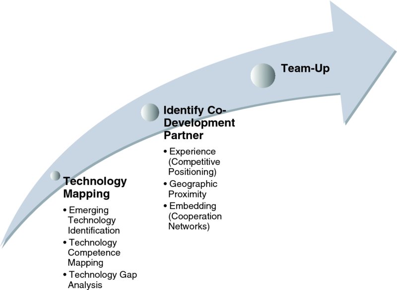
Figure 1.6: Preparation Process Outline for Open Innovation
Technological Competence Mapping and Gap Analysis
Once innovation objectives are identified and prioritized, the first step in setting up an OI project is to identify internal competence strengths and gaps. This is about finding and specifying complementary technologies that are required to reach the innovation objectives. For that purpose, network graphing, in the context of competence mapping, is a powerful and quantitative method to specify the technology competences required from co-development partners.
Figure 1.7 shows a technology network with individual technologies (i.e., individual patent classifications), as nodes and edges, as derived from patent applications assigned to the two classifications connected with the edge. From such a network graph, central technologies become visible. In this particular graph, the size of the network nodes is scaled by the patenting frequency of this individual technology, and the width of the connecting lines (edges) is scaled by the patenting frequency of both connected technologies. The graph thereby shows technology Tech 01 to be most frequently patented, and well connected to technology Tech 05. It also shows a strong link between technologies Tech 06 with both Tech 02 and Tech 04. The other technology combinations are patented less frequently, which may be a sign for further innovation potential through innovation by combination. For the present purpose, Figure 1.7 helps identify core competences, which are Tech 01 and Tech 05, as well as the triangle Tech 06—Tech 02—Tech 04. Subsequently, these core competences may be mapped against the required competence portfolio to finally identify the competence gaps.
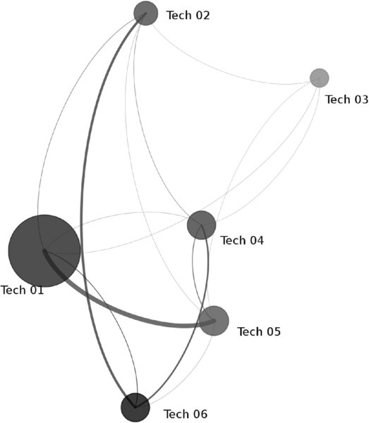
Figure 1.7: Technology Network for Gap Analysis3
To assess the maturity of certain technologies (both for core competence and competence gaps), a dynamic analysis is recommended. A plotting of the patent application frequencies over time often provides a valuable insight into the phase of a technology lifecycle. The scheme is shown in Figure 1.2. For the relevant phase in the curve, a linear approximation using regression is applied to calculate the average patenting rate as well as the slope of the patenting rate.
Those two measures derived from the previous analyses allow the plotting of a technology matrix (slope of patenting rate versus patenting rate) with four quadrants (Figure 1.8). The quadrant in the bottom left shows technologies with few patent applications and minor growth. The quadrant in the top left shows emerging small technologies. The quadrant at the bottom right shows stagnating large technologies, and the quadrant in the top right shows large and rapidly growing technologies. Tech 01 is the most frequently patented technology, with a high dynamic. So, consistent with the network graph shown in Figure 1.7, where the high connectivity of Tech 01 became evident, Figure 1.8 confirms its importance by means of a high patenting rate and a big slope of patenting rate.
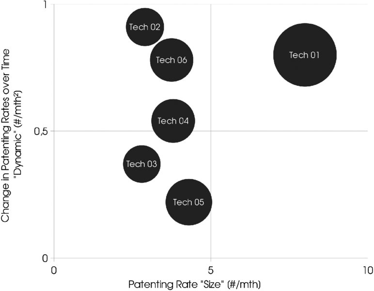
Figure 1.8: Technology Matrix
From the technology network and dynamic analyses, competence gaps are identified. In addition, maturities of individual technologies can be determined. In the context of Open Innovation, this allows the firm to prioritize the competences required for the co-development project.
Geographic Proximity Analysis
Having identified complementary technology areas and competence gaps, the next step is to identify the most suitable industrial partner with whom to collaborate. Several factors need to be taken into consideration. Geographic proximity is one of the key success factors to achieve the innovation objective with the least effort. This is due to cultural similarities, ease of communication through minor differences in time zones, and so forth.
Quantifying geographic proximity requires standardized regional analysis. Building on the data set of patent application data, one may use the information about inventor residence as a very structured source of information about inventor densities per region. These evaluations can be done on a country level or even in more detail. Figure 1.9 shows the geographic distribution of inventors in one particular technology area. Regional clusters with different inventor densities are visible.
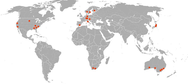
Figure 1.9: Geographic Proximity of Patent Investors
Understanding Cooperation Networks through Co-Inventor Analysis
There is yet another success factor for setting up OI partnerships. This concerns understanding the existing collaborations of potential partners. Most importantly, it is necessary to understand which collaborative partnerships have already been established and to identify which parts of the network may be more or less tangible and more or less fruitful, bearing in mind the activities of competitors and peers as well as critical suppliers. For that purpose, the existing cooperation networks of potential industrial partners, as illustrated in Figure 1.10, need to be well understood. Co-inventor analysis provides a systematic approach to structuring cooperation networks. They show how companies have jointly patented in the past. The cooperation network graph shows the patent assignees (companies) as nodes, and the connecting lines (edges) represent the joint patent applications. The graphic shows the inter-organizational innovation behavior for particular technology areas. This information is very useful for understanding the embeddedness of potential cooperation partners and thus for avoiding potential conflicting interests due to already established innovation links.
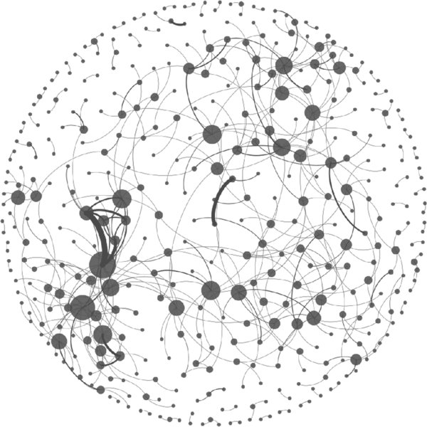
Figure 1.10: Cooperation Networks4
As a result of competence mapping and gap analysis through technology networks and technology matrices, geographic proximity analysis, and cross-check of embeddedness (as seen from the cooperation networks based on the co-inventor analysis), one can significantly speed up the selection of the most technically qualified, most suitably established, and best geographically located co-development partners. Hence, these methods provide a toolset for de-bottlenecking Open Innovation in its most time-consuming steps, namely the identification of required technology resources and the most promising and capable co-development partners.
The next section focuses on a specific case study of nanotechnology, where each of the steps is explained in detail.
1.3 Nanotechnology Case Study
This section provides a case study on the setup of an OI project on nanotechnology. In the first step, the technology network of nanotechnology is derived from patents filtered with a full text search on the substring nano*. Patent databases are visited and documents for further analysis are exported. Suitable databases include the United States Patent Office (USPO), European Patent Office (EPO), and Japanese Patent Office (JPO). Patent applications with a full text search string nano* are exported and analyzed by their metadata, in particular by coincident mentioning of patent classifications. Such prepared data are visualized by standard network charting software. As a result, a network chart is obtained which shows how different technology areas in terms of IPC codes are linked with each other via patent applications.
The specific result for patent applications containing the substring nano* in the title is shown in Figure 1.11. Central technologies such as nanotechnology (B82), concrete (C04), and also paper (D21) instantly become obvious. Next, metrics describing the dynamics behind those technology combinations are calculated. The simplest measure is the patent application frequency per month. It is monitored over time and a slope of patent application frequency over time is derived. Consequently, a forecast frequency as well as an impact factor (defined as the product of frequency and slope of frequency) can be calculated. In doing so, a ranking of nano-related technologies is prepared, based on impact factors and is depicted in Table 1.6. As a result concrete, organic chemistry, plastic conversion, metals, crystal growth, sewage water, and paper are among the top-ranked technologies.
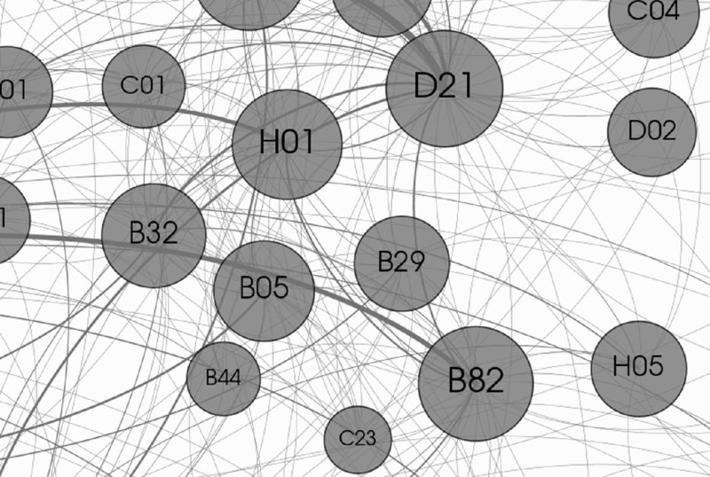
Figure 1.11: Technology Network for Nanotechnologies5
Table 1.6 Technology Impact Ranking for Nanotechnologies, Weighted by Impact Factor (Patenting Frequency x Slope of Patenting Frequency)
| IPC | Description | Patenting Frequency
[#/mth] |
Slope of Patenting Frequency
[#/mth2] |
Impact Factor
[#/mth3] |
| C04 | Concrete | 2.78 | 0.039 | 0.11 |
| C07 | Organic Chemistry | 7.20 | 0.013 | 0.09 |
| B29 | Plastic Processing | 3.35 | 0.026 | 0.09 |
| B22 | Metallurgy | 2.30 | 0.020 | 0.05 |
| C30 | Crystal Growth | 3.88 | 0.011 | 0.04 |
| C02 | Sewage Water | 1.13 | 0.009 | 0.01 |
| D21 | Paper | 1.30 | 0.007 | 0.01 |
| A01 | Agriculture | 2.40 | 0.004 | 0.01 |
From those top eight technologies, paper has been selected for the subsequent case study. In the technology network, paper (D21) is directly connected to B82 (nanotechnology), showing high patent application frequency as well as strong dynamics, i.e., increasing frequency over time. This technology connection between D21 and B82 has been selected for a detailed analysis. Furthermore, it has been enriched by a third technology, printing technologies (B41), which is often closely linked with paper according to experience (although it does not appear directly in the technology network of nanotechnology). In this manner, the field of potential technologies has been narrowed and a more detailed analysis now can be prepared.
For the present case study, new search profiles for the patent database are specified. A logical combination of text search in the title (the title containing “nano*”) and patent classifications (the patent classification being B82 and either D21 or B41). The monitoring period is 10 years, a time frame long enough for robust data fitting and yet not looking too far into the past. A total of 499 hits were obtained and analyzed in more depth.
To show the power yet parsimony of this type of analysis, we now compare the results from the patent literature with other information sources. On the one hand, the 499 hits in the patent literature is a number high enough to derive industry structures and identify sound players with a track record of high-level inventions. On the other hand, other information sources, such as the scholarly literature, would have resulted in thousands of hits, and even more, millions, if a search was done on the Internet (Table 1.7). This demonstrates the high level of data quality within the patent literature. The size of the sample, i.e., approximately 500 documents, can be handled easily, providing transparency and therefore a high quality level of subsequent results.
Table 1.7 Comparison of Sources
| Source | Search Profile | Hits |
| Patents | (nano* or B82) and (D21 or B41) | 499 |
| Literature | nano* and (paper or printing) | 200,000 |
| Internet | nano* and (paper or printing) | 10,000,000 |
In the first step, the dynamics of patent application frequency are investigated for the data set of paper/printing/nano* patent applications. Investigating the last 10 years, one observes all four phases in the technology lifecycle in the results graphed in Figure 1.12. Patent application frequencies over a moving 24-month period have been plotted against the end date of this 24-month period, so that the data cover 2003–2013. The smoothed patent application frequency (moving average of 24 months6) increases from 2.5 per month in 2005 to almost 8 in 2013. Patent application frequencies increase until early 2006. Subsequently the curve flattens until 2009 when it picks up rapidly until the beginning of 2012 when the lifecycle enters Phase IV, where patent application frequencies remain fairly constant at a high level.
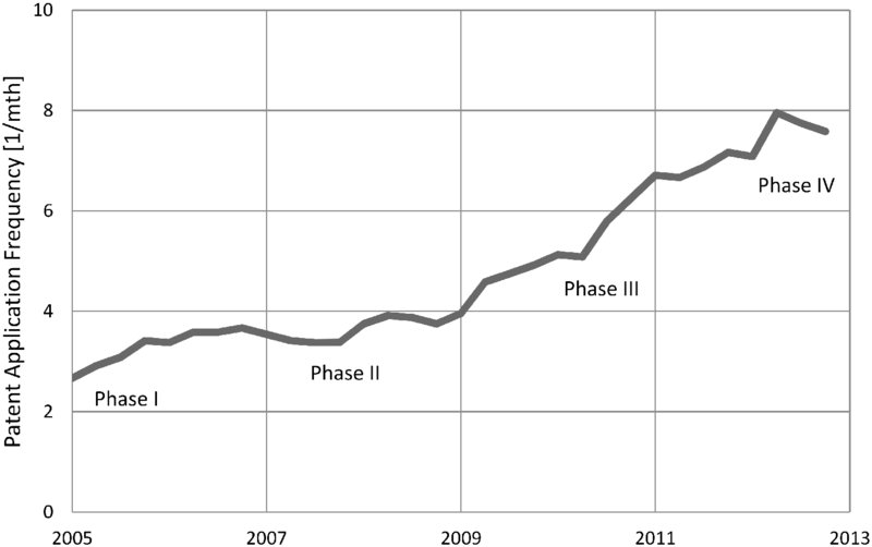
Figure 1.12: Patent Application Dynamics and Technology Lifecycle Assessment
In a next step, industry structure is investigated through a report of the organizations (patent assignees) with regard to their patenting rate and patenting rate slope (Table 1.8). The assignees are clustered in four distinct groups: users (printing machinery producers), universities, additive producers, and paper producers. As can be seen, the first two in the list of assignees are users, companies producing printing machines, followed by universities and additive producers. The first paper producer is ranked at position 6. Thus, compared to paper producers and additive producers, printing machinery producers (“users”) focus much more on patenting technologies related to nanotechnology.
Table 1.8 Companies Ranked by Patenting Rate and Slope of Patenting Rate
| Label | Patenting Rate | Slope of Patenting Rate |
| User 1 | 60 | 0,106 |
| User 2 | 35 | 0,122 |
| University 1 | 27 | 0,120 |
| Additive Producer 1 | 26 | 0,100 |
| User 3 | 24 | 0,036 |
| Paper Producer 1 | 22 | 0,070 |
| Paper Producer 2 | 22 | 0,125 |
| Additive Producer 2 | 20 | 0,050 |
| Additive Producer 3 | 19 | 0,110 |
| University 2 | 19 | 0,080 |
| University 3 | 18 | 0,130 |
| User 4 | 18 | 0,066 |
| Additive Producer 5 | 17 | 0,040 |
| University 4 | 17 | 0,150 |
| University 5 | 17 | 0,140 |
| University 6 | 17 | 0,100 |
| Paper Producer 3 | 16 | 0,110 |
| Paper Producer 4 | 15 | 0,135 |
| University 7 | 15 | 0,055 |
| Additive Producer 4 | 14 | 0,126 |
| Additive Producer 6 | 13 | 0,140 |
This is also illustrated in Figure 1.13, where a portfolio chart is given (please note that the dimension “patenting rate” is shown on a logarithmic scale in the portfolio chart). It underscores that Users 1 and 2, as well as University 1 and Additive Producer 1, clearly have a leadership position when it comes to patenting rate.
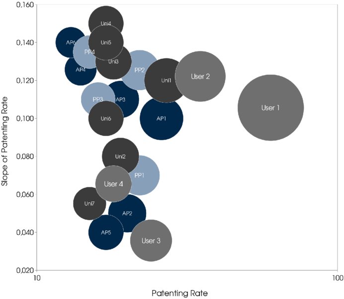
Figure 1.13: Organization Portfolio
The distribution is even more interesting, as it also shows that there is no major organization that put a lot of resources in the topic in the past, but is more recently decreasing these efforts. The bottom right of the chart is empty. This area would be populated if organizations were de-prioritizing nanotechnology in the context of paper/printing. This finding is in line with the interpretation, and shows that this present technology area is in an early phase of its maturity (Phase IV) with patent application frequencies still high.
Furthermore, one may take a look at the regional distribution of inventors as shown in Figure 1.14, where inventors are allocated to regions by their addresses. This regional allocation is done only roughly here, distinguishing between three major geographic areas: North America, Asia, and Europe. The most inventors are located in North America, followed by Asia and then Europe. This may encourage cooperation over a larger area, despite the general preference for geographically close partners in a co-development project. For a manager in Europe, cooperation with a North American partner may have the potential to achieve the innovation objective in the particular technology area.
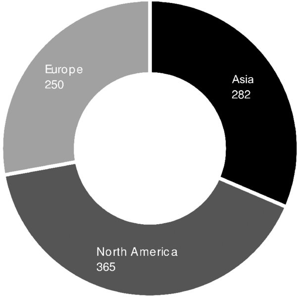
Figure 1.14: Inventors per Region
Finally, in order to determine how established different inventive organizations are, based on co-inventor analysis a network of collaborations is provided. Wherever inventors have filed a patent with more than one assignee, a line between the different inventors (nodes) is plotted. The matrix for the co-inventor analysis is created from bibliographic data in the patent applications, which mention assignee and inventors and thereby connect those. Whenever the same inventor shows up on patent applications from different assignees, a new edge is specified in the input table for the network program.
Users, universities, additive producers, and paper producers in central positions in the network are shown in Figure 1.15. This is additional information to the portfolio chart in Figure 1.13, because it enables the determination of which universities are cooperating with other major inventing organizations. Hence, it prevents the selection of cooperation partners with conflicting interests for a potential Open Innovation endeavor.
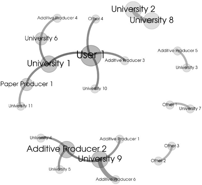
Figure 1.15: Cooperation Network7
Assembling the aggregated information derived from Figures 1.13 through 1.15, the most suitable candidates to approach for teaming up in an OI project are identified (Table 1.9). The organization portfolio gives quantitative information on the experience of the organizations, highlighting User 1 as the patent applicant with the highest patent application frequency and progressive dynamics. For each of the organizations, geographic information is provided. Geographically close organizations are thus identified and an overall picture on the strength of regions in certain technologies is obtained. In this case, the relative strength of North America has been shown. Finally, how established the organizations are becomes transparent from the cooperation network analysis, pointing again at User 1 operating in the densest and most diverse cooperation environment. Hence, User 1 may be the preferred candidate for an Open Innovation project.
Table 1.9 Development Partner Dashboard (Identification of Co-development Partner)
| Category | Experience | Geographic Proximity | Embeddedness |
| Measure | Patenting Rate (slope of patenting rate) | Main Region of Inventors | Direct Links in Co-operation Network |
| User 1 | 60 (growing) | North America | Additive Producer 3
Universities 1, 10 Other |
| User 2 | 35 (growing) | Asia | - |
| University 1 | 27 (growing) | North America | User 1
Paper Producer 1 University 6 |
| Additive Producer 1 | 26 (growing) | Europe | University 9 |
| User 3 | 24 (constant) | Asia | - |
| Paper Producer 1 | 22 (constant) | North America | Universities 1, 11 |
| Paper Producer 2 | 22 (growing) | Asia | - |
1.4 Conclusion
The approach presented in this chapter results in creating value in Open Innovation practice because it is generic and standardized. It also ensures an adequate level of quality and avoids biased decisions in selecting a collaboration partner. The analysis is structured in three phases (Figure 1.16).
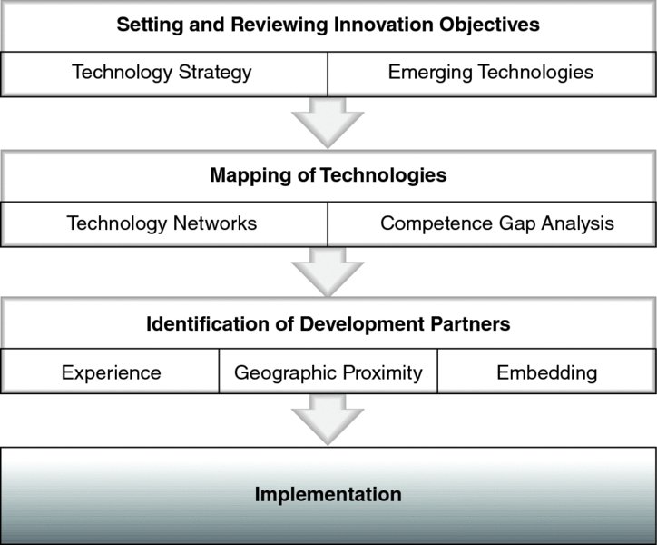
Figure 1.16: Process Outline
In the first phase, the competence landscape required to achieve the innovation objective was determined using technology networks. Based on a prioritization step, phase two specifies the field of technologies in more detail. More stringent search criteria result in more focused technology networks and a mapping of individual competence gaps. For specific technologies of interest, a technology lifecycle assessment was performed with a dynamic analysis and technology matrix. Finally, in the third phase, the relevant metrics of potential cooperation partners were determined.
THUS, IT IS POSSIBLE TO IDENTIFY HIGH-LEVEL, EXPERIENCED COOPERATION PARTNERS BASED ON JUST THREE PARAMETERS:
- Patenting rate in the targeted technology by organization
- Region of the inventors to assess geographic proximity
- Direct links in the cooperation network to assess the risk of conflicting interests and identify experienced organizations
The specific results for the top-ranked potential co-development partners are listed. For example, as shown in Table 1.9, the organization User 1 (with the term “User” indicating that the organization is a paper user) shows the highest patenting rate. The patenting rate is growing, as indicated in parentheses. Its inventors are predominantly located in North America, and the direct links in the cooperation network are with Additive Producer 3, with two different universities (University 1 and University 10) and with one other organization.
The speed with which these promising partners could be identified and profiled was quite striking—after a single research run on the patent literature, which identified the central network nodes. Subsequently, the partnership was set up successfully and delivered valuable results.
The set of methods described in this chapter represent a straightforward approach for de-bottlenecking Open Innovation for technology collaborations through identifying the most technologically capable and well-established partners. It has demonstrated how emerging technology landscapes can be evaluated by the means of advanced patent analysis, how the most dynamic technologies are identified, and how collaboration networks are visualized for the identification of prospective external collaboration partners.
References
- Bastian M., S. Heymann, and M. Jacomy, 2009, Gephi: An open source software for exploring and manipulating networks. International AAAI Conference on Weblogs and Social Media.
- Faust, K., and H. Schedl, 1984, Internationale Patentdaten: Ihre Nutzung für die Analyse technologischer Entwicklungen, in: Oppenländer, K. H. (Hrsg.), Patentwesen, Technischer Fortschritt und Wettbewerb, Berlin, S. 151–172.
- Knoben, J., L.A.G. Oerlemans 2006, Proximity and inter-organisational collaboration: A literature review. International Journal of Management Reviews, Volume 8 (2), 71–89.
- Park, H., K. Kim, S. Choi, and J. Yoon, 2013, A patent intelligence system for strategic technology planning, Expert Systems with Applications 40, 2373–2390S.
- Rastogi, S., A. Shinozarki, and M. Kaness, 2008, Intellectual Property and NPD, in: Griffin, A., and S. Somermeyer, (eds.) The PDMA ToolBook 3 for New Product Development, John Wiley & Sons, Inc., Hoboken, NJ, USA, 275–313.
- Sternitzke, C., A. Bartkowski, and R. Schramm, 2008, Visualizing patent statistics by means of social network analysis tools, World Patent Information 30, 115–131.
About the Contributors
- Manfred Stadlbauer is Head and Founder of Techmeter, an IT startup providing the Innovation Portal for technology forecasting, quantitative technology intelligence, data mining, and visualization of metadata from patent literature. Manfred is inventor of more than 20 international patents. He has 10 years of experience in hands-on R&D as researcher, project manager, and R&D manager in the fields of Rheology, Crystallization Kinetics of Polymers, and Polypropylene Development with academia and worldwide operating chemical industries. He holds a PhD in Chemical Engineering and an MBA from Linz University. Contact: m.stadlbauer@techmeter.at.
- Gerhard Drexler (NPDP) is Head of R&D Services of Mondi Uncoated Fine Paper, a worldwide operating paper producer. He is also member of the advisory boards of the Association for Process Management, the Platform for Innovation Management, the PDMA Austria e.V., and the Association for Environmental Management. Gerhard has 25 years of experience in industrial production, innovation, and R&D, and his latest publication is “Social Network Analysis: An Important Tool for Innovation Management,” in The Evolution of Innovation Management (Palgrave, 2013). He holds an MBA in general management and a PhD from Leeds Metropolitan University. Contact: gerhard.drexler@mondigroup.com.