The only works of art America has given are her plumbing and her bridges.
— The Blind Man (1917)
Why not look at the constellations of things that surround us every day?
That is the combinatory art. Nothing should be left out. Everything has to undergo the test of how it can live in this relatedness.
—Frederick Sommer, The Constellations
That Surround Us (1992)
Art supposes that beauty is not an exception—is not in despite of—but is the basis for an order.
—John Berger, “The White Bird” (1985)
From the viewpoint of art for art’s sake, aesthetic decisions are continually being contaminated by the things of this world. In Donald Lipski’s art, this process is not merely tolerated, but celebrated. In fact, this contamination—resulting from the contact and mixture of disparate substances and materials—defines the method and has come to be the principal subject of Lipski’s art.
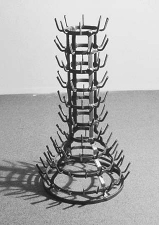
Lipski’s medium—the medium of things in the world (in this context called “found objects,” translated from the French objet trouvé) and their formal arrangement in relation to one another (called “assemblage”)1—was born in 1913, when Marcel Duchamp, for his own amusement, mounted a spinning bicycle wheel on a wooden stool.2 Though later called a readymade, this object is different from the Bottle Rack (1914) and the snow shovel (In advance of a broken arm, 1915), in that something was physically done to transform it, and to combine two different things (aside from the selection and the addition of language). Why not sneeze Rrose Sélavy? (1921) was also essentially an assemblage, called by Duchamp an “assisted readymade.”
Duchamp chose objects for his readymades that he hoped would have no visual appeal and thus would elicit “no aesthetic emotion.” While Duchamp’s readymades were made in response to the question “Can one make works which are not works of ‘art’?” Lipski’s pieces, whether they succeed or not, are always “art” works. The distinction is made with great clarity and elegance in Lipski’s Artwork (1993), which consists of a Duchampian bottle rack meticulously sheathed and stitched in leather and hung on the wall so that it projects out into the room like a playfully erect handiwork. Of his 1914 bottle rack, Duchamp said, “It can no longer be a matter of plastic Beauty. The idea of contemplation disappears completely. Simply note that it was a bottle-rack which changed its destination.”3In Lipski’s version, the bottle-rack is given new directions, only reaching its destination through physical manipulation and the motor of plastic Beauty.
But the contemplation of such beauty in Lipski’s artworks is never pure or undisturbed, because the objects he employs in these works are never entirely stripped of prior reference. However transformed, they carry their histories into the work with them. Along with the considerable visual appeal of Untitled (1994) comes a complex of mental, physical, and emotional associations arising from the admixture of thousands of razor blades to a Medivac stretcher. That combination of menace and rescue works on the skin of the viewer as well as on the eyes. As Duchamp noted in his Green Box: “Razor blades which / cut well and / razor blades which no / longer cut / The first have / ‘cuttage’ in reserve.”4
Perhaps the closest Lipski comes to the “assisted readymade” is a work like Salt Box (Psychiatrist’s Couch) (1993), which effects the transformation of a child-sized psychiatrist’s couch into a salt box with relatively little manipulation. The white of the rock salt contrasts pleasingly with the black upholstery, and the polished silver ring appears to settle in on its own to complete the appliance. But what sort of appliance is it—one to cleanse the tortured psyche, or pour salt in the wounds?
Artwork (1993) by Donald Lipski; courtesy of Galerie Lelong, New York City
The more one tries to separate the “matter of plastic Beauty” from these other (associative) matters, the less accurate to one’s actual experience of Lipski’s works it becomes. Looking at Untitled 89–20 (1989), one might notice the tactile, seeming softness of the gray material against the six harder, more regular and resistant tines, at about the same time that one recognizes a fan wrapped with steel wool. And the aesthetic integrity of the work has something to do with the way the purely sensual apprehension of it combines with the sense of those potentially spinning blades wrapped and stilled—suspended there for our delectation.
In one of his treatises on aesthetics and the combinatory arts, Frederick Sommer calls aesthetics “the non-judgmental assessment of structure,”5 and one of the enduring pleasures of Lipski’s art is the way the stubborn insistence of identity in materials gives way to relational urge. In Untitled 90–40 (1990), a copious mass of azure blue shoelaces gives up its former binding utility to form an object of stunning beauty and presence—a swelling blue heart, in fullness, with erotic cleavage and lots of strings attached.
Lipski’s attention to color has been little remarked upon, but it is remarkable. The greens of the rubber bands in Untitled 91–17 (1991), of the plants in Water Lilies 58 (1990), and of the broken glass in Free Reef (1987) are precisely calibrated in each case to work in saturated accumulation, to enhance the effect of cohesion. In the anagrammatically titled Free Reef (an homage to Carl Andre), the way the color comes out of the ends of the broken glass shards adds to the aquatic effect.
Rather than the result of forced couplings, these pieces are participations of a sort, more like recognitions. And when they work, the combinations seem, if not inevitable, at least meet and right, as if these things were meant for each other, and as if each miscellaneous thing was a part of some grand design. They are apprehensions of the adhesiveness of things, of the desire of things to cohere. The smile that often comes when one first sees a Lipski piece is partly due to that recognition, but is also an automatic response to that pleasurable twist in the mind as one tries to make rational sense of the combination and fails. It’s the failure that makes us smile.
Lipski’s wall pieces are collections of sketches, the seeds from which all the other work has grown. Gathering Dust—300 miniature sculptures arranged in a grid—was first exhibited at Artists Space in New York in 1977, and then three months later at the Museum of Modern Art. Each tiny piece is a preliminary study, an impromptu test of a sculptural idea. Again, color is a prime element, in the individual pieces and in the arrangement of the whole.
Lipski’s art is particularly well suited to contemporary postindustrial society, a society of plethoric overproduction, wealth, and waste. But his art is not plethoric. It is, rather, remarkably light on its feet, transforming glut into spare elegance. The work clearly responds more to minimalism than to pop, but with a twist. In his conclusion to a 1990 essay on Lipski’s work, David Rubin wrote: “Although minimalism was born of a disdain for metaphor and materials with associative value, Lipski has brought new life to its most cherished principles. In subjectifying minimalism, altering it as he does objects, Lipski has effectively transformed it from an art of the few into an art for the many. In applying minimalist aesthetics to familiar objects that tend to elicit a wide range of personal experiences, Lipski is essentially a benevolent populist.”6
Although the constituent objects are not chosen for their metaphoric content, this content, when it exists, is also transformed. The candle pieces trade on the symbolic—votive and ceremonial—associations of candles in various ways. In Untitled C-40 (1991), the two ends of a large dark elbow pipe are stuffed with white tapers, pointed down. This draping action shows up often in Lipski’s work—in several of the Poxabogue Pond and Water Lilies glass pipe works, in the new “Would Work” piece, Dialog (1999), and in one of the miniatures in the wall work Tobaccolage (1993), where a smaller elbow pipe is stuffed with cigarettes. When the tapers of Untitled C-40 are lit, they burn up rather than down, and the flames and smoke leave the traces of their struggle against gravity on both candles and candleholder. The pure white of the tapers is smeared and sullied with soot. The poet and critic Marjorie Welish has noted the “sense of the anarchic, or, alternatively, of play tinged with violence” in this piece.7 In Untitled C-19 (1991), one half of a sousaphone case is packed with hundreds of unlit candles. Their potential conflagration is held in suspension, turning the oversize instrument case into a kind of well-tempered instrument of portable mourning.
One of the operative tensions in Lipski’s art has been the conflicted relation between symbol and object. In 1990, at the Fabric Workshop in Philadelphia, Lipski produced a series of works using the American flag as a sculptural material, prompted in part by congressional attempts to make flag desecration a crime (this was the year the U.S. Supreme Court ruled a Texas flag desecration law unconstitutional). Lipski’s title for the series was “Who’s Afraid of Red, White & Blue?”8 It didn’t take long for his question to be answered; a confused but purposeful patriot vandal (flagellant?) responded to what he perceived as Lipski’s desecration of the Stars and Stripes by slashing one of Lipski’s large flag balls to pieces. The logic of such an act is difficult to parse, but it must have gone something like this: “You desecrate my symbol by transforming it into art, so I will desecrate your art, in the process desecrating my own symbol doubly.” Or perhaps the patriot vandal was implicitly acknowledging Lipski’s transformative powers. Since Lipski had effectively transformed the symbol of the flag into art, that art could now be attacked directly, without harming the symbol.
Speaking of an earlier piece that presaged the “Who’s Afraid” work—Half Conceals, Half Discloses (1988), a 20-foot-long flag that Lipski had perforated in a regular pattern with burn holes and titled with a phrase from “The Star-Spangled Banner”—Lipski said: “People ask: Is this desecration? I say no, its decoration.”9 The very idea that using the material flag to make art might be seen as unpatriotic struck Lipski as an essentially un-American idea. It is also a decidedly un-Lipskian one. From the flag balls to the flag chair to the wonderfully, symmetrically insistent flag book, these are clearly celebrations—graceful, seemly adornments—not desecrations. In this, as always, Lipski goes forward with a kind of willed innocence that is invigorating. In place of studied distance and obfuscation, Lipski says, in effect, “What you see is what you get. If you don’t get it, you’re not looking, and if you get something else, that’s your responsibility. My responsibility is to make it beautiful.” In several highly public artworks, Lipski has found some surprising ways to fulfill that responsibility socially.
The Yearling (1992) is composed of a toy horse standing on the seat of a child’s nursery chair. What makes it work is that the horse is the size of a real pinto pony, and the bright red child’s chair is over 20 feet high. Till the end of May 1998, this steel and fiberglass sculpture stood at the southeast entrance to Central Park, and was one of the most successful and affecting pieces of public sculpture I’ve ever seen in New York. Whenever I caught a glimpse of it, passing on foot or from the window of a cab or bus, it made me smile. Towering over the people scurrying around on the sidewalk below, gently mocking General Sherman on his horse across the way in Grand Army Plaza, it was a benign yet powerful image.
Not everyone shared this view. The piece was originally made for a school in Washington Heights, but the school’s principal objected to it. He apparently took it as some kind of personal insult. And perhaps it is an insult, to adult propriety, pedantry, and small-mindedness. Like all of Lipski’s works, it will not reduce to a single, literal meaning, but it appeared to many of us as a monument to the child’s imagination, to its willful resilience and fortitude. One person who surely will understand it this way is Donald Lipski’s son, born the year of its making.10
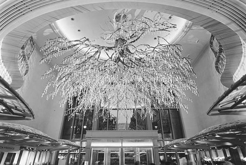
Sirshasana (1999) by Donald Lipski; courtesy of Galerie Lelong, New York City. Collection of Grand Central Market, New York and MTA Arts for Transit
The public artwork Lipski completed in 1998 for Grand Central Terminal in New York marks another departure. Titled Sirshasana, it consists of a huge artificial olive tree, suspended upside down from the ceiling. The tree’s roots are covered in gold leaf, and 5,000 Austrian lead crystals hang from its branches. The tree itself was fashioned by “the world’s foremost artificial tree builder,” the fortuitously named Jonquil Le Master, and the pendant crystals were supplied by Swarovski of Austria.
Placed just inside the 43rd Street entrance to the newly opened Grand Central Market, the piece rapidly became the talk of midtown. Because it so completely fills the domed ceiling area above the entrance, its visual reception comes in stages. At first, people may just see a fulsome chandelier, with thousands of crystals sparkling in the lights. Then they might see further into it, to the tree trunk and spreading branches, and eventually, the gilded roots secreted high up in the dome. Even though Le Master’s craft achieves a flawless verisimilitude, most viewers will not recognize it at first as an olive tree. And even if they do, what are they to make of the replacement of the tree’s oily fruit with lead crystals, or the gilding of the upended roots?
In this most recent public work, Lipski has moved from exploring the sculptural properties of a symbol (as in the flag works, especially Wave) to exploring the symbolic properties of a sculpture. The Cauldron, which he installed at the Parrish Art Museum in 1996—consisting, in part, of two large charred trees extending horizontally end to end and sharing a common root ball—certainly presages this one, but Sirshasana is much more symbolically loaded. The title refers to a yogic posture or asana that involves standing on one’s head. The inverted tree, with its roots in heaven and its branches reaching down to the earth—as a sort of bridge linking heaven and earth—is a primary image in both Indian and Judaic mystical traditions. It is described in detail in the earliest Indian scriptures, the Vedas and Upanishads (c. 900–500 B.C.). “The name given to the Indian asvattha, the tree of life,” writes Hans Peter Duer, “is sometimes quoted as urdhvamulam, ‘with roots toward the top,’ or, as we read in the Chandogya Upanishad, as nyagrodha, ‘growing downward.’”11 And in kabbalistic texts, it appears as the Sephirotic Tree. The thirteenth-century Zohar says: “The Tree of Life extends from above downwards, and is the sun which illuminates us all.”12
In his book The Tree of Life, Roger Cook juxtaposes a picture of a Buddha Tree temple decoration from China with a photograph of Duchamp’s Bottle Rack. “Questioning the meaning of the visual image,” writes Cook, “the twentieth-century artist Marcel Duchamp removed this apparently meaningless Parisian bottle-rack from its utilitarian context and exhibited it as a ‘work of art.’ In doing so, he drew attention to its dignity and power as a symbol. Placed next to this Buddhist Celestial Tree, its latent symbolism is further brought out.”13 Whether or not one buys Cook’s projection, one has to admit that the purity of Duchamp’s gesture is in increasing danger of being contaminated the longer it exists in the world of things.
Meanwhile, Lipski’s contamination is growing to include ever more substance as he further explores the relation of symbol to object. At a time when the separation between contemporary art and its public seems to be widening daily, Lipski is finding new ways to make a public art that is neither condescending nor pandering, neither didactic nor empty.
Two women are standing before one of the full-to-bursting glass cases of food near the entrance to the new Grand Central Market, expressing their approval of the display. A security guard approaches, lifts one finger like a sage, and says, “If you want to see something really beautiful, look up.”
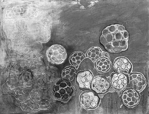
Colony (1983) by Terry Winters; courtesy of the artist