When using a Pareto diagram, the first step is to make a list of complaints and the number of their occurrences during a specific time period. The only tool that you need is Excel, which has a built-in Pareto diagrams function in its statistical chart's functionalities.
Let us see how to do this:
- First, we make a simple list in Excel, as shown in the following screenshot:

- After that, we can select Complaint 1 to 595 and then select the Pareto diagram function in the INSERT | statistical charts menu. As shown in the following screenshot, it will create a Pareto diagram:
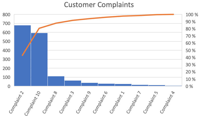
Abiding by the 80:20 rule, we can deduce that (680 + 595)/1583 =0.805, or approximately 80%, which means that complaint 2 and compliant 10 are causing 80% of the issues for the customers. Therefore, the company should focus its efforts on the remediation of those two issues.