PROCESSING MAGIC
LONG-TERM ARTISTIC GOALS
The creation of my images is guided by my efforts to interpret the landscape distinctively, an approach suggested to me many years ago by Ansel Adams. His approach was to make the most expressive photographs possible, believing that his passion gave him the greatest chance for creative success. He also felt his best art, after the fact, would inspire the desire for environmental conservation.
With Ansel’s approach in mind, I’d like to walk you through my digital workflow. It has evolved over the years, beginning with Photoshop, prior to the introduction of Lightroom. Currently, my image processing begins in Lightroom. I find Lightroom to be an invaluable organizational tool for cataloging my extensive image library.
I sort through all of the files for a given photo session, judging them for exposure, sharpness, and composition. I often use the Compare function to identify the ones I like best from a group of similar files. Each time I look through the images from that session, I will rank them using the star ratings.
Although I started out using only Photoshop long ago, I now use the Develop module in Lightroom for many adjustments, mostly global ones that affect the whole image. I find the Highlights and Shadows sliders to be invaluable to bring out the nuances in my photographs, and the White, Black, and Clarity sliders get plenty of use. The Dehaze and Texture tools are helpful options too. As Lightroom has evolved with each new version, more and more local adjustments are available. The main one I use is the Adjustment Brush, and many photographers I know swear by the Graduated and Radial filters.
At the end of my work on an image in Lightroom, I take it to Photoshop for the final adjustments, mostly for local areas of refinement, such as adding contrast or saturating a specific color. Each change I make using Photoshop tools such as Curves, Levels, or Color Saturation is made on a separate layer. Most often, I use various masking techniques to tweak a problem area not fixed in Lightroom. I also use luminosity masks offered commercially by Tony Kuiper.
The final step in my workflow is to create a PSD master file, adding “master” to the file name to remind me that it is the full-sized, multi-layered file. This applies to both scanned film and digital captures. I started using master files when first scanning my 4x5 film for digital printing in the early 1990s, thanks to my digital mentor Bill Atkinson. The master file becomes your archive for the full-resolution image plus the adjustment layers you’ve created.
When I save the Photoshop file, that PSD file shows up back in Lightroom so that both the RAW and PSD files reside in the same place. I love this convenience. Even if I return to work on the image after many years, I have that visual reference of the original file and how I processed it, and I can see any variations that I might have experimented with, such as a black-and-white or a cropped version.
With a layered PSD master file, I can make refinements easily at a later date by adding new layers or fine-tuning existing layers. Tastes and skills change over time. For my recent retrospective book, I revisited each of the 151 photographs, often making small tweaks.
In terms of refining past adjustments in Lightroom, the software’s foundation is that those adjustments are non-destructive to the original RAW capture. It tracks your processing history and allows you to go back to adjust, reverse, or eliminate past changes. Although this isn’t as powerful as Photoshop’s adjustment layers, you can still refine or reverse your efforts.
Your full-resolution master file is the primary foundation for preparing images for any use—fine art prints, JPGs for the web, files prepared for publishers, and so on. You flatten the layers, set the image size and resolution, sharpen for that output size, and save the new file with a name related to its use. When I make my fine art prints, I save the file named to the size output, so I don’t have to open and prep the master file when I next need to make a print that size.
The images shown in this essay reflect two of my “intimate landscape” interpretations of Yosemite. The winter image was taken in 1989 with my 4×5 camera and film. Although El Capitan was beautifully lit, I chose to exclude it. I saw magic in the subtle but distinct contrasts of cool and warm tones, and in the textures in the snow. My approach to processing was to maintain that subtlety without overplaying the key elements of color and texture. Small amounts of contrast and color saturation brought the scene to life.
The image of backlit pines was taken in 2014. As with the Winter Sunset Reflections in Merced River photograph, I excerpted a part of the landscape before me, choosing to leave that which was out of the frame to the viewer’s imagination. My compositional emphasis was on the pattern of pine trunks and branches, especially the glistening needles. I processed the digital file to keep cliffs and trees dark, which helps the needles glow out of the dark background. My main goal is the interpretation, and all my efforts in processing my work are aimed at conveying the magic and mystery of that experience.
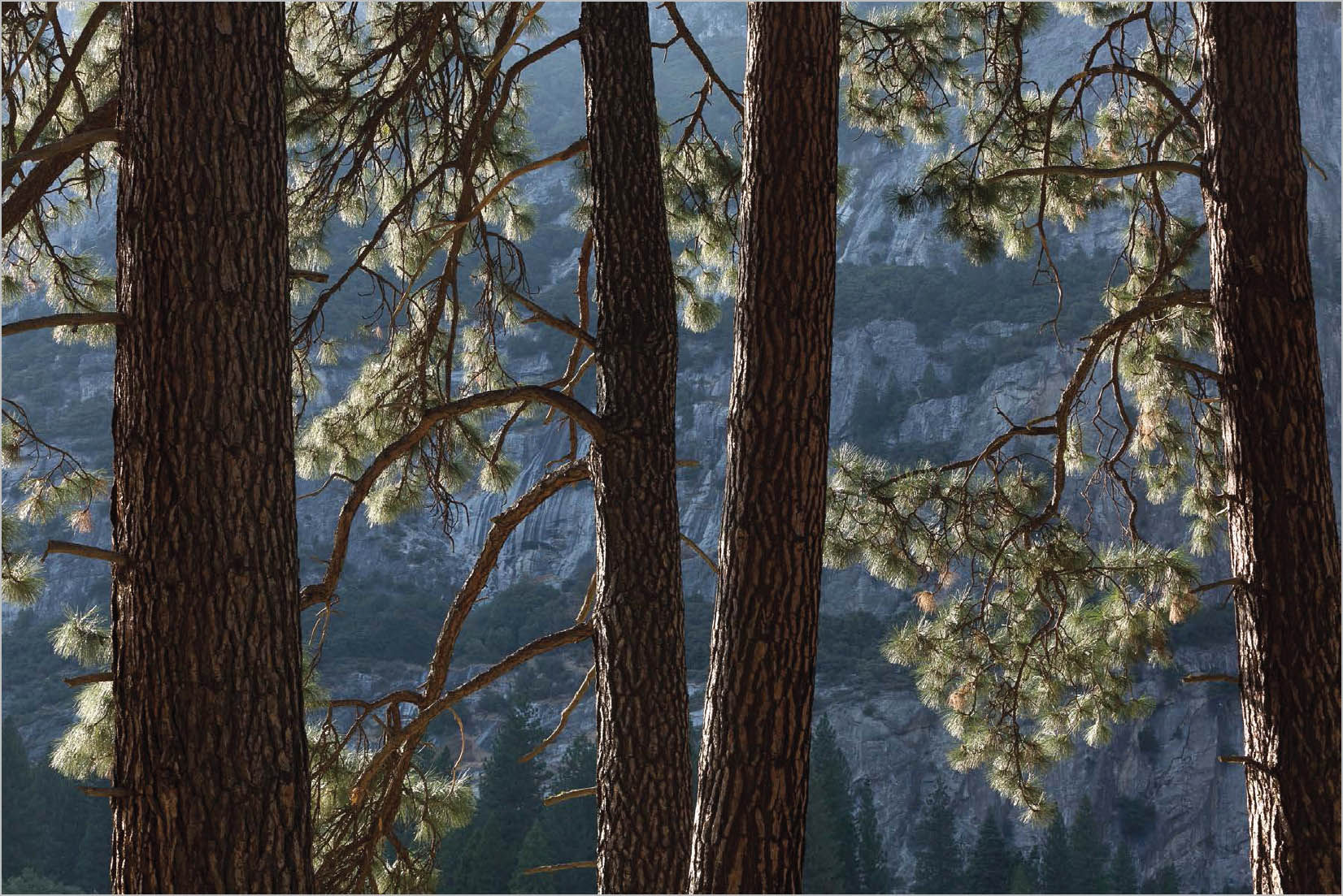
Backlit Ponderosa Pine Trees | Yosemite Valley, Yosemite National Park, California | 2014
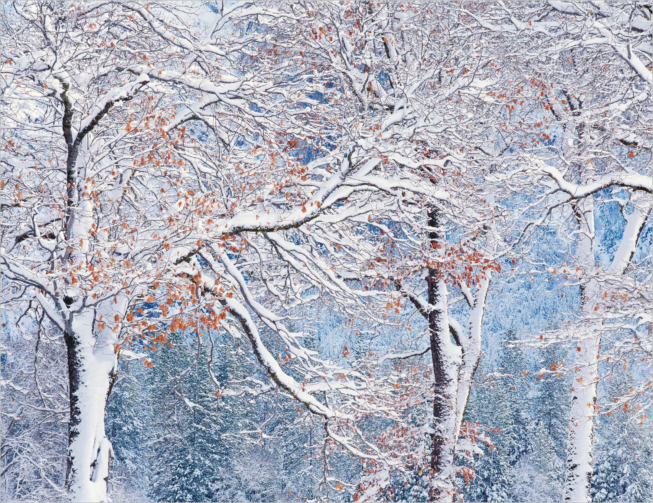
Black Oak Branches in Winter | Yosemite Valley, Yosemite National Park, California | 1994