10
TASTE
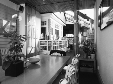
Before she became the grande dame of American letters, Edith Wharton wrote The Decoration of Houses. The subject is the history of décor from the sixteenth to the eighteenth century, but the aim of Wharton and her coauthor, the architect Ogden Codman Jr., was polemical rather than scholarly. They denounced the clutter of contemporary Victorian homes and called for a return to architectural principles of classical Italian and French interiors. “Rooms may be decorated in two ways,” they advised, “by a superficial application of ornament totally independent of structure, or by means of those architectural features which are part of the organism of every house, inside as well as out.” Clearly favoring the latter, they extolled the décor of the “golden age of architecture,” and deplored the present-day excesses of what they called the “gilded age of decoration.” Both Wharton and Codman spent their summers in Newport, Rhode Island, which had some of the most extravagant examples of overdone interior decoration, much of it in the mansions built by members of the Vanderbilt family. “I wish the Vanderbilts didn’t retard culture so very thoroughly,” Wharton wrote heatedly to her coauthor. “They are entrenched in a sort of Thermopylae of bad taste, from which apparently no force on earth can dislodge them.”
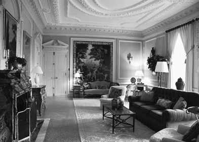
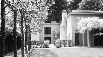
Wharton and Codman acknowledged the “vagaries of taste,” but believed that taste in décor was not a matter of personal feeling, as it was in painting or music. “With architecture and its allied branches the case is different,” they wrote. “Here beauty depends on fitness, and the practical requirements of life are the ultimate test of fitness.” Certainly they were not functionalists, but they saw utility as the bedrock of architecture—and decoration. “The essence of taste is suitability,” Wharton wrote in French Ways and Their Meaning. “Divest the word of its prim and priggish implications, and see how it expresses the mysterious demand of the eye and mind for symmetry, harmony, and order.” Wharton practiced what she preached in her celebrated home, The Mount, built under her direction, and whose rooms she and Codman decorated. That peripatetic houseguest Henry James described Wharton’s home as “an exquisite French chateau perched among Massachusetts mountains—most charming ones—and filled exclusively with old French and Italian furniture and decorations.”
Elsie de Wolfe, who invented the profession of high-society interior decorator, was influenced by Wharton’s ideas on décor, and the two were acquainted although not close—Wharton disapproved of de Wolfe’s flamboyant lifestyle. In 1913, de Wolfe published The House in Good Taste, a collection of her articles from women’s magazines. This decorating handbook is full of sage advice on practical matters such as heating (fireplaces are more agreeable than steam heat), electric lighting (make sure it is located where you need it), closet organization (don’t waste space), and furnishing small apartments (stay away from massive armchairs). But the thread that runs through the book—as the title implies—is the importance of taste. Taste is what will guide us through the myriad decisions that are required to furnish a home, whether they have to do with paint colors, furniture styles, or the best place for a writing desk.
Drawing Room, The Mount, Lenox, Massachusetts, 1902
De Wolfe believed that taste, like good manners, had to be learned. “How can we develop taste?” she asked. “We must learn to recognize suitability, simplicity and proportion, and apply our knowledge to our needs.” Suitability—that word again—had as much to do with aesthetics as with convenience and comfort. De Wolfe believed in visual rather than stylistic consistency in interiors, often mixing styles, and she was open to the avant-garde, writing admiringly of the black-and-white décor of the Viennese architect and designer Josef Hoffmann. Above all, she championed simplicity—less furniture, limited colors, fewer knickknacks. Her ultimate goal was what she called the Modern House. “Before very long we shall have simple houses with fire-places that draw, electric lights in the proper places, comfortable and sensible furniture, and not a gilt-legged spindle-shanked table or chair anywhere.” Her thinking anticipated Bauhaus modernism—assuming the Bauhauslers had been able to come to terms with chintz and trelliage.
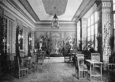
Elsie de Wolfe, Trellis Room, Colony Club, New York, 1907
ENTHUSIASM FOR FORM
Geoffrey Scott’s The Architecture of Humanism appeared a year after The House in Good Taste. It is a different sort of book, but written by someone with a similar sensibility—Scott worked as a secretary for Codman and Wharton, and knew de Wolfe well. He subtitled his book A Study in the History of Taste, and argued that while architects were influenced by function, materials, and engineering, their work was also the result of taste, which he defined as “the disinterested enthusiasm for architectural form.” This is the same point that John Summerson made about Gothic builders being attracted to pointed arches, but the historic period that influenced Scott’s thinking was the Italian Renaissance.
The architecture of the Renaissance is pre-eminently an architecture of Taste. The men of the Renaissance evolved a certain architectural style, because they liked to be surrounded by forms of a certain kind. These forms, as such, they preferred, irrespective of their relation to the mechanical means by which they were produced, irrespective of the materials out of which they were constructed, irrespective sometimes even of the actual purposes they were to serve. They had an immediate preference for certain combinations of mass and void, of light and shade, and, compared with this, all other motives in the formation of their distinctive style were insignificant.
There is abundant evidence for Scott’s claim. Renaissance architects designed the same ornamental pilasters, whether these were carved stone, plastered brick, or painted frescos. Symmetry was adhered to, both in elevation and plan: if an enclosed staircase was required on the right of a space, then a matching volume had to occur on the left, even if all it enclosed was an empty—and unneeded—closet. If symmetry mandated an extra window, then a window was added—irrespective of functional needs; when an actual window was not feasible, a false window would do. A trademark Renaissance motif was the arch, which was used irrespective of structural spans—if more strength was required an iron tie bar was added.
Scott did not explain where Renaissance taste came from—he was a critic rather than a historian, and his prime purpose in writing was to influence contemporary opinion. He believed that architecture had become overintellectualized, and he was as skeptical of academic classicism as he was of John Ruskin and the Romantic Movement. He ignored contemporary architects, even Lutyens, whose version of classicism he might have admired. Nor did he take issue with such modernist theorists as Adolf Loos and Walter Gropius. Perhaps, sequestered in Florence, Scott was simply unaware of—or uninterested in—current architectural fashions. Or maybe he was being shrewd, for by avoiding topical references, his book acquired a timeless quality which partly accounts for its longevity.
Scott resisted the impulse to formulate an alternative aesthetic theory. “What we feel as ‘beauty’ is not a matter for logical demonstration,” he wrote. Scott can be maddeningly obscure, and the closest he came to practical advice was to recommend a greater firsthand familiarity with humanist architecture, which would presumably develop one’s taste. He recognized that to many this sounded capricious and inconsequential; nevertheless, he called for the primacy of aesthetics, and for responding to buildings with the eyes and heart rather than with the intellect.
On this last point, Paul Cret was in total agreement. He once described the goal of architectural education as “the development of what artistic sense the student may possess in a latent state—the education of his taste and the opening of his eyes to the beauty of form.” Cret emphasized that this process should not be mechanical. “To be really deep and effective, this (slow) passage through successive stages in which one learns how to appreciate some new things and despise others, must be a personal one, else the intellect only, and not the feelings will be touched and permanently influenced.”
Cret may have been thinking of his time at the École des Beaux-Arts. The school was divided into ateliers, or studios, each consisting of sixty to seventy students of all levels, newcomers as well as upperclassmen, all under the tutelage of a patron, an eminent practicing architect. When the planner and architect Andrés Duany attended the École in the early 1970s, the curriculum was much changed but the atelier system was still in place. Duany recalls that since the patron came to class only on Saturday mornings, the bulk of teaching was done by the senior students. Another surviving feature of the old École was the charrette, an intense work period when students prepared final drawings of their design assignments, the junior students regularly assisting their senior classmates. “During the charrettes, the upper-level students sometimes fed their assistants in the many good, affordable restaurants that were nearby,” Duany writes. “There they learned about cheese and wine and the flamboyance of dress and manner required of an ancien élève … Socialization was not just the transmittal of architectural culture,” he emphasizes, “but also of manners, mannerisms, and taste.”
Most schools of architecture devote the first year of the curriculum to design exercises whose aim is less to impart specific practical knowledge than to develop visual and conceptual abilities—that is, to develop taste. The Bauhaus institutionalized this practice in the vorkurs, or preliminary course, which was started by Johannes Itten and later taught by László Moholy-Nagy and Josef Albers. Students explored color, texture, and graphics through a series of exercises, producing collages, mobiles, and a variety of color and form studies. According to the art historian Leah Dickerman, “These compositions also stand as a first effort, repeated in many iterations through the Bauhaus, to define a primary visual language for all artistic practice.”
An early application of the Bauhaus visual language was the director’s office that Walter Gropius designed for the Weimar Bauhaus in 1923. The room is conceived as a walk-in Constructivist sculpture. The same geometry governs the design and placement of the furniture, the rug, and a wall hanging. A structure suspended in the center of the room is an unshaded tubular lighting fixture, whose functional inadequacy, as Reyner Banham pointed out, is attested to by the desk lamp, which was not part of the original design. The lamp, like the furniture and the textiles, was made in the school’s workshops. Although the office was a demonstration of the new unity of art and industry, the handmade nature of its contents—as well as its design—clearly gave precedence to art. A visitor perched on the Gropius-designed armchair would have to peer awkwardly around the in-out tray and across the corner of the desk to speak to Herr Direktor. Hardly Wharton’s idea of fitness.
When I was a student at McGill, our vorkurs was called Elements of Design, and was taught by Gordon Webber, who had been a student of Moholy-Nagy at the Chicago Institute of Design. One afternoon a week we painted color charts, constructed three-dimensional mobiles of wire and string, and built “feely boxes.” The last were cardboard boxes with a hole large enough to insert your hand, and stuffed with a variety of tactile materials: fur, steel wool, rocks, sandpaper, a wet sponge. The highlight of the class was when our professor would sample the boxes, a procedure accompanied by many oohs and ahs.
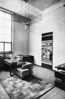
Walter Gropius, director’s office, Bauhaus, Weimar, 1923
We considered Webber’s playful class a welcome relief from our demanding lecture courses in structural steel and reinforced concrete, but Elements of Design had a serious purpose. Somewhat akin to the goal of military basic training, the goal of the course was to “break down” our visual prejudices (for many of us, formed by our suburban upbringings) and to “build up” a new set of aesthetic values. Values, not rules. We were never actually forbidden to design a traditional pitched roof or a bow window, but we came to instinctively understand that these did not belong to the approved modernist vocabulary. Modernist design was challenging, however. For my first studio assignment, I adapted one of Marcel Breuer’s houses, which I admired, and was soundly scolded; I learned it was strictly forbidden to copy. On the other hand, imitating drawing styles was acceptable. Le Corbusier’s minimal drawings were particularly popular, since they were easy to reproduce. I learned how to draw his stick-figure people and spindly trees. One of my classmates had a set of metal Corbusian lettering stencils, whose military-style type could turn any drawing into an hommage to the master.
Six years of indoctrination had its effect. Although I had grown up in a suburban bungalow with pastel-colored walls, when I graduated I could not imagine painting the walls of my apartment any other color than flat white. Wall-to-wall carpeting was out, too; small colorful rugs were okay, but a bare wood floor was best. Wood-and-canvas director’s chairs completed the décor. However, the only constant in taste is that tastes change. A few years later, postmodernism was in the air, and after visiting a Bavarian Rococo church, I added a blue sky and puffy clouds to my bedroom ceiling; the walls stayed white. A decade later, that changed, too, when I pasted up striped wallpaper in our guest room, feeling deliciously like a bourgeois traitor to my Corbusian roots. Researching Home, I came across Elsie de Wolfe, who introduced me to the field of interior decoration, and my taste broadened. I acquired a wing chair, still my favorite reading spot. I was particularly taken with the celebrated home of the Swedish painter Carl Larsson, and I painted the wooden ceiling of our dining room cobalt blue. A decade later, we sponge-painted our bedroom walls to create a textured finish. The walls and ceilings of our current house are all the same color, a warm yellowish white, like old parchment, with sand added to the paint to produce a rough finish. I sponge-painted the bathrooms—one ocher, one pink—to camouflage the plastered-over cracks, but also because the battered appearance reminds me of an old Italian villa.
One can look back on one’s youthful taste with amusement. Who was that young man in the Nehru jacket with the long sideburns and the Zapata mustache? In time, discarded fashions can be left in the back of the closet, and grooming can change, as can décor. But architecture remains. Part of the attraction of old buildings is that they are a testimony of who we once were, what we believed in, our values as well as our tastes. We can look back with admiration, respect, or awe. Or puzzlement. What were those Victorians thinking when they indiscriminately piled up layer upon layer of startling ornament? Did the modernists really think that “streets in the air” would be as good as streets on the ground? Did the Brutalist architects of the 1960s believe that the public would ever warm to their cold, ponderous concrete creations? How on earth could the postmodernists use those insipid pastel colors? But there’s no accounting for taste.
ARCHITECTURAL TASTE
I’m pretty sure that Itten would have disputed the claim that his vorkurs had anything to do with taste. Indeed, since Scott, few architects have seen taste as a legitimate concern. The modern dismissal of taste is the result of the current belief that intellectual theories are the foundation for design, as well as the profession’s understandable desire to distance itself from the frivolity of fashion. When Richard Rogers was designing the Lloyd’s of London building, he wrote: “Taste is the enemy of aesthetics, whether it is found in art or architecture. It is abstract, at best elegant and fashionable, it is always ephemeral, for it is not rooted in philosophy or even craftsmanship, being purely a product of the senses. As such it can always be challenged and is always being superseded, for how can one judge whose taste is best? Yours, mine, or someone else’s?”
Unlike Scott and Cret, Rogers is suspicious of taste precisely because it is governed by the senses. But can taste really be dismissed so summarily? Isn’t an architect’s preference for a certain way of dressing, for example, an indication of taste, and wouldn’t the same visual taste be likely to influence the design of a building? Frank Lloyd Wright, who wore flowing neckties and capes, went so far as to design some of his own clothes, which were as original and as theatrical as his buildings. As one might expect, Mies van der Rohe dressed more conservatively, but his handmade suits were as meticulously crafted as his buildings. That bohemian firebrand Le Corbusier also wore well-cut suits, although usually accompanied by a jaunty bow tie.1 Architectural dress is a balancing act between communicating sobriety (I am a responsible builder) and creativity (I am also an artist). Some architects assert the latter by sporting fashion accessories such as colorful socks, an insouciant scarf, or a pair of off-beat eyeglasses. The last was pioneered by Le Corbusier, who had extremely poor eyesight (he was blind in one eye) and made thick, perfectly round framed glasses (later emulated by Philip Johnson and I. M. Pei) his trademark.
Architecture being visual, it’s natural that architects should be concerned with fashion. When I was a young architect I wore tweed jackets with hand-woven ties—lots of textures and earth colors. Today, young architects favor all black, which makes them resemble clerics—perhaps they see themselves as spreading the gospel of Good Design, or maybe it’s just a practical way of appearing stylish on a limited budget. Not all contemporary architects subscribe to this somber dress code. Richard Rogers is usually photographed in intensely colored collarless shirts; for formal occasions, the shirts are white. Norman Foster dresses like a very successful business executive in a creative field. Renzo Piano is an unusual dresser for an architect: his clothes are neither black, nor colorful, nor stylish, and surprisingly not Italian but casually American—pullovers, chinos, tieless button-down shirts. Gap rather than Prada.
Taste may be ephemeral, as Rogers claims, but his own architectural taste has remained remarkably consistent over the years. In the Reliance Controls Electronics Factory, a landmark project designed with Norman Foster when both men were in their early thirties, the workers’ canteen was furnished with Eames chairs. Forty-five years later, Rogers uses similar chairs in the staff cafeteria of 300 New Jersey Avenue, an office building in Washington, D.C. The choice is revealing. The Eames DSR Chair, designed by Charles and Ray Eames, is a molded plastic seat on spindly wire legs. The chair, geared to mass production, perfectly encapsulates a certain kind of taste: innovative, progressive, unfettered by history. Although this modernist icon appeared in 1948, it’s still in production—and likely will be in 2048, when the original will officially qualify as an antique.
The Washington office building also demonstrates Rogers’s abiding taste for bright colors: the columns in the atrium are canary yellow, the structural masts are emerald green, and as for the Eames chairs, they are bright red. This partiality to color was evident in the Centre Pompidou, whose exterior is a riot of color-coded pipes and ducts—blue for air, green for water, and yellow for electricity—as well as red elevators and escalators.
The Centre Pompidou is one of those unusual buildings that emerge aesthetically fully formed. Critics, assuming there was nothing left to explore, described it as the swan song of high tech. But in the following decades, in a series of remarkable buildings (Lloyd’s of London, Madrid’s Barajas Airport, the Bordeaux Law Courts), Rogers showed conclusively that this is not the case.
Rogers Stirk Harbour + Partners, 300 New Jersey Avenue, Washington, D.C., 2010
Another Rogers obsession is complicated, lightweight structure. The glass atrium roof of 300 New Jersey Avenue is carried on trusses that extend out to unusual-looking masts. Dennis Austin, one of the design team, explains:
The mast columns at the entrance support the ends of the trusses. They are essentially nine-story unbraced columns, so we studied a mast outrigger form to provide stability over its height. The mast is a simple six-inch column with a series of arms which provide mid-length support (the effect is that the six-inch column is fooled to think it is really a five-foot-diameter column at mid-length). They were originally painted light gray so as not to call attention to themselves; however, when Richard saw how beautifully they were fabricated, he felt that they should be painted a bright green—which we did.
Rogers’s last-minute decision to change the color of the masts sounds capricious, but he regularly uses colors to distinguish the main structural elements of his designs—he wants us to understand how things work. On the other hand, his predilection for garish colors such as bright orange, magenta, chrome blue—never pastels—is a matter of taste. Rogers’s use of color can be iconoclastic. The atrium of 300 New Jersey Avenue could have been all one color, white or gray, which would have suited a high-end office building that houses an international law firm. But by using unexpectedly bright colors, Rogers undermines the solemnity and self-importance that usually attaches to corporate architecture.
One of the powerful early influences on Rogers was Charles and Ray Eames’s house and studio in Santa Monica. Built in 1949, the house uses prefabricated factory-made materials such as open-web steel joists, corrugated steel decks, and standardized windows in an artful way that is both industrial-looking and casual. The exterior black-painted steel frame is filled with glazed and colored panels. The inspiration is obviously Mies, but the architecture is much too relaxed, too cozily cluttered, and too unmonumental to be called Miesian.
Norman Foster, who also visited the Eames House as a young man, shared Rogers’s interest in lightweight structures (and also used Eames chairs in many projects), although his taste in color is more sedate. With the notable exception of a few early buildings such as the Willis Faber office building, which has bright green rubber flooring on the main level, and the Renault Distribution Centre, whose exposed structure is entirely painted a bright canary yellow, Foster’s interiors have tended to be monochrome. The Sainsbury Centre for Visual Arts, for example, is predominantly gray and silver—the Eames chairs in the student cafeteria are white. The Hongkong Bank is a sober (charcoal gray) version of the Centre Pompidou that likewise reveals its structural bones. But this turned out to be one of Foster’s last “Gothic” structures. Over the years—unlike Rogers—he has moved away from dramatic engineering to a seamless integration of structure, skin, and mechanical services. An early example is an addition to the Sainsbury Centre, designed a decade after the original building. If the original Sainsbury Centre could be said to reflect the early twentieth-century engineering aesthetic of a dirigible shed, the Crescent Wing is more like the Italian sailplane that Foster flew at the time: precise, streamlined, and very sleek. Foster was always a minimalist, but today his minimalism has become opulent, almost luxurious.
Foster + Partners, Crescent Wing, Sainsbury Centre for Visual Arts, University of East Anglia, Norwich, 1991
Renzo Piano was also Rogers’s partner—on the Centre Pompidou project—but when he struck out on his own, it became evident that his taste was more conservative, too. Piano’s first major work, the Menil Collection in Houston, is completely monochrome—the steel structure is painted white, the sunshades are white concrete, and the cypress siding is painted gray. Using wood in a high-tech design is unexpected, and it gives the engineered building a distinctly handcrafted look. This combination of craft and technology has become a Piano trademark, and later buildings have incorporated iroko wood, terra-cotta panels, laminated timber, and fabrics. The New York Times Building is one of the few office buildings I know whose lobby floor is wood—white oak—rather than granite or marble. That, and the use of marmorino (hand-laid Venetian plaster) on the walls, humanizes the commercial environment. The marmorino is a warm marigold color. Piano occasionally introduces bright accents, although unlike Rogers, he is not a natural colorist, and the results sometimes feel forced. The bright-red-painted steel on the new wing of the Los Angeles County Museum of Art appears contrived. Reacting to the strident colors of the terra-cotta skin of Central St. Giles, The Independent’s Jay Merrick asked: “Can this shouty polychromatic architecture really be the work of the 72-year-old designer whose museums have become masterful demonstrations of fine-boned modernist decorum?”
Renzo Piano Building Workshop, New York Times Building, New York, 2007
Rogers, Foster, and Piano share, in Scott’s phrase, an “enthusiasm for certain forms,” particularly those forms found in modern engineered structures such as aircraft hangars, drilling platforms, factory sheds, and transmission towers. While each has interpreted this enthusiasm somewhat differently, it is the common thread that runs through their work. Architects such as Gehry, Herzog and de Meuron, and Nouvel produce individual works whose unusual forms garner attention, but Rogers, Foster, and Piano have redefined entire categories of buildings: airport terminals, office towers, civic buildings, museums. Their particular combination of technological innovation and structural refinement seems to capture, dare I say it, the spirit of the age. Or maybe we have simply all come to share their taste.
THE ARCHITECT’S HOUSE
In 1971, while a graduate student, I visited Marcel Breuer’s house in New Canaan, Connecticut, which he had designed twenty years earlier. We had lunch with the illustrious architect, sitting around a square, granite-topped dining table. The chairs were his classic Cesca sidechairs, chrome tubing, wood, and rattan, dating from the time that he was furniture master at the Bauhaus. His modernist taste was evident in the large plate-glass windows, the white-painted brick fireplace, and the spare décor, but these were combined with an unexpected rusticity: fieldstone walls, a rough flagstone floor, and a broad-planked cypress ceiling. Not for nothing did Philip Johnson call Breuer a “peasant mannerist.”
There is a long tradition of architects designing houses for themselves: Wright’s sprawling compound in Spring Green, Aalto’s summer house on Muuratsalo Island, Moore’s little barn in Orinda, and, of course, Johnson’s glass house. An architect’s choices are generally circumscribed by the particularities of a project: the demands of the program, the limitation of the budget, the constraints of regulations, and, not least, the likes and dislikes of the client. But in his or her own home, the taste of the architect is, if not completely free, certainly less inhibited. Even if a house is not a self-conscious design statement—as Johnson’s was—it is always architecturally revealing.
VILLA CORBEAU
Marc Appleton is neither a modernist nor a mannerist. He studied architecture at Yale under Charles Moore and worked for Frank Gehry, but when he struck out on his own, he realized that neither Moore’s postmodernism nor Gehry’s modernism appealed to him. “When I thought about the Southern California architecture I most admired, much of it had been created by classically trained architects from the early twentieth century,” he told an interviewer. “What I appreciated most was these folks seemed flexible and adept at working in varied styles, without imposing an overriding personal stamp on their buildings. This appealed to me, and, coupled with the fact that as a young architect I began with restoration and remodeling of older buildings, sent me off in different directions.” The different directions included exploring the many regional domestic styles of Southern California: Spanish Colonial Revival, English Arts and Crafts, and Mediterranean.
The home that Appleton built for himself and his wife, Joanna Kerns, in Montecito, California, is named Villa Corbeau, in part to honor the crows that hang around the site, and in part as a tongue-in-cheek reference to Le Corbusier—Corbu. The form of the house is a simple box. The roof is hipped and covered in clay tiles, and the stucco walls are cream-colored with slightly irregular surfaces and softened corners. The only architectural gesture on the façade—which is more or less symmetrical, with regularly placed wooden casement windows of different sizes—is an unadorned stone door-surround with a projecting cornice. The gravel courtyard in front of the house encircles a large California live oak.
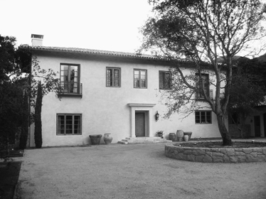
Appleton & Associates, Villa Corbeau, Montecito, California, 2002
The interior is equally artless. Some of the floors are rough limestone from France, others are recycled oak boards, and the ceiling beams in the living room are reused hand-hewn timbers. The plan is simplicity itself. A stair hall divides the lower floor in two, with the living room on one side, and a large kitchen and dining area on the other. The wood paneling in the living room is orderly but unremarkable, the wood windows have divided lights. The dining area opens onto an outdoor gravel patio shaded by an iron pergola. “The overgrown garden will eventually resemble a Mediterranean country house gone to seed,” says Appleton. In all, the building looks like a recently renovated Tuscan farmhouse, or perhaps like a house designed and built by an experienced but unschooled Tuscan mason.
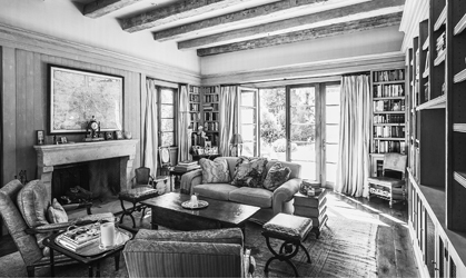
Living room, Villa Corbeau
“I was inspired by the Santa Barbara Mediterranean Revival,” explains Appleton, whose grandparents built Florestal, a nearby estate designed by George Washington Smith. “But I didn’t want to do another Spanish Colonial house, and Joanna liked Tuscan and Provençal farmhouses.” What makes his house traditional is less its style than Appleton’s taste. He obviously admires old, unpedigreed buildings. “What I like about vernacular architecture is the way that it simplifies classical traditions,” he says. At the same time, he doesn’t feel the need to make a self-conscious architectural statement. “As I designed it, the house got simpler. We got rid of shutters, for example. There’s not a lot of frosting or detail,” he adds.
Effortless Appleton’s architecture may be, but by ascetic modernist standards, it is almost sybaritic. The décor is simple rather than austere; the furniture in the living room is ample and comfortable rather than “designed”—there are no Eames chairs. Equally unmodernist is a pleasant sense of clutter, both literally—the mantelpiece is crowded with objects—and also visually: the space abounds in patterns, colors, and textures. This is a room of which Elsie de Wolfe would approve.
THE WAREHOUSE
Michael Graves likewise finds inspiration in the Mediterranean. To reach the front door of his house, you pass under a drooping wisteria bower into an open-air anteroom that is animated by the low sound of a bubbling fountain in a water-filled stone trough, a nineteenth-century replica of a Roman sarcophagus. The pink-stucco building is hidden away in the center of a downtown block in Princeton, New Jersey. The original two-story structure was built in the 1920s as a warehouse where students could store their belongings for the summer. Graves bought the dilapidated structure and over several decades transformed it into a rambling, highly personal home that he calls the Warehouse.
Although zoning regulations prevented Graves from adding to or altering the footprint of the L-shaped plan, he transformed a utilitarian building by the judicious placement of new openings, and the addition of landscape elements—a pergola, a rectangle of lawn, a gravel courtyard. Two five-foot-high terra-cotta olive oil jars stand at the edge of the courtyard. Graves seems haunted by Italy, especially Rome, which he first experienced as a Rome Prize winner. “What I took from Rome isn’t so much classicism, or Baroque, or even the medieval architecture that’s there,” he once told an interviewer. “One of the glories of Rome is that it works with all these periods in such a fluid and magnificent way.” This fluidity is visible in his own house, which combines a highly simplified version of classicism, with Cubist-inspired forms and his own characteristic palette of muted, painterly colors. Graves’s designs can sometimes look perilously like cartoonish versions of themselves; that is not the case here. There are no jokes or visual puns, no architectural wordplay; there is only calm, order, and beauty.
Michael Graves & Associates, Graves House, Princeton, New Jersey, 1970–present

Living room, Graves House
The interior plays with space and light in a way that suggests John Soane and nineteenth-century neoclassicism. This impression is heightened by the Biedermeier furniture and Graves’s collection of nineteenth-century Grand Tour souvenirs, including drawing instruments, Temple of Vesta inkwells, and other architectural curios. The paintings (some real, some replicas painted by Graves), the furnishings—some old, some designed by the architect—the objects, and the décor are all of a piece. Not since the great early-twentieth-century Viennese designer Josef Hoffmann, whom Graves admires, has a modern architect orchestrated such a Gesamtkunstwerk, or total work of art.
BOHLIN HOUSE
There are no Grand Tour souvenirs in the home that Peter Bohlin built for himself and his wife, Sally, in Waverly, a small town near Scranton, Pennsylvania. A framed sketch by Erik Gunnar Asplund—the Karl Johan School in Göteborg—hangs in the bedroom. “I admire Asplund and especially Sigurd Lewerentz, who saw the traps in modernism and avoided them,” says Bohlin. At first glance, his house, covered in unprepossessing gray siding with white trim, looks ordinary. The central portion is an 1800-era gable-roofed structure that has been enlarged by adding several wings. At second glance, the architect’s modernist sensibility gently asserts itself. Traditional construction details are simplified and refined, a bay window is larger than expected, a wall oddly overlaps a dormer, and a tall freestanding brick chimney painted white brings to mind Louis Kahn—or Marcel Breuer. The casual entry sequence is carefully orchestrated: from a walled car court the space slides under a trellis and between the house and an outbuilding, which frame a view to a meadow. Throughout, the house responds to the surrounding landscape. The deck of a guesthouse cantilevers over the pond to make a sort of Zen viewing platform. Zen-like, too, is a pristine lap pool set in the meadow next to a little wooden barnlike pool house. Bohlin describes the small cluster of buildings as “a calm, soft place that recalls childhood memories of unpretentious houses and a northern landscape of walls, forest, fields, and water.”
Bohlin describes himself as a “soft modernist” and, perhaps because of his Swedish ancestry, has a pragmatic, unpolemical, and unsentimental Scandinavian attitude to design. Things are what they are. In his house, a section of cement-block wall that was part of an earlier addition is simply painted over; slivers of the nineteenth-century wooden structure are exposed in unexpected places; the raised stone hearth of the fireplace is supported on small I-beams. The eat-in kitchen and the living room are casually combined, and the dining room, which doubles as a work area, is in a space that resembles a porch, with closely spaced exposed roof joists and floor-to-ceiling glazing. Bohlin manipulates scale as purposefully as Appleton and Graves, although to different ends, not as part of a classical language, but to affect the experience of the interior space.
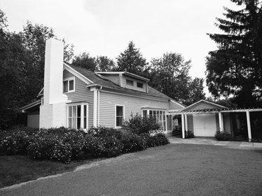
Bohlin Cywinski Jackson, Bohlin House, Waverly, Pennsylvania, 2001
The porch looks into a birch grove. Every window in the house frames a particular view. When hardware is required—light fixtures, door handles, drawer pulls—it is out in the open, but does not call attention to itself. The walls and ceilings are mostly white, and natural materials abound: a recycled southern pine floor, honed marble kitchen countertops, a sisal rug, and classic 1920s-era Thonet bentwood-and-rattan dining chairs—a longtime favorite of architects. The furniture is an eclectic modernist mix: a nondescript couch with colorful Josef Frank throw pillows, Aalto stools, butterfly chairs, an Eames rocking chair. This low-key home is definitely different architecturally from Apple’s dramatic glass cube, yet it is governed by the same pared-down taste: intelligent, somewhat ascetic, demanding, and founded in construction rather than intellectual speculation.
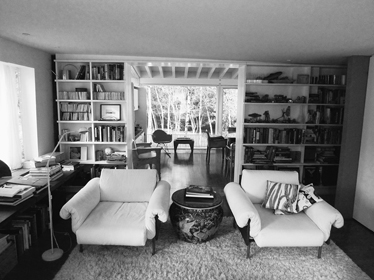
Living room, Bohlin House
GEHRY HOUSE
Berta and Frank Gehry’s home likewise incorporates an old house, a 1920s gambrel-roofed cottage on a small corner lot in Santa Monica. “I looked at the old house that my wife found for us to live in, and I thought it was kind of a dinky little cutesy-pie house,” Gehry recalls. “We had to do something to it. I couldn’t live in it.” He set out to make the house more to his taste.
Armed with very little money I decided to build a new house around the old house and try to maintain a tension between the two by having one define the other, and to have the feeling that the old house was intact within the new house, from the outside and from the inside. Those were the basic goals.
From the exterior, the impression is of a construction site: angled walls of corrugated sheet metal resemble construction hoarding, unpainted plywood looks like a temporary barrier, and—most famously, for Gehry is something of a showman—chain-link fencing envelopes part of the pink cottage. Nor was the old house exactly left “intact.” Many of the walls and ceilings were stripped of the original lath and plaster to reveal the wooden studs and rafters beneath; elsewhere plaster was replaced by plywood.
Following a 1990s renovation, the interior has lost some of its rough edges—the exposed joists have been covered with a wood-strip ceiling, some of the plywood walls have been plastered, the rolled asphalt kitchen floor is now asphalt pavers, and the director’s chairs in the dining room have been replaced by Gehry-designed bentwood chairs. But this is still the home of a bohemian. Books are everywhere; so is modern art, hanging and stacked against the walls.
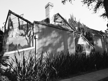
Frank O. Gehry & Associates, Gehry House, Santa Monica, California, 1977–78, 1991–94
Dining room and kitchen, Gehry House
The use of low-cost materials was influenced by more than merely a restricted budget. Like Foster and Rogers, Gehry is partial to certain modern forms, but they are the forms of everyday life rather than of advanced technology. “It just seems so obvious to me, that one should use chain link, because it’s such a pervasive material,” he once said. This is slightly disingenuous, since to most people it is not obvious at all. Gehry has a definite iconoclastic streak, and chain-link fencing used sculpturally is a calculated affront to mainstream taste, as is the raw plywood on the exterior, and a front door that is a smooth panel of unpainted galvanized metal, as prosaic as a warehouse fire exit.
In the late 1970s, when Gehry was designing his house, what were other architects doing? James Stirling and Michael Wilford had just won the competition for the Staatsgalerie addition in Stuttgart with a historical collage, Piano and Rogers were celebrating technology at the Centre Pompidou, and in the East Building of the National Gallery, I. M. Pei was demonstrating that there was still life left in mainstream modernism. The Gehry house shares none of their architectural concerns—it contains no historical references, no fancy hardware, no elegant details. With its cheerful disdain for conventional architectural refinement, the house is a milestone both in the architect’s career and in the development of contemporary architectural taste.2
* * *
“Each age finds its own expression in material things, and the faculty we use to identify those things we find palatable or repellent we call taste,” writes the British design critic Stephen Bayley. In other words, taste is about making choices, it’s about what we dislike as well as what we like. Appleton likes the casual classicism of Italian farmhouses and adapts it to modern living; Graves interprets the same classicism in a more personal fashion; Bohlin likes his old house in Waverly and accepts its limitations; Gehry doesn’t like his pink cottage and subverts it. The self-effacing Appleton dislikes standing out, Gehry and Graves dislike fitting in. Bohlin seems somewhere in between.
The homes—and tastes—of these four architects reflect the wide range of contemporary architectural expression. The low-key Villa Corbeau is a reminder that classicism is here to stay. After centuries of revivals, and revivals of revivals, this is hardly surprising. As long as architects—and their clients—are drawn to age-old traditions, classicism will continue, even if it is used to design a refined Tuscan farmhouse. Since classicism is a cumulative tradition, it only becomes richer over time, offering the architect an array of examples—grand, modest, elaborate, simple. The contemporary classicist is able to draw on John Russell Pope and Edwin Lutyens as well as Andrea Palladio—or on the rural Tuscan vernacular.
No one would ever confuse the Warehouse with a Tuscan farmhouse; the architect’s hand is too apparent. Graves avoids ornament, creating a composition of volumes that is classical in its symmetrical and axial arrangement, but modern in its unembellished simplicity. At the same time, Graves’s painter’s taste for color undermines the severity. This personal interpretation of classicism is part of a long tradition, found in the work of John Soane and Paul Cret in the past, and the late Aldo Rossi and Léon Krier today.
Frank Gehry, the iconoclast, pushes the limits. But this is not 1923, when Le Corbusier could write of revolution and overturning old codes, and Gehry’s exploration is personal rather than prototypical. Instead of avant-garde—a portent of the future—his vision is quirky and personal. When Gehry was seventeen and living in Toronto, he heard a talk by Alvar Aalto, and years later made a pilgrimage to the Finn’s office in Helsinki. “He was away but I was allowed to sit in his chair.” Gehry, like Aalto, is an intensely intuitive modernist. “If I think too much about a design, I tend to discard it,” he says.
Peter Bohlin seems to look forward and backward. Unlike most classicists, he accepts the revolution that was modernism, but is unwilling to observe all its confining rules—“traps,” he calls them. He doesn’t embrace the past, but does cast a fond backward glance from time to time. He is unwilling to treat architecture as a medium of personal expression, preferring to root his designs in the constraints of site, materials, and construction. I don’t want to make him sound too diffident. The wall that defines the front of his property in Waverly is the straightest, most precise, most perfect dried-laid stone wall I have ever seen. It says Architect’s House just as unmistakably as Gehry’s unconventional façade on a quiet street corner in Santa Monica.
CHANGING TASTES
In 1972, Robert Venturi, Denise Scott Brown, and Steven Izenour published Learning from Las Vegas, a polemical book whose theme was that architects should be more attuned to the tastes of mainstream America. “Billboards are almost all right,” they proclaimed, championing a Pop Art sensibility that somewhat unconvincingly aimed to fuse the vulgar with the highbrow. A few years later, the editors of VIA, a student publication of the University of Pennsylvania, referred to Venturi’s book in an interview with Michael Graves. Why was Graves’s formal architectural vocabulary so different—they called it a breach—from the taste of average Americans, they wanted to know? Graves, whose style had only just begun to shift from Corbusian modernism to a more figural classicism, gave an interesting answer:
I would like to respond by discussing the issue of popular culture. Popular culture gets its strength, it seems to me, through its transitory nature. It is probably interesting to us because it is short-lived, a part of fashion or trends, and probably has a commercially oriented base. It must change or be supplanted by other trends and fashions. It must be made over to feed its commercial orientation. It gets its strength from being here today and gone tomorrow. Its symbols are, in fact, transitory. To codify elements of the popular culture is to make them static, which is contrary to their ephemeral nature.
Graves was making a sharp distinction between architectural and popular taste, although it was not the distinction between good taste and bad that Edith Wharton might have drawn. Instead, he differentiated between ephemeral popular culture and—by implication—the long-lasting values of architecture.
Neither the architect nor his interviewers could have imagined that it would be Graves—not Venturi—whom the popular culture would lionize. A few years later, in a feature article in The New York Times Magazine, the newspaper’s architecture critic Paul Goldberger called Graves “the architect of the hour.” Goldberger did not use the word taste, but he made it clear that his subject had connected with the American public in a profound way. “Graves has burst into a kind of celebrity shared by no other architect of his generation,” Goldberger wrote. “We are at a moment when we have come to reject the sleek austerity of modernism, a style that never served very well as anything but a symbol of corporate anonymity. We want architecture to serve as a symbol, to stand for cultural values and civic grandeur, but we tend to remain fairly uncomfortable with modernism’s obvious opposite, the literal re-use of historical style. If we seek a hero, we want one who seems to bring us something we have not seen before.”
Graves became that hero. He was commissioned to design public libraries and museums, office buildings and civic centers, and was effectively the house architect for the Disney company. When the Washington Monument was being renovated, it was Graves who designed the distinctive scaffolding that, illuminated at night, became a tourist attraction in its own right. He produced a wildly successful whistling teakettle, and for the mass market he designed not high-end flatware and crystal but everyday objects such as kitchen whisks and dustpans. Graves did not exactly adopt popular culture as Venturi wanted architects to do, but popular culture definitely adopted him.
By the late 1990s, the Guggenheim Museum in Bilbao had captured the public’s imagination, and Frank Gehry was the new architect of the hour; moreover, Goldberger’s analysis was upturned. The “sleek austerity of modernism” made a resounding comeback in the shape of Norman Foster’s Swiss Re building in London—the Gherkin, corporate but hardly anonymous—and in numerous museums, many designed by the globe-trotting Renzo Piano, whose sleek austerity became the new museum norm. When Richard Meier led a wave of all-glass condominium towers in New York, some observers declared modernism the winner in the condo style wars. Then Robert A. M. Stern’s 15 Central Park West became the most successful residential real estate project in the city’s history, demonstrating that the days of the “literal re-use of historical style” were far from over. A few years later Gehry reasserted himself with the tallest—and most abstractly curvaceous—residential tower in the city.
These shifts in popular taste displaced Graves from center stage. However, like Richard Rogers, he remains true to his personal vision, which is the ultimate lesson: the public’s taste may change, but an architect should hold firm. Indeed, it is this sense of deep personal conviction—not style, or craft, or taste—that is the test of the best architecture. Louis Kahn never courted popularity; a building was what it wanted to be. The uncompromising Paul Rudolph followed his architectural muse even when she ceased to be popular. And the indifferent Mies van der Rohe proclaimed, “I don’t want to be interesting, I want to be good.”
There are many ways to be good. Architecture is not a religion, and there is no right and wrong, although there is certainly good and bad, practical and impractical, beautiful and ugly. But taste—“those things we find palatable or repellent”—is hard to escape, hence the Gothic-classical debates of the nineteenth century, the classical-modernist dispute of the early twentieth, and the modernist-traditional contretemps of today. Since architecture is not a science, there can be no ultimate proof, which may explain the ferocity of the argument.
“Every worthwhile building—like all works of art—has its own standard,” observed Steen Eiler Rasmussen. “If we contemplate it in a carping spirit, with a know-it-all attitude, it will shut itself up and have nothing to say to us.” He wrote that more than fifty years ago, and in a multicultural world, a global world of many and varied tastes, it is more true than ever. Diversity is not merely accepted by the public, it is demanded—in fiction, in music, in movies, in food, so why not in architecture? We are happy with corporate minimalism in an office building, expressionism in a concert hall, and tradition at home. Or maybe minimalism at home, tradition in the concert hall, and expressionism in the office—it all depends.
While I find it hard to excuse a building that fails at a functional level, or that ignores its setting, or that is badly built, that does not mean that I cannot appreciate a variety of design approaches. What I have called a conceptual toolkit can help us to understand this variety. The media have a tendency to focus on what is new and unexpected, but it is important to understand that architectural innovation, whether it is willful and questions established conventions, or considered and embraces old rules, never occurs in a vacuum. The architect takes a position with respect to history and style, details and structure, and plan and setting. This position, as I have tried to show, can vary. This does not mean that it always leads to success; the world is full of pretentious experiments and banal re-creations. Yet architectural diversity is a good thing. An architect must hold strong convictions in order to create, but as users of architecture we should open our minds—and our eyes—to the richness of our surroundings. And allow the buildings to speak to us.