3
SITE
A building may ignore its setting, but it cannot ignore its site. Disney Hall faces Grand Avenue, the main artery of downtown Los Angeles, and on this side, the building opens up to the sidewalk with a glass wall behind which are the lobby, a café, and shops. Around the corner, across First Street, is the Dorothy Chandler Pavilion. This huge hall, designed by Welton Becket in the ponderous monumental style that was popular in the 1960s, is one of the largest performing arts centers in the United States. Rather than try to compete with this behemoth, Gehry turns the other cheek and breaks down the scale of his building into smaller forms. On the opposite side of the site, across nondescript Second Street, Disney Hall faces a parking lot. Here, instead of sails, Gehry places a no-nonsense limestone box containing administrative offices. The box forms a hard edge against the street, and also provides a screen between the concert hall and whatever will eventually be built on the empty lot. Most Angelinos will arrive at Disney Hall by car, and the public entrance to the parking garage is here, too. Gehry deals with the two-story drop between Grand Avenue and the lowest point on the site by creating a limestone podium. The top of the podium is a public garden that provides a landscaped haven from the traffic on the surrounding streets, and includes a fountain, terraces, and an amphitheater for outdoor performances.
Every site has its own questions. What are the main views of the building, and what does one see from the building? Where do people arrive; that is, where is the entrance? What is the nature of the surrounding buildings: good, bad, or indifferent? Is the site flat or sloped? Where is the “back” of the building? Not least, from where does the sun shine? An architect must take all these factors into account, especially if one comes to the fore and affects the design in a major way.
LOOK AT ME
A prime consideration for a tall structure, whether it is a steeple, a minaret, or a pagoda, is how it looks from afar. The early skyscraper architects, such as Cass Gilbert and Raymond Hood, recognized this and drew their inspiration from cathedral spires. The results were such evocative towers as the Woolworth Building and the Chicago Tribune Tower. Eliel Saarinen’s second-place design in the 1922 Chicago Tribune competition showed how abstract forms could also produce a memorable silhouette, which led to such stripped-down classics as the exuberant Chrysler Building, the stolid Empire State Building, and Rockefeller Center’s soaring RCA Building. When Mies van der Rohe first arrived in the United States, he stayed at the University Club, close to the RCA Building. It was his first experience of a skyscraper. “I saw the main tower of the Rockefeller Center every morning from my breakfast table and it made a great impression on me,” he recalled. “It has nothing to do with style. There you see that it is a mass. That is not an individual thing, thousands of windows, you know. Good or bad, that doesn’t mean anything. That is like an army of soldiers or a meadow. You don’t see the details anymore when you see the mass.” For Mies, as for other modern architects in the fifties and sixties, the mass was inevitably a prism with a flat top. One of the first modern architects to break out of the rectangular mold was Mies’s disciple Philip Johnson, whose thirty-six-story twin towers at Pennzoil Place in Houston resemble glass crystals. Today, the celebration of height has returned with distinctive skyscraper silhouettes such as Norman Foster’s rocket ship–like Swiss Re building in London, Jean Nouvel’s phallic Torre Agbar in Barcelona, and Renzo Piano’s steel-and-glass stalagmite, the London Shard.
The skyline aside, urban buildings are viewed in one of two ways: those that face an open space may be seen head-on, but those on the street are seen only at an oblique angle. Mies was aware of the difference when he pulled the Seagram Building back from Park Avenue to create a plaza. “I set it back so you could see it,” he said in a 1964 interview. “You know, if you go to New York you really have to look at these canopies to find where you are. You cannot even see the building. You see only the building in the distance.”
Urban buildings without the benefit of a square or plaza are seen obliquely. The Guggenheim Museum in New York, for example, is usually photographed from across the street (with a wide-angle lens), but the first view for most pedestrians walking up Fifth Avenue is a tantalizing glimpse of a fragment of what appears to be a giant cream-colored Dixie cup. What on earth is it? As you get closer the mysterious shape turns out to be a dramatic upside-down bowl that looms over the sidewalk. By then you are under the overhanging base and about to enter the building. Wright has teased a powerful sequence out of what is a rather inauspicious site.
With the Yale Center for British Art, Louis Kahn adopted a different solution to the oblique approach. Instead of a sculptural façade along the street, he made the building as flat as it could be. Looking up at the building, there is nothing to catch your eye, and the difference between the glazing and the stainless-steel panels is so subtle, especially on a dull day, that the whole façade seems like a diaphanous gray skin—truly a moth. In an earlier building that is likewise approached obliquely, Kahn took a more Wrightian approach. The site of the Richards Medical Research Laboratory at the University of Pennsylvania, beside Hamilton Walk, is so hemmed in that you don’t see the building until you are almost upon it. Instead of designing a single horizontal block beside the walk—as his predecessor, Cope & Stewardson, had done in a medical laboratory building next door—Kahn broke his building down into an irregular row of seven-story laboratory towers and brick shafts containing stairs and exhaust ducts. The towers and shafts are not intended to be seen as a whole; instead they appear one by one as one proceeds down the walk.

Gehry Partners, New World Center, Miami Beach, 2011
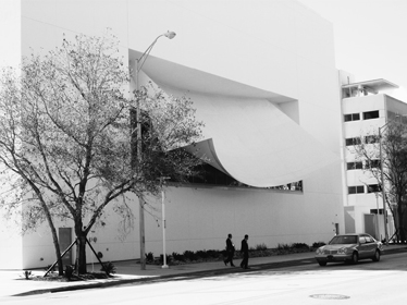
The New World Center, an orchestral academy in Miami Beach, offered Frank Gehry both oblique and frontal conditions. The building is a white box wedged between two streets of the tight South Beach grid, so the two short sides come right up against the sidewalk and are seen only obliquely. On one side the building faces a narrow street, and the white façade with scattered windows is so mundane as to be unnoticeable. On the opposite side, the building abuts a four-lane thoroughfare. A shape that looks like a billowing canvas curtain, but is really a solid awning, projects over the sidewalk like a marquee. The awning shades a large glazed opening in the end wall of the concert hall, but its chief function is to announce the presence of the New World Symphony to the drivers who are speeding by on Seventh Street. The main façade of the center faces a public park. Behind the fully glazed wall is a jumble of Gehryesque forms that contain rehearsal rooms. The interior jumble notwithstanding, Gehry is uncharacteristically circumspect on the exterior. A large blank wall becomes an outdoor projection screen on which audiences in the park can watch live telecasts from the concert hall. The only whimsical touch is a delicate canopy of trees that is visible on the roof.
Jørn Utzon, the architect of the Sydney Opera House, referred to the roof as a building’s “fifth façade.” Roofs traditionally offered the architect an opportunity to create a memorable silhouette seen against the sky. Most modern buildings have unadorned flat roofs, which creates the impression that the architecture has been brutally truncated. The flat roofs are often littered with an assortment of ventilating stacks, elevator penthouses, air-conditioning chillers, antennas, and satellite dishes. At worst these are scattered indiscriminately across the expanse of the roof; at best they are camouflaged by ungainly screens. In either case, they lend the building a pathetic air, as if architecture were so unimportant that anything at all could be dumped on the roof. That is why good architects pay as much attention to the design of the roof as the rest of the building. On the roof of the New World Center, part of which is a garden, Gehry integrated the mechanical penthouses with sculptural forms that house a music library as well as various public rooms, and the ebullient roofscape turns a simple box into an animated composition.
ENTRANCE
The first question you ask yourself approaching a building is: Where is the front door? According to Christopher Alexander’s A Pattern Language, always a useful guide, locating the entrance to a building is the single most important decision in the design process. “The entrance must be placed in such a way that people who approach the building see the entrance or some hint of where the entrance is, as soon as they see the building itself,” he writes. There are several issues here. One is simply finding one’s way. In a well-designed building you proceed to the entrance almost without thinking—you know which way to go, you should not have to look for signs or ask for directions. Furthermore, a building with a clearly identifiable entrance feels welcoming, whereas a building—especially a public building—whose entrance is obscured feels both annoying and forbidding. Equally bad are buildings like the renovated Morgan Library, whose front doors are permanently closed.
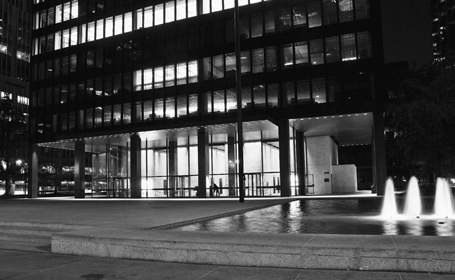
Historically, entrances were given pride of place simply by virtue of their location—in the center of the main façade. This is true whether the building is Buckingham Palace, a law school, or a country house. Such an entrance needs only minor additional architectural treatment—several steps or a prominent frame—to stand out. This remains an effective strategy. Mies van der Rohe experimented with asymmetrical entrances as a young man: the entry path into the Barcelona Pavilion is far from direct, and the front door of the Tugendhat House is completely hidden. But in his later buildings, he reverted to tradition. The entrance to the Seagram Building is in the center of the Park Avenue façade, and is emphasized by a canopy—another traditional device that signals “entrance.”
The entrance to the Seagram Building is viewed head-on from a distance. What about a site where the entrance is approached obliquely and hence is less visible? The classic solution is to make the entrance more prominent by having it protrude, or by adding a porch or a canopy. The African American museum in Washington, D.C., will have a large freestanding porch facing the Mall, marking the entrance as unequivocally as Pope’s Ionic portico and grand steps at the nearby National Gallery.
Ludwig Mies van der Rohe & Philip Johnson, Seagram Building, New York, 1958
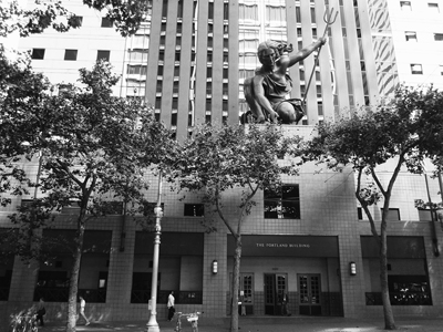
Michael Graves was faced with the problem of an oblique approach when he designed a municipal office building in downtown Portland, Oregon. He pushed out the main entrance to the edge of the sidewalk in the form of a portico, and made it the base for Raymond Kaskey’s thirty-five-foot statue of a kneeling woman. As you walk down Fifth Avenue—despite the name a narrow street—you can see a giant copper hand emerging from the trees. Equally dramatic is the entrance to Frank Gehry’s Chiat\Day Advertising building. The giant binoculars indicate the entrance to the building but, more important—since this is Southern California—they also form a portal to the basement parking garage. Like Kaskey’s statue, the giant scale makes up for the fact that the binoculars are seen at an acute angle while driving down the street.
Nothing signals “important public building” as effectively as a set of broad outdoor steps. Not only does the entrance gain in importance by being elevated, the act of climbing also lends processional gravity to the entry sequence. Think of the Lincoln Memorial, the National Gallery in London, or innumerable “courthouse steps.” Critics of monumental steps consider them retrograde and vaguely undemocratic. Monumental they may be, but even a cursory glance at the people sitting or sprawling on the front steps of the New York Public Library or the Metropolitan Museum of Art dispels the notion that they are undemocratic. And, indeed, broad steps continue to be a feature of many modern buildings, including the Sydney Opera House, Disney Hall, the Bibliothèque Nationale, and Arthur Erickson’s Law Courts building in Vancouver, whose steps ingeniously integrate a handicap ramp.
Michael Graves, Portland Building, Portland, Oregon, 1982
Another traditional position for an entrance, especially in an urban building, is at a street corner. This is less grand than a central location, but it has the advantage of being visible from two directions, which is why so many department stores are entered at street corners. Although the Four Seasons Performing Arts Centre in Toronto occupies an entire block, the main entrance is at the corner of two important streets. Disney Hall likewise has a street-corner entrance, as does the Yale Center for British Art.
The site of the National Gallery of Canada offered Moshe Safdie several challenges. Normally, a museum entrance leads directly into the most dramatic public space, as it does in Wright’s Guggenheim Museum and in Pei’s East Building. But in Ottawa the best location for the Great Hall was several hundred feet from the street corner where people arrived. According to Christopher Alexander, if people have to walk more than fifty feet to an entrance, they start to feel lost, wondering if they have taken a wrong turn. But if Safdie moved the Great Hall closer to the street corner, he would lose the dramatic view of the parliament buildings, and the crucial visual connection between the Hall and the Parliamentary Library. His solution was to place a smaller twin of the Great Hall at the street corner as an entrance lobby, and take people up to the Great Hall via a long ramped colonnade. Since the colonnade is on the exterior of the building it has views and natural light, and since it is tall and imposing, the ascent feels ceremonial rather than utililitarian. The long space also serves as an agreeable queuing area for blockbuster art shows.
Even good buildings can have poor entrances. The entrance to Saarinen’s CBS Building in New York fails on two counts: it is so well integrated into the façade that it is almost invisible, and it is down several steps, and so feels lowly rather than welcoming. As Philip Johnson observed of CBS, “It can’t be a very important building if you have to go down into it.” Louis Kahn often had trouble with entrances, beginning with the Yale University Art Gallery, whose entrance doesn’t face the street and requires climbing an awkward stair that is parallel to the sidewalk. The hidden entrance to the Richards Medical Research Laboratory is hinted at by two sets of steps, but these lead to a dark, unpleasant space—and you can’t actually see the front door until you are in front of it. Wright often obscured the entrances to houses. The entrance to the Robie House, for example, is invisible from the street and is not in the main façade, as you might expect, but at one end of a narrow court on the north side of the building. The experience of entry is circuitous and slightly mysterious—like the man himself.
VIEW
The first real building that I designed, while I was still an architecture student, was a tiny shelter. My parents had bought a lot in North Hero, Vermont, and they needed somewhere to sleep and store camping equipment while they saved to build a summer cottage. I designed a triangular prism made out of six sheets of plywood and perched on four splayed legs. The two ends were closed with pine boards, and the roof was covered in asphalt shingles. It took me all of one weekend to build. A single window of corrugated fiberglass in the gable end cast a yellow glow inside. From the exterior, the pointed window looked vaguely Gothic and the shelter came to be known as the kapliczka—the little chapel.
That was 1964, the heyday of the A-frame vacation house, so my solution was hardly original. The popularity of A-frames was based on several advantages. They are relatively inexpensive to build—they are mostly roof—and they lend themselves to do-it-yourself construction. A-frames are durable—mine stood for thirty years—and there is something about the tentlike interiors that makes them particularly attractive as country retreats, whether they are in the mountains, on the beach, or by a lake, as in our case.
The A-frame fad blossomed in the 1950s, but the most interesting A-frame house is older than that. The architect was the California modernist Rudolf Schindler, who had trained in Vienna under Otto Wagner and Adolf Loos, immigrated to America, and ended up working for Frank Lloyd Wright. Eventually, Schindler established himself in Los Angeles, where he designed some very interesting concrete houses (notably, his own house in West Hollywood and the Lovell Beach House in Newport Beach), although he never achieved the public recognition of his friend and rival Richard Neutra. In the mid-1930s, Schindler was commissioned by an art teacher to design a modest summer cottage. The site, overlooking Lake Arrowhead, was in a planned community that mandated the Norman style. Schindler designed an A-frame house with a steeply sloping roof that almost touched the ground, and somehow convinced the local design committee that this was an authentic Norman form. In truth his design was anything but traditional. Most of the interior was finished in fir plywood, then a new industrial material; the kitchen was a compact workspace in the Wrightian manner; and the bedroom was in a loft overlooking the living room, whose end wall was entirely glass. Schindler was an ingenious designer, and he flattened out the steep roof of the A-frame on one side into a sort of dormer, to provide headroom for a dining nook and for glazed doors leading to a side terrace and a deck. As Esther McCoy, who knew the architect well, wrote, the house “had a spontaneity that made the later A-frames seem over-studied.”
My wife and I once spent three months in a A-frame beach house in Alligator Point, Florida. Like Schindler’s design it had a sleeping loft overlooking a tall living space, but it lacked his subtlety, being simply a triangular tube with a glazed wall facing the sea. The view of the Gulf of Mexico which so impressed us when we first saw the house soon lost its allure. The trouble was that wherever we were in the house, the view was always the same. We had lived in a waterside house before, an old stone farmhouse on Île Perrot in Quebec. The broad St. Lawrence River was across the road, but none of the windows focused on the view. Instead, it was only when one came out of the front door that the majestic, slowly moving river was visible. The view felt new every time.
Our experience underscores Christopher Alexander’s wise observation that a good view may be spoiled by familiarity. “One wants to enjoy [the view] and drink it in every day,” he writes. “But the more open it is, and the more obvious, the more it shouts, the sooner it will fade.” He suggests that instead of building large windows oriented to the view, it is more effective if one catches only occasional, indirect glimpses. Alvar Aalto was a master of the indirect view. His own summer house on Muuratsalo Island in central Finland is a good example. Although situated close to the water’s edge, the house, surrounded by forest, was designed around a central courtyard that functioned as a sort of outdoor living room, focused on a fire pit that was sometimes used for cooking. An opening in the courtyard wall provided a view of the lake through the trees, but most of the rooms looked onto the forest, or into the courtyard itself.
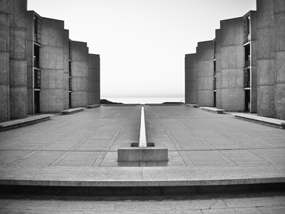
Louis Kahn handled the view indirectly when he designed the Salk Institute in La Jolla, California. The two laboratory buildings on a dramatic site overlooking the Pacific Ocean are placed at right angles to the coastline, framing an open courtyard. The laboratories have no views. Four-story towers lining the courtyard contain individual offices that have angled windows offering a glimpse of the ocean. But it is only as you cross the paved courtyard, which is split down the center by a narrow channel of water, that you fully experience the spectacular view of the Pacific.
Louis I. Kahn, Salk Institute, La Jolla, California, 1966
Where does this leave a glass house, which is all view, all the time? Philip Johnson’s glass house had a desk in one corner, but it lacked bookshelves, and in 1980 he built himself a study-cum-library in a small one-room building some distance from the house. Johnson called the room his “monk’s cell,” and he liked to read beneath its tall conical skylight, sitting facing the room’s only window. The small aperture looks out at a garden structure of chain-link fencing that Johnson built as an homage to Frank Gehry. Not quite the “Zen view” that Christopher Alexander advocated, but close.
TOPOGRAPHY
“With a small budget, the best kind of land to build on is flat land,” Frank Lloyd Wright advised prospective house builders. “Of course, if you can get a gentle slope, the building will be more interesting, more satisfactory.” Taliesin, the house that he built for himself at Spring Green, Wisconsin, is on such a slope; its several wings, built of roughly laid native limestone, girdle the brow of a hill. Walled gardens occupy the slopes above and below the house. Wright worked on Taliesin from 1911 until his death in 1959, rebuilding after two disastrous fires, enlarging, altering, and refining. In a choreographed sequence, the visitor drives up a winding road that circles the house, passes under a porte cochere, makes a sharp turn, and arrives in a courtyard between the building and the crown of the hill. This is not quite the end, however. Before entering the house, the visitor passes under a shaded loggia that—finally—offers a panoramic glimpse of the Jones Valley below.
In the 1920s, Wright established an office in Los Angeles, hoping to get work in the fast-growing city.1 Despite his best attempts he was unsuccessful and several ambitious real estate proposals came to naught, but the short-lived venture did produce four memorable houses, the so-called textile-block houses, which were built out of patterned concrete blocks. Wright dealt imaginatively with the characteristically hilly topography of the Los Angeles area. Some of the houses are entered at an upper level, with sleeping quarters below; in the Storer House, the entrance level includes the dining room and bedrooms, while the living room is above; and the entrance of the exquisite Millard House, which is in a narrow ravine, is at mid-level, with the living room sandwiched between the dining room and the master bedroom. In all the houses, rooms open onto sheltered balconies, sleeping porches, roof decks, and courtyards and terraces carved out of the hillside.
The steep Southern California sites, so different from the flat Midwest, stimulated Wright to design differently—vertically rather than horizontally. The interlocking interior spaces are exciting; the results on the exterior are mixed, however. The small Millard House—which Wright named La Miniatura—is a little gem that Brendan Gill considered “assuredly among the most beautiful houses to be found anywhere in the world, regardless of size.” But the larger Storer House overwhelms its hillside site on Hollywood Boulevard, and the templelike Ennis House would be at home in a Cecil B. DeMille epic. The monumental structure “threatens to crush the hilltop upon which it sprawls,” wrote Gill, for whom the “bizarre vehemence with which it calls attention to itself” contradicted Wright’s teaching about how a house should gently occupy its site.
Wright returned to the Midwest and the sort of houses that he designed best: predominantly horizontal, on flat or gently sloping sites. The notable—and very successful—exception was Fallingwater. When Wright first visited the forested site, Edgar J. Kaufmann showed him his favorite spot, a huge boulder on which he sunned himself after swimming in a pool beneath a waterfall. “Visit to the waterfall in the woods stays with me and a domicile has taken vague shape in my mind to the music of the stream,” Wright wrote Kaufmann. Instead of a house that overlooked the waterfall, however, Wright designed a house on top of it. “E.J., I want you to live with the waterfall, not just look at it,” he told his client. The dramatic result is the most daring example of an integration of the man-made and the natural—building and site—in Wright’s oeuvre.
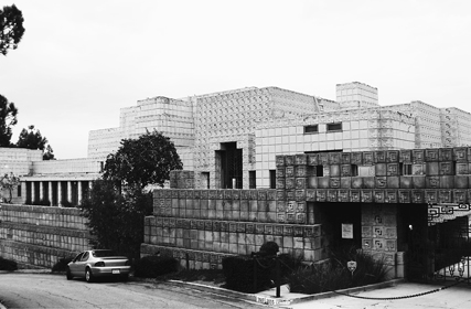
Frank Lloyd Wright, Ennis House, Los Angeles, 1924
In the 1930s, before he built the Farnsworth House, Mies van der Rohe designed several houses for rural sites. The first, sometimes referred to as the House for the Architect, was a house for himself in the Tyrolean Alps. He was then unemployed—the Bauhaus, of which he had been director, had closed and the Depression had halted all construction in Germany—so this was a purely theoretical exercise. His charcoal sketch shows a long house spanning a valley depression. With stone walls and large areas of glass, it grows out of the landscape in a way that recalls Taliesin, which Mies would visit three years later. He was invited to the United States by Helen and Stanley Resor to design a summer house on their property in Jackson Hole, Wyoming, at the foot of the Grand Tetons. The site was unusual. The Resors had started work on a house with another architect, but had gotten only as far as four foundation piers. These were actually bridge piers, for the house was to straddle a mountain stream. Mies jumped at the opportunity to explore his earlier idea, and he proposed a long single-story box framed in steel. The two ends were clad in wood—teak—and contained the bedrooms at one end, and the kitchen and service rooms at the other. The central portion, spanning the stream, contained the living and dining area, and an immense fieldstone fireplace. The walls of this room were floor-to-ceiling glass, and provided movie-screen-size views of the imposing mountain scenery in two directions, a more subtle approach to the view than an all-glass house. The Resor House is a more compelling design than the Farnsworth House in other ways. The combination of teak, fieldstone, and glass is visually richer, and the arrangement of solid and glazed rooms is less precious and more practical. Unfortunately, the house was never built; a disastrous flood destroyed the foundation piers, and the discouraged Resors abandoned the project.
Difficult sites challenge the architect. It is not simply the technical difficulty of awkward topography but the responsibility of adding to what is already a beautiful natural setting. Yet the best buildings can actually enhance dramatic landscapes. This apparent paradox is explained by the relationship between the natural and the man-made. “The shape of architecture is the shape of the earth,” wrote Vincent Scully, “as it is modified by the structures of mankind.” A lighthouse standing on a headland beside the sea seems to complete the maritime scene, just as a chapel on a mountaintop can make its surroundings even more brooding and mysterious.
FRONT AND BACK
Our language and our way of seeing the world are influenced by our bodies, which have fronts and backs. Thus, we approach a person openly from the front, and sneak up on them from the back; we present a brave front to the world, or turn our backs on it; we tell someone to their face, or whisper behind their back. It is important to know which is which (that’s why double-faced carnival masks are so disconcerting). Buildings likewise have identifiable faces (façades) and backs. Of course, this is also the result of practical considerations: houses need places where you take out the trash; museums need truck docks where works of art are unloaded; office buildings need delivery bays. The back is the place for mail rooms, temporary storage, garbage rooms, and access to parking, trash bins, and Dumpsters. Such messy impedimenta are ideally located away from the entrance, often screened from public view—at the back of the building.
The Seagram Building definitely has a front, which faces Park Avenue and whose entrance is reached by crossing a spacious plaza. From the vantage point of the plaza, the thirty-nine-story shaft looks like a perfect prism. In fact, the other side—the back—has a full-height spine, one bay deep, whose solid side walls brace the slender tower. These sheer walls are covered on the exterior by a grid of bronze mullions, just like the rest of the building, but filled with Tinian marble rather than glass. “I received a letter recently from an architect who asked, very sensibly, ‘Why wasn’t [the sheer wall] plain, like the U.N. building?’” recalled Philip Johnson, who worked with Mies on the design. “I must say it never crossed my mind. It seemed most logical to Mies and to me that the building all look the same.”
One reason that Mies and Johnson didn’t hesitate in making the different sides of the Seagram Building “all look the same” was that architects at the time—the late 1950s—took it for granted that while a building might have a functional back, it shouldn’t look different from the front. That is why Johnson’s glass house was so admired: its extreme perfection represented the early modernist ideal; if something was good enough for the front, it was good enough for the back. If, in the process, the back door was eliminated, well, too bad. “That we should have a front door to come in and a back door to carry the garbage out—pretty good,” Johnson said in a famous Harvard lecture, “but in my house I noticed to my horror the other day that I carried the garbage out the front door.”2
A decade after the Seagram Building, in the Garden Building at St. Hilda’s College, Oxford, a women’s residential college, Alison and Peter Smithson proposed a different solution to the front-and-back question. The husband-and-wife team were leaders in postwar British architecture, and their writings were at least as influential as their built work. They combined a particularly hard-nosed brand of modernism with an interest in offbeat subjects, Beatrix Potter as well as Le Corbusier. I visited the Smithsons’ project in the mid-1970s. The Garden Building was tucked in among several nondescript Victorian buildings on the far side of the river Cherwell. At a time when British architects such as James Stirling and Denys Lasdun were building dramatic campus buildings, the Smithsons’ little four-story block was decidedly humdrum. The modular exterior consisted of a precast concrete frame enclosing large plate-glass windows behind a Tudorish screen of crisscrossing wooden timbers that hung from the façade. “Absolutely it is unpretentious,” wrote the architectural critic Robin Middleton, in a review titled “The Pursuit of the Ordinary.” I was struck by one feature of the Garden Building. The glass-and-concrete façade with the wood screen covered three sides of the square block, but the fourth side, which gave onto a service lane, was a blank wall of plain stock brick. The Smithsons had followed an age-old architectural practice: faced with a limited budget, they had put their money into the front of the building, and kept the back plain and simple.
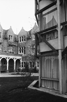
Alison & Peter Smithson, Garden Building, St. Hilda’s College, Oxford University, 1970
The Harold Washington Library in downtown Chicago occupies a full block, bounded on three sides by major streets and on the fourth by a narrow alley. The architect, Thomas Beeby, put the public reading rooms and study carrels on the three sides facing the streets and placed all the service areas of the library—offices, staff rooms, book sorting, deliveries, elevators, and washrooms—against the alley. The difference is expressed on the exterior: while three façades of the nine-story building are elaborately decorated brick and stone, the back is a plain steel-and-glass curtain wall.
There are certain types of buildings that don’t have backs. Airports terminals, for example, have two fronts—the land side and the air side; so where does one put the maintenance, delivery, and service areas? Norman Foster found the answer in Stansted Terminal, designed in 1991. The terminal, an enormous shed illuminated by skylights, functions on a single level that sits above a service floor, which Foster calls the “engine room.” In addition to a station for the shuttle train that takes passengers to the departure gates, the lower level houses baggage handling and mechanical services. The precursor to Stansted was the Sainsbury Centre for Visual Arts. Like many university buildings, the centre is freestanding. Challenged by the need to provide service access to the building, Foster placed storage rooms and workshops in a basement, reached by a long external truck ramp. The National Museum of African American History and Culture in Washington, D.C., has a similar arrangement. Like all museums on the Mall, it is approached from two opposite sides: Constitution Avenue and the Mall itself. A long ramp takes trucks down to the basement, which contains the loading dock, mechanical rooms, and museum workshops and storage. Like the Sainsbury Centre and Stansted, the “back” of the building is underneath.
I am reminded of the importance of the proper relationship between front and back every day. I work at the University of Pennsylvania, in Meyerson Hall, an undistinguished brick-and-concrete building of the mid-1960s. The building has no real front and back, since all sides are given equal architectural importance, although the main entrance faces the campus, and a service entrance faces the street. The problem is that for people on foot, or arriving by car or bus, the service door—instead of the main entrance—provides the most convenient access. Over the years, this has become the de facto front door. The area immediately outside also houses food carts and Dumpsters, so, in addition to students queuing for lunch, and people entering and leaving the building, there are cars making drop-offs, delivery vans and service vehicles, and people taking out trash. It is an inelegant and uncomfortable mixture.
THE SUN
The first house I built was a summer cottage for my parents—after five years of camping in the kapliczka they were ready for something more comfortable. I based my floor plan on a house that Le Corbusier had designed for his parents. What appealed to me about his layout was that the bedroom was an extension of the main living space—a curtain provided privacy but could be left open when the couple was alone in the small house. The site of Le Corbusier’s parents’ house was on Lake Geneva, and to take maximum advantage of the view, the long, narrow house was parallel to the shore. My parents’ house was beside a lake, too—Lake Champlain—but the lakeshore was bordered by a thick stand of trees, and since I wanted to remove as few of them as possible, I turned the building ninety degrees so that it was at right angles to the lake. In the narrow end wall that poked out of the trees, I placed a large window providing a view over the lake. The deck was at the other end of the house, separated from the water by the stand of trees. When the house was finished, it worked out as I had planned: in the mornings, my parents had a wonderful view through the open curtain, and the combined rooms made the tiny cottage—less than six hundred square feet—feel more spacious. However, the large window faced west, and in the late afternoon, the sun boomed straight into the room, making the glare off the water almost insupportable. Chagrined, I installed bamboo blinds.
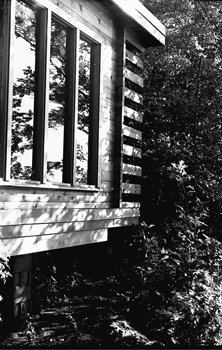
Witold Rybczynski, Cottage, North Hero, Vermont, 1969
I learned an important lesson, and never again ignored the position of the sun. “South is the most important point on your compass,” observes the experienced residential architect Jeremiah Eck in The Distinctive Home. “I try to position the longest side of a house within thirty degrees of due south,” he writes. “This means that most of the rooms of the house will get some direct sunlight during some portion of the day.” The longest side of my current home is about twenty degrees off due south. Not only does this bring sunlight into most of the rooms, it also means that the front of the house is in the sun, and the sharp shadows make the façade appear cheerful—a sunless north façade always looks drab. On the other hand, the terrace of our house in Philadelphia is on the north side and is shaded most of the day, which is an advantage in the hot summers. Our kitchen has an east window—as does our bedroom—so they are sunny in the mornings, whereas the porch, where we sometimes eat dinner in warm weather, is on the west side of the house, offering a view of the garden with trees casting long evening shadows on the lawn.
As Eck points out, few building sites are ideal, and orientation to the sun has to be balanced by other considerations such as views and topography. At Disney Hall, Grand Avenue runs northeast–southwest, so the corner entrance faces northeast and, except for a brief time in the morning, is in shadow most of the day. Hardly ideal, but Gehry mitigates the condition by lowering the building to allow sunlight onto the entrance plaza from the rear, and brings sunlight into the lobby through south-facing skylights. At the New World Center, the front of the building faces due east to the park. The east sun is low, but unlike the west sun it is less hot and glaring. On the other hand, this orientation means that the main façade of the center is in shadow most of the afternoon. By adding a large skylight over the interior of the building, Gehry ensures that the jumble of forms visible through the glazed east wall is brightly illuminated.
As a Nordic architect, Alvar Aalto was particularly aware of the sun. He rotated the plan of the Villa Mairea about thirty degrees from due south. As a result, the bedrooms get the morning sun, the courtyard and the swimming pool get afternoon and evening sun, and the living area, which has windows on three sides, is sunny all day long. The courtyard of his own summer cottage on Muuratsalo Island is sideways to the water but is oriented due south to capture the sun. Another of Aalto’s buildings is almost entirely shaped by considerations of sunlight. In 1946, he designed Baker House, a student dormitory at MIT, where he was a visiting professor. The long, narrow site in Cambridge faces south to the Charles River and the Boston skyline. The conventional solution would have been a long slab with a double-loaded corridor, but that would have meant that half the rooms would face north. Instead, Aalto decided that all rooms should have some direct sun. A long, single-loaded building wouldn’t fit on the site, so he bent the plan into an S-curve, and as a result was able to place three-quarters of the rooms facing south (the balance face west).
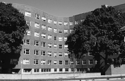
Alvar Aalto, Baker House, Massachusetts Institute of Technology, 1948
A house designed to maximize the warming effects of the sun needs to be oriented very precisely in order to be effective. The winter sun in the northern hemisphere moves in a tightly constrained arc, rising in the southeast and setting in the southwest, and the sun’s zenith (at noon) varies considerably with the seasons: low in winter and high in summer. This variation means that a roof overhang above a south-facing window will block the high summer sun, but will allow the low winter sun’s rays to enter. If, in addition, the floor is masonry, preferably dark-colored, to absorb the sun’s rays, passive solar heating is the result.
In 1980, I designed a house for a young couple, Jacqueline and Jim Ferrero. They had two small children, and in addition to the usual rooms, they wanted a sunroom, a sauna, a mudroom, a study space, plenty of bookshelves, and a cold storage room in the basement. The budget was tight, and I had to fit all this into twelve hundred square feet. In addition, they wanted the house to be passively heated by the sun. The site, in southern Quebec, was in open farmland with no obstructing trees, and fortunately south coincided with an attractive view of distant hills. The problem was that due south was at a thirty-degree angle to the adjacent country road. All the neighboring houses faced the road—as rural houses generally do—and turning the house at an angle would look decidedly odd. The solution was a plan that resembled a dogleg: one wing facing the road, the other facing the sun.
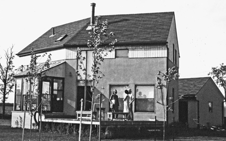
Witold Rybczynski, Ferrero House, St. Marc, Quebec, 1980
I recently got an e-mail from the new owners of the house. They were satisfied with their new home, but with three growing children they wanted advice on how to add space. They sent me photographs. The cedar siding had turned silver, as planned, and the synthetic stucco had proved remarkably durable. The quilted blinds that insulated the large south-facing windows at night were still there; so was the wood-burning stove. Although the trees were now fully grown, the kitchen had been redone, and a patterned brick wall on the interior had been painted white. After almost thirty years the house looked remarkably unchanged. I sent them sketches with suggestions. I had not originally designed the house with expansion in mind, but it was easy enough to extend the southerly portion of the dogleg, enlarging the living room and adding a bedroom above. I also added a large window facing the sun.