9
THE PAST
High Hollow is the house that twenty-eight-year-old George Howe built for his growing family in 1914, on a steeply sloping site adjoining Fairmount Park in Philadelphia’s Chestnut Hill. Howe was a wealthy young man, and this, his first built work, was based on his final project at the École des Beaux-Arts from which he had graduated the year before. The plan has all the refinement that one would expect from an ancien élève; what are unexpected are the details, or rather their absence. “All mouldings, ornaments, recesses, all those things that are commonly called ‘architectural trimmings,’ have been eliminated,” wrote Paul Cret in Architectural Record. “These walls, built shortly before the war, seem to be old … And yet a remarkable fact is that the house is quite free from imitation of historic precedents in its details … No doubt many clients would be disappointed by their inability to tack a ‘style’ label to any portion of it.”
Cret put his finger on it: High Hollow is curiously style-less. The seam-faced red and brown stone walls with red-brick trim, the steep slate roofs, and a striking round tower, are vaguely French, but this connection is blurred, like a distant memory. Although later owners clumsily redecorated the interior in a French period style, adding moldings and bric-a-brac, you can still experience Howe’s architecture: the entrance hall with its checkerboard floor and dramatic stair, a beautiful oval study, and the grand living room. The living room floor is rustic Enfield tile from a local pottery, grayish yellow with a dull blue border; tall French doors slide into ingenious wall pockets. Howe went on to design many exceptional houses in a long career, but one sees the already steady hand of a talented architect in this early masterpiece, with its well-proportioned rooms, axial views, and integration into the natural landscape. “Were not the phrase ‘modern art’ somewhat discredited for having been a cloak to a multitude of sins,” observed Cret, “I would see here a very typical example of what modern art ought to be; a logical continuation of the best traditions.” Although Cret and Howe were friends, coming from the master, this was high praise.
In describing High Hollow’s subtle charms, Cret saw no contradiction between modernity and tradition:
The greatest pleasure will be found in discovering in these features, which at first seem to have been adopted without thought, a clever adaptation of the great principles of design; in realizing that this architecture, which owes so little to precedents, is true to the best traditions of art; in finding the soul of our art instead of the cast-off clothing of former time.
Cret obviously did not think much of architects who merely copied the past. He celebrated originality as the “soul of our art” while at the same time recognizing that the “great principles of design” were rooted in history. This was a subtle distinction, but then architects have always had a complicated relationship to the past.
Architects turn to history for the same reason that politicians read biographies of famous leaders: circumstances change, the problems are not the same, yet human nature—like materials and space—is a constant, and the hope is to glean something from the accomplishments of the past that will serve the present. Old buildings are best “read” firsthand, hence the tradition of the architectural tour. As long ago as the thirteenth century, the French master mason Villard de Honnecourt traveled to Chartres, Laon, and Reims to sketch their cathedrals; Inigo Jones and John Soane likewise compiled travel diaries. The eighteenth-century Grand Tour was a staple of aspiring British gentleman architects and their clients. Today, young graduates, with budget guides and cameras in hand, continue to visit Renaissance palazzos, Gothic cathedrals, and Greek temples. Architectural travel does not end with maturity—all the practicing architects I know travel in order to see places with their own eyes, to observe the effect of a specific form, a quality of light, or a particular dimension, and to learn how people behave in certain spaces.
This intimate relationship to the past sets the architectural profession apart, for while medicine and engineering both have recorded histories, neither doctors nor engineers consider a knowledge of the past—especially the distant past—to be an essential qualification for contemporary practice. In that regard, architects are more like lawyers who practice common law that is based on judicial precedents. Architectural precedents are not binding, of course, but they have frequently provided inspiration. Modern architects as different as Louis Kahn, Robert Venturi, and Michael Graves have drawn lessons from Renaissance Rome. Palladio went to the Eternal City to study its ancient ruins, Le Corbusier went to Vicenza to learn from Palladio, and a young Richard Meier went to Paris to study—and unsuccessfully apply for a job with Le Corbusier.
Retrospection begins in school. When I was a student, every school of architecture had its historian; the University of London had Nikolaus Pevsner, Columbia had James Marston Fitch, and Yale had Vincent Scully. The historian at McGill, where I studied, was Peter Collins, who had studied architecture at Leeds and worked for Auguste Perret in Paris. Collins wrote an important book on Perret and the early history of concrete, but he taught what today is disparagingly called a “survey course” in history—although it is hard to know a more effective way of learning about the past than chronologically.1 We started with the ancients, then moved on to the Romanesque and Gothic; during the second year we covered the Renaissance; and the third year was devoted to French neoclassicism—which was Collins’s great love—and the early twentieth century. Although McGill’s design curriculum was influenced by the one that Gropius had installed at Harvard, there was an abiding sense—unlike at Harvard—that the past was important. Memorizing the names and dates of Greek temples for periodic slide tests struck me as a waste of time, but years later, when I saw the real thing, the buildings were all the more meaningful for being so familiar. We borrowed books from the library, but we all owned a copy of Banister Fletcher’s dictionary-size A History of Architecture, first published in 1896. Like his father and coauthor, Fletcher was a practicing architect as well as a historian, and this comprehensive book never lost touch with the constructional foundation of architecture. As well as photographs, he included plans, elevations, sections, cutaway drawings, and details. My own copy—the seventeenth edition—had 650 pages of illustrations, almost half the book. Although Fletcher was not a revivalist—his 1937 Gillette factory in Brentford, a London suburb, is Art Deco in style—he saw the study of history as essential for all architects. “Greek architecture stands alone in being accepted as beyond criticism, and being an obligatory study for students of otherwise very different principles,” he wrote.
REVIVALS
A prime indicator of architects’ unique relationship to the past is the architectural revival. “An architectural revival is the physical expression of an architect’s desire to demonstrate to his public that he wishes to remind them of an historic building form specifically because it existed in the past and which, for some subsequent period of time, fell out of general use,” writes the contemporary British architect Robert Adam. “This revival could occur several times or once, it could be done wholly or partially, it could be done accurately or inaccurately; it is still a revival.” The last point is important. Critics of revival architecture sometimes fix on a lack of historical verisimilitude as evidence that a revival is “inauthentic,” but accuracy, as Adam writes, is not the point. Sometimes, merely creating an aura of a past period is enough.
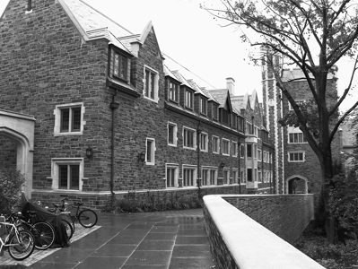
Architectural revivals have occurred with clockwork regularity. The Renaissance revived Roman architecture; European neoclassicists revived Greek architecture; American architects revived Roman, Greek, and Renaissance architecture. One of the most enduring revival styles is Gothic. The heyday of cathedral building in northern Europe lasted from the twelfth to the thirteenth century, but Gothic churches continued to be built in Spain and Italy much longer than that, and Milan Cathedral, begun in the fourteenth century, was completed as late as the mid-1800s. In fact, there was never a period when Gothic disappeared entirely. Brunelleschi is considered a pioneer of Renaissance classicism, but his ribbed Duomo in Florence is more Gothic than classical; Christopher Wren rebuilt St. Paul’s in the classical style, but he also built St. Mary Aldermary in London, which Pevsner judged the most important late-seventeenth-century Gothic church in England. The fan-vault ceiling of St. Mary is plaster rather than stone—so much for authenticity. In the mid-nineteenth century, Augustus Pugin led a major Gothic revival in Britain, Eugène Viollet-le-Duc did the same in France, and later Ralph Adams Cram was the leading advocate of Gothic in America. Twentieth-century Gothic structures on both sides of the Atlantic include Giles Gilbert Scott’s Liverpool Cathedral, Marchand & Pearson’s Peace Tower in Ottawa, and Cram’s Cathedral of St. John the Divine in New York. Cram’s partner, Bertram Goodhue, designed the exceptional Rockefeller Chapel at the University of Chicago in 1924, and six years later Goodhue’s successor firm used the same Gothic style in the Oriental Institute next door. When Thomas Beeby designed an addition to the institute in the early 1990s, he adopted the style of his predecessors. Six years ago, Demetri Porphyrios completed Whitman College for Princeton in the Collegiate Gothic style that Cram had introduced to the university a hundred years earlier—thus, a revival of a revival.

Porphyrios Associates, Whitman College, Princeton University, Princeton, 2007
THE ZEITGEIST
William Mitchell, former dean of the architecture school at the Massachusetts Institute of Technology, huffily told The New York Times that Whitman College signaled “an astonishing lack of interest in architecture’s capacity to respond innovatively and critically to the conditions of our own time and place.” Since revivals have a six-hundred-year track record, “astonishing” seems overwrought. Mitchell’s “our own time and place” echoes Hegel’s idea of the zeitgeist, or the Spirit of the Age, suggesting that each era produces its own distinctive architecture. But as Léon Krier has observed, while it is obvious that architecture can mark an epoch, it is less clear that the reverse is true; there are many historical periods that do not produce a distinctive architecture. Nevertheless, the notion of the zeitgeist persists. The University of Pennsylvania, for example, has adopted guidelines that instruct architects that the style of new buildings on the campus “should express the aesthetic ideas of our times, so that as we look back on them they also become a cultural record of ideas about architecture and campus life.” Setting aside the questions of what the aesthetic ideas of our times actually mean and, if such ideas exist, whether they really change as often as the guideline implies, this is really code for “No historical styles allowed.” Indeed, an award-winning architect who is known for his classical work told me that he was privately informed that the reason he was never considered for a commission at Penn was that the university built only “modern buildings.”
The idea that architecture should be driven by the spirit of the age is relatively recent, deriving from the early days of architectural modernism. Le Corbusier explained in his 1923 classic Vers une architecture:
The history of Architecture unfolds itself slowly across the centuries as a modification of structure and ornament, but in the last fifty years steel and concrete have brought new conquests, which are the index of a greater capacity for construction, and of an architecture in which the old codes have been overturned. If we challenge the past, we shall learn that “styles” no longer exist for us, that a style belonging to our own period has come about; and there has been a Revolution.
Le Corbusier’s proposition sounds plausible—new construction materials and methods require a new architecture; the old rules no longer apply; we are modern, so we should have our own modern style. But on reflection, the argument is less persuasive. Concrete was invented long ago by the Romans, but Roman builders had no difficulty combining the new material with ancient Greek forms. Reinforced concrete was invented in 1849, long before Vers une architecture was written, and architects such as Auguste Perret, for whom Le Corbusier worked, and Grosvenor Atterbury in the United States had already demonstrated how concrete could be used without “overturning old codes.” Sullivan and Burnham had built steel-frame skyscrapers that expanded, but likewise did not upend, traditional rules.
Architects have always adapted old forms to new materials, and vice versa. Palladio built Roman columns out of brick, sometimes plastering them over to resemble marble, sometimes leaving the red brick exposed. Inigo Jones’s Banqueting Hall in Whitehall was inspired by Palladio, but was built of dressed stone, not plastered brick. Jefferson’s Doric columns in Monticello are wood. John Russell Pope’s Ionic columns in the National Gallery rotunda are monolithic shafts of marble, not white but dark green Verte Imperial. For the Tuscan columns of the News Building in Athens, Georgia, Allan Greenberg made do with precast concrete. Today, in addition to wood, stone, and concrete, prefabricated classical columns can be had in cast stone, glass-reinforced gypsum, and glass-fiber reinforced plastic.
The other problematic question is exactly how to define “our own period.” The industrial era celebrated by Le Corbusier in Vers une architecture lasted less than fifty years, and the transportation technologies that were the raison d’être for a revolutionary modern style—ocean liners, steam locomotives, flying boats, and Delage touring cars—all disappeared. According to Le Corbusier’s own logic, his ideas about modern architecture were now obsolete and should be rethought, and, indeed, he turned from designing white Cubist boxes to rough concrete sculptural forms. Today, proponents of blob architecture and parametric design argue that a digital age requires its own architecture just as the industrial age did, but is a continuous architectural revolution really possible, let alone desirable? And granting that architecture is always a reflection of the moment, that moment may involve looking back, as well as looking forward. If the spirit of the age includes an interest in the past, as it has done so often, wouldn’t looking back be the “modern” thing to do?
Steen Eiler Rasmussen raised the issue of the past in the first chapter of Experiencing Architecture. He included a photograph of a famous Danish actor dressed in a Renaissance costume of doublet and lace, riding a bicycle. “The costume, of its kind, is undoubtedly a handsome one, and the bicycle too is of the best. But they simply do not go together,” Rasmussen wrote. “In the same way, it is impossible to take over the beautiful architecture of a past era; it becomes false and pretentious when people can no longer live up to it.” There are a number of problems with this analogy. Rasmussen implied that Renaissance dress did not “go together” with a bicycle because the latter was a modern device, but the velocipede was invented in the early 1800s, and the first “safety bicycle” became popular well before the end of the nineteenth century. These early bicycles were pedaled by gentlemen in knickerbockers and straw boaters, and ladies in bloomers and sun bonnets, yet we do not consider it “false and pretentious” to ride a bicycle today dressed in shorts and a baseball cap. To maintain that the architecture of the past becomes false when people can no longer “live up to it” (or dress up to it?) ignores that people happily use old buildings all the time. It is not necessary to wear a blazer and flannels, as students did when Cram built Princeton’s Collegiate Gothic colleges in the 1920s, to reside in Graduate College today; polo shirts and chinos will do just fine.
THE EVER-PRESENT PAST
Architecture, if it’s well done, lasts a long time. With periodic maintenance and occasional refurbishment, buildings remain useful for hundreds of years. They are not disposable, which makes them special in our throwaway culture. None of my students has ever seen a steam-powered locomotive in regular service or flown in a dirigible, yet they can still walk through the concourse of Grand Central Terminal, or visit the observation platform of the Empire State Building, whose mast was originally intended for mooring airships. Cuisine, dress, even behavior, changes from one generation to the next; I don’t dress, or eat, or behave like a person of a hundred years ago. I don’t drive a hundred-year-old car, but I do live in a hundred-year-old house. I don’t think of my home as an antique, exactly, it’s just a house that happens to be old. The casual, daily experience of old buildings may explain why the public has accepted—sometimes even demanded—architecture that reminded them of the past.
Le Corbusier, Rasmussen, and Mitchell would have us believe that people experience buildings as unique expressions of distinct historical periods. My built Philadelphia is a hodgepodge of old and new. Apart from streets and streets of row houses of every vintage, the city includes the Athenaeum as well as Thirtieth Street Station, the venerable Academy of Music and the Kimmel Performing Arts Center, the Neo-Grec Philadelphia Museum of Art as well as the recently completed Barnes Foundation. I may pause to reflect on the fact that the Athenaeum kicked off the Renaissance Revival in the United States, or that Thirtieth Street Station was the last of the grand railroad stations, and I have my likes (the Academy) and dislikes (Kimmel). But like most people I don’t think of buildings as representing historical periods; they are simply places in the urban landscape. Moreover, I do not expect that every building added to that landscape must be radically different. It’s nice that I. M. Pei’s Society Hill towers stick out, but it’s also nice that Robert A. M. Stern’s 10 Rittenhouse Square fits in. Pei’s towers are fifty years old, but to most people they still look “modern,” while Stern’s brick-and-limestone building is brand-new, but most would describe it as “traditional.” Like the people in the street, some buildings are dressed in the latest fashions, some in nondescript dress, and others—this is Philadelphia, after all—are a throwback to another time. I like seeing the architectural equivalent of a gentleman in a seersucker suit, or a lady in a proper hat, from time to time. It would be boring if everyone dressed the same.
Historic revivals are not unique to architecture, although in the other arts they occur less regularly. One field that is similar, as far as revivals are concerned, is typography, whose long history curiously parallels that of architecture. The first movable type used by Gutenberg in the mid-fifteenth century was based on a medieval script, called blackletter, and widely used in Germany, the Netherlands, England, and France. The successor to blackletter was roman, developed by Renaissance typecutters in Italy, who copied ancient lettering from surviving Roman monuments—the first typographic revival. The roman typeface spread all over Europe. Claude Garamond, an early sixteenth-century Parisian typecutter, developed several popular fonts based on roman models. “Garamond’s romans are stately High Renaissance forms with humanist axis, moderate contrast and long extenders,” writes the Canadian typographer Robert Bringhurst. The Garamond typeface later itself experienced several revivals. In 1900, Original Garamond was introduced at the Paris World’s Fair; in 1924, the Stempel foundry in Frankfurt issued a Garamond typeface; in 1964, the famous typographer Jan Tschichold designed Sabon, named after a fifteenth-century French typefounder and based on Garamond; and in 1977, a digital version of Garamond was released. The sixteenth-century type experienced yet another revival when, from 1984 to 2001, Apple used Garamond as its corporate font.
The font of my word processor as I write this is Times New Roman, which Bringhurst describes as a historical pastiche, with a “humanist axis but Mannerist proportions, Baroque weight, and a sharp, neoclassical finish.” The typeface was commissioned by the London Times in 1931, and although the newspaper no longer uses the original Times New Roman, the typeface has become one of the most widely used in history, thanks to its default position in Microsoft Word. Times New Roman, like most book and newspaper fonts, is a serif typeface—that is, the letters have small marks at the ends of the strokes, a feature introduced by ancient Roman letter carvers. Unserifed—or sans serif—letters also date back to ancient Greece and Rome, but unserifed printing type did not appear until the early nineteenth century—in London—and was used only in advertising signs and newspaper headlines. Unserifed type was revived in the twentieth century, since its geometrical purity suited the Bauhaus aesthetic; Futura, designed by Paul Renner in the 1920s, is a typical modernist font. When I was a student, we used Letraset press type on our drawings, and the font of choice was Helvetica, a Swiss unserifed typeface. The most recent revival of unserifed type is due to a technological change: unserifed letters are easier to read on low-resolution electronic screens and have become the standard font on all digital devices.
Typesetting technologies have changed radically in the last five hundred years, yet as Bringhurst points out, this does not necessarily mean that the basis of typographical design has altered:
Typographic style is founded not on any one technology of typesetting or printing, but on the primitive yet subtle craft of writing. Letters derive their form from the motions of the human hand, restrained and amplified by a tool. That tool may be as complex as a digitizing tablet or a specially programmed keyboard, or as simple as a sharpened stick. Meaning resides, in either case, in the firmness and grace of the gesture itself, not in the tool with which it is made.
Architecture is likewise not founded on the techniques or materials of construction but on the enclosure of space and ultimately on the human activity it houses. As in typesetting, there are no absolutes, no moral imperatives. There are rules, but these derive from practice rather than theory, sometimes very old practice. That is why the past continues to influence architects. The root of the word tradition, as Tschichold pointed out, is the Latin tradere, which means to deliver, one generation handing over to the next.
CONVENTIONS
Jan Tschichold observed that the root of convention is the Latin conventionem, which means “agreement.” “I use the word convention and its derivative, conventional, only in its original and never in any derogatory sense.” Revivalist architects tend to follow conventions. As we have seen, Robert A. M. Stern has designed many campus buildings in revival styles—Georgian, Gothic, Richardsonian Romanesque—generally as a way of complementing neighboring buildings. His choice of the Federal style for the McNeil Center for Early American Studies at the University of Pennsylvania arose from a different motive. The longtime benefactor of the program insisted that the center’s new home reflect its academic mission, and the university softened its stylistic guideline. Federal is an American version of the Adam style that was popular in the United States from 1780 to 1820. Although the Penn campus has no Federal buildings, Philadelphia is the site of some of the finest Federal architecture in the country. Stern modeled his design on the university’s original medical school, designed by Benjamin Henry Latrobe in the early 1800s (and long since demolished). The result is a brick box with uncomplicated massing, a flattened tripartite composition, no classical details, and a low hipped roof.
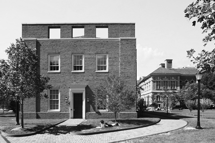
Robert A. M. Stern Architects, McNeil Center for Early American Studies, University of Pennsylvania, Philadelphia, 2005
Stern was looking back, but not only to the nineteenth century. The top of the McNeil Center has a parapet wall pierced by square window-like apertures. This detail is not Federal but is derived from Louis Kahn, a longtime presence at the university. The apertures are based on Kahn’s Phillips Exeter Academy Library, as are the brick jack arches. The connections to two of the city’s great architects—Latrobe and Kahn—to the nineteenth-century home of the university, and to the redbrick traditions of Philadelphia, combine to make this little building a rich exercise in historical memory.
While Stern’s design made explicit links to the past, at the University of Miami, Léon Krier designed an octagonal lecture hall that has no immediate precedent yet appears distinctly classical, although it does not slavishly follow stylistic conventions. The interior of the auditorium is a steeply raked hall surmounted by an industrial-looking dome supported on exposed steel beams. The whitewashed exterior has no orders and no classical detail; a tiered tower resembles a columbarium. The effect is both primitive and slightly mysterious. “Alone among architects working in a traditional syntax, Krier has extended the vocabulary of classicism through bold use of proportion and a free interpretation of tropes and motifs,” writes Alexander Gorlin.
Mannerists call up rules, too, but usually in order to distort them. Robert Venturi and Denise Scott Brown’s work is full of bent conventions and deformed precedents: odd column spacings, capitals that don’t quite meet their architraves, moldings that are awkwardly located in the “wrong” place. One of their favorite strategies is to play with scale. The entrance to Gordon Wu Hall at Princeton has heraldic motifs drawn from Elizabethan domestic interiors. “The entrance enhances the identity of this otherwise recessive building through the bold symbolic pattern adorning it,” Venturi writes, “which refers to Elizabethan/Jacobean motifs often found over fireplaces and appropriate within the context of a quasi-Elizabethan precinct of the campus.” But at Wu Hall, these motifs are vastly enlarged and moreover flattened out, as if a steamroller had run over them.
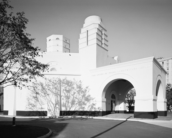
Léon Krier/Merrill Pastor, Jorge M. Perez Architecture Center, University of Miami, 2006
Even an architectural revolutionary such as Le Corbusier, once he was done challenging the past, came to terms with tradition. His designs after 1950, such as the Jaoul houses in Paris and the Sarabhai residence in Ahmedabad, India, have rough brick walls and tiled Catalan vaults in a modern interpretation of Mediterranean vernacular architecture. His most sculptural work, the chapel at Ronchamp, contains many oblique Mediterranean references: whitewashed walls, rough details, Cycladic towers.
The experience of a building, especially an abstract modernist building, is enriched when it includes allusions to the past. Louis Kahn’s Richards Medical Building distinguished between what the architect called “servant and served spaces,” brick shafts containing staircases and ducts, and the laboratories themselves. This rather obscure notion—there is no real parallel between people climbing stairs and air traveling through exhaust ducts—is probably lost on most observers, but no one who has ever visited the Tuscan hill town of San Gimignano (as Kahn did in 1928) will miss the connection between the tall brick shafts and medieval towers. Another Kahn design that benefits from a link to the past is the Kimbell Art Museum. Long, vaulted rooms for displaying art date back to the Renaissance, and by the eighteenth century, the vaulted galleria, usually top-lit, was a staple of palace planning. Kahn was no revivalist, yet his vaulted, top-lit galleries are a modern interpretation—and a masterly one—of this old convention.
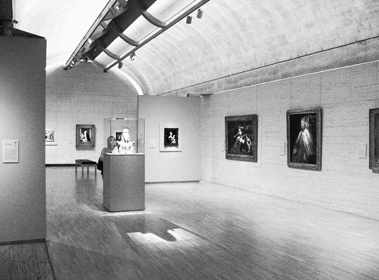
Louis I. Kahn, Kimbell Art Museum, Fort Worth, 1972
The lanterns and vaulted rooms of Venturi’s addition to the National Gallery are a direct acknowledgment of John Soane’s Dulwich Picture Gallery, although the scale of the latter is much smaller, and Soane’s use of detail is actually less conventionally classical than Venturi’s. Norman Foster at the Sainsbury Centre for Visual Arts in Norwich makes no direct references to the past, yet his design resonates with history in subtle ways, as Reyner Banham pointed out. The long, shedlike building, which resembles an airship hangar, is less than twenty miles away from the site of an old Royal Navy Air Service airship station. At the same time, the simple linear building in its parklike setting has reminded many of a Greek temple; one critic called it East Anglia’s Parthenon. Thus, the Sainsbury Centre conjures up two opposing images of the past, one relatively recent and one ancient.
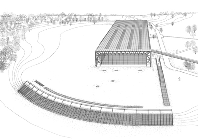
Foster Associates, Sainsbury Centre for Visual Arts, University of East Anglia, Norwich, 1978
Some architects ignore the past altogether, willfully solving old problems in new and unexpected ways. The novelty of these buildings attracts attention, but buildings that cut loose from the past pay a price; their novelty can quickly become stale. In that regard, I find London’s Tate Modern, which is housed in a converted power station, to be a more interesting building than the de Young Museum in San Francisco, precisely because at the Tate, Herzog and de Meuron’s often relentless innovation is tempered by Giles Gilbert Scott’s 1940s architecture.2 Similarly, Frank Gehry’s Disney Hall is more compelling than the Bilbao Guggenheim Museum, because the traditional, wood-lined concert hall sets up an interesting dialogue with the stainless-steel sail shapes that surround it. The New World Symphony Center, where Gehry shoehorns a rambunctious sense of sculptural fun into a conventional South Beach white box, is likewise more nuanced than his buildings that are unfettered by such self-imposed constraints.
REMEMBERING THE PAST
One type of architecture that deals explicitly with history is the memorial, since its sole function is to commemorate an event or a figure from the past. Five outstanding twentieth-century memorials illustrate how architects have used different means to achieve this difficult task.
THE CENOTAPH
The Cenotaph in London has inspired replicas and copies across the British Empire, yet the iconic monument came about almost by accident. In 1919, the British government planned a national holiday to celebrate the signing of the peace treaty that formally ended the Great War. The central event of Peace Day was to be a victory parade through London. When the British learned that the French, who were holding a similar parade in Paris, were erecting a temporary funerary memorial next to the Arc de Triomphe to honor the fallen, they decided that the London parade should have a similar structure. The prime minister, David Lloyd George, turned to Sir Edwin Lutyens, Britain’s foremost architect. Since Peace Day was less than three weeks off, Lutyens had to work quickly, and he is said to have made his first sketch the same day. He proposed a memorial based on an archaic funerary device that dates from ancient times and commemorates a dead personage who is buried elsewhere: a cenotaph (the word is from the Greek meaning an empty tomb). Lutyens’s design is of the utmost simplicity: a stepped plinth, a base, and a tall shaft supporting a coffin. There are no military decorations or allusions to war, no patriotic sentiments, no mention of God or country. The only inscriptions are the dates MCMXIV–MCMXIX, and the words, said to be suggested by Lloyd George, THE GLORIOUS DEAD.
The temporary structure built of wood and plaster was located in the middle of Whitehall, the broad street that runs through the center of the government precinct of Westminster. The parade of Allied forces took place on July 14, 1919. Then something unexpected happened. For days after the peace parade, long lines of people formed at Lutyens’s memorial, leaving flowers and paying their respects. After four years of devastating human losses, the British public felt neither the thrill of victory nor pride in military prowess, simply a deep sense of bereavement. “No feature of the Victory March in London made a deeper impression than the Cenotaph,” observed The Times. “Simple, grave and beautiful in design, it has been universally recognized as a just and fitting memorial of those who have made the greatest sacrifice; and the flowers which have been daily laid upon it since the march show the strength of its appeal to the imagination.”
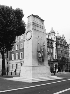
Edwin Lutyens, Cenotaph, London, 1919
So strong was the public outpouring of support, and so loud the calls to preserve the memorial, that within two weeks the cabinet decided that the Cenotaph should be rebuilt on the same spot in Portland stone. The temporary memorial had included live laurel wreaths and actual silk flags, three on each side, and for the permanent monument Lutyens wanted to have the wreaths and flags carved in stone, which would have reduced their impact as nationalistic symbols. He got his stone wreaths, but the cabinet insisted on keeping the real flags. He also made several other small but crucial modifications. The vertical surfaces are very slightly battered, and the horizontal surfaces are imperceptibly curved. Lutyens based his work on the optical refinements found in ancient Greek temples, and these subtle enhancements give the memorial a marked solidity and humanist grace. The Cenotaph is just over thirty-five feet tall, yet because it occupies a prominent position in the center of an important street, and because of its delicate severity, it makes a strong impression. Like all good memorials, it leaves plenty of room for the onlooker to find meaning. Memorials should neither preach nor moralize. The Cenotaph also achieves an essential quality—timelessness. Memorials are intended to last forever, and it helps if they look as if they had been there forever, too.
LINCOLN MEMORIAL
The Lincoln Memorial, at the west end of the National Mall in Washington, D.C., was dedicated in 1922, three years after the Cenotaph, but this project had a much longer gestation. In 1901, the Senate Park Commission, which was replanning and extending the Mall, proposed culminating the west end of the great axis with a memorial to Abraham Lincoln, facing the Washington Monument across a long reflecting pool. Charles McKim, a member of the commission, proposed a giant open-air colonnade supporting an attic story bearing the text of the Gettysburg Address. A bronze statue of the president was to stand outside on a terrace overlooking a fountain and the reflecting pool. “This extraordinarily elegant solution created multiple stages of transcendence,” writes the historian Kirk Savage. “Lincoln as a human figure was elevated above the historic strife suggested by the fountain, and his words were in turn removed from their historical context of creation and lifted to a nearly sacred status at the top of the composition. It was no longer the man himself who was the pinnacle of the monument but his aphorisms, which outlived him.”
Many in Congress resisted the high cost of what would have been the most expensive American memorial ever built, while others objected to the site. McKim died in 1909, his design unrealized. In 1912, the memorial finally received the congressional go-ahead. Henry Bacon, McKim’s protégé, and John Russell Pope, an up-and-coming young architect, were invited to submit proposals. Pope’s design consisted of a huge open-air Doric colonnade encircling a statue of the president; Bacon’s winning design resembled a temple.
Although Bacon’s memorial is often compared with the Parthenon, it includes several distinctly untemplelike features. The entrance to a Greek temple is always at the narrow end, but Bacon turned the building ninety degrees and placed the entrance in the center of the long façade. Moreover, he made the entrance simply a break in the wall—no door—creating a sense of unobstructed access. The message is that this is a democratic temple, open to all. Bacon also eliminated the pitched roof—and the pediments—which are traditional features of Greek temples. The Lincoln Memorial has a flat roof, or rather, it is surmounted by a boxy attic—a nod to McKim’s original design—that hides a large skylight. Thus the Greek model is transformed.
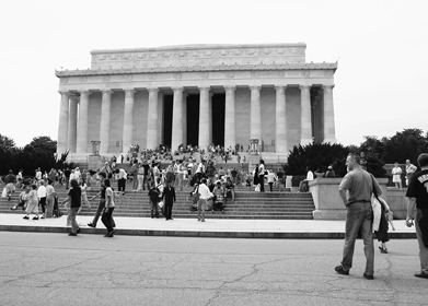
Henry Bacon, Lincoln Memorial, Washington, D.C., 1922
The interior of the memorial is divided into three chambers. The east and west walls carry the full texts of Lincoln’s two most famous wartime speeches: the Gettysburg Address and the Second Inaugural. The central chamber contains Daniel Chester French’s colossal marble statue of the president. Behind and above the statue, carved into the wall, is the inscription IN THIS TEMPLE, AS IN THE HEARTS OF THE PEOPLE FOR WHOM HE SAVED THE UNION, THE MEMORY OF ABRAHAM LINCOLN IS ENSHRINED FOREVER.3 Ancient Greek temples often contained a cult statue; the Parthenon housed Pheidias’s ivory-and-gold goddess Athena. On the face of it, this is an odd model for a memorial to a democratically elected president, especially one as homespun as this one. French was obviously aware of this anomaly, for there is nothing Olympian about his somber Lincoln. The president is sitting rather than standing, and he looks resolute, though tired, rather than triumphant. “The gentleness, power, and determination of the man has been wonderfully expressed by the sculptor,” wrote Bacon, “not only in the face but also in the hands which grip the arms of the massive seat.”
Like Lutyens, Bacon incorporated subtle optical refinements based on ancient Greek practice. “The columns are not vertical, being slightly tilted inward toward the building, the four corner columns being tilted more than the others,” he wrote. “The outside face of the entablature is also inclined inward, but slightly less than the columns underneath it.” Unlike the Cenotaph, the Lincoln Memorial incorporates a complex narrative—of sacrifice, suffering, and national redemption. The thirty-six columns of the peristyle represent the number of states in the Union at the time of Lincoln’s death. The names of the states, and their dates of entry into the Union, are inscribed in the frieze. A second frieze, surrounding the attic, contains the names of the forty-eight states that existed at the time of the memorial’s dedication. The immense funerary tripods that flank the steps outside, eleven feet tall and carved from single blocks of marble, symbolize Lincoln’s ultimate sacrifice.
The Lincoln Memorial did not meet with universal approval. Many critics thought that it was too wedded to the past, and that an ancient temple was an inappropriate—and un-American—symbol. “One feels not the living beauty of our American past, but the mortuary air of archaeology,” wrote Lewis Mumford. Bacon might have answered that the architecture of the world’s first democracy was a suitable model for a memorial to Lincoln, but the truth was that he was a confirmed classicist, and whether he was designing a railroad station or a library—or a memorial—he used the language of Greece and Rome. He might have simplified that language, as Lutyens did, or designed a more original form, as McKim had done. On the other hand, the juxtaposition of the colossal brooding Lincoln and his two speeches continues to be moving, and the memorial has taken its place as a national symbol of human struggle and emancipation.
CHÂTEAU-THIERRY
During the summer of 1918, the fourth year of the First World War, the Aisne-Marne salient was the site of heavy fighting. In July, Germany launched its last great offensive, known as the Second Battle of the Marne, against the French army and eight untested divisions of the newly arrived American Expeditionary Force. The German offensive drove forward and reached as far as Château-Thierry, only fifty-four miles from Paris. The Allied forces stopped the advance, and their counterattack drove the exhausted Germans back beyond their original front line, hastening the end of the war. There were twelve thousand American dead and wounded. After the war, each of the Allies built military cemeteries, but they also built commemorative memorials on battlefield sites. The dramatic site of the monument commemorating the Aisne-Marne campaign is what the doughboys called Hill 204, overlooking the town of Château-Thierry and the Marne River.
There are two kinds of war memorial. Some, like the Cenotaph, commemorate events that happened elsewhere; others, like a battlefield memorial, mark the actual spot. The architect of the Château-Thierry Monument, Paul Cret, elected to let the site speak for itself and to make the memorial extremely simple: a roofed double colonnade, 50 feet high and about 150 feet long, dead straight and standing on a broad terrace. An access road approaches the monument from the rear and arrives at a large paved semicircle. Facing this platform, in the center of the colonnade, are two heroic-size allegorical female figures representing the United States and France. One figure holds a sword, the other a shield; their fingers are intertwined. The dedication, in both English and French, reads: THIS MONUMENT HAS BEEN ERECTED BY THE UNITED STATES OF AMERICA TO COMMEMORATE THE SERVICES OF HER TROOPS AND THOSE OF FRANCE WHO FOUGHT IN THIS REGION DURING THE WORLD WAR. IT STANDS AS A LASTING SYMBOL OF THE FRIENDSHIP AND COOPERATION BETWEEN THE FRENCH AND AMERICAN ARMIES. On the opposite side of the memorial, a terrace looks eastward over the Marne Valley. A compass rose in the paving orients the visitor to the chief locations where the fighting took place. On this side, the colonnade is adorned with a giant American eagle and the inscription TIME WILL NOT DIM THE GLORY OF THEIR DEEDS. The sculptor, Alfred-Alphonse Bottiau, collaborated with Cret on several projects, and like him had served in the French army during the war.4
The Château-Thierry Monument was designed more than a decade after the Lincoln Memorial, and it represents a different approach to the classical past. The architecture is spare and austere. Traditional columns are replaced by massive square piers without bases or capitals, but scribed with grooves to suggest fluting. The piers are so close together that the voids are barely wider than the solids; the effect is more like a massive stone wall with slots than a traditional colonnade. The plain architrave, which is engraved with the names of individual battle sites, merely continues the plane of the piers. The effect is almost utilitarian; even the dedication is in a contemporary-looking unserifed typeface, rather than in a classic roman font. The Doric frieze—palm leaf triglyphs (symbolizing victory over death) alternating with oak leaf metopes (symbolizing longevity)—is the only classical motif. Above the frieze is a narrowly projecting cornice adorned by bronze medallions, not the usual leonine decoration but lupine—wolves’ heads. The cornice is surmounted by a low plain attic. The style of the memorial, according to Cret, “though inspired by a Greek simplicity of treatment is not, however, an archaeological adaptation but follows, rather, the American traditions of the post-colonial period, and develops them in the spirit of our own times.” Interestingly, many of the simplifications that Cret introduced were in response to a request by his client, the American Battle Monument Commission (chaired by General Pershing), which considered Cret’s first design for the Château-Thierry Monument too imposing. Cret complied, and later continued to explore this stripped classicism in buildings such as the Folger Library and the Federal Reserve.
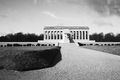
Paul Philippe Cret, Château-Thierry Monument, Château-Thierry, France, 1937
It is difficult to look at this evocative memorial today with an unprejudiced eye. In the 1930s, Hitler’s architects, Paul Troost and Albert Speer, copied Cret’s stripped classicism, so that for many today the style is synonymous with Nazism. That is a shame. Compared with Bacon’s literal interpretation in the Lincoln Memorial, Cret’s allusions to history are light-handed, and they give the Château-Thierry Monument a severe modernity. Seen from the town, the giant hilltop colonnade suggests an immovable bulwark, or perhaps a line of soldiers firmly standing their ground.
GATEWAY ARCH
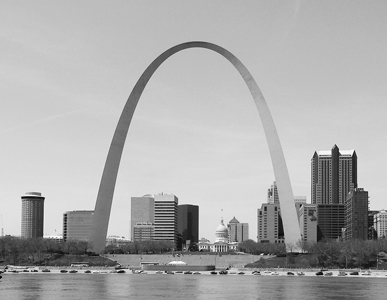
St. Louis’s Gateway Arch started life in the 1930s as a city boosters’ idea for downtown revival. A plan to replace a forty-block area of nineteenth-century commercial buildings with a riverfront park had been around for decades, but its supporters believed that linking the project to a national memorial to Thomas Jefferson and westward expansion, and creating jobs during the Depression, would garner federal support. They were right. In due course, Franklin D. Roosevelt signed an executive order approving the memorial, instructing the National Park Service to acquire the land, and allocating almost $7 million in WPA and PWA funds to the project. That was 1935, but as usual Congress was slow to apportion the money, the Second World War intervened, and it was another dozen years before the project could begin.
The designer of the memorial was chosen by a national competition, organized by none other than George Howe. “I was called in as professional adviser to divest the event of local implications,” he later explained, “and possibly as a sort of missing link between past and present.” While modernism was in the air, no major modernist monument had yet been built in the United States, and many in the architectural establishment doubted that it could. As the first modernist to be made a fellow of the American Institute of Architects, the Beaux-Arts-trained Howe was an inspired choice. He balanced the jury between traditionalists and modernists, including Fiske Kimball, the director of the Philadelphia Museum of Art who had recently chaired the commission that had built the Jefferson Memorial, and Louis La Beaume, a local classicist, together with Richard Neutra and William W. Wurster, both California modernists. The competition attracted more than 170 entries. Howe’s presence ensured that many of the younger generation of modernists entered, including Edward Durell Stone, Wallace K. Harrison, Charles Eames, Louis Kahn, Gordon Bunshaft, and Minoru Yamasaki, as well as such senior figures as Walter Gropius and Eliel Saarinen. None of these was among the five finalists, however, although neither were there any classicists.
Howe’s competition brief for the second stage called for a “striking element, not only to be seen from a distance in the landscape, but also as a notable structure to be remembered and commented on as one of the conspicuous monuments of the country.” Some of the finalists included vertical elements such as a pylons, but only Eero Saarinen responded directly to the call for an iconic form, proposing a giant arch of stainless steel, which combined innovation with tradition in a way that won over both factions of the jury. In any case, his entry was by far the best. Architectural Forum found the other finalists “somewhat disappointing,” and concluded that “American architects are uncomfortable and unsteady on projects of this scale.”
Eero Saarinen & Associates, Gateway Arch, St. Louis, 1968
Saarinen’s soaring arch suited the eighty-acre site beside the broad Mississippi River. Although the shape of the arch is sometimes described as a parabola, it is actually an inverted catenary arch, a form derived by hanging a chain from two fixed points at the same height and inverting the resulting shape. A catenary arch is extremely efficient, since the thrust is contained within the curve. That makes it sound like a work of engineering, but Saarinen was trained as a sculptor before he studied architecture, and his approach, whether he was designing an armchair or a building, was never purely technical. He wanted the triangular cross-section arch to narrow as it rose, which resulted in a flattened, or weighted, catenary, whose height—630 feet—was equal to its span.
Thanks to delays in land acquisition and fund-raising, construction did not begin until 1962—a year after Saarinen’s death—and by the time the memorial was complete, the design was already two decades old. Yet Saarinen’s sculptural form remains as fresh as ever, and demonstrates conclusively that modernism is compatible with monumentality. The arch is unabashedly modernist—absolutely abstract, with no symbolic decoration, not even an inscription—yet it is familiar. Triumphal arches originated in Roman times, and since the Renaissance, gates and arches have been important urban symbols. The St. Louis arch is not processional, but as Saarinen rather offhandedly observed, it symbolizes “the gateway to the West, the national expansion, and whatnot.”
VIETNAM VETERANS MEMORIAL
To celebrate its 150th anniversary, in 2007 the American Institute of Architects commissioned a national opinion poll that asked the public to name its favorite buildings in the United States. The four most popular buildings turned out to be the Empire State Building, the White House, Washington National Cathedral, and the Jefferson Memorial. The list continued in a similar retro vein: the Golden Gate Bridge, the U.S. Capitol, the Lincoln Memorial, the Biltmore Estate, and the Chrysler Building.
The AIA survey suggests that the American public has a marked antipathy to modern design—there are no Pritzker Prize winners in the top fifty—yet there is one contemporary design among the top ten: the Vietnam Veterans Memorial.5 The story of how the designer, Maya Lin, a twenty-one-year-old Yale architecture student, beat out almost fifteen hundred entries to win a national competition is the stuff of legend. The concise competition brief had only four simple requirements: the memorial should be reflective and contemplative in character; it should harmonize with its surroundings; it should contain the names of those who had died in the conflict or who were still missing; and it should make no political statement about the war.
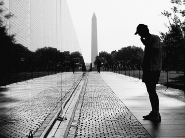
Given the requirement that more than 58,000 names be recorded on the memorial, it was obvious that a large vertical surface would be required. Lin’s brilliant concept was to create this surface belowground.
I imagined taking a knife and cutting into the earth, opening it up, an initial violence and pain that in time would heal. The grass would grow back, but the initial cut would remain a pure flat surface in the earth with a polished, mirrored surface, much like the surface on a geode when you cut it and polish the edge. The need for the names to be on the memorial would become the memorial; there was no need to embellish the design further. The people and their names would allow everyone to respond and remember.
Simple as the design is, there are several important refinements. The two “cuts” are in a V shape, with a ramped walk descending ten feet to a low point at the apex of the V, and rising again along the other side. The two arms are oriented to the Washington Monument and the Lincoln Memorial. Although the Vietnam memorial is often referred to as a wall, Lin envisioned it differently. She imagined the polished granite as a thin surface and resisted all suggestions to make it thicker and more monumental. The other important detail is the order of the names. Lin arranged the names chronologically, by dates of death—not alphabetically. Moreover, rather than simply listing the names from left to right across the memorial, she arranged the sequence to begin at the apex of the V, continue to the east end, then recommence at the far west end. “Now the chronological sequence began and ended at the apex so that the time line would circle back to itself and close the sequence,” she explained. “A progression in time is memorialized. The design is not just a list of the dead.” The sequence begins with the date 1959 and ends with 1975, marking the year of the last fatality. Two short inscriptions are the only references to the subject of the memorial.6
Lin’s design is abstract but it is not without meaning. The highly polished mirrorlike granite is black—the traditional color of mourning. Listing the names of the dead is likewise traditional; Lin has said that she was inspired by John Carrère and Thomas Hastings’s 1901 Yale Memorial Rotunda, whose walls are inscribed with the names of all alumni killed in military service. In that sense, the Vietnam memorial resembles a large tombstone. The funereal theme is further emphasized by the descent belowground, the underworld being a concept common to many ancient mythologies. These references to the past are subtle but unmistakable.
Maya Lin, Vietnam Veterans Memorial, Washington, D.C., 1982
From a distance, Maya Lin’s design resembles one of Robert Smithson’s earthworks. Like all good memorials, the Vietnam memorial can be appreciated as art, but it is definitely a memorial, although an unusual one. It does not commemorate the war—which, after all, the United States lost—nor, in spite of its name, does it commemorate all the veterans who served. Like the Cenotaph, it memorializes only the dead, although in Lutyens’s case the dead are “glorious,” whereas in the Vietnam memorial they are merely absent. Unlike the Château-Thierry Monument, Lin’s design is almost completely nondidactic. “These people died” is all it says, leaving us to fill in the blanks. For this memorial has a different purpose than teaching about the past; in Kirk Savage’s words, the Vietnam memorial is “the nation’s first ‘therapeutic’ memorial.” Lin herself has described the memorial as cathartic. “I remember one of the veterans asking me before the wall was built what I thought people’s reaction to it would be,” she recalled. “I was too afraid to tell him what I was thinking, that I knew a returning veteran would cry.”
* * *
James Stirling once remarked, “Architects have always looked back in order to move forward.” Looking back takes different forms. In his design of the Cenotaph, Edwin Lutyens took the influence of history for granted, although his remarkable talent allowed him to find new meaning in the old forms. Henry Bacon’s deep respect for the ancient world was more literal, although like the Cenotaph, the Lincoln Memorial is enriched by its connection to the past. Paul Cret acknowledged history, although he was more interested in how architecture could be changed to suit the modern world than in merely referring to a previous era. Both Eero Saarinen and Maya Lin were aware of the past, as the forms of their memorials—a gateway, a wall—suggest, even if as modernists their interpretations were highly abstract.
The architectural advantage of looking back is that it engages the memory as well as the eye. The Cenotaph would be considerably impoverished if it were merely a block of Portland stone. If the Lincoln Memorial were just a walled enclosure, the moving contrast between the ancient temple and the statue of the all-too-human president would be lost. And as so many banal walls-of-names memorials have subsequently demonstrated, the power of the Vietnam memorial lies not in its abstraction but in its understated evocation of the past.
Looking back may be prompted by different sentiments—nostalgia, reverence, admiration—or simply by the recognition that we owe a debt to our ancestors. The alternative, only looking forward, produces what are sometimes called visionary buildings, but nothing fades as quickly as yesterday’s vision of tomorrow. That is why old science-fiction films tend to elicit chuckles rather than admiration, just as old visionary buildings—houses shaped like soap bubbles or rock crystals—will soon look merely eccentric and will not acquire the status of old friends.