
Figure 580: Google Maps navigation toggle buttons
One of the classic forms of code reuse is the GUI widget. Since the advent of Microsoft Windows — and, to some extent, even earlier – developers have been creating their own widgets to extend an existing widget set. These range from 16-bit Windows “custom controls” to 32-bit Windows OCX components to the innumerable widgets available for Java Swing and SWT, and beyond. Android lets you craft your own widgets as well, such as extending an existing widget with a new UI or new behaviors.
Understanding this chapter requires that you have read the core chapters of this book.
You have five major options for creating a custom View class.
First, your “custom View class” might really only be custom
Drawable resources. Many widgets can adopt a radically different
look and feel just with replacement graphics. For example, you might
think that these toggle buttons from the Android 2.1 Google Maps
application are some fancy custom widget:
Figure 580: Google Maps navigation toggle buttons
In reality, those are just radio buttons with replacement images.
Second, your custom View class might be a simple subclass of an
existing widget, where you override some behaviors or otherwise
inject your own logic. Unfortunately, most of the built-in Android
widgets are not really designed for this sort of simple subclassing,
so you may be disappointed in how well this particular technique
works.
Third, your custom View class might be a composite widget —
akin to an activity’s contents, complete with layout and such, but
encapsulated in its own class. This allows you to create something
more elaborate than you will just by tweaking resources. We will see
this later in the chapter with ColorMixer.
Fourth, you might want to implement your own layout manager, if your
GUI rules do not fit well with RelativeLayout, TableLayout, or
other built-in containers. For example, you might want to create a
layout manager that more closely mirrors the “box model” approach
taken by XUL and Flex, or you might want to create one that mirrors
Swing’s FlowLayout (laying widgets out horizontally until there is
no more room on the current row, then start a new row).
Finally, you might want to do something totally different, where you
need to draw the widget yourself. For example, the ColorMixer
widget uses SeekBar widgets to control the mix of red, blue, and
green. But, you might create a ColorWheel widget that draws a
spectrum gradient, detects touch events, and lets the user pick a
color that way.
Some of these techniques are fairly simple; others are fairly complex. All share some common traits, such as widget-defined attributes, that we will see throughout the remainder of this chapter.
The classic way for a user to pick a color in a GUI is to use a color wheel like this one:
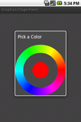
Figure 581: Color Wheel
However, a color wheel like that is difficult to manipulate on a touch screen, particularly a capacitive touchscreen designed for finger input. Fingers are great for gross touch events and lousy for selecting a particular color pixel.
Another approach is to use a mixer, with sliders to control the red, green, and blue values:
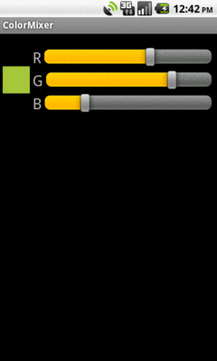
Figure 582: The ColorMixer widget, inside an activity
That is the custom widget you will see in this section, based on the
code in the
Views/ColorMixer
sample project.
ColorMixer is a composite widget, meaning that its contents are
created from other widgets and containers. Hence, we can use a layout
file to describe what the widget should look like.
The layout to be used for the widget is not that much: three
SeekBar widgets (to control the colors), three TextView widgets
(to label the colors), and one plain View (the “swatch” on the left
that shows what the currently selected color is). Here is the file,
found in res/layout/mixer.xml in the Views/ColorMixer project:
<?xml version="1.0" encoding="utf-8"?>
<merge xmlns:android="http://schemas.android.com/apk/res/android">
  <View android:id="@+id/swatch"
    android:layout_width="40dip"
    android:layout_height="40dip"
    android:layout_alignParentLeft="true"
    android:layout_centerVertical="true"
    android:layout_marginLeft="4dip"
  />
  <TextView android:id="@+id/redLabel"
    android:layout_width="wrap_content"
    android:layout_height="wrap_content"
    android:layout_alignTop="@id/swatch"
    android:layout_toRightOf="@id/swatch"
    android:layout_marginLeft="4dip"
    android:text="@string/red"
    android:textSize="24sp"
  />
  <SeekBar android:id="@+id/red"
    android:layout_width="match_parent"
    android:layout_height="wrap_content"
    android:layout_alignTop="@id/redLabel"
    android:layout_toRightOf="@id/redLabel"
    android:layout_marginLeft="4dip"
    android:layout_marginRight="8dip"
  />
  <TextView android:id="@+id/greenLabel"
    android:layout_width="wrap_content"
    android:layout_height="wrap_content"
    android:layout_below="@id/redLabel"
    android:layout_toRightOf="@id/swatch"
    android:layout_marginLeft="4dip"
    android:layout_marginTop="4dip"
    android:text="@string/green"
    android:textSize="24sp"
  />
  <SeekBar android:id="@+id/green"
    android:layout_width="match_parent"
    android:layout_height="wrap_content"
    android:layout_alignTop="@id/greenLabel"
    android:layout_toRightOf="@id/greenLabel"
    android:layout_marginLeft="4dip"
    android:layout_marginRight="8dip"
  />
  <TextView android:id="@+id/blueLabel"
    android:layout_width="wrap_content"
    android:layout_height="wrap_content"
    android:layout_below="@id/greenLabel"
    android:layout_toRightOf="@id/swatch"
    android:layout_marginLeft="4dip"
    android:layout_marginTop="4dip"
    android:text="@string/blue"
    android:textSize="24sp"
  />
  <SeekBar android:id="@+id/blue"
    android:layout_width="match_parent"
    android:layout_height="wrap_content"
    android:layout_alignTop="@id/blueLabel"
    android:layout_toRightOf="@id/blueLabel"
    android:layout_marginLeft="4dip"
    android:layout_marginRight="8dip"
  />
</merge>One thing that is a bit interesting about this layout, though, is the
root element: <merge>. A <merge> layout is a bag of widgets that
can be poured into some other container. The layout rules on the
children of <merge> are then used in conjunction with whatever
container they are added to. As we will see shortly, ColorMixer
itself inherits from RelativeLayout, and the children of the
<merge> element will become children of ColorMixer in Java.
Basically, the <merge> element is only there because XML files need
a single root — otherwise, the <merge> element itself is
ignored in the layout.
Widgets usually have attributes that you can set in the XML file,
such as the android:src attribute you can specify on an
ImageButton widget. You can create your own custom attributes that
can be used in your custom widget, by creating a
res/values/attrs.xml file containing declare-styleable resources
to specify them.
For example, here is the attributes file for ColorMixer:
<resources>
  <declare-styleable name="ColorMixer">
    <attr name="initialColor" format="color" />
  </declare-styleable>
</resources>The declare-styleable element describes what attributes are
available on the widget class specified in the name attribute —
in our case, ColorMixer. Inside declare-styleable you can have
one or more attr elements, each indicating the name of an
attribute (e.g., initialColor) and what data format the attribute
has (e.g., color). The data type will help with compile-time
validation and in getting any supplied values for this attribute
parsed into the appropriate type at runtime.
Here, we indicate there is only one attribute: initialColor, which
will hold the initial color we want the mixer set to when it first
appears.
There are many possible values for the format attribute in an
attr element, including:
booleancolordimensionfloatfractionintegerreference (which means a reference to another resource, such as
a Drawable)stringYou can even support multiple formats for an attribute, by separating
the values with a pipe (e.g., reference|color).
Our ColorMixer class, a subclass of RelativeLayout, will take
those attributes and provide the actual custom widget implementation,
for use in activities.
A View has three possible constructors:
Context, which usually will be an Activity
Context and an AttributeSet, the latter of which
represents the attributes supplied via layout XMLContext, an AttributeSet, and the default style to
apply to the attributesIf you are expecting to use your custom widget in layout XML files,
you will need to implement the second constructor and chain to the
superclass. If you want to use styles with your custom widget when
declared in layout XML files, you will need to implement the third
constructor and chain to the superclass. If you want developers to
create instances of your View class in Java code directly, you
probably should implement the first constructor and, again, chain to
the superclass.
In the case of ColorMixer, all three constructors are implemented,
eventually routing to the three-parameter edition, which initializes
our widget. Below, you will see the first two of those constructors,
with the third coming up in the next section:
  public ColorMixer(Context context) {
    this(context, null);
  }

  public ColorMixer(Context context, AttributeSet attrs) {
    this(context, attrs, 0);
  }
The ColorMixer has a starting color — after all, the SeekBar
widgets and swatch View have to show something. Developers can, if
they wish, set that color via a setColor() method:
  public void setColor(int color) {
    red.setProgress(Color.red(color));
    green.setProgress(Color.green(color));
    blue.setProgress(Color.blue(color));
    swatch.setBackgroundColor(color);
  }
If, however, we want developers to be able to use layout XML, we need
to get the value of initialColor out of the supplied
AttributeSet. In ColorMixer, this is handled in the
three-parameter constructor:
  public ColorMixer(Context context, AttributeSet attrs, int defStyle) {
    super(context, attrs, defStyle);

    ((Activity)getContext())
        .getLayoutInflater()
        .inflate(R.layout.mixer, this, true);

    swatch=findViewById(R.id.swatch);

    red=(SeekBar)findViewById(R.id.red);
    red.setMax(0xFF);
    red.setOnSeekBarChangeListener(onMix);

    green=(SeekBar)findViewById(R.id.green);
    green.setMax(0xFF);
    green.setOnSeekBarChangeListener(onMix);

    blue=(SeekBar)findViewById(R.id.blue);
    blue.setMax(0xFF);
    blue.setOnSeekBarChangeListener(onMix);

    if (attrs!=null) {
      TypedArray a=getContext()
                      .obtainStyledAttributes(attrs,
                                                R.styleable.ColorMixer,
                                                0, 0);

      setColor(a.getInt(R.styleable.ColorMixer_initialColor,
                        0xFFA4C639));
      a.recycle();
    }
  }
There are three steps for getting attribute values:
TypedArray conversion of the AttributeSet by calling
obtainStyledAttributes() on our Context, supplying it the
AttributeSet and the ID of our styleable resource (in this case,
R.styleable.ColorMixer, since we set the name of the
declare-styleable element to be ColorMixer)TypedArray to access specific attributes of interest, by
calling an appropriate getter (e.g., getInt()) with the ID of the
specific attribute to fetch (R.styleable.ColorMixer_initialColor)TypedArray when done, via a call to recycle(), to
make the object available to Android for use with other widgets via
an object pool (versus creating new instances every time)Note that the name of any given attribute, from the standpoint of
TypedArray, is the name of the styleable resource
(R.styleable.ColorMixer) concatenated with an underscore and the
name of the attribute itself (_initialColor).
In ColorMixer, we get the attribute and pass it to setColor().
Since getInt() on AttributeSet takes a default value, we supply
some stock color that will be used if the developer declined to
supply an initialColor attribute.
Also note that our ColorMixer constructor inflates the widget’s
layout. In particular, it supplies true as the third parameter to
inflate(), meaning that the contents of the layout should be added
as children to the ColorMixer itself. When the layout is inflated,
the <merge> element is ignored, and the <merge> element’s
children are added as children to the ColorMixer.
Similar to activities, a custom View overrides
onSaveInstanceState() and onRestoreInstanceState() to persist
data as needed, such as to handle a screen orientation change. The
biggest difference is that rather than receive a Bundle as a
parameter, onSaveInstanceState() must return a Parcelable with
its state… including whatever state comes from the parent View.
The simplest way to do that is to return a Bundle, in which we have
filled in our state (the chosen color) and the parent class’ state
(whatever that may be).
So, for example, here are implementations of onSaveInstanceState()
and onRestoreInstanceState() from ColorMixer:
  @Override
  public Parcelable onSaveInstanceState() {
    Bundle state=new Bundle();

    state.putParcelable(SUPERSTATE, super.onSaveInstanceState());
    state.putInt(COLOR, getColor());

    return(state);
  }

  @Override
  public void onRestoreInstanceState(Parcelable ss) {
    Bundle state=(Bundle)ss;

    super.onRestoreInstanceState(state.getParcelable(SUPERSTATE));

    setColor(state.getInt(COLOR));
  }
ColorMixer defines a callback interface, named
OnColorChangedListener:
  public interface OnColorChangedListener {
    public void onColorChange(int argb);
  }
ColorMixer also provides getters and setters for an
OnColorChangedListener object:
  public OnColorChangedListener getOnColorChangedListener() {
    return(listener);
  }

  public void setOnColorChangedListener(OnColorChangedListener listener) {
    this.listener=listener;
  }
The rest of the logic is mostly tied up in the SeekBar handler,
which will adjust the swatch based on the new color and invoke the
OnColorChangedListener object, if there is one:
  private SeekBar.OnSeekBarChangeListener onMix=new SeekBar.OnSeekBarChangeListener() {
    public void onProgressChanged(SeekBar seekBar, int progress,
                                  boolean fromUser) {
      int color=getColor();

      swatch.setBackgroundColor(color);

      if (listener!=null) {
        listener.onColorChange(color);
      }
    }

    public void onStartTrackingTouch(SeekBar seekBar) {
      // unused
    }

    public void onStopTrackingTouch(SeekBar seekBar) {
      // unused
    }
  };
The project contains a sample activity, ColorMixerDemo, that shows
the use of the ColorMixer widget.
The layout for that activity, shown below, can be found in
res/layout/main.xml of the Views/ColorMixer project:
<?xml version="1.0" encoding="utf-8"?>
<LinearLayout xmlns:android="http://schemas.android.com/apk/res/android"
  xmlns:mixer="http://schemas.android.com/apk/res-auto"
  android:layout_width="match_parent"
  android:layout_height="wrap_content"
  android:orientation="vertical"
>
  <TextView android:id="@+id/color"
    android:layout_width="wrap_content"
    android:layout_height="wrap_content"
  />
  <com.commonsware.android.colormixer.ColorMixer
    android:id="@+id/mixer"
    android:layout_width="wrap_content"
    android:layout_height="wrap_content"
    mixer:initialColor="#FFA4C639"
  />
</LinearLayout>Notice that the root LinearLayout element defines two namespaces,
the standard android namespace, and a separate one named mixer.
The mixer namespace is given a URL of http://schemas.android.com/apk/res-auto,
which indicates to the Android build system to match up mixer
attributes with their respective widgets that are supplied via
Android library projects.
Our ColorMixer widget is in the layout, with a fully-qualified
class name (com.commonsware.android.colormixer.ColorMixer), since
ColorMixer is not in the android.widget package. Notice that we
can treat our custom widget like any other, giving it a width and
height and so on.
The one attribute of our ColorMixer widget that is unusual is
mixer:initialColor. initialColor, you may recall, was the name of
the attribute we declared in res/values/attrs.xml and retrieve in
Java code, to represent the color to start with. The mixer
namespace is needed to identify where Android should be pulling the
rules for what sort of values an initialColor attribute can hold.
Since our <attr> element indicated that the format of
initialColor was color, Android will expect to see a color value
here, rather than a string or dimension.
The ColorMixerDemo activity is not very elaborate:
package com.commonsware.android.colormixer;

import android.app.Activity;
import android.os.Bundle;
import android.widget.TextView;

public class ColorMixerDemo extends Activity {
  private TextView color=null;

  @Override
  public void onCreate(Bundle state) {
    super.onCreate(state);
    setContentView(R.layout.main);

    color=findViewById(R.id.color);

    ColorMixer mixer=findViewById(R.id.mixer);

    mixer.setOnColorChangedListener(onColorChange);
  }

  private ColorMixer.OnColorChangedListener onColorChange=
    new ColorMixer.OnColorChangedListener() {
    public void onColorChange(int argb) {
      color.setText(Integer.toHexString(argb));
    }
  };
}It gets access to both the ColorMixer and the TextView in the
main layout, then registers an OnColorChangedListener with the
ColorMixer. That listener, in turn, puts the value of the color in
the TextView, so the user can see the hex value of the color along
with the shade itself in the swatch.
Sometimes, what you want to achieve only requires a basic subclass of an existing widget (or container), into which you can pour your business logic.
For example, Android has a Chronometer widget, which is used for
denoting elapsed time of some operation. It works well, but it only
counts up from zero. It cannot be used to display a countdown instead.
But, we can roll a ReverseChronometer that does, simply by subclassing
TextView, as seen in the
Views/ReverseChronometer
sample project:
package com.commonsware.android.revchron;

import android.content.Context;
import android.graphics.Color;
import android.os.SystemClock;
import android.util.AttributeSet;
import android.widget.TextView;

public class ReverseChronometer extends TextView implements Runnable {
  long startTime=0L;
  long overallDuration=0L;
  long warningDuration=0L;

  public ReverseChronometer(Context context, AttributeSet attrs) {
    super(context, attrs);

    reset();
  }

  @Override
  public void run() {
    long elapsedSeconds=
        (SystemClock.elapsedRealtime() - startTime) / 1000;

    if (elapsedSeconds < overallDuration) {
      long remainingSeconds=overallDuration - elapsedSeconds;
      long minutes=remainingSeconds / 60;
      long seconds=remainingSeconds - (60 * minutes);

      setText(String.format("%d:%02d", minutes, seconds));

      if (warningDuration > 0 && remainingSeconds < warningDuration) {
        setTextColor(0xFFFF6600); // orange
      }
      else {
        setTextColor(Color.BLACK);
      }

      postDelayed(this, 1000);
    }
    else {
      setText("0:00");
      setTextColor(Color.RED);
    }
  }

  public void reset() {
    startTime=SystemClock.elapsedRealtime();
    setText("--:--");
    setTextColor(Color.BLACK);
  }

  public void stop() {
    removeCallbacks(this);
  }

  public void setOverallDuration(long overallDuration) {
    this.overallDuration=overallDuration;
  }

  public void setWarningDuration(long warningDuration) {
    this.warningDuration=warningDuration;
  }
}
ReverseChronometer is designed to show minutes and seconds remaining
from some initial time. In the constructor, by means to a call to a reset() method,
we set the text of the TextView to show a generic starting point (“-:–”), set its
color to black, and note the current time (SystemClock.elapsedRealtime())
in a startTime data member.
ReverseChronometer also tracks two durations in seconds,
with corresponding setter methods:
overallDuration is how long the countdown should run from beginning to endwarningDuration is how far from the end we should change the color of the
TextView from black to orange, to hint to the viewer that time is running outReverseChronometer implements Runnable, and when its run() method is called,
it determines how many seconds have elapsed since that startTime value.
Depending on the amount of seconds remaining, we either:
In either of the first two cases, we also call postDelayed() to schedule
ourselves to run again in a second, where we can update the TextView contents
once more. That continues until somebody calls stop().
As with any custom View, we can reference this in a layout XML resource,
fully-qualifying the class name used as the name of our XML element for the
widget. And, since we inherit from TextView, we can set any of the
attributes that we want on that TextView, in terms of styling the text,
positioning it within a parent container, etc.:
<RelativeLayout xmlns:android="http://schemas.android.com/apk/res/android"
  xmlns:tools="http://schemas.android.com/tools"
  android:layout_width="match_parent"
  android:layout_height="match_parent"
  tools:context=".MainActivity">

  <com.commonsware.android.revchron.ReverseChronometer
    android:id="@+id/chrono"
    android:layout_width="wrap_content"
    android:layout_height="wrap_content"
    android:layout_centerInParent="true"
    android:textSize="50sp"
    android:textStyle="bold"/>

</RelativeLayout>All our activity needs to do is set the durations,
then call run() and stop() at appropriate times,
such as when the activity is resumed and paused:
package com.commonsware.android.revchron;

import android.app.Activity;
import android.os.Bundle;

public class MainActivity extends Activity {
  private ReverseChronometer chrono=null;

  @Override
  protected void onCreate(Bundle savedInstanceState) {
    super.onCreate(savedInstanceState);
    setContentView(R.layout.activity_main);

    chrono=(ReverseChronometer)findViewById(R.id.chrono);
    chrono.setOverallDuration(90);
    chrono.setWarningDuration(10);
  }

  @Override
  public void onResume() {
    super.onResume();

    chrono.run();
  }

  @Override
  public void onPause() {
    chrono.stop();

    super.onPause();
  }
}
The result is much as you would expect: a countdown of the time remaining:
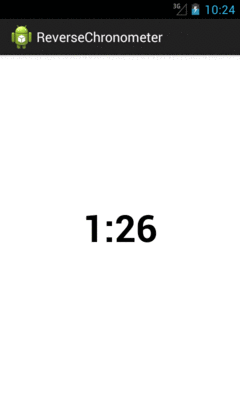
Figure 583: ReverseChronometer, Early in Countdown
…changing to orange when we are within the warning duration:
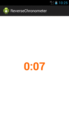
Figure 584: ReverseChronometer, Late in Countdown
…and changing to red when time has run out:
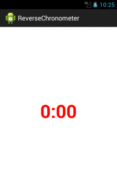
Figure 585: ReverseChronometer, With Complete Time Elapsed
Of course, much more could be done with this widget, if you chose:
You can also craft your own custom container classes, whether inheriting
straight from ViewGroup to implement your own set of layout rules, or by
extending an existing ViewGroup to merely augment its functionality.
For example, there may be cases where you want to control the aspect ratio
of some set of widgets. This is important when working with preview frames
off of the Camera to prevent distortion, for example.
AspectLockedFrameLayout, therefore, is a custom extension of FrameLayout
that ensures that its contents are kept within a particular aspect ratio,
reducing the height or width of the contents to keep that aspect ratio.
AspectLockedFrameLayout is published as part of the CWAC-Layouts project,
with its own GitHub repo. As with
many of the CWAC projects, the reusable code is distributed as a JAR and as
an Android library project, with a demo/ sub-project illustrating the use
of some of the library’s contents.
AspectLockedFrameLayout holds onto two data members:
double (aspectRatio) that represents a specific aspect ratio to
maintain, initialized to 0.0
View (aspectRatioSource) that represents some other widget whose
aspect ratio should be matched, initialized to null
AspectLockedFrameLayout has corresponding setters for each:
        lockedHeight=(int)(lockedWidth / localRatio + .5);
      }

      // Add the padding of the border.
      lockedWidth+=hPadding;
      lockedHeight+=vPadding;

      // Ask children to follow the new preview dimension.
      super.onMeasure(MeasureSpec.makeMeasureSpec(lockedWidth,
                                                  MeasureSpec.EXACTLY),
                      MeasureSpec.makeMeasureSpec(lockedHeight,
                                                  MeasureSpec.EXACTLY));
    }
  }

  /**
   * Supplies a View as a source. The AspectLockedFrameLayout will aim to
   * match the aspect ratio of this View. This is a one-time check; if the
   * View changes its aspect ratio later, the AspectLockedFrameLayout will
   * not attempt to match it.
   *
   * @param v some View
The “business logic” of maintaining the aspect ratio comes in onMeasure().
onMeasure() is called on a ViewGroup when it is time for it to determine
its actual size, based upon things like the requested height and width and the
sizes of its children. In our case onMeasure() needs to be tweaked to maintain
the aspect ratio, assuming that we have an aspect ratio to work with:
  }

  /**
   * {@inheritDoc}
   */
  public AspectLockedFrameLayout(Context context, AttributeSet attrs) {
    super(context, attrs);
  }

  // from com.android.camera.PreviewFrameLayout, with slight
  // modifications

  /**
   * {@inheritDoc}
   */
  @Override
  protected void onMeasure(int widthSpec, int heightSpec) {
    double localRatio=aspectRatio;

    if (localRatio == 0.0 && aspectRatioSource != null
        && aspectRatioSource.getHeight() > 0) {
      localRatio=
          (double)aspectRatioSource.getWidth()
              / (double)aspectRatioSource.getHeight();
    }

    if (localRatio == 0.0) {
      super.onMeasure(widthSpec, heightSpec);
    }
    else {
      int lockedWidth=MeasureSpec.getSize(widthSpec);
      int lockedHeight=MeasureSpec.getSize(heightSpec);

      if (lockedWidth == 0 && lockedHeight == 0) {
        throw new IllegalArgumentException(
                                           "Both width and height cannot be zero -- watch out for scrollable containers");
      }

      // Get the padding of the border background.
      int hPadding=getPaddingLeft() + getPaddingRight();
      int vPadding=getPaddingTop() + getPaddingBottom();

      // Resize the preview frame with correct aspect ratio.
      lockedWidth-=hPadding;
      lockedHeight-=vPadding;

      if (lockedHeight > 0 && (lockedWidth > lockedHeight * localRatio)) {
        lockedWidth=(int)(lockedHeight * localRatio + .5);
      }
We start by determining what actually is the desired aspect ratio, held onto
in a localRatio local variable. That will be aspectRatio if we do not have an
aspectRatioSource that already knows its size, otherwise we will calculate the
aspect ratio from the source. And, if localRatio turns out to be 0.0, indicating
that we do not have an aspect ratio to maintain, we just chain to the superclass,
so AspectLockedFrameLayout will behave just like a normal FrameLayout.
If we do have an aspect ratio to maintain, we start by determining our requested
height and width. onMeasure() is passed a pair of “specs” that provides details about
our requested size, and we can get the height and width from those by means of the
MeasureSpec helper class. We remove any
horizontal padding — padding is considered to be “outside” the locked area and
therefore is ignored in aspect ratio calculations. We then adjust the height
or the width, as needed, to maintain the aspect ratio. We add back in the padding,
then chain to the superclass with revised height and width “specs” via MeasureSpec.
Note that much of this logic was derived from com.android.camera.PreviewFrameLayout
from the AOSP Camera application, which is used to maintain the aspect ratio of the
SurfaceView used to display preview frames.
To use an AspectLockedFrameLayout, just add it to your layout XML file, with
an appropriate child widget/container representing the material that needs to
maintain a particular aspect ratio. Since the AspectLockedFrameLayout is
overriding its natural size, you can use android:layout_gravity to control its
positioning within some parent widget, such as centering it:
<FrameLayout
    android:layout_width="match_parent"
    android:layout_height="match_parent">

    <com.commonsware.cwac.layouts.AspectLockedFrameLayout
        android:id="@+id/source"
        android:layout_width="match_parent"
        android:layout_height="match_parent"
        android:layout_gravity="center">

        <!-- children go here -->
    </com.commonsware.cwac.layouts.AspectLockedFrameLayout>
</FrameLayout>
Another scenario where aspect ratios matter is when you are presenting information
on an external display via Presentation, as is covered
elsewhere in this book. Ideally, you fill the external display.
And normally this will happen for you automatically, as your Presentation
content view should fill the available screen space… assuming that the content
has the right aspect ratio, or can be suitably stretched.
One scenario where this might be a problem is if you want the same material
shown on both the main display and on the external display. For example,
suppose that you are using Presentation to deliver… well… a presentation.
The external display is probably some form of video projector, and you will
want your slides or other materials shown there. However, it is useful for
you to be able to see those same slides and such on the tablet, as typically
the projector screen is behind, or to the side of, the presenter. If the
presenter has to keep turning around to confirm what is shown on “the big screen”,
it can detract from the presentation.
Moreover, you might not only want to show the same material, but have it
stem from the same source, on the tablet, for interactivity reasons. Suppose
that you want to display a Web page. You might just pop up a WebView in the
Presentation. But… how do you scroll? The Presentation offers no touch
interface — projector screens do not magically respond to pinch-to-zoom just
because we happen to be projecting something onto them from an Android tablet.
In this case, ideally we would like to mirror something. Have the actual
widgets shown on the tablet, which can then respond to touch events and the like.
At the same time, capture what is shown on the tablet and reproduce it, verbatim,
on the Presentation for the audience to see. Now everybody can see the same
material, and the presenter can manipulate that material.
But now aspect ratios come into play. We want to fill the Presentation display
space, without black bars or stretching or whatever. That only works if our
source material — the widgets and containers to be mirrored — have the same
aspect ratio as the Presentation’s Display itself.
With that in mind, the CWAC Layouts project also contains two classes to solve this problem:
MirroringFrameLayout is an AspectLockedFrameLayout that also can mirror
its content to…Mirror, a View that takes a Bitmap representing the MirroringFrameLayout
contents and displays itTechnically, MirroringFrameLayout works with a MirrorSink, an interface that
can receive updates to the content to be mirrored when that content changes.
Mirror implements MirrorSink, and you could have other classes implement
MirrorSink as well if that made sense for your app. The sections that follow
focus on MirroringFrameLayout working with a Mirror, as that is the most
likely scenario.
MirroringFrameLayout extends AspectLockedFrameLayout, so that we can lock
the aspect ratio of the to-be-mirrored contents to match the aspect ratio
of the Mirror. The Mirror is designed to be projected by the Presentation,
and so if the Mirror fills the Presentation’s Display, we want our
MirroringFrameLayout to match the aspect ratio so the entire Display can
indeed be filled.
Of course, a ViewGroup like FrameLayout normally just has its children
draw to the screen. In our case, we need to capture what is drawn ourselves,
to supply to the Mirror as needed. This is a bit tricky.
package com.commonsware.cwac.layouts;

import android.content.Context;
import android.graphics.Bitmap;
import android.graphics.Canvas;
import android.graphics.Rect;
import android.util.AttributeSet;
import android.view.ViewTreeObserver.OnPreDrawListener;
import android.view.ViewTreeObserver.OnScrollChangedListener;

/**
 * A FrameLayout that locks its aspect ratio (courtesy of AspectLockedFrameLayout)
 * and supplies "screenshots" of its contents to an associated MirrorSink,
 * such as a Mirror.
 *
 * Principally, MirroringFrameLayout and Mirror are designed for use with
 * Android's Presentation system. The MirroringFrameLayout would be part of the
 * UI of the activity on the mobile device, allowing for user interaction. The
 * Mirror would be used in the Presentation to show an audience (e.g., via a
 * projector) what is shown inside the MirroringFrameLayout on the mobile
 * device.
 */
public class MirroringFrameLayout extends AspectLockedFrameLayout
    implements OnPreDrawListener, OnScrollChangedListener {
  private MirrorSink mirror=null;
  private Bitmap bmp=null;
  private Canvas bmpBackedCanvas=null;
  private Rect rect=new Rect();

  /**
   * {@inheritDoc}
   */
  public MirroringFrameLayout(Context context) {
    this(context, null);
  }

  /**
   * {@inheritDoc}
   */
  public MirroringFrameLayout(Context context, AttributeSet attrs) {
    super(context, attrs);

    setWillNotDraw(false);
  }

  /**
   * Associate a MirrorSink; this sink will be given bitmaps representing
   * updated contents of the MirroringFrameLayout as those contents change.
   *
   * @param mirror a Mirror or other MirrorSink implementation
   */
  public void setMirror(MirrorSink mirror) {
    this.mirror=mirror;

    if (mirror != null) {
      setAspectRatioSource(mirror);
    }
  }

  /**
   * {@inheritDoc}
   */
  @Override
  public void onAttachedToWindow() {
    super.onAttachedToWindow();

    getViewTreeObserver().addOnPreDrawListener(this);
    getViewTreeObserver().addOnScrollChangedListener(this);
  }

  /**
   * {@inheritDoc}
   */
  @Override
  public void onDetachedFromWindow() {
    getViewTreeObserver().removeOnPreDrawListener(this);
    getViewTreeObserver().removeOnScrollChangedListener(this);

    super.onDetachedFromWindow();
  }

  /**
   * {@inheritDoc}
   */
  @Override
  public void draw(Canvas canvas) {
    if (mirror != null) {
      bmp.eraseColor(0);

      super.draw(bmpBackedCanvas);
      getDrawingRect(rect);
      canvas.drawBitmap(bmp, null, rect, null);
      mirror.update(bmp);
    }
    else {
      super.draw(canvas);
    }
  }

  /**
   * {@inheritDoc}
   */
  @Override
  protected void onSizeChanged(int w, int h, int oldw, int oldh) {
    initBitmap(w, h);

    super.onSizeChanged(w, h, oldw, oldh);
  }

  /**
   * {@inheritDoc}
   */
  @Override
  public boolean onPreDraw() {
    if (mirror != null) {
      if (bmp == null) {
        requestLayout();
      }
      else {
        invalidate();
      }
    }

    return(true);
  }

  /**
   * {@inheritDoc}
   */
  @Override
  public void onScrollChanged() {
    onPreDraw();
  }

  private void initBitmap(int w, int h) {
    if (mirror != null) {
      if (bmp == null || bmp.getWidth() != w || bmp.getHeight() != h) {
        if (bmp != null) {
          bmp.recycle();
        }

        bmp=Bitmap.createBitmap(w, h, Bitmap.Config.ARGB_8888);
        bmpBackedCanvas=new Canvas(bmp);
      }
    }
  }
}
Our one-argument constructor uses this() to chain to the two-argument
constructor. The two-argument constructor calls setWillNotDraw(false)
indicating to Android that we want this ViewGroup to participate in
the drawing process like a regular View — normally, certain steps in
the drawing process are skipped as being irrelevant to View classes that do
not draw anything themselves.
We have a setMirror() method, where the activity or fragment can supply the
MirrorSink that is connected to this MirroringFrameLayout. In addition to
holding onto the MirrorSink in a mirror data member, we call
setAspectRatioSource(), inherited from AspectLockedFrameLayout, so
our contents will match the aspect ratio from that source.
MirroringFrameLayout overrides onAttachedToWindow() and
onDetatchedFromWindow(). As one might guess, these callbacks are called
when views are attached and detached from some window. Usually, that window
represents an activity, though it could represent a Dialog or a Presentation.
In those callbacks, we connect with the ViewTreeObserver of the
MirroringFrameLayout. A ViewTreeObserver is a way to find out about events
of a view tree, rooted at some ViewGroup. In our case, we want to find out
when children are going to be drawn (addOnPreDrawListener()) and when
they are scrolled (addOnScrollChangedListener()).
We override onSizeChanged(). This is called on any View when its size may
have changed, either because it is being sized initially when the UI is being
set up, or because something else nearby changed size (e.g., its parent) and
therefore the size of the View itself may now be different. In our case, we
use onSizeChanged() to set up a Bitmap object, sized to match our size,
and a Canvas object that wraps around that Bitmap object. As you will see,
we will use this Canvas to capture what is being drawn on the screen, for
later use by the Mirror.
We also override draw(). This is, in effect, the “entry point” into the
logic that causes a View to render itself on the screen, by drawing to a
supplied Canvas object. Most View classes do not override draw(), as the
real rendering is done in an onDraw() method, as we will see with Mirror
later in this chapter. However, in our case, we have to override draw() for
one simple reason: we do not want to draw to the Canvas supplied by Android
to the draw() method. We want to draw to our own Canvas, backed by that
Bitmap.
To that end, if we have a MirrorSink, we:
Bitmap starts off blank by calling eraseColor()
Canvas given to us in draw() by
our own Bitmap-backed Canvas
Rect object with our size and position, using getDrawingRect()
Rect and the Bitmap to render the Bitmap to the “real” Canvas
supplied to us in draw()
update() on the MirrorSink, to give it the new Bitmap
By rendering our contents to the Bitmap-backed Canvas, instead of the normal
one, we capture a copy of the output, in the form of the Bitmap. Since the
Bitmap has the same size as the “real” Canvas (courtesy of our onSizeChanged()
work), when we draw the Bitmap onto the Canvas, we effectively “color in” the
same pixels in the same spots as if we had skipped all of this and left the
normal draw() logic alone. But, since we still hold onto our Bitmap, we can
use those same pixels elsewhere… such as in our Mirror.
The problem with relying on draw() is that it is not always called when there
are changes to widgets within the MirroringFrameLayout. In particular, WebView
often does not trigger draw() on the MirroringFrameLayout. That’s where
the pre-draw and scroll-changed events from the ViewTreeObserver come into play:
they give us more indication that we need to update our Bitmap.
The onPreDraw() method is called when a child of this MirroringFrameLayout is
about to be drawn. If we have our MirrorSink, we then either call requestLayout()
(if we have no bitmap yet) or invalidate() (if we do), to trigger Android to go
through the draw process for the MirroringFrameLayout too, allowing us to update
our Bitmap.
The onScrollChanged() method is called when a child of this MirroringFrameLayout
has been scrolled. This delegates to onPreDraw(), to run through the same logic
to force an update to the Bitmap.
Mirror extends the base View class, and so it is the most “raw” of all the
custom widgets and containers shown so far in this chapter. It has an update()
method, used to connect the MirroringFrameLayout from which the Mirror can
obtain what it is supposed to display:
package com.commonsware.cwac.layouts;

import android.content.Context;
import android.graphics.Bitmap;
import android.graphics.Canvas;
import android.graphics.Rect;
import android.util.AttributeSet;
import android.view.View;

/**
 * A View that implements MirrorSink and renders the supplied bitmaps to its
 * own contents. When connected to a MirroringFrameLayout, Mirror will aim to
 * show the same contents as is in the MirroringFrameLayout, at the same aspect
 * ratio, though possibly at a different size.
 *
 * Principally, MirroringFrameLayout and Mirror are designed for use with
 * Android's Presentation system. The MirroringFrameLayout would be part of the
 * UI of the activity on the mobile device, allowing for user interaction. The
 * Mirror would be used in the Presentation to show an audience (e.g., via a
 * projector) what is shown inside the MirroringFrameLayout on the mobile
 * device.
 */
public class Mirror extends View implements MirrorSink {
  private Rect rect=new Rect();
  private Bitmap bmp=null;

  /**
   * {@inheritDoc}
   */
  public Mirror(Context context) {
    super(context);
  }

  /**
   * {@inheritDoc}
   */
  public Mirror(Context context, AttributeSet attrs) {
    super(context, attrs);
  }

  /**
   * {@inheritDoc}
   */
  public Mirror(Context context, AttributeSet attrs, int defStyle) {
    super(context, attrs, defStyle);
  }

  /**
   * {@inheritDoc}
   */
  @Override
  public void update(Bitmap bmp) {
    this.bmp=bmp;
    invalidate();
  }

  /**
   * {@inheritDoc}
   */
  @Override
  protected void onDraw(Canvas canvas) {
    super.onDraw(canvas);

    if (bmp != null) {
      getDrawingRect(rect);

      calcCenter(rect.width(), rect.height(), bmp.getWidth(),
                 bmp.getHeight(), rect);
      canvas.drawBitmap(bmp, null, rect, null);
    }
  }

  // based upon http://stackoverflow.com/a/14679729/115145

  static void calcCenter(int vw, int vh, int iw, int ih, Rect out) {
    double scale=
        Math.min((double)vw / (double)iw, (double)vh / (double)ih);

    int h=(int)(scale * ih);
    int w=(int)(scale * iw);
    int x=((vw - w) >> 1);
    int y=((vh - h) >> 1);

    out.set(x, y, x + w, y + h);
  }
}
The bulk of the “business logic” lies in onDraw(), plus a helper calcCenter()
static method.
onDraw() is called on a View when it is time for that widget to actually
draw its visual representation onto the supplied Canvas. Different widgets will
use different drawing primitive methods offered by Canvas, to draw lines and
text and whatnot. In our case, we:
Rect object with our size and position, using getDrawingRect()
Bitmap object from the MirroringFrameLayout, via a call to
getLastBitmap() (which simply returns the Bitmap that the MirroringFrameLayout
is using)calcCenter to adjust our Rect to take into account the fact that our
size may be different than the size of the actual Bitmap
drawBitmap() on our Canvas, to render the Bitmap into the location
specified by the Rect, where drawBitmap() will automatically down-sample or
up-sample the image as needed to fill the necessary spaceNormally, you would use the Mirror in a layout for a Presentation and the
MirroringFrameLayout in an activity that controls the Presentation. However,
it is possible to use both in the same layout file, for light testing. However,
please do not put the Mirror inside of the MirroringFrameLayout, as this
is likely to cause a rupture in the space-time continuum, and you really do not
want to be responsible for that.
So, in the SimpleMirrorActivity from the demo/ sub-project, we use a layout
that has both Mirror and MirroringFrameLayout, with the latter set to mirror
a WebView:
<LinearLayout xmlns:android="http://schemas.android.com/apk/res/android"
  xmlns:tools="http://schemas.android.com/tools"
  android:layout_width="match_parent"
  android:layout_height="match_parent"
  android:orientation="vertical"
  tools:context=".SimpleMirrorActivity">

  <FrameLayout
    android:layout_width="match_parent"
    android:layout_height="0dp"
    android:layout_weight="1">

    <com.commonsware.cwac.layouts.MirroringFrameLayout
      android:id="@+id/source"
      android:layout_width="match_parent"
      android:layout_height="match_parent"
      android:layout_gravity="center">

      <EditText
        android:id="@+id/editor"
        android:layout_width="match_parent"
        android:layout_height="match_parent"
        android:gravity="left|top"
        android:inputType="textMultiLine"/>
    </com.commonsware.cwac.layouts.MirroringFrameLayout>
  </FrameLayout>

  <View
    android:layout_width="match_parent"
    android:layout_height="4dip"
    android:background="#FF000000"/>

  <com.commonsware.cwac.layouts.Mirror
    android:id="@+id/target"
    android:layout_width="match_parent"
    android:layout_height="0dp"
    android:layout_weight="2"/>

</LinearLayout>
In this case, we set the background of the FrameLayout holding our
MirroringFrameLayout to green, to show how the MirroringFrameLayout size is
changed to maintain our aspect ratio.
(or, perhaps we just like green)
Besides configuring the to-be-mirrored widgets, all you need to do is call
setMirror() on the MirroringFrameLayout to enable the mirroring logic:
package com.commonsware.cwac.layouts.demo;

import android.app.Activity;
import android.os.Bundle;
import com.commonsware.cwac.layouts.Mirror;
import com.commonsware.cwac.layouts.MirroringFrameLayout;

public class SimpleMirrorActivity extends Activity {
  MirroringFrameLayout source=null;

  @Override
  protected void onCreate(Bundle savedInstanceState) {
    super.onCreate(savedInstanceState);
    setContentView(R.layout.simple_mirror);

    source=findViewById(R.id.source);
    Mirror target=findViewById(R.id.target);

    source.setMirror(target);
  }
}
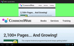
Figure 586: MirroringFrameLayout Above Its Mirror
While the bottom portion is just the Mirror and therefore is non-interactive,
the top is the real WebView, which can be scrolled, with the resulting changes
reflected in the Mirror in real-time:
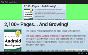
Figure 587: MirroringFrameLayout and Mirror, Showing Scrolled Contents
MirroringFrameLayout only works for materials drawn in the Java layer, that therefore
can be drawn to the Bitmap-backed Canvas. Content not drawn in the Java layer
will not work with MirroringFrameLayout, notably anything involving a SurfaceView.
This not only includes your own SurfaceView widgets, but anything else that depends
upon SurfaceView, such as VideoView or the Maps V2 MapView and MapFragment.
Also, the re-sampling done by Mirror is not especially sophisticated and will
cause jagged effects, particularly when up-sampling. Ideally, the MirroredFrameLayout
will be the same size or larger than the Mirror. This may not always be possible,
particularly with a Mirror shown on a 1080p external display, but the closer you can
get will improve the output.