58. Album Design: Clean, Classic
Photographers: Bob and Dawn Davis


Clean and Classic
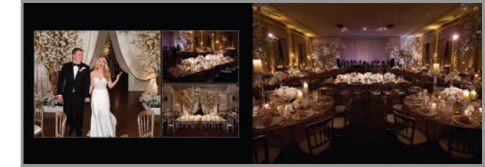
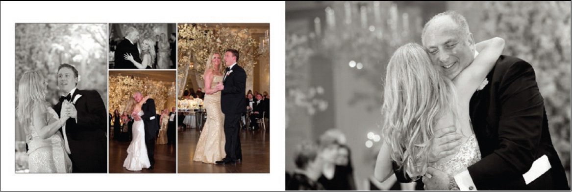
“I like to design our books with a very clean and classic style in which each spread tells a story,” says Dawn Davis. “I use all-white backgrounds throughout the story until the reception, when I’ll add some all-black backgrounds to the spreads. I like each image that isn’t a bleed to have a 3-point inside border. If the background is white, I like the borders to be black. If the background is black, I like the borders to be white.”
Signature Images
“I like to end the book design with a signature image. This is a shot of the bride and groom that Bob will take sometime during the reception after asking the couple for a few minutes to head outside or to a designated spot where he has his lights already set up. It’s always wonderful to end the book with a good-night shot like that.”


Logo Placement Is Really Important
“Instead of slapping your logo over the last image in the book, I think it’s very important—not to mention, classier and worth the extra minimal cost—to add a spread for your logo,” recommends Dawn. “In our books, the very last spread is solid white. In the lower right-hand corner, I include our logo. Under our logo, I place text that reads ‘Photography and book design by (our website address, phone number, blog).’ Under that, the text reads, ‘Book printed in Italy by GraphiStudio.’ All of our fine-art books are handmade in Italy and I want our couples to remember that their album was manufactured by one of the best book companies in the world.”
