Problem Set Solutions
-
PROBLEM A
- (C)
First, identify the chart that gives information about the average duration of visits: the bottom graph. The question asks for the number of years shown that had an average duration of more than twice the average in 1985.
The average duration in 1985 was 45 minutes, so find the number of years that had an average duration greater than 90 minutes. Only 1995 and 2000 fit this constraint, so the answer is two, choice (C).
- 235
The average daily revenue for the aquarium can be found using the following formula:
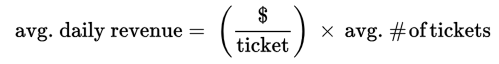
The price per ticket is given in the question ($4.70), and the top graph gives the average daily number of tickets sold. In 1980, the average daily number of tickets sold was 50,000, so the average daily revenue is 50,000 × $4.70 = $235,000. The question asks for the revenue in thousands, so the answer is 235.
- (D)
To answer this question, you’ll need information about both gift shop revenue and the average number of full-price tickets sold. The former can be found in the middle graph, and the latter can be found in the top graph.
In 2000, total gift shop revenue for the year was $3,600,000 and the average daily number of full-price tickets sold was 90,000. The question asks how many times greater 3,600,000 is than 90,000. To find out, divide 3,600,000 by 90,000 (using the calculator!).
The answer is 40, choice (D).
- (D)
Percent increase is defined as the change divided by the original value. In this question then, the percent increase can be found using the following formula (let x stand for the average daily full-price ticket sales):

Information on the average number of full-price ticket sales can be found in the top graph. The average number in 1990 was 220 and in 1995 it was 325:


Remember that the question asks you to approximate. The answer is closest to choice (D).
-
Statement II only This question asks which statements can be inferred from the data, therefore, you have to use the process of elimination and treat each statement as its own mini question.
First statement: Identify the five-year periods in which gift shop revenue (middle graph) decreased: 1990–1995 & 1995–2000. Next, locate the graph for average ticket sales, which is the top graph. Ticket sales did not decrease in 1990–1995, so statement I is false.
Second statement: The graph for gift shop revenue is the middle one. Locate the biggest jump—it is from 2.3 to 5. Compute the size of this jump: 5 − 2.3 = 2.7, so statement II is true.
Third statement: The graph for duration of visits is the bottom one. The increase from 1995–2000 was 104 − 97, which equals 7 minutes, not 12 minutes, so statement III is false.
Only the box for the second statement should be selected.
-
Problem B
- (D)
For specific information about trucks and passenger cars, look at the middle graph. Though the pie chart does not give specific information about the number of cars or the number of trucks, it does tell you what percent of the total number of private vehicles each represents. Because each of the percents is out of the same total, you can compare the percents directly to find the ratio of cars to trucks.
Note: You could also use the information in the top graph to calculate the actual numbers of cars and trucks, but that would be time-consuming and unnecessary.
Remember that the question asks you to approximate. The ratio of 4 percent to 59.5 percent is approximately the ratio of 4 to 60. Reduce the ratio to get the correct answer, 1 : 15.
- (E)
To find the total numbers of miscellaneous public transit vehicles and public transit trolley buses, you will need to combine information from the top and bottom graphs.
According to the top graph, there were roughly 120,000 public transit vehicles in 2000 (remember the question asks you to approximate). Of those 120,000 public transit vehicles, 4 percent were miscellaneous vehicles and 1.5 percent were trolley buses.
The difference in the number of miscellaneous and trolley bus vehicles is:
(0.04 × 120,000) − (0.015 × 120,000) Either calculate both numbers and subtract, or realize that the difference will be (0.04 − 0.015) × 120,000. However you perform the calculation, the difference is 3,000.
- (A)
Percent increase is defined as change divided by original value. In this question then, the percent increase can be found using the following formula (let x stand for the total number of U.S. aircraft, vehicles, and other conveyances):

The question says that the total number in 1995 was 572,000. The total number in 2000 can be found in the top graph. Fortunately, the question doesn’t require you to add the values in every column together! At the bottom, the graph states that the total number of conveyances was 785,000.
Find the approximate percent increase:

Answer choice (A) is the closest to the real value.
- (B)
Rephrase the question as a mathematical expression. To save time, write x for “the number of demand-response vehicles that experience mechanical problems” when you rephrase the question. The key thing to remember here is the relationship between percentages and absolute numbers. Multiply the percentage times the total to get the absolute quantity:
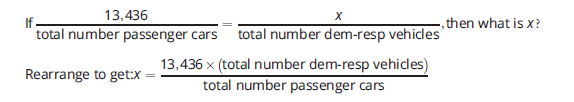
You know from the first pie that demand-response vehicles makes up 24.4 percent of all public transit vehicles, and you know from the main chart that there are roughly 120,000 public transit vehicles, so you can calculate the approximate number of demand-response vehicles:
0.244 × 120,000 = 29,280 You know from the second pie that passenger cars makes up 59.5 percent of all private highway vehicles, and you know from the main chart that there are about 225,000 private highway vehicles, so you can calculate the approximate number of private highway vehicles:
0.595 × 225,000 = 133,875 So, pulling it all together:

To avoid overloading the calculator display, you must divide 13,436 by 133,875 before multiplying by 29,280.
The answer is (B).
-
Problem C
- (E)
One of the answer choices is “cannot be determined,” so check exact wording and be sure you have enough information to solve it before doing any math.
Locate the relevant column within the table in the chart on the bottom: “Uranium, Titanium, & Aluminum.” The figures in this column represent Uranium + Titanium + Aluminum, but do not tell you the level of Aluminum alone. Because the question is asking only about Aluminum, you do not have enough information.
The answer is (E).
- (A)
Rephrase the question. Expressing the desired percentage as a fraction is a good way to abbreviate the question:
In 1996 – 2000,

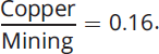
The chart that mentions Copper is on the bottom and tells you that from 1996–2000, Copper was 16% of Mining Industries’ Production. In other words, it tells you that the value of
 This is not quite what you are looking for, because the question is about
  Look to the top chart to see if it provides a way to convert your
  information into a
  figure.
The top chart gives you information on Metals, Borates, Coal, and Salt—all of the components of Mining from the bottom table—as a percentage of GDP. You will therefore be able to use the following equation to get

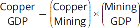
Substitute numbers into the above equation. The top chart tells you that from 1996–2000, Metals were 9 percent of GDP and Borates, Coal, and Salt were each roughly 3% of GDP. Thus, total Mining was roughly 9% + 3% + 3% + 3%, or 18% of GDP.
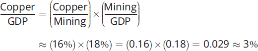
The answer is (A).
- Statement II only.
First statement: For each time period, the production of Borates, in the bottom chart, is given as 15% of that period’s Mining Industries’ Production. Each period has a different dollar figure for Mining Industries’ Production, therefore, Borate production is not the same in all of the periods. (For example, from 1981–1985, Borate production was 15% × $342.5, whereas from 1986–1990, Borate production was 15% ’ $326.8.) Statement I is therefore false.
Second statement: To test whether this is true, notice that the dollar values of Gold & Silver production were:
- 81–85: 20% × $342.5
- 86–90: 17% × $326.8
- 91–95: 20% × $310
- 96–00: 22% × $257.9
- 01–05: 24% × $205
You can eliminate two of these five choices without doing any arithmetic. The figure for 86–90 is clearly lower than that for 81–85, because 86–90 has a lower percentage (17% as opposed to 20%) times a lower dollar amount ($326.8 as opposed to $342.5). Along the same lines, you can see that 91–95 is lower than 81–85: the percentage is the same for both periods (20%), but for 91–95 that percentage is multiplied by a smaller dollar amount ($310 as opposed to $342.5). For the three remaining periods, use the calculator:
- 81–85: 20% × $342.5 = 68.50
- 96–00: 22% × $257.9 = 56.74
- 01–05: 24% × $205 = 49.20
These calculations show that 81–85 had the highest Gold & Silver production, so statement II is true.
Third statement: It concerns which period had the highest Gross Domestic Product (GDP). You clearly need to use the TOP chart, because it is the one that mentions GDP. However, the top chart is not enough, because it only gives information as percentages. To get dollar amounts for GDP, you need to connect the dollar amounts in the bottom chart with the percentages in the top chart.
One way to figure out GDP in 2001–2005 would be to focus on Salt. The top table gives a figure for Salt as a percentage of GDP (roughly 3.5%), and the bottom table allows you to figure out the dollar amount of Salt production (17% × $205 million). Substituting these figures into the following equation, you could solve for GDP:

However, performing this calculation, and similar calculations for other time periods, would be too much work. It is a good idea to focus on Borates instead, since Borates accounted for the same percentage (15%) of Mining Industries’ Production in each of the time periods shown. Consider the equation:

Compare 1981–1985 to 2001–2005. In 2001–2005, the numerator (Borates) of the fraction
 was lower than in any other time period—it was 15 percent of the lowest value ($205 million) for Mining Industries’ Production. On the other hand, 2001–2005 saw the denominator
  of our large fraction assume its highest value (≈ 3%), because the top chart shows that 2001–2005 was the only time frame in which Borate production was more than 3 percent of GDP. Thus,
 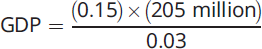 for 2001–2005.
From 1981–1985, Borates were 15 percent of a much greater total ($342.5 million), but were a smaller percentage of GDP (≈ 1.5%). So
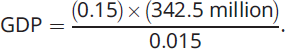 This fraction has a larger numerator and a smaller denominator, which will result in a higher total GDP. Statement III is therefore false.
Only the box for the second statement should be checked.