… is to move beyond the world of risk-free hedging and enter the exciting and dangerous world of gambling, also known as investing, in risky assets. You will see some simple ideas for deciding how to allocate your money between all the possible investments on offer.
 Modern Portfolio Theory and the Capital Asset Pricing Model optimizing your portfolio alternative methodologies such as cointegration how to analyze portfolio performance
The theory of derivative pricing is a theory of deterministic returns: we hedge our derivative with the underlying to eliminate risk, and our resulting risk-free portfolio then earns the risk-free rate of interest. Banks make money from this hedging process; they sell something for a bit more than it’s worth and hedge away the risk to make a guaranteed profit.
But not everyone is hedging. Fund managers buy and sell assets (including derivatives) with the aim of beating the bank’s rate of return. In so doing they take risk. In this chapter I explain some of the theories behind the risk and reward of investment. Along the way I show the benefits of diversification, how the return and risk on a portfolio of assets is related to the return and risk on the individual assets, and how to optimize a portfolio to get the best value for money.
For the most part, the assumptions are as follows:
In this section I introduce some more notation, and show the effects of diversification on the return of the portfolio.
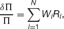
We hold a portfolio of N assets. The value today of the ith asset is Si and its random return is Ri, over our time horizon T. The Rs are Normally distributed with mean μiT and standard deviation  . The correlation between the returns on the ith and jth assets is ρij (with ρii = 1). The parameters μ, σ and ρ correspond to the drift, volatility and correlation that we are used to. Note the scaling with the time horizon.

If we hold Wi of the ith asset, then our portfolio has value

At the end of our time horizon the value is

We can write the relative change in portfolio value as
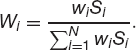
where
The weights Wi sum to one.
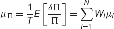
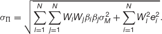
From (21.1) it is simple to calculate the expected return on the portfolio
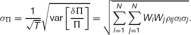
and the standard deviation of the return
In these, we have related the parameters for the individual assets to the expected return and the standard deviation of the entire portfolio.
Suppose that we have assets in our portfolio that are uncorrelated, ρij = 0, i ≠ j. To make things simple assume that they are equally weighted so that Wi = 1/N. The expected return on the portfolio is represented by
the average of the expected returns on all the assets and the volatility becomes
This volatility is O(N−1/2) since there are N terms in the sum. As we increase the number of assets in the portfolio, the standard deviation of the returns tends to zero. It is rather extreme to assume that all assets are uncorrelated but we will see something similar when I describe the Capital Asset Pricing Model below, diversification reduces volatility without hurting expected return.
I am now going to refer to volatility or standard deviation as risk, a bad thing to be avoided (within reason), and the expected return as reward, a good thing that we want as much of as possible.

Time Out…
Spreadsheet test
In the following spreadsheet you can see the effect of investing all your cash in one risky asset, or of spreading it across four equally risky but uncorrelated assets. A convincing case for diversification … but watch out for those market crashes when all correlations become one.
Simple example of diversification


We can use the above framework to discuss the ‘best’ portfolio. The definition of ‘best’ was addressed very successfully by Nobel Laureate Harry Markowitz. His model provides a way of defining portfolios that are efficient. An efficient portfolio is one that has the highest reward for a given level of risk, or the lowest risk for a given reward. To see how this works imagine that there are four assets in the world, A, B, C and D, with reward and risk as shown in Figure 21.1 (ignore E for the moment). If you could buy any one of these (but as yet you are not allowed more than one), which would you buy? Would you choose D? No, because it has the same risk as B but less reward. It has the same reward as C but for a higher risk. We can rule out D. What about B or C? They are both appealing when set against D, but against each other it is not so clear. B has a higher risk, but gets a higher reward. However, comparing them both with A we see that there is no contest. A is the preferred choice. If we introduce asset E with the same risk as B and a higher reward than A, then we cannot objectively say which out of A and E is the better, this is a subjective choice and depends on an investor’s risk preferences.
Figure 21.1 Risk and reward for five assets.

Now suppose that I have the two assets A and E of Figure 21.2, and I am now allowed to combine them in my portfolio, what effect does this have on my risk/reward?
Figure 21.2 Two assets and any combination.

From (21.2) and (21.3) we have

and

Here W is the weight of asset A, and, remembering that the weights must add up to one, the weight of asset E is 1 − W.
Demonstration of optimal asset allocation
As we vary W, so the risk and the reward change. The line in risk/reward space that is parameterized by W is a hyperbola, as shown in Figure 21.2. The part of this curve in bold is efficient, and is preferable to the rest of the curve. Again, an individual’s risk preferences will say where he wants to be on the bold curve. When one of the volatilities is zero the line becomes straight. Anywhere on the curve between the two dots requires a long position in each asset. Outside this region, one of the assets is sold short to finance the purchase of the other. Everything that follows assumes that we can sell short as much of an asset as we want. The results change slightly when there are restrictions.
If we have many assets in our portfolio we no longer have a simple hyperbola for our possible risk/reward profiles, instead we get something like that shown in Figure 21.3. This figure now uses all of A, B, C, D and E, not just the A and E. Even though B, C and D are not individually appealing they may well be useful in a portfolio, depending how they correlate, or not, with other investments. In this figure we can see the efficient frontier marked in bold. Given any choice of portfolio we would choose to hold one that lies on this efficient frontier.
Figure 21.3 Portfolio possibilities and the efficient frontier.

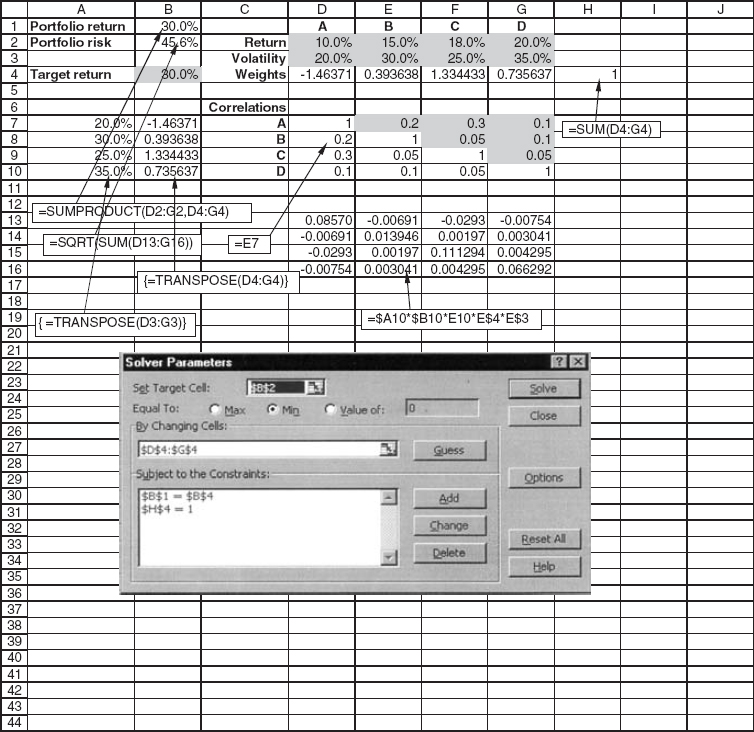
The calculation of the risk for a given return is demonstrated in the spreadsheet in Figure 21.4. This spreadsheet can be used to find the efficient frontier if it is used many times for different target returns.
Figure 21.4 Spreadsheet for calculating one point on the efficient frontier.
A risk-free investment earning a guaranteed rate of return r would be the point F in Figure 21.3. If we are allowed to hold this asset in our portfolio, then since the volatility of this asset is zero, we get the new efficient frontier which is the straight line in the figure. The portfolio for which the straight line touches the original efficient frontier is called the market portfolio. The straight line itself is called the capital market line.1
Having found the efficient frontier we want to know whereabouts on it we should be. This is a personal choice; the efficient frontier is objective, given the data, but the ‘best’ position on it is subjective.
The following is a way of interpreting the risk/reward diagram that may be useful in choosing the best portfolio.
The return on portfolio Π is Normally distributed because it is comprised of assets which are themselves Normally distributed. It has mean μΠ and standard deviation σΠ (I have ignored the dependence on the horizon T).
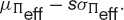
The slope of the line joining the portfolio Π to the risk-free asset is

This is an important quantity, it is a measure of the likelihood of Π having a return that exceeds r. If C(·) is the cumulative distribution function for the standardized Normal distribution then C(s) is the probability that the return on Π is at least r. More generally
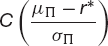
is the probability that the return exceeds r*. This suggests that if we want to minimize the chance of a return of less than r* we should choose the portfolio from the efficient frontier set Πeff with the largest value of the slope

Conversely, if we keep the slope of this line fixed at s then we can say that with a confidence of C(s) we will lose no more than

Our portfolio choice could be determined by maximizing this quantity. These two strategies are shown schematically in Figure 21.5.
Figure 21.5 Two simple ways for choosing the best efficient portfolio.

Neither of these methods give satisfactory results when there is a risk-free investment among the assets and there are unrestricted short sales, since they result in infinite borrowing.
Another way of choosing the optimal portfolio is with the aid of a utility function. This approach is popular with economists. In Figure 21.6 I show indifference curves and the efficient frontier. The curves are called by this name because they are meant to represent lines along which the investor is indifferent to the risk/reward tradeoff. An investor wants high return and low risk. Faced with portfolios A and B in the figure, he sees A with low return and low risk, but B has a better reward at the cost of greater risk. The investor is indifferent between these two. However, C is better than both of them, being on a preferred curve.
Figure 21.6 The efficient frontier and indifference curves.


The inputs to the Markowitz model are expected returns, volatilities and correlations. With N assets this means N + N + N(N − 1)/2 parameters. Most of these cannot be known accurately (do they even exist?), only the volatilities are at all reliable. Having input these parameters, we must optimize over all weights of assets in the portfolio: choose a portfolio risk and find the weights that make the return on the portfolio a maximum subject to this volatility. This is a very time-consuming process computationally unless one only has a small number of assets.
The problem with the practical implementation of this model was one of the reasons for development of the simpler model of the next section.
Before discussing the Capital Asset Pricing Model or CAPM we must introduce the idea of a security’s beta. The beta, βi, of an asset relative to a portfolio M is the ratio of the covariance between the return on the security and the return on the portfolio to the variance of the portfolio. Thus

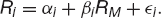
I will now build up a single-index model and describe extensions later. I will relate the return on all assets to the return on a representative index, M. This index is usually taken to be a wide-ranging stock market index in the single-index model. We write the return on the ith asset as
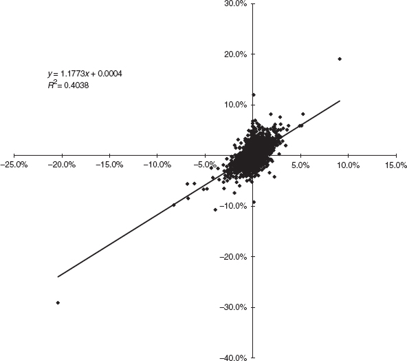
Using this representation we can see that the return on an asset can be decomposed into three parts: a constant drift, a random part common with the index M and a random part uncorrelated with the index,  i. The random part i is unique to the ith asset, and has mean zero. Notice how all the assets are related to the index M but are otherwise completely uncorrelated. In Figure 21.7 is shown a plot of returns on Walt Disney stock against returns on the S&P500; α and β can be determined from a linear regression analysis. The data used in this plot ran from January 1985 until almost the end of 1997.
Figure 21.7 Returns on Walt Disney stock against returns on the S&P500.
The expected return on the index will be denoted by μM and its standard deviation by σM. The expected return on the ith asset is then

and the standard deviation
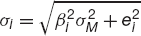
where ei is the standard deviation of i.
If we have a portfolio of such assets then the return is given by
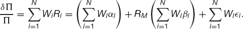
From this it follows that
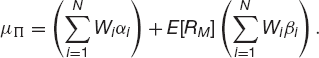
Let us write
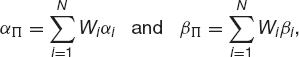
so that

Similarly the risk in Π is measured by
If the weights are all about the same, N−1, then the final terms inside the square root are also O(N−1). Thus this expression is, to leading order as N → ∞,
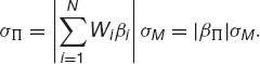
Observe that the contribution from the uncorrelated s to the portfolio vanishes as we increase the number of assets in the portfolio: the risk associated with the s is called diversifiable risk. The remaining risk, which is correlated with the index, is called systematic risk.
Time Out…
Finding beta
It’s really easy to find beta from asset returns and index returns data using Excel. See the spreadsheet below. I’ve used the Add Trendline option when drawing the plot. This finds the best-fit straight line through the data, the slope of which is the beta.

The principle is the same as the Markowitz model for optimal portfolio choice. The only difference is that there are a lot fewer parameters to be input, and the computation is a lot faster.
The procedure is as follows. Choose a value for the portfolio return μΠ. Subject to this constraint, minimize σΠ. Repeat this minimization for different portfolio returns to obtain efficient frontier. The position on this curve is then a subjective choice.
The model presented above is a single-index model. The idea can be extended to include further representative indices. For example, as well as an index representing the stock market one might include an index representing bond markets, an index representing currency markets or even an economic index if it is believed to be relevant in linking assets. In the multi-index model we write each asset’s return as

where there are n indices with return Rj The indices can be correlated to each other. Similar results to the single-index model follow.
It is usually not worth having more than three or four indices. The fewer the parameters, the more robust will be the model. At the other extreme is the Markowitz model with one index per asset.
Whether you use MPT or CAPM you will always worry about the accuracy of your parameters. Both of these methods are only as accurate as the input data, CAPM being more reliable than MPT generally speaking, because it has fewer parameters. There is another method which is gaining popularity, and which I will describe here briefly. It is unfortunately a complex technique requiring sophisticated statistical analysis (to do it properly) but which at its core makes a lot of sense. Instead of asking whether two series are correlated we ask whether they are cointegrated.
Two stocks may be perfectly correlated over short timescales yet diverge in the long run, with one growing and the other decaying. Conversely, two stocks may follow each other, never being more than a certain distance apart, but with any correlation, positive, negative or varying. If we are delta hedging then maybe the short timescale correlation matters, but not if we are holding stocks for a long time in an unhedged portfolio. To see whether two stocks stay close together we need a definition of stationarity. A time series is stationary if it has finite and constant mean, standard deviation and autocorrelation function. Stocks, which tend to grow, are not stationary. In a sense, stationary series do not wander too far from their mean.
We can see the difference between stationary and non-stationary with our first coin-tossing experiment. The time series given by 1 every time we throw a head and −1 every time we throw a tail is stationary. It has a mean of zero, a standard deviation of 1 and an autocorrelation function that is zero for any non-zero lag. But what if we add up the results, as we might do if we are betting on each toss? This time series is non-stationary. This is because the standard deviation of the sum grows like the square root of the number of throws. The mean may be zero but the sum is wandering further and further away from that mean.
Testing for the stationarity of a time series Xt involves a linear regression to find the coefficients a, b and c in
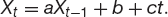
If it is found that |a| > 1 then the series is unstable. If −1 ≤ a < 1 then the series is stationary. If a = 1 then the series is non-stationary. As with all things statistical, we can only say that our value for a is accurate with a certain degree of confidence. To decide whether we have got a stationary or non-stationary series requires us to look at the Dickey–Fuller statistic to estimate the degree of confidence in our result. From this point on the subject of cointegration gets complicated.
How is this useful in finance? Even though individual stock prices might be non-stationary it is possible for a linear combination (i.e. a portfolio) to be stationary. Can we find λi, with ∑i=1N λi = 1, such that

is stationary? If we can, then we say that the stocks are cointegrated.
For example, suppose we find that the S&P500 is cointegrated with a portfolio of 15 stocks. We can then use these 15 stocks to track the index. The error in this tracking portfolio will have constant mean and standard deviation, so should not wander too far from its average. This is clearly easier than using all 500 stocks for the tracking (when, of course, the tracking error would be zero).
We don’t have to track the index, we could track anything we want, such as e0.2t to choose a portfolio that gets a 20% return. We could analyze the cointegration properties of two related stocks, Nike and Reebok, for example, to look for relationships. This would be pairs trading. Clearly there are similarities with MPT and CAPM in concepts such as means and standard deviations. The important difference is that cointegration assumes far fewer properties for the individual time series. Most importantly, volatility and correlation do not appear explicitly.
If one has followed one of the asset allocation strategies outlined above, or just traded on gut instinct, can one tell how well one has done? Were the outstanding results because of an uncanny natural instinct, or were the awful results simply bad luck?
The ideal performance would be one for which returns outperformed the risk-free rate, but in a consistent fashion. Not only is it important to get a high return from portfolio management, but one must achieve this with as little randomness as possible.
The two commonest measures of ‘return per unit risk’ are the Sharpe ratio of ‘reward to variability’ and the Treynor ratio of ‘reward to volatility’. These are defined as follows:
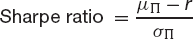
and
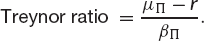
In these μΠ and σΠ are the realized return and standard deviation for the portfolio over the period. The βΠ is a measure of the portfolio’s volatility. The Sharpe ratio is usually used when the portfolio is the whole of one’s investment and the Treynor ratio when one is examining the performance of one component of the whole firm’s portfolio, say. When the portfolio under examination is highly diversified the two measures are the same (up to a factor of the market standard deviation).
In Figure 21.8 we see the portfolio value against time for a good manager and a bad manager.
Figure 21.8 A good and a bad manager; same returns, different variablity.

Portfolio management and asset allocation are about taking risks in return for a reward. The questions are how to decide how much risk to take, and how to get the best return. But derivatives theory is based on not taking any risk at all, and so I have spent little time on portfolio management in the book. On the other hand, as I have stressed, there is so much uncertainty in the subject of finance that elimination of risk is well-nigh impossible and the ideas behind portfolio management should be appreciated by anyone involved in derivatives theory or practice. I have tried to give the flavor of the subject with only the easiest-to-explain mathematics, the following sources will prove useful to anyone wanting to pursue the subject further.
| Asset | μ | σ |
| A | 0.08 | 0.12 |
| B | 0.10 | 0.12 |
| C | 0.10 | 0.15 |
| D | 0.14 | 0.20 |
1 In the risk-neutral world they think that all investments lie on the horizontal line going through the point (0, r).