6.1 Introduction
A possibility of making a dead person become alive again has been fascinating people for thousands of years. Zombies—also called the undead—can be considered a perfect example of that fascination. People have been imagining those creatures in a vast number of ways—almost every book or every film that zombies appeared in, approached the topic differently. There exists however some specific set of characteristics that zombies share in most pieces of works that mention their existence. They are usually described as very anomalous beings, extremely hostile to the humankind and willing to entirely destroy it or turn all ‘ordinary’ people into zombies. Hence, the zombie invasion could hypothetically be considered a threat for the entire human civilisation. Regardless of what the majority of people might think of it, there are still thousands who strongly believe that the ultimate end of the human civilisation will be a widespread rise of hordes of zombies.
Nevertheless, most of us would admit that the zombie apocalypse is not the most plausible scenario of the how our civilisation ends, especially considering that the today’s world is facing multiple more tangible issues. However, from some perspectives, an event like this can be considered worth looking at with a scientific eye and one can name at least few reasons. First and foremost—modelling an event like the zombie invasion differs significantly from the ‘classical’ modelling process, i.e. creating a model of an existing and real-life phenomenon. In case of creating a mathematical description of anything we know from the world around us, the modeller needs to be very concious of the tools and concepts they employ. This is obviously driven by the fact that any scientific theory aiming to describe a real-life phenomenon must necessarily be compared to the experimental data. And it is absolutely clear as well that scientific results are evaluated based on the agreement between scientist’s theoretical model and the observations. Although this should be very natural for everyone—it is clear that we all want our theories to describe the surrounding world accurately—from some other perspective this urge for obtaining valuable and sterling results can be seen as a factor limiting creativeness. It is difficult to argue that the pervasive need for scientific usability makes us try to follow the paths which look most promising from the perspective of measurable results, which can be immediately applied. Arguably, it is also worth to look at the scientific progress form a kind of reversed perspective. Modelling a more abstract, less realistic ideas or processes (like, in this case, the zombie invasion for example) enables us to analyse the issue more freely, without unnecessary borders and limits, lets us to think outside of the box and somewhat play with the problem. Results obtained this way are not usually ready to be directly used right after developing them but they may change scientist’s perspective and their point of view, they may feature new research methods and may become an inspiration for totally new studies which might turn out to unexpectedly pop out in some future research.
This was the actual reason for our research project of modelling the zombie invasion—not only does it sound more intriguing and more approachable in reception (although we admit that this can serve as an asset too), but it also creates an opportunity to do science differently, in a way oriented on methods rather than the results. So—as our main target we picked creating a model of an extremely fast-spreading epidemic totally from scratch, with minimal number of pre-settled assumptions, but general enough to possibly be ‘calibrated’ to some known contagious disease in the future. The only requirement, in some ways defining the direction of the development of the model was that the spreading scheme should be based on the population density maps and should embrace a premiss (taken purely from the common sense) that more densely populated areas should be more vulnerable to faster epidemic spreading. Agreeing only for those high-level assumptions marked a point where the actual project development could have been started.
6.2 Data Preparation
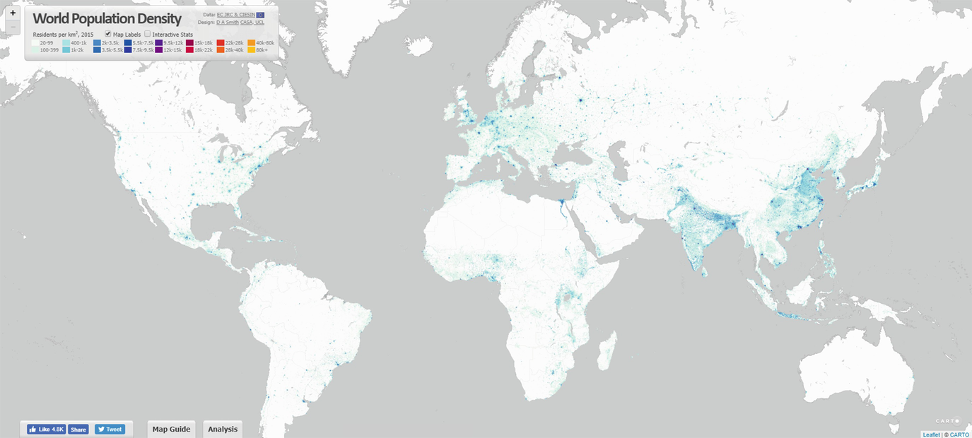
Interface of the world population density webpage [6]
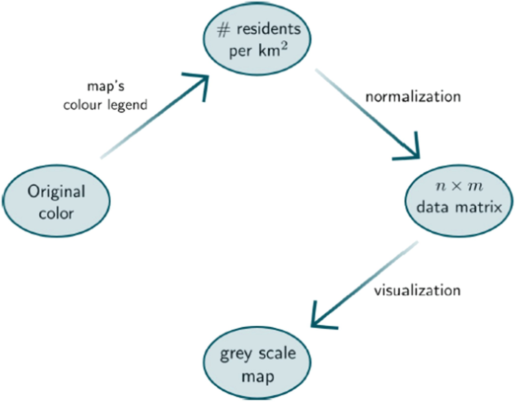
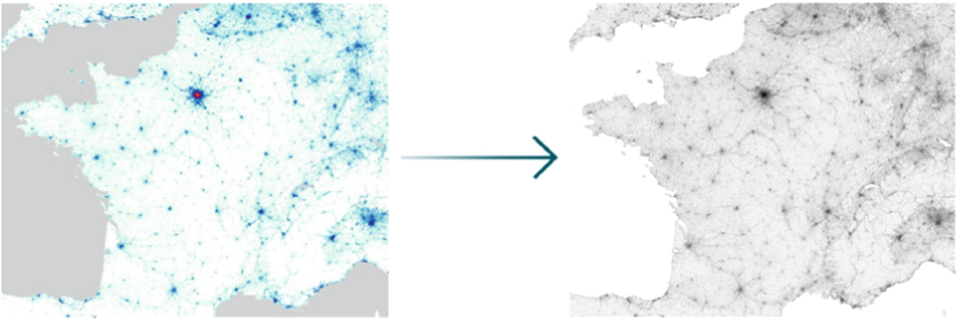
Just like in case of most maps of this kind, the density population was represented by a colour scale. In order to use information that such maps convey, it is obviously needed to quantify it, i.e. move it from a format of a picture to some specific numeric data type. The picture itself can be viewed as a structure composed of pixels—tiny, square pieces of the image. Each pixel can be uniquely identified by its position in a picture (i, j) ∈ (1, n) × (1, m), where n is height of the image and m is its width, expressed in the number of pixels. Having that said, any method that can be used to move the entire picture from any on-line location into our computer’s workspace should start by scanning the image, pixel by pixel. This can be done effectively in many different programming languages and author’s language of choice was Python 3 [7] with the usage of an image processing library called Pillow [2] and other side modules [4, 5]. The entire purpose of scanning all pixels of the image is actually to save the data of a colour value of each of them. The most common way to keep the information about the colour in a numeric way is by analysing what is called the RGB value of it. From the mathematical point of view, RGB is simply a vector of three numbers (r, g, b), r, g, b ∈ [0, 255] each of them representing the saturation of the red, blue and green colour component respectively. Only having the value of the RGB for every pixel of the image one can actually start analysing it.

Legend for the data population maps available under http://luminocity3d.org [6]

 is the sharpened version of the original colour (r
(i, j), g
(i, j), b
(i, j)) of a given pixel and (r
k, g
k, b
k), k ∈{1, 2, …, 16} is the RGB value of each of the 16 colours of the map.
 represents the grey scale colour value of the pixel in position (i, j) and ρ
(i, j) is the entry in position (i, j) of the matrix containing data of population density normalised to only have values between 0 and 1 (obtained as described above).
represents the grey scale colour value of the pixel in position (i, j) and ρ
(i, j) is the entry in position (i, j) of the matrix containing data of population density normalised to only have values between 0 and 1 (obtained as described above).6.3 Model Description
Once we had the data prepared, the actual modelling part could have been started. Our starting point was the normalised density population matrix ρ. We now wanted to treat the elements of this matrix as indicators of how many people live in a given area and further—we wanted to split those people into two groups—healthy ones (denoted by H) and the zombies (which we will mark as Z). As we were interested in the evolution of those quantities in both space and time, they should both be space- and time-dependent, so that  and
and  should be understood as indicators of the number of individuals occupying area represented by map position (i, j) at time t, which belong to healthy population or to the zombies, respectively. We now wanted to describe the mechanism of how the sizes of these two groups change in time, i.e. how people turn into zombies. We created 3 models of that process which vary in assumptions that were made and we shall now describe them in the order of ascending complexity.
6.3.1 Simple Deterministic Model


 we denote what we call the contamination, i.e. the fraction of healthy people from a given area (i, j), which were turned into zombies at time t. More advanced readers may note the similarity of this description to the one of the classical SI model [3], however, since we were dealing not only with time-related but also with spacial aspects of the invasion spreading, we continued to develop our model ourselves, instead of trying to adjust the classical one to make use of it.
 and
and  depends directly on
  and
and  . This means that for the description to be complete, we need to set up the initial conditions. Let us set them up in the following way

 is a place where the outbreak occurs and γ ∈ (0, 1] is the ratio of people who become zombies in that place at time t = 0. Now—coming back to the topic of the contamination. As mentioned at the beginning of this section, for each piece of area (represented by a single pixel) it should be dependent on the number of zombies that this particular area was in contact with at a given moment of time. Hence, we proposed the following way of calculating contamination
In formula (6.6)  represents the neighbourhood of (i, j), i.e. the set of positions which we consider to affect (i, j) in terms of the possibility of the zombie attack. For example, the classical neighbourhood (often referred to as von Neumann neighbourhood) is the set of positions adjacent from top, bottom, left and right to the position in question. In such a set-up, we have for example
  . Pixel’s self-inclusion in its neighbourhood scheme ensures that if a given point already has some zombies, there will be more of them in the next time step, even if this spot does not yet have any contaminated neighbours. Since we are dealing with the data normalised to fit between 0 and 1, at any point of time the cumulative value of the zombies’ component within a given neighbourhood constructed of k positions cannot exceed k. Hence, the value of the fraction
  is between 0 and 1 so the value of this fraction itself could serve as a decent definition of contamination. However, to give ourselves a bit more modelling freedom we decided to introduce one more parameter, α, to artificially rise or decrease the contamination value. We called it infectiousness and explain it as a measure of invasion’s strength in terms of spreading. Setting α to be a big number makes the invasion develop faster. It must be noted that multiplying by α, especially if its value is much bigger than 1, might make the contamination ratio rise above the value of 1, which is unacceptable (as the value of
  could drop below zero, as per Eq. (6.2)). Therefore, we added a safety feature in the form of a
  function.
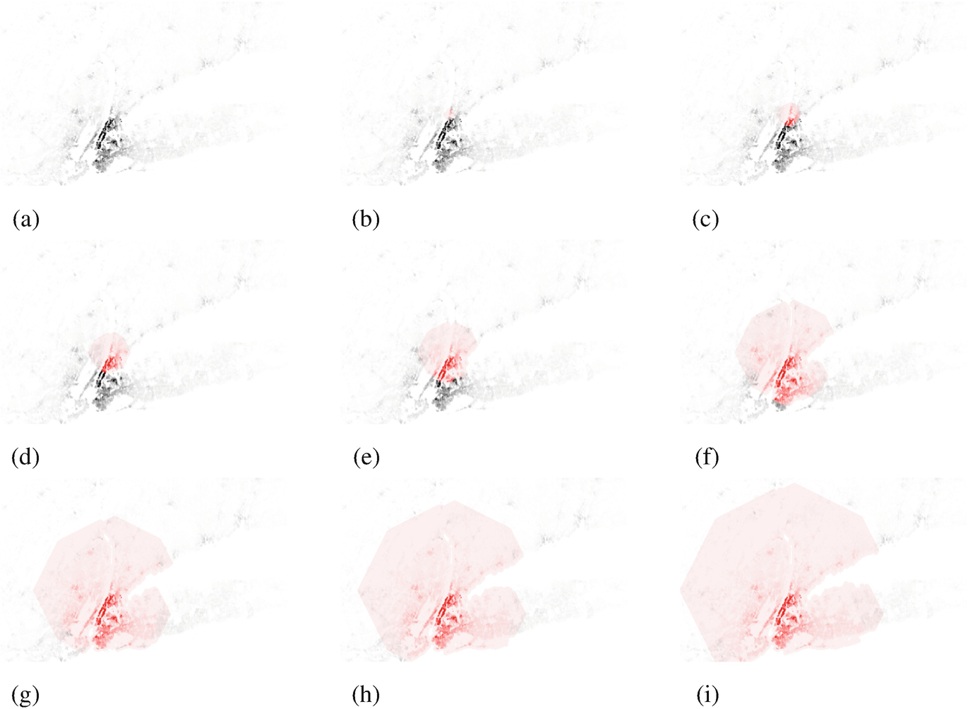
Snapshots of the process of the zombie invasion, as per the rules of the model described in Sect. 6.3.1. (a) Zombie spread at t = 0. (b) Zombie spread at t = 3. (c) Zombie spread at t = 6. (d) Zombie spread at t = 10. (e) Zombie spread at t = 15. (f) Zombie spread at t = 25. (g) Zombie spread at t = 35. (h) Zombie spread at t = 42. (i) Zombie spread at t = 50
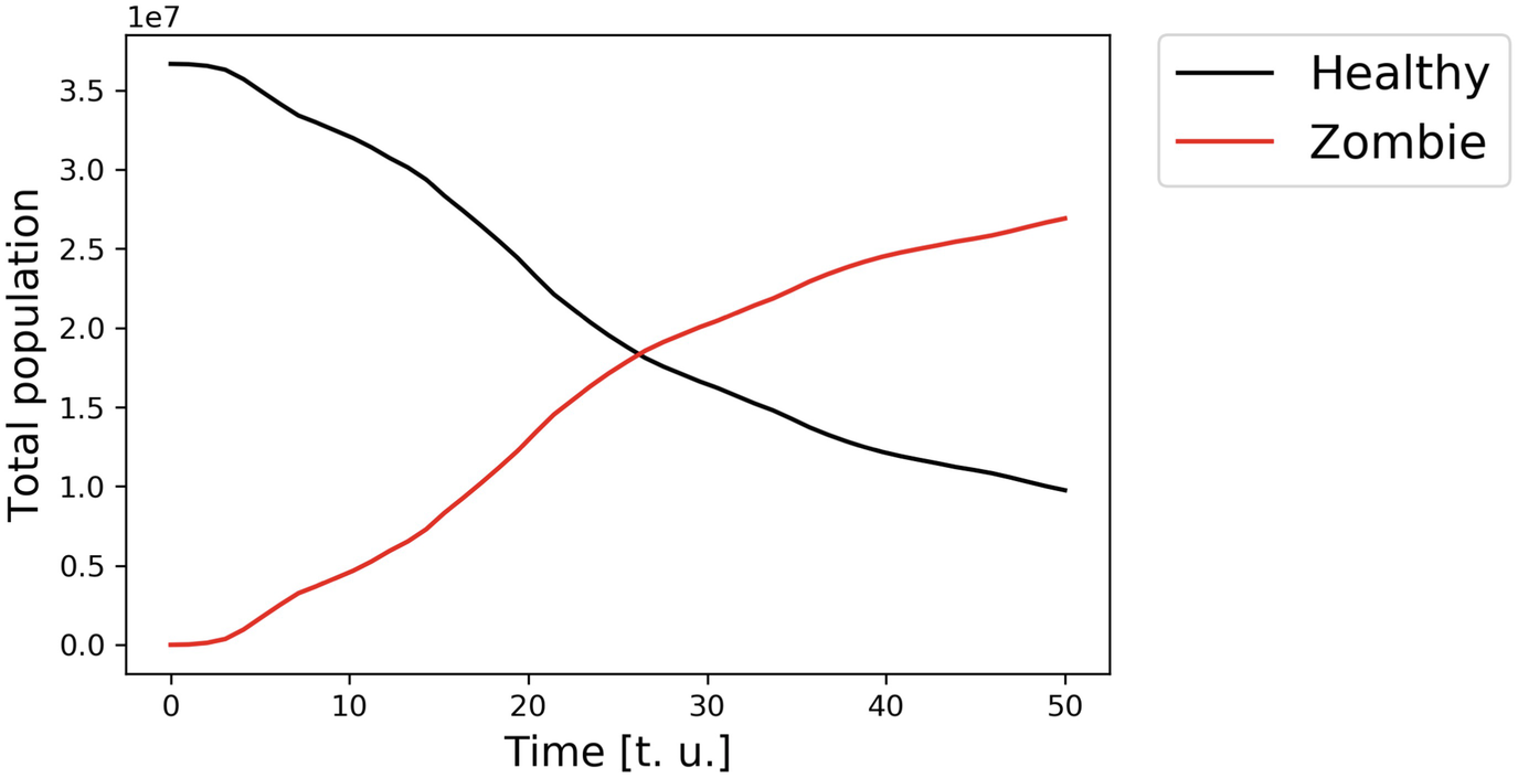
Populations of healthy people and zombies as functions of time, within the model described in Sect. 6.3.1
6.3.2 Probabilistic Model (Without Recovery)


 which is a random variable from a Bernoulli distribution with parameter f, f ∈ [0, 1]:


We therefore see no changes at all—we can say, healthy people are 100% effective in resisting zombies’ spread. We can therefore think of f as of a slider which lets us decide on what is the actual probability that a given point on the map, in certain moment of the simulation, turns out to defend itself from the zombie attack. Thanks to this we successfully introduced an intuitive randomization to the flow of the model execution.

Snapshots of the process of the zombie invasion, as per the rules of the model described in Sect. 6.3.2. (a) Zombie spread at t = 0. (b) Zombie spread at t = 5. (c) Zombie spread at t = 15. (d) Zombie spread at t = 25. (e) Zombie spread at t = 35. (f) Zombie spread at t = 45. (g) Zombie spread at t = 65. (h) Zombie spread at t = 85. (i) Zombie spread at t = 100
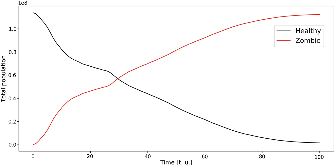
Populations of healthy people and zombies as functions of time, within the model described in Sect. 6.3.2
6.3.3 Probabilistic Model (with Recovery)


As we can see—two new parameters appeared in Eqs. (6.15) and (6.16), compared to the Eqs. (6.7) and (6.8), describing the previous model. Those parameters are  and
and  .
.  is again, a random variable from Bernoulli distribution with success parameter s ∈ [0, 1] which we called the development factor. It plays a similar role to the role of
  in the previous model—introduces randomness. We thought that the more developed a given country is, the more likely it will be that each and every cell will start curing itself if it only had a chance to do so (this will likely be a case for a big value of the development factor s) but if the level of the development of the society is low—there might be problems with transferring cure from one neighbourhood to the other (such situation would be modelled by a small value of s).
 —the recovery factor, i.e. the fraction of zombies who become recovered (note the similarity to the contamination parameter, first introduced in Eqs. (6.2) and (6.3)). Its precise definition is
 takes care. It is defined as follows
The idea of the indicator is quite simple—for the cell (i, j) at the moment t, the value of the indicator is 1 if there are any cells in the neighbourhood which contain any recovered people. This information is then used to establish the fraction of people that will be cured from being zombies—to do that we multiply  by an additional parameter β ∈ (0, 1], which we call the purification constant. This constant helps us to control the speed in which zombies will be converted into recovered humans once they have access to cure through their neighbours.

Snapshots of the process of the zombie invasion, as per the rules of the model described in Sect. 6.3.3. (a) Zombie spread at t = 0. (b) Zombie spread at t = 40. (c) Zombie spread at t = 50. (d) Zombie spread at t = 60. (e) Zombie spread at t = 70. (f) Zombie spread at t = 80. (g) Zombie spread at t = 100. (h) Zombie spread at t = 120. (i) Zombie spread at t = 150
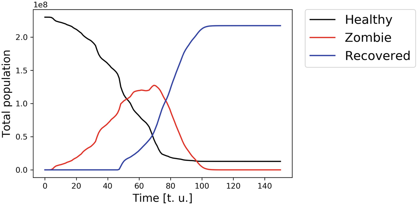
Populations of healthy people and zombies as functions of time, within the model described in Sect. 6.3.3
6.4 Conclusions
The project described above aimed to develop a model of a disorder rapidly spreading over some area for which the density population maps are available. As part of our work on the project we created as many as three such models which vary in the level of complexity. While creating the models we were not focusing on any concrete information about the actual epidemic that we were modelling, we also tried not to put any binding assumptions. Instead, we were turning nearly every variable that we used into a customisable parameter of the model. Thanks to that we were able to obtain the models which are very general and also possible to be calibrated to various kinds of real diseases, as long as they are able to spread relatively quickly. The next steps that can be taken to develop the project is to try to estimate the values of all the parameters so that the models themselves can be used for forecasting an modelling the spread of real-life contagious diseases.
The number of complex disease spreading models that are already available and well-studied is obviously huge. One of the biggest advantages of each of our models is their actual simplicity. Although the evolution equations that we used to describe the dynamics of populations of healthy and infected people might look a bit overwhelming, they mostly consist of simple arithmetic operations and feature some random factors—both of these mathematical ideas can be easily understood by most people. Models based on complicated differential equations or stochastic processes might have a lot of advantages that our models do not have but they also might be more difficult to explain to a person which does not have a solid mathematical background. In our models however, changes can be made easily and the effects of those changes are usually quite easy to predict, they can also be verified quickly by the simulation that we have performed ourselves as well. Simple tools are usually more difficult to be broken, yet, if used appropriately, they may give us valuable insights into the problems that we are studying.
Author’s inspiration for considering this research problem was a post on the blog by Max Breggren [1].
The solution to the problem of modelling zombie invasion in the shape described above was obtained during the ECMI Modelling Week 2019 in Grenoble, France, under the supervision of the author of this work. It would not be possible to achieve those results without the group of remarkably hard-working students from all over Europe. The groups members were:
• Alejandro Tobio Pena,
• Alessandro Sfilio,
• Chiara Borsani,
• Miguel Rebocho,
• Sara Costa Faya,
• Simon Li Ying Yin.
The author would like to thank all of them for their cooperativeness and involvement in the project.
