Black and white
The power of black and white
There was a time when photographs and films could only show our world in black and white. When colour film was invented it might have seemed that it would sweep black and white aside altogether, but it remains popular.
Early photographers experimented with toning, handcolouring and processes such as gum bichromate to introduce colour to this new medium, but it was laborious work and the photographic image in all its forms remained largely monochrome. Today, the situation is reversed – the vast majority of photographs are in colour, and black and white is regarded as an art form that deserves skill and patience in the making of an exhibition-quality print.
Using a red filter has rendered the blue sky almost black and increased the contrast of highlight and shadow, greatly dramatizing the picture and adding to its graphic quality.
To understand the immense power of black and white imagery, rent out DVDs of movies such as Citizen Kane, Gilda, The Third Man and the great Westerns made by John Ford and Howard Hawks; nearly every frame is a dramatic photograph. It’s very important to look at the masters of black and white photography too, such as Edward Weston, Ansel Adams, Paul Strand and, among today’s practitioners, Albert Watson, Sebastião Salgado and Sarah Moon.

This shot is intended as a metaphor of life, symbolic of the way our lives are always changing directions – we never go in a straight line but we get there in the end.
Seeing in black and white
It’s the very fact that we are surrounded by colour images that makes black and white photographs so noticeable and dramatic. Of course, our reality too is coloured and this step away into the unreal, partly abstract world of black and white imagery makes it stand out as a separate art form. It’s a powerful creative medium that requires a different approach from colour, and it’s difficult to visualize a subject equally well in both mediums at the same time.
This is because black and white relies on tone, and the absence of colour draws attention to texture and form. A scene full of vivid colour can look as if it will make a great shot, but if those colours are all of similar tone the black and white image may be rather flat. Conversely, texture and tonal contrast may go unnoticed when the viewer’s attention is distracted by colours, and if the latter don’t work well together the picture as a whole may fail to attract the eye.
Digital versus darkroom
The quality of digital printing is now so improved that it’s possible to make really good black and white prints. Some paper manufacturers have produced inkjet paper that resembles fibre-based glossy darkroom paper, while the matt watercolour papers are, to some people, preferable to a darkroom print. Other people continue to enjoy darkroom work for its history, its craft techniques and its image quality.
The bottom line is that whether digital or analogue, the art of black and white photography is visualizing our colour world in tones of grey. The projects will teach you the techniques you need to do just that.
Seeing the bigger picture
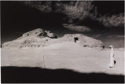
The double-page shot that opens the lesson was taken at an air show. I was in the right place at the right time to be able to see the juxtaposition of scale that makes the huge Vulcan appear to have taken off from the tail of the plane in the foreground. I used a red filter to darken the sky and also printed the picture darker and increased the contrast to add to the drama.
Filters
Using coloured filters on the lens in black and white photography has the effect of differentiating the tones in objects where they are similar.
Translated into tones of grey, colours such as red and green are rendered very much alike – a problem if you are photographing a red flower with green foliage around it, for example. A coloured filter on the lens which lightens the colours in its own part of the colour wheel (see below) and darkens the colours opposite is the solution.
For example, if you shoot a black and white picture of a red-brick house in a green field using a red filter, the red areas will be lightened and the greens darkened. The photographs here demonstrate how effective filters are in this respect.

These peppers placed on a blue background all stand out by virtue of their colour.

Shot on film without any filtration, the tonal range is very close, especially between red and green.
Digital users can set their camera to black and white and use the filters to get a similar effect, or convert a colour shot using the channel mixer in Photoshop. Go to: Layer > New Adjustment Layer > Channel Mixer. Tick Monochrome and adjust the sliders to give the filter effect you want.

An orange filter has lightened the yellow and red areas while the blue and green are darker.
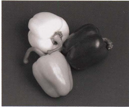
A red filter has increased the contrast between the tones even more than the orange filter.

A green filter has lightened the green and yellow areas and darkened the red and blue.

A blue filter has lightened the background considerably and darkened all of the peppers.

Here the colour spectrum is shown in the form of a wheel. A filter will lighten the colours on its own side of the colour wheel and darken the colours on the opposite side.
Colour to black and white
Visualizing your existing colour images in tones of grey is a good way of learning how to see and think in black and white instead.
When you desaturate your colour images or change them to Grayscale they may look a little dark and flat. If so, use Brightness/ Contrast or Levels in Photoshop to give them more sparkle.

This is one of a number of colour portraits I took of fishermen in Sicily. When I was editing them on the computer I decided to make a black and white version of this one to see how it looked in tones of grey. I prefer it, as I don’t like the reddish skin tones that the incandescent lamp added to the colour version. I also think the subject looks stronger and more traditional in black and white.

This seemed an interesting image to convert to black and white. With the green leaves dark grey and the pink tones of the flower lighter grey it made a great monochrome image and didn’t require any manipulation on the computer. It was shot with a 55mm macro lens at f/8, which kept the leaves slightly out of focus.
Print quality
A high-quality print makes all the difference to a black and white image, where contrast and gradations of tone are important to attract the viewer.
This landscape, shot on both colour and black and white film, demonstrates the range of tonal contrast that you can achieve from a black and white negative. It was printed in the darkroom using variable contrast paper.
If you are not already versed in darkroom printing, you will find many books that will take you through the basic stages. Here, and on p.156, the intention is to point out what to look for in a good print, for if you are working alone in a home darkroom it’s easy to keep on producing prints that don’t quite make the grade without ever recognizing it.
The fine tuning of contrast and tone in a black and white print is equally possible for digital photographers using Brightness/ Contrast or Levels in Photoshop.

This is the original negative, showing a range of tones from the dark of the sky to the light areas of foliage in the foreground.

Here it is printed low contrast to show how a very flat range of grey tones looks. Flat prints don’t usually have any areas of black or white and tend to look very insipid.

This high-contrast print also has a very limited tonal range, with areas of solid black and white and only a small range of mid-tones. The hills in the background have disappeared completely.

This is the final print. If the negative had been normal contrast it would have printed well at grade 2. However, the print at that grade was a bit flat so I increased the contrast to grade 3, retaining a full range of tones but giving the print more sparkle; brightness is vital to a fine print, unless the intention is to create a deliberately sombre effect to suit a particular subject.
Quick tip
• If you are having trouble getting a print right in the darkroom, split-grade printing might help. By masking off areas and exposing them separately at a different grade you can boost or reduce contrast where needed. This is very useful when you have a tricky negative to work with.

This version shot on colour film shows how the colours have translated into monochrome.
Final prints
Part of the pleasure of black and white is fine-tuning the final print, making carefully considered adjustments to take it to a new level.

In my first print (below) the fish is too dark and lacks a silvery glow, the tones of the background below the fingers are distracting and the fingertips are too light. I also decided that the top third could be a bit darker. For the final print, I shaded the fish for 10 seconds during the basic 22-second exposure, then burned in the background for 12 seconds. The fingers and the top of the arm were burned in for a further 5 seconds. I used a grade 3 filter and a warm-toned semi-matt fibre-based paper. The following day I decided to selenium tone the print to give it more warmth.
Whether you print in the darkroom or with the computer, the most important thing is to know what a good print looks like and how to make yours reach that standard. The images here show how you can improve a straightforward print with burning and dodging, or even combine painting with photography by handcolouring a print with a range of media.

A black and white print can be transformed by handcolouring. I shot this ginkgo leaf on a textured background in window light. I printed it lighter in tone than normal so there weren’t many black areas to apply the colour over, using matt paper so the colour would adhere. Using colour pastels and pencils, I applied the colour, blending it with cotton buds. There are also specialized oil paints for colouring prints.
Toning
The toning of black and white prints has a long history and is still popular, both to change the colour and to add longevity.
Traditional darkroom prints are treated with either single-bath toners or bleached first and then toned. The toners can be used at different strengths to vary the colours, and likewise bleaching can be done to a greater or lesser extent; for example, while people associate sepia prints with the overall faded brown of old photographs you can choose to retain the blacks in a print and use a weaker solution of sepia toning to give a light golden colour. It’s something you can experiment with for many hours to find out what you like best, and what will suit individual photographs.
Increasing the archival life of the print is of great importance when it comes to selling art prints. Selenium, gold and sepia are the toners traditionally used for this.
Digital toning
Alternatively, you can get the same colour effects using your computer software – the prints shown here were produced with Photoshop. When you have your black and white image on the computer screen, go to Image > Mode, make sure you are in RGB colour mode then > Image > Adjustments > Hue/Saturation and check Colorize. Use the Hue slider to choose your colour and the Saturation for the intensity. That’s it, without having to mix chemicals.
It’s also possible to produce duo-toned prints (two colours) with both toning methods, giving you even more choice of colour to play with.
Quick tip
• Selenium toner produces beautiful colours but is carcinogenic. Always wear gloves to use it and work in a well-ventilated room – you don’t need to be in the dark for toning as the prints are already fixed.

Black and white digital print

Blue-toned digital print

Green-toned digital print

Sepia-toned digital print

Red-toned digital print
PROJECT 1
Red and orange filters
The essential kit of any photographer shooting in black and white should include red and orange filters. If you have never tried them, you will be pleasantly surprised by the difference they make.
Red and orange filters are most often used for landscapes – in fact you will have trouble holding any sky detail without one. However, they are also useful for any subject that requires the tones in the red/orange end of the spectrum to be lightened.

A red filter on a portrait has a cosmetic effect, lightening any spots and smoothing out skin tones. This works best with front lighting – an old trick used by the Hollywood portrait photographers.
Orange filters produce tones that are a natural interpretation of blue sky and white clouds, while red filters exaggerate the contrast between them. The project here is to use an orange and red filter on the same landscape to see the difference – remember this will only work with a blue sky. The second part of the project is to try a red filter on a portrait.
When you are working with filters on film, you will need to overexpose by +1/2 or +2/3 stop. This is because the increased contrast could leave you with insufficient shadow detail. If you are shooting digitally, set the camera to black and white and just use the normal exposure settings, checking the result on the screen as you go.

An orange filter is a less dramatic alternative to a red filter for landscapes. Here it has made the sky and clouds stand out, but more subtly than in the red-filtered photograph on p.152.
PROJECT 2
Available light
Many photographers working in black and white are devoted adherents of natural light wherever possible. Its atmospheric quality lends an air of the caught moment, giving intimacy to the shot.
There is a great tradition of available light reportage photography, and indeed some of the greatest photographs ever taken could be described as available light pictures.
The use of available, or natural, light tends to be associated with photographs shot indoors in low light without the addition of flash. Because the light is of low intensity, it does not necessarily follow that it is of poor quality – in fact it is probably alive with drama. Many photographers have the lazy habit that if the light is low they just turn on the flash, killing the atmosphere of the picture which may be the very thing that attracted them in the first place.
Making the most of light
A traditional photojournalist would not dream of flashing an intimate indoor picture, and with today’s fast films and digital photography working with low natural light has become even easier. Kodak TMAX 3200 ISO can be pushed to 12000 ISO, for example, and large-aperture lenses mean that it’s nearly possible to ‘shoot a black cat in a coal cellar’, as the saying goes.
This is an exercise in turning off your flash and learning to see low-level indoor light. On digital you can set the ISO at 1200, though some of the top-range cameras can operate at an amazing 25600 ISO. For subject matter, try both individual portraits and shots of gatherings such as a birthday party. Directional window light may leave some areas in deep shadow, but it’s easy to throw some light into this if necessary by using a white card or sheet as a reflector.

Here a dancer is waiting to go on stage at the Royal Opera House in London. Flash would have killed this picture stone dead.

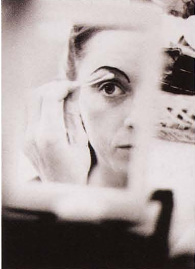
In the dressing room, the reflection of a ballerina putting on her make-up interested me more than a straightforward portrait. Like the other shots on this page, it was taken on film rated at 6000 ISO and with a 50mm lens set at f/1.2.
A ballerina checking the ribbons on her ballet shoes in the wings. The ability to see the light possibilities like this silhouette take time to acquire – available light photography is a constant learning process.
PROJECT 3
Shooting tonal abstracts
For this project, the task is to search for patterns in the ordinary things around you and isolate them into tonal compositions.
In both of the examples used in this project you will see that it’s the light and shadow creating the tonal pattern that is really the subject, not the materiality of the objects.
This project requires you to abstract a subject in a similar way. Try to forget about what its purpose is in everyday life and see it merely as shapes of grey tones. In your treatment the subject might not even be recognizable – the picture could just be a purely abstract form.
It’s worth while spending a good deal of time on this exercise, because once you have begun to isolate tonal patterns from the subjects around you and turned them into interesting black and white pictures this will influence all your work. If the subject has contrasting colours you can use filters to separate them and create a more dramatic tonal composition. For some great examples of this style, look at the work of Ralph Gibson and Lee Friedlander.

The tables and chairs next to me in a Pittsburgh diner were strongly cross-lit from the front window. I wasn’t seeing them as tables and chairs, just as shapes of grey.

I noticed that the interior lights in this building threw the stairs into silhouette and created some very pleasing graphic tonal shapes.
Quick tip
• If you find it hard to dissociate objects from their everyday use, turning them upside down will help you to view them in terms of just shapes and patterns.
PROJECT 4
Sun prints and photograms
You don’t actually need a camera to produce a photographic print – all that is required is a subject, sensitized paper and some light.
These techniques take us back to the origins of photography when people experimented with materials to record images on paper. The processes shown here both produce negative prints, but they can be turned into positives by contact printing them onto another sheet of photographic paper, or by scanning them into your computer and inverting them in Photoshop.
Experiments with light
This type of photography is not for those in a hurry, but the craft element of it is immensely satisfying. You will of course need to do tests to determine your correct exposure, as you would with ordinary darkroom work, but for the sun print this will take a bit more experimentation.
Photograms are quicker to try out and more predictable. If you use solid objects you will get a silhouette; translucent objects work best as the light can penetrate them, giving you a range of tones. For inspiration have a look at Man Ray’s wonderful photograms, which he called Rayograms.
Historical methods of printing are referred to as alternative processing. It is growing in popularity, and if you want to explore it further you will find websites such as www.apug.org where enthusiasts discuss techniques and suppliers of chemicals.

I placed hammers on a sheet of unprocessed photographic paper and took them out into low-angled sunlight. After exposure for 5 minutes, I used photographic fixer to stabilize the print; the sun had formed the image already, so there was no need for development. Finally I washed the print in the normal way.

A photogram is similar to a sun print but is made in a darkroom. I placed the two flowers on a sheet of photographic paper under the enlarger and exposed them for 15 seconds before developing, fixing and washing the paper as usual.

It was the ball of sun behind the clouds that attracted me to take the picture of this burnt-out tree trunk. The sun formed the focal point and created the silhouette. I have played with tonal composition here. The tree is not a tree – just a dramatic shape. I used a red filter and exposed on aperture priority with +11/2 stops exposure compensation.

I would never have dreamed of shooting the kettle, but the sun coming through the window created a shadow that presented me with an entirely different possibility. I shot it in colour but decided it made a much stronger black and white image. The exposure was as the meter calculated, with no compensation needed.

This picture of a Texan cowboy breaking in a horse has been simplified by shooting it in black and white; I like the graphic relationship of the shapes of the horse and the cowboy. I used a red filter to darken the blue sky and a 24mm lens to enhance the composition. Kodak TMax 3200 ISO film has given a grainy image.
Black and white review
- Using black and white rather than colour requires you to think about images in a different way, seeing them as tones of grey.
- Manipulating black and white prints allows you to take pictures to another level and express your feelings about the subject.
Project 1 Red and orange filters
If the red and orange filters didn’t work very well on the landscape the sky might not have been a strong enough blue. Check the shadow detail in the negatives – you may have underexposed them. If the portrait didn’t produce a smoother than real-life complexion you either underexposed at the negative stage (try again +1 stop) or you printed too dark or at too low contrast – try grade 4 or even 5.
Project 2 Available light
If there wasn’t enough detail in the pictures, the film may have been underdeveloped. Test the first six frames if you are processing yourself, or if you are using a lab, ask them to test a clip of six frames first to be sure. If shooting digitally, you can check your exposures on the back of the camera and learn what works as you go.
Project 3 Shooting tonal abstracts
If the results are a bit boring, it was probably that the light wasn’t sufficiently interesting to create strong tonal compositions, or perhaps you weren’t close enough and didn’t isolate the vital components. Print with high contrast, which tends to isolate and separate the blocks of tone in your composition.
Project 4 Sun prints and photograms
With luck you’ll have produced some really interesting images, but this low-technology style of photography isn’t for everyone. It’s worth spending time exploring it, though, as the prints are unique and have a special quality.