CHAPTER 8
Iterate to Improve
Data visualizations are never “done”; you merely get to a point where you think they are “good enough” and consider them complete. This chapter will provide advice about iterating through your work, giving and receiving feedback, and the benefits of iteration.
Why Iterate?
In Chapter 6, we provided tips for identifying your audience and getting to know their needs. Once you have identified those needs, you should generate lots of ideas, and then it is time to build a prototype. You then review or test the design with your audience, get feedback, and iterate on your work. Once you have a new prototype built, the process starts over again.
The earlier you start this feedback loop, the more cost-effective it will be. Working through this feedback loop with the audience early is also beneficial because they will understand that it is only a prototype, so they will focus more on the functionality than the design, thus resulting in a more usable product in the end.
Agile Data Visualization
Nearly every data analysis or dashboard design project starts like Figure 8.1.1
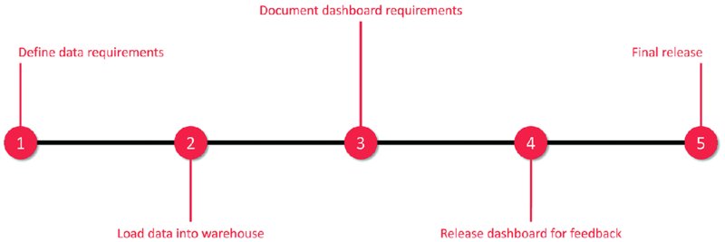
Figure 8.1 A waterfall approach to data visualization projects.
This is often called waterfall development; that is, you do not start the next process until the previous stage has finished, continuing until you get to the end. This is great if everything in the project is perfect, but how often does that happen? Almost never. Requirements change, the data is not correct or complete, the development takes longer than expected. The list of obstacles to overcome is endless.
The problem with waterfall development is that once something breaks down, you have to go back to the beginning and start again. This is not sustainable if you want to get a lot of work done and you want your projects to be a success.
If you follow a waterfall process and do not get feedback until the end of your project, you will find it highly likely that people will not use your dashboard. Why? Because it may not be the dashboard they needed and probably does not address the reasons the project was started in the first place.
How can you give your end users something of value when you do not know their definition of value and have not checked whether what you created suits them? The solution is to go on a journey together, and the result almost certainly will not be a direct journey like it was above. It will probably look somewhat like the “squiggle” in Figure 8.2, adapted from the original by Damian Newman:2
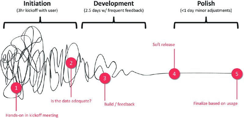
Figure 8.2 An agile approach to data visualization projects.
This process is proven and effective. This is the process that has been followed by the Data School for over 100 projects and the failure rate is 0%. That’s right—every project has been a success, largely due to following this “squiggle” development process. There are three simple phases that make it work.
Initiation
- Time: Three hours.
- Who: Project owner, users, developers.
- Purpose: Determine scope and sketch ideas with stakeholders.
-
Details: Start every project with a kickoff meeting. The project owner should be able to clearly communicate the questions they want answers to. Having the project owner list a set of questions removes them from the design process (no more “Build me a pie chart, please”) and gets them thinking about the insights they are seeking.
Users, developers, and the project owner should get involved in prototyping and sketching designs so that everyone is clear on what can be delivered. - Decisions: At the end of the initiation phase, there should be enough information to determine whether the data is available and in the right format to deliver the project. If not, then the initiation phase should continue until the scope is appropriately sized based on the data available.
- Outcomes: A prototype or wireframe that all stakeholders agree to which provides the basis for the deliverables of the project.
Development
- Time: Two to three days.
- Who: Developers.
- Purpose: Build, test alternate visualization techniques, design user interface that can be changed and adjusted as needed.
- Details: Dedicated work on the deliverables by the developer, including daily feedback sessions with a subset of users. Create a time-boxed, structured daily schedule to keep the team motivated and the project moving forward. The daily feedback loop ensures that no work gets too far outside the scope without time to correct the direction.
- Decisions: At the end of the development phase, there should be enough information to determine whether there is a viable product to be released for final feedback.
- Outcomes: All stakeholders get daily reassurance that the project will be delivered as expected. A beta version of the work for feedback by users to be provided within one work week.
Polish
- Time: Less than one day.
- Who: Developers.
- Purpose: Deliver final visualization.
- Details: Incorporate final feedback; ensure details like tooltips, formatting, and color are addressed. Conduct peer review session. Verify accuracy of final calculations.
- Decisions: By the end of the polish phase, the team should determine if the product goes into production.
- Outcomes: A final release of the visualization to stakeholders.
Examples of Effective Iteration
Most people we know agree that this development method works extremely well, yet few organizations implement iterative processes and get stuck in a never-ending cycle of development. Each week, we host a live webinar where we provide feedback on visualizations to the Makeover Monday community. Similar to the development loop above, users seek feedback and iterate on their work.
We typically recommend, above all other suggestions, a simplification of the design, with fewer colors; clearer instructions, titles, and descriptions; and a general decluttering of dashboards. We sometimes also have to address incorrect treatment of data, such as aggregation issues or misrepresenting the data.
Below is a series of before and after images from people who have iterated through feedback (Figures 8.3–(8.16).

Figure 8.3 A very “busy” visualization comparing the price of crude oil and gold.
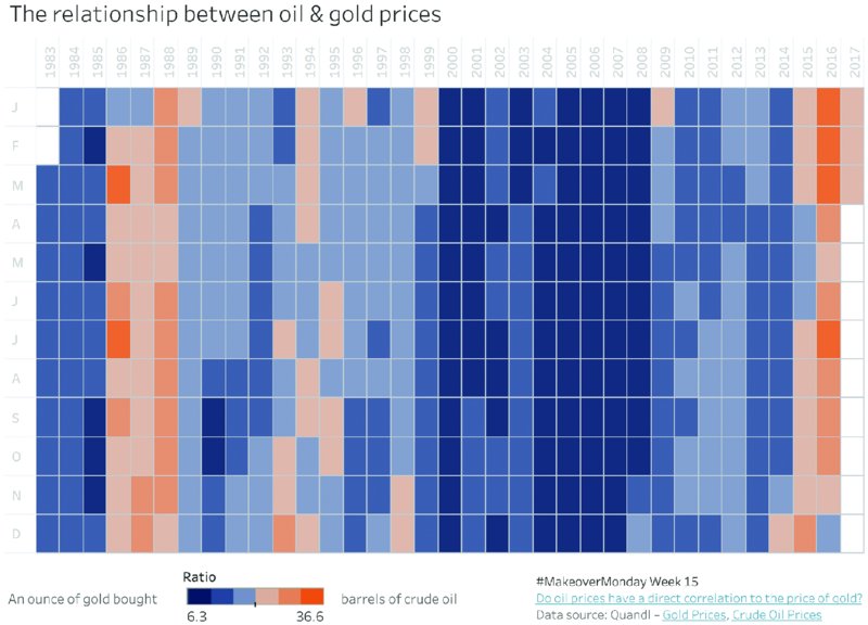
Figure 8.4 A much simpler way of showing the relationship between oil and gold prices.
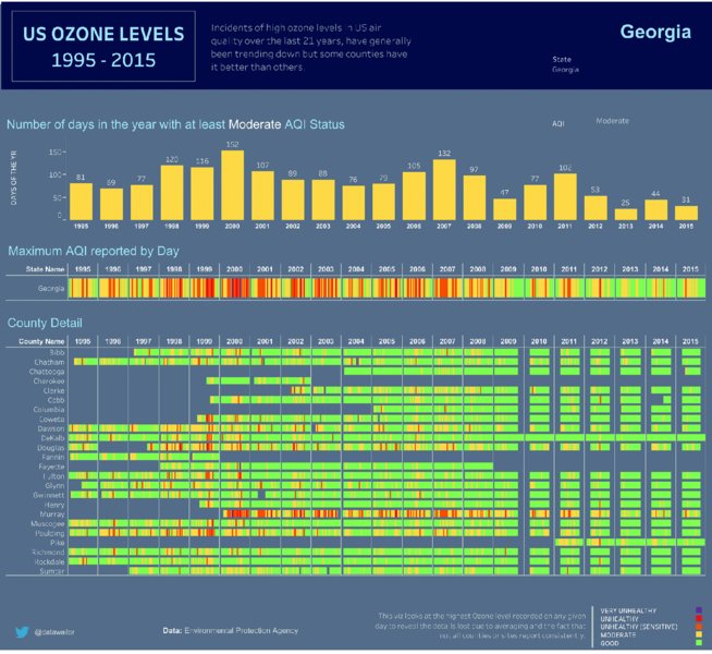
Figure 8.5 A green-to-red color palette is used to differentiate ozone levels.

Figure 8.6 A blue-to-red color palette makes this visualization colorblindness friendly.

Figure 8.7 An eye-catching but difficult to read vertical timeline.

Figure 8.8 The horizontal timeline creates a more intuitive design that is easier to comprehend.

Figure 8.9 Small multiple line charts without zero lines make it difficult to compare different states.
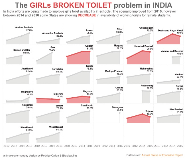
Figure 8.10 Small multiple area charts with a clear zero line make comparisons easier and show changes more clearly.
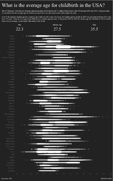
Figure 8.11 The single color of the dot plot reduces the visibility of differences between states.

Figure 8.12 Applying a diverging color palette highlights differences and trends more clearly.
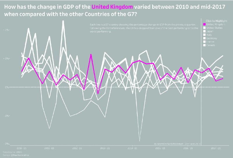
Figure 8.13 White lines with changing thickness for non-UK countries reduce the impact of the pink line representing the UK.

Figure 8.14 Reducing the thickness of all non-UK country lines helps focus on the key message about the UK GDP.

Figure 8.15 The yellow background is uncomfortably bright.

Figure 8.16 The light gray background and light and dark blue lines result in a more professional appearance.
Louise Heath: The Price of Oil versus Gold
Before
After
Effective Changes
- Colors were softened, and text was removed from the heatmap to move the focus to the patterns in the colors.
- Line charts and background images were removed to reduce clutter.
- Heatmap is now the sole focus of the analysis.
Wale Ilori: Air Quality Above America
Before
After
Effective Changes
- Colors have been adjusted for colorblindness.
Paul Griffith: Le Tour de France
Before
After
Effective Changes
- Chart was rotated so that time reads left to right.
- Big numbers were added to summarize the findings.
Rodrigo Calloni: India’s Broken Toilets
Before
After
Effective Changes
- Chart was changed to an area chart to ensure the emphasis is on the problem areas.
Sarah Bartlett: The Timing of Baby Making
Before
After
Effective Changes
- Hex map and line charts were added to enhance the analysis.
- Colors were changed to diverging to make the patterns more obvious.
Daniel Caroli: The UK Economy Since the Brexit Vote
Before
After
Effective Changes
- Bump chart was added to emphasize rankings.
- Size of lines was made consistent.
- Legend was removed because it was already incorporated in the title.
Adolfo Hernandez: Baseball Demographics, 1947–2016
Before
After
Effective Changes
- Colors were made softer to make it easier to read.
Giving and Receiving Feedback
Feedback is information about reactions to a product, a person’s performance of a task, and the like, which is used as a basis for improvement.3 In data visualization, feedback is about reactions to the visualization, how well it communicates information, how it can be more effective, and the overall design.
If you are giving feedback, be mindful of the person receiving it and make it constructive and encouraging. If you have asked for feedback, be prepared to listen and not view it as personal criticism. When receiving feedback about your data visualization, it is your choice which feedback to accept and which to reject, but it is important to understand that the feedback is about your work, not about you as a person.
For Makeover Monday, each participant has the option to receive feedback on the data.world website in the discussion posts, as well as during the weekly Viz Review webinar and on Twitter. The key is having the courage to ask for it. As mentioned before, no visualization is ever “done”; the feedback loop helps you make your visualization more effective and communicate more clearly.
Giving Effective Feedback
For Makeover Monday and data visualization in general, effective feedback is that which is clearly heard and understood.4 As the provider of feedback, those are the only areas that are within your control. The recipient will ultimately determine which parts of the feedback to accept or reject in order to improve their work.
The process for providing feedback can be broken down into a few simple steps.
Feedback Should Be About the Work, Not the Person
First, we recommend that you provide feedback only when it is requested. If you provide feedback to someone who has not asked for it, it is possible that the recipient will find it offensive and might question your motive for providing feedback.
If you are asked to provide feedback, it is critical that you remember to keep the feedback based on the work. Think back to the first visualization you created when you got started in data visualization, and provide the feedback as if someone were providing you feedback at that time. Really focus on their work and be objective.
Feedback Should Describe Your Opinion
After all, you do not know the opinion of anyone else. You only know your reaction or what you thought. Presenting feedback as your opinion makes it much easier for the recipient to hear and accept it, even if the feedback is negative yet constructive. Similar to how the creator has no control over what you thought, you have no insight into the intention of their design. Keeping the feedback focused on the end product will make the feedback much more acceptable.
Feedback Should Be Specific
If you start by telling someone that “everything is poor,” you can easily demoralize them and discourage them from seeking your feedback again. Think about the specific feedback you can provide. Perhaps you think there are too many colors in the visualization competing for your attention. Provide feedback exactly about where there is too much color and how color could be used more effectively. Giving the designer specific feedback and a suggestion for changes is constructive and helpful.
As an example, consider the Makeover Monday data set about arrests of NFL (National Football League) players. Since there are 32 teams in the NFL, it is easy to fall into the trap of using too many colors when you are showing all 32 teams in the same chart. Many teams have colors that are very similar, making it difficult to distinguish them from one another.
It is okay to show all 32 teams at once; however, when you do, consider using highlighting to either (i) focus on a team you want your audience to focus on, or (ii) allow your audience to pick a team themselves. If you want to look at cumulative arrests by team across the seasons from 2000 to 2017, you could assign each team’s official color to the team name and create a view like Figure 8.17:

Figure 8.17 Assigning a different color to each team creates a busy visualization with very similar-looking lines throughout.
Many of these colors blend together. Instead, consider Figure 8.18, which allows the user to highlight their favorite team.

Figure 8.18 Highlighting a single team in black while keeping all other teams in gray ensures focus without losing context.
Now that the visualization is much less cluttered, the user can focus on what they are interested in, and thus they will be more engaged. In general, if you are ever unsure whether you are using too much color, you probably are. If you need a second opinion, ask someone who does not know anything about the data. Can they see what you want them to see?
When providing feedback, the more specific, the better. It is much easier to understand and act on specific feedback. For example, suggesting that a design would be more effective with fewer colors while suggesting highlighting as an alternative is constructive and will likely help the author create a better visualization.
Feedback Should Be Timely
Feedback needs to be given in a timely manner while it is still appropriate to take action, rather than providing suggestions on work from many months ago. If you have been asked to give feedback and have something to share, do not keep the person waiting. Keep in mind, though, that your feedback should be specific and actionable.
Receiving Feedback
If you ask for feedback, be prepared to receive it, consider which comments you agree with, take note of the suggestions you disagree with, and act upon the feedback provided. Constructive critique by others is an opportunity to learn and improve, so take advantage of it. Also keep in mind that acknowledging feedback is the right and courteous thing to do. Even if you do not agree with the suggestions, thank the person for taking the time to review your work, for putting thought into their comments and making the effort to help you improve. For people who give you feedback, it is satisfying and exciting to see you improve.
Receiving feedback can be difficult and it may feel like you are being criticized personally rather than in response to your work. If someone says something about you as a person, do your best to ignore them and do not react impulsively. Focus on the constructive feedback you have received and use it to improve your work. The most important skill in receiving feedback is listening. When someone gives you suggestions, focus on listening to their points, rather than thinking about how you are going to respond or defend yourself.
Acting Upon Feedback
Consider Figure 8.19 from Sarah Burnett, who had asked for feedback on her work during a Viz Review webinar.
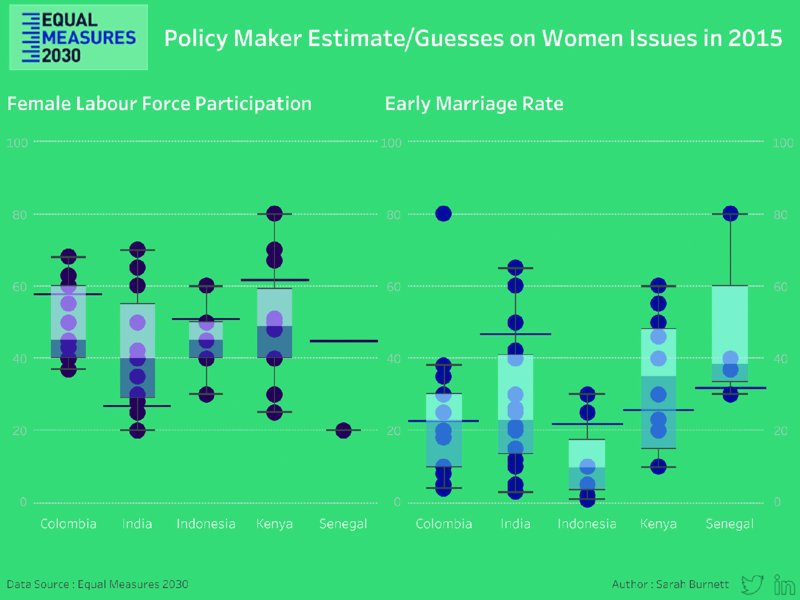
Figure 8.19 A deep turquoise background makes the dark purple and blue circles difficult to see.
We provided some feedback:
- What value do the whiskers on the box plot add?
- Consider a reference band that spans +/− 20% from the correct answer as this range was meaningful to the stakeholder, the Equal Measures 2030 campaign team.
- Change the scale to percentages instead of absolute numbers.
- The turquoise background is too strong and makes it challenging to focus on the data and the message.
- Include a description in the subtitle that explains what the visualization is about.
Note that none of this feedback is about Sarah as a person; it is about her work. The feedback is our opinion. The feedback is specific, timely, and actionable. In other words, the feedback is effective, and Sarah was able to take a short amount of time to create a more informative visualization (Figure 8.20).

Figure 8.20 The white background lets the data stand out more easily and makes labels easier to read.
Sarah was open to feedback; she asked for it. She used the feedback as a way to learn and improve. She understands that the feedback will help her become better at analyzing and visualizing data and will help her communicate information more effectively.
Once you receive feedback that has helped you, you will be able to provide effective feedback to others because you know the style of feedback that has helped you.
Summary
Being open to feedback and iterating on your work is an essential skill if you want to learn, grow, and become a better data analyst and data visualization designer. Learning how to properly communicate feedback takes practice, much like developing any other skill. In this chapter, you have learned:
- How iterating during a project will help you deliver outputs faster and with higher quality
- What examples of effective iterations look like
- How to give and receive feedback
None of this is complicated; these things can be subtle and may go unnoticed when you look at just the surface of your work and processes. It is natural to make mistakes along the way; no one gets it right all the time. What is important is that you continue to develop your communication skills along with your technical skills. In today’s market, those two skills in combination are critical for success not just as a data analyst but as an effective member of any organization and team.