CHAPTER 12
Using Context to Inform
Providing your audience with context about the data, the subject, and the impact of your findings helps them draw meaningful conclusions and understand the relevance of your analysis. When you work with data and spend time analyzing and visualizing it, you need to ensure you give your audience enough background information to set the scene. If you jump straight into the detail, you will lose your audience very quickly and leave them confused, uninspired, and potentially misinformed.
For Makeover Monday, we select data sets from a variety of topics and urge our participants to give their audience sufficient context, because if the subject is unfamiliar to our community, it is probably unfamiliar to their audience as well.
This chapter describes why context is important, how you can communicate context easily, and how context allows you to inform your audience more effectively.
The Importance of Context
In everyday life, you come across numbers constantly. People tell you how tall their children are, friends talk about the results of a football match, and the news reports on the latest company revenues. Numbers are just numbers, though, and they do not mean much in isolation.
Rather than accepting the numbers as facts and the partial information they offer, you should ask probing questions to put these numbers into context. This will help you understand whether the results are good, bad, or as expected.
Here are some simple examples of adding context to numbers:
-
My five-year-old daughter is 44″ tall.
- Is that taller or shorter than the typical five-year-old girl?
- How much has she grown in the past six months?
- Is she taller than you were at that age?
-
The Golden State Warriors beat the Cleveland Cavaliers 108:85.
- How does this compare to the last times these two teams played each other?
- What is their average score per match?
- What did the bookmakers suggest the final score would be?
-
In 2017, Microsoft reported revenues of 89.95 billion USD.
- Is this result better than the previous year?
- What was the overall profit?
- How does this result compare to their rivals?
- How did the stock market view the results? Did the share price rise?
There are numerous angles to take on any piece of information and different audiences will have different interests and questions about your work. Providing context with your visualization allows you to show your audience how you want your work to be understood, what information you worked with, what you focused on, and how the different parts of your analysis work together.
Lack of Context
Before you dive into the usefulness of contextual information, look at what happens to your understanding when no context is provided. For this purpose, consider Figure 12.1, a stripped-down version of one of Andy’s visualizations. All information aside from the title and the line chart has been stripped off.

Figure 12.1 A visualization without sufficient contextual information can leave your audience confused as to what your message is.
Does this chart provide you with valuable insights? You can make the following assumptions:
- The topic is the melting ice in the Arctic.
- The lines in the chart are going down with noticeable spikes.
- There are a black and a red line and a number of gray lines.
Because context is not provided, you cannot answer any of the following questions from this visualization:
- What do the colors of the different lines mean?
- How can I identify the summer months referred to in the title?
- What do the percentages on the y-axis represent?
- Are things getting worse over time, and if so, how much worse are they now compared to when measurements began?
- What is the significance of the starting point of the lines? Why do they all meet at the far left?
Not having the relevant context available makes it difficult for us to understand the full picture and to truly appreciate what the author of a visualization wants to communicate.
In the following sections, we will gradually add contextual details to show you how they help you communicate information more effectively.
Using Simple Metrics
Simplicity is important for communicating effectively, especially when the topic is new for the audience or is complex and needs to be broken down into easy-to-understand components. Complicated metrics require mental gymnastics to understand them. And even then you sometimes do not know what exactly the creator wanted to achieve with a particular metric.
Using basic metrics that are easy to understand will help you get your point across and encourage your audience to interact with your work. Comparing metrics such as sales or profit gives your audience proper context to understand what has been presented.
Figure 12.2 builds on Andy’s previous visualization by adding a simple metric that compares the extent of Arctic sea ice in each year to 1979, the first year that the data was collected. Does adding this small amount of contextual information back into the visualization help improve your understanding?
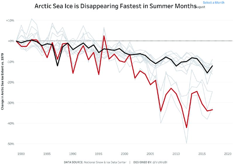
Figure 12.2 Metrics that are easy to understand and labeled clearly help you communicate your message to your audience
The only additional information is the axis label for the y-axis. It reads “Change in Arctic Sea Ice Extent vs. 1979.” This small axis label alone allows us to answer two of our original questions:
-
What do the percentages on the y-axis represent?
Answer: The percentages represent the change compared to 1979. This is expressed in percentages, with positive numbers showing more ice and negative numbers showing less ice than in 1979. -
What is the significance of the starting point of the lines? Why do they all meet at the far left?
Answer: All the lines start at 1979, which is the first year for which data was available in this data set. From there the lines diverge as the data is compared to 1979.
How can you answer the remaining questions? We’ll gradually complete Andy’s dashboard over the remainder of this chapter by continuing to add a few more elements of contextual information.
Big Ass Numbers
Big Ass Numbers (BANs), which you can also read about in Chapter 11, “Effective Use of Text,” are large numbers on a visualization that capture your audience’s attention and let you make a precise statement. BANs can be a great supportive element in your visualization, when done well as part of the overall design.
Ineffective Example
We challenged the Makeover Monday community to visualize data about the Tate collection of artworks. Eva created the image seen in Figure 12.3, focusing on the artworks created by J.M.W. Turner.
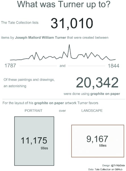
Figure 12.3 Using multiple BANs in different sizes and font colors across your visualization makes them less effective as they compete for attention.
While Eva included BANs to show the sheer volume of artworks created by Turner, there are actually four large numbers, all competing for attention. A single BAN would have worked much better, with the remaining numbers turned into unit charts.
Effective Example
When you add BANs to Andy’s visualization, as in Figure 12.4, they enhance the understanding of the chart and give the audience useful context.
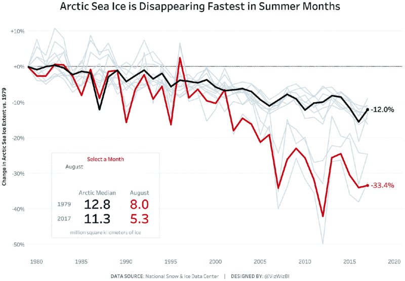
Figure 12.4 Adding well-positioned BANs in your visualization shows your audience what to focus on and aids their understanding.
Having the right amount of information displayed with BANs and labeling the end of the black and red lines highlights the key figures based on a selection the audience can make. When choosing a particular month additional black and red BANs show the difference between the Arctic median (black line and black number) and the median of the chosen month (red line and red number), in this case August. The viewer’s eyes are immediately drawn to these numbers. The stark difference between the black and the red numbers helps Andy make his visualization more impactful.
Color Coding
Using colors is another effective way to add context and provide additional information in your visualization. It is important not to overdo it, though. Use color sparingly yet deliberately, so that it has maximum impact.
Ineffective Example
Too often we have seen visualizations similar to Figure 12.5 that use an abundance of colors.
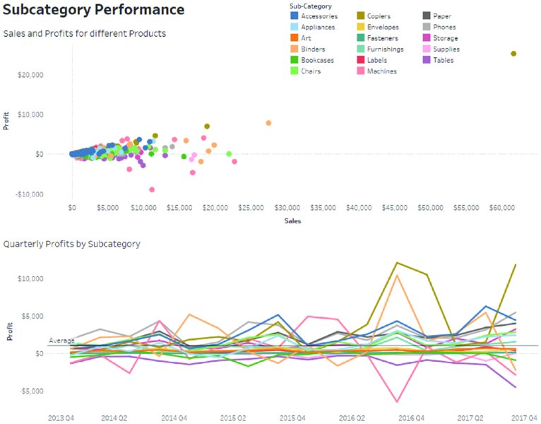
Figure 12.5 Using more than a dozen colors challenges your audience to move their eyes constantly between chart and color legend to make sense of the data.
The use of color to show different subcategories results in a scatterplot and a line chart with 17 different colors. That is not helpful for anyone looking at this visualization, especially if you ask yourself questions like:
- Which subcategories were profitable?
- Were there any quarters during which all subcategories were profitable?
- Which subcategory sold the most?
Too many colors result in an increased cognitive load because the users of your visualization need to remember the meaning of each color as they scan the page. By changing the color to show profitability in the existing two charts, they would be more effective at providing a quick overview of the results. Alternatively, color could be applied to a single subcategory to show its performance against all other subcategories.
Effective Example
In Andy’s visualization, colors are used sparingly with most of the lines in the chart being gray and only two lines being highlighted: one in black and one in red. Figure 12.6 adds a color legend to the visualization, helping to quickly explain the meaning of black and red lines.

Figure 12.6 Applying minimal color to highlight the data and including a color legend creates clarity for your audience.
The color legend reminds us that the black line is the median across all months, while the red line represents the month chosen. Using the color for the highlighted month helps the audience explore the visualization because when you change the month, the visualization changes to reflect the color to focus on. Having a single highlight color, one reference color (black), and one context color (gray) means you know what to focus on immediately. Repeating the red and black across the lines, the color legend, and the box with the BANs helps reinforce the message.
The color legend allows us to answer an additional question from the list we compiled earlier:
-
What do the colors of the different lines mean?
Answer: The black line shows the median ice extent, while the red line shows the median ice extent for a chosen month, in this case August.
Reference Lines
Reference lines provide a point to which you compare any other results. Common use cases for reference lines are:
- Revenue of the previous quarter or year
- Points scored during the last season
- Target units sold
- Median house price for a country
- Average sales across a year
Reference lines are an excellent way to put any number into context. When visualizing data, your audience wants to know whether a result is good or bad, what it means to them, and so on. A reference line can give them this information by showing where their sports team is compared to their performance in the previous season. Your CFO will be interested to know how the current quarter’s revenue compares to the previous quarter and the same quarter in the previous year, and the like.
Ineffective Example
It can be very helpful to include a reference line in your visualization, yet some reference lines are neither clear nor allow for insights.
Using the colorful line chart from the previous section again, we have added average profit as a reference line in Figure 12.7. You may find it difficult even to see that reference line because it is thin, gray, and does not stand out against all of the colors. Additionally, with so much variation in the profit figures of each subcategory, an average is not very meaningful.

Figure 12.7 The reference line becomes almost invisible among the multitude of colored lines and is therefore ineffective at providing contextual information.
Effective Example
Consider Andy’s dashboard again as seen in Figure 12.8. The black reference line shows the median ice extent. This is effective because the median, as the middle value of the data, gives a reference point that is not skewed by extreme points in the data. The reference line helps us see how much of an impact the higher temperatures have on the ice melting (the lines further below the black line) and that the overall ice extent is decreasing, as shown by the downward trend of the black line as well as the label of −12%.
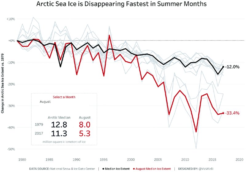
Figure 12.8 The black reference line is darker and thicker than the gray lines and can easily be compared to the red line.
When you use a reference line, make sure the metric you choose is logical in the context of your analysis and insights. Letting your reference line stand out, like Andy did, helps provide context for your audience, which in turn allows them to better understand your insights. For the melting Arctic ice, you can see that the median extent has decreased by 12% since 1979, and you will probably be even more shocked to see that the August decrease has reached 33.4% in 2017 compared to 1979!
Tooltips
Tooltips are an effective way to provide contextual information to your audience in an interactive visualization without cluttering up your charts. Tooltips are the little boxes with information or additional charts that appear as you move your mouse over an interactive visualization.
Ineffective Example
In the performance dashboard for various subcategories in Figure 12.9, you can see poorly executed tooltips.

Figure 12.9 Tooltips that are not designed with the user in mind are a wasted opportunity to provide additional information for your audience.
The tooltip shows the key metrics, but the formatting is poor, the descriptions are abbreviated, and the alignment makes the tooltip difficult to read. A few basic tidy-ups would make this much more effective. Do not neglect your tooltips when you publish your visualizations.
Effective Example
In Figure 12.10, Andy chose to update his tooltips to achieve consistency with the overall design of his visualization and to provide information about those data points that were not labeled in his view (i.e., the gray lines).
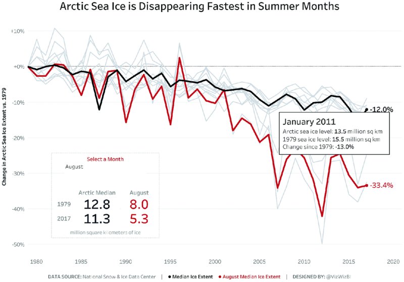
Figure 12.10 The tooltip contains the most important metrics with simple descriptions and clearly states the month and year of the data point.
The interactive tooltips provide information about actual sea ice levels, as well as the change since 1979. By adding this contextual information, Andy provides the same details for all lines, just at different levels of interactivity. Most importantly, his viewers can see the month and year of each data point to help identify the months with the largest decrease of ice (those clustered around the red August line) and those months that are closely aligned to the median.
You can now answer a further question:
-
How can I identify the summer months referred to in the title?
Answer: The control with the title “Select a Month” lets the audience identify a particular month. By hovering over the gray lines with a similar pattern to August, the summer months can be identified via the information provided in the tooltip and the line you hover over will be highlighted against the remaining months.
Subtitles
While the title for a visualization sets the scene, a subtitle provides additional information in a short sentence or two, further guiding your audience and aiding their understanding of your analysis. A subtitle can feature your key insights, describe the data set, explain how the data was collected, and serve as a place to explain the colors and metrics used.
Ineffective Example
An ineffective subtitle represents a lost opportunity to inform your audience and to provoke their curiosity in a subject. In Figure 12.11, the subtitle does not add any value that you could not gain simply from looking at the axis labels.
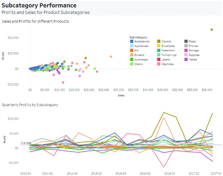
Figure 12.11 The subtitle is used to state the metrics and fields used in the charts, instead of stating some of the insights from the analysis.
The subtitle merely states the obvious; it names the metrics contained in the dashboard (profit and sales) and the field by which the data is broken down (subcategory). A more effective subtitle would include summary insights.
Effective Example
In Figure 12.12, Andy used the subtitle in his visualization to explain the key findings to his audience in three straightforward sentences.
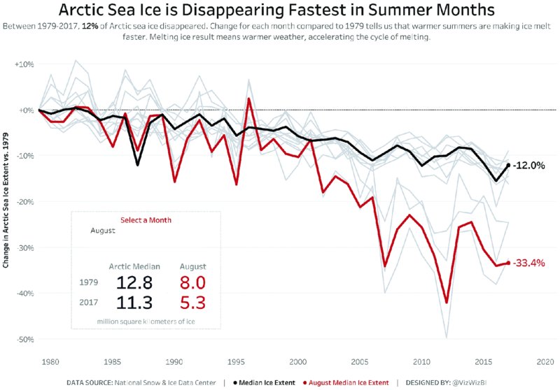
Figure 12.12 This subtitle clearly states the key findings, what the chart shows, and what the results mean for the environment.
The subtitle explains:
- The amount of Arctic sea ice that has disappeared between 1979 and 2017.
- The analysis relates every month and year back to 1979.
- There is a link between warmer summers and the accelerated decrease of sea ice.
- In general, less ice equals warmer weather, which equals accelerated melting of ice.
In dashboards using scientific data like Andy’s, it is helpful to use the subtitle as a description, outlining in plain English what the significant findings were so that an audience of laypeople can gain value and better understanding of the topic from the analysis and visualization.
Methods for Communicating Context
Now that you have thoroughly dissected Andy’s visualization of melting Arctic ice, look at a few more methods for communicating context. The following section goes through a variety of visualizations on different topics, each showing an ineffective chart or dashboard first, followed by an effective example.
Indicators and Arrows
Indicators and arrows are commonly used in dashboards to quickly show performance against a reference point. For example, if the quarterly revenue figures are below target, a downward arrow, colored in red, can be placed next to charts or numbers to indicate, at a glance, whether a result is good or bad.
Ineffective Example
In Figure 12.13, indicator arrows were used to show whether profits were positive or negative at an annual basis for different regions in Italy. Giving your audience this first impression can be helpful, but if you stop there, your viewers will wonder what they should do with this information.

Figure 12.13 These indicators do not specify the magnitude of profits or losses and how the different regions compare to each other.
The arrows provide an overall impression of the performance of each region, showing profits as green upward arrows and losses as red downward arrows. However, this information should be extended to include some additional detail. For example:
- How big were the profits and losses for each region and what were the contributions to the overall Italian market?
- Given that you are looking at the annual results, did each region trade for all periods during each year?
- Which cities or products contributed to the performance?
Indicators alone will rarely be effective in communicating your message to the audience. By including additional information for context, you will provide a more complete picture.
Effective Example
Figure 12.14 uses arrows to indicate whether a result is positive or negative. Amar Donthala shows that meat consumption trends are increasing for chicken and turkey but decreasing for beef and pork.

Figure 12.14 Indicators are more effective in combination with percentage figures and actual consumption statistics.
Amar listed the percentage values to show how much consumption has grown or declined for a given meat product. The downward or upward arrow next to those numbers makes it clear whether it was growth or decline and this is further visually supported by the small sparkline next to the total numbers, showing how the consumption developed over time.
Comparing Time Periods
Comparing the performance between specific points in time is a useful method to add context for time series data. For example, profit achieved in one quarter can be compared to profit achieved in a previous quarter or to the same quarter in the previous year.
Ineffective Example
Figure 12.15 contains information about the profits achieved by different departments from Q1 2014 through Q4 2017.

Figure 12.15 Comparing quarterly results on a single continuous timeline is difficult because quarterly differences are not as easy to see.
While the colors indicate whether profits decreased or increased from one quarter to the next, there is limited value in this information alone and quarterly results could be displayed differently to focus more on profits. A simple change of the view, as in Figure 12.16, allows us to look at each quarter’s performance over time. Color has been applied to the product category to differentiate those lines more clearly.

Figure 12.16 Dividing the chart into quarters and showing performance over the years makes the comparison of quarters easier.
Effective Example
Using date and time fields to add context to your visualization can work really well, as you can see in Andy’s visualization of UK economic growth in Figure 12.17.
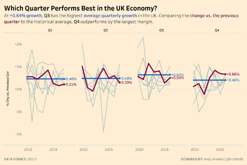
Figure 12.17 Economic performance is often viewed in quarters to account for the impact of summer months and holiday seasons.
Quarterly analysis is a relevant and logical way to approach economic and financial data. There are commonalities for each quarter in the UK (e.g., Q3 features the summer slowdown, while Q4 includes the busy Christmas and holiday season).
Andy added other G7 countries for context in gray, highlighted the average quarterly growth for the UK in blue, and used red to indicate the change to the previous quarter.
Normalizing the Data
Data is often not normalized, for instance when you analyze country-level data for different metrics. Normalizing data brings values that are on different scales into a common range.1 What this means for country-level data is that every metric should be on a per capita basis. This makes the results comparable across countries regardless of a nation’s population (e.g., you can now compare China and Luxembourg for different indicators).
Ineffective Example
In Figure 12.18, the lines correspond to the total ecological consumption per country since 1961. The design highlights China as an outlier.
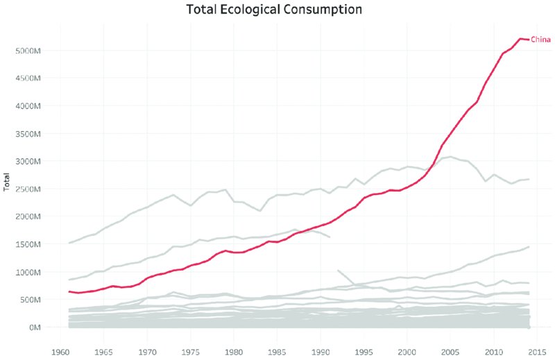
Figure 12.18 Without normalizing the data, very populous nations like China and India will appear as outliers for resource consumption at a total level.
Note that the data is the total consumption for each country. China has the largest population in the world, therefore you would expect China to have the largest ecological consumption. A more effective way to communicate the data is to represent the consumption on a per capita basis, as in Figure 12.19.
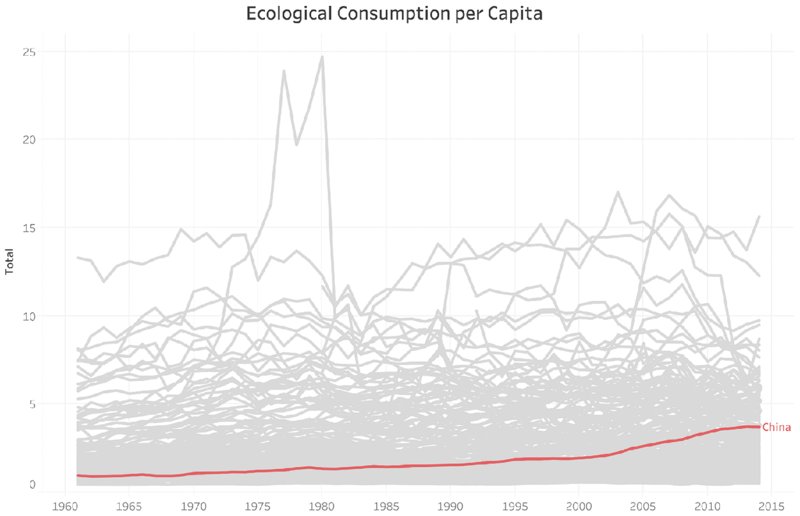
Figure 12.19 At a per capita level, comparing countries is much more appropriate and the results for China now appear very differently.
Normalizing the data gives a completely different picture. China is actually near the bottom half on the basis of consumption per capita.
Effective Example
In her visualization of different countries’ ecological footprint and biocapacity, as seen in Figure 12.20, Luisa Bez used per capita indicators so that her audience can easily compare the results of different countries.
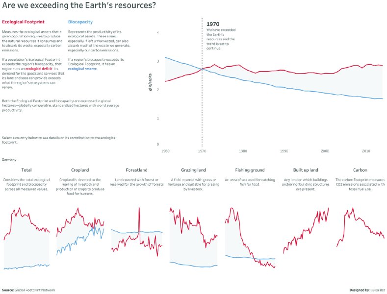
Figure 12.20 Highlighting detailed metrics at a per capita level for an individual country creates a country profile that can be compared to a benchmark.
Comparing the total impact of countries would skew the results because very populous countries will have more negative results simply based on the number of people living in each country. Luisa analyzed the data on a per capita basis to make the countries more comparable.
Supplementing the Data
For Makeover Monday we provide a single data set each week. The data can be used as is or additional data sources can be used to supplement the data set. Including additional data allows participants to delve deeper into a particular analysis and find additional insights or context to make their analysis more impactful.
Ineffective Example
Supplementing data just for the sake of it and drawing conclusions that are not substantiated creates the risk of losing credibility. Sometimes there simply is not an insightful story in a data set and adding more data just makes things worse. In these situations, pick a clear story. If it does not make sense to supplement the original data with more information, do not feel compelled to do so.
Effective Example
In Figure 12.21, Gina Reynolds used additional data when she visualized the prices of meals at Wetherspoon pubs in the UK. By supplementing her data with geographical information about the distance of a pub relative to Big Ben in the heart of London, she was able to show a clear decrease in prices the further away a pub was located from Big Ben.
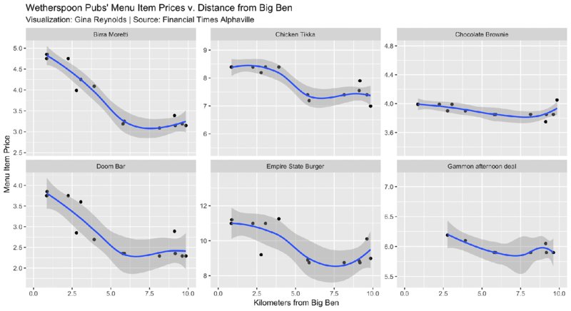
Figure 12.21 Supplementing your data set with related data can enrich your findings and make them more relevant for your audience.
Supplementing a data set with interesting data to enrich your visualization can be very effective in communicating a stronger message.
Summary
When you give your audience sufficient context alongside your data visualization, you help them understand your message more easily. Effective ways to achieve this include:
- Simple metrics communicated through large numbers
- Color coding and highlighting
- Reference lines
- Tooltips
- Subtitles
You can also choose additional techniques for providing context in your data including:
- Comparing time periods
- Adding indicators and arrows
- Normalizing the data
- Supplementing your data with further information
Next time you create a data visualization, look at each element and ask yourself, “Compared to what”? If you cannot answer this question, then you have a clear indication that you need to add more context.