Chapter 7
Creating Custom Ribbon Interface Applications
WHAT’S IN THIS CHAPTER?
- Developing a simple Forms application
- Developing a simple WPF application
As with many new technologies that Microsoft creates, the Ribbon technology designed for Windows 7 targets the C++ developer, not the managed-application developer. Even the tutorials Microsoft provides are for this group of developers (see http://www.microsoft.com/downloads/details.aspx?FamilyID=F62039AD-A224-4979-AE7F-67B4E09CD81E). Underlying the C++ support are Component Object Model (COM) DLLs. However, don’t worry about the lack of material online. This chapter provides a good starting point for your Ribbon experience and then shows a few practical examples of how you can implement the Ribbon in your own application.
Adding the Ribbon to your applications is definitely worthwhile. Chapter 6 points out a number of advantages to using this new interface, especially in certain circumstances that are all too common in the corporate environment today (such as when you have a wealth of novice users who require extra hand-holding). Using the techniques in this chapter will provide you with two main methods of adding the Ribbon to your applications. (In neither case is Visual Studio ready to create a Ribbon-based application immediately.) Here are the methods:
- Rely on an interoperability (interop) module to provide access to the COM modules that C++ developers use to create their applications. Fortunately, there’s a third-party library you can download to assist in this technique; otherwise, you’d have to rely on creating reams of difficult P/Invoke code to accomplish the task. This technique works great for Windows Forms applications that you want to update. In many cases, you can update an existing application with little disruption of the underlying code or data strategy.
- Use Windows Presentation Foundation (WPF) programming techniques. In this case, you can download managed application support directly from Microsoft, rather than rely on the interesting programming techniques provided for Windows Forms developers in this chapter. The WPF approach is useful for new application development.
No matter which technique you choose, you need to define the user interface using XML code. The Windows Forms approach relies on the XML code described in Chapter 6, while the WPF approach uses an eXtensible Application Markup Language (XAML) equivalent of the Chapter 6 discussion. There’s no designer support for creating a Ribbon interface in Visual Studio. This means that you’ll need a tool for viewing the interface as you create it. Fortunately, Microsoft supplies such a tool in the form of PreviewRibbon. This chapter shows how to work with PreviewRibbon. It also tells you how to get the utility working within Visual Studio 2010 (the code doesn’t even compile when you first download it).
GETTING STARTED WITH THE RIBBON
This first application, SimpleRibbon, uses the Windows Forms approach to adding Ribbon support to an application. In this application, you discover a number of fundamentals, such as how to use the Microsoft interop module to your advantage. You’ll also obtain all the details needed to configure your system and create a simple Windows Forms application that employs the Ribbon. The example is purposely simple so that you can focus on setup, utilities, and technique.

Whenever Microsoft introduces a technology that seems to make life difficult for the developer, a third-party vendor comes along to make things easier. Professional UI Solutions makes a set of Windows Forms controls called Elegant Ribbon (http://www.prof-uis.com/elegant-ribbon/controls-framework-overview.aspx) that you can use to create an Office-like environment for your application. You can even download and try the controls out free.
Obtaining the Windows 7 SDK
There isn’t any easy way to obtain the support you need for working with the Ribbon. Unlike the Taskbar examples, you really do need the Windows 7 Software Development Kit (SDK) to create Ribbon-based applications for Windows 7. Even the Microsoft-supplied Ribbon example (see the example code and description at http://code.msdn.microsoft.com/PreviewRibbon) requires the Windows 7 SDK to run. It would be nice if there were a managed code approach you could take, but the Ribbon relies on Component Object Model (COM) technology that relies on a good deal of C++ code.
GETTING MICROSOFT’S PREVIEWRIBBON EXAMPLE TO WORK
It’s a good idea to at least view Microsoft’s PreviewRibbon example before you perform much development work of your own, because managed code examples for the Ribbon are a bit scarce. In addition, getting Microsoft’s example to work will also prepare your machine for your own development efforts and help you understand potential distribution problems for production applications. The following steps help you get the example to work properly:
1. Open the example using Visual Studio 2010. You’ll immediately notice that you need to convert it for use with Visual Studio 2010. The conversion should proceed without error.
2. Try to compile the code to locate four errors within the application. The errors appear in the ConfigOptions.CS file.
3. Change each of the val = ConfigurationSettings.AppSettings["StringValue"]; lines to read val = ConfigurationManager.AppSettings["StringValue"];. The code will compile at this point, but you still won’t see the example work. That’s because you haven’t specified a Ribbon definition file for the example to use.
4. Copy the BasicRibbon.XML into the Debug folder for the application, so the application can easily access it.
5. Right-click the PreviewRibbon entry in Solution Explorer and choose Properties from the context menu.
6. Select the Debug tab and type BasicRibbon.XML in the Command Line Arguments field.
You should be ready to go now. Assuming you have the Windows 7 SDK installed, the example should run. Choose Start ⇒ All Programs ⇒ Microsoft Windows SDK v7.1 ⇒ Windows SDK 7.1 Command Prompt. Windows will open a command prompt. Change directories to the Debug folder of the PreviewRibbon application (normally \PreviewRibbon-src\source\bin). Type PreviewRibbon BasicRibbon.XML and press Enter.
Of course, you might want to run the example from within Visual Studio. In this case, open the App.CONFIG file. You’ll see four entries in the <appSettings> tag. Uncomment these entries and ensure that the paths point to the locations of the utilities that the application requires. Here are the entries for Visual Studio 2010 using the Windows 7 SDK version 7.1 on a 64-bit system (even though these entries appear on two or three lines in the book, they should appear on a single line in your source code):
<add key="UiccPath"
value="C:\Program Files\Microsoft
SDKs\Windows\v7.1\Bin\UICC.exe" />
<add key="RCExePath"
value="C:\Program Files\Microsoft
SDKs\Windows\v7.1\Bin\RC.exe" />
<add key="LinkExePath"
value="C:\Program Files (x86)\Microsoft Visual Studio
10.0\VC\Bin\Link.exe" />
<add key="ColorizationValues"
value="150, 127, 245; 25, 127, 245; 150, 71, 158" />
As an alternative to changing the App.CONFIG file, you can also change the paths provided by the sdkBinPath, vsBinPath32, and vsBinPath64 variables found in ToolHost.CS. Changing either file will work.
The Windows 7 SDK comes in two forms: Web installer and an International Standards Organization (ISO) package used to create a DVD. You can obtain the Web installer from http://www.microsoft.com/downloads/details.aspx?FamilyID=6b6c21d2-2006-4afa-9702-529fa782d63b and the ISO version from http://www.microsoft.com/downloads/details.aspx?FamilyID=35AEDA01-421D-4BA5-B44B-543DC8C33A20. Whichever version you obtain, double-click the installer after the download to begin the installation. Follow the default setup instructions for installing the Windows 7 SDK on your system. A default installation will require 1.7 GB of hard-drive space.

Make absolutely certain that you obtain the correct version of the Windows 7 SDK for your system. If you have a 64-bit version of Windows installed, you must download the 64-bit version of the Windows 7 SDK. Anyone using an Itanium system will need the Itanium version of the Windows 7 SDK. Attempting to install the incorrect version will result in a failure message that says the installer couldn’t find a particular file (rather than telling you that you have the incorrect version of the SDK).
Obtaining RibbonLib
If you look at the PreviewRibbon example code, you’ll find that it has a relatively large number of files containing complex code. Writing a COM wrapper for the Ribbon isn’t for the faint of heart. With this in mind, you’ll probably want to use a pre-written wrapper to make your Ribbon development easier. One such wrapper is RibbonLib at http://windowsribbon.codeplex.com/releases/view/32943.
After you download the ZIP file, extract it. You’ll find .SLN files for both Visual Basic and C#. In addition, both Visual Basic and C# examples are included with the library. The solutions will require conversion for Visual Studio 2010. Simply follow the Visual Studio Conversion Wizard prompts as you normally would to perform the conversion. The conversion should proceed without error.
When you initially attempt to build the library and its examples, you’ll be discouraged to see a number of errors (36 of them). The errors aren’t due to any coding problem. The problem occurs when you use the latest version of the Windows 7 SDK. Use the following steps to correct the problem:
1. Right-click an example project entry in Solution Explorer and choose Properties from the context menu. You’ll see the Properties window for that project.
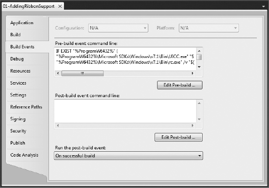
2. Select the Build Events tab as shown in Figure 7-1. Notice that the Pre-Build Event Command Line field contains entries that compile the XML file containing the Ribbon code into a DLL. You must modify these entries to match the version of the Windows 7 SDK installed on your system (the book uses version 7.1).
FIGURE 7-1: The Build Events tab contains the settings you need to change.
3. Click Edit Pre-Build. You’ll see the Pre-Build Event Command Line dialog box shown in Figure 7-2.
FIGURE 7-2: This dialog box contains the pre-build events for the project.
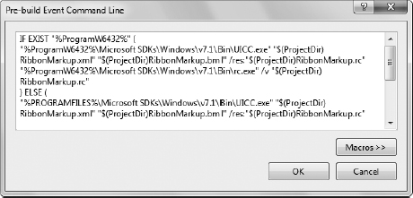
4. Change each of the directory entries in the dialog box to match the directory setup on your machine. Be especially careful of the version numbers. The example is configured to use version 7.0 of the Windows 7 SDK.
5. Click OK.
6. Choose Build ⇒ Build Solution to build the application.
When the code compiles, you’ll find Ribbon.DLL in either the \RibbonLib_v2.4\Ribbon\bin\Debug or \RibbonLib_v2.4\Ribbon\bin\Release folders, depending on the kind of build you performed. You’ll use Ribbon.DLL for the Windows Forms examples in this chapter.
Configuring the Application
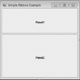
The example begins with a Windows Forms application. You need to add a SplitContainer control to the form and set the Orientation property to Horizontal so that the form appears as shown in Figure 7-3. You don’t need to add any other controls to the form at this point (and to keep things simple, it’s probably better that you don’t add anything).
FIGURE 7-3: Configure the client area to contain two panes, one of which will contain the Ribbon.
At this point, you have an important piece of the puzzle, Ribbon.DLL. Create a reference to Ribbon.DLL by right-clicking References in Solution Explorer and choosing Add Reference from the context menu. Select the Browse tab in the Add Reference dialog box and browse to the location of Ribbon.DLL. Highlight Ribbon.DLL and click OK.
The application requires only one additional using statement, using RibbonLib;. In addition, you must modify the class statement so that it includes a reference to IRibbonForm, as shown here:
public partial class frmMain : Form, IRibbonForm
After you add the interface, you can choose Implement Interface IRibbonForm from the drop-down list box, as shown in Figure 7-4.
FIGURE 7-4: Implement the IRibbonForm interface in your application.

The “Obtaining RibbonLib” section of the chapter discusses a Pre-Build Event Command Line (Figure 7-2). You must also add this script for building the Ribbon resources to the example application. The easiest way to perform this task is to copy it from one of the Ribbon-cs or Ribbon-vb projects. The same script works fine for every project you create. Listing 7-1 shows the script used for all the Windows Forms examples in this book (if you see a ![]() at the end of a line, it means that the next line is part of the current line).
at the end of a line, it means that the next line is part of the current line).
 LISTING 7-1: Script used to compile the Ribbon
IF EXIST "%ProgramW6432%" (
"%ProgramW6432%\Microsoft SDKs\Windows\v7.1\Bin\UICC.exe" ![]()
"$(ProjectDir)RibbonMarkup.xml" "$(ProjectDir)RibbonMarkup.bml" ![]()
/res:"$(ProjectDir)RibbonMarkup.rc"
"%ProgramW6432%\Microsoft SDKs\Windows\v7.1\Bin\rc.exe" /v ![]()
"$(ProjectDir)RibbonMarkup.rc"
) ELSE (
"%PROGRAMFILES%\Microsoft SDKs\Windows\v7.1\Bin\UICC.exe" ![]()
"$(ProjectDir)RibbonMarkup.xml" "$(ProjectDir)RibbonMarkup.bml" ![]()
/res:"$(ProjectDir)RibbonMarkup.rc"
"%PROGRAMFILES%\Microsoft SDKs\Windows\v7.1\Bin\rc.exe" /v ![]()
"$(ProjectDir)RibbonMarkup.rc"
)
cmd /c "("$(DevEnvDir)..\..\VC\bin\vcvars32.bat") && ![]()
("$(DevEnvDir)..\..\VC\bin\link.exe" /VERBOSE /NOENTRY /DLL ![]()
/OUT:"$(ProjectDir)$(OutDir)$(TargetName).ribbon.dll" ![]()
"$(ProjectDir)RibbonMarkup.res")"
This script calls three utilities to create a DLL out of the RibbonMarkup.XML markup file you create in the “Defining a Ribbon Interface” section of the chapter. The UICC utility compiles the Ribbon markup that you create into a binary (.BML) file. The UICC utility also creates a resource (.RC) file based on the objects within the markup file. The RC utility compiles the resource file into a resource object (.RES) file.
At this point, the script calls on VCVars32.BAT to create an environment suitable for the linker. A linker (Link.EXE) takes object files and creates an executable from them. In this case, Link combines the two Ribbon files into a single executable native-code DLL. The DLL has your project name, followed by .Ribbon.DLL. For example, the DLL for this project is named SimpleRibbon.Ribbon.DLL.
To use RibbonLib, you must add a reference to Ribbon.DLL using the same procedure found in previous chapters. In addition, you must add the following using statements to your code:
using RibbonLib;
using RibbonLib.Controls;
using RibbonLib.Interop;

If you find that your application isn’t executing as expected, make sure you verify that the directory containing the application has three files in it. The first, Ribbon.DLL, provides the interoperability layer between .NET and the Ribbon. The second, SimpleRibbon.Ribbon.DLL in this case, contains the native-code DLL that the Ribbon components use to display the Ribbon for your application on-screen. The third is the application executable, which is SimpleRibbon.EXE in this case.
Defining a Ribbon Interface
The Ribbon interface is actually an XML file containing special entries that are later compiled using the script shown in Listing 7-1. A Ribbon interface defies normal development procedures because it doesn’t rely on a designer. You write the XML code directly when working with a Windows Forms application. The problem that most developers will encounter is finding a way to create the interface in an orderly manner. The following sections help you create the interface for the simple Ribbon application and also provide guidelines for creating the Ribbon interface in an organized way to reduce potential errors.
Defining the Initial XML File
The process begins when you create an XML file. Use these steps to add an XML file to your project:
1. Right-click the project entry in Solution Explorer and choose Add ⇒ New Item. You’ll see the Add New Item dialog box shown in Figure 7-5.
FIGURE 7-5: Add an XML file to your application.
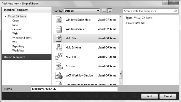
2. Highlight the XML File entry.
3. Type RibbonMarkup.XML in the Name field. The name you type is important because it has to match the name found in the script shown in Listing 7-1. If you use a different name, you’ll have to change the script to match. Otherwise, your Ribbon won’t compile and your application won’t display the interface. Interestingly enough, Visual Studio will accept all this without displaying a single error message.
4. Click Add. Visual Studio will add the new XML file and automatically open it for you.
One way to stay out of trouble when you create the interface is to design the basic Ribbon structure before you add any details. Listing 7-2 shows a basic structure you can use for any application.
 LISTING 7-2: Creating the basic Ribbon structure
<?xml version='1.0' encoding='utf-8'?>
<Application xmlns='http://schemas.microsoft.com/windows/2009/Ribbon'>
<Application.Commands>
<Command Name="cmdApplicationMenu" Id="1000" />
<Command Name="cmdTabHome" Id="2000" LabelTitle="Home" />
<Command Name="cmdQAT" Id="3000" />
</Application.Commands>
<Application.Views>
<Ribbon>
<Ribbon.ApplicationMenu>
<ApplicationMenu CommandName='cmdApplicationMenu'>
</ApplicationMenu>
</Ribbon.ApplicationMenu>
<Ribbon.Tabs>
<Tab CommandName='cmdTabHome'>
</Tab>
</Ribbon.Tabs>
<Ribbon.QuickAccessToolbar>
<QuickAccessToolbar CommandName='cmdQAT'>
</QuickAccessToolbar>
</Ribbon.QuickAccessToolbar>
</Ribbon>
</Application.Views>
</Application>
The root node for a Ribbon interface is always <Application> and you must include the xmlns attribute that points to the version of the Ribbon schema you want to use for your application. The structure is further divided into two main areas: <Application.Commands> and <Application.Views>. Notice the dot syntax used for the node names. An application command is an action that you want the Ribbon to perform. You’ll discover later that the command section contains property settings for each of the entries. An application view is the visual presentation of the Ribbon element. This section creates a connection between a visual element, such as a button, and a command that describes what to do with the visual element.
The basic Ribbon contains three areas: file menu, tabs, and QAT (Quick Access Toolbar). Consequently, the <Application.Commands> node has three child <Command> nodes for each of these areas. The areas don’t actually do any work, so their definitions are simple. The file menu needs nothing more than a Name attribute (used to access the file menu in code) and Id attribute (used when creating the resource file — each resource must have a unique identifier). The same holds true for the QAT entry. Each of the tabs also requires a LabelTitle attribute that contains the name of the tab as it appears on the Ribbon. By convention, the first tab of a Ribbon application is always the Home tab, so the example labels it as such.

The Id value you assign to each Ribbon element must be unique. However, there isn’t any rule on how you number the Ribbon elements. The example uses values of 1000, 2000, and 3000 to make later numbering easier and more logical. The File ⇒ New command will receive a value of 1010, while File ⇒ Open will receive a value of 1020, and so on. A submenu, such as File ⇒ New ⇒ Document, will receive a value of 1011, and File ⇒ New ⇒ Template will receive a value of 1012. Using a numbering system like this isn’t required, but it does make it easier to figure out the values of the Ribbon elements later when your structure becomes complex. Of course, you’ll need to come up with a system that works for you. Using this approach lets you create up to 10 elements in each of the three areas, 99 menu items, and 10 submenu items, which will likely provide enough flexibility for any application.
When you begin working with the application views, you’ll quickly find that they’re highly structured, as contrasted with the commands, which tend to be flat. All three areas appear as children of the <Ribbon> node. The <Ribbon.ApplicationMenu> node contains all the file menu entries; the <Ribbon.Tabs> node contains all the tabs such as Home; and the <Ribbon.QuickAccessToolbar> node contains all the QAT entries which normally default to Save, Redo, and Undo. Within each of these areas, you begin to see controls. In this case, you see the <ApplicationMenu>, <Tab>, and <QuickAccessToolbar> controls, each with its associated commands. The sections that follow will concentrate, for the sake of simplicity, on specific commands and their associated Ribbon entries, but it pays to keep this overall structure in mind as you read.
Developing a File Menu
The File menu (or the new term, Application menu) contains document management entries for the most part. Microsoft has been wishy-washy on just what to call the old File menu, and you’ll find that Office 2010 actually returns to the File menu. No matter what you call the File menu, it contains entries such as New, Open, Save, Print, and Exit. You may find additional entries on this menu, but it’s important to keep the File menu for document management functions and perhaps an application options entry.
The example contains just one entry on the File menu, Exit. A production application will have more entries, but this one entry is more than sufficient for now to show how to work with the File menu. You begin augmenting the File menu command shown in Listing 7-2 and add the Exit command as shown in Listing 7-3.
 LISTING 7-3: Creating the File Exit command
<Command Name="cmdApplicationMenu"
Id="1000"
TooltipTitle="File Menu"
TooltipDescription="Contains document management entries."/>
<Command Name="btnExit"
Id="1010"
LabelTitle="E&xit"
LabelDescription="End the Program"
TooltipTitle="Exit"
TooltipDescription="End the Program">
<Command.LargeImages>
<Image>Res/Exit32.bmp</Image>
</Command.LargeImages>
<Command.SmallImages>
<Image>Res/Exit16.bmp</Image>
</Command.SmallImages>
</Command>
The first thing you should notice is that there’s no differentiation between menus, buttons, or any other visual presentations when it comes to commands. You simply use the <Command> node to define the actions and properties for the element. This example adds the TooltipTitle and TooltipDescription attributes. These attributes appear as balloon help when the user hovers the mouse over the entry. However, these attributes won’t affect the QAT or an actual tab, such as Home. Keep the entries short and relevant. Anyone using a screen reader will hear these entries (in lieu of seeing them). Long entries take an unimaginable amount of time to read, and by the time the screen reader reads all the entries, the user has forgotten some of the initial entries. So short but precise is better.
The btnExit command contains an Id value of 1010 so you can quickly tell it belongs to the File menu. The LabelTitle attribute contains the text that appears on the menu. Notice the use of & to represent an ampersand (&). As with all menus, placing an ampersand in front of a letter underlines that letter and creates a speed key. In this case, the speed key is the x in Exit. The LabelDescription attribute provides descriptive text for the label. As with the File menu, the btnExit command adds the TooltipTitle and TooltipDescription attributes for accessibility reasons.
A new addition is icons. The <Command.LargeImages> and <Command.SmallImages> nodes provide the Ribbon with images for the command. Because this is the File menu, the icon appears to the left of the word Exit in the menu. You normally supply two sizes of icons so that people who rely on a large-print screen can have an appropriately sized icon. The “Obtaining 32-bit Graphics” section of this chapter describes how to create these icons. You normally provide the name of the command along with the icon size (16×16 or 32×32). The icon must be in 32-bit .BMP format and appear within an <Image> node.
Now that you have the command part of the File menu, it’s time to look at the view portion of the same menu. Listing 7-4 shows this part of the example.
 LISTING 7-4: Creating the File Exit view
<Ribbon.ApplicationMenu>
<ApplicationMenu CommandName='cmdApplicationMenu'>
<MenuGroup>
<Button CommandName='btnExit' />
</MenuGroup>
</ApplicationMenu>
</Ribbon.ApplicationMenu>
You place entries on the File menu within <MenuGroup> nodes. If you use more than one <MenuGroup>, the Ribbon places separators between each group. The controls for a particular group appear within the <MenuGroup> node. In this case, there’s only one entry, a <Button> control for Exit. All you need to provide is the CommandName attribute to create the association between the <Button> and the <Command>.
Obtaining 32-bit Graphics
You’ll very likely want to add icons to your Ribbon. All current Ribbon designs include graphics of various sorts. For most developers, the easiest way to obtain the required graphics is to draw them right in Visual Studio. The following steps get you started adding your first image to the project:
1. Right-click the project entry in Solution Explorer and choose Add ⇒ New Folder from the context menu. You’ll see a new folder appear in Solution Explorer.
2. Type Res as the folder name and press Enter. The Res (resource) folder will contain all the graphics for your project.
3. Right-click the Res folder and choose Add ⇒ New Item from the Context menu. You’ll see the Add New Item dialog box shown in Figure 7-5.
4. Highlight Bitmap File and type the filename in the Name field. Normally, you’ll want to use a logical naming scheme, such as the control name followed by the icon size in pixels, such as Exit32.BMP.
5. Click Add. Visual Studio adds the bitmap and automatically opens it for editing.
6. Set the Height and Width properties to the icon size you want, such as 16.
7. Set the Colors property to 24-bit. Even though the drop-down list box shows 32-bit as an option and you can select it, Visual Studio won’t allow the value on-screen. Unfortunately, Visual Studio produces 24-bit graphics as a maximum, not 32-bit graphics.
8. Draw the icon you want and save it to disk.
9. Close the graphics file.
At this point, you have a 24-bit bitmap that won’t display on the Ribbon. In order to display graphics on the Ribbon, you must use 32-bit graphics, but as you just saw, Visual Studio doesn’t support them. Use the following procedure to overcome this problem:
1. Download the Convert2BMP.EXE utility found at http://windowsribbon.codeplex.com/releases/view/32943.
2. Place the utility in an easily accessible location such as C:\Convert2BMP.
3. Open a command line and use the CD command to change directories to your project’s \Res folder, such as typing CD \SimpleRibbon\SimpleRibbon\Res and pressing Enter.
4. Type C:\Convert2BMP\Convert2BMP InputFilename OutputFilename and press Enter, where InputFilename is the name of the original file and OutputFilename is the name of the modified file.
If you reopen the graphic at this point, you’ll see that it is, indeed, 32 bits. However, don’t make any additional changes to it. Simply close the graphic and use it on the Ribbon.
Creating a Home Tab
The Home tab is probably the most complicated of the three areas you configure on the Ribbon. The reason is that you control the size and positioning of the controls, which means you must provide Windows with additional information. While the commands aren’t much more complex than those used for the File (Application) menu, the setup of the Ribbon view can be significantly more complex. Given the goals of the Ribbon, size and positioning are important, so you can spend quite a bit of time getting the layout of the tabs just right. Listing 7-5 shows the Home tab command code.
 LISTING 7-5: Creating the Home tab commands
<Command Name="cmdTabHome"
Id="2000"
LabelTitle="Home"
TooltipTitle="Home Tab"
TooltipDescription="Contains the main document settings."
Keytip="H"/>
<Command Name="grpTest"
Id="2010"
LabelTitle="Test"
TooltipTitle="Test Group"
TooltipDescription="Test the Application" />
<Command Name="btnClickMe"
Id="2011"
LabelTitle="Click Me"
TooltipTitle="Test Button"
TooltipDescription="Click to see a dialog box."
Keytip="C">
<Command.LargeImages>
<Image>Res/ClickMe32.bmp</Image>
</Command.LargeImages>
<Command.SmallImages>
<Image>Res/ClickMe16.bmp</Image>
</Command.SmallImages>
</Command>
The tabs require a bit more work because you need a different kind of presentation for the user. In addition to btnClickMe, which isn’t that much different from btnFileExt described in the “Developing a File Menu” section of this chapter, you also have to create a group in which to place the button. The group is grpTest in this case. You create it much as you do a tab, but its visual presentation is different. A group gathers like controls together to make them easier to understand and find.
Both cmdTabHome and btnClickMe contain a new attribute, Keytip. The Keytip is one or more characters that identify the control for keyboard users. When a user presses Alt, the Ribbon displays the Keytip you provide. If you don’t provide a Keytip, the Ribbon chooses a shortcut key for you that may not be a good match (such as selecting Y for the Home tab). Listing 7-6 shows the visual presentation of the Home tab.
 LISTING 7-6: Creating the Home tab view
<Ribbon.Tabs>
<Tab CommandName='cmdTabHome'>
<Tab.ScalingPolicy>
<ScalingPolicy>
<ScalingPolicy.IdealSizes>
<Scale Group='grpTest' Size='Large' />
</ScalingPolicy.IdealSizes>
</ScalingPolicy>
</Tab.ScalingPolicy>
<Group CommandName='grpTest' SizeDefinition='OneButton'>
<Button CommandName='btnClickMe' />
</Group>
</Tab>
</Ribbon.Tabs>
The Home tab view code begins with a new node, <Tab.ScalingPolicy>. A scaling policy defines how you want the controls to appear on the Ribbon. The default view is to show the controls in a small size. Using a small control lets the Ribbon display up to three buttons vertically before moving to the next horizontal position. Medium-sized controls are a little larger and will fit only two buttons vertically, while a large control consumes the entire vertical area.
You use the <ScalingPolicy.IdealSizes> tag to define the preferred size of the elements. The scaling policy is closely tied to the SizeDefinition attribute. When a group has just one button in it, the SizeDefinition is OneButton, which allows only Size='Large' controls. If you want to use some other size control, then you need to create a custom SizeDefinition node, which can get quite complex. For now, all you really need to know is that the scaling policy defines the size of the control and that the size you choose has to be consistent with the default SizeDefinition you choose, or you must create a custom SizeDefinition to accommodate special needs.

You may wonder where the OneButton SizeDefinition value comes from. Microsoft has defined several default scaling policies for you. There is a listing of these scaling policies at http://msdn.microsoft.com/library/dd316927.aspx.
After you define a scaling policy, you can define the <Group> that holds the control you want to display (obviously, the Ribbon can contain as many groups as needed — the example uses just one group for the sake of simplicity). The <Group> associates the group with a suitable command and also defines the SizeDefinition for the controls in the group. All the controls will be the same size unless you create a custom SizeDefinition. Within the <Group> are one or more controls. The example uses a <Button> control, but you can use any mix of controls desired.
Adding the QAT
The QAT, or Quick Access Toolbar, is actually the easiest part of the Ribbon to define, but you should define it last. The QAT makes controls used in other parts of the Ribbon easier for the user to access. For example, a user may want quick access to the File ⇒ New command and place it on the QAT, rather than perform the extra steps required to actually access the File ⇒ New command. In short, the QAT never introduces anything new — it uses features you’ve already defined. The QAT consists of two parts: the QAT itself and the customization component that appears as a drop-down list box of available items. Listing 7-7 shows the tags used to create the QAT and its associated customization.
 LISTING 7-7: Defining the QAT customization
<Command Name="cmdQAT"
Id="3000"
TooltipTitle="Quick Access Toolbar"
TooltipDescription="Contains the user configurable settings."/>
<Command Name="CustomizeQAT"
Id="3001" />
As you can see, the command portion of the QAT is extremely simple — nothing more than command declarations with appropriate tooltip information. The view is equally easy. Listing 7-8 shows the code used to create the QAT view.
 LISTING 7-8: Creating the QAT view
<Ribbon.QuickAccessToolbar>
<QuickAccessToolbar CommandName='cmdQAT'
CustomizeCommandName='CustomizeQAT'>
<QuickAccessToolbar.ApplicationDefaults>
<Button CommandName="btnExit"
ApplicationDefaults.IsChecked="true" />
<Button CommandName="btnClickMe"
ApplicationDefaults.IsChecked="true" />
</QuickAccessToolbar.ApplicationDefaults>
</QuickAccessToolbar>
</Ribbon.QuickAccessToolbar>
The <QuickAccessToolbar> node needs to contain a CustomizeCommandName attribute if you want the user to have the ability to change the QAT configuration. Because the QAT is there for the user to customize, you should always include this attribute.
The QAT will normally appear in a default state. You configure these defaults using the <QuickAccessToolbar.ApplicationDefaults> node. Each control that you want to appear on the QAT will appear as a child of this node. However, you don’t define the control again — you simply provide its name. In addition, you provide the ApplicationDefaults.IsChecked attribute to control whether the control is visible when the user starts the application.
Using PreviewRibbon to Test Your Design
At some point, you’ll have enough Ribbon elements put together for your application that you’ll want to start seeing what it looks like. You can simply start your application up and it will compile the Ribbon. Of course, you’ll see just the visual display and it probably won’t do anything because you haven’t performed any code behind yet. An alternative to this approach is to use the PreviewRibbon utility to view the Ribbon you’ve created. This utility provides a number of useful diagnostics and helps you see how your interface works. To use this utility, copy the RibbonMarkup.XML and associated \Res folder to the PreviewRibbon executable folder, open a command prompt, type PreviewRibbon RibbonMarkup.XML, and press Enter. Figure 7-6 shows how the example application appears in PreviewRibbon.
FIGURE 7-6: PreviewRibbon can help you see potential flaws in your design.
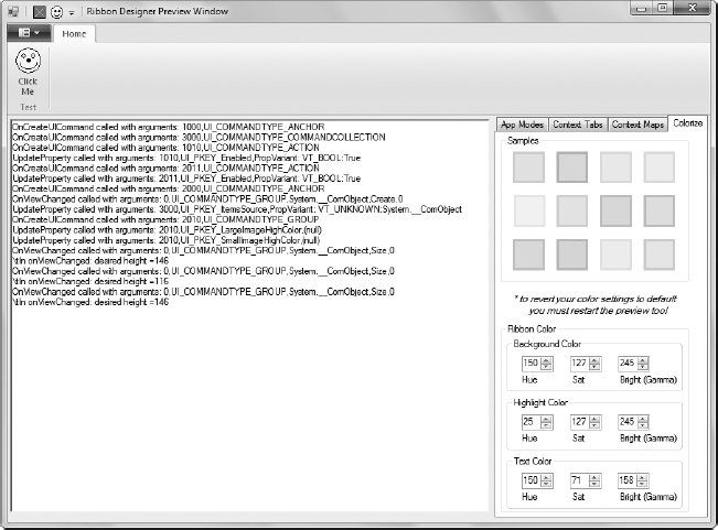
As your application becomes more complex, PreviewRibbon has more to offer. When working with the example application, you can obtain three benefits:
- Seeing the actual layout of the Ribbon to ensure it appears as you expect.
- Observing the message traffic that occurs when the user interacts with the Ribbon.
- Trying different Ribbon color combinations to ensure the colors you’ve chosen will work for the user. In some cases, color choices that seemed appropriate during the design phase don’t work in reality.
The messages are the more interesting part at this point. For example, when you choose File ⇒ Exit, you see the message, “Execute called with arguments: 1010,Execute,(n/a),(null)”. Notice that the Ribbon uses the unique identifier you provided. The call executes an action. Finally, since this is a simple Button control, it doesn’t pass any arguments to the event handler. When you click the Exit button on the QAT, it produces the same message, which tells you that everything is connected correctly. Now you can try the same actions with the Click Me button. In this case, you see a message of, “Execute called with arguments: 2011,Execute,(n/a),(null)”, which corresponds to the identifier you assigned. Obviously, as an application becomes more complex, you can see more potential for performing QA checks on your design.
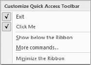
This utility also helps you discover some things about the Ribbon. For example, click the drop-down list box on the QAT. You’ll see a message of “OnCreateUICommand called with arguments: 3001,UI_COMMANDTYPE_ACTION” as the Ribbon creates the menu shown in Figure 7-7. However, the Ribbon makes this call only once. If you open the drop-down list box again, it simply appears on-screen without an additional message.
FIGURE 7-7: Explore your design to determine when it generates messages and how often it generates them.
It doesn’t take long to figure out that the PreviewRibbon utility can tell you a lot about how the Ribbon works. All these messages are real Windows messages. Your .NET application receives these messages as a callback and then acts on them when you supply the required code. In fact, it’s possible to create custom handlers to intercept and react to these messages, but working with RibbonLib is far easier.
Creating the Application
The example application is only a front end at this point — the controls don’t perform any useful work. It’s time to add some code. Using RibbonLib does make things significantly easier, but you still need to add a few special pieces of code to make the application work properly. The following sections describe these special pieces of code, as well as the event handlers you use to react to user clicks.
Implementing IRibbonForm
A Windows Forms application inherits from the Form class. However, in order to display a Ribbon, you need additional support in the form of the IRibbonForm interface. Using this interface is relatively easy, but you do need to provide support for two members as, shown in Listing 7-9.
 LISTING 7-9: Implementing the required IRibbonForm members
public void RibbonHeightUpdated(int newHeight)
{
// Update the height of the Ribbon.
this.splitContainer1.SplitterDistance = newHeight;
}
public IntPtr WindowHandle
{
// Return a handle to this window.
get
{
return this.Handle;
}
}
The Ribbon height can change when the user minimizes the Ribbon. If your application doesn’t know about this change, you’ll suddenly find that the user can’t interact with this properly. The RibbonHeightUpdated() method receives the new height of the Ribbon and changes the size of the splitter used to allocate space for it. The result is that the second pane, the client area of the application, automatically resizes as needed to accommodate the Ribbon.
Before the Ribbon can even interact with your application, it needs to know which window to work with. The WindowHandle property returns an IntPtr with the handle for the current window. It’s essential that you pass the correct handle. Normally, using this.Handle works just fine, but if you have an application with multiple windows, you’ll want to pass the handle of the active window, rather than the main window.
Defining the Application Framework
The Ribbon works within a specialized framework. If you were a C++ developer, you’d need to know all about this framework because you’d interact with it directly. However, as a C# developer working with RibbonLib, these details are already taken care of for you. If you want to know more about the framework, you can read about it at http://msdn.microsoft.com/library/dd316910.aspx. You still need to create and destroy the framework before you use it. Listing 7-10 shows the code used to perform this task.
 LISTING 7-10: Creating and destroying the application framework
private void frmMain_Load(object sender, EventArgs e)
{
// Create the Ribbon framework.
MyRibbon.InitFramework(this);
}
private void frmMain_FormClosing(object sender, FormClosingEventArgs e)
{
// Destroy the Ribbon framework.
MyRibbon.DestroyFramework();
}
The code creates the framework when the form is loading through the frmMain_Load() event handler. All you do is call the InitFramework() method with a pointer to the form object. The framework is destroyed as the form is closing through the frmMain_FormClosing() event handler. In this case, the code calls the DestroyFramework() method. It may seem as if nothing too terrible will happen if you don’t destroy the framework. However, if you don’t destroy the framework, you’ll create a memory leak at a minimum, and your application won’t exit cleanly. Make sure you include both of these event handlers in your application.
Accessing Ribbon Resources
Because of the way the Ribbon works, the resources on your form aren’t immediately available. Yes, that seems very odd indeed. The controls are on the form, but they weren’t put there by your application. A native-code DLL outside your application, SimpleRibbon.Ribbon.DLL, puts the controls there. In short, your application has no clue that these resources even exist until you create them using code. Many developers will have a hard time understanding how this can possibly work, which is why you really need to spend some time watching your application interface work using the PreviewRibbon utility (see the “Using PreviewRibbon to Test Your Design” section of this chapter for details).
The controls provided by the Ribbon aren’t standard controls either. You need to use special Ribbon versions of the controls. The following code contains the declarations for each of the resources you need to access for this example.
// Define the Ribbon.
private Ribbon MyRibbon = new Ribbon();
// Access the main elements.
private RibbonApplicationMenu FileMenu;
private RibbonTab HomeTab;
private RibbonQuickAccessToolbar QAT;
// Access the controls on the main elements.
private RibbonButton FileExit;
private RibbonButton HomeClickMe;
Notice that the code begins by obtaining access to the Ribbon itself. You also need to access each of the major areas of the Ribbon: File menu, Home tab, and QAT. Finally, you need access to each of the buttons defined on the Ribbon. Each of these resources has a special type associated with it, and they don’t have the same properties, methods, and events as Windows Forms controls.
The resources aren’t initialized yet (except for MyRibbon, which is initialized when you create the application framework). Listing 7-11 shows the code used to initialize each of the resources.
 LISTING 7-11: Initializing the application resources
public frmMain()
{
InitializeComponent();
// Gain access to the main elements.
FileMenu = new RibbonApplicationMenu(MyRibbon, 1000);
HomeTab = new RibbonTab(MyRibbon, 2000);
QAT = new RibbonQuickAccessToolbar(MyRibbon, 3000);
// Gain access to the File menu controls.
FileExit = new RibbonButton(MyRibbon, 1010);
// Create event handlers for the File menu controls.
FileExit.OnExecute +=
new RibbonLib.Controls.Events.OnExecuteEventHandler(
FileExit_OnExecute);
// Gain access to the Home tab controls.
HomeClickMe = new RibbonButton(MyRibbon, 2011);
// Create event handlers for the Home tab controls.
HomeClickMe.OnExecute +=
new RibbonLib.Controls.Events.OnExecuteEventHandler(
HomeClickMe_OnExecute);
}
At this point, you should suddenly understand the need to use easily remembered identifiers for the controls on the Ribbon. In order to gain access to any of the controls, you must pass the instance of the Ribbon (MyRibbon) and an Id value to the constructor. Obtaining a reference to any Ribbon control works precisely the same way.
Once you have access to a control, you can begin using it. The two Button controls need to do useful work. To make this possible, the code creates RibbonButton objects and then accesses the OnExecute event for each of them. Only now do you have a callback between the Ribbon on the application and the code behind for your application. Fortunately, except for a few small wrinkles, there isn’t anything mysterious about creating the event handler references. In fact, you can simply press Tab twice, as you normally would, to create both the remainder of the code after you type OnExecute += and the event handler code.
Handling Ribbon Events
The event handlers for this example are relatively simple since the focus of this example is on understanding the basics for creating an application with a Ribbon interface. Listing 7-12 shows the code for both event handlers.
 LISTING 7-12: Handling the Ribbon Events
void FileExit_OnExecute(PropertyKeyRef key,
PropVariantRef currentValue,
IUISimplePropertySet commandExecutionProperties)
{
// End the program.
Environment.Exit(0);
}
void HomeClickMe_OnExecute(PropertyKeyRef key,
PropVariantRef currentValue,
IUISimplePropertySet commandExecutionProperties)
{
MessageBox.Show("You clicked Click Me!");
}
The first thing you should notice is that the event handlers for a Ribbon control are different from the event handlers for Windows Forms controls. You get more information as input because you need it in order to perform some tasks. However, you can perform any required application-level task without accessing these properties. The properties generally affect access to the Ribbon in some way. For now, just realize that you have more information than normal at your disposal, and you’ll probably need that information when creating a complex application.
The FileExit_OnExecute() event handler is called when the user clicks the Exit button in either of the locations (File menu or QAT). Notice that the code uses Environment.Exit(0) instead of the more standard Close(). The reason for this difference is that you’re working with a Ribbon-based application. If you simply close the form, the application will exit without properly deallocating memory for the Ribbon. A return value of 0 indicates success to the system.
The HomeClickMe_OnExecute() event handler displays a simple message box. There isn’t anything unique about this call.
The Windows Presentation Foundation (WPF) is Microsoft’s alternative to the Windows Forms application. This chapter won’t debate the relative merits of WPF and Windows Forms. However, WPF does seem to attract the attention of developers developing a new application far more often than of developers performing upgrades, which is why this chapter views WPF in the light of new development. The following sections describe how to create a Ribbon-based application using WPF.
Obtaining Microsoft Ribbon for WPF
As with Windows Forms development, Microsoft doesn’t include any Ribbon development functionality for WPF in Visual Studio. You must instead download what you need and install it on your system before you begin your project. Fortunately, Microsoft does make a product available for WPF developers to use. You can find it at http://www.microsoft.com/downloads/details.aspx?FamilyID=2BFC3187-74AA-4154-A670-76EF8BC2A0B4. Make sure you download both Microsoft Ribbon for WPF Source and Samples.MSI and Microsoft Ribbon for WPF.MSI to obtain a complete setup.
First, double-click Microsoft Ribbon for WPF.MSI and follow the instructions to install Ribbon support for WPF. Second, double-click Microsoft Ribbon for WPF Source and Samples.MSI and follow the prompts to install the source and samples. The source code is nice, but what you really need are the Ribbon samples for later experimentation. Unfortunately, the Ribbon samples are stored in the \Program Files\Microsoft Ribbon for WPF\v3.5.40729.1 or \Program Files (x86)\Microsoft Ribbon for WPF\v3.5.40729.1 directory (depending on whether you have a 32-bit or 64-bit operating system) as MicrosoftRibbonForWPFSourceAndSamples.ZIP. In order to use the samples, you must open the .ZIP file and place it in a folder you have permission to access.

The Microsoft examples rely on their new Model-View-ViewModel (MVVM) design pattern. You can read about this design pattern at http://msdn.microsoft.com/magazine/dd419663.aspx. The MVVM approach probably works fine for large-scale development in corporations, but it isn’t particularly friendly for learning a new development technique. With this in mind, the example in this chapter takes a much simpler approach to working with WPF and the Ribbon. The idea is to help you understand the underlying technology before you jump into the distinctly large learning curve of MVVM. However, once you master the basic Ribbon technology, you should at least look at MVVM for larger Ribbon projects where it can help you keep your application well ordered.
Configuring the WPF Application
Unlike the Windows Forms application found in the “Getting Started with the Ribbon” section of this chapter, your WPF application comes with a number of amenities. After you perform the installation, you’ll see a new WPF Ribbon Application template in the Visual Studio New Project dialog box shown in Figure 7-8 (accessed by choosing File ⇒ New Project or by clicking New Project on the Start page).
FIGURE 7-8: Adding WPF Ribbon support provides a new template for you to use.
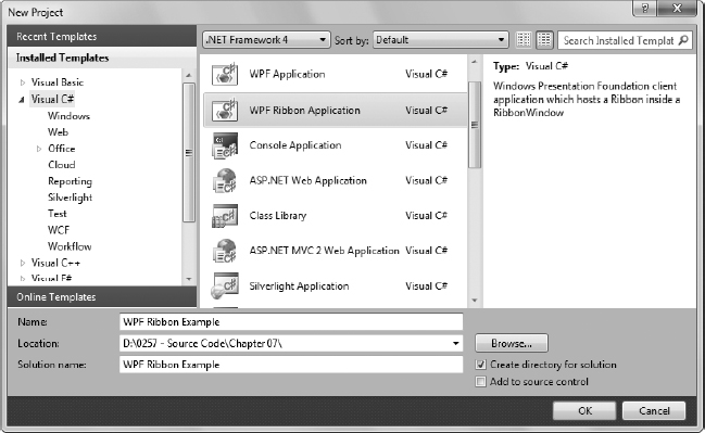
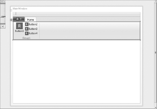
The example application is named WPF Ribbon Example. Select the required project, enter a project name, and click OK. Visual Studio creates the project for you. The first thing you’ll notice is that the new project includes everything needed to begin writing a Ribbon application, including a designer, as shown in Figure 7-9.
FIGURE 7-9: The WPF Ribbon Application template comes complete with a designer.
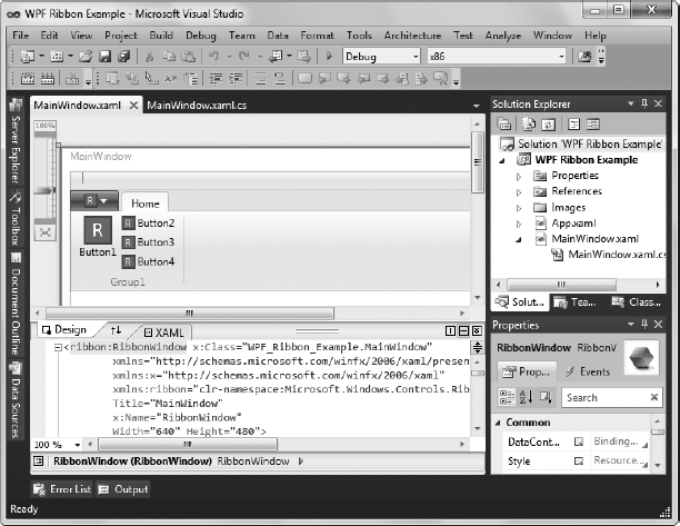
In fact, your application is ready to start designing. The only problem with using this template is that it relies on an entirely different technique for creating the Ribbon than any other programming strategy. In short, if you want to use WPF, then you need to learn yet another method of creating the Ribbon interface. All this said, at least the technique relies on graphic development methods using a designer instead of writing XML code.
Defining the Ribbon Interface for the WPF Application
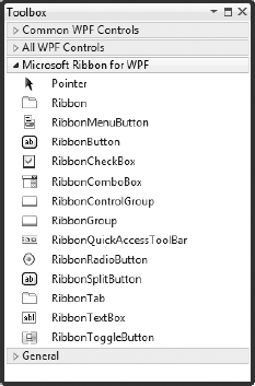
Having a designer to use is the nice part of working with WPF. Unfortunately, using the designer is a complex undertaking, and it’s not even possible to set all the required configuration information using it. You have to perform some tweaks by working directly with the XAML, but you can create the basic layout using just the designer and the Properties window. As shown in Figure 7-9, the template automatically creates a Ribbon with a QAT (hidden, but there), a File menu with one menu entry, and a Home tab with four buttons on it. Everything that’s supplied is generic, though, so you’ll definitely want to change the interface. Fortunately, you have access to a full set of tools to perform the job, as shown in Figure 7-10.
FIGURE 7-10: The Toolbox now contains a Microsoft Ribbon for WPF tab that holds Ribbon controls.
This section shows how to modify the QAT, File menu, and Home tab so they appear the same as the example shown in Figure 7-6. In most cases, the example will use XAML so that you can easily see the required changes without spending hours clicking through the designer.
Begin by selecting the Home tab. It’s not always obvious when you have a particular element selected. For example, you might think that you would click on the Home tab itself to select the Home tab, but what you really need to do is click within the Home tab client area, as shown in Figure 7-11.
FIGURE 7-11: Exercise care when selecting Ribbon elements or you might modify the wrong object.
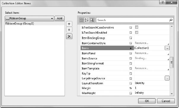
Locate the Items property in the Properties window and click the ellipsis next to it. You’ll see the Collection Editor: Items dialog box shown in Figure 7-12. This dialog box contains a listing of the items within the Home tab. In this case, there’s a single group. Change the Header property value to Test. In addition, change the KeyTip value to H.
FIGURE 7-12: The Collection Editor: Items dialog box lets you drill down into the Ribbon in your application.
The application requires only one button for this example, so locate the Items property. Click the ellipsis next to it and you’ll see another Collection Editor: Items dialog box. In fact, you can keep drilling down as needed to get to the level required in your application. Highlight RibbonButton (Button2) in the Select Item list and click Remove Item. Do the same thing for RibbonButton (Button3) and RibbonButton (Button4). You should now have a single large button in the Test group.
It’s time to focus on the remaining large button. Copy the four graphics created in the “Obtaining 32-bit Graphics” section of the chapter to the Images folder of this project. Change the following properties to the values shown:
| PROPERTY NAME | VALUE |
| KeyTip | C |
| Label | Click Me |
| LargeImageSource | Images/ClickMe32.BMP |
| QuickAccessToolBarId | 2011 |
| SmallImageSource | Images/ClickMe16.bmp |
| ToolTipDescription | Click to see a dialog box. |
| ToolTipTitle | Test Button |
There are some properties you can’t change using the Collection Editor: Items dialog box. One of these properties is the object name, which appears as x:Name in XAML. You need to change the XAML code directly to make this change.
Some of these settings take on increased importance when you’re working with WPF. For example, there aren’t any default KeyTip values. If you press Alt in a default WPF application, nothing happens — you don’t see any letters at all. Therefore, if you want to accommodate keyboard users, you must define a KeyTip value for every object that requires one.
The QuickAccessToolBarId is also exceptionally important. If an object lacks this value, the user can’t add it to the QAT. At this point, you’ve configured the Home tab. Listing 7-13 shows the XAML for this part of the application. If you compare this listing to Listing 7-5, you’ll see many similarities, but also a few differences.
 LISTING 7-13: WPF Home tab XAML code
<ribbon:RibbonTab x:Name="cmdTabHome"
Header="Home"
KeyTip="H">
<ribbon:RibbonGroup x:Name="grpTest"
Header="Test">
<ribbon:RibbonButton x:Name="btnClickMe"
LargeImageSource="Images/ClickMe32.BMP"
Label="Click Me"
KeyTip="C"
QuickAccessToolBarId="2011"
SmallImageSource="Images/ClickMe16.bmp"
ToolTipDescription="Click to see a dialog box."
ToolTipTitle="Test Button"
Click="btnClickMe_Click" />
</ribbon:RibbonGroup>
</ribbon:RibbonTab>
One of the more important differences is that not every object receives a number. There’s no Id attribute in XAML. XAML also uses different names for similar items. The Header and Label attributes replace the LabelTitle attribute. There are also similarities. Both XML and XAML use the ToolTipTitle and ToolTipDescription attributes to provide tooltips. Despite the differences, if you know how to work with the Windows Forms application XML, you also have a good idea of how to work with XAML.
You should also notice something else that differs when working with WPF. It’s possible to create a direct connection to an event handler. Notice the Click attribute for btnClickMe. Notice that it points to btnClickMe_Click, which is discussed in the “Creating the WPF Application” section of this chapter. Listing 7-14 shows the XAML for the File (application) menu.
 LISTING 7-14: WPF File menu XAML code
<ribbon:Ribbon.ApplicationMenu>
<ribbon:RibbonApplicationMenu SmallImageSource="Images\SmallIcon.png"
KeyTip="F">
<ribbon:RibbonApplicationMenuItem
Header="Exit"
KeyTip="x"
x:Name="btnExit"
ImageSource="Images/Exit16.BMP"
ToolTip="End the Program"
ToolTipDescription="End the Program"
QuickAccessToolBarImageSource="Images/Exit16.BMP"
QuickAccessToolBarId="1010"
ToolTipTitle="Exit"
Click="btnExit_Click" />
</ribbon:RibbonApplicationMenu>
</ribbon:Ribbon.ApplicationMenu>
The differences between the File (Application) menu for WPF and the File menu for Windows Forms are about the same as those for the Ribbon tab. You define the text that appears on the menu using the Header attribute and must define a KeyTip attribute if you want to support keyboard users. You must also define a QuickAccessToolBarId attribute value if you want the user to be able to place the menu on the QAT. As with btnClickMe, btnExit has a Click attribute to define the Click event handler, btnExit_Click().

WPF development differs in another important way from Windows Forms development. The default graphics supplied with the template are .PNG (Portable Network Graphics) files and not .BMP files. In addition, these files are 24-bit, rather than the 32-bit files used by Windows Forms applications. While the UUIC utility requires that you provide 32-bit graphics, Visual Studio seems content to use 24-bit files. In short, you have one less conversion step to worry about.
The QAT is part of the initial template, but you won’t find an XAML entry for it, and without adding some code you have little control over how the QAT appears. In fact, unlike the Windows Forms application, most of the QAT functionality is controlled through the code behind. Listing 7-15 shows a basic QAT XAML entry.
 LISTING 7-15: WPF QAT XAML code
<ribbon:RibbonQuickAccessToolBar
Name="cmdQAT"
ToolTip="Contains the user configurable settings."
LayoutUpdated="cmdQAT_LayoutUpdated">
</ribbon:RibbonQuickAccessToolBar>
Unlike the Windows Forms application, you don’t define members of the QAT as part of the markup. The members are defined in the code behind. However, as with other members of the Ribbon, the QAT does include an event entry. You need to define an event handler for the LayoutUpdated event, which is cmdQAT_LayoutUpdated() in this case.
Creating the WPF Application
A WPF application has the potential to require a considerable amount of code behind, which contrasts somewhat to a Windows Forms application where a lot of the configuration is performed using XML. The most visible configuration requirement is the QAT. Although you could perform some configuration tasks in XAML, the QAT is far more reliant on events that you create in code behind. The following sections describe the code behind for this example.
Handling the Button Events
Unlike a Windows Forms application, a WPF provides connectivity for you between the Ribbon and the code behind in the background — you don’t have to create any special code as you do when working with a Windows Forms application. Consequently, all you really need to worry about are any event handlers that you described in the XAML, as shown in Listing 7-16.
 LISTING 7-16: Creating the btnExit and btnClickMe event handlers
private void btnExit_Click(object sender, RoutedEventArgs e)
{
// End the program.
Close();
}
private void btnClickMe_Click(object sender, RoutedEventArgs e)
{
// Display a message box.
MessageBox.Show("You clicked Click Me!");
}
The btnExit_Click() and btnClickMe_Click() event handlers correspond to the Click attribute entries for the buttons in the XAML code. Unlike a Windows Forms application, the btnExit_Click() can actually call Close() without causing any sort of memory error. Again, all the connectivity requirements are handled for you in the background. The btnClickMe_Click() event handler code is precisely the same as its Windows Forms application counterpart.
Handling the QAT
The QAT is handled completely differently when working with WPF. For one thing, you have to keep track of which elements are on the QAT. The QAT also works differently. When you right-click an item that has the QuickAccessToolBarId attribute defined, you see the Add to Quick Access Toolbar option on the Objects Context menu enabled as shown in Figure 7-13. Choose this option and the item appears on the QAT. Contrast this to the Context menu for the QAT in the Windows Forms application, where checking the item displays it on the QAT.
FIGURE 7-13: Each item has a Context menu entry that lets you add it to the QAT.
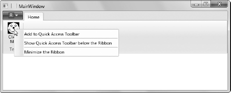
When you no longer want an item on the QAT, you right-click its entry on the QAT and choose the Remove from Quick Access Toolbar entry on the Context menu, as shown in Figure 7-14. The item is actually destroyed because it exists as a separate entity on the QAT. Consequently, you must always track objects you want to manage on the QAT.
FIGURE 7-14: Removing an item destroys its QAT entry.
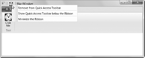
One of the requirements for managing the QAT is a set of variables that track the object’s existence on the QAT. There are only two buttons that have QAT access for the example. The following code provides the means for tracking their connected state:
// Create variables to hold QAT connectivity data.
private Boolean btnExitConnected = false;
private Boolean btnClickMeConnected = false;
The XAML for the QAT defines an event handler for the LayoutUpdated event. Updates occur in a number of situations, not just the addition or removal of objects on the QAT. Consequently, your code can’t assume anything about the QAT; it must work as though the QAT could be performing some other task. Listing 7-17 shows the code used to manage QAT updates for the example.
 LISTING 7-17: Updating the QAT
private void cmdQAT_LayoutUpdated(object sender, EventArgs e)
{
// Make sure the Ribbon is initialized.
if (Ribbon.QuickAccessToolBar != null)
// Determine whether there are any items on the Ribbon.
if (Ribbon.QuickAccessToolBar.Items.Count > 0)
{
// Check the connectedness for each item on the Ribbon.
foreach (var Item in Ribbon.QuickAccessToolBar.Items)
{
// Check the ID of each variable and set its connected
// variable as appropriate.
// Check for btnExit.
if (((RibbonButton)Item).QuickAccessToolBarId.ToString() ==
"1010")
{
// Only create a connective if we haven't done so already.
if (!btnExitConnected)
{
// Set the tracking variable so we don't make multiple
// connections.
btnExitConnected = true;
// Handle the Click event.
((RibbonButton)Item).Click +=
new RoutedEventHandler(MainWindow_Click);
// Handle the Unloaded event.
((RibbonButton)Item).Unloaded +=
new RoutedEventHandler(MainWindow_Unloaded);
}
}
// Check for btnClickMe.
if (((RibbonButton)Item).QuickAccessToolBarId.ToString() ==
"2011")
{
if (!btnClickMeConnected)
{
btnClickMeConnected = true;
((RibbonButton)Item).Click +=
new RoutedEventHandler(MainWindow_Click);
((RibbonButton)Item).Unloaded +=
new RoutedEventHandler(MainWindow_Unloaded);
}
}
}
}
}
The application can call cmdQAT_LayoutUpdated() a number of times before the QAT is even initialized. Therefore, the first check you must make is whether the QAT is null. You access the QAT using the Ribbon.QuickAccessToolBar object.
If the QAT has been initialized, it will contain information about itself that isn’t used in this example, but the information is extensive and you should spend some time in the debugger reviewing it. The item of interest for this example is the Ribbon.QuickAccessToolBar.Items collection. When this collection has entries in it, you can process them to determine which items are on the QAT.
Both of the items you can place on the QAT are RibbonButton objects for this example, which simplifies the code. When you allow the user to place other kinds of objects on the QAT, you need to create relatively flexible code because you don’t know what type of object is in a particular Ribbon.QuickAccessToolBar.Items collection item. To determine which button is being processed, the code coerces the generic object in Item to a RibbonButton. It then uses the QuickAccessToolBarId value to compare with the numbers assigned to each of the RibbonButton objects.
The first thing the code does is set the requisite tracking variable, such as btnExitConnected, to true. This variable ensures that the button doesn’t create more than one event handler connection. Each button can call cmdQAT_LayoutUpdated() multiple times, so this step is extremely important.
The next step is to create a RoutedEventHandler object for the Click event, which connects to the MainWindow_Click() event handler. The MainWindow_Click() will route the call to the appropriate button event handler. When the user clicks the button on the QAT, the code calls MainWindow_Click() first.
A problem with the QAT is that you don’t know when something is unloaded by monitoring the cmdQAT_LayoutUpdated() event handler. Monitoring is performed by the Unloaded event. So the code creates a RoutedEventHandler object for the MainWindow_Unloaded() event handler as well. This event handler takes care of any cleanup when the user removes an item from the QAT.
Now that you have some idea of how QAT layout monitoring occurs, it’s time to look at how clicks are handled. Listing 7-18 shows the code used to handle QAT clicks.
 LISTING 7-18: Responding to QAT clicks
void MainWindow_Click(object sender, RoutedEventArgs e)
{
// Determine which button was clicked.
switch (((RibbonButton)sender).QuickAccessToolBarId.ToString())
{
case "1010": // Exit
// Call the standard click event.
btnExit_Click(sender, e);
break;
case "2011": // Click Me
btnClickMe_Click(sender, e);
break;
}
}
Routing clicks is relatively easy. All you need do is determine which QuickAccessToolBarId has fired the event. In both cases, the code simply calls the required Click event handler and passes both the sender and e values to it.
Cleanup is a little more involved than click routing. Listing 7-19 shows the last piece to this example, the MainWindow_Unloaded() event handler.
 LISTING 7-19: Removing QAT members
void MainWindow_Unloaded(object sender, RoutedEventArgs e)
{
// Determine which button was clicked.
switch (((RibbonButton)sender).QuickAccessToolBarId.ToString())
{
case "1010": // Exit.
// Remove the click event handler.
((RibbonButton)sender).Click -=
new RoutedEventHandler(MainWindow_Click);
// Remove the unloaded event handler.
((RibbonButton)sender).Unloaded -=
new RoutedEventHandler(MainWindow_Unloaded);
// Set the tracking variable to false.
btnExitConnected = false;
break;
case "2011": // Click Me
((RibbonButton)sender).Click -=
new RoutedEventHandler(MainWindow_Click);
((RibbonButton)sender).Unloaded -=
new RoutedEventHandler(MainWindow_Unloaded);
btnClickMeConnected = false;
break;
}
}
It’s important to remember that the .NET Framework isn’t magic. The example code you’ve examined still works with a native-code module. The fact that .NET hides it from you for a WPF application doesn’t change things. When you debug this application, you’ll see some sections of code where the Call Stack window (Figure 7-15) specifically mentions external code. This is your application’s native module at work.
FIGURE 7-15: A WPF application doesn’t magically get rid of the native module.

This is important because your application can still cause memory leaks when you don’t handle things correctly. Consequently, you must perform cleanup for your application through the MainWindow_Unloaded() event handler. Every object you create, every event handler you define, everything that could have a memory connection to it, must be cleaned up before the object is unloaded.
In this case, the code determines which button is being cleaned up. It then removes the connection to the Click and Unloaded event handlers. After it performs these two cleanup tasks, the code sets the requisite tracking variable to false so that the process can begin anew the next time the user adds the object to the QAT.
MOVING YOUR APPLICATIONS TO WINDOWS 7
This chapter has focused on techniques for adding the Ribbon to your application. Most developers will use the Windows Forms approach for application updates and the WPF approach for new development. Of course, you can always choose to use a third-party solution like Elegant Ribbon to reduce your workload. The one concept you should take away from this chapter is that using the Ribbon is going to require a lot of work from everyone, developer and user alike. In order to make using the Ribbon worthwhile, you must evaluate and quantify the benefits, using the concepts presented in Chapter 6. In short, you don’t want to embark on a Ribbon adventure without a clear idea that you’ll gain something in the end.
Now that you’ve seen a few Ribbon examples, you’ll probably want to begin developing your own Ribbon application. That would be a mistake. Your first steps should be to obtain a copy of PreviewRibbon, get it working on your machine, and create some sample Ribbon setups for users, managers, and developers to see before you do anything else. It also pays to spend some time using debug to trace through the PreviewRibbon example so that you can better see how things work at a more advanced level (use the simple example in this chapter as your starting point, or you’ll quickly go crazy).
After everyone agrees that the Ribbon truly is going to provide quantifiable benefits, start developing your application. However, start very simply. Because the Ribbon uses a callback mechanism, you want to be sure you develop the basic application first and get it working. After that, you can add the complete Ribbon interface, and then start making the features work one at a time as users test your application. The Ribbon is actually a forgiving environment to work in once you get the basic application working.
Chapter 8 takes the next logical step in the Windows 7 user interface environment — working with Aero Glass. Vista users often noted that Aero Glass was pretty much eye candy with a few helpful, but not essential, features. This perception has changed in Windows 7. Features such as Show Desktop and Peek make using Aero Glass more appealing. Of course, your application will look nicer running on Windows 7 if it supports Aero Glass, but Chapter 8 provides you with a lot of practical reasons for adding this support to your update or new application.