Chapter 3: Working with Video Kiosk Using C#
Windows has developed tools in the now not-so-recent past to allow users to use its flexible graphics programming structures and techniques, which were, frankly, dense and intimidating to use before then. We shall use the example of a Video Kiosk program to understand how this toolbox, named “GDI+”, functions, and in doing so learn how to apply these tools in making unique and creative graphical interfaces of our own, as well as simply using them effectively in more straightforward projects.
We will cover the following sub-topics:
-
Introduction to creating Custom Controls.
-
Making a Control Library.
-
The ControlPaint class and its implementation in customizing controls.
-
Virtual Methods.
-
Overriding Events via Controls.
-
Exception Handling and caching Exception Flags.
-
COM Interop and how to use it.
-
Designing and Implementing Interfaces.
-
TODO lists.
-
TimeSpan and MessageBox Classes
An Introduction to GDI+
There has always been an exceptionally robust and capable graphics programming toolkit available in Windows, referred to as “GDI”, though as we have mentioned it has often been held back by the technical investment required to learn how to use it effectively. Specifically, GDI consists of a group of unorganized structures and subroutines and uses API methods that do not very simply fall in line with each other. In other words, GDI is implemented onto a “canvas” procedurally.
In contrast, GDI+ is an object-oriented library of graphical tools that encapsulates all of the above into one structure, i.e. it is an ordered, categorized version of GDI. This lets us peruse one cleanly divided section of tools at a time, instead of spending half our time diving into a jumble of structures to find one that we need.
Let’s learn about how GDI has been sorted into GDI+, and the resulting types, classes, and namespaces that it is made of.
GDI+ Namespaces
The GDI+ Classes are stored in System.Drawing.dll
, and are further divided using various namespaces:
-
System.Drawing
-
System.Drawing.Design
-
System.Drawing.Drawing2D
-
System.Drawing.Imaging
-
System.Drawing.Printing
-
System.Drawing.Text
Combined, these broadly cover the three foci of graphics programming: typography
(drawing text using different glyphs, fonts, sizes, etc.), imaging
(non-trivial graphical objects, such as images, photographs, bitmaps, etc.), and 2D vector graphics
(comparatively trivial graphical objects, such as basic shapes, lines, and curves).
An Introduction to GDI+ Programming
An important concept in the modern era of internet development is statelessness, i.e. code does not retain information but rather carries flags that are accessed every time it is used. This also applies to using GDI+: code using these classes require a reminder of their properties and states, such as font size, shape, position, screen size, etc. In short, almost every piece of information that relates to the graphics environment has to be explicitly stated every time the code interacts with a DC, or device context (the “canvas” on which you’re designing a graphic). You cannot cheat by caching the DC itself, either:
|
public class CacheGraphics : System.Windows.Forms.Form
{
Graphics graphics;
public CacheGraphics()
{
graphics = new Graphics();
}
}
|
This defines a class CacheGraphics
that inherits information from Form
, and creates a new Graphics
object, storing it in the graphics
variable. This does not work because GDI+ is stateless. Any changes in the DC (which is contained in the Graphics
object) will not be transferred over into the graphics
variable as it is only displaying a graphics according to the information it has been given - it has stored none of said data. Thus, please do not try to create a Graphics object directly using new, nor store an object of this sort in some field.
Instead, use CreateGraphics
to make a new Graphics object to work on every time you need one (alternatively, get the Graphics
object argument from an event handler). Creating a Graphics object is much more complex that simply calling for a new one, and using this predefined method ensures that an object is initialized smoothly every time. You will have to provide it all the state data it needs every time a new graphics operation is called for.
Let’s now look at an example of how to make a graphical interface using GDI+: The PlayControl:
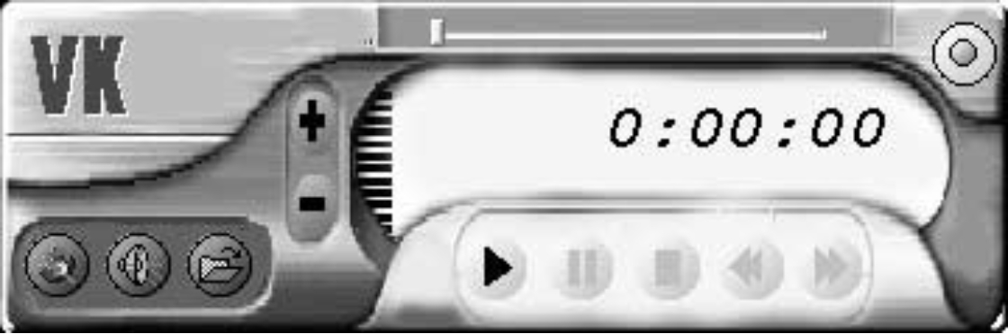 PlayControl
The PlayControl is a simple example of how to integrate graphics with functionality. A few things are going on, on the surface level: rounded shapes and buttons, gradients and colors, images contained in the button spaces, the VideoKiosk trademark logo, the slider on the top of the interface, etc. As one might expect, the buttons respond to Click events, causing a Click event handler to be called into function that passes its output to run the requisite code block.
Two things contribute to the reusable design of these graphical controls: one, controls are implemented separately by the button,
and two, the graphical design does not actually do anything - it only serves to call a function using an IPlayer interface (which will be discussed later). For example, pressing Play plays something by passing the respective command of the PlayControl, on the condition that the IPlayer interface is used. Classes allow repeatability of individual controls and the interface allows us to reuse the entire component. This interface and its subroutines is described below.
|
using System;
namespace VideoKiosk
{
public interface IPlayer
{
void Close();
void Play();
void Pause();
void Stop();
void FastForward();
void FastReverse();
void VolumeUp();
void VolumeDown();
bool Open();
double Duration();
bool Mute();
void Mute(bool state);
double Elapsed();
}
}
|
Owing to this sizeable list of functions, we can conclude that the IPlayer interface can be used to emulate many modern devices on
one computer instead.
Form1.cs
, the main form in the VideoKiosk, is used to implement the interface, i.e. all functions named in the interface are handled by this form. Therefore, we can call Form1 as a player using PlayControl. To do so, we pass a reference to the PlayControl, contained within its constructor, to the form as follows:
|
private PlayControl control = null;
private void Form1_Load(object sender, System.EventArgs e)
{
control = new PlayControl(this);
control.Show();
}
|
The PlayControl instances themselves associate and keep track of players. Its constructor is as follows:
|
private IPlayer player;
public PlayControl()
{
InitializeComponent();
}
public PlayControl(IPlayer player) : this()
{
this.player = player;
}
|
Since PlayControl is dependent on Form1, the PlayControl closes when Form1 does. The above constructor shows how to call for the default constructor, which is the PlayControl method itself, and takes no arguments. It must call this constructor since this is the function to initialize the component. Without doing so, the control objects we wanted to create will not be created, and the form will not work correctly.
This default constructor is called by this()
,and the subsequent player controls are cached in the this.player
variable field. This has now created a player that we can control using PlayControl.
Let’s look at how, for example, the play
functionality is handled when we press the play button. To begin with, the function player.Play()
is called, which runs code in Form1. Form1 contains the following in our example. This can be different for other sets of interfaces:
|
void IPlayer.Play()
{
axMediaPlayer1.Play();
}
|
A more nuanced and practical implementation of a play
functionality (as shown in this example code for VideoKiosk’s play
command) would involve things such as event invocation and logic checks:
|
private void Play()
{
if(player==null) return;
try
{
player.Play();
PlayerState = PlayerState.playing;
}
catch
{
PlayError();
PlayerState = PlayerState.stopped;
}
}
private void playButton1_Click(
object sender, System.EventArgs e)
{
Play();
}
|
Generally, it is a good habit not to write code into an event handler itself, instead placing a call to a method, Play
, and using PlayControl’s current context to determine what to do. It uses a sentinel structure (we may also alternate towards using if-else or other conditional block statements) to make sure that PlayerState is not null. For exception handling, this method is used again, ensuring that nothing wrong happens to the player.
If the call (player.Play
) succeeds, PlayerState is updated and the player performs an action. However, if it does not (for example, in the case of there not being a media file to play) the Catch
block (or else conditional, etc.) is called which runs a PlayError
method and stops the PlayerState. PlayError displays a message box, which you can edit using previously discussed procedures.
Creating the Graphics for the PlayControl Interface
Creating graphics for a computer program requires one to be proficient at programming and have a level of artistic capability and thought. Both these qualities are difficult and rare, and good graphical interfaces are challenging, though interesting, to develop.
We can apply a few different types of graphical inputs, such as vector art, photography, drawing/sketching, and others. It would be a good idea to leave the art to the artists and implement their vision into the interface and this means that creating graphics becomes a two-person job: one artist and one programmer, working in tandem.
Returning to our example, the PlayControl graphics interface consists of a background image with buttons, sliders, the tracker, and elapsed time (displayed using text) stacked on top.
Background
The background graphic for a Form is assigned using a variable called BackgroundImage
. By default, this is a grey background defined by Windows itself, though you can use any image of your
choosing and assign it to that variable. This also reduces the need for using complex control to create graphics to use. It is easier to work on a base of a predefined image and edit that instead of using custom control methods to define something, and speeds up code by not making an excessive amount of calls and keeping it lean.
Using the remaining Form controls to design regions on top of the background results in straight lines and boxes, and does not come off as very interesting. We will thus just limit our interaction to it to adding a background for now.

Buttons and Custom Controls
Let us now look at how we can add buttons to the PlayControl interface, for which we will use the GDI+ Toolbox. We would prefer to have buttons with rounded edges, and elliptical shapes as borders, but this is not offered straightforwardly by the toolbox. We’ll have to make some ourselves. To do so, we will add a custom control to our project that contains all the classes and methods we might need to implement into the button’s functionality. The following code describes a basic button made using custom controls, which serves as a basis to all the other buttons in our interface.
|
1: public class RoundButton :
2: System.Windows.Forms.Control
3: {
4: private bool hasOutline = false;
5:
6: protected bool down = false;
7:
8: protected virtual Color Getcolor()
9: {
10: Color[] colors = {Color.Silver, Color.Gray};
11: return colors[Convert.ToInt32(down)];
12: }
13:
14: protected virtual Brush GetBrush(bool buttonState)
15: {
16: return new LinearGradientBrush(
17: new Point(2,2), new Point(Width -1 , Height - 1),
18: Color.White, Getcolor());
19: }
20:
21: private int GetPenWidth()
22: {
23: // use button state to adjust pen width
24: return 1 + Convert.ToInt32(down);
25: }
26:
27: private Pen GetPen()
28: {
29: return new Pen(Brushes.Black, GetPenWidth());
30: }
31:
32: public bool HasOutline
33: {
34: get
35: {
36: return hasOutline;
37: }
38: set
39: {
40: hasOutline = value;
41: Invalidate();
42: }
43: }
44:
45: private void DrawButtonOutline(Graphics graphics)
46: {
47: graphics.DrawEllipse(GetPen(), 1, 1,
48: Bounds.Width - 2, Bounds.Height - 2);
49: }
50:
51: private void DrawButton(Graphics graphics)
52: {
53: graphics.FillEllipse(GetBrush(down), 0, 0,
54: Width, Height);
55: if(hasOutline)DrawButtonOutline(graphics);
56: }
57:
58: protected override void OnPaint(
59: System.Windows.Forms.PaintEventArgs e)
60: {
61: base.OnPaint(e);
62: DrawButton(e.Graphics);
63: DrawGraphic(e.Graphics);
64: }
65:
66: protected override void OnResize(System.EventArgs e)
67: {
68: GraphicsPath path = new GraphicsPath();
69: path.AddEllipse(0, 0, Bounds.Width, Bounds.Height
70: Region = new Region(path);
71: Invalidate();
72: base.OnResize(e);
73: }
74:
75: protected override void OnMouseDown(
76: System.Windows.Forms.MouseEventArgs e)
77: {
78: base.OnMouseDown(e);
79: down = true;
80: Invalidate();
81: }
82:
83: protected override void OnMouseUp(
84: System.Windows.Forms.MouseEventArgs e)
85: {
86: base.OnMouseUp(e);
87: down = false;
88: Invalidate();
89: }
90:
91: protected virtual void DrawDownGraphic(
92: Graphics graphics)
93: {
94: Matrix m = new Matrix();
95: m.Scale(1.03F,1.03F);
96: graphics.Transform = m;
97:
98: }
99:
100: protected virtual void DrawGraphic(
101: Graphics graphics)
102: {
103: if(down) DrawDownGraphic(graphics);
104: }
105:
106: protected virtual Brush GraphicBrush()
107: {
108: return Enabled ? Brushes.Black: Brushes.Silver;
109: }
110: }
|
Let’s break this down:
Constructors, Destructors, and Dispose
Because a control is nothing more than a class, it will have its own constructors, destructors, and a Dispose
method, same as any class. The RoundButton
class does not use any of these (aside from the defaults), but this is a specific case. In other classes in Control.dll
(itself a part of VideoKiosk.dll
) you will notice their presence. Let’s go through what they do:
Control Constructors
A constructor serves to initialize any objects that a class requires. A control constructor serves the same purpose. Defining a constructor can be ignored in situations where new members do not require initialization, or no particular method is required to be performed
during initialization. Constructors are usually public, have no return type, and have the same name as their class. For our RoundButton class we do not need to have a constructor since we do not need any special form of initialization.
Constructors can be overloaded (i.e. multiples of the same name can be defined and have different functionalities, inputs, and outputs), and calls to the constructors are resolved depending on what types of data are given as arguments.
A good idea is to use the constructor to call an initializer method instead of stuffing it full of code. For example, Form1 uses the InitializeComponent method using its constructor, since it has multiple controls that need to be initialized.
Control Dispose Methods
C#, being a .NET language, employs non-deterministic destruction, i.e. objects are destroyed by predefined, and a programmer does not need to define a function to do so. A “garbage collector” removes cached data, though using this explicitly is tricky, inconvenient, and dangerous, and thus requires us to write a block of code calling it. Oftentimes we write code that requires deterministic destruction anyway. This is where we turn towards Dispose
methods, as opposed to destructors. Dispose is a public method that can be easily called, whereas destructors are unreliable to use in a .NET language.
Destructor
To cover our bases, we’ll describe what a destructor is. It serves to remove and delete cached data after its use is complete. We won’t often see it as compared to Dispose, but this is what it looks like:
A few rules about using destructors are:
-
There can only be one destructor per class.
-
It cannot take any arguments.
-
It cannot be overloaded, nor inherited.
-
It cannot be explicitly called.
-
The garbage collector uses the destructor, and the user cannot call it.
Conditional Logic and using Arrays
There is a technique where instead of using if-else logic, we can turn to arrays. This makes the code more streamlined and lean and the IL code for conditional statements is shorter than that for using arrays. Take the example of the following, which checks a down
field and returns a color. There’s two ways we can do it:
|
protected virtual Color Getcolor()
{
Color[] colors = {Color.Silver, Color.Gray};
return colors[Convert.ToInt32(down)];
}
|
|
protected virtual Color Getcolor()
{
if( down )
return Color.Gray;
else
return Color.Silver;
}
|
The former utilizes our method, whereas the latter uses basic statements to achieve the same purpose and is clearer to understand. The IL code is different between the two because C# doesn’t allow for typed arrays, and the Boolean must be converted to an integer first before it will work to index the array.
Also, for very simple conditionals exists the ternary operator ( ? :
). It evaluates a variable as a Boolean - if true, the first option applies, and if false, the second instead. This produces the least amount of IL code, but it is difficult to use for multiple, complex conditionals (one might use case
instead).
|
protected virtual Color Getcolor()
{return down ? Color.Gray : Color.Silver;
}
|
You can use any of these methods as you please, and since the method is well-named, you can code the routine as densely as you like. To summarize, keep the following in mind when choosing a method:
-
Array indexing produces concise and specific code.
-
If-else statements are simple for a few conditions, but can get difficult to decipher when nesting goes too deep and conditions get too many.
-
Case statements allow you to order multiple choices.
-
The ternary operator is a short and sweet method for simple binary choices.
A note about colors: a list of colors with their names is stored in the Color structure, which can be called using the Getcolor
method. We can also specify alpha blend (transparency of the color), red, blue, and green hues (on a scale of 0 to 255, or base 8) to create a color.
Another note: we have used a Convert
class in Getcolor. This class consists of methods to convert datatypes to a particular type, such as Convert.ToInt32
converting data to a 32-bit integer. These can accept most datatypes due to them being overloaded, as we have explained previously. When it isn’t able to, an InvalidCastException
is called.
Using Graphics Objects
A Graphics object in GDI+ is like a canvas, and multiple iterations of the object are required to paint on it. To create a custom drawing, you’ll need to start by creating a Graphics object by either using a CreateGraphics
method from something that has a canvas, such as Windows Forms, or as a property of the PaintEventArgs
argument passed to the Paint event handler, or other methods. Once you’ve created an instance of the object, you can use the class methods to create your desired graphic. Take care not to cache this object nor use it in recursive methods where a previous one is called since these objects are stateless and remember nothing. We’ll show you how to request a Graphics object from the Paint event handler, and every time a Paint operation is performed, below.
Paint Event Handler
This handler receives two input arguments:
This handler is used most commonly in cases where one wants to create their own drawing. For now, let us concern ourselves with only two methods, which are directly implemented onto the PlayControl interface.
|
private void PlayControl_Paint(
object sender, System.Windows.Forms.PaintEventArgs e)
{
OutlineControl(e.Graphics);
DrawTrademark(e.Graphics);
}
|
The Refactored
methods in the code above describe their functionality. Then, to create a nice, rounded shape, we add the first statement to use PlayControl in such a manner (we could not have created this shape otherwise). Lastly, to add the trademark “VK”, we write the second statement. The following code elaborates on these functions:
|
1: private Point[] GetPoints(int shift)
2: {
3: return new Point[]
4: {
5: new Point(3 + shift, 0 + shift),
6: new Point(Bounds.Width - 3 + shift, 0 + shift),
7: new Point(Bounds.Width + shift, 3),
8: new Point(Bounds.Width + shift, Bounds.Height - 3 + shift),
9: new Point(Bounds.Width - 3 + shift, Bounds.Height + shift),
10: new Point(3 + shift, Bounds.Height + shift),
11: new Point(0 + shift, Bounds.Height - 3 + shift),
12: new Point(0 + shift, 3 + shift),
13: new Point(3 + shift, 0 + shift)
14: };
15: }
16:
17: private void OutlineControl(Graphics graphics)
18: {
19: graphics.SmoothingMode = SmoothingMode.AntiAlias;
20: graphics.DrawPolygon(new Pen(Brushes.Black, 2),
21: GetPoints(-1));
22: graphics.DrawPolygon(new Pen(Brushes.White, 2),
23: GetPoints(1));
24: }
25:
26: private void DrawShadowText(Graphics graphics,
27: string s, Font font, Brush foreBrush, Brush backBrush, int x, int y)
28: {
29: graphics.DrawString(s, font, backBrush, new Point(x, y));
30: graphics.DrawString(s, font, foreBrush, new Point(x-1, y-1));
31: }
32:
33: private void DrawTrademark(Graphics graphics)
34: {
35: Font font = new Font("Haettenschweiler", 24,
36: FontStyle.Bold);
37: DrawShadowText(graphics, "VK", font,
38: Brushes.DarkSlateBlue, Brushes.White, 5, 5);
39: }
|
OutlineControl modifies the Graphics object to set the SmoothingMode
parameter to AntiAlias
, which blends multiple pixels in a polygon to smoothen it out. The new, smoothened shape is then returned using GetPoints
.
DrawTrademark creates shadows and an inset effect by applying multiple layers of text. These text layers are created using a method called DrawShadowText
that offsets the text to a side or throughout. The inset effect is created by writing that text offset by -1 and inputting a brighter color.
Overloading OnPaint
One can either create multiple custom effects on a form every time the graphic is instanced or create custom controls to handle all of that. To do so, we would need to overload the OnPaint method. This is the method we use to remake a control (such as our RoundButton) every time it is painted.
In our PlayControl code listing, we notice that OnPaint is not an event handler, as this method is a part of the class that is being used to create a custom painting. We do not need to give it an event flag, but we need to give it a PaintEventArgs object, with the Graphic object we’re using. If you want a default drawing method followed, you can use an inherited OnPaint method instead that will also call the event handler. After we’ve made the base drawing, we will insert this code that makes our custom painting, as we’ve shown in the PlayControl listing by using DrawButton
and DrawGraphic
. We’ll go over GDI+ tools to do this soon.
Invalidating a Control
We use the Invalidate
method to change a control’s graphics. It calls OnPaint, causing a Paint event, and forces the control to be repainted. In the PlayControl listing, this is shown on line 72, in the HasOutline
subroutine.
Drawing Shapes and Filling Them
While working with the Graphics class we have many methods to create polygonal and circular drawings and methods to fill said
drawings. For example, for making our buttons we used DrawEllipse
to draw the outline circle of the button (depending on whether HasOutline returns true) and FillEllipse
to color in this region.
These methods work by using a Pen (in the case of Draw methods) or Brush (for Fill methods) to create their respective graphics. You can use either integer arguments or floating-point inputs to define the path they need to follow or fill, the difference being that the math in floating-point inputs is more accurate). How these graphics are created is particularly dependent on what kind of arguments these methods receive. T there are multiple overloaded functions for each kind of shape, which are selected and used by the compiler.
For rectangular regions, you can use two points to define its input instead of four, which are called Rectangle structures and Point structure, respectively (for integer inputs, or RectangleF and PointF).
Moving Graphics Objects on the Screen using Transforms
GDI+ defines its position using multiple sets of coordinates, such as world coordinates, page coordinates, and device coordinates. A Graphics method receives a world coordinate when it is called to function, and these coordinates are translated into page coordinates and then to device coordinates. All of this happens internally, and allows us as programmers to make changes to things such as the origin location, pixel size, etc. We use these transforms to provide an illusion of movement. Specifically, for our example of RoundButton, we use a scaled matrix transform of the Graphics object’s position and size to do so.
|
protected virtual void DrawDownGraphic(Graphics graphics)
{
Matrix m = new Matrix();
m.Scale(1.03F,1.03F);
graphics.Transform = m;
}
protected virtual void DrawGraphic(Graphics graphics)
{
if(down) DrawDownGraphic(graphics);
}
protected override void DrawGraphic(Graphics graphics)
{
base.DrawGraphic(graphics);
graphics.FillPolygon(GraphicBrush(), GetPoints());
}
protected override void OnPaint(System.Windows.Forms.PaintEventArgs e)
{
base.OnPaint(e);
DrawButton(e.Graphics);
DrawGraphic(e.Graphics);
}
protected override void OnMouseDown(System.Windows.Forms.MouseEventArgs e)
{
base.OnMouseDown(e);
down = true;
Invalidate();
}
|
When the button is clicked, the RoundButton control calls the OnMouseDown
method (in this case, we use the base class’ OnMouseDown method, which allows the user to intercept that event), causing the down field to be set to True to invalidate and update the button. This calls OnPaint to repaint the control; the base.OnPaint method first, then the custom method. When down is True (I.e. the button is pushed in), the DrawDownGraphic
method creates a matrix object. This object is scaled and fed to the Graphics object via graphics.Transform
to create the requisite effect. Using transforms is something of an art and you’ll need a good eye, practice, and retries to get the perfect fit for you.
Creating Shaped Forms, using the GraphicsPath Object
GraphicsPath
is a class stored in the System.Drawing. Drawing2D namespace, used to create a conjoined series of lines and curves. Basically, it is the curve-centric analogue to Windows Forms.
The objects of this class combine straight lines and not-as-straight curves to create a shaped form. This combination is sent to the object and is used to define a clipping region for a shape. For example, the PlayControl’s rounded edges are created like so:
|
private void ShapeForm()
{
GraphicsPath path = new GraphicsPath();
path.AddPolygon(GetPoints(0));
Region = new Region(path);
}
|
This code creates a GraphicsPath object Path
. This object receives points using GetPoints, and is sent into Region
to define a region to clip in order to create a form. This is a simple example to help you understand its basic functionality in the context of our PlayControl, but is fairly lacking on its own. We will elaborate on this shaped form below.
Defining Clipping Regions
Windows Forms includes a Region property class which represents the control’s clipping region. These class objects are useful because scaling them is fairly easy owing to them being expressed in word coordinates. Defining a region yields a form, not just an arbitrary shape.
The following block of code redefines a form’s clipping region and changes it to the one shown below. It is clipped in such a way that
the frame is included as well. The form responds to the user’s input and moves the clipping region when it is dragged around like it was the original image.
|
private void Form1_Load(object sender, System.EventArgs e)
{
BackColor = Color.Red;
GraphicsPath path = new GraphicsPath();
path.AddString("C#", Font.FontFamily, 1, 75,
new Point(0, 0), new StringFormat());
Region = new Region(path);
}
private void Form1_Click(object sender, System.EventArgs e)
{
MessageBox.Show("Clicked!");
}
|
This block of code also changes the background color in the Form Load event. We initialize a new GraphicsPath object and provide it a string and some information on the font it is to use. This object is used to create a Region, which is assigned to the form’s Region field.
Linear-scaling Gradient Bushes
As we’ve mentioned previously, we fill and color shapes using Brush objects. There’s a few kinds of these, such as HatchBrush
, LinearGradientBrush
, PathGradientBrush
, SolidBrush
, and TextureBrush
. All of these produce a different effect when filling a graphic shape. To use a brush, we either create an instance of a brush type or use the Brushes class explicitly, which contains methods for these.
To begin with, let’s talk about LinearGradientBrush. This brush type produces a gradient that transforms from one color to another over a region in a user-defined direction. In the PlayControl listing, between lines 45 and 50, an example of this in use is shown. The
gradient’s start and end points are provided, and the colors on either end defined.
This Brush can be modified in various ways:
-
Blend
defines how much of either is to exist at any point along the gradient region.
-
GammaCorrection
is a simple yes-or-no Boolean answer to the question of whether or not gamma correction is applied to the gradient.
-
InterpolationColors allows a user to create gradients of more colors than just two.
-
LinearColors
is an array of the starting and ending colors of the gradient.
-
Transform
allows us to positionally transform (skew, move, rotate, scale, etc.) a region.
-
Rectangle
defines a rectangular region and a gradient between the two points used to define the region.
We have used LinearGradientBrush to paint RountButton and have also added a condition to use different gradients depending on the state of the down field.
The following listing shows how we can use LinearGradientBrush methods RotateTransform
and SetTriangularShape
.
|
1: using System;
2: using System.Drawing;
3: using System.Drawing.Drawing2D;
4: using System.Collections;
5: using System.ComponentModel;
6: using System.Windows.Forms;
7: using System.Data;
8:
9: namespace GradientBrushDemo
10: {
11: public class Form1 : System.Windows.Forms.Form
12: {
13:
14: [ Chopped out code that was generated by the forms designer]
15: private System.Windows.Forms.Timer timer1;
16:
17: private float angle = 0;
18:
19: private LinearGradientBrush GetBrush()
20: {
21: return new LinearGradientBrush(
22: new Rectangle( 20, 20, 200, 100),
23: Color.Orange,
24: Color.Yellow,
25: 0.0F,
26: true);
27: }
28:
29: private void Rotate( Graphics graphics,
30: LinearGradientBrush brush )
31: {
32: brush.RotateTransform(angle);
33: brush.SetBlendTriangularShape(.5F);
34: graphics.FillEllipse(brush, brush.Rectangle);
35: }
36:
37: private void Rotate(Graphics graphics)
38: {
39: angle += 5 % 360;
40: Rotate(graphics, GetBrush());
41: }
42:
43: private void timer1_Tick(object sender, System.EventArgs e)
44: {
45: Rotate(CreateGraphics());
46: }
47:
48: private void Form1_Paint(object sender,
49: System.Windows.Forms.PaintEventArgs e)
50: {
51: Rotate(e.Graphics);
52: }
53: }
54: }
|
Notice how we’ve used a Timer control to recreate an ellipse at regular intervals. We have used Yellow and Orange as the two gradient colors. Every time we use the Rotate
method, we increment the floating-point value by five, which is kept in check using a modulo operator. RotateTransform rotates the brush and SetBlendTriangularShape creates a triangular-shaped gradient, the three outer points transitioning from one color to the other as it approaches the center. Finally, we use FillEllipse to fill an ellipse using this brush.
Pens
Pens work similarly to Brushes; you can either create an instance of one to use or call one explicitly from the Pens class. The code below creates a Pen object, initializing it using a LinearGradientBrush, and uses it to draw an ellipse.
|
LinearGradientBrush brush =
new LinearGradientBrush(new Rectangle(0, 0, 2, 2),
Color.White, Color.Green, LinearGradientMode.ForwardDiagonal);
Pen p = new Pen(brush, 10F);
e.Graphics.DrawEllipse( p, 5, 5, 100, 200);
|
Tracker Control
We recall that we used the Control class to create our RoundButton class object. We could’ve improved by using a ButtonBase class, since its functionality and structures are similar and thus easier to modify. You should always consider what base class to use, so that the modification of your inherited structure is much easier to achieve. You can also create a Control class from scratch, which is described later in the book. Sometimes neither of these work and you will need to create an inherited class with a base that is tiered higher on the control hierarchy, such as System.Windows.Forms.Control
.
Defining Tracker Control
Think of a tracker as a custom-made control. In the PlayControl example, it is the slider at the top of the interface. It looks and functions similarly to a progress bar to indicate a relative value between two extremes (i.e. there are three variables, a minimum value, a maximum value, and a current position). This is an example that will grant you a lot of insight into GDI+ methods and functionalities.
For our tracker, the minimum defines the left, the maximum defines the right, and the progress indicator is somewhere in between, which can be determined using a percentage. A complete score listing for the tracker is included in Tracker.cs, part of Controls.dll package in VideoKiosk.sln.
Consider the range between your minimum and maximum is 2000. To avoid invalidation and repaint calls (up to 2000 unique calls), we instead use an arbitrary number of subdivisions and only repaint the
progress indicator when there’s a significant change.
SetStyle
We’ve made a considerable effort to create an appealing combination of foreground control elements and a background image in creating PlayControl. However, there is no native support for transparent backgrounds, which forces us into either making the controls look like the background or just let the background image show. The latter is a less resource-expensive option and happens to be the cleanest solution. To do this, we’ll need to set up an attribute of the control called ControlStylesSupport.SupportsBackTransparentColor
. Setting this up for the tracker will allow the background to show through.
|
public Tracker()
{
this.SetStyle(ControlStyles.SupportsTransparentBackColor, true);
}
|
ControlPaint
ControlPaint is a GDI+ class that contains methods to draw 3D shapes such as buttons or sliders. This class is defined in the Systems.Windows.Forms
and consists of methods for designing buttons, checkboxes, menu glyphs, radio buttons, size grips, etc. We’ll use ControlPaint to make the visual interface of the Tracker.
Drawing a 3D Border
We want a 3D border for our Tracker. The Tracker class has a DrawBar
method that draws a bar groove for the Progress Indicator to move along. This method takes a Graphics object as an argument and calls a DrawBorder3D
method to operate on it.
|
protected virtual void DrawBar(Graphics graphics)
{
ControlPaint.DrawBorder3D(graphics, GetX(), GetY(),
GetWidth(), GetHeight(), Border3DStyle.Etched,
Border3DSide.All);
}
|
This method is static, and thus requires no special ControlPaint object to be created for it. Boundaries for the region are specified using GetX
, GetY
, GetWidth
, and GetHeight
methods relative to the tracker’s size. The last two arguments are enumerated values, selected from a list of available members according to our design considerations. This helps create a visual style that indicates movement along the line, and thus we implement the etcborder-style along all sides of the border.
Drawing a Button Control
We can go about creating a button for the Tracker in multiple ways. One way involves scaling an image that is inserted into the control according to the size of the tracker. For instance, let this image be the shape of a button. To draw this, the control uses Tracker.drawTracker
to call ControlPaint.DrawButton
which draws the indicator.
|
protected virtual void DrawTracker(Graphics graphics)
{
ControlPaint.DrawButton(graphics,
TrackPosition(), (Height-8)/2, 5, 10, ButtonState.Normal);
}
|
The vertical offset is (Height – 8)/2, which puts the button squarely along the line. Tracking the horizontal position is more complex, and we will use TrackPosition
to achieve this. ButtonState.Normal
draws the button in an unpushed state.
Graphics.DrawImage
The buttons included in the PlayControl are of various types, differing most visibly by the image. Thus, instead of creating unique classes for each button, we can make one class with a subroutine to change what image it needs to display. The following code describes an ImageButton
object, which is a derivative of RoundButton.
|
1: public class ImageButton : DarkButton
2: {
3: // TODO: Make sure that the image can be deleted!
4: private Image graphic = null;
5:
6: public ImageButton()
7: {
8:
9: }
10:
11: protected override Color Getcolor()
12: {
13: Color[] colors = {Color.MidnightBlue, Color.Black};
14: return colors[Convert.ToInt32(down)];
15: }
16:
17: private int GetX()
18: {
19: return (Width - graphic.Size.Width) / 2;
20: }
21:
22: private int GetY()
23: {
24: return (Height - graphic.Size.Height) / 2;
25: }
26:
27: private ImageAttributes GetImageAttribute()
28: {
29: ImageAttributes attribute = new ImageAttributes();
30: attribute.SetcolorKey(Color.White, Color.White,
31: ColorAdjustType.Default);
32: return attribute;
33: }
34:
35: private Rectangle GetRectangle()
36: {
37: return new Rectangle(GetX() + 1, GetY() + 1,
38: graphic.Size.Width, graphic.Size.Height);
39: }
40:
41: protected override void DrawGraphic(Graphics graphics)
42: {
43: base.DrawGraphic(graphics);
44: if( graphic == null ) return;
45:
46: graphics.DrawImage(graphic,
47: GetRectangle(), 0, 0,
48: graphic.Size.Width, graphic.Size.Height,
49: GraphicsUnit.Pixel,
50: GetImageAttribute());
51: }
52:
53: public Image Graphic
54: {
55: get
56: {
57: return graphic;
58: }
59: set
60: {
61: graphic = value;
62: Invalidate();
63: }
64: }
65: }
|
Of key importance is how to alter the image so that it fits into the button’s display. For example, some parts of an image are perhaps unnecessary to display. To remove these parts, you can screen them out by defining an ImageAttributes
object which defines what colors need to be removed. Also, notice how overloaded DrawImage is so as to account for a variety of input arguments.
ImageButton, now, uses the ImageAttributes object we created to screen our desired color (white, in this case) and removes it. If we want only to remove a specific part of the image, make that part match the same color as given to the ImageAttributes method.
Secondary Topics
We’ve given you a fairly solid overview of how VideoKiosk.sln works but do keep in mind that the listing for this structure, which includes Control.dll as well, is well over a few hundred lines of code. These would allow you to simplify your operation of making all of your control buttons from one base RoundButton object, but we wanted to show you how to use and appreciate GDI+. However, it does use a few structures from .NET to round out its functionality, which is tangential to our topic. We’ll discuss them here for your perusal.
The Elapsed Time Clock
VideoKiosk.sln contains an Elapsed Time clock that is updated using a Timer tick. The Timer control isn’t very resource-intensive, but it does get the job done for one small clock.
It works by raising a flag at time intervals defined in milliseconds. When this interval (Timer.Interval
) completes, a SetPosition
function changes the Tracker object's position using a value defined by Player.Elapsed that
also updates the digital clock that expresses the Tracker’s time. This works by defining a position in seconds so it can be used for the digital clock and the extreme values of the Tracker. We create the clock using a method called TimeSpan
, which is initially provided the elapsed time in seconds:
|
private TimeSpan GetSpan(int position)
{
return new TimeSpan(0,0,0,position, 0);
}
private string GetMask()
{
return "{0}:{1,2:0#}:{2,2:0#}";
}
private string GetFormatted(TimeSpan span)
{
return string.Format(GetMask(), span.Hours,
span.Minutes, span.Seconds);
}
private void ChangePosition()
{
labelElapsed.Text = GetFormatted(GetSpan(Position));
}
|
This method also knows how to convert seconds to other larger units of time. Seconds are converted to minutes and hours automatically. GetMask
provides a formatting string to control the appearance of TimeSpan, which is then used to update the clock. We’ll discuss this formatting string soon.
Using TimeSpan to Tell Time
TimeSpan can measure time differences to an accuracy of 100 nanoseconds. This is a ”tick” of the TimeSpan, like the tick of any other clock. TimeSpan can be represented as either a positive or negative span of time that can measure out to days. The string that TimeSpan stores its time in is d:hh:mm:ss.ff
, where ff
refers to fractions of a second. If we needed this string we could use TimeSpan.ToString()
to get time in that format. Performing arithmetic on DateTime
values also yields a string like that.
Formatting Strings
We choose not to use TimeSpan.ToString() and instead do it manually for a more educational view into the string's inner workings.Format
and formatting masks.
GetMask provides you with a formatting mask
, which serves to receive data values from the string. This mask is “{0}:{1,2:0#}:{2,2:0#}”: values in the bracket are format characters that can be modified, and everything else is literals. The first value represents the zero-based argument to be changed, and any value after the comma represents the size of the argument. The third value represents the number and adds a zero to the number if there’s space for it (in the case of the number being too short). For example, {1,2:0#} represents the first replaceable parameter, length 2, and currently filled with 0.
Tooltip Control
Windows Forms contains a ToolTip structure. This structure is added to the component tray of a program, rather than the main form, which causes the Form’s controls to have the ToolTip property added: this allows you to display a tooltip textbox when the mouse hovers over a control. They are invisible components and do not show up during runtime automatically. Using it seems unintuitive at first, and Windows Forms does not seem to support it at a cursory glance, but it is as simple as adding it to the Component Tray.
Adding Controls to a Toolbox
We create a custom control to add a set of functionalities to a container. Adding a control automatically adds it to the Windows Forms tab of a toolbox.
Adding controls to a Toolbox requires you to create a Control Class library, into which you will add the methods you need. You can then access the Customise Toolbox option from the Toolbox context menu and add this library to the list you want to display in the Toolbox. This will be expounded upon in later sections of the book.
Catching and Handling Exceptions
We’ve learned how to work with exception flags using the resource protection block and the try-finally
structure. VideoKiosk.sln used the try-catch
structure instead. The Try block is the place where you place your main code to run, and the Catch block is where you add exception-handling code. If an exception is raised in Try, the Catch block is called. The basic syntax for this is:
|
try
{
// code to try
}
catch
{
// code to run if an error occurs
}
|
You can use multiple Catch blocks for multiple exceptions that each work for a particular class of exceptions. The following is an example of how to do so - in the method, SetMaximum is a function to catch an exception called OverflowMaximum
the input integer is larger than 32 bits.
|
private void SetMaximum(double duration)
{
try
{
tracker1.Minimum = 0;
tracker1.Maximum = Convert.ToInt32(duration);
}
catch(OverflowException e)
{
MessageBox.Show(e.Message, "Media Error!",
MessageBoxButtons.OK, MessageBoxIcon.Exclamation);
}
}
|
As a final note, do not use an exception handling structure if there isn’t an exception to handle. This serves to clean up code and keep it lean.
Making a TODO List
You can add comments as reminders or headings in Visual Studio .NET using comment tokens, which are special keywords. These token keywords include TODO
and any other
keyword we have defined. To use them, place them immediately after your double forward-slash comment token ( // ). This places
the comments in a task list. We can look through this task list by going through View > Show Tasks > All, or View > Show Tasks > Comment, in the Visual Studio environment. To make custom tokens, define them in the Options list or the Environment > Task List page:
The following code demonstrates an update to the previous code for the ImageButton class, where we remembered to edit it using a comment. We’ll add the ability to delete the Image property in the class, which is done by assigning it a DefaultValueAttribute
.
|
1: public class ImageButton : DarkButton
2: {
3: private Image graphic = null;
4:
5: public ImageButton()
6: {
7:
8: }
9:
10: protected override Color Getcolor()
11: {
12: Color[] colors = {Color.MidnightBlue, Color.Black};
13: return colors[Convert.ToInt32(down)];
14: }
15:
16: private int GetX()
17: {
18: return (Width - graphic.Size.Width) / 2;
19: }
20:
21: private int GetY()
22: {
23: return (Height - graphic.Size.Height) / 2;
24: }
25:
26: private ImageAttributes GetImageAttribute()
27: {
28: ImageAttributes attribute = new ImageAttributes();
29: attribute.SetcolorKey(Color.White, Color.White,
30: ColorAdjustType.Default);
31: return attribute;
32: }
33:
34: private Rectangle GetRectangle()
35: {
36: return new Rectangle(GetX() + 1, GetY() + 1,
37: graphic.Size.Width, graphic.Size.Height);
38: }
39:
40: protected override void DrawGraphic(Graphics graphics)
41: {
42: base.DrawGraphic(graphics);
43: if( graphic == null ) return;
44:
45: graphics.DrawImage(graphic,
46: GetRectangle(), 0, 0,
47: graphic.Size.Width, graphic.Size.Height,
48: GraphicsUnit.Pixel,
49: GetImageAttribute());
50: }
51:
52: [DefaultValue(null)]
53: public Image Graphic
54: {
55: get
56: {
57: return graphic;
58: }
59: set
60: {
61: graphic = value;
62: Invalidate();
63: }
64: }
65:
66: }
|
The problem is resolved in line 52 of the above code. After this is done, remember to remove the TODO token from your code.
A tip for using comments is to add custom tokens to classify what kind of problem something is, and how it should be handled.
The Process Class
The Process Class, introduced in a previous section of the book, is used to actually receive an impetus for the rest of the code to run. Process.Start
is a static method attached to the Click event handler for the leftmost ImageButton control on the PlayControl interface.
COM Interop
COM Interop (for interoperability) is a concept in .NET languages that uses COM libraries and controls in .NET environments since
.NET uses Reflection and metadata in its assemblies to achieve the same goal. These concepts were explained in a previous section as well if you would like to review them.
Let's take the example of the ActiveX Media Player from VideoKiosk.sln. This is a COM-based control, and to use it we need to import these controls to our .NET toolbox by selecting Customize Toolbox from the Toolbox menu. This will import the type library for that COM control, and allows their usage in a .NET environment. This, of course, comes with the caveat that you will be using outdated COM structures, and you also will need to create an installer program to register these commands and methods.
To conclude the discussion we made so far in this chapter, GDI+ is an improvement and a streamlining of Windows’ powerful GDI toolkit, making it much easier and more lenient to handle due to the advent of .NET and the addition of new methods and structures. GDI+ is used for imaging, typography, and vector-based graphics. The structures GDI+ uses are stateless and require constant streams of their information. Use CreateGraphics to create a Graphics object, or take the object received by Paint event handlers.
