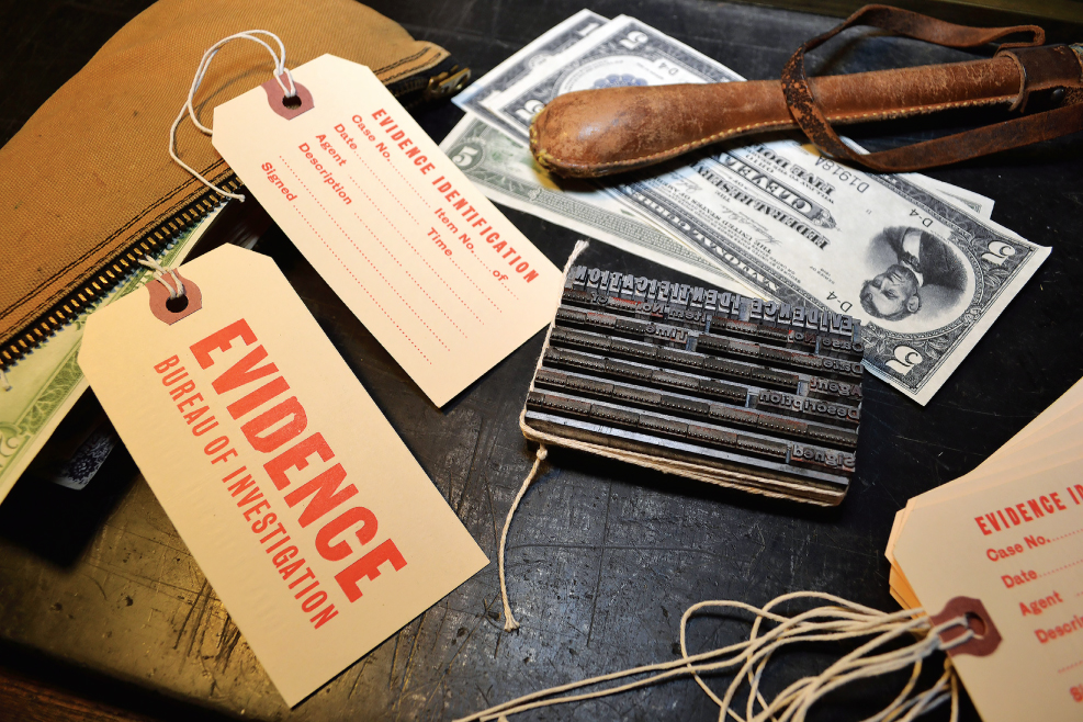
Chapter 4
Letters and Type
The lingua franca, or common language, of graphic design is type. You can call yourself a designer only when you understand the rules of type and how to break them. Not long ago, type design was almost an airtight profession. Only the very skilled and highly motivated were allowed entry. One reason was the intense amount of time that it took to design a typeface in its various weights and point sizes. Breaking into this realm of design required years of apprenticeship.
Today, the computer has changed all that—some argue for good, others for ill. Type design software has increased the capability of serious type designers to create many more custom and proprietary typefaces and has made it possible for neophyte and fly-by-night designers to develop personalized type. Somewhere between these two extremes, graphic designers who are interested in or passionate about typefaces have entered the field, either developing the occasional face, which they then sell or license to a digital type foundry, or establishing their own digital type foundries. The computer has broken down the barriers.
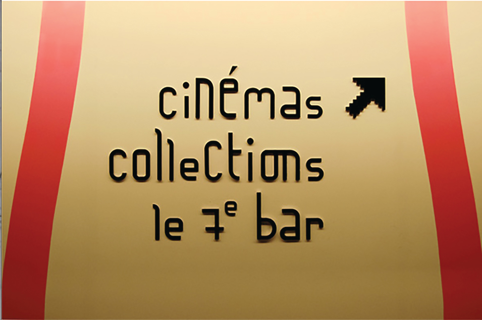
The technology is available for neophytes to experiment at designing typefaces on the desktop and then testing their applications in real documents. Never before in the history of type design and type founding has this been so technically and financially accessible. Lettering is another indispensable component of graphic design. Lettering is the design of one-of-a-kind, often limited-use typographic or calligraphic compositions. The letterer is not necessarily a type designer, and vice versa, but the skills of one are certainly useful to the other. Letterers are most often used to develop signs, logos, book titles, package labels, and other custom items. Lettering classes are common in most art and design schools and are the only efficient way to learn the methods of the craft. Although much lettering begins as hand-drawing, the computer is used as a tool for detailing and finalizing work.
Type design is an extremely time- intensive field; the designer may work for many months on a single family, style, or even weight. Type designers who create custom faces for publishing, corporate, or institutional clients also spend a large amount of time in revisions. The letterer works on a specific project, usually for a fixed period of time. This is not to imply that one field is more satisfying than the other, but if type and lettering are desired specialties, it is important to evaluate the investment required for each of these.
You don't have to design type or draw letters, however, to be a good typographer. All designers must be fluent in the language of type and letters, and that fluency governs how well or not their typographic composition will be. A designer has to love type and all its nuances.
Marian Bantjes
Lettering as Art and Business
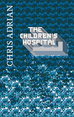
The Children's Hospital
Artwork and Design: Marian Bantjes
Client: Granta Publications
Art Director: Michael Salu
2012
The level of intricacy in everything you do is mind-numbing. You must be wired. Does the planning of your pieces come naturally or through struggle?
It comes very naturally. Ideas form in my head quite quickly, and while I've certainly had my share of false starts, the process is relatively simple for me provided I'm working under my own steam and/or have the full support of a client.
What determines for you where and in what style you will take a particular work? Is it the more detailed, the better?
It's really due to whim and what I'm interested in exploring or experimenting with at that time. I don't think that more detailed is better. Usually it's whatever is challenging to me, whether that be the materials, or the structure, or figuring out some kind of system to work within. I'm particularly fond of systems—coming up, I'm interested in using new techniques.
Does the word simplicity have any place in your life?
Yes, absolutely. I'm very fond of Modernism, and I try very hard to pare down the number of things I have in my house and my life. I abhor tchotchkes, and I don't allow myself to collect, because I know where it leads. My ideal house would be a Modernist box; I can't think with clutter, and while I'm not currently living in my ideal environment, I'm slowly working toward it . . . it's all very strange.
In the scheme of contemporary design, do you see yourself as part of a movement, or are you an iconoclast?
A little of both. I'm certainly part of the ornamental movement that swept across the design scene in the past 10 years, but I'm one of the few who (a) practiced it with rigor and a true sense of form and attention to detail as opposed to pastiche, and (b) who took it into more interesting realms than the usual pretty decoration. In that I am still exploring the form and trying new things and constantly moving through “style,” I think I'm somewhat of an iconoclast. I'm prideful that I'm hard to pin down, while at the same time recognizing that this makes it very difficult for clients to choose me because they're never sure what they're going to get. Having said that, my best work has always been for those who trusted me to do something new.
What makes you the most happy about your practice?
Feeling understood. That is not to say I always am—in fact I think I'm often misunderstood, but in those times when people get what I'm trying to do, or experience something exactly the way I wanted them to experience it, that is incredibly gratifying.
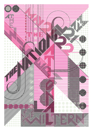
The National (The Wiltern)
Poster
Artwork and Design: Marian Bantjes
2010
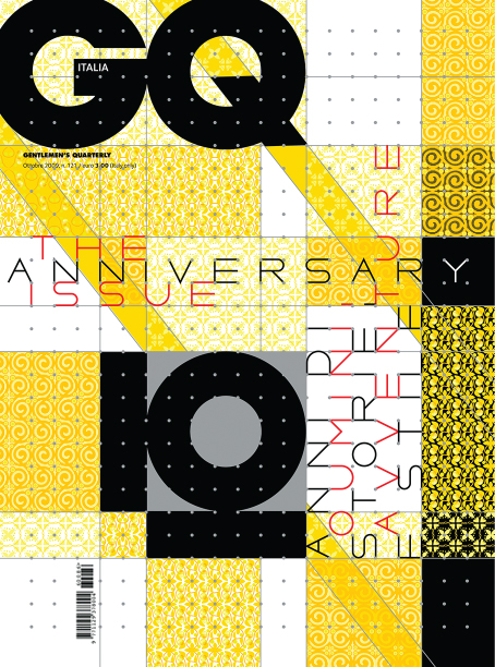
G2 Cover: Puzzle Special
Artwork: Marian Bantjes
Client: G2 (The Guardian)
Art Director: Richard Turley
2007
Andy Cruz and Rich Roat
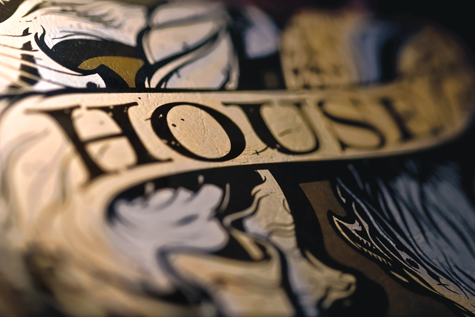
There's a Type Designer in the House
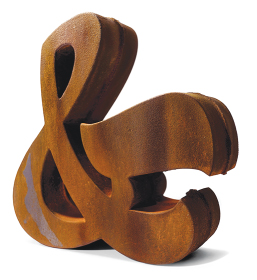
Cast Iron Ampersand
Photography by Carlos Alejandro
Design by House Industries
Was it the digital revolution that prompted you to start a type foundry?
No, that really had already gone down by the time we got in the game. We were just looking for an alternate revenue stream and started assembling some simple lettering styles cooked up by Andy Cruz and our original partner, Allen Mercer.
How many designers/workers are there at House, and how do you break down the work?
We have two people working full-time on type, but that doesn't mean they are drawing type all of the time. Ken Barber is an amazing type designer, but much of his time is spent creating lettering treatments for various projects and directing contract type designers. We have three or four contractors working on the Photo-Lettering collection at any given time plus two or three contractors who are helping us expand the House Industries collection.
Did you have a long-term business plan, or was this seat-of-the-pants?
I don't think you can call it seat-of- the-pants because we are a fully functioning company in the traditional sense with decent salaries, retirement plans, and really good health benefits. However, we've always found that a long-term business plan is an impediment to the creative process because it would require us to set arbitrary deadlines and revenue goals. Our best work is finished when it's finished and doesn't have a price tag attached.
Why the name House Industries?
That's an easy one. We were getting some good press for our new company, Brand Design Co., Inc., and didn't want the new font venture to reflect badly on us when it failed. The name came from a clip art logo sheet we found in our swipe file that had a house next to a factory, so we called the company House Industries.
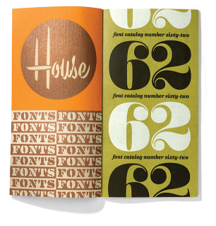
House Industries Catalog
Photography by Carlos Alejandro
Design by House Industries
What did you do to distinguish House Industries from other digital foundries?
I don't think we ever considered ourselves a “digital foundry” because there are so many other facets to our business. We would rather look at the House Industries and Photo-Lettering type collections as perpetual projects that we design for and around.
You have an interesting balance of type, type-related ancillaries, and products in your “store.” How do you decide on what products to create?
Most of our product development is based on visual dynamics, which is a fancy way of saying that if something looks really cool, we try to produce it. The products are also a way for us to take a macro view of typographic elements as illustrative assets instead of components in a system of glyphs.
House, in fact, houses some important collections of letters and fonts, like the Photo-Lettering collection. What made you purchase vintage typefaces for retail use?
We never looked at Photo-Lettering as “vintage.” The collection and the lessons we've learned from it are visually relevant in any era. We use pieces of that collection every day in our design work, so it's been an amazing aesthetic investment.
When type designers approach you with their designs, what determines what you will take on to be published or distributed by House?
We work with an amazing group of type designers, but we do not normally take on submissions from outside the company. Most of the ideas and concepts are generated by us, and then we try to find the best person for the project.
When hiring for House, what do you need and whom do you look for?
Someone who has worked for us as an intern for at least six months. We're still not sure what we're looking for, but if they've stuck with us for that long, they're probably worth hiring.
Big and Tall Blocks and Box
Photography by Carlos Alejandro
Design by House Industries
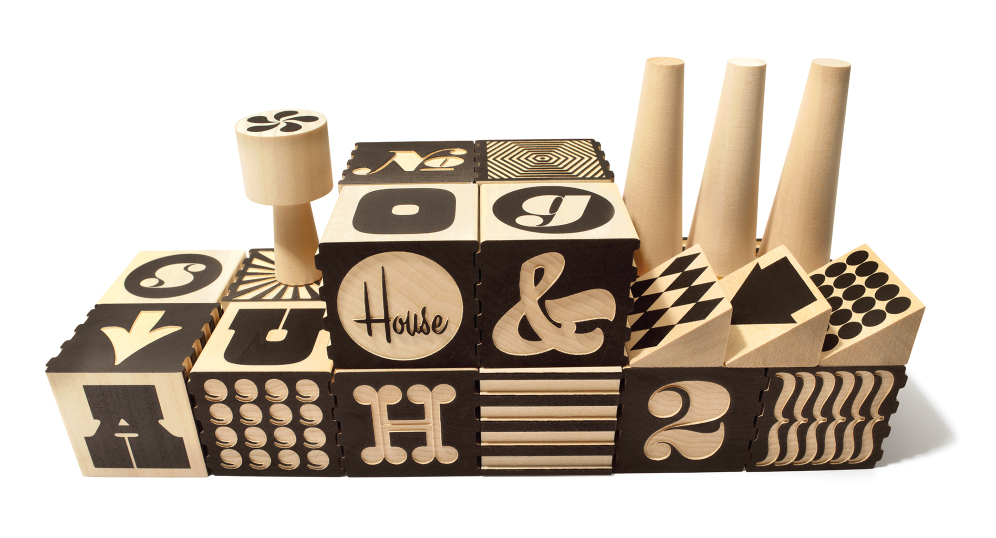
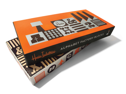
Alphabet Factory Blocks
Photography by Carlos Alejandro
Design by House Industries
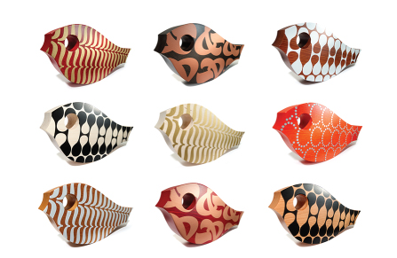
Wooden Koi
Photography by Carlos Alejandro
Design by House Industries
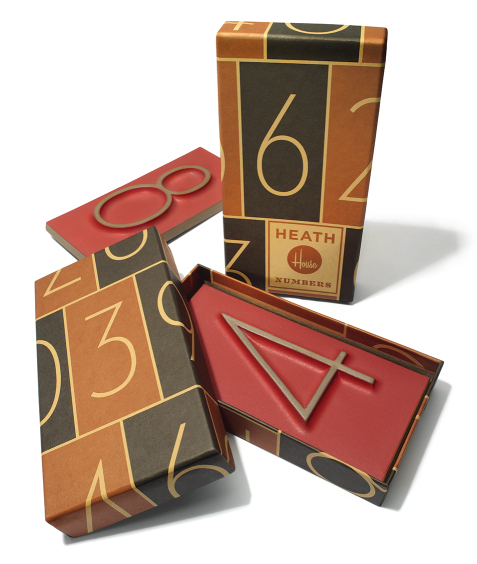
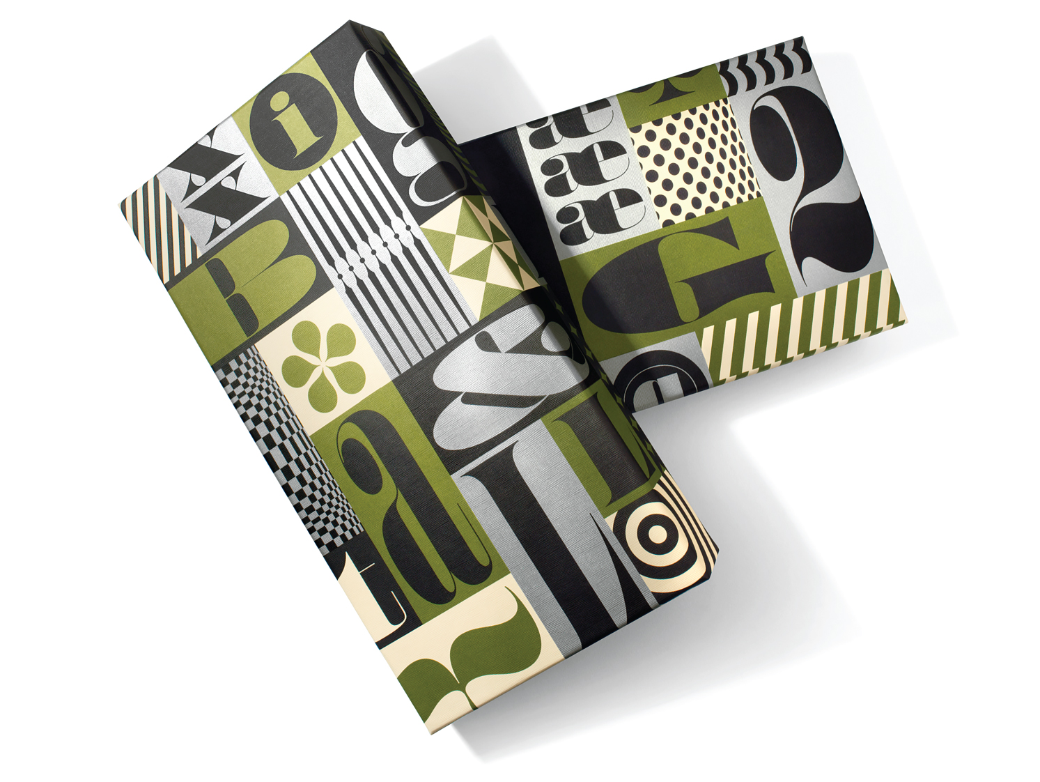
Heath Neutraface Tiles and Packaging
Photography by Carlos Alejandro
Design by House Industries
Pierre di Scuillo
Typography That Speaks Up
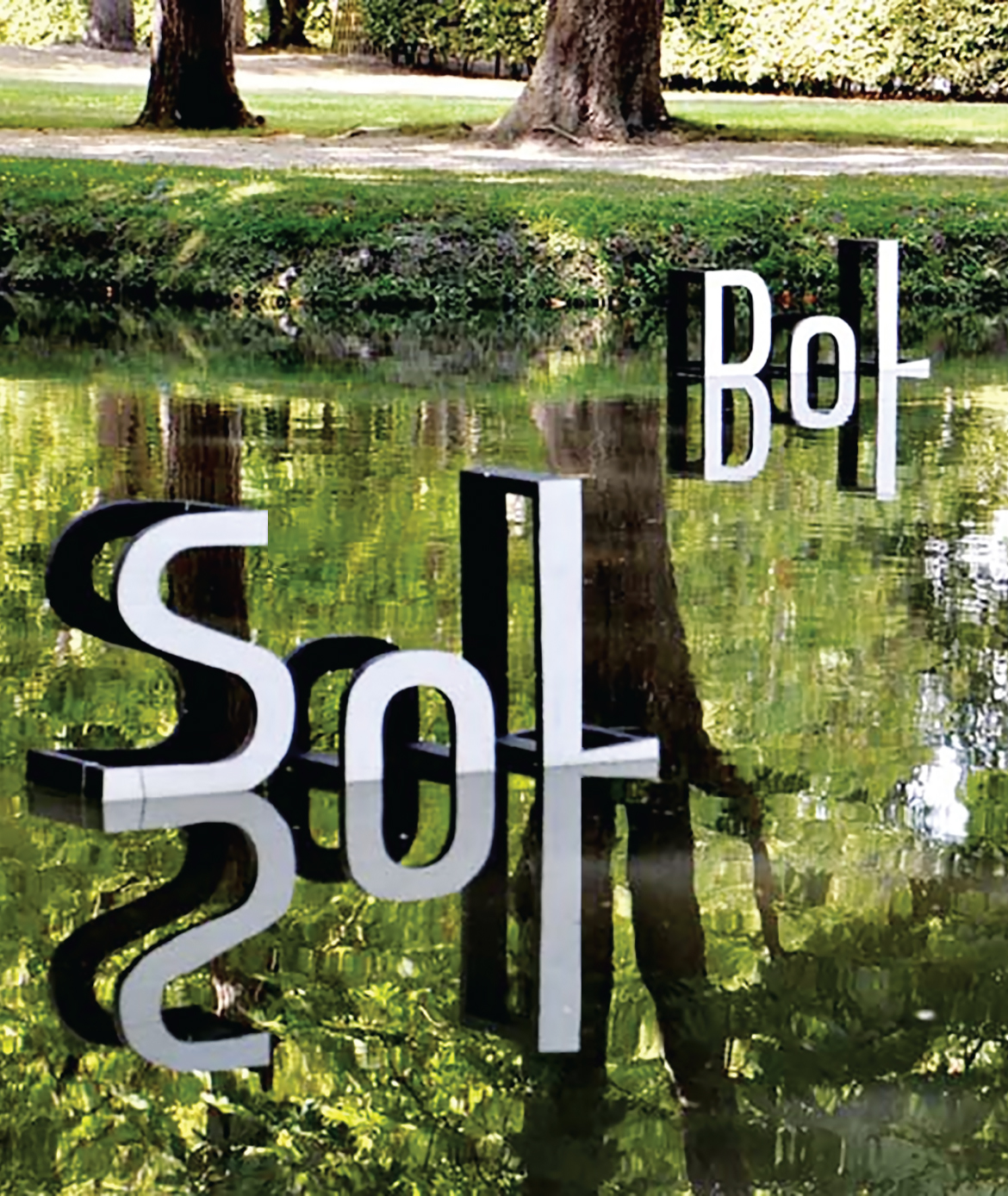
Outdoors installation, Royaumont, France
Designer: Pierre di Sciullo
2012
How did you become a typographer?
In 1985, for the fifth issue of Qui? Résiste, an underground magazine I published sporadically at the time, I began to design strange letterforms. I have always loved to pun and play with the sound of words (when I was young, I studied music). My odd-looking letterforms were an attempt to make my headlines heard as well as seen. Ever since, I have been obsessed with typography as musical notation—with letters as representations of sounds.
By 1988, thanks to scalable vector graphics now available, I was ready to design entire alphabets, which I did for the eighth issue of my magazine. I then realized that type design was at the crossroad of many of my passions: the music of words, the relationship between form and content, poetry, abstract signs, and playful mischiefs. Finally, in 1995, I hit my stride as a type designer when I was able to create a family of typefaces for the traditional Tuareg language, for the nomadic inhabitants of the Sahara. The experience taught me to look at letterforms critically.
Your typefaces are not commercialized. Do you create them for specific projects, and then, occasionally, you tweak them and use them again?
In my notebook, I design typefaces constantly, as I would practice the piano or do vocal exercises. I like to rearrange the letters of a word to produce new words. It is basically a musical exercise, one used by Bach in the playful contrapuntal composition of his fugues. Our alphabet is based on sounds, so highlighting the oral quality of the letterforms with anagrams is both fun and tempting.
But I only develop full alphabets for specific jobs, as part of the problem- solving process. From time to time (in the last 25 years!), I think about perfecting some of my typefaces in order to commercialize them, but I procrastinate. The amount of work required to finalize a typeface is enormous, and I prefer to work on new projects rather than reassess old ones.
Signage for a Movie Theater, Forum des images, Paris
Designer: Pierre di Sciullo
2008
Was it difficult to “sell” your anagrammatic signposts to the city of Brest?
It was easy because the assignment was to make an “artistic” statement. My work was part of an initiative to create, along the new tram route, a series of playful installations. It is not unusual in France for towns to ask artists to contribute to urban planning. Once I was in (I won a competition), the city officials trusted me. I had a good track record regarding urban signage—it wasn't my first “playful” project. But I have to confess that I had a lot of fun shuffling around the letters of the word Recouvrance to create serendipitous and surrealist wordplays.
Some of your alphabets mimic vocal intonations. How do you do that?
Practically, you cannot combine a traditional phonetic alphabet with correct spelling, but you can use intuitive graphic notations, such as the thickness or the relative height of letters, to indicate tone of voice and pitch. My goal is often to delight the eye and stimulate the voice.
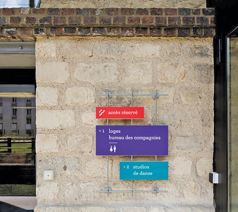
How do you explain the effectiveness of your odd-looking letterforms and pictograms for wayfinding projects?
My work is not decorative—it is informative and serves a purpose. What could be more satisfying for a designer like me than to be able to combine functionality, fun and form?
In the press, you are described as an “artist.” At the same time, your clients expect you to deliver rational and readable design solutions.
In France, is it possible to have credibility as both an artist and a designer?
You would have to talk to my clients to get this answer. Let's say that I am a “creative type” working in the field of graphic design. My clients come to me when they want something different or when they have a hybrid project that's hard to describe. I never boast about my work as being “poetic”—that would be counterproductive. Poetry, like true elegance, comes and goes as it pleases, slipping away when you call it. I prefer to focus on the way I work: I collaborate with architects, with city officials, with urban planners. What I love about my work is not so much the result but the challenges along the way. I am particularly aware of how difficult it is to stay creative in the face of administrative hurdles and political pressures. I meet incredibly smart people—people involved with public work and cultural programs—and that is what's most stimulating. I am learning all the time. What a treat!
Anagrams of “Recouvrance,” Signage for a Tram Route, Brest, France
Designer: Pierre di Sciullo
2013
Signage, The Briqueterie Dance Center, Vitry, France
Designer: Pierre di Sciullo
2013
Ross MacDonald
An Illustrator's Passion for Type
Walpurgisnacht
Client: Steven Smith
Designer: Ross MacDonald
Director: Steven Smith
Illustrator: Ross MacDonald
2010
You've worked as an illustrator. How has the digital media affected your work in the past decade?
Initially, there was a lot of fear that digital media would supplant traditional media. I haven't seen that happening so far, but the day's not over yet. It just seems to have added a lot of additional outlets. Some of the magazines and book publishers I work for now have very active websites that publish new material, so I'm doing separate work for the print and digital publications.
How would you describe your illustration style?
I work in traditional media—watercolor and ink and pencil crayon—and I draw most of my inspiration from illustration styles of the late nineteenth and early twentieth centuries. Sometimes I will work directly in the style of an old comic book or a Dick and Jane reader, using that style as part of the concept of the piece.
You've also created “vintage” film props, often relying on letters. Did this just fall into your lap?
I had done a little television work off and on for years, but in 1993 I was hired to work on a movie called Baby's Day Out, produced by John Hughes. They were looking for someone to create a faux 1930s children's book and had seen my work in that style in magazines. The book was a major plot point in the movie and integral to a lot of scenes, so I worked on set in Chicago for six months and met a lot of people. Some of those people hired me or recommended me when they went on to work on other movies, and it kind of snowballed from there.
Tree
Client: Northern Credit Union
Art Director: Michael Bryden
Illustrator: Ross MacDonald
2013
Having It All
Client: The Atlantic
Art Director: Eliza Glass
Illustrator: Ross MacDonald
2013
You are an antique type maven. How did this come about? And how do you maintain it?
I actually started life as a printer, in my teens. In 1974 I worked at a place in Toronto called Coach House Press for a year, and setting type and printing on the Vandercook was one of my duties, in addition to offset printing. I moved on to doing illustration and writing and left printing behind for a while. In the mid-1990s, I was living in New York and started getting the letterpress bug again. I got a Poco proof press and a few fonts of type, and then something snapped and in a couple of years I had amassed a bunch of wood type and presses. In 1996 my wife and I moved out to Connecticut, where I have a small barn/studio, and I was able to expand the letterpress operation. At one time I had four presses. Now I have two, and hundreds of fonts of wood and metal type.
You are proprietor of the Brightwork Press. What do you do at the press?
It's a one-man shop. Occasionally, I have interns here who help a bit, but I do most of the setting and printing myself. I don't take on much printing work for other people—a few things for friends here and there. I mostly print things I design myself. Often it's paper props—cards, letterheads, tags, posters—that kind of thing.
Your typography is based on the old types you've collected. Why should designers be fluent in the antique?
Understanding why typefaces look like they do, and where they came from, can have a huge effect on a designer's work. I always say that digging into the history of design will take you places you will never find on your own.
The Book of Eli
Client: Alcon Entertainment/Warner Brothers
Designer: Ross MacDonald
Leadman: Tommy Samona
2010
How would young designers become knowledgeable about metal, wood, and letterpress printing?
There are lots of great books, for starters. There are also a lot of good websites. You can spend hours watching videos of type and presses and typecasting machines on YouTube. Hands-on experience is the best way to learn. There are places like the Arm in Brooklyn and the Center for Book Arts in New York where you can get your hands on type and presses. Taking classes on typesetting and printing is a lot of fun and will give you the kind of understanding that you can't get from books.
What is the greatest benefit for you?
The main benefit is that I find it hugely interesting and a lot of fun. One of the other benefits has been the ability to produce historically accurate period props.
Boardwalk Empire
Client: Boardwalk Empire, HBO
Designer: Ross MacDonald
Propmaster: Vinny Mazzarella
Illustrator: Ross MacDonald
2013
Roberto de Vicq de Cumptich
For the Love of Type
My Thai
Designer: Roberto de Vicq
de Cumptich
Client: Michael Monaham
Type is a signature item for you. How would you describe your typographic approach?
For me, type is the best indicator of the zeitgeist. Type is an imperfect version of ideal forms where you try to peg your concepts. Type is like silly putty: endless possibilities and lovely to play with.
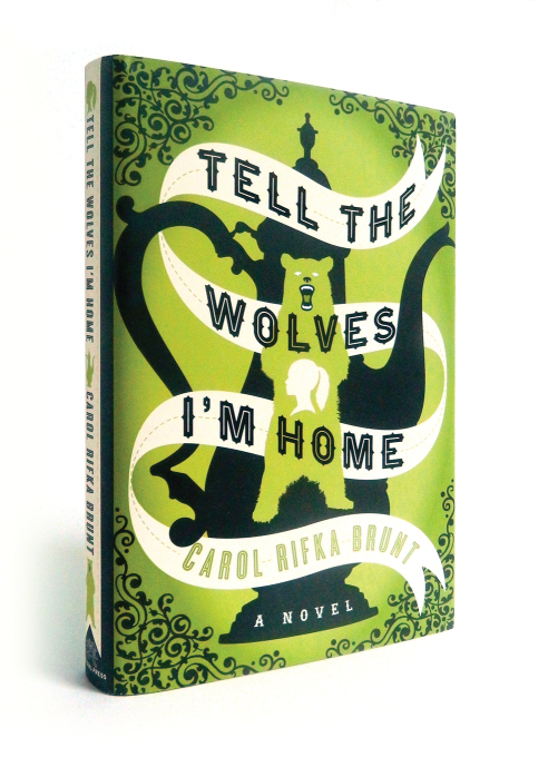
Tell the Wolves I'm Home
Designer: Roberto de Vicq de Cumptich
Art Director: Tom Stvan
Client: Random House
You were typographically designing book jackets for ages. How did you begin in this specialized genre?
It was a series of trial-and-error situations. I began my career designing corporate work, but perhaps being at the bottom of the ladder and the kind of clients I had, it was dreary. I then moved to magazines but discovered that unless you were the art director, the fonts and images were already chosen; you have very few liberties. I was ready to move to Paris, but while polishing my French at Alliance Française, a fellow student, who was going on maternity leave, asked me if I could fill in for her at Pantheon Books.
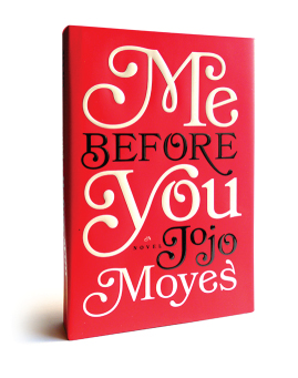
Me Before You
Designer: Roberto de Vicq
de Cumptich
Art Director: Roseanne Serra
Client: Penguin
When it was time to branch out into other client areas, how did you go about it?
I asked friends to send me any work that was not in publishing and made some cold calls myself. My first major restaurant, My Thai, was for a family friend in Brazil. In lieu of a design fee, she kindly allowed me full creative control and a healthy budget. I saw endless possibilities in this market and the opportunity to branch out from book jacket design.
You do food, restaurants, publications, and logos. What is the most satisfying?
Good work and good clients are the most gratifying should be the answer, but I have to say I enjoy restaurant design. They are special spaces where the purpose is the enjoyment of the experience. Translating this into everything from large signage to business cards is challenging yet fun.
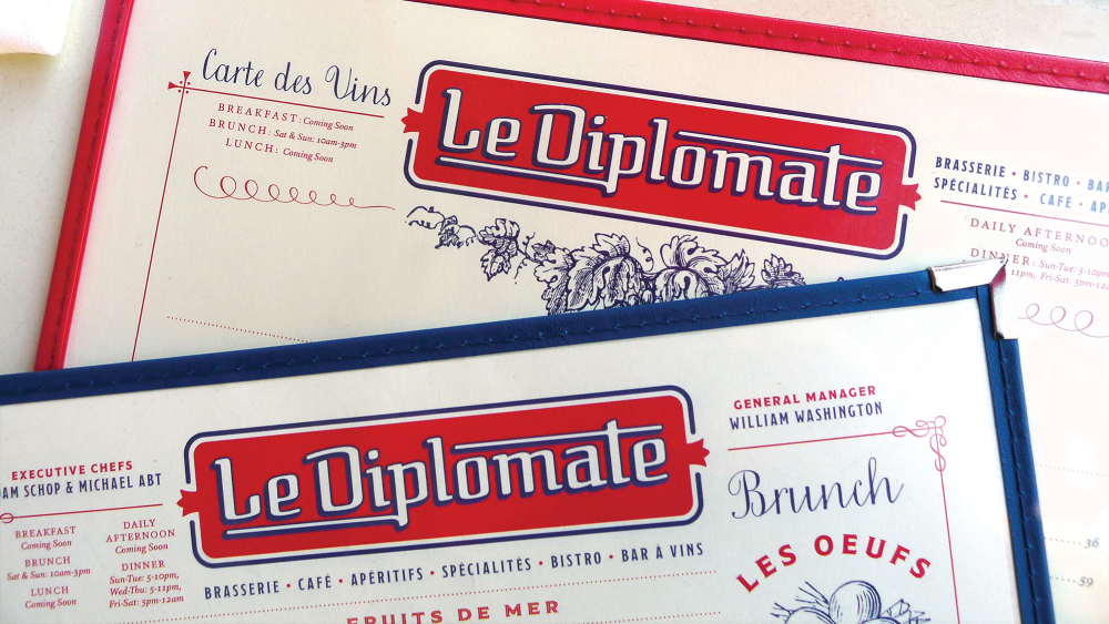
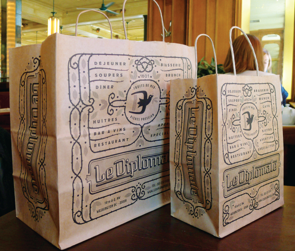
Le Diplomate
Designer: Roberto de Vicq de Cumptich
Creative Director: Randi Sirkin
Client: Starr Restaurants
What do you look for in a client?
Normally, I look for Catherine the Great: the enlightened tyrant. Someone with taste and ideas that I can grow with—even if we disagree.
What do you look for in an employee?
Curiosity, flexibility, and an ability to critique one's own work: the basic predispositions for a good graphic designer. I am also lazy, so I badger my wife to help me.
What is the most important bit of knowledge a designer should have?
There are always several different solutions for any problem, but only one at a time.