Chapter 5
Making Logos and Marks
The logo or trademark is the cornerstone of graphic identity (not to be confused with “branding,” which is the entire process of creating an identity). The logo is the mark that reduces all business attributes into a recognizable sign. The reason for developing a particular mark is often based on research into a company's mission and the synthesis of its ideals into a symbol or brand. The mark itself might be so abstract that no obvious connection can be made, but, simply, the imposed relationship between it and the company imbues it with meaning.
The logo is usually the most charged design element of a company, sometimes inviolate, other times mutable, depending on the client's faith in the mark's symbolic power. A logo must appeal to the client (and the public) on cognitive and emotional levels; it is not simply a graphic device to denote one business from another, but, like a national flag, a charged symbol of corporate philosophy.
Much has been written about the philosophy and psychology of logos and marks. Marks have value when associated with good companies and are valueless when attached to bad ones. The swastika is a case in point. Prior to its adoption as the Nazi party symbol in 1926 (and German national symbol in 1933), the swastika's history dated back to antiquity, when it signified good fortune. In the early twentieth century, it was a very popular commercial mark used on scores of products. But once it was adopted by a heinous regime, it was inextricably wed to evil. The design of the swastika is simple, pure, and memorable, while its symbolic meaning is forever tainted. Nevertheless, once the logo is decided upon, then designing the other elements of corporate identity must proceed.
Mark Fox
The Mark Maker
Dog Lamp
Client: In-House
2001–2011
Much of your work is making icons and logos. How did you get started?
I didn't study design in college—my degree is in fine arts—so I didn't have any school assignments with which to build a portfolio. As a result, I spent the year after college inventing projects I could execute on the cheap but that still looked good. One couldn't produce a convincing annual report by oneself at that time—this was 1984—but one could design a convincing trademark and present it as a clean black-and-white stat at little expense. I spent three days a week for a year designing fake trademarks for fake businesses in an effort to create a portfolio. Fortunately, my fake trademarks proved strong enough to get me a job with Michael Schwab.
What is a logo? A trademark? A symbol?
A symbol suggests rather than depicts; it represents not only itself, but also some larger, external narrative. This narrative may be religious, cultural, commercial, or personal in nature.
In his 1952 essay “On Trademarks,” Herbert Bayer refers to the trademark as a form of “pictorial stenography.” A good trademark is glyphic and functions as visual shorthand for a commercial endeavor (i.e., a company, product, or service). All trademarks are symbols, but not all symbols are trademarks. The term logo as applied to corporate identity is a relatively recent addition to the design lexicon, its first recorded use in English dating to 1937. (It appears to be a shorter variation of the nineteenth-century terms logograph, logogram, or logotype.) As it originates from the Greek word for speech or word, the term logo is applicable to anything from a nonlingual symbol (such as the Nike “swoosh”) to a corporate motto. Its range, therefore, is rather vast. Although more prosaic, I prefer the clarity of a trademark.

Trademark for UC Press
Client: University of California Press
Studio: BlackDog
Designer: Mark Fox
Illustrator: Mark Fox
2005
When you start one, what goes through your mind?
What is the client's point of differentiation? What makes their approach, service, or product unique or superior? What ideas or associations does their name conjure? What are the key letters that comprise their name? What would be an appropriate typographic “voice”? What aspect of the design problem excites me? Where in the problem can I find interest, amusement, or beauty? What typographic forms make me happy?

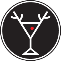
Logo for Coffee Company
Client: Four Barrel Coffee
Studio: Design is Play
Designers: Mark Fox and Angie Wang
Letterer: Mark Fox
2008
How do you know when it is right?
When the idea is smart or original; when the forms are beautiful or well crafted; when I like looking at it. When possible, I strive to create trademarks that don't simply identify but that pull the eye and hold it, that reward repeated viewings.

CCA monogram
Client: California College of the Arts
Studio: BlackDog
Designer: Mark Fox
Letterer: Paul Renner (1924–1927)
2003
Is it better to use type or just image?
Either can work, but images have the advantage of being translingual and of occupying less horizontal space. (Paul Rand compares the trademark to a “coin,” a self-contained unit.) When done well, the monogram seems to offer the best of both approaches: functions as type and image. (The Chanel monogram is a good example: Its forms are both decoded as language and seen as abstract shapes.)
Do you think trademark and icon making is an inborn talent or a learned skill?
One may be born with “an eye” or with the facility to make marks, but these abilities will either be cultivated through practice or eroded through neglect. Our bodies are no different: One's muscles become stronger with use and weaker with disuse. Innate talent is only a benefit when there is a continual application of that talent.
You teach. What is the tenet or idea you teach most?
I believe that the primary idea I convey is authorship. My students develop their symbols from scratch, through iterative sketching. The final forms are executed the old-fashioned way, with a Rapidograph technical pen and a drafting board. The precision demanded by this process forces the students to pay attention, to be deliberate in their decision making, and to become “makers” and “authors” in the sense of being the origin (and thus the authority) of their own work. My curriculum celebrates the designer as maker or designer as author; it stands in opposition to the designer as reassembler of images lifted from the Internet.

Avatar for the CCA Graphic Design Facebook Page
Client: California College of the Arts Graphic Design Program
Studio: Design is Play
Designers: Mark Fox and Angie Wang
Illustration: Mark Fox
2013
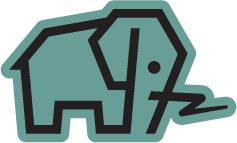
BO.LT
Client: BO.LT
Studio: Design is Play
Designers: Mark Fox and Angie Wang
Illustration: Mark Fox
2010
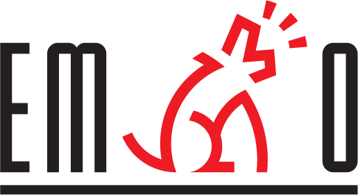
Logo Emarko Restaurant
Client: Embarko
Studio: BlackDog
Designer: Mark Fox
Letterer: Mark Fox
1989
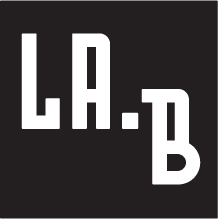
Logo for L.A. Boulders
Client: L.A.B
Studio: Design is Play
Designers: Mark Fox and Angie Wang
Letterer: Mark Fox
2013
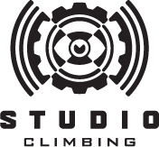
Logo for Indoor Climbing Gym
Client: The Studio
Studio: Design is Play
Designers: Mark Fox and Angie Wang
Illustrator and Letterer: Mark Fox
2011