Open many books to any page and there is nothing but text. There are no illustrations or photographs, no diagrams or graphs, no section headings, no sub-section headings, no lists, no chapter outlines, no indented quotations, nor any other attempt to break up the monotonous routine of straight text.
A book by a major publisher has built-in credibility and therefore does not need an elaborate design. A small press book must try harder in order to get attention. When you publish your book, dress it up. Remember, it must compete with 35,000 other books the year it’s released. It must be distinctive. It must catch and please the eye of reviewers, and ultimately readers.
How Large Should Your Book Be?
Book buyers are generally willing to pay more for a larger book than they will pay for a smaller one—even when each book contains the same amount of information. Make your book as big as is practical.
By doubling the dimensions of your book, you can substantially increase its price. However, your cost to produce the book does not double. The only significant increased cost is for paper, which should increase your overall costs by no more than 20 to 30 percent.
In maximizing your book size, don’t overdo it. The shelves of most bookstores have a standard height of 12 inches. Therefore, the maximum height of your book should be 11V2 inches. You can also bulk out the text by using a heavier paper.
The standard page sizes, or "trim sizes,” meaning the size of the trimmed sheets of paper, that are the most economical to print are:
Vh* X 8W' X 9W
8V2' x 11" 9" X 12"
Design Your Book To Its Subject
A writer recently asked the author for advice concerning a proposed book on how to play better tennis. She was planning to print on pages with a width of 6 inches and a height of 9 inches. Half her book was to be illustrations. It was suggested that she reverse her dimensions (using a height of 6 inches and a width of 9 inches). This would permit relevant text to be placed beside each illustration, instead of above or below it. An extra-wide book also stands out better on a bookstore shelf. Its spine sticks out, exhibiting part of the cover to the passing browser.
Your Choice of Paper
Most books are printed on 50- to 60-pound paper. Fifty-pound paper is paper in which 500 standard-size sheets (a ream) weigh 50 pounds. The standard sheet sizes for book text papers, which will later be cut down to your book page size, are: 23 X 35 inches or 25 X 38 inches.
The lighter the paper, the more the text from the other side of the page will show through.
If you wish to make your book thicker without increasing its weight, order a high-bulk paper into which air has been whipped during manufacture. While line illustrations are not affected by the use of high-bulk paper, a slight degree of clarity is lost in photographs.
The following chart lists the thickness and weight of a 208-page softbound book when printed on varying weights of paper:
Book
Paper Weight Thickness Weight
50 lb 12 mm. 8V.i oz
55 lb high bulk 15 9
60 ib 14 10
The same book in hardbound weighs 13 ounces when printed on 50-pound paper, and l4*/2 ounces on 60-pound paper.
Design Your Book to Weigh Less Than a Pound
You will save 25 cents (at current postal rates) per book if your book weighs less than 1 pound. Mailing less than 1 pound now costs 69 cents, while between 1 and 2 pounds costs 94 cents. This savings can amount to $250 for a thousand books, which is approximately 10 percent of the cost of printing the signatures for that many books.
In designing your book’s weight, make adequate allowance for the weight of its mailing package (at least an ounce), label, invoice, and any promotional material you wish to enclose when filling orders.
There are hundreds of styles for the typeface of your text; however, there are few that can be comfortably read at length. For the sake of your readers, choose an easy-to-read face. A few of these are:
1. Century Expanded,
2. Times Roman, or English Times,
3. Baskerville, and
4. IBM Executive Modern.
If your typesetter suggests another style, ask for an example (at least a page worth). Examine it for a few days. If it is too unusual, it may irritate reviewers and other readers.
Sample Typefaces
Century
Expanded
Times Roman
Baskerville
This is a patient-oriented book. It should provide the reader a clear and complete understanding of the nature, causes, symptoms, and proper treatment of hemorrhoids. Confusion and misconceptions concerning this subject exist not only among the public, but also within the medical profession,
A recurring theme of this book has been the necessity for thoroughly investigating all investment options prior to committing one's capital. Information provided in this book should enable investors to make intelligent choices of these options.
Hopefully, readers will also be able to distinguish between the many reasonable and unreasonable bond investment ideas which will surely be introduced in the future.
He told us at the beginning of the class, “You’re either going to pay me now or pay me later. You either get into shape now, or you get into shape later.” But the biggest impression he made on me was that he stressed the fact that you can only be what you are. You can improve on yourself, but you’ve got to take what you have and do the best you can with it. If you’re 5'3" (like me), you’re not going to look like a 5'9" model.
IBM Executive Modem
If you decide to do your own typesetting, purchase a special clay-coated paper on which to type your final draft. The clay-coat on one side of the paper gives your typesetting the necessary hairline definition.
Typefaces to Avoid
Do not use a typeface that has no serifs. Serifs are the curls or lips at the ends of letters. The 1, t, r, and s in the word “letters” have serifs. Our eyes have become accustomed to reading words that have serifs—in newspapers, magazines, and other books.
The Helios typeface (without serifs) below is contrasted with Century Expanded with serifs. While this short passage without serifs may not prove aggravating to read, ''our eyes would tire of reading this style in a magazine-length article or in a book:
EACH BOOK IS AN INDIVIDUAL PROBLEM, AS YOU well know. Therefore, our estimate /or your book will be based on several things—including the number of pages, type of text (prose, tables, poetry), the condition of the original manuscript, etc. Your inquiry for an estimate will be cheerfully and immediately answered ... and your book will be promptly and proudly set.
EACH BOOK IS AN INDIVIDUAL PROBLEM, AS YOU well know. Therefore, our estimate for your book will be based on several things—including the number of pages, type of text (prose, tables, poetry), the condition of the original manuscript, etc. Your inquiry for an estimate will be cheerfully and immediately answered ... and your book will be promptly and proudly set.
Also avoid typefaces that display certain letters in awkward positions. Examples of these are:
notice the e and g
notice the a and e
notice the t and i
The selection of a typeface that is comfortable to read is one of the few areas of book design where you should be conservative.
Size of Type
Eleven-point type is usually the minimum size selected for nonfiction books. Smaller sizes may cause eye strain, especially under artificial light. If you're designing a book for children or the elderly, use a 12-point type size. Examples of various type sizes are shown below:
S pt.—The purpose of good typography is to present the message clearly
9 pt.—The purpose of good typography is to present the message
10 pt,—The purpose of good typography is to present the
11 pt.—The purpose of good typography is to present
12 pt.—The purpose of good typography is to pre 14 pt.—The purpose of good typography
18 pt.—The purpose of good typo
24 pt.—The purpose of g 30 pt.—The purpose
Leading
The distance between lines of text is called leading. If there is not enough leading on a wide text page, the eye may have difficulty finding the next line of type. When interviewing a typesetter, take an example of the style, size, and leading that you prefer for your book text.
Letter-Spacing (or Pitch)
The typesetter will normally set the degree of spacing between letters at an appropriate distance. When this spacing is too right, some letters may "connect" with each other. This is rarely a problem, but when it is, know that you can instruct the typesetter to correct it.
Chapter titles that are repeated at the top of right-hand pages are called running heady They aid readers in locating particular chapters. Most major publishers also place a running head on the upper-left-hand pages to repeat the title of their books.
When a chapter has a lengthy title, reduce it to three or four words as a running head.
Page numbers should be placed at the outside comers of either the top or bottom of pages. When you have section headings, sub-section headings, and running heads at the top of your pages, you might want to place page numbers at the bottom.
You may want to use Arabic numbers instead of Roman numerals for your front matter. If you use Roman numerals, then you must use a double-numbering system during the paste-up of your book, which will be inconvenient and may cause errors.
Begin your Arabic numbers with the first page of your book —the half-tide page. By the time you reach your preface or foreword, you should be at page 5 or 6.
Reviewers often state how many pages are in a book. Using Arabic numbers from the first page of your book, you will receive full credit for the entire book. When prices are comparable, book buyers will usually purchase the longer book. Don't short-change your page count.
When pasting up artwork, do not commit the common sin of many publishers: placing illustrations or photographs on pages of text to which they do not relate. Take the time to plan the placement of your artwork, so it is next to the relevant text. How to do this is explained in Chapter 23.
When your book contains numerous illustrations and/or photographs, label them in proper order by chapter. If your third chapter has four illustrations, for example, label them as Figures 3.1, 3.2, 3.3, and 3.4. The next two chapters discuss illustrations and photographs in detail. ;
Reinforcing Your Text
A joint research project by the University of Minnesota and Sperry Systems determined that when people simply listen to a presentation, their learning efficiency is 25 percent. When this listening is supplemented by visual aids, an additional 35 percent is absorbed and information may be retained 55 percent longer. A similar study by Mobil Oil found that people remember 20 percent of what’s heard, but 50 percent of what’s both heard and seen.
This data suggests that an author can almost double a reader’s comprehension by using illustrations.
In addition to indented quotes and examples, section and sub-section headings, lists and chapter outlines, imaginative artwork can maintain your reader’s alertness.
As you write your manuscript, make a sketch wherever an illustration or diagram would improve the reader’s understanding. It’s not necessary that you be an accomplished artist to make a sketch. Just draw an outline to the best of your ability. As you rewrite your text, you will also refine your sketches further.
Illustrations to Clarify Text
Some ideas can be best conveyed through illustrations. For example, during the preparation of the author’s manuscript on the subject of orthodontics, it was important to illustrate the proper method of holding dental floss in order to not damage the gums. Only illustrations could do this clearly.
Illustrations for Dramatic Effect
In the same book on orthodontics, it was also important to show how tartar causes gums to recede from tooth surfaces, resulting in tooth loss. This was illustrated to demonstrate the seriousness of the condition.
4 STAGES OF PERIODONTAL DISEASE
|
1 1E lr: |
.1 £1 jv| i | ||
|
1. SwoVcn gum*, which b*«d easily |
? The 4ums to withdraw |
1 Th« Hum* tviihdrMt Further and tht dAuW reach** the bom |
4 Mo*t bocy ujppori for tht r*«ih i* draroytd |
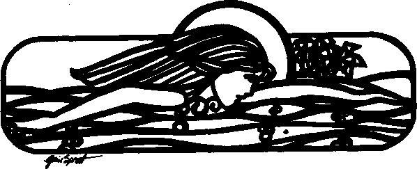
Illustrations That Are Decorative
An illustration is justified, too, if it renders your book more attractive. Make such illustrations as functional as possible. The example below was included in the author’s first book in a chapter stressing the value of exercise. It eventually became the logo for the company that published this book.
How Do You Make An Illustration?
If you want high-quality illustrations and are not an artist, Jind a graphic designer. If you cannot afford a professional graphic designer, seek the services of a student graphic designer at your local community college. If an artist-friend offers help, make sure this person knows the requirements for camera-ready artwork.
Provide Good Examples of Wbat You Require
After selecting a graphic designer (see Chapter 15), submit the sketches you’ve prepared during the writing of your manuscript. These should be as precise as you can make them. Cut out examples from magazines or make photocopies of book illustrations to show your graphic designer exactly what you’re striving for. The more details provided the graphic designer, the less rime the designer will require to complete your artwork—and the less expense you will incur.
Black-and-Wbite Line Drawings
The least expensive illustrations to print in a book are those that can be pasted up and photographed with your text. These are called line drawings, or line art. They have no tones of gray. The preceding illustrations in this chapter are line drawings.
Halftones
If you require varying tones of gray in your illustration, then the artwork must be photographed through a crossline or contact screen, which converts the image into dots of various sizes. All photographs require halftones.
The quality of a halftone varies according to how many dots are obtained per linear inch. Newspapers customarily screen their photographs at 85 dots per linear inch, while book reproductions are generally screened at 120 to 133 dots per inch. An artbook may use 150 dots. You can see these dots with a magnifying glass if you hold the halftone negative up to the light.
What Size Should Artwork Be Prepared?
Many reference works—and graphic designers—believe that illustrations should be prepared larger than they will eventually be printed. Their reasoning is that when the illustrations are reduced, they will become sharper. This is not always good advice.
When a black-and-white illustration is reduced by the printer, it does become darker—possibly darker than you prefer. Another problem may arise when your illustrations have patterns of closely arranged lines or dots. These patterns may become solid black upon reduction, particularly when reduction exceeds 50 percent.
A further good reason for not making your artwork larger than it will be printed is that it’s easier to plan required space for illustrations in your book when they are drawn to scale. Text can be accurately arranged around illustrations early during the paste-up, when you know exactly what size your illustrations will be.
If illustrations are prepared smaller than the desired book size, enlarging them has the opposite effect—they lighten. When it is not possible to avoid enlarging artwork, a general rule is not to enlarge more than 100 percent if quality reproduction is desired.
Printing in Color
If you plan to use color within your book, read the pertinent pages concerning color work in Chapter 25. Color printing is expensive and in many cases prohibitive for the self-publisher. Chapter 25 provides several tips that can minimize the expense of color work.
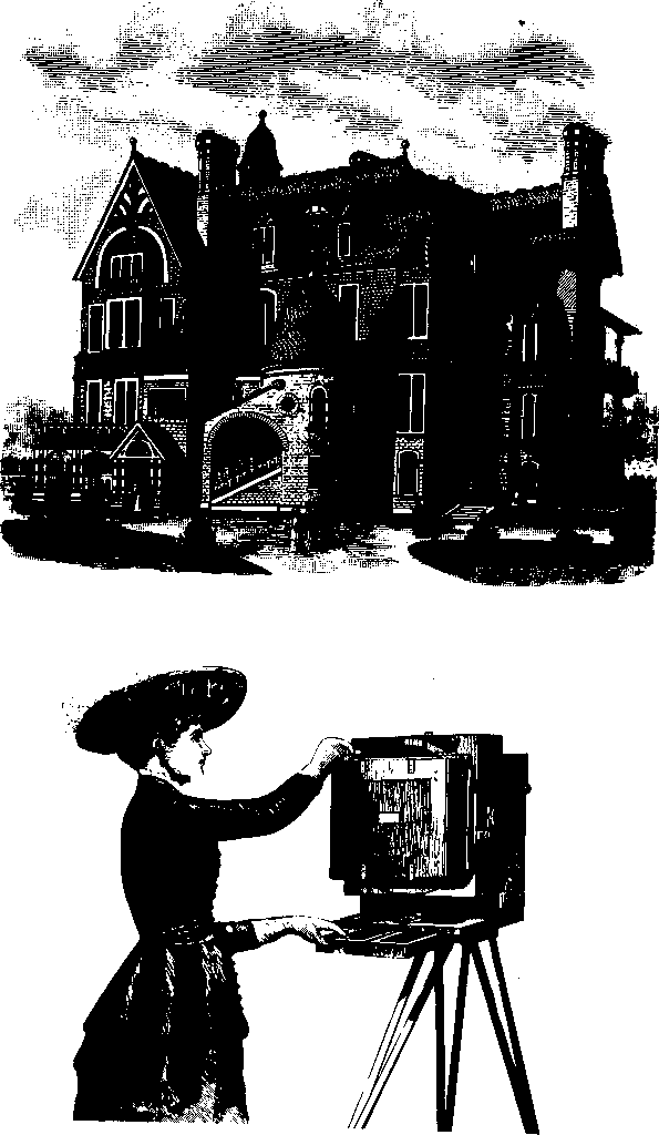
Can You Use Clip-Art?
If your artwork is primarily for decorative purposes, check readymade artwork in clip-art catalogs. Folders or magazines of clip-art can often be obtained in stationery or art supply stores.
Artwork in most government publications can be reproduced freely, as it is not copyrighted; but you should always check with the agency responsible for the publication to be sure that you are allowed to copy their artwork. You can also borrow freely from any book or magazine printed more than fifty-six years ago, as the copyright has expired on these publications.
You can borrow from publications printed prior to 1950 also, as long as their publishers did not renew their copyrights. However, it can be almost impossible to determine if such copyrights have been renewed once these publications have gone out of print.
On the next page are some examples of clip-art that are available in catalogs. Check this source of artwork before hiring an artist or graphic designer.
Photographs— How to Enhance Your Book