CHAPTER SIX
Reporting Performance Data
How do you effectively communicate the results of performance measurement? Which formats are best for displaying different kinds of performance data? Are graphics always necessary when communicating performance results? Once performance data are collected and measures are computed, managers, staff, and analysts must decide on the most effective ways to communicate the results. This chapter addresses considerations that should be taken into account in the display of performance data and presents several examples of display formats.
Performance Data and Their Audience
Organizations implement measurement systems to monitor performance and communicate the results to managers, clients, governing bodies, and other stakeholders. The output of these systems, in fact, are focused on reporting results. To communicate performance effectively, managers and staff should take into account both the nature of the performance data and the needs of the audience for the data.
Nature of the Performance Data and Comparative Frameworks
A performance measurement system may include measures of resources, workload, outputs, outcomes, efficiency and productivity, quality, client satisfaction, and cost-effectiveness. Some of these measures may be expressed as raw numbers, others as averages, percentages, or rates or ratios. In some cases, indexes may have been created as summary variables to represent, for example, overall service quality or program effectiveness. The data may be collected weekly, monthly, quarterly, or annually. Furthermore, the scope of the measurement system may focus solely on a program or organization as a whole, or it may be designed to afford comparisons among various programmatic divisions or organizational units such as geographically dispersed regions or districts.
Whatever kinds of performance data are being monitored, it is important to keep in mind that the value of a given measure observed at one particular time is rarely useful. Rather, performance data are converted into performance information for reporting in some appropriate comparative framework. The principal types of comparisons are
- Over time
- Against targets
- Among operating units
- Compared with other programs
- Other breakouts
These kinds of comparisons are relevant with respect to the design of data displays that will convey performance information in meaningful ways. First, what is the time orientation of the data? It might be helpful to show the time series data for a measure over the past several weeks, months, or years up to the current or most recent observation in order to provide an indication of what the long-term trend has been and whether performance on the measure has been improving or worsening over that period. Second, when targets have been established for certain performance measures, as discussed in chapter 4, it might be important to report the actual level of performance on a given indicator versus the targeted level of performance to clarify the extent to which actual performance meets, exceeds, or falls short of the target. Third, when services are delivered to the public or clients on a decentralized basis, disaggregating the data down to the level of organizational units or geographic regions can be helpful in terms of assessing, in addition to long-term trends overall, the extent to which performance varies—for instance, from district to district or precinct to precinct—and identifying the leading performers as well as the units whose performance is more problematic. Fourth, when feasible, it can be very helpful to compare a program's or agency's performance with that of other similar kinds of programs or agencies. For example, a state office of child support enforcement might benefit from comparing its own performance with that of other state child support enforcement programs operating in similar environments. Finally, reporting other kinds of breakouts—breaking down standardized test scores across various racial/ethnic groups of students in a local public school system or comparing the number of personal injuries reported for different kinds of facilities or venues in a state park systems, for instance—may provide additional insight as to the incidence of possible performance problems beyond an indication of whether performance has been improving or declining on the whole.
In addition, those who are developing formats for reporting performance data should ask themselves whether there are any aspects of the data that require additional explanatory information. For example, have there been variations in the data over time that are important to highlight, or have there been unusual occurrences that have affected performance? If so, it may be useful to integrate a comment field in the presentation of performance results. This would allow for explanation or comment on the data that may not be readily apparent through presentation of the numbers or graphics alone. The answers to these questions will help guide the choice of display format.
Needs of the Audience
The better that system designers understand the information needs of their intended audiences, the more effectively they will be able to communicate performance results. The data should be displayed in a way that maximizes the audience's ability to quickly, easily, and accurately understand what the data represent. Managers and staff may accomplish this by communicating performance results in a way that is appropriate to the audience. Overall, the level of sophistication and interest of the audience must be considered. In some cases, the same data may be displayed differently for different groups. For example, it is likely that an audience internal to the organization or one very familiar with its activities are more likely to prefer and benefit from more detail and perhaps more breakdowns of the data, whereas the general public might be better served with a simple, easily understandable display of the performance data. Elected officials often prefer information that is brief and quickly understandable, whereas the media would prefer an easily understandable, attractive presentation of data. The audience may prefer to view only numerical performance results, or they may benefit from explanatory information to highlight different aspects of the performance data.
Reporting Formats
There are many alternatives to choose from in terms of formats for reporting performance information. The remainder of this chapter presents several alternative formats for displaying performance data results and discusses the appropriate uses and advantages of each. Examples range from tabular and graphical displays to scorecards and maps.
Although these examples are useful for illustrating a range of data display formats, it is important to note that there are myriad ways in which any of these formats can be adapted to suit the reporting needs of both the organization and the audience.
Basic Tables and Spreadsheets
Not all performance measurement systems involve elaborate databases. In fact, for some organizations, a performance data management system may simply involve detailed and well-organized tables or spreadsheets.
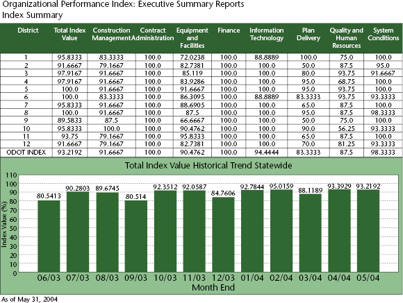
For example, the upper half of figure 6.1 illustrates a spreadsheet format presenting performance data for several functions such as construction management, contract administration, highway system condition, and plan delivery in the Ohio Department of Transportation (ODOT). Interestingly, performance on each of these functions is represented by an index computed with a number of more specific indicators, with each index ranging from 0 to 100 (representing top performance). In addition to the index value for each function, this report shows a composite index value covering all these functions, and it also breaks down these performance indexes for each of ODOT's twelve operating districts as well as for the department as a whole. In addition, this spreadsheet incorporates a “roll-up/drill down” feature (not shown) that allows viewers to quickly find supporting data for any elements of particular interest in the table. For instance, using the electronic version of the report, one could click on the index value of 83.3333 for the construction management function in district 1 and find the performance scores for that district on a number of subfunctions that make up that index, such as field supervision, on-time performance, cost control, and contractor evaluation.
Spreadsheet designs can also be useful for displaying performance data for different time periods, thereby allowing comparisons to be made by month, quarter, or year. In another example of a simple tabular design, the State of Texas provides reports in tabular format for all agencies as part of its annual performance measures report. Columns display not only performance data by quarters but also targeted performance levels for the year, year-to-date performance, and the percentage of the annual target that has been met to date. Stars are used to highlight measures for which the performance varies more than 5 percent from its targeted performance level. This can be a useful way to draw attention to an individual item.
Performance reports generated directly from a spreadsheet or database have the advantage of being convenient and easy to access for users. They are also economical to produce and allow rapid, regular updating. Once the spreadsheet is designed, it requires relatively little work to generate the report. As data are updated, the report can be generated for the next month very quickly. This sort of report is especially useful for performance items that need to be viewed regularly.
Tabular displays of performance data do not always provide the most desirable format for all audiences, however. Fairly dense spreadsheets such as the one in figure 6.1 tend to be best suited for audiences who are very familiar with the program activities detailed in the spreadsheet and wish to see detailed figures. For individuals who do not view the spreadsheet report on a regular basis, understanding the data may be very time consuming. Some individuals may be interested in only a few summary items, in which case graphical formats could be preferable.
Common Graphical Displays
Many software packages make it easy and quick to display data in a variety of graphical formats. Graphical displays of data have the advantage of quickly communicating performance results without requiring in-depth knowledge of the raw numbers. Graphics are especially useful for showing trends over time, or the relationship of different groups to one another. Perhaps most important, graphical displays allow information to be easily absorbed by a wide range of audiences. They have the advantage of easy readability for audiences who are intimidated by or uninterested in the actual numbers. Displaying performance data in any of these simple graphical formats is appropriate for dissemination to both internal groups and external stakeholders, such as policymakers or the media. The general public and even policymakers may be most interested in trends or comparisons of groups; these are easily communicated using graphical displays. Graphical displays can also be memorable; individuals may be more likely to remember a trend illustrated by a line graph or a relative comparison illustrated by a bar chart than the actual numbers.
Common graphical display formats are pie charts, bar charts, line graphs, and cluster charts. Simple bar charts are especially useful for displaying performance data. The lower half of figure 6.1 is a bar chart showing the statewide composite index value of the Ohio Department of Transportation's performance over a twelve-month period from June 2003 through May 2004. Curiously, the graph shows a drop in these overall scores every three months. While the composite scores consistently run in the low 90s in July, August, October, November, January, February, April, and May, they drop into the 80s—in three cases, the low or mid-80s—in September, December, March, and June of the year in question. If this finding is not already explained by some corresponding cyclical pattern in ODOT's operations, it would likely raise questions and prompt looking deeper in the data to determine the reasons that performance would drop below the average every three months like this.
Stacked bar charts can be used to report the frequency with which programs or agencies meet varying thresholds of performance targets. For example, figure 6.2 shows data monitored by the US Centers for Disease Control and Prevention (CDC) on the proportion of cases diagnosed with primary or secondary syphilis who are then interviewed by local sexually transmitted disease programs within the number of days targeted by CDC at three different levels. While the graph shows the proportion of cases interviewed within seven days, the principal target, it also shows the proportion interviewed within fourteen days, a fallback target, and then within thirty days, a further fallback target. Also of interest is the fact that figure 6.2 displays these performance data for each of the ten standard federal regions as well as for the nation as a whole, which from CDC's perspective constitutes comparisons among units, or internal benchmarking.
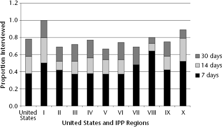
Source: US CDC, Division of Sexually Transmitted Disease (2004).
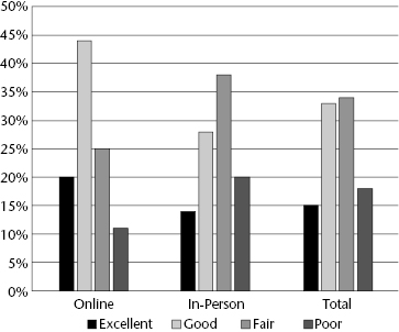
Bar graphs may also be constructed as cluster charts with individual bars for breaking out groups within the data to allow for comparisons across groups or clusters of cases. Figure 6.3, for example, reports statewide data on customer ratings of a driver's license renewal process solicited by the state's department of driver services over the course of fiscal year 2014. The ratings in the response cards were excellent, good, fair, and poor, and the results are broken down by two groups of customers: those who renewed their licenses in person in one of the driver service centers and those who completed the process online. As might be expected, the ratings differ substantially between the two service modalities. While a large majority, nearly 65 percent, of the online customers rated the service as good or excellent, a majority of those who renewed their licenses in person rated the service as only fair or poor. Overall, then, just under half of all the customers who filled out the customer response cards gave the service a positive rating, while slightly more than half gave it a negative rating.
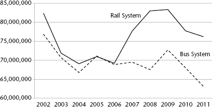
Line graphs are most typically used to chart performance trends over time. For example, figure 6.4 shows annual revenue ridership totals, which represents a bottom-line outcome measure in the local public transit industry in the United States, for the Metropolitan Atlanta Rapid Transit Authority (MARTA) from 2002 to 2011. These data are further broken down by MARTA's rail system and its bus system. Ridership on the two systems tracked each other very closely from 2002 through 2006, declining precipitously from around 80 million revenue passengers in 2003 and then leveling off at around 70 million through 2006. However, while ridership on the bus system continued to hover around the 70 million mark through 2008 and then increased somewhat in 2009 before dropping to fewer than 65 million passenger trips by 2011, the number of revenue passengers on MARTA's rail system turned the corner in 2007 and then rose up to more than 80 million passenger trips in 2008 and 2099 before dropping down somewhat above the 75 million mark in 2010 and 2011. Line graphs like this one can paint a vivid picture of an agency's performance over time, and in this case the old adage that a picture can tell the story of a thousand words is clearly true.
Bubble graphs can be very useful for reporting data on two indicators of performance simultaneously on a set of cases broken down by service delivery venues, organizational units, and geographic areas or, projects, while taking into account some other dimension of these cases. The upper half in figure 6.5, for example, is a bubble chart showing on-time performance and on-budget performance for all highway construction projects completed in fiscal 2002 by the Virginia Department of Transportation (VDOT). Each bubble in the chart represents one of these completed projects.
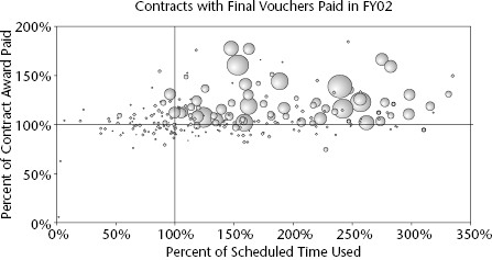
The reference line at 100 percent on the horizontal axis represents the point at which projects have come in on precisely the number of days they were programmed to take. Projects to the right of the reference line were late in reaching completion; for example, projects plotted at 200 percent required twice as many days to reach completion than the number of days programmed. Similarly, the reference line at 100 percent on the vertical axis represents projects that were brought in exactly on budget, costing neither more nor less than the amount specified in the contract between VDOT and the highway contractors that actually build these projects. The bubbles above this reference line are projects whose actual cost exceeded VDOT's projected costs, and projects plotted below the reference line came in under budget.
In this case, the bubble size represents the size of the completed highway project, as represented by their dollar value as a surrogate measure of the magnitude of the work required to build it. As is evident from the bubble chart in the upper half of figure 6.5, the majority of projects completed by VDOT in 2002 took longer than programmed, many significantly longer, and a majority of these projects came in over budget as well. Most of the larger projects completed by VDOT in 2002 especially were both over time and over budget, many dramatically so. With a few exceptions, the only projects that were completed on time or on budget (or both) were very small projects. This state of affairs signaled an urgent need at VDOT to improve the performance of its highway construction program, and that became the department's top priority.
Improving performance on these criteria is represented by moving projects down and to the left in these graphs. The bubble chart in the lower half of figure 6.5 shows the same performance data for VDOT highway projects completed in 2002. Clearly VDOT's performance improved dramatically over the intervening six years, with the majority of projects having been completed in less time than programmed or under budget, or both, and with a few exceptions, most of those projects that failed to come in on time and on budget were within 25 percent of their targets rather than up to three times their planned completion time and two times their allotted budgets.
Such bubble charts offer great potential for reporting performance data in a compelling manner whenever the data are being used to assess the performance of multiple programs, projects, organizational units, or grantees, for example, and the two key performance indicators are measured on interval scales. The following applications might be interesting and meaningful ones:
- An international development program wishes to assess the performance of all projects it has funded that are meeting both numerical output targets and outcomes, with the size of each bubble representing the number of people affected by each funded project.
- A state transportation department wishes to track the performance of each of its local area highway maintenance operations on measures of pavement condition as measured on the international roughness index and customer satisfaction with ride quality as measured by a customer satisfaction index computed with survey data, with the size of each bubble representing the number of lane miles of state highway that each highway maintenance operation is responsible for.
- A national association of state boards of nursing wishes to monitor the performance of each member board in terms of both cycle time in processing applications for nursing licenses and cycle time in completing investigations of reported practice violations, with the size of the bubble representing the number of nurses within the purview of each state board of nursing.
Scorecards and Dashboards
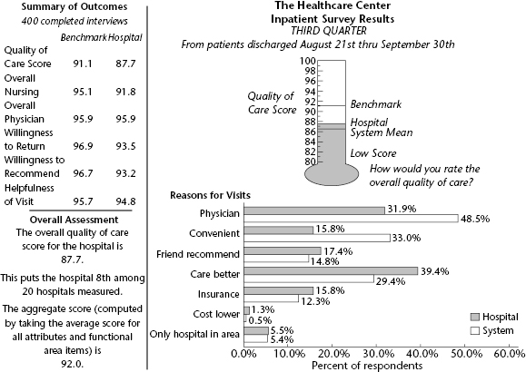
Graphical displays of data such as those described in the preceding section are common and familiar to many stakeholder groups. It is useful to display data using a scale and a graphic that the audience readily understands. For audiences that might be intimidated by even simple bar or pie charts, the creative use of pictorial items from everyday life makes the data display more accessible and less threatening. For example, figure 6.6 shows the use of a thermometer to illustrate the overall quality of care for a public hospital as solicited in brief interviews with recent patients. Using the thermometer, “hotter” is better in terms of quality, whereas “cooler” implies poorer-quality care. In this example, a number of comparative items are also displayed on the thermometer, such as the benchmark goal level, the system mean for twenty hospitals, and the low score from the survey results. It is a nonthreatening, efficient way to show not only the performance results but also their relationship to other key figures. The patient feedback shown in the thermometer is also displayed in tabular format, along with ratings from other dimensions, including overall nursing and overall physician quality, willingness to return, willingness to recommend, and helpfulness of visit. Other data useful to the audience are also shown in a bar graph (reasons for visits to the health care center) to add an additional level of respondent information to the report.
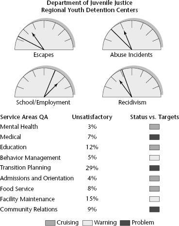
In another example, figure 6.7 illustrates a dashboard display with an automotive flavor to convey performance results for a department of juvenile justice. In this example, both the current status of certain performance items, represented by the arrows, as well as target levels, shown with solid lines, are displayed on each gauge. For example, the actual number of escapes is above the target level, as are cases of reported abuse, whereas the recidivism rate of discharged juveniles is lower than the target. Here, the arrow on the dashboard is implied to be moving in an upward direction. Below the dashboards, “traffic signals” (best displayed in color) are used to indicate how well a number of ongoing operations are moving along. Red is used to indicate a problem for an individual item, yellow to indicate a warning, and green to indicate that the item is within an acceptable range, or cruising. This pictorial example allows users to quickly scan the display and see where trouble spots may be.
The terms scorecard and dashboard are not used consistently in the field of public management, and they are often used interchangeably. Typically, however, they are meant to refer to formats for displaying performance information that can be taken in and understood at a glance. Figure 6.8 shows the dashboard provided by the US Patent Office, which indicates the status of the office's operations on eight key performance indicators and is posted and updated monthly online. As rendered in black and white in this book, it is impossible to see the distinct colorations surrounding the dials that represent various gradations in performance levels, which presumably are meaningful to managers who are responsible for various aspects of the patent office's operations.
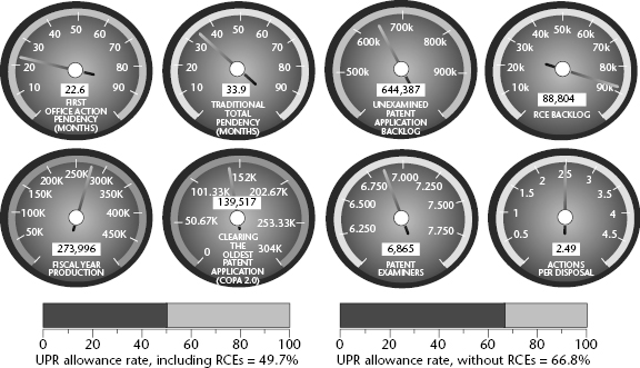
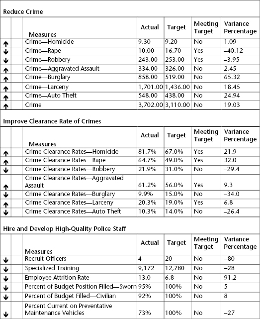
Figure 6.9 shows part of a municipal police department's scorecard. It shows performance data on numerous measures of performance related to three different goals that focus on reducing Part 1 crimes, improving clearance rates, and hiring and developing police officers. In the column on the left the arrows indicate at a glance whether performance at this point has improved (up arrows) or declined (down arrows) since the previous reporting period. Of particular interest in this scorecard is the reporting of data on actual performance as well as targets, and also showing the variance between the two. For example, while the target crime rate for homicides was 9.2 reported homicides per 100,000 population, the actual reported data indicate 9.3 homicides per 100,000 population. Thus, the actual homicide rate slightly exceeded the target by 1.09 percent, indicating that actual performance failed to meet the target by that margin.
Maps
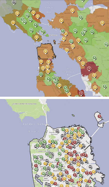
There is a wide range of options to choose from in pictorial graphical displays. For example, with programs or organizations that serve broad geographical areas, it is sometimes desirable to map the variation across subareas in order to facilitate comparisons among them and identify where the higher-performing and lower-performing programs or districts are. The creative use of mapping can be particularly useful in displaying performance results when spatial variation in outputs and outcomes is of interest. With advances in geographic information systems (GIS), maps can be increasingly integrated in performance reporting. For example, the upper half of figure 6.10 displays ratings of local public school systems in the San Francisco metropolitan area based on average scores on standardized tests used in California. As posted online, the small circles on the map use the conventional green—yellow—red color scheme to represent individual schools that fall in the upper, middle, and lower tiers, respectively. More specifically, the numbers inside the circles indicate which decile each school system falls into. For instance, a school represented with a 1 ranks above the lowest 10 percent of all the school districts in the state, while a system represented by a 6 scored higher than 60 percent of the schools, and a school district with a rating of 9 ranked higher than 90 percent of all school systems in the state. The map in the lower half of figure 6.10 focuses solely on the City of San Francisco, where each circle represents an individual elementary, middle, or high school, using the same color coding and numbers as in the upper half of the figure. Users can also call up comparisons of these ratings by grade and by student groups defined by such variables as gender, ethnicity, and special student status within each school.
Maps can be especially useful for presenting performance information whenever service delivery is decentralized geographically. For example, the New York City Police Department's CompStat system tracks the incidence of crimes and maps this information by the five boroughs and fifty-nine community districts, as well as block by block, on a real-time basis, and it also provides longitudinal comparisons by comparing these maps over time. The City of Baltimore maps the spatial distribution of the occurrence of such problems as cases of lead paint flaking. Many state transportation departments display performance data regarding road condition, safety hazards, and construction projects on maps at the district and county level, and a state's child support enforcement agency might well map the variation in payment delinquency across all of its local offices where enforcement activities are actually carried out.
Overall, creative graphical and pictorial displays can be especially useful for communicating with the media, in press releases, and in annual reports or news briefs read by a variety of audiences. Organizations should choose pictorial displays that make sense to their audience and are appropriate for the services they provide. Like other graphical displays, the results can be memorable to some individuals who are not likely to recall the precise numbers. However, unlike the simpler graphical displays discussed earlier, displays such as these do require some expertise in graphics and may not be easily generated by all staff. More specialized software or graphical design may be required.
Conclusion
The output of a performance measurement system is generally a performance report of one form or another, and the data are frequently posted online as well as documented in hard-copy reports. Public and nonprofit organizations are often interested in demonstrating their performance to a variety of stakeholders, and they need to keep in mind that the overall utility of a performance measurement system resides in large part in the accessibility and understandability of its results, that is, how quickly, easily, and accurately the intended audiences are able to understand and absorb the performance reporting. In deciding the best way to communicate their organization's performance results, managers and staff need to consider not only the nature of the data to be presented but also the information needs and interests of their audiences for the information. Because these interests may well vary significantly by stakeholder group—for instance, managers, employers, partners, customers, governing bodies, and funding agencies—it often makes sense to report the same data in different formats to different audiences.
With these differences in mind, organizations should be creative in designing reports, and they need not feel restricted to the easiest, most common display formats. Using a mix of display formats may also be useful, with many performance reports employing a combination of tables, bar graphs, line graphs, maps, and perhaps other pictorial displays to present their performance information effectively. The choices of display formats must also be guided by the level of measurement used in each indicator—nominal, ordinal, and interval—and the comparative frameworks within which the data are to be presented, including comparisons over time, against targets, across operating units or other breakdowns, and against other similar programs or agencies.
Finally, to be creative in developing reporting formats, organizations need to be familiar with and take advantage of software technologies. The range of display options continues to increase as advances in software technology greatly improve the ease and accessibility of different display formats for even relatively unsophisticated computer users. As the production values continue to improve and the variety of formats continues to expand, however, and as the software becomes steadily more user friendly and more easily accessible, however, there is a temptation sometimes to focus more on the appearance of the report than the substance. The principal criterion in designing performance reports is not glitzy formats but rather a mix of formats that converts the data to information effectively, making the most appropriate comparisons, and presents the performance information in the most meaningful and compelling manner possible.