Chapter 11. Model Selection
This chapter will discuss optimizing hyperparameters. It will also explore the issue of whether the model requires more data to perform better.
Validation Curve
Creating a validation curve is one way to determine an appropriate value for a hyperparameter. A validation curve is a plot that shows how the model performance responds to changes in the hyperparameter’s value (see Figure 11-1). The chart shows both the training data and the validation data. The validation scores allow us to infer how the model would respond to unseen data. Typically, we would choose a hyperparameter that maximizes the validation score.
In the following example, we will use Yellowbrick to see if changing the value of the max_depth
hyperparameter changes the model performance of a random forest. You can provide a scoring parameter
set to a scikit-learn model metric (the default for classification is 'accuracy'):
Tip
Use the n_jobs parameter to take advantage of the CPUs and run this faster. If you set it to -1, it will use all of the CPUs.
>>>fromyellowbrick.model_selectionimport(...ValidationCurve,...)>>>fig,ax=plt.subplots(figsize=(6,4))>>>vc_viz=ValidationCurve(...RandomForestClassifier(n_estimators=100),...param_name="max_depth",...param_range=np.arange(1,11),...cv=10,...n_jobs=-1,...)>>>vc_viz.fit(X,y)>>>vc_viz.poof()>>>fig.savefig("images/mlpr_1101.png",dpi=300)
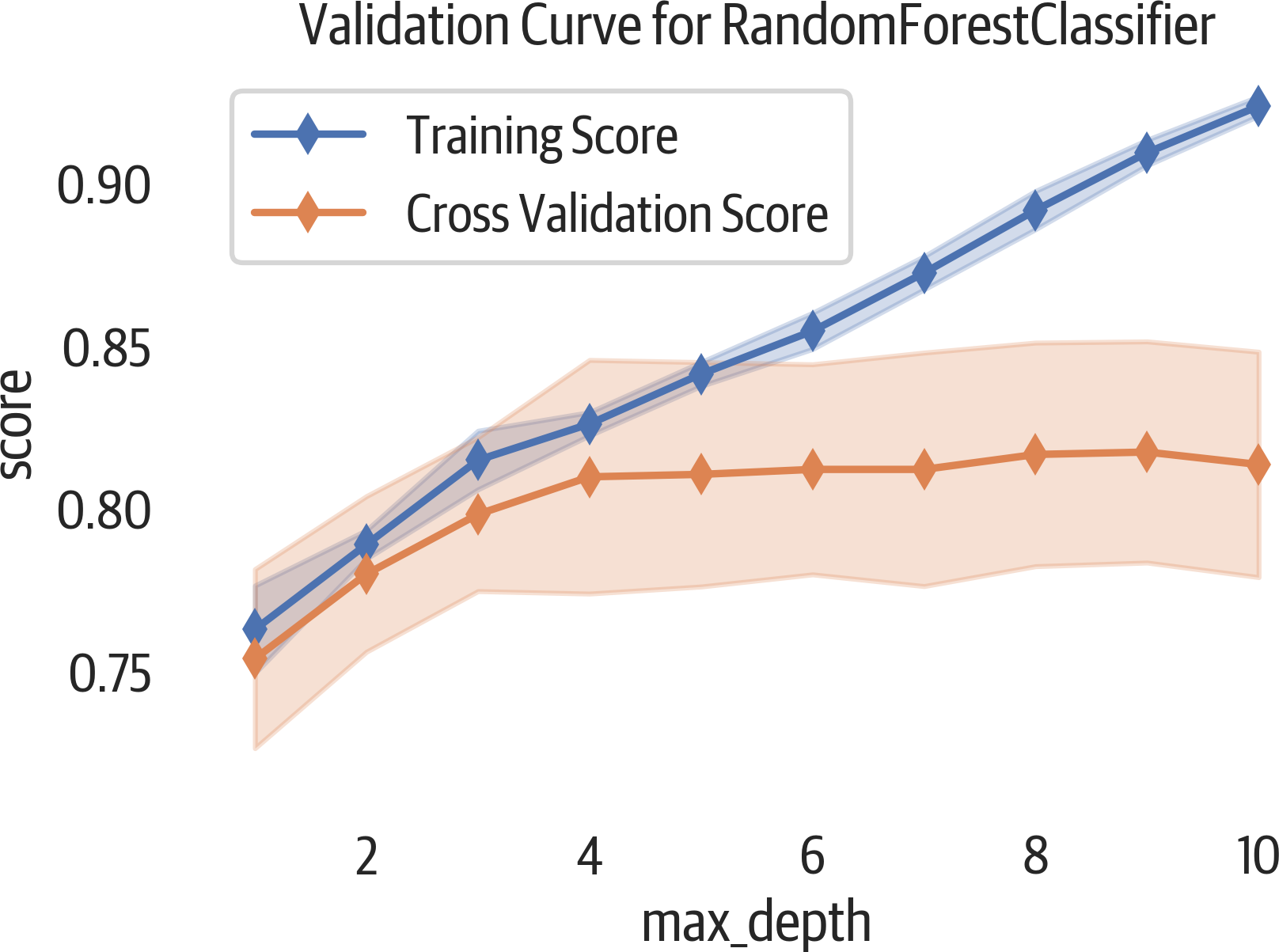
Figure 11-1. Validation curve report.
The ValidationCurve class supports a scoring parameter. The parameter can be a custom function or one of the following options, depending on the task.
Classification scoring options include: 'accuracy', 'average_precision',
'f1', 'f1_micro', 'f1_macro',
'f1_weighted', 'f1_samples', 'neg_log_loss', 'precision', 'recall', and
'roc_auc'.
Clustering scoring options: 'adjusted_mutual_info_score',
'adjusted_rand_score', 'completeness_score', 'fowlkesmallows_score',
'homogeneity_score', 'mutual_info_score',
'normalized_mutual_info_score', and 'v_measure_score'.
Regression scoring options: 'explained_variance',
'neg_mean_absolute_error', 'neg_mean_squared_error',
'neg_mean_squared_log_error', 'neg_median_absolute_error', and 'r2'.
Learning Curve
To select the best model for your project, how much data do you need? A learning curve can help us answer that question. This curve plots the training and cross-validation score as we create models with more samples. If the cross-validation score continues to rise, for example, that could indicate that more data would help the model perform better.
The following visualization shows a validation curve and also helps us explore bias and variance in our model (see Figure 11-2). If there is variability (a large shaded area) in the training score, then the model suffers from bias error and is too simple (underfit). If there is variability in the cross-validated score, then the model suffers from variance error and is too complicated (overfit). Another indication that the model is overfit is that the performance of the validation set is much worse than the training set.
Here is an example of creating a learning curve using Yellowbrick:
>>>fromyellowbrick.model_selectionimport(...LearningCurve,...)>>>fig,ax=plt.subplots(figsize=(6,4))>>>lc3_viz=LearningCurve(...RandomForestClassifier(n_estimators=100),...cv=10,...)>>>lc3_viz.fit(X,y)>>>lc3_viz.poof()>>>fig.savefig("images/mlpr_1102.png",dpi=300)
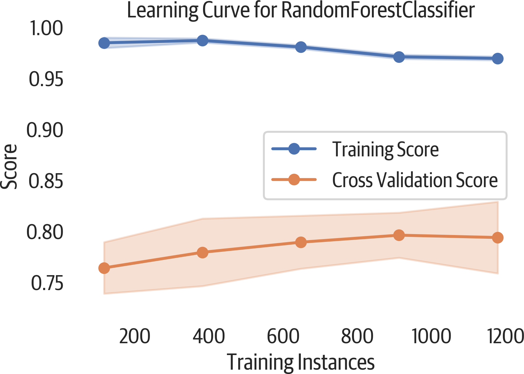
Figure 11-2. Learning curve plot. The plateau in the validation score indicates that adding more data would not improve this model.
This visualization can also be used for regression or clustering by changing the scoring options.