With the dashboard layout complete, it is time to make it dynamic and interactive. Before jumping into the exercises, however, we'll review the key concepts related to form inputs first.
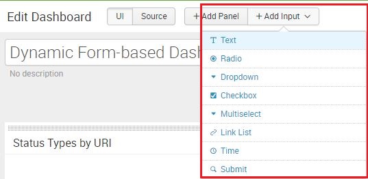
Just as in any web page, a form input is an element that allows you to select or type in information that will be submitted to the application for processing. There are different form inputs available for Splunk dashboards:
- Text (key in free-form text)
- Radio (uses a radio button convention)
- Dropdown (uses a menu or list to select a single option)
- Checkbox
- Multiselect (similar to Dropdown, allowing you to select multiple choices)
- Link list (this is a horizontal list that contains clickable links)
- Time
In this list is also the Submit option. This is an action button. If you decide not to autorun the dashboard on change of input selection, the Submit button will execute the dashboard with updated selections when clicked.
It's important the inputs you build are relevant and clear to the user, and selections may be description fields found in Lookup tables as opposed to the event itself.
Going back into Edit mode for your dashboard, you will see this list of options by clicking on the Add Input drop-down menu:
- Select Text in the Add Input drop-down. A new editable input field panel will be added at the very top of the dashboard. You can either edit the properties of the field using the pencil icon or delete the field entirely using the X icon:
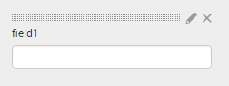
- Click on the pencil icon to edit the properties. You can change the type of input by clicking on the selections on the left of the pop up window:

Although the options are generally different for every type of input, there are common concepts that you need to fully comprehend. So, it is worth looking at this list carefully before we take you through some examples.
In the General section, you'll see the following options:
- Label: Every input needs a label. This is a free form message shown to the user on the dashboard to indicate what the user should do, for example, Select a Date Range: or Select Response Code:.
- Search on Change: If checked, this checkbox triggers a reload of the dashboard panels that depend on the specific input. Ensure that you know the requirements of your users to know whether this feature should be enabled.
In the Token Options section, you'll see the following option:
- Token: This is what is used to associate the value from the form input to the search itself. In programming, this is what you would refer to as a variable. For example, if you created an input for time and you named the token time1, then in your panel's search query you can extract the value of the input field by calling the identifier, $time1$. Then, the tokens that we use to get specific fields will be $time1$.earliest and $time1$.latest. You will walk through examples of this in this chapter.
- Default: On inputs that require a selection, you can specify a default value during page load. This is important if your panel charts require an initial value to populate the data. If not, your panels will not load data until the user selects an option.
- Explore the messages next to Initial Value, Token Prefix, and Token Suffix in the UI by hovering the pointer over the question mark next to each item to understand their functions.
If you're still in the options for the Text input, change it to Radio. This will expose two more sections: Static Options and Dynamic Options. In Static Options, you will see the following:
- Name and Value: These are name-value pairs that will appear in the selection of the input field, thereby creating a manual list of value options
In the Dynamic Options section, you'll see the following options:
- Search String: Occasionally, the selection that you need shown in the input fields is already in Splunk, either in the event or in a Lookup. With this option, you can use a search query to populate the input field dynamically. For example, the search query index=main | top host will allow the input field to show the top hosts as the possible options to select.
- Time Range: This is the time range for the search query used previously. Try to use a small time range here.
- Field for Label: This is the field that returns the value you need, based on the search string. In the previous example, you need the host field.
- Field for Value: You can change the field for the value, but we recommend you use the same one as the label. The value is what is actually applied to the search.