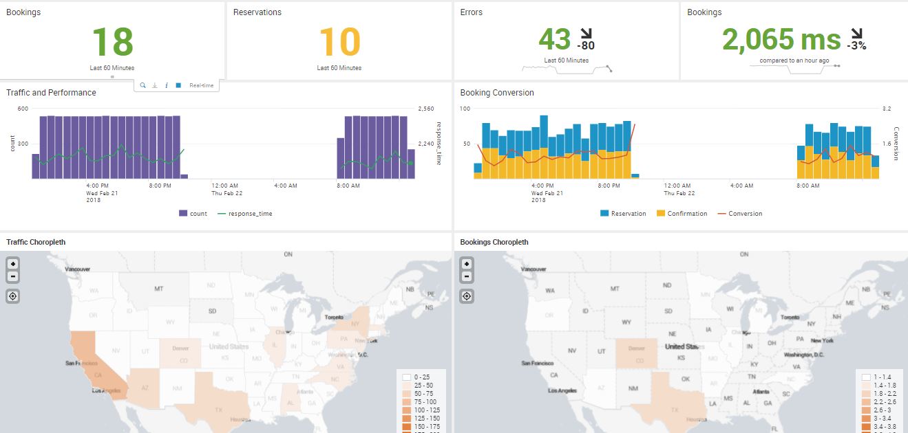
A choropleth map, whose name comes from two Greek words meaning area/region and multitude, is a two-dimensional map where areas are designated by color shades or patterns to indicate the measured strength of a statistical indicator, such as sales per area or crime rates.
We will not cover in detail the mathematical details of how a choropleth is created, but we are fortunate that we can use Splunk to provide this effective visualization tool for us. We will create two choropleth maps to denote bookings by region and traffic by region.
Since we don't have a panel to clone from, we will create this from scratch:
- Enter edit mode with the Edit button.
- Click on Add Panel.
- Select New | Choropleth Map.
- Change Time Range to a 1 hour window under the real-time presents.
- In Content Title, type in Traffic Choropleth.
- Type in this Search String, which includes a geomap command and makes use of one of the two geographic lookup maps that are included by default with Splunk. The one used here includes the United States; the other one is for the world. This geomap command asks for a map with the counts for different states. Shading is based on the relative magnitudes of the counts:
SPL> index=main | iplocation client_ip | stats count by Region
           | rename Region as featureId | geom geo_us_states
- Click on Add to Dashboard.
- Click the Format Visualization icon in the panel just created.
- We will now put the United States in the center of the map and adjust the zoom level.
- Change Latitude to 39.
- Change Longitude to -98.
- Change Zoom to 4:

- Click on the Colors tab.
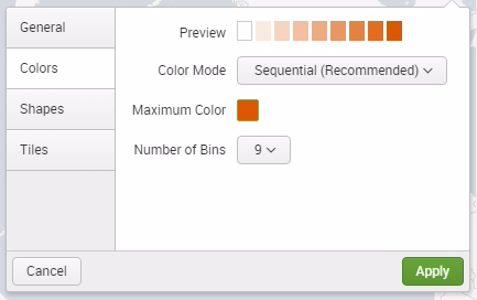
- Change Number of Bins to 9. This will increase the color range by adding more gradient tones:

- Click on the X to close the window.
- Click on Save.
Now, reload your browser to allow this new panel to be added to the cloning panel selection.
Clone the Traffic Choropleth panel and change two things:
- Title: Bookings Choropleth
- Search String: index=main http_uri=/booking/confirmation http_status_code=200 | iplocation client_ip | stats count by Region | rename Region as featureId | geom geo_us_states
Now, drag and position the second choropleth panel to the right of the other one to make the dashboard fluid.
You have now created a real-time, multi-panel dashboard. When you use this with your real production data, you can create a visualization that is useful and can produce all kinds of efficiencies. Your hard work can become a big hit!
