STILL LIFE
STILL LIFE COMPOSITION
Creating a good still life composition is simply arranging the elements of a drawing in such a way that they make an eye-pleasing, harmonious scene. It’s easy to do once you have a few guidelines to follow. The most important things to keep in mind are: (1) choosing a format that fits the subject, (2) establishing a center of interest and a line of direction that carries the viewer’s eye into and around the picture, and (3) creating a sense of depth by overlapping objects, varying the values, and placing elements on different planes. Like everything else, the more you study and practice forming pleasing compositions, the better you’ll become.
ARRANGING A STILL LIFE
Composing still lifes is a great experience because you select the lighting, you place the elements where you like, and the objects don’t move! Begin by choosing the items to include, and then try different groupings, lighting, and backgrounds. Test out the arrangements in small, quick thumbnails like the ones shown here. These studies are invaluable for working out the best possible composition.
Composing with Photos Dynamic compositions rarely “just happen”—most are well planned, with objects specifically selected and arranged in an appealing manner to create good flow and depth. Taking snapshots of your arrangements will help you see how your setups will look when they’re drawn on a flat surface.
SELECTING A FORMAT
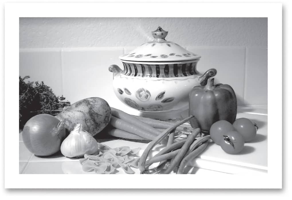
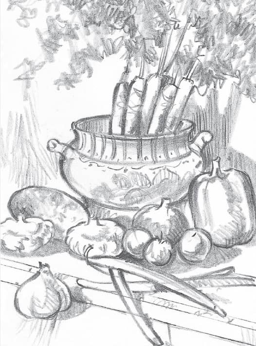
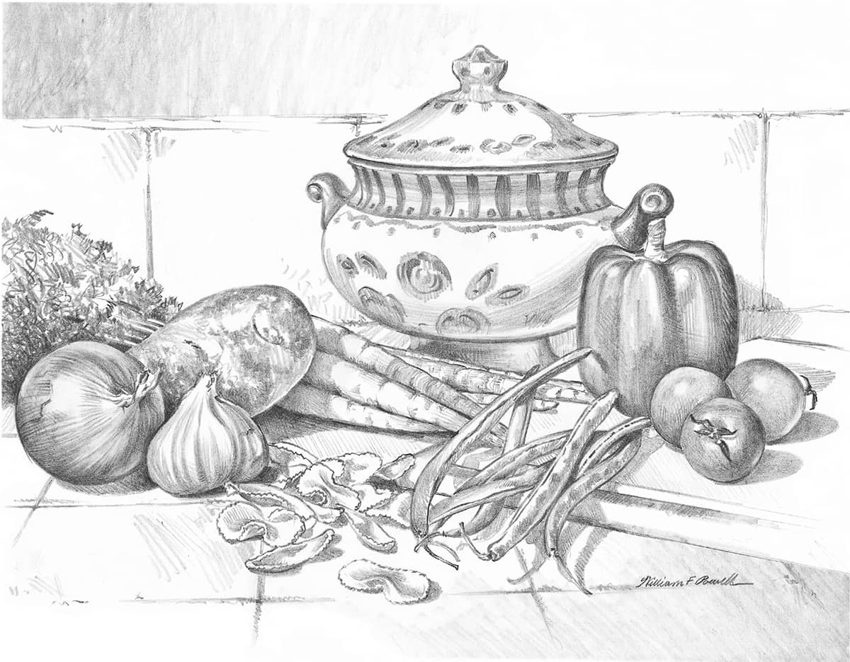
Horizontal Format The “landscape” format is a traditional one and is perfect for drawing indoor or outdoor scenes. Here, as in any good composition, the overlapping vegetables lead the viewer’s eye around the picture and toward the focal point—the tureen. Even the tile pattern points the way into the picture and toward the focal point.
Vertical Format In this “portrait” format, the carrot tops add height to the composition and counterbalance the arc of vegetables in the foreground. The tip of the head of garlic and the angle of the beans lead the viewer into the composition and toward the focal point. In the background, only a suggestion of shadows are drawn, and the vertical tiles are not clearly defined. This adds to the upward flow of the entire composition and keeps the viewer’s attention focused on the tureen.
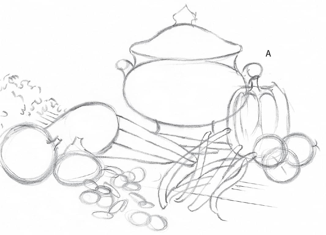
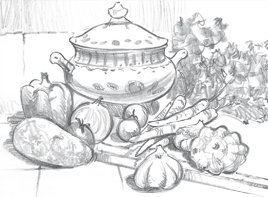
Step 1 From your thumbnail sketches, choose a horizontal format. Notice that the tureen is set off-center. If the focal point were dead center, your eye wouldn’t be led around the whole drawing, which would make a boring composition. Then lightly block in the basic shapes with mostly loose, circular strokes, using your whole arm to keep the lines free.
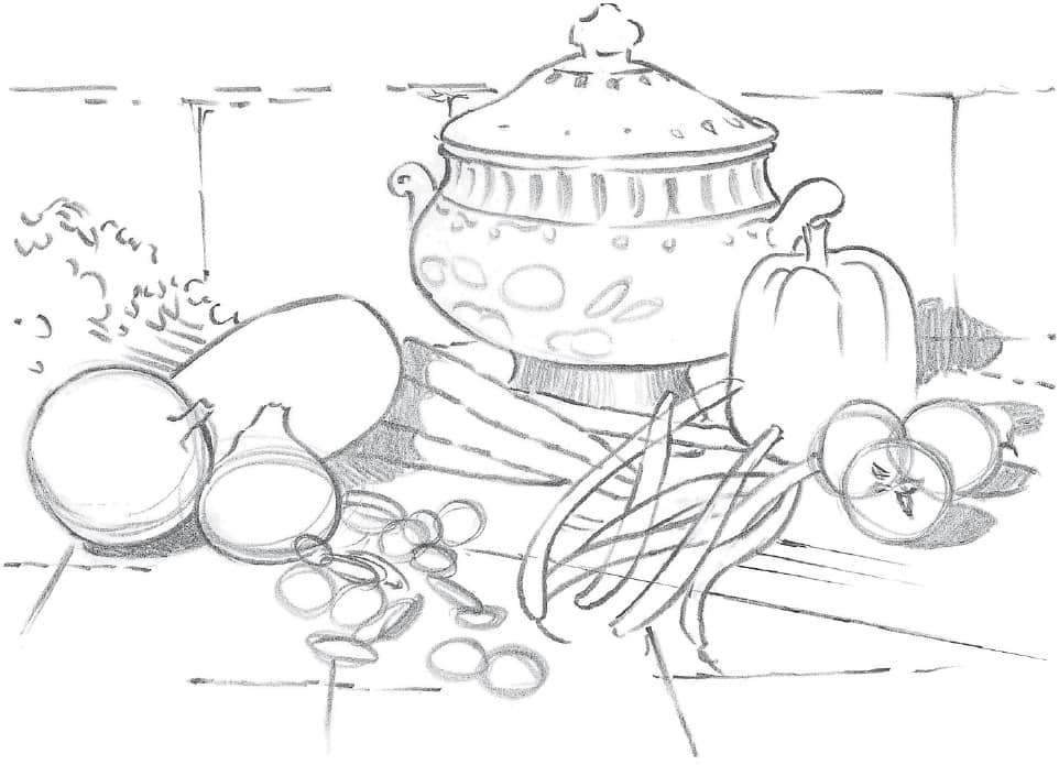
Step 2 Next refine the shapes of the various elements, still keeping your lines fairly light to avoid creating harsh edges. Then, using the side of an HB pencil, begin indicating the cast shadows as well as some of the details on the tureen.
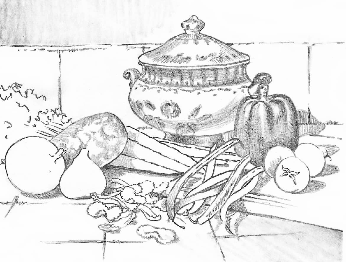
Step 3 Continue adding details on the tureen and darkening the cast shadows. Then start shading some of the objects to develop their forms. You might want to begin with the bell pepper and the potato using the point and side of an HB pencil.
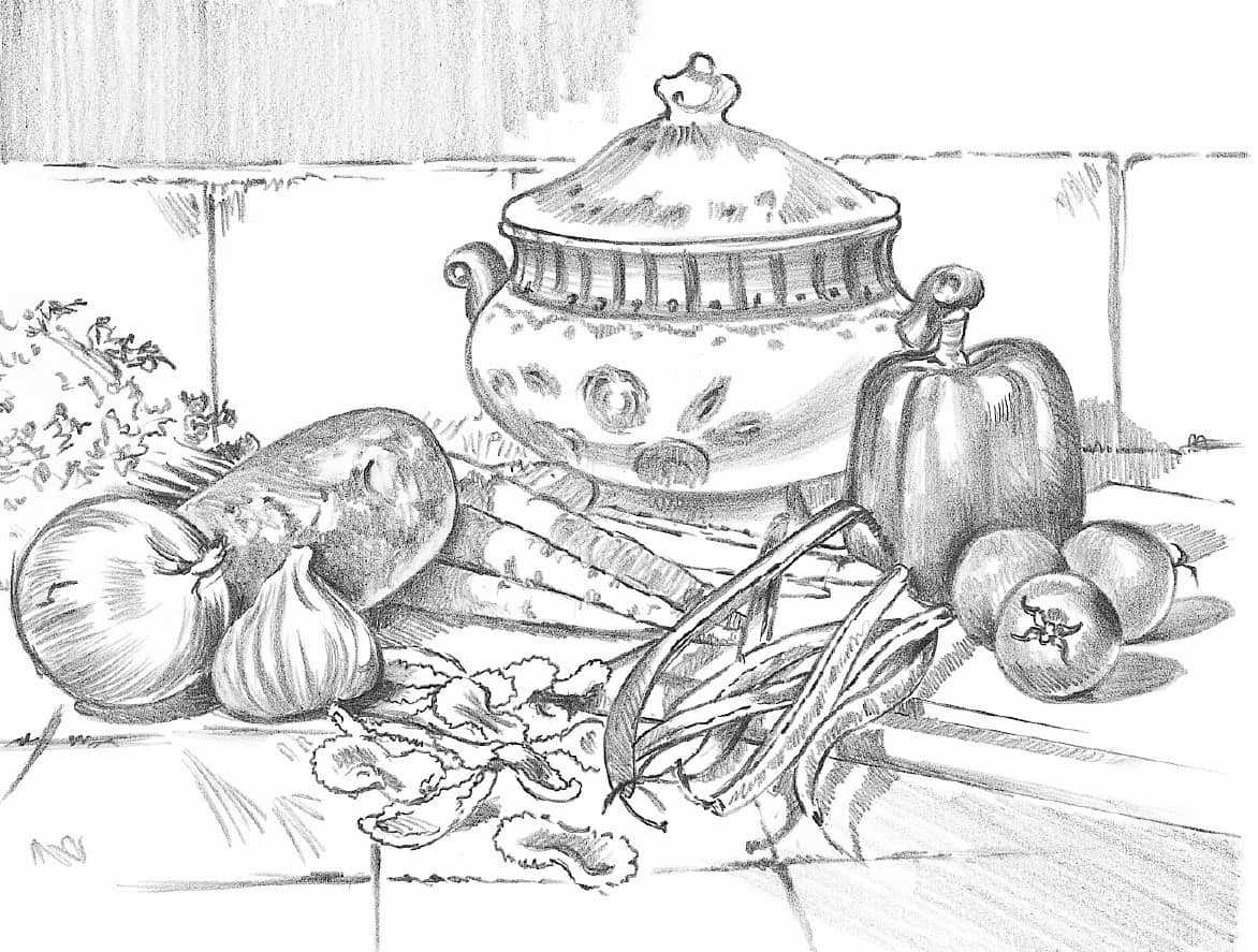
Step 4 Next, build the forms of the other vegetables, using a range of values and shading techniques. To indicate the paper skins of the onion and the garlic, make strokes that curve with their shapes. For the rough texture of the potato, use more random strokes.
Step 5 When you are finished developing the light, middle, and dark values, use a 2B pencil for the darkest areas in the cast shadows (the areas closest to the objects casting the shadows).
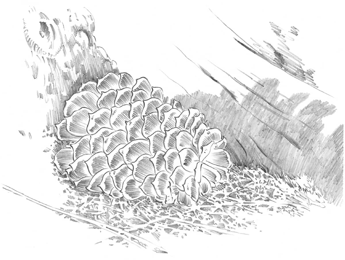
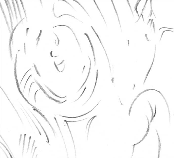
PINECONE
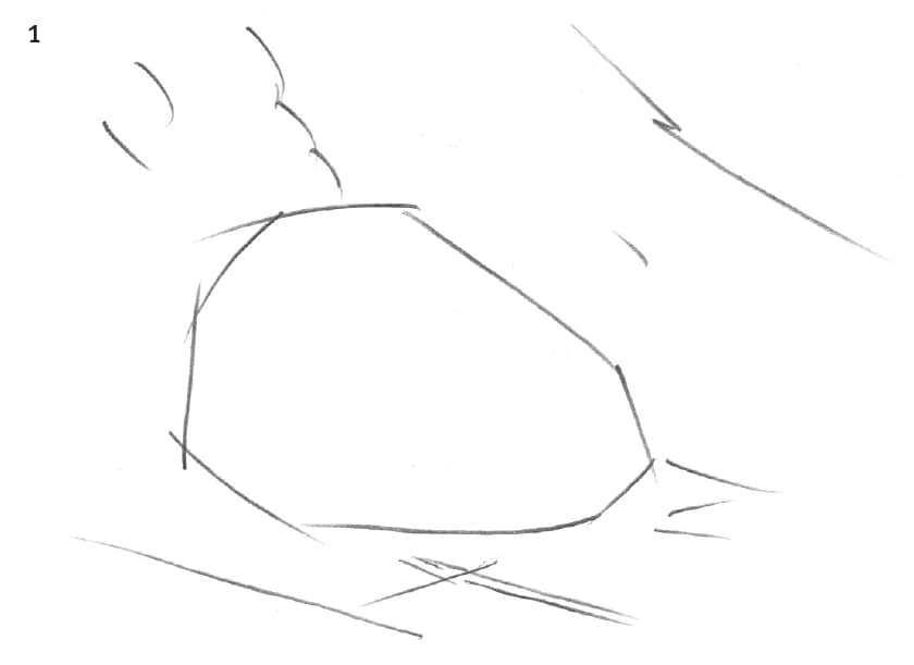
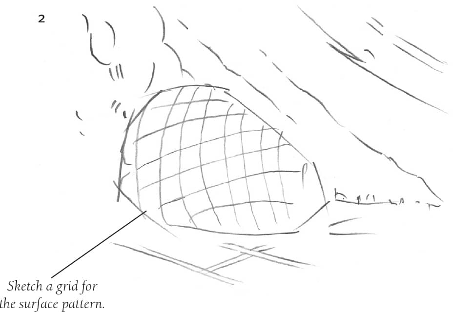
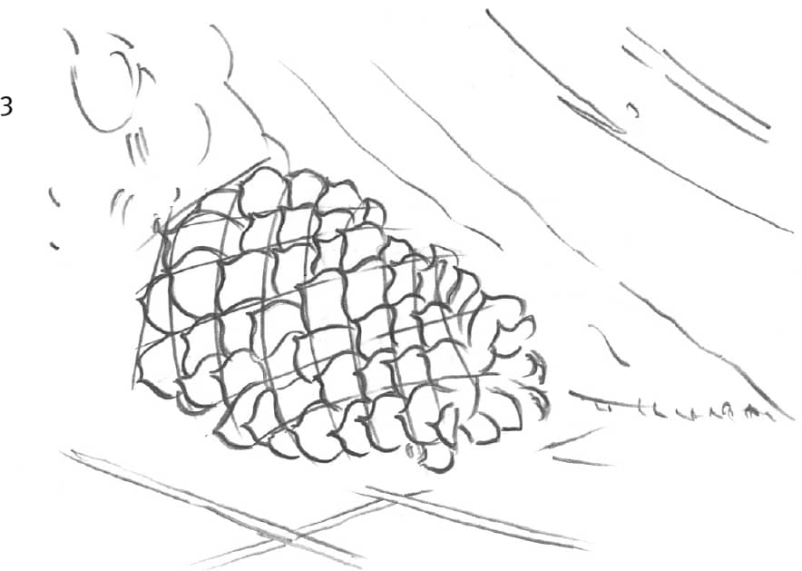
Using an HB pencil, position the pinecone with light guidelines in step 1. Then indicate the tree trunk and pine needles in step 2, and add a grid for the pattern on the pinecone.
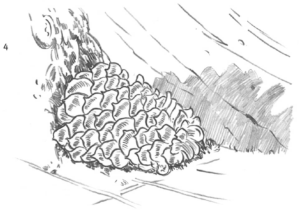
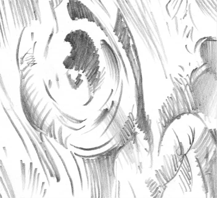
Establishing Detail Draw the shapes of the spiked scales, which change in size from one end of the cone to the other. In step 4, begin shading the cone and surrounding objects. Make the cast shadow appear to follow the curve of the tree root.
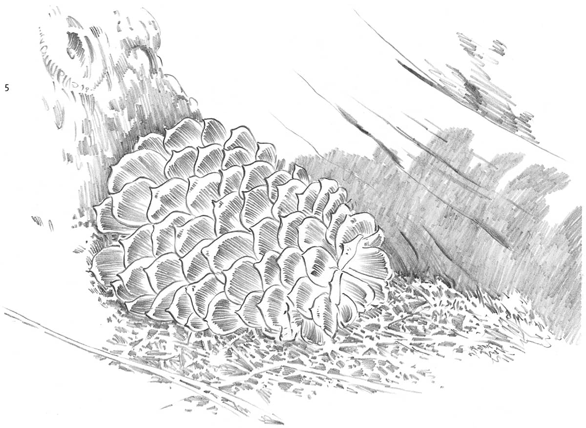
Working with Negative Space Develop the grass in step 5 by drawing the negative spaces. Instead of drawing individual pine needles and blades of grass, fill in the shadows between them. By shading around the negative spaces, the grass shapes will automatically emerge from the white of the paper.
DEVELOPING DETAILS
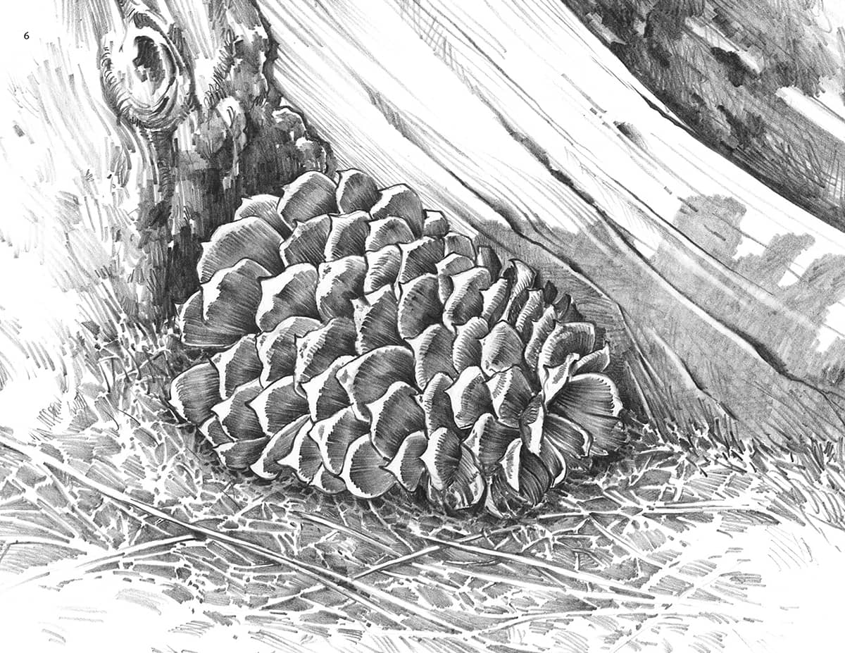
Tree Texture Guidelines To render the bark and knothole of the gnarled tree trunk, first lightly draw in the texture design. Then, when you’re happy with the general appearance, proceed with the shading.
Tree Texture Shading Short, rough strokes give the impression of texture, whereas long, smooth strokes provide interest and contrast. Use a combination of the two strokes to provide the bark’s shading and details.
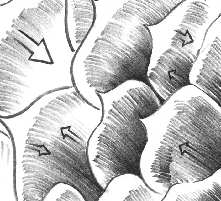
Pinecone Scale Shading Develop each pinecone scale separately, following the arrows on the diagram above for the direction of your strokes. Keep the hatched strokes smooth and close together.
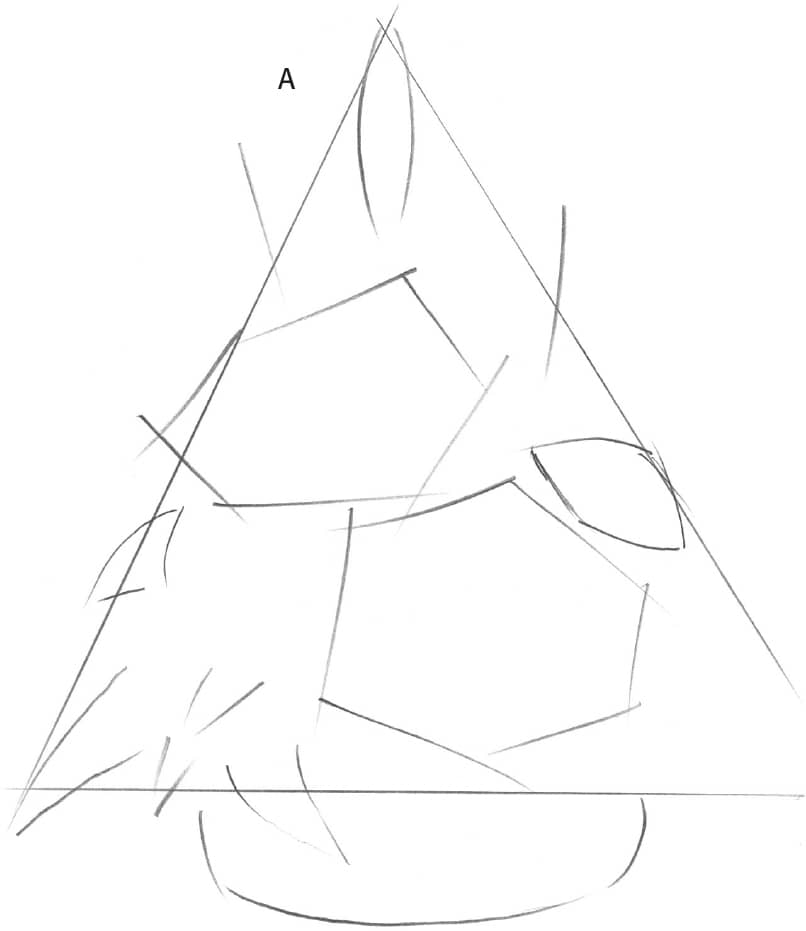
FLORAL ARRANGEMENT
By varying your techniques, you become a more versatile artist. Therefore, this drawing was drawn more loosely than the previous one. Begin with an HB pencil, lightly drawing in the basic shapes within the floral arrangement.
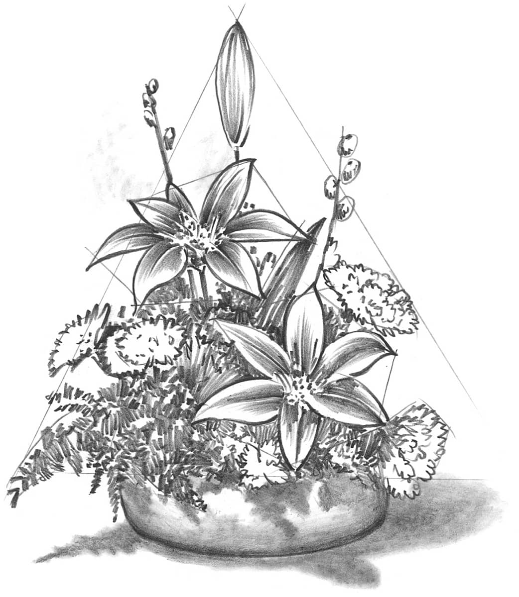
This rendering was finished using a loose, sketchy technique. Sometimes this type of final can be more pleasing than a highly detailed one.
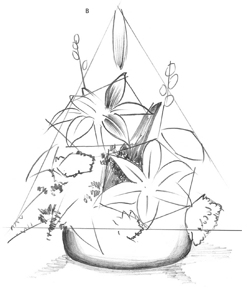
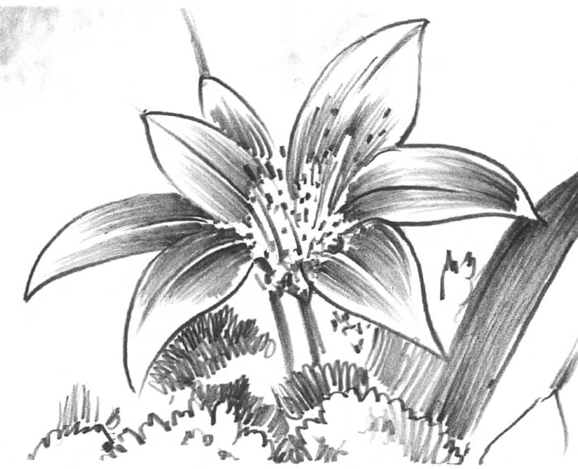
The sketch above shows shading strokes for the flower petals and leaves. Try not to add too much detail at this stage of your drawing.
As shown in the close-up above, the cast shadow needs the smoothest blending. Position the shadows using the side of an HB pencil; then blend softly with a paper stump.
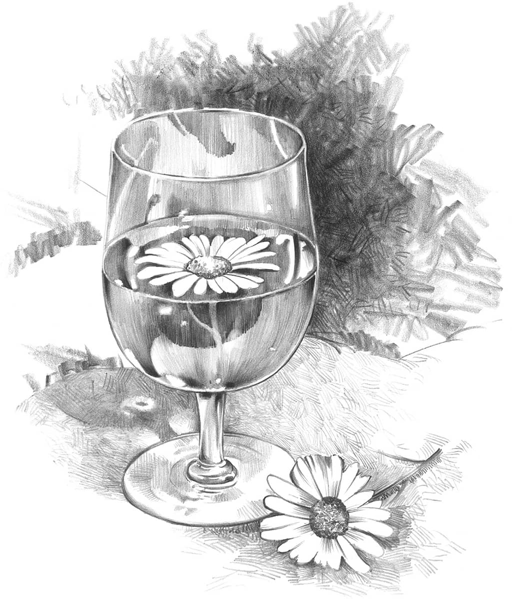
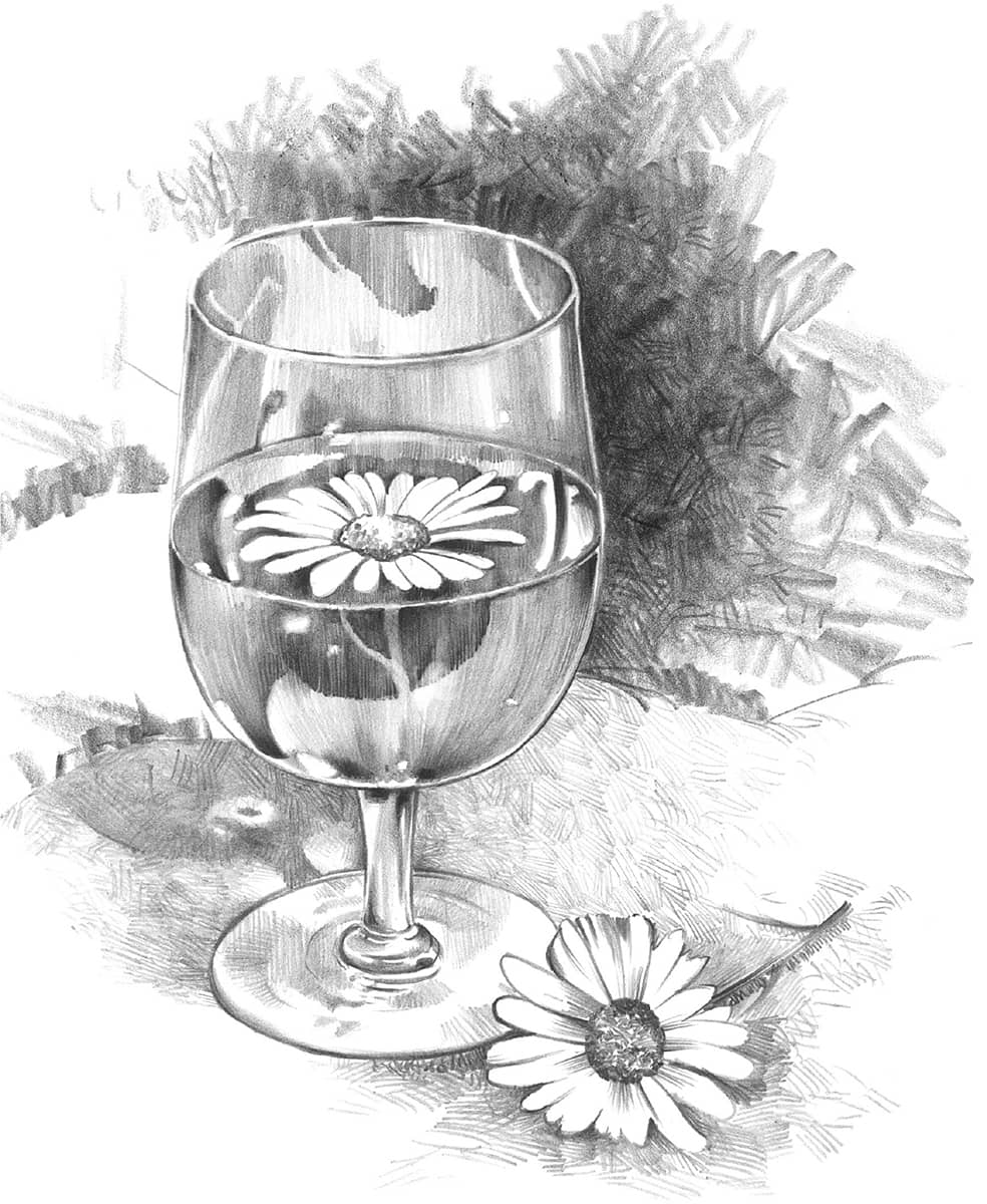
LIQUID & GLASS
This drawing involves more planning than the previous ones. It was done on Bristol board with a plate (smooth) finish. Use an HB pencil for most of the work and a 2B pencil for the dark shadows. A flat sketch pencil is good for creating the background texture.
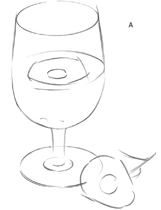
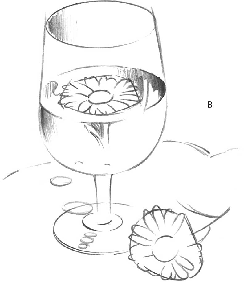
In step A, sketch the basic shapes of the glass, liquid, and flowers. In step B, add more details, and begin shading the glass and liquid areas. Take your time, and try to make the edges clean.
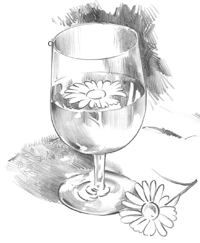
In step C, use the flat lead of a sketching pencil for the background, making the background darker than the cast shadows. Note the pattern of lights and darks that can be found in the cast shadow.
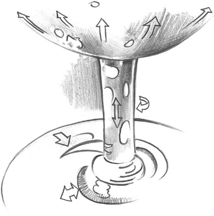
Use the arrows below as a guide for shading. Remember to keep the paper clean where you want highlights. Highlights help suggest light coming through the glass stem, creating a transparent look.
Once you’ve completed the steps, use the finished drawing as your guide for finalizing lights and shadows. If pencil smudges accidentally get in the highlights, clean them out with a kneaded eraser. Lastly, use sharp-pointed HB and 2B pencils to add final details.
BOTTLE & BREAD
This exercise was drawn on vellum-finish Bristol board with an HB pencil. Vellum finish has a bit more “tooth” than the smoother plate finish does, resulting in darker pencil marks.
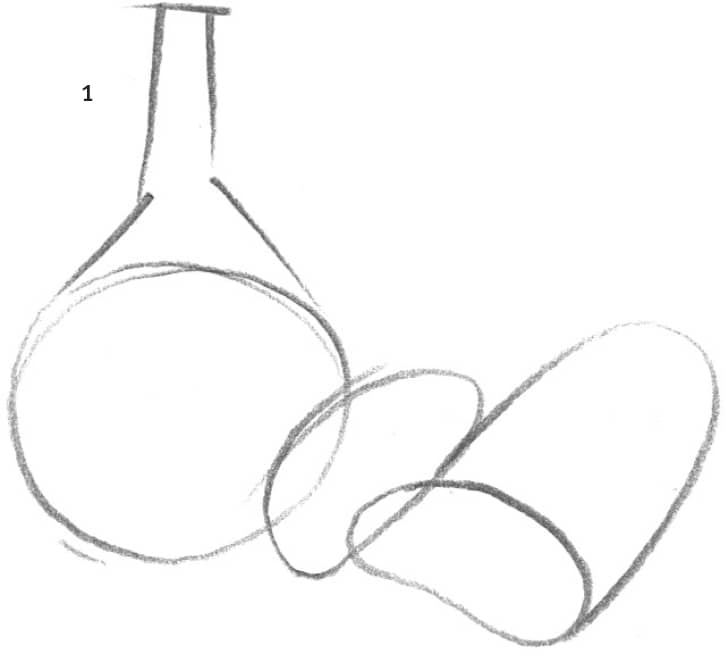
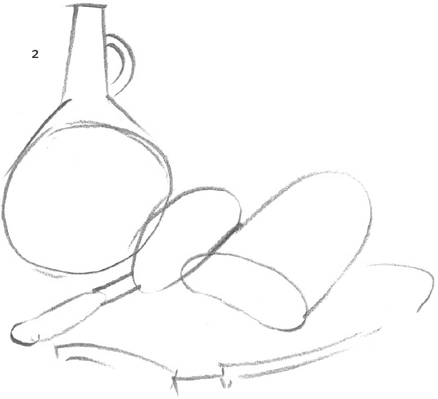
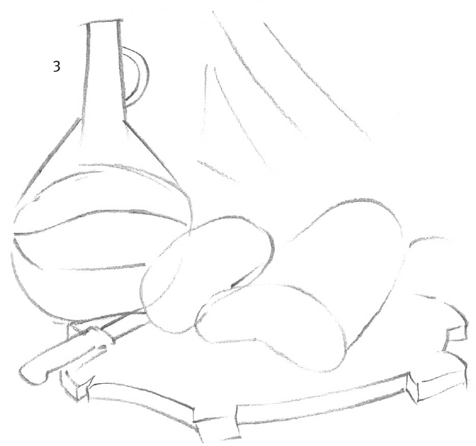
Blocking In the Composition Begin lightly sketching the wine bottle, bread loaf, knife, and cutting board, roughing in the prominent items first, and then adding the remaining elements in step 2. Continue refining the shapes in step 3, and then indicate the placement for the backdrop.
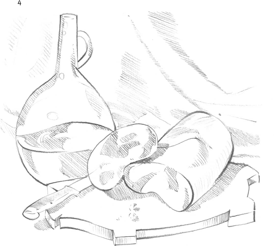
Placing Highlights and Shadows Lightly outline where the highlights will be so you don’t accidentally fill them in with pencil. Now add shadows with uniform diagonal strokes. Use vertical strokes on the sides of the cutting board.
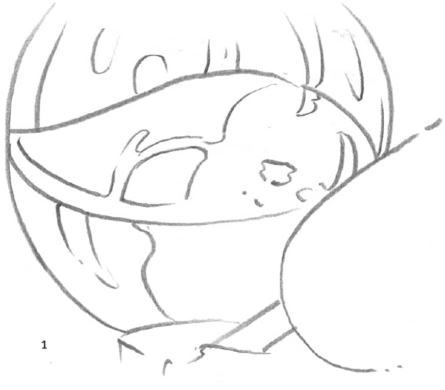
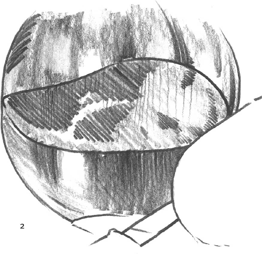
Paying Attention to Detail In the close-up examples below, the guidelines show the distorted wine level, which is caused by the bottle’s uneven curves. An artist must make important observations like this in order to create natural, true-to-life drawings.
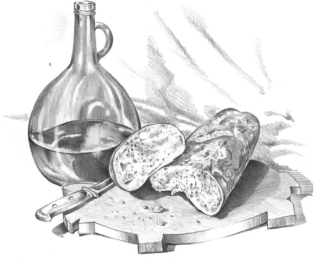
Developing Form and Texture To draw the irregular texture of the bread’s interior, make a variety of marks—tiny lines, dots, and smudges—creating a speckled, bread crumb appearance. For the crust, use longer, flowing strokes that wrap around the bread’s exterior. Finish with angled lines on the crust for additional texture.
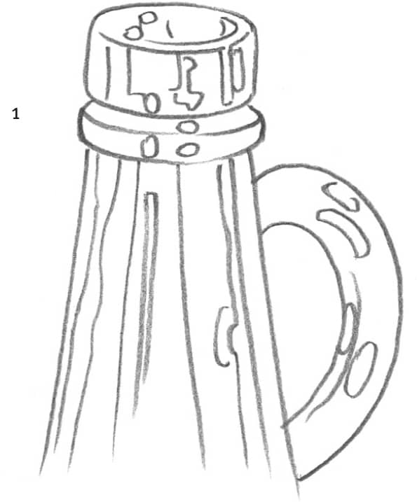
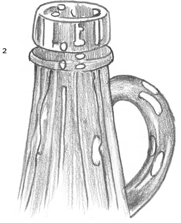
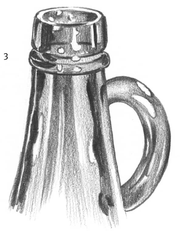
Glass Detail To draw a finished look of shiny glass, follow steps 1 through 3 that show the bottle’s spout. Draw in shapes for the light and dark areas, and then evenly shade over all areas that don’t contain highlights. Finally, fill in the darkest areas, and clean out any highlights with a pointed kneaded eraser.