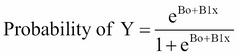
As previously discussed, our classification problem is best modeled with the probabilities that are bound by 0 and 1. We can do this for all of our observations with a number of different functions, but here we will focus on the logistic function. The logistic function used in logistic regression is as follows:
If you have ever placed a friendly wager on horse races or the World Cup, you may understand the concept better as odds. The logistic function can be turned to odds with the formulation of Probability (Y) / 1 – Probability (Y). For instance, if the probability of Brazil winning the World Cup is 20 percent, then the odds are 0.2 / 1 - 0.2, which is equal to 0.25, translating to the odds of one in four.
To translate the odds back to probability, take the odds and divide by one plus the odds. The World Cup example is thus, 0.25 / 1 + 0.25, which is equal to 20 percent. Additionally, let's consider the odds ratio. Assume that the odds of Germany winning the Cup are 0.18. We can compare the odds of Brazil and Germany with the odds ratio. In this example, the odds ratio would be the odds of Brazil divided by the odds of Germany. We will end up with an odds ratio equal to 0.25/0.18, which is equal to 1.39. Here, we will say that Brazil is 1.39 times more likely than Germany to win the World Cup.
One way to look at the relationship of logistic regression with linear regression is to show logistic regression as the log odds or log (P(Y)/1 – P(Y)) is equal to Bo + B1x. The coefficients are estimated using a maximum likelihood instead of the OLS. The intuition behind the maximum likelihood is that we are finding the estimates for Bo and B1 that will create a predicted probability for an observation that is as close as possible to the actual observed outcome of Y, a so-called likelihood. The R language does what other software packages do for the maximum likelihood, which is to find the optimal combination of beta values that maximize the likelihood.
With these facts in mind, logistic regression is a very powerful technique to predict the problems involving classification and is often the starting point for model creation in such problems. Therefore, in this chapter, we will attack the upcoming business problem with logistic regression first and foremost.
Dr. William H. Wolberg from the University of Wisconsin commissioned the Wisconsin Breast Cancer Data in 1990. His goal of collecting the data was to identify whether a tumor biopsy was malignant or benign. His team collected the samples using Fine Needle Aspiration (FNA). If a physician identifies the tumor through examination or imaging an area of abnormal tissue, then the next step is to collect a biopsy. FNA is a relatively safe method of collecting the tissue and complications are rare. Pathologists examine the biopsy and attempt to determine the diagnosis (malignant or benign). As you can imagine, this is not a trivial conclusion. Benign breast tumors are not dangerous as there is no risk of the abnormal growth spreading to the other body parts. If a benign tumor is large enough, surgery might be needed to remove it. On the other hand, a malignant tumor requires medical intervention. The level of treatment depends on a number of factors but most likely will require surgery, which can be followed by radiation and/or chemotherapy. Therefore, the implications of a misdiagnosis can be extensive. A false positive for malignancy can lead to costly and unnecessary treatment, subjecting the patient to a tremendous emotional and physical burden. On the other hand, a false negative can deny a patient the treatment that they need, causing the cancer to spread and leading to premature death. Early treatment intervention in breast cancer patients can greatly improve their survival.
Our task then is to develop the best possible diagnostic machine learning algorithm in order to assist the patient's medical team in determining whether the tumor is malignant or not.
This dataset consists of tissue samples from 699 patients. It is in a data frame with 11 variables, as follows:
ID: This is the sample code numberV1: This is the thicknessV2: This is the uniformity of the cell sizeV3: This is the uniformity of the cell shapeV4: This is the marginal adhesionV5: This is the single epithelial cell sizeV6: This is the bare nucleus (16 observations are missing)V7: This is the bland chromatinV8: This is the normal nucleolusV9: This is the mitosisclass: This is the tumor diagnosisbenignormalignant; this will be the outcome that we are trying to predict
The medical team has scored and coded each of the nine features on a scale of 1 to 10.
The data frame is available in the R MASS package under the biopsy name. To prepare this data, we will load the data frame, confirm the structure, rename the variables to something meaningful, and delete the missing observations. At this point, we can begin to explore the data visually. Here is the code that will get us started when we will first load the library and then the dataset, and using the str() function, will examine the underlying structure of the data, as follows:
> library(MASS)

> data(biopsy)

> str(biopsy)

'data.frame':   699 obs. of  11 variables:
 $ ID   : chr  "1000025" "1002945" "1015425" "1016277" …
 $ V1   : int  5 5 3 6 4 8 1 2 2 4 …
 $ V2   : int  1 4 1 8 1 10 1 1 1 2 …
 $ V3   : int  1 4 1 8 1 10 1 2 1 1 …
 $ V4   : int  1 5 1 1 3 8 1 1 1 1 …
 $ V5   : int  2 7 2 3 2 7 2 2 2 2 …
 $ V6   : int  1 10 2 4 1 10 10 1 1 1 …
 $ V7   : int  3 3 3 3 3 9 3 3 1 2 …
 $ V8   : int  1 2 1 7 1 7 1 1 1 1 …
 $ V9   : int  1 1 1 1 1 1 1 1 5 1 …
 $ class: Factor w/ 2 levels "benign","malignant": 1 1 1 1 1 2 1 1 1 1 ...
An examination of the data structure shows that our features are integers and the outcome is a factor. No transformation of the data to a different structure is needed. Depending on the package in R that you are using to analyze the data, the outcome needs to be numeric, which is 0 or 1. We can now get rid of the ID column, as follows:
> biopsy$ID = NULL
Next, we will rename the variables and confirm that the code has worked as intended:
> names(biopsy) = c("thick", "u.size", "u.shape", "adhsn", "s.size", "nucl", "chrom", "n.nuc", "mit", "class")

> names(biopsy)

 [1] "thick"   "u.size"  "u.shape" "adhsn"   "s.size"  "nucl"
   "chrom"   "n.nuc"
 [9] "mit"     "class"
Now, we will delete the missing observations. As there are only 16 observations with the missing data, it is safe to get rid of them as they account for only two percent of all the observations. A thorough discussion of how to handle the missing data is outside the scope of this chapter. In deleting these observations, a new working data frame is created. One line of code does this trick with the na.omit function, which deletes all the missing observations:
> biopsy.v2 = na.omit(biopsy)
There are a number of ways in which we can understand the data visually in a classification problem, and I think a lot of it comes down to personal preference. One of the things that I like to do in these situations is examine the boxplots of the features that are split by the classification outcome. This is an excellent way to begin understanding which features may be important to the algorithm. Boxplots are a simple way to understand the distribution of the data at a glance. In my experience, it also provides you with an effective way to build the presentation story that you will deliver to your customers. There are a number of ways to do this quickly and the lattice and ggplot2 packages are quite good at this task. I will use ggplot2 in this case with the additional package, reshape2. After loading the packages, you will need to create a data frame using the melt() function. The reason to do this is that melting the features will allow the creation of a matrix of boxplots, allowing us to easily conduct the following visual inspection:
> library(reshape2)

> library(ggplot2)
The following code melts the data by their values into one overall feature and groups them by class:
> biop.m = melt(biopsy.v2, id.var="class")
Through the magic of ggplot2, we can create a 3x3 boxplot matrix, as follows:
> ggplot(data=biop.m, aes(x=class, y=value)) + geom_boxplot() +facet_wrap(~variable,ncol = 3)
The following is the output of the preceding code:
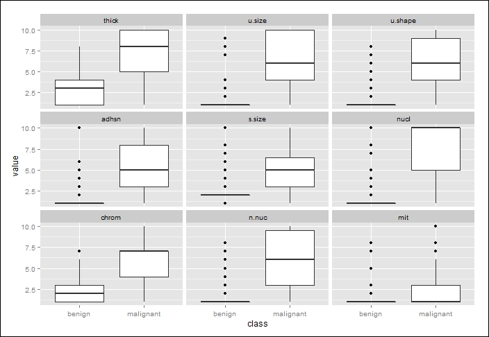
How do we interpret a boxplot? First of all, in the preceding image, the thick white boxes constitute the upper and lower quartiles of the data; in other words, half of all the observations fall in the thick white box area. The dark line cutting across the box is the median value. The lines extending from the boxes are also quartiles, terminating at the maximum and minimum values, outliers notwithstanding. The black dots constitute the outliers.
By inspecting the plots and applying some judgment, it is difficult to determine which features will be important in our classification algorithm. However, I think it is safe to assume that the nuclei feature will be important given the separation of the median values and corresponding distributions. Conversely, there appears to be little separation of the mitosis feature by class and it will likely be an irrelevant feature. We shall see!
With all of our features quantitative, we can also do a correlation analysis as we did with linear regression. Collinearity with logistic regression can bias our estimates just as we discussed with linear regression. Let's load the corrplot package and examine the correlations as we did in the previous chapter, this time using a different type of correlation matrix, which has both shaded ovals and the correlation coefficients in the same plot, as follows:
> library(corrplot)

> bc = cor(biopsy.v2[ ,1:9]) #create an object of the features

> corrplot.mixed(bc)
The following is the output of the preceding code:
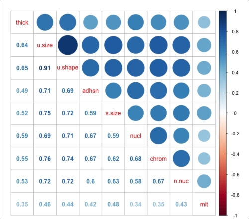
The correlation coefficients are indicating that we may have a problem with collinearity, in particular, the features of uniform shape and uniform size that are present. As a part of the logistic regression modeling process, it will be necessary to incorporate the VIF analysis as we did with linear regression. The final task in the data preparation will be the creation of our train and test datasets. The purpose of creating two different datasets from the original one is to improve our ability so as to accurately predict the previously unused or unseen data. In essence, in machine learning, we should not be so concerned with how well we can predict the current observations, but more focused on how well we can predict the observations that were not used in order to create the algorithm. So, we can create and select the best algorithm using the training data that maximizes our predictions on the test set. The models that we will build in this chapter will be evaluated by this criterion.
There are a number of ways to proportionally split our data into train and test sets: 50/50, 60/40, 70/30, 80/20, and so forth. The data split that you select should be based on your experience and judgment. For this exercise, I will use a 70/30 split, as follows:
> set.seed(123) #random number generator

> ind = sample(2, nrow(biopsy.v2), replace=TRUE, prob=c(0.7, 0.3))

> train = biopsy.v2[ind==1,] #the training data set

> test = biopsy.v2[ind==2,] #the test data set

> str(test) #confirm it worked

'data.frame':   209 obs. of  10 variables:
 $ thick  : int  5 6 4 2 1 7 6 7 1 3 ...
 $ u.size : int  4 8 1 1 1 4 1 3 1 2 ...
 $ u.shape: int  4 8 1 2 1 6 1 2 1 1 ...
 $ adhsn  : int  5 1 3 1 1 4 1 10 1 1 ...
 $ s.size : int  7 3 2 2 1 6 2 5 2 1 ...
 $ nucl   : int  10 4 1 1 1 1 1 10 1 1 ...
 $ chrom  : int  3 3 3 3 3 4 3 5 3 2 ...
 $ n.nuc  : int  2 7 1 1 1 3 1 4 1 1 ...
 $ mit    : int  1 1 1 1 1 1 1 4 1 1 ...
 $ class  : Factor w/ 2 levels "benign","malignant": 1 1 1 1 1 2 1 2 1 1 ...
To ensure that we have a well-balanced outcome variable between the two datasets, we will perform the following check:
> table(train$class)

   benign malignant
      302       172
> table(test$class)

   benign malignant
      142        67
This is an acceptable ratio of our outcomes in the two datasets, and with this, we can begin the modeling and evaluation.
For this part of the process, we will start with a logistic regression model of all the input variables and then narrow down the features with the best subsets. After this, we will try our hand at both linear and quadratic discriminant analyses.
We've already discussed the theory behind logistic regression so we can begin fitting our models. An R installation comes with the glm() function that fits the generalized linear models, which are a class of models that includes logistic regression. The code syntax is similar to the lm() function that we used in the previous chapter. The one big difference is that we must use the family = binomial argument in the function, which tells R to run a logistic regression method instead of the other versions of the generalized linear models. We will start by creating a model that includes all of the features on the train set and see how it performs on the test set, as follows:
> full.fit = glm(class~., family=binomial, data=train)

> summary(full.fit)

Call:
glm(formula = class ~ ., family = binomial, data = train)

Deviance Residuals:
    Min       1Q   Median       3Q      Max
-3.3397  -0.1387  -0.0716   0.0321   2.3559

Coefficients:
            Estimate Std. Error z value Pr(>|z|)
(Intercept)  -9.4293     1.2273  -7.683 1.55e-14 ***
thick         0.5252     0.1601   3.280 0.001039 **
u.size       -0.1045     0.2446  -0.427 0.669165
u.shape       0.2798     0.2526   1.108 0.268044
adhsn         0.3086     0.1738   1.776 0.075722 .
s.size        0.2866     0.2074   1.382 0.167021
nucl          0.4057     0.1213   3.344 0.000826 ***
chrom         0.2737     0.2174   1.259 0.208006
n.nuc         0.2244     0.1373   1.635 0.102126
mit           0.4296     0.3393   1.266 0.205402
---
Signif. codes:  0 '***' 0.001 '**' 0.01 '*' 0.05 '.' 0.1 ' ' 1

(Dispersion parameter for binomial family taken to be 1)

    Null deviance: 620.989  on 473  degrees of freedom
Residual deviance:  78.373  on 464  degrees of freedom
AIC: 98.373

Number of Fisher Scoring iterations: 8
The summary() function allows us to inspect the coefficients and their p-values. We can see that only two features have p-values less than 0.05 (thickness and nuclei). An examination of the 95 percent confidence intervals can be called on with the confint() function, as follows:
> confint(full.fit)
                   2.5 %     97.5 %
(Intercept) -12.23786660 -7.3421509
thick         0.23250518  0.8712407
u.size       -0.56108960  0.4212527
u.shape      -0.24551513  0.7725505
adhsn        -0.02257952  0.6760586
s.size       -0.11769714  0.7024139
nucl          0.17687420  0.6582354
chrom        -0.13992177  0.7232904
n.nuc        -0.03813490  0.5110293
mit          -0.14099177  1.0142786
Note that the two significant features have confidence intervals that do not cross zero. You cannot translate the coefficients in logistic regression as the change in Y is based on a one-unit change in X. This is where the odds ratio can be quite helpful. The beta coefficients from the log function can be converted to the odds ratios with an exponent (beta).
In order to produce the odds ratios in R, we will use the following exp(coef()) syntax:
> exp(coef(full.fit))
 (Intercept)        thick       u.size      u.shape        adhsn
8.033466e-05 1.690879e+00 9.007478e-01 1.322844e+00 1.361533e+00
      s.size         nucl        chrom        n.nuc          mit
1.331940e+00 1.500309e+00 1.314783e+00 1.251551e+00 1.536709e+00
The interpretation of an odds ratio is the change in the outcome odds resulting from a unit change in the feature. If the value is greater than one, it indicates that as the feature increases, the odds of the outcome increase. Conversely, a value less than one would mean that as the feature increases, the odds of the outcome decrease. In this example, all the features except u.size will increase the log odds.
One of the issues pointed out during the data exploration was the potential issue of multicollinearity. It is possible to produce the VIF statistics that we did in linear regression with a logistic model in the following way:
> library(car)

> vif(full.fit)
   thick  u.size  u.shape  adhsn   s.size   nucl   chrom   n.nuc
 1.2352 3.2488  2.8303   1.3021  1.6356   1.3729 1.5234  1.3431
     mit
1.059707
None of the values are greater than the VIF rule of thumb statistic of five, so collinearity does not seem to be a problem. Feature selection will be the next task; but for now, let's produce some code to look at how well this model does on both the train and test sets.
You will first have to create a vector of the predicted probabilities, as follows:
> train$probs = predict(full.fit, type="response")

> train$probs[1:5] #inspect the first 5 predicted probabilities
[1] 0.02052820 0.01087838 0.99992668 0.08987453 0.01379266
The contrasts() function allows us to confirm that the model was created with benign as 0 and malignant as 1:
> contrasts(train$class)
          malignant
benign            0
malignant         1
Next, in order to create a meaningful table of the fit model that is referred to as a confusion matrix, we will need to produce a vector that codes the predicted probabilities as either benign or malignant. We will see that in the other packages this is not necessary, but for the glm() function it is necessary as it defaults to a predicted probability and not a class prediction. There are a number of ways to do this. Using the rep() function, a vector is created with all the values called benign and a total of 474 observations, which match the number in the training set. Then, we will code all the values as malignant where the predicted probability was greater than 50 percent, as follows:
> train$predict = rep("benign", 474)

> train$predict[train$probs>0.5]="malignant"
The table() function produces our confusion matrix:
> table(train$predict, train$class)
            benign malignant
  benign       294         7
  malignant      8       165
The rows signify the predictions and columns signify the actual values. The diagonal elements are the correct classifications. The top right value, 7, is the number of false negatives and the bottom left value, 8, is the number of false positives. The mean() function shows us what percentage of the observations were predicted correctly, as follows:
> mean(train$predict==train$class)
[1] 0.9683544
It seems we have done a fairly good job with our almost 97 percent prediction rate on the training set. As we previously discussed, we must be able to accurately predict the unseen data, in other words, our test set.
The method to create a confusion matrix for the test set is similar to how we did it for the training data:
> test$prob = predict(full.fit, newdata=test, type="response")
In the preceding code, we just specified that we want to predict the test set with newdata=test.
As we did with the training data, we need to create our predictions for the test data:
> test$predict = rep("benign", 209)

> test$predict[test$prob>0.5]="malignant"

> table(test$predict, test$class)

            benign malignant
  benign       139         2
  malignant      3        65

> mean(test$predict==test$class)
[1] 0.9760766
It appears that we have done pretty well in creating a model with all the features. The roughly 98 percent prediction rate is quite impressive. However, we must still see if there is room for improvement. Imagine that you or your loved one is a patient that has been diagnosed incorrectly. As previously mentioned, the implications can be quite dramatic. With this in mind, is there perhaps a better way to create a classification algorithm?
The purpose of cross-validation is to improve our prediction of the test set and minimize the chance of over fitting. With the K-fold cross-validation, the dataset is split into K equal-sized parts. The algorithm learns by alternatively holding out one of the K-sets and fits a model to the other K-1 parts and obtains predictions for the left out K-set. The results are then averaged so as to minimize the errors and appropriate features selected. You can also do the Leave-One-Out-Cross-Validation (LOOCV), where K is equal to one. Simulations have shown that the LOOCV method can have averaged estimates that have a high variance. As a result, most machine learning experts will recommend that the number of K-folds should be 5 or 10.
An R package that will automatically do CV for logistic regression is the bestglm package. This package is dependent on the leaps package that we used for linear regression. The syntax and formatting of the data requires some care, so let's walk through this in detail:
> library(bestglm)
Loading required package: leaps
After loading the package, we will need our outcome coded to 0 or 1. If left as a factor, it will not work. All you have to do is add a vector to the train set, code it all with zeroes, and then code it to one where the class vector is equal to malignant, as follows:
> train$y=rep(0,474)

> train$y[train$class=="malignant"]=1
A quick double check is required in order to confirm that it worked:
> head(train[ ,13])
[1] 0 0 1 0 0 0
The other requirement to utilize the package is that your outcome, or y, is the last column and all the extraneous columns have been removed. A new data frame will do the trick for us by simply deleting any unwanted columns. The outcome is column 10, and if in the process of doing other analyses we added columns 11 and 12, they must be removed as well:
> biopsy.cv = train[ ,-10:-12]

> head(biopsy.cv)
   thick u.size u.shape adhsn s.size nucl chrom n.nuc mit y
1      5      1       1     1      2    1     3     1   1 0
3      3      1       1     1      2    2     3     1   1 0
6      8     10      10     8      7   10     9     7   1 1
7      1      1       1     1      2   10     3     1   1 0
9      2      1       1     1      2    1     1     1   5 0
10     4      2       1     1      2    1     2     1   1 0
Here is the code to run in order to use the CV technique with our data:
> bestglm(Xy = biopsy.cv, IC="CV", CVArgs=list(Method="HTF", K=10, REP=1), family=binomial)
The syntax, Xy = biopsy.cv, points to our properly formatted data frame. IC="CV" tells the package that the information criterion to use is cross-validation. CVArgs are the CV arguments that we want to use. The HTF method is K-fold, which is followed by the number of folds of K=10, and we are asking it to do only one iteration of the random folds with REP=1. Just as with glm(), we will need to use family=binomial. On a side note, you can use bestglm for linear regression as well by specifying family=gaussian. So, after running the analysis, we will end up with the following output, giving us three features for Best Model such as thick, u.size, and nucl. The statement on Morgan-Tatar search simply means that a simple exhaustive search was done for all the possible subsets, as follows:
Morgan-Tatar search since family is non-gaussian.
CV(K = 10, REP = 1)
BICq equivalent for q in (7.16797006619085e-05, 0.273173435514231)
Best Model:
              Estimate Std. Error   z value     Pr(>|z|)
(Intercept) -7.8147191 0.90996494 -8.587934 8.854687e-18
thick        0.6188466 0.14713075  4.206100 2.598159e-05
u.size       0.6582015 0.15295415  4.303260 1.683031e-05
nucl         0.5725902 0.09922549  5.770596 7.899178e-09
We can put these features in glm() and then see how well the model did on the train and test sets. The predict() function will not work with bestglm, so this is a required step:
> reduce.fit = glm(class~thick+u.size+nucl, family=binomial, data=train)
Using the same style of code as we did in the last section, we will save the probabilities and create the confusion matrices, as follows:
> train$cv.probs = predict(reduce.fit, type="response")

> train$cv.predict = rep("benign", 474)

> train$cv.predict[train$cv.probs>0.5]="malignant"

> table(train$cv.predict, train$class)

            benign malignant
  benign       294         9
  malignant      8       163
Interestingly, the reduced feature model had two more false negatives than the full model.
As before, the following code allows us to compare the predicted labels versus the actual ones:
> test$cv.probs = predict(reduce.fit, newdata=test, type="response")

> test$predict = rep("benign", 209)

> test$predict[test$cv.probs>0.5]="malignant"

> table(test$predict, test$class)

            benign malignant
  benign       139         5
  malignant      3        62
The reduced feature model again produced more false negatives than when all the features were included. This is quite disappointing, but all is not lost. We can utilize the bestglm package again, this time using the best subsets with the information criterion set to BIC:
> bestglm(Xy= biopsy.cv, IC="BIC", family=binomial)
Morgan-Tatar search since family is non-gaussian.
BIC
BICq equivalent for q in (0.273173435514231, 0.577036596263757)
Best Model:
              Estimate Std. Error   z value     Pr(>|z|)
(Intercept) -8.6169613 1.03155250 -8.353391 6.633065e-17
thick        0.7113613 0.14751510  4.822295 1.419160e-06
adhsn        0.4537948 0.15034294  3.018398 2.541153e-03
nucl         0.5579922 0.09848156  5.665956 1.462068e-08
n.nuc        0.4290854 0.11845720  3.622282 2.920152e-04
These four features provide the minimum BIC score for all possible subsets. Let's try this and see how it predicts the test set, as follows:
> bic.fit=glm(class~thick+adhsn+nucl+n.nuc, family=binomial, data=train)

> test$bic.probs = predict(bic.fit, newdata=test, type="response")

> test$bic.predict = rep("benign", 209)

> test$bic.predict[test$bic.probs>0.5]="malignant"

> table(test$bic.predict, test$class)

            benign malignant
  benign       138         1
  malignant      4        66
Here we have five errors just like the full model. The obvious question then is which one is better? In any normal situation, the rule of thumb is to default to the simplest or most interpretable model given the equality of generalization. We could run a completely new analysis with a new randomization and different ratios of the train and test sets among others. However, let's assume for a moment that we've exhausted the limits of what logistic regression can do for us. We will come back to the full model and the model that we developed on a BIC minimum at the end and discuss the methods of model selection. Now, let's move on to our discriminant analysis methods, which we will also include as possibilities in the final recommendation.
Discriminant Analysis (DA), also known as Fisher Discriminant Analysis (FDA), is another popular classification technique. It can be an effective alternative to logistic regression when the classes are well-separated. If you have a classification problem where the outcome classes are well-separated, logistic regression can have unstable estimates, which is to say that the confidence intervals are wide and the estimates themselves would likely vary wildly from one sample to another (James, 2013). DA does not suffer from this problem, and as a result, may outperform and be more generalizable than logistic regression. Conversely, if there are complex relationships between the features and outcome variables, it may perform poorly on a classification task. For our breast cancer example, logistic regression performed well on the testing and training sets and the classes were not well-separated. For the purpose of comparison to logistic regression, we will explore DA, both Linear Discriminant Analysis (LDA) and Quadratic Discriminant Analysis (QDA).
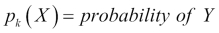
DA utilizes Bayes' theorem in order to determine the probability of the class membership for each observation. If you have two classes, for example, benign and malignant, then DA will calculate an observation's probability for both the classes and select the highest probability as the proper class.
Bayes' theorem states that the probability of Y occurring—given that X has occurred—is equal to the probability of both Y and X occurring divided by the probability of X occurring, which can be written as:
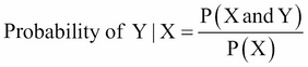
The numerator in this expression is the likelihood that an observation is from that class level and has these feature values. The denominator is the likelihood of an observation that has these feature values across all the levels. Again, the classification rule says that if you have the joint distribution of X and Y and if X is given, the optimal decision of which class to assign an observation is by choosing the class with the larger probability (the posterior probability).
The process of attaining the posterior probabilities goes through the following steps:
- Collect data with a known class membership.
- Calculate the prior probabilities—this represents the proportion of the sample that belongs to each class.
- Calculate the mean for each feature by their class.
- Calculate the variance-covariance matrix for each feature; if it is an LDA, then this would be a pooled matrix of all the classes, giving us a linear classifier, and if it is a QDA, then a variance-covariance matrix is created for each class.
- Estimate the normal distribution (Gaussian densities) for each class.
- Compute the discriminant function that is the rule for the classification of a new object.
- Assign an observation to a class based on the discriminant function.
This will provide an expanded notation on the determination of the posterior probabilities, as follows:
 is the prior probability of a randomly chosen observation in the
 kthclass.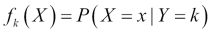 is the density function of an observation that comes from the
 kth class. We will assume that this comes from a normal (Gaussian) distribution; with multiple features, the assumption is that it comes from a multivariate Gaussian distribution.-
Using
 given
given X, we can adjust Bayes' theorem accordingly. 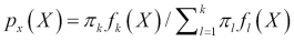 is the posterior probability that an observation comes from the
 kclass when the feature values for this observation are given.-
Assuming that k=2 and the prior probabilities are the same,
 , then an observation is assigned to the one class if
 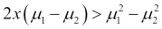 , otherwise it is assigned to the two class. This is known as the decision boundary. DA creates the k-1 decision boundaries, that is, with three classes (k=3), there will be two decision boundaries.
Even though LDA is elegantly simple, it has the limitation of the assumption that the observations of each class are said to have a multivariate normal distribution and there is a common covariance across the classes. QDA still assumes that the observations come from a normal distribution, but also assumes that each class has its own covariance.
Why does this matter? When you relax the common covariance assumption, you now allow quadratic terms into the discriminant score calculations, which was not possible with LDA. The mathematics behind this can be a bit intimidating and is outside the scope of this book. The important part to remember is that QDA is a more flexible technique than logistic regression, but we must keep in mind our bias-variance trade-off. With a more flexible technique, you are likely to have a lower bias but potentially a higher variance. Like a lot of flexible techniques, a robust set of training data is needed to mitigate a high classifier variance.
LDA is performed in the MASS package, which we have already loaded so that we can access the biopsy data. The syntax is very similar to the lm() and glm() functions. To facilitate the simplicity of this code, we will create new data frames for the LDA by deleting the columns that we had added to the training and test sets, as follows:
> lda.train = train[ ,-11:-15]

> lda.train[1:3,]
  thick u.size u.shape adhsn s.size nucl chrom n.nuc mit  class
1     5      1       1     1      2    1     3     1   1  benign
3     3      1       1     1      2    2     3     1   1  benign
6     8     10      10     8      7   10     9     7   1 malignant

> lda.test = test[ ,-11:-15]
> lda.test[1:3,]
  thick u.size u.shape adhsn s.size nucl chrom n.nuc mit  class
2     5      4       4     5      7   10     3     2   1 benign
4     6      8       8     1      3    4     3     7   1 benign
5     4      1       1     3      2    1     3     1   1 benign
We can now begin fitting our LDA model, which is as follows:
> lda.fit = lda(class~., data=lda.train)

> lda.fit
Call:
lda(class ~ ., data = lda.train)

Prior probabilities of groups:
   benign malignant
0.6371308 0.3628692

Group means:
           thick  u.size u.shape   adhsn  s.size    nucl   chrom
benign    2.9205 1.30463 1.41390 1.32450 2.11589 1.39735 2.08278
malignant 7.1918 6.69767 6.68604 5.66860 5.50000 7.67441 5.95930
            n.nuc     mit
benign    1.22516 1.09271
malignant 5.90697 2.63953

Coefficients of linear discriminants:
                LD1
thick    0.19557291
u.size   0.10555201
u.shape  0.06327200
adhsn    0.04752757
s.size   0.10678521
nucl     0.26196145
chrom    0.08102965
n.nuc    0.11691054
mit     -0.01665454
This output shows us that Prior probabilities of groups are approximately 64 percent for benign and 36 percent for malignancy. Next is Group means. This is the average of each feature by their class. Coefficients of linear discriminants are the standardized linear combination of the features that are used to determine an observation's discriminant score. The higher the score, the more likely that the classification is malignant.
The plot() function in LDA will provide us with a histogram and/or the densities of the discriminant scores, as follows:
> plot(lda.fit, type="both")
The following is the output of the preceding command:
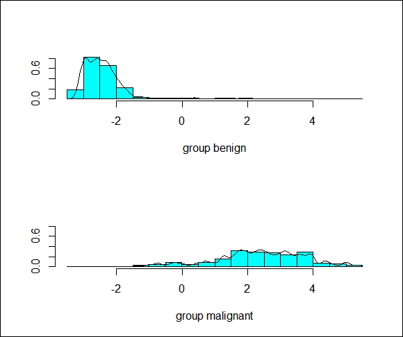
We can see that there is some overlap in the groups, indicating that there will be some incorrectly classified observations.
The predict() function available with LDA provides a list of three elements (class, posterior, and x). The class element is the prediction of benign or malignant, the posterior is the probability score of x being in each class, and x is the linear discriminant score. It is easier to produce the confusion matrix with the help of the following function than with logistic regression:
> lda.predict = predict(lda.fit)

> train$lda = lda.predict$class
> table(train$lda, train$class)

            benign malignant
  benign       296        13
  malignant      6       159
Well, unfortunately, it appears that our LDA model has performed much worse than the logistic regression models. The primary question is to see how this will perform on the test data:
> lda.test = predict(lda.fit, newdata = test)

> test$lda = lda.test$class

> table(test$lda, test$class)

            benign malignant
  benign       140         6
  malignant      2        61
That's actually not as bad as I thought, given the poor performance on the training data. From a correctly classified perspective, it still did not perform as well as logistic regression (96 percent versus almost 98 percent with logistic regression):
> mean(test$lda==test$class)
[1] 0.9617225
We will now move on to fit a QDA model to data.
In R, QDA is also part of the MASS package and the function is qda(). We will use the train and test sets that we used for LDA. Building the model is rather straightforward and we will store it in an object called qda.fit, as follows:
> qda.fit = qda(class~., data=lda.train)

> qda.fit
Call:
qda(class ~ ., data = lda.train)

Prior probabilities of groups:
   benign malignant
0.6371308 0.3628692

Group means:
           Thick u.size u.shape  adhsn s.size   nucl  chrom  n.nuc
benign    2.9205 1.3046  1.4139 1.3245 2.1158 1.3973 2.0827 1.2251
malignant 7.1918 6.6976  6.6860 5.6686 5.5000 7.6744 5.9593 5.9069
               mit
benign    1.092715
malignant 2.639535
As with LDA, the output has Group means but does not have the coefficients as it is a quadratic function as discussed previously.
The predictions for the train and test data follow the same flow of code as with LDA:
> qda.predict = predict(qda.fit)

> train$qda = qda.predict$class

> table(train$qda, train$class)

            benign malignant
  benign       287         5
  malignant     15       167
We can quickly tell that QDA has performed the worst on the training data with the confusion matrix.
We will see how it works on a test set:
> qda.test = predict(qda.fit, newdata=test)

> test$qda = qda.test$class

> table(test$qda, test$class)

            benign malignant
  benign       132         1
  malignant     10        66
QDA classified the test set poorly with 11 incorrect predictions. In particular, it has a high rate of false positives.