For this chapter, we will stick with cancer—prostate cancer in this case. It is a small dataset of 97 observations and nine variables but allows you to fully grasp what is going on with regularization techniques by allowing a comparison with the traditional techniques. We will start by performing best subsets regression to identify the features and use this as a baseline for the comparison.
The Stanford University Medical Center has provided the preoperative Prostate Specific Antigen (PSA) data on 97 patients who are about to undergo radical prostatectomy (complete prostate removal) for the treatment of prostate cancer. The American Cancer Society (ACS) estimates that nearly 30,000 American men died of prostate cancer in 2014 (http://www.cancer.org/). PSA is a protein that is produced by the prostate gland and is found in the bloodstream. The goal is to develop a predictive model of PSA among the provided set of clinical measures. PSA can be an effective prognostic indicator, among others, of how well a patient can and should do after surgery. The patient's PSA levels are measured at various intervals after the surgery and used in various formulas to determine if a patient is cancer-free. A preoperative predictive model in conjunction with the postoperative data (not provided here) can possibly improve cancer care for thousands of men each year.
The data set for the 97 men is in a data frame with 10 variables as follows:
lcavol: This is the log of the cancer volumelweight: This is the log of the prostate weightage: This is the age of the patient in yearslbph: This is the log of the amount of Benign Prostatic Hyperplasia (BPH), which is the noncancerous enlargement of the prostatesvi: This is the seminal vesicle invasion and an indicator variable of whether or not the cancer cells have invaded the seminal vesicles outside the prostate wall (1= yes,0= no)lcp: This is the log of capsular penetration and a measure of how much the cancer cells have extended in the covering of the prostategleason: This is the patient's Gleason score; a score (2-10) provided by a pathologist after a biopsy about how abnormal the cancer cells appear—the higher the score, the more aggressive the cancer is assumed to bepgg4: This is the percent of Gleason patterns—four or five (high-grade cancer)lpsa: This is the log of the PSA; this is the response/outcometrain: This is a logical vector (true or false) that signifies the training or test set
The dataset is contained in the R package, ElemStatLearn. After loading the required packages and data frame, we can then begin to explore the variables and any possible relationships, as follows:
> library(ElemStatLearn) #contains the data

> library(car) #package to calculate Variance Inflation Factor

> library(corrplot) #correlation plots

> library(leaps) #best subsets regression

> library(glmnet) #allows ridge regression, LASSO and elastic net

> library(caret) #parameter tuning
With the packages loaded, bring up the prostate dataset and explore its structure, as follows:
> data(prostate)

> str(prostate)
'data.frame':97 obs. of  10 variables:
 $ lcavol : num  -0.58 -0.994 -0.511 -1.204 0.751 ...
 $ lweight: num  2.77 3.32 2.69 3.28 3.43 ...
 $ age    : int  50 58 74 58 62 50 64 58 47 63 ...
 $ lbph   : num  -1.39 -1.39 -1.39 -1.39 -1.39 ...
 $ svi    : int  0 0 0 0 0 0 0 0 0 0 ...
 $ lcp    : num  -1.39 -1.39 -1.39 -1.39 -1.39 ...
 $ gleason: int  6 6 7 6 6 6 6 6 6 6 ...
 $ pgg45  : int  0 0 20 0 0 0 0 0 0 0 ...
 $ lpsa   : num  -0.431 -0.163 -0.163 -0.163 0.372 ...
 $ train  : logi  TRUE TRUE TRUE TRUE TRUE TRUE ...
The examination of the structure should raise a couple of issues that we will need to double-check. If you look at the features, svi, lcp, gleason, and pgg45 have the same number in the first ten observations with the exception of one—the seventh observation in gleason. In order to make sure that these are viable as input features, we can use plots and tables so as to understand them. To begin with, use the following plot() command and input the entire data frame, which will create a scatterplot matrix:
> plot(prostate)
The output of the preceding command is as follows:
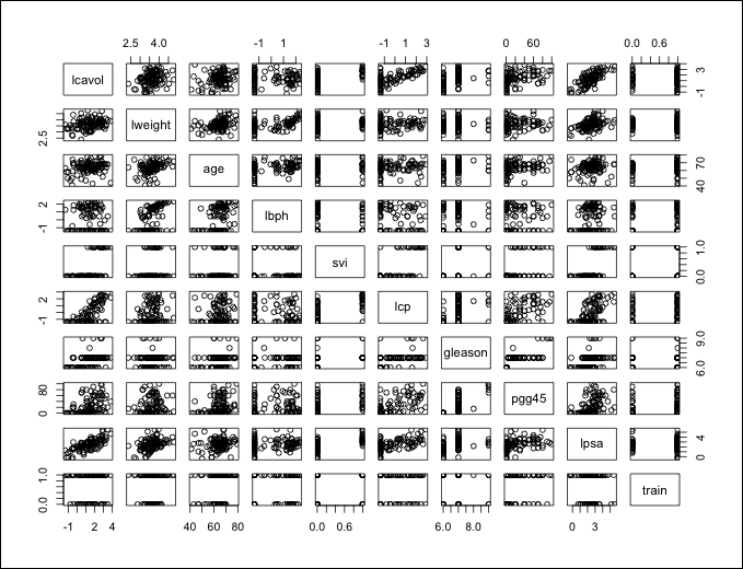
With these many variables on one plot, it can get a bit difficult to understand what is going on so we will drill down further. It does look like there is a clear linear relationship between our outcomes, lpsa, and lcavol. It also appears that the features mentioned previously have an adequate dispersion and are well-balanced across what will become our train and test sets with the possible exception of the gleason score. Note that the gleason scores captured in this dataset are of four values only. If you look at the plot where train and gleason intersect, one of these values is not in either test or train. This could lead to potential problems in our analysis and may require transformation. So, let's create a plot specifically for that feature, as follows:
> plot(prostate$gleason)
The following is the output of the preceding command:
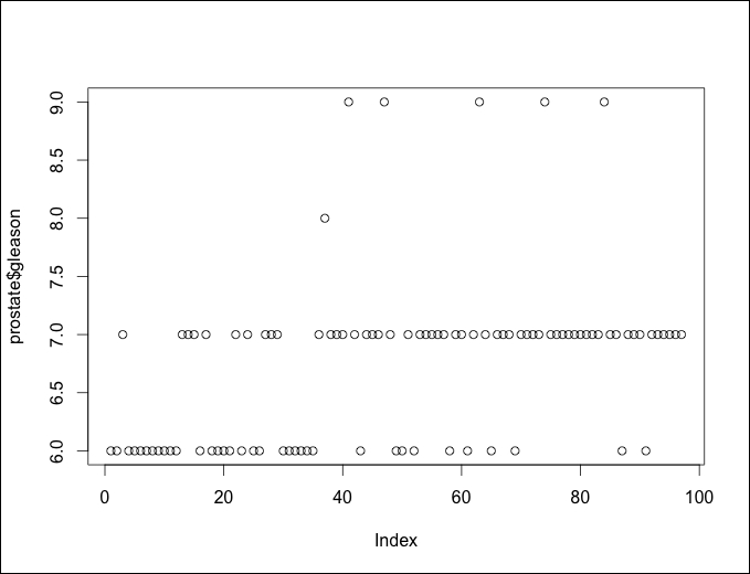
We have a problem here. Each dot represents an observation and the x axis is the observation number in the data frame. There is only one Gleason score of 8.0 and only five of score 9.0. You can look at the exact counts by producing a table of the features, as follows:
> table(prostate$gleason)

 6  7  8  9
35 56  1  5
What are our options? We could do any of the following:
- Exclude the feature altogether
- Remove only the scores of 8.0 and 9.0
- Recode this feature, creating an indicator variable
I think it may help if we create a boxplot of Gleason Score versus Log of PSA. We used the ggplot2 package to create boxplots in a prior chapter but one can also create it with base R, as follows:
> boxplot(prostate$lpsa~prostate$gleason, xlab="Gleason Score", ylab="Log of PSA")
The output of the preceding command is as follows:
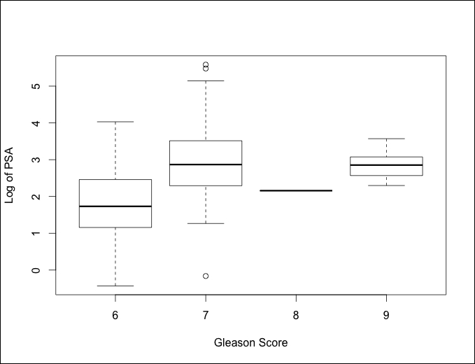
Looking at the preceding plot, I think the best option will be to turn this into an indicator variable with 0 being a 6 score and 1 being a 7 or a higher score. Removing the feature may cause a loss of predictive ability. The missing values will also not work with the glmnet package that we will use.
You can code an indicator variable with one simple line of code using the ifelse() command by specifying the column in the data frame that you want to change, then following the logic that if the observation is number x, then code it y, or else code it z:
> prostate$gleason = ifelse(prostate$gleason == 6, 0, 1)
As always, let's verify that the transformation worked as intended by creating a table in the following way:
> table(prostate$gleason)
 0  1
35 62
That worked to perfection! As the scatterplot matrix was hard to read, let's move on to a correlation plot, which indicates if a relationship/dependency exists between the features. We will create a correlation object using the cor() function and then take advantage of the corrplot library with corrplot.mixed(), as follows:
> p.cor = cor(prostate)

> corrplot.mixed(p.cor)
The output of the preceding command is as follows:
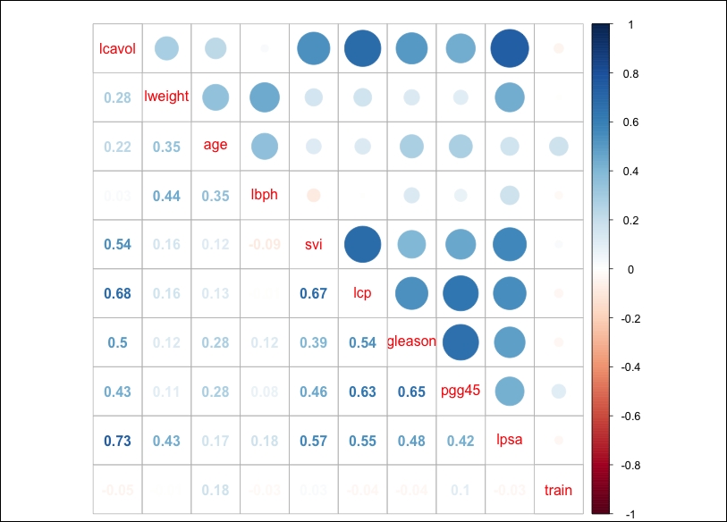
A couple of things jump out here. First, PSA is highly correlated with the log of cancer volume (lcavol); you may recall that in the scatterplot matrix, it appeared to have a highly linear relationship. Second, multicollinearity may become an issue; for example, cancer volume is also correlated with capsular penetration and this is correlated with the seminal vesicle invasion. This should be an interesting learning exercise!
Before the learning can begin, the training and testing sets must be created. As the observations are already coded as being in the train set or not, we can use the subset() command and set the observations where train is coded to TRUE as our training set and FALSE for our testing set. It is also important to drop train as we do not want that as a feature, as follows:
> train = subset(prostate, train==TRUE)[,1:9]

> str(train)
'data.frame':67 obs. of  9 variables:
 $ lcavol : num  -0.58 -0.994 -0.511 -1.204 0.751 ...
 $ lweight: num  2.77 3.32 2.69 3.28 3.43 ...
 $ age    : int  50 58 74 58 62 50 58 65 63 63 ...
 $ lbph   : num  -1.39 -1.39 -1.39 -1.39 -1.39 ...
 $ svi    : int  0 0 0 0 0 0 0 0 0 0 ...
 $ lcp    : num  -1.39 -1.39 -1.39 -1.39 -1.39 ...
 $ gleason: num  0 0 1 0 0 0 0 0 0 1 ...
 $ pgg45  : int  0 0 20 0 0 0 0 0 0 30 ...
 $ lpsa   : num  -0.431 -0.163 -0.163 -0.163 0.372 ...

> test = subset(prostate, train==FALSE)[,1:9]

> str(test)
'data.frame':30 obs. of  9 variables:
 $ lcavol : num  0.737 -0.777 0.223 1.206 2.059 ...
 $ lweight: num  3.47 3.54 3.24 3.44 3.5 ...
 $ age    : int  64 47 63 57 60 69 68 67 65 54 ...
 $ lbph   : num  0.615 -1.386 -1.386 -1.386 1.475 ...
 $ svi    : int  0 0 0 0 0 0 0 0 0 0 ...
 $ lcp    : num  -1.386 -1.386 -1.386 -0.431 1.348 ...
 $ gleason: num  0 0 0 1 1 0 0 1 0 0 ...
 $ pgg45  : int  0 0 0 5 20 0 0 20 0 0 ...
 $ lpsa   : num  0.765 1.047 1.047 1.399 1.658 ...