Chapter One
Everything You Know Is Wrong
Classify Your Investments the Alternative Way
There is no point chasing after alternatives while our conventional portfolio sits there like a broken-down wreck at the side of the road. After all, our conventional portfolio is going to be the source of most of our returns. It needs to be tuned up and purring like a cat. Only then can we use it to cruise around town and pick up alternatives.
Our conventional portfolio is invariably summarized by a pie chart. Everyone loves the look of a portfolio pie. You see them in books. You see them on the Internet. You see them on your brokerage statements.
These pie charts show how our assets are invested. Each wedge is a different color. U.S. stocks might be in blue. Bonds might be in red. Emerging market stocks in yellow.
A really colorful pie chart will divide your assets into many subcategories, each one getting its own special color: Large-Cap Growth Stocks, Large-Cap Value Stocks, Municipal Bonds, Treasury Bonds, and so on. We inserted one as Figure 1.1 for your entertainment. Unfortunately, we aren’t allowed to use full-color graphics, so you’ll have to use your imagination to get the full effect. (We suggested including 3D goggles to make it really pop out, but they shot down that idea, too.)
Figure 1.1 A Portfolio Pie Chart

As exciting as these charts are, they can be extremely misleading. This is because when you see a whole box of crayons used to color in the different wedges of the pie, you might naturally assume that you own a nicely diversified portfolio. Unfortunately, many of these different wedges perform in about the same way—and never do they behave more in the same way than when Wall Street is self-defenestrating. It would be like someone who owned 16 different CDs by Yanni claiming he had a diversified music collection. While no doubt there are subtle differences within the Yanni oeuvre, to many of us it sounds pretty much the same.
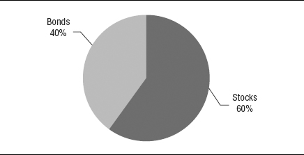
It is closer to the truth to say that there are really just two big wedges represented in your portfolio: a big wedge of stocks, and a big wedge of bonds or cash. This is the canonical 60/40 stock/bond policy portfolio, as widely dismissed as it is widely held, whose returns we just alluded to in the Introduction (you didn’t skip the Introduction, did you?).
The big idea is that roughly 60 percent of our assets are in stocks of various colors, and the other 40 percent in bonds. Your portfolio looks like Figure 1.2.
Figure 1.2 The 60/40 Portfolio
Financial snobs speak contemptuously of the 60/40 portfolio, as if the people who own it don’t know which fork to use at a dinner party. Your authors, however, love the 60/40 portfolio. It is a sensational portfolio for almost everyone, combining a bracing dose of caffeine from the stocks with a judicious modicum of port from the bonds. The fact that it is found everywhere should not blind us to its inherent beauty.
A portfolio can be 60/40 even if it is dressed up with a lot of sub-asset classes. In fact, this is probably a lot like what you own right now. Or, maybe you own a portfolio that’s 50/50, or 70/30. You get the idea.
While the 60/40 portfolio is undoubtedly great, that is not to say that it is perfect. Like everything else, it has issues. Issues that can lead to tissues.
What’s wrong with the 60/40 pie? It implies that your investments are pretty evenly balanced. That is false. Stocks are about three to four times riskier than bonds. The risks of the 60/40 portfolio are really allocated more like those in Figure 1.3.
Figure 1.3 The 60/40 Portfolio by Risk

As you can see, almost all the risk in the 60/40 stock/bond portfolio (85 percent; some say more) comes from the stock side. The 60/40 portfolio looks like it is standing on two legs, when it’s mostly standing on one: stocks. This explains why when stocks hit a nail, the whole thing goes flat. The 60/40 portfolio really acts too much like a stock portfolio, not a stock + bond portfolio. Even a good year in bonds will be overwhelmed by a bad year in equities. You might have a few ducks and chickens, but nothing else is going to make much difference with an 800-pound equity gorilla sitting at the center. Of course, even if stocks go to zero, you won’t lose more than the 60 percent that you put into stocks to begin with—unless the bonds crumble at the same time.
The 60/40 stock and bond portfolio looks like it is standing on two legs, when it’s mostly standing on one: stocks.
This goes a long way towards explaining why 2008 was such a disaster for investors. They were hypnotized by their pretty pie charts into thinking that they had diversified risk away. In fact, nearly all their eggs were in the same basket.
Although Robert Palmer never put it in a song, you’re gonna have to face it—you’re addicted to stocks. When stocks are on a tear there is nothing lovelier. Your authors fondly remember going for bicycle rides along the beach in Santa Monica during the dot-com era while their stock portfolios effortlessly climbed hundreds of points day after day. It was a great way to make a living. We thought we were rich.
While it lasted.
Lots of things in life are thrilling. But in the end, you have to ask: Can I afford them? As great as stocks are on the upside, they are sickening on the downside. With two major crashes in the last decade sticking out like an ad for a Playtex Cross Your Heart bra, you’d think we would have learned our lesson. That’s just part of the story. A growing number of economists believe that stock market returns going forward are not going to be as vigorous as they have been since, say, the end of World War II. Some cite low dividends, some cite a declining rate of productivity, and some cite the overextended nanny state, but to these swamis the stock market’s long-term historical return of 7 percent after inflation no longer seems bankable. Against this, we can’t think of any mainstream economists offhand who are expecting future long-term returns from the stock market to exceed their historical averages. If this view is correct, the implications for the retiring baby boomers are tragic. Our best investing years would lie behind us.
Who knows? Not us, that’s for sure. But that’s not the end of it.
The problem we see is that almost everything else in your life is closely linked to the stock market, because the stock market is closely linked to the overall economy. Your job—and your spouse’s job—for starters. When the economy is doing well, you are getting raises, promotions, the world is your oyster. Once a recession arrives, though, it’s time for layoffs and cutbacks. Work becomes like death row—who will get the ax next? When there is a recession, you cannot waltz across the street to your competitor. They are laying people off, too. Even if you hang on by your fingernails, it is going to be stressful, and the stress will ricochet throughout your life and your family’s life. Meanwhile, your working spouse will be going through the same grinder. Life may look different on one paycheck or half a paycheck, and it definitely will look a lot different on no paycheck.
What else is happening at the same time? Your 401(k) plan is going through the shredder. So is your company stock. Your stock options might become worthless. Your investment accounts—loaded with stock—are down and leave you with two bad choices: Take greater risk by selling your bonds (if any), or sell your stocks when they are beaten down, which is equivalent to a farmer eating his cow.
At the same time, the housing market is a graveyard. It can take a long time to sell a house in the middle of a recession, which is naturally a terrible time to sell. Being forced to sell your home just to climb out of debt is a very stressful prospect. In short, everything in your life is going to be circling the drain at the same time.
Our point is: Whether we realize it or not, most of us are wired to the stock market’s electrodes more than we should be. It is great fun to watch stocks race up when the economy is strong, but it is a zing that many of us cannot afford to the degree that we do. Unless we work for the government or some bulletproof company that makes money no matter how the economy is faring (and there aren’t many of those), we probably owe it to ourselves to lighten up on equities. Recessions happen, and when they do, the stock market suffers terribly.
But let us go back. . . . Why do we love stocks so much? Because we are greedy, naturally. The headline for stocks is, “Big Returns Here.” In fact, our money chases whatever has offered big returns lately: stocks, houses, gold, whatever. Instead of chasing after kicks on Route 66, the sadder-but-wiser investor focuses on factors within his control: investment expenses, asset allocation (diversification), and risk management.
This book is largely about finding legitimate assets that will make your finances less tied to the churn of the stock market. To the extent that you succeed, the tradeoff is that you really will be less tied to the stock market. When stocks are rocketing to the stars, you won’t be. When stocks are melting through the earth, you won’t be. It will be less clear to you from day-to-day how you are doing. This can be liberating but also can be anxiety producing, especially if you’re used to checking the Dow Jones Industrial Average every 15 minutes or 15 seconds. It requires a leap of faith that there is life beyond stocks. We want to interest you in accepting a higher degree of stock market de-correlation into your life than you probably have at present.
One very basic step on the road to recovery from stock fever is for most of us to hold more cash. This cash should be in some liquid form where we can get at it to buy gas and groceries, not locked inside a five-year CD at a bank in Sioux City. We are thinking money market fund, even if (as of this writing) they pay next to nothing in interest. We recently talked to an investor with $20 million in the stock market. Did he bail out in 2008? No. Why not? Because he had $2 million sitting in Fidelity money market funds. That cash was like a security blanket. It let him sleep nights without succumbing to panic. We need enough ready cash to get us through the next recession without trashing our future with a gigantic, lifetime-financial-returns-destroying “sell low” stock transaction.
Get more cash. It is an obvious but brilliant first step. Cash is the premier alternative investment.
Cash is the premier alternative investment.
If classifying your assets according to the amount of money you have invested in each of your holdings is devilishly misleading, what is the alternative? Instead of classifying your investments by dollars as the standard pie chart does, it is more useful to classify them by the risks to which those dollars expose you. This is a game changer. It will show you what you are really doing with your investments, whether you realize it or not. Looked at this way, you can immediately see if you are asking for trouble by having all your risk eggs in the same basket.
In finance, risk and reward are closely related. Over long periods of time, markets reward investors for taking certain risks. When investors put their capital at risk, they expect to be paid for it—whether they lend it to the government or buy shares of a publicly-traded company. Not all risks are equally rewarded, though. Putting all of your life savings on “00” at the roulette table would be a reckless risk, for example.
How do we chart portfolio risk? First, we have to measure the riskiness of each asset class. We equate risk here with standard deviation—a statistical measure of how volatile the asset class’s price is. The higher the standard deviation, the more the price jumps around. The stock market has an average return of about 10 percent a year, with a standard deviation of about 15 percent. By definition, this means that, two-thirds of the time, stock returns will vary from minus 5 percent (the average return of 10 percent minus one standard deviation of 15 percent) to plus 25 percent (the average return of 10 percent plus one standard deviation of 15 percent). Once we know the standard deviation, we can even take a stab at predicting the probable upper and lower range of an asset class’s price movements. This is not to be confused with how much you will lose when the market falls badly, which invariably proves to be many times greater. However, it is directionally correct. For all the complaints about standard deviation as a measure of risk, no one seems to have put up any better idea.
Once we know the standard deviation, we multiply the dollars we have invested in each asset class by its standard deviation and its correlation to each of the others, and voila, we can see the risk allocation of the total portfolio. Just for fun, Phil will post a spreadsheet on his web site so that you can play with this to your heart’s content (www.phildemuth.com/pages/risk.htm).
Consider: Stocks have a standard deviation of about 15 percent, and bonds have a standard deviation of about 5 percent. Right away you can intuit that to balance these risks you would need a portfolio that has at least three times as many bonds as it has stocks, or in other words allocated with 25 percent of the money in stocks and 75 percent invested in bonds (see Figure 1.4). This is roughly the opposite of the 60/40 portfolio that most of us hold. There is trouble in paradise, however. Stocks have higher expected returns (say, 10 percent) than bonds (say, 5 percent). When we lower our allocation to equities, we also lower our expected returns. But we need the big returns if we ever want to retire. We have hit a wall.
Figure 1.4 A More Risk-Balanced Stock and Bond Portfolio

Or, have we . . . ?
There are several ways to address this problem.
One way would be to use leverage: borrow money to amplify the returns of the more stable 25/75 portfolio. We’re not talking about levering up 70-to-1 as Long Term Capital Management did before their hedge fund blew up. We would only jack up the returns to where they would have been if we had continued operating at 60/40—in this case, about 1.4-to-1. In other words, we would put up $100 of our own money, then borrow another $40 from our broker, and spend the $140 buying a portfolio of 25 percent stocks and 75 percent bonds. Magically, the resulting portfolio should deliver about the same returns with less risk than if we had stayed at 60/40 all along. In this scenario, we have swapped some of the equity risk for bond risk and added some leverage risk, spreading our risks around. While this approach is perfectly rational, we don’t recommend it unless you have cheap access to capital and are more sophisticated investors than we are.
Another approach to solving this problem would be to use riskier bonds—bonds that, due to their long maturities or questionable credit quality—are just as risky as stocks. As we go to press, bonds appear to be extremely expensive, so we would shrink from this approach. We don’t want to charge you with the job of monitoring interest rate curves and credit spreads on an ongoing basis.
Fortunately, there is another way. We can change our asset mix. We can add some new, low-correlating alternative asset classes that have higher expected returns than bonds do. That is what the rest of this book is going to be about. Then, in the last chapter, we will show you how to combine the new alternatives with your conventional portfolio.
The Alternative Reality
Instead of classifying your investments by how many dollars you have in each one, it is more revealing to look at how much you are exposed to the underlying risk factors that are driving your returns. Most investors are overexposed to one risk factor, equity risk, and would be safer spreading the risks around. Diversifying your dollars without diversifying your risks is just whistling in the wind.