Chapter 1: Planning
“It works, but nobody uses it”
SO YOU JUST finished your latest digital creation, and you managed to squeeze in every last toolbar, pop-up menu, banner, button, tooltip, and scrolling marquee. It’s awesome . . . right? I’m sure it is. But sadly, more features rarely mean better software.
Well-designed software doesn’t start with a functional requirements list, pretty pictures, or a slick algorithm. It starts with people. People use software as a means to an end. Whether it’s a website, MP3 player, or utility, users have distinct needs and motivations for using the digital product. It’s your job to cater to them.
How many times have you found yourself using, say, a GPS unit or kiosk and thinking, “That doesn’t make any sense” or “Why did they design it that way?” Chances are, the people who built the software weren’t thinking about you. Tragic, I know.
Seriously though, all too often we approach building software solely in terms of functional requirements. We approach every problem by looking for the best technology solution, rather than focusing on what’s best for the user. After all, that is how software development is typically taught in school and how most projects are structured.
I’ll let you in on a little secret. Creating successful software is not that complicated. In fact, all you must do is understand what users need, and then give it to them in the clearest, least cluttered way possible. Simple, huh? Well, not exactly. But, by using the techniques in this chapter, you’ll be well on your way to creating software people love to use.
An Introduction to User Research
Many industries conduct extensive user research to create that perfect product. For example, the advertising, gaming, and auto industries invest tremendously in user research. Frankly, however, the tech community is a bit behind in adopting user research as an integral part of software design. Okay, maybe that’s a bit overstated, because user research seems to be prevalent among web designers and Human Computer Interaction students. However, why do websites and school projects get all the attention? Why not kiosks, digital signage, ATMS, GPS units, or cable box menus for that matter? Ugh . . . just thinking about navigating my DVR makes me tired all over.
The whole point of doing user research, and this is important, is to generate insights and empathy. Most good product solutions revolve around a just few good insights. Nonetheless, the field of user research isn’t new, and the techniques in this chapter barely scratch the surface of what’s out there. However, using just a few key techniques can have a profound impact on the usability of your application. Let’s have a look.
KEY POINT
The whole point of doing user research, and this is important, is to generate insights and empathy.
User Research Is Not Usability
The terms user research and usability go hand in hand but aren’t necessarily interchangeable. User research, through various techniques, can lead to insights that can improve usability. But at its core, user research is about understanding the needs and goals of users. I like to think of user research as the precursor to usability.
Design Lingo: Ethnography
Another form of user research worth mentioning is ethnography. Wait, ethno—what? Ethnographic research methods are aimed at generating understandings from a particular group of people or culture. Wikipedia defines it as follows: “A qualitative method aimed to learn and understand cultural phenomena which reflect the knowledge and system of meanings guiding the life of the cultural group.”
Ethnographic research methods are outside the scope of this book, but they can help demonstrate when ethnography might be useful. I like to think of ethnography as a pre-product activity. In other words, before you identify an audience or particular problem to solve, you can conduct ethnographic research to determine social and behavioral trends that might lead to the invention of a new product.
Table 1-1 shows use cases for ethnography, user research, and usability testing..
Table 1-1: Cases for Ethnography, User Research, and Usability Resting
|
Technique |
When Should I Use It? |
What Is It Good For? |
|
Ethnography |
Before you know the whos and whats |
Uncovering trends and potential product ideas |
|
User research |
Once you have an audience and problem to solve |
Understanding the goals and needs of the user |
|
Usability testing |
After you’ve built something and are ready to refine |
Identifying interaction and interface flaws |
Start with User Insights
Before you can build the next killer website, widget, or app, you need to understand what the user’s goals are. As technologists, we have some issues with prying ourselves away from the minutia—our meticulous attention to detail and compulsive habits tend to inhibit us from looking beyond our own role on a project. These aren’t bad characteristics because they help make for great engineering minds. However, taking a step back and really getting into the user’s shoes will help you understand the real problem.
To illustrate this point, I’ll use Dropbox.com. Dropbox is a utility application that makes syncing files extremely simple. Dropbox operates from a particular perspective: Technologists often work with many computers and potentially many operating systems. Syncing files among computers can be a cumbersome task, and before Dropbox, the only products that claimed to help solve this problem were complicated and rife with inconsistencies.
Dropbox understands these pain-points, but what’s more, it understands the motivations and behaviors of users seeking a better solution. Its product works exactly how you expect it to and where you need it most. Dropbox didn’t create a flashy user interface (UI); in fact, it’s virtually a UI-less product. For Dropbox, it was about understanding the target audience’s needs and delivering a solution as elegantly as possible.
The secret sauce, if you will, of great software stems from your ability to uncover your audience’s motivations, which in turn, leads to key behaviors that result in connections between your software and the user. For example, take a look at top sites and apps such as Mint, Evernote, and Amazon. All these sites are extremely efficient at helping users complete a handful of core tasks.
KEY POINT
Great software stems from your ability to uncover your audience’s motivations, which in turn, leads to key behaviors that result in connections between your software and the user.
Despite its size, Amazon remains really good at one thing—making it super easy to buy stuff. Perhaps a little too easy (I’m looking at you, Mr. 1-Click purchasing button). Amazon gets the impulse buying mentality and nailed it right on the head. Do you really like to pull out your credit card every time you make an online purchase? I’m guess most people don’t.
Mint.com (see Figure 1-1) is a great example of where user research literally paid off. If you compare Mint to most online banking offerings, it’s clear that the folks at Mint understand the motivations, pain-points, and opportunities involved with managing personal finances. When you log into your Mint account, the first thing you see is how much money you have, how much you owe, and how your money has been spent. In contrast, most online banking sites turn reading your balance into something of a science with terms like ledger balance, available balance, and current balance—when all you’re wondering is, “How much money do I have?”
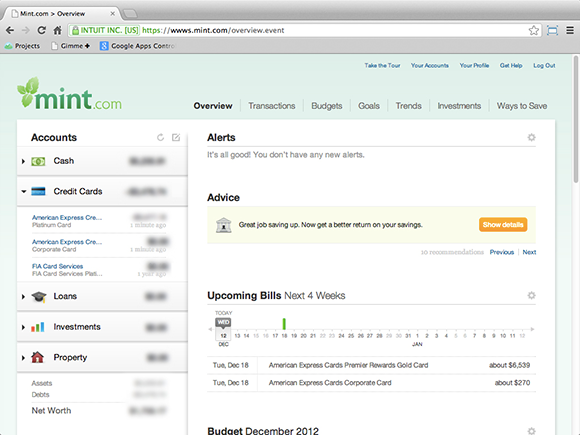
Figure 1-1: Using clear language and layouts help keep your UI aesthetically pleasing and usable.
(Copyright Mint.com)
Evernote (see Figure 1-2) does digital note taking better than anyone else. This is by no accident; they focus on one task and do it really well. The good folks at Evernote understand a nearly frictionless user experience is crucial for successful note taking. Ironically, it’s pretty easy to screw up something as simple as digital note taking with save dialogs, connectivity alerts, and gratuitous styling. Evernote jumps through some pretty significant engineering hoops to mask the complexity of file storage, syncing, and conflict resolution so that the UI “just works”. You never have remember where you put your notes, how to get them on other computers, or even bother organizing them. Evernote took something that has been done many times before and made it better. That’s really hard to do without truly understanding the user’s needs and tasks at hand.
USER RESEARCH TECHNIQUE #1: OBSERVATION
I’d be willing to guess that some of you have developed software and then haven’t watched how users actually interact with it (and, yes, I’ve been guilty, too).
People ask me all the time, “What’s the one thing I can do to make my project better?” My response is usually another question—“Have you watched anybody use it?” Sadly, more times than not, the answer is “no.”

Figure 1-2: Even though many note taking applications exist, Evernote succeeds because it takes a user centered approach to note taking.
(Copyright Evernote.com)
Though a bare-bones approach to user research, observation is perhaps the easiest, cheapest, and quickest way to elicit real feedback from your target audience. Simply observing users in their environment can be an invaluable tool to keep in your software-design utility belt. Of course, I’m not suggesting that this is the only tactic for doing user research, but direct observation is a great way to get started.
The quick-n-dirty method
For those of you who literally have no time, and perhaps no money for user research, here are the ten steps to the quick-n-dirty method:
1. Find out who your primary users are.
2. Go to their workplace and ask for permission to observe them at work.
3. Bring a camcorder.
4. Bring a coworker.
5. Keep an eye out for common activities.
6. Watch for struggles and hesitations.
7. Note how the users interact with their environment (consciously and unconsciously).
8. Eat a burrito and analyze your recordings; specifically, try to find patterns in behavior.
9. Group the patterns and translate them into insights.
10. Bonus: Have users state their stream-of-consciousness while they are using an application. And have them verbalize their thought process (this is very useful, and usually very funny.)
Brilliant. Now, take a closer look at these steps.
If possible, it’s highly useful to observe users on location; doing so allows you to peer into the unspoken aspects of their tasks and motivations. Going onsite literally puts you in a user’s world. Be sure to gain permission before you shadow users. Nothing is worse than showing up at someone’s workplace with a camcorder looking to gain some insights, only to have a security guard toss you out and confiscate your equipment.
Camcorders, voice recorders, cellphones with video capture, anything that can replay a session is important for keeping an accurate account of what happens. Relying on some chicken-scratch notes and your memory simply won’t cut it.
Common behaviors may surface throughout the session; try to keep note of them. For example, users may need to frequently take phone calls while inputting information. Or they may need to adjust the angle of the screen throughout the course of a day to account for sunlight glare, which may be a good reason to use a high-contrast color palette.
Imagine that you’re targeting a power user . . . say, a stock trader using a trading system. Observing the trader’s environment and how he interacts with it can be a good way to understand the context in which your software will reside. More specifically, observing the interactions among traders may lead to a really nifty social feature.
Watching for hesitations and struggles is also important, especially when looking for ways to improve existing technology or to discover usability issues within your own applications. These struggles are typically referred to as pain-points and can be catalogued and prioritized. Identifying pain-points can also provide valuable insights into how to differentiate your product from your competitors’.
Another interesting thing to look out for is how participants subconsciously interact with their environment. For example, I often see people bustle up to a kiosk or an ATM and place their drinks, purses, or bags on top of the display or on any nearby surface. Thus, one obvious insight is that people need the ability to drive the interface by using only one hand. A simpler solution might be to install a ledge to accommodate personal effects.
After you scour your recordings, transcripts, and notes, you’ll likely uncover patterns in participants’ activities and struggles. Later in the chapter, you find out exactly what do with your findings. At this point, take a moment to rank and prioritize your findings, and give yourself a gold star.
Case Study: Lightning Fast Checkout
A couple of years ago, my company was consulted on a project in which the client wanted to increase the efficiency of the retail checkout processes. You know the scene—you’re standing in a checkout line noting that there are 30 registers, with only one servicing customers. So, you decide to ditch your basket and walk. That was precisely the problem we were asked to resolve. The client voiced the problem loud and clear: “Time is money, and saving even one second per transaction matters.”
First, we observed transactions at the checkout lane as they happened in real time. As we began our investigation, we noticed the whole process was peppered with little bottlenecks. Most peculiarly, the total checkout time was only loosely correlated to the basket size. Curious about what was causing these bottlenecks, we looked deeper into the tasks involved with ringing up a customer. We timed everything from how long it took to bag milk and weigh produce to how long it took to return cash and accept electronic payments.
We discovered one consistent bottleneck—ringing up of produce. All those tasty apples, onions, and spices caused the average transaction to take up to six times longer than other items. This bottleneck occurred because each produce item had a unique barcode found by combing through a little black code book. Every time a produce item came across the belt, employees had to flip through this book, which disrupted the whole checkout process. At that point, we had our key insight, and it was clear what we had to do: eliminate the black book and make ringing up produce as fast as possible.
In our final solution, we had touchscreens, biometric fingerprint scanners, and even label recognition, all in an effort to make checkout more efficient. This Frankenstein of a lane was a real beaut, and I could write an entire chapter on all of its small innovations, but I’ll avoid going on tangents (for now) and get back to the produce screen.
In our exploration of options for the produce screen (see Figure 1-3), we started with a basic grid layout with the barcode, the item name, and an image for each row. The grid was sortable, nicely styled, and it worked. It was an obvious way to solve the problem of looking up produce in a long list, but it didn’t do much to make the task of ringing up produce easier or faster. Meanwhile, the little black book lay quietly staring.
We knew we could do better than this, so we barged forward and continued to refine. The final version of the screen (see Figure 1-4) was successful for a couple of reasons. For starters, we laid out the produce buttons in a left-to-right order and sized them proportionally to their popularity, making the most popular produce the easiest to access. In addition, we displayed a large produce image behind the produce title for visual reinforcement. We grouped each edge case product (atypical peppers and spices) into broader categories such as “ethnic” and “exotic.” This effectively put all produce items no more than two taps away, making the screen very efficient and eliminating the need to memorize the barcodes. Bye-bye little black book!

Figure 1-3: Tabular UI presentation is often antiquated. Grids or cards can be more usable and aesthetically pleasing.

Figure 1-4: Design to accommodate habitual tasks. In this case, bigger buttons and images are used for fast recognition and touch efficiency.
(Copyright 2013 Microsoft)
And there you have it. I wanted to share this example because it demonstrates that even with just a few basic observations, you can start thinking about the software you’re building from the user’s perspective. Also, if you let your findings drive your UI decisions, then you’ll be on the path to creating a unique and elegant solution.
USER RESEARCH TECHNIQUE #2: USER INTERVIEWS
Whether you’re building a new mobile app, website, or dog leash, you have to discover what people want, and there’s no better way to do so than to ask them. However, even so, understanding what people want can be hard, namely, because cognitive psychology tells us that as humans, we’re generally bad at a few things:
• We’re bad at articulating what makes us happy.
• We’re bad at predicting what we’ll like or dislike.
• We’re bad at giving feedback on things we don’t care about.
As the interviewer, you’re on a mission to find out exactly what users want. So, what the heck, why not just ask them, “How would you design [some feature or interface]?” This approach would work great if all the interviewees were also product designers. But that’s not always the case, and unfortunately, this method typically produces knee-jerk reactions that aren’t well thought out.
However, figuring out what people want isn’t a pipe dream. The fact is that arriving at accurate conclusions from your research is all about getting the right users and asking the right questions.
Get the right users
During the planning portion of most projects, you may find yourself in a room with various business stakeholders brainstorming creative ways to solve a problem. These discussions are important for understanding the goals of the project from a business perspective. But it’s also important to understand the problem from a users’ perspective, and most of the time, these initial planning discussions don’t include actual users.
Recently, I found myself with a group of business folks looking for ways to make food stamps “more innovative.” After a couple of hours of fruitless brainstorming, it occurred to me that no one in the room had ever used a food stamp, and I couldn’t help but think, “What business do we have innovating something we’ve never used?” Unfortunately, we didn’t come up with any major food stamp breakthroughs.
Interviewing stakeholders can lead to great supplemental information but will never be as good as conducting interviews with real users. Actually, being there lets you hear what users have to say, but more importantly, how they say it. (As a side note, your colleagues at work, your mom, and your best friend are usually not good candidates for collecting accurate information.)
Finding the right participants can be pretty easy, and maybe a little obvious in hindsight. Depending on the project, I usually try to find the following:
• Existing users
• Potential users
• Power users
• Former users (these are the best users to interview)
Wrong questions, wrong answers
After you have the right people, you need to ask them the right questions. Being armed with good questions for your interview will help pull good answers out of even the most introverted participants.
Like any craft, asking the right questions requires some finesse. Remember, there are people who dedicate their careers to user research, and if it’s possible, hiring a professional will likely generate the best information. However, if you don’t have the extra time or a sufficient budget to do so, here are some guidelines for creating good questions:
• Avoid closed questions. Closed questions are typically questions that yield dead-end answers. In general, try avoiding questions that can be answered with a simple Yes or No. Closed questions will give you quick facts and can be a good way to test an individual’s knowledge, but they aren’t very good for generating thoughtful responses. Inevitably, closed questions will come up in the natural flow of conversation (it’s almost impossible to never ask a closed question). You can recover by simply asking your participant “Why? ...” Here are some examples of dead-end questions:
• Are you happy with ____?
• Do you dislike _____?
• How should ____ work?
• How do you think _____ should look?
• How often do you use ______?
• Do you think _____ is better than _____?
• Avoid leading questions. Leading questions are another form of closed questions. Leading questions tend to be directional in that they close off alternative and potentially undesirable answers. Leading questions often sneak into interviews because of our natural tendency to speak that way. They typically end with speech like “isn’t it?” “right?” or “don’t you think?” Some examples of leading questions are
• ____ is better than _____, don’t you think?
• When you are ______ing, do you find yourself using _____?
• Would _____ be easier to click if it were bigger?
• Is it true that you are more productive when you ______?
• Use open-ended questions. Open-ended questions promote thoughtful answers and typically motivate participants to share the unique aspects of their activities. I like to frame these questions in the context of moving through space. In other words, “How did you arrive here?” “What did you do after you arrived?” “Where did you go afterward?” Some examples of open questions are
• Can you walk me though a typical ______?
• After you’ve completed ______, what do you with the results?
• Describe the benefits of ______?
• What are you thinking while you are performing ______?
• How would you describe ______ to a friend?
• When _____ doesn’t work, how do you work around it?
• Do you have any “tips and tricks” for using _____?
• What do you like best about _____?
• What do you dislike about _____?
These are just a few tactics for really getting into a user’s mindset. Understanding what’s best for a user versus what’s the best technology will help you prioritize and frame the features and functions in your applications.
Making Sense of Your Findings
At this point, you may be thinking, “Okay, I have all these insights, now what do I do with them?” This is the fun part. Once you’ve managed to glean a modest amount of information from users, it’s time to distill this information into something useful. As shown in Figure 1-5, you want to find patterns, prioritize goals, and create objectives.

Figure 1-5: Distilling your research into something useful.
USER RESEARCH TECHNIQUE #3: PERSONAS
Within your research data, you will notice behavioral patterns, and you can use these patterns to define the core types of users who will make up your user base. Creating a profile, or persona, for each of these key types will help you focus on creating features to solve problems unique to each type of user. Personas can also deter scope creep by ensuring that the high-priority features map to the highest priority users.
Figure 1-6 shows a sample persona template (slightly modified) from one of my recent projects. I typically like to gather two to three key personas for each project. And I usually keep them posted on a work board or in line-of-sight throughout the project. With a strong set of personas, you can make informed decisions about new features and can prioritize them relative to the persona hierarchy.
Sometimes, what users want and what stakeholders want don’t align. (Big surprise.) So, in addition to creating user personas, creating business stakeholder personas can be helpful. I usually do so when there are multiple agendas to juggle and I need everything to be front-of-mind.
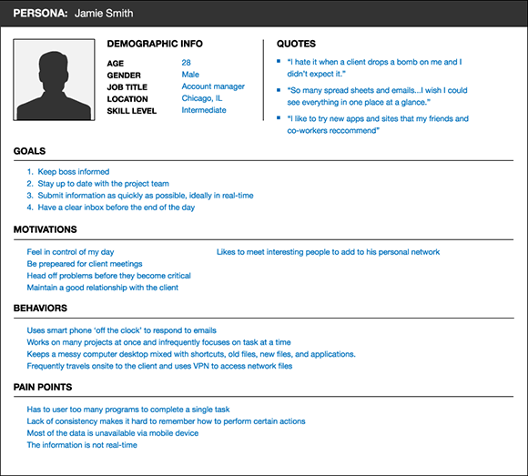
Figure 1-6: A sample persona template. Using personas helps keep your feature list focused on primary users.
USER RESEARCH TECHNIQUE #4: USER STORIES AND SCENARIOS
At this point, you’re knee deep in user data and in a good spot to organize it all into a user story. This is where the rubber meets the road and where you can start forming scenarios that will mimic how users will interact with the software to complete their goals. Once you create the core scenarios, you can use them for generating a high-level requirements list for the product.
For the engineering folks out there, user stories may seem eerily similar to use cases. They’re quite similar in that they describe how the user will interact with a particular facet of a product. The biggest differences between the two are that user-story scenarios are characterized by brevity and have a shallower scope than use cases. User scenarios are best used to describe the main touch points between the user and the product.
Where, what, when, how?
When coming up with user scenarios, I usually describe a particular persona in a location and plot out the high-level interactions as they accomplish a goal. The same technique can be used for low-level actions . . . say, a user creates a new item, adds it to a list, and shares that list with a friend.
To assist with creating scenarios and stories, you can use a method called P.I.E.C.E. that helps frames the narrative in a meaningful way. The P.I.E.C.E. method stands for
Persona: Who are you targeting?
Intrigue: What attracts users to the product?
Engage: How do you help users achieve their goals?
Close: How do users exit the scenario?
Extend: How can the user extend the experience beyond the screen?
Figure 1-7 shows a sample user scenario template.
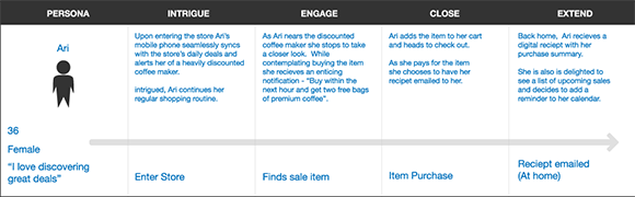
Figure 1-7: A user scenario template. Framing methods help depict features in a relatable way.
Okay, still there? At this point, you know who your users are, what they want, why they want it, and how they will get it. This puts you in a really good place to start actually designing your shiny new product.
Summary
This chapter isn’t very designery in the traditional sense, but it gives you a sound foundation for moving on to the visual aspects of the design process. The remainder of the book is dedicated entirely to giving you specific design tactics for creating the best software on the planet. Yes, the whole planet.