Chapter 8: Digital Typography
“Just give me some good font sizes to use . . .”
OF THE FIVE or six major areas of visual design, typography is one that will benefit your applications the most. It can massively improve the usability and overall aesthetic quality of your application.
When I look at most line-of-business applications, kiosks, and websites, I’m usually struck by the fact that many pay little or no attention to things like consistent spacing, margins, text-casing, and type size. These are just a few things that can improve the appearance of your application with relative ease.
For most people creating digital designs, picking and pairing fonts, calculating line height, and determining font size is a mystifying process. And as with most design disciplines, typography is a mixture of precision, calculation, and intuition that takes some experience to develop a taste for. But in the grand scheme of things, I believe that anybody can make good typography choices by following a set of straightforward guidelines.
Over the years, I’ve designed and built a lot of digital interfaces that required picking and experimenting with different fonts. And along the way, I’ve discovered a bunch of typographic tidbits and for making good typography decisions. In this chapter, I’d like to share some of my findings on digital type, and in doing so, I’ll drill into these common typography questions:
• What is the difference between a serif and a sans-serif typeface?
• What is the difference between a typeface and a font?
• What fonts should I pick?
• When should I use a serif or sans-serif?
• What sizes should I use for headers and body text?
• Which fonts look good together?
• Which weights should I use and when?
• When should I use all uppercase or lowercase text?
First Things First
Typography may seem like something that is exclusive to designers or even something that designers are overly sensitive to. After all, it’s just a matter of picking fonts, right? Well, not quite. While there is some truth to designers being emotional beings, typographic knowledge is not something that should exist solely in a designer’s skill set. Typography is a discipline that has been built up over the course of hundreds of years of written language. And there are long-established principles for enabling typography to communicate the text it represents with clarity and beauty.
As Robert Bringhurst writes in his seminal book, The Elements of Typographic Style:
“Like oratory, music, dance, calligraphy—like anything that lends its grace to language—typography is an art that can be deliberately misused. It is a craft by which the meaning of a text can be clarified, honored and shared, or knowingly disguised.”
KEY POINT
The Elements of Typographic Style is one of the most authoritative sources on the topic of typography. It’s a must-have for anyone looking to truly understand the intricacies of this classic art form. Many designers even consider the book to be the typography “bible.”
Nonetheless, my point here is that typography is much more than merely “picking fonts.” The type of typography I’ll be talking about in this chapter focuses on typography as a communication system. It includes a few subjective topics like font pairing, but mostly I’ll explore typography from a tactical perspective focusing on best practices for readability, legibility, and consistency.
A Lap Around Typography
Before we get into techniques, I’d like to spend some time going over the basics. As I mentioned, typography is a well-established fine art with a rich history worth having a working knowledge of. Understanding basic terminology and history will help you make confident decisions about the typography in your applications.
Understanding Type Terminology
The terminology associated with typography can be quite complex (see Figure 8-1). In fact, most typography books have an entire glossary of terms used to describe the properties of typography. For our purposes, I’ll focus on the properties I think are most relevant to digital typography. Note that this is not an exhaustive list, and I recommend checking out one of the many typography books for a deeper dive.

Figure 8-1: Character anatomy typographic reference of basic names.
X-Height
The x-height is the height of the lowercase letters, not including the height of the ascenders or descenders (see Figure 8-2). The letter x typically exemplifies the x-height of a typeface. A typeface with a taller x-height is typically better for legibility onscreen.

Figure 8-2: A larger x-height is preferable for legibility on digital screens.
Baseline
The baseline is an imaginary line where the letters in a font rest (see Figure 8-3).
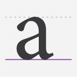
Figure 8-3: Keeping the baseline distance consistent in a design is helpful for better readability.
Cap Height
The cap height is the distance from the baseline to the top of the uppercase letter (see Figure 8-4). In other words, it’s the height of a capital letter above the baseline.

Figure 8-4: The top of a capital letter.
Leading
Pronounced LED-ing, leading is the distance between the baseline of a line of text and the next baseline of text (see Figure 8-5). In other words, this is the vertical spacing between lines of text. In languages like CSS, leading is adjusted with the line-height property.
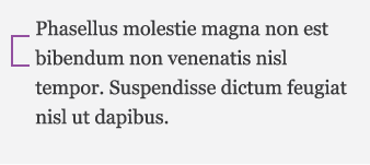
Figure 8-5: Keeping consistent leading values is important for good readability.
Kerning
Kerning is the horizontal space between an individual pair of letters (see Figure 8-6). Most fonts have kerning tables and built-in values to adjust spacing between specific letters to reduce awkward space and increase readability. Manual kerning is most often used when text is set in all caps or for logo type.

Figure 8-6: Most quality fonts have specific kerning values built in and shouldn’t be modified for general reading purposes.
Ascender
An ascender is the part of a lowercase letter that extends above the x-height (see Figure 8-7). Ascenders, together with descenders, increase the eye’s ability to recognize words.

Figure 8-7: Ascenders help with legibility when type is set in sentence case or lower case.
Descender
A descender is the part of a lowercase letter that extends below the baseline of a font (see Figure 8-8).

Figure 8-8: Lowercase p’s, q’s, y’s j’s, and g’s all have descenders.
Serif
Serifs are the small lines tailing from the edges of letters and symbols (see Figure 8-9). Some studies show serif typefaces to be difficult to read at low-screen resolutions. And some studies suggest serifs are more readable in print.

Figure 8-9: A typeface with serfis is called a serif typeface.
Axis
The axis is an imaginary line drawn from top to bottom of a letterform bisecting the upper and lower strokes (see Figure 8-10).

Figure 8-10: The axis is often used as a way to identify early styles of typefaces.
Measure
Measure is the width of a block or column of text (see Figure 8-11). The measure will influence legibility—long lines are hard to read; short lines are more easily read.
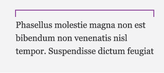
Figure 8-11: Measure is important in website design where long blocks of text are present. If the width of the block of text is too long, it can be cumbersome to read.
Ligature
Ligatures are the special characters that are two letters combined into one (see Figure 8-12). Ligatures are usually found where two adjacent letters would normally bump into each other; a ligature allows the letters to flow together more gracefully.

Figure 8-12: Ligatures are often used for stylistic flair and better readability.
Font or Typeface—What’s the Difference?
This topic seems to confuse a lot of people who are getting started with typography. What’s more, there doesn’t appear to be any definitive source for an exact definition. When in doubt, I turn to Wikipedia, which differentiates the terms font and typeface by writing the following:
“The distinction between font and typeface is that a font designates a specific member of a type family such as a roman, boldface, or italic type, while typeface designates a consistent visual appearance or style. For example, a given typeface such as Arial may include roman, bold, and italic fonts.”
Some good folks at www.fontfeed.com explored this topic and came up with a couple of elegant ways to remember the tricky terminology:
“The difference between typeface and font is similar to the difference between songs and MP3s. The song is the original creative work, and MP3 is the delivery mechanism. Similarly, in type a font is the delivery mechanism and a typeface is the creative work.”
And even more simply put: Font is what you use; typeface is what you see.
Type Classification
There are a lot of typefaces to choose from. When I say a lot, I mean hundreds of thousands. And depending on the look of your design, you’ll want to pick a font that suits the occasion. For example, if you’re looking to impart a whimsical, lighthearted feel, a sturdy traditional typeface might not be the best choice. At a high level, fonts are loosely classified into groupings to give designers a starting point for making an appropriate decision.
In practice, there are 25+ classifications and sub classifications that make up a complete list of typeface categories. If you really have the itch to comb through a comprehensive list of all of the classifications, a simple web search for “typeface classification” will point you in the right direction. But for our purposes, the majority of typefaces can be grouped into five major categories.
Serif Typefaces
Serif typefaces have semi-structural details at the ends of their strokes. In other words, serifs are the little “feet” at the end of each letter. Some individuals refer to serif typefaces as roman.
Old Style Serif
Old style serifs are some of the oldest typefaces, created back when the printing technology was quite primitive, which resulted in typefaces that are characterized by relatively thick stokes and bracketed serifs. These typefaces can lend themselves to a classic, traditional look and feel and are well suited for lengthy reading tasks.
Examples include Garamond (see Figure 8-13), Bembo, Sabon, and Palatino.

Figure 8-13: Old style serifs such as Garamond have good readability and are best used for lengthy text and decorative headers.
Transitional Serif
As printing technology advanced so did typefaces. Transitional typefaces reflected refinements in technology with greater attention to detail—strokes became higher in contrast with thicker and thinner features. Because they were positioned in history between the old style and the modern style, they were appropriately named Transitional. They moved away from the influence of scriptural typefaces and became more influenced by geometric shapes. Transitional typefaces inherently have stylish and strong visual characteristics and are most often used for body text.
Examples include Baskerville (see Figure 8-14), Times New Roman, Mrs Eaves, and Caslon.

Figure 8-14: Traditional serif typefaces first appeared in the mid-18th-century.
Modern Serif
The trend of geometric influence continued with modern typefaces, which pushed the limits of the lead typesetting systems of the time. Characterized by extreme contrast between thick and thin stokes, these typefaces typically feature hairline serifs, geometric letterforms, and an upright axis. Much of the development of modern style typefaces was influenced by two rival designers—Didot and Bodoni, and both have typefaces named after them. Modern style typefaces can have poor legibility when used at smaller sizes. But when used in large sizes, they are very elegant, sophisticated, and fashionable.
Examples include Didot, Bodoni (see Figure 8-15), and Bell.
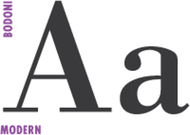
Figure 8-15: Modern serif typefaces are often used in high-end fashion magazines.
Slab Serif
Also known as Egyptian, slab serif typefaces are characterized by thick, block-like serifs. Traditionally, slab serif fonts emerged during a time when typefaces were designed for long stretches of texts, for books. And advertisers at that time were looking for a new kind of typeface that would stand out on billboards and posters. Thus, the slab serif makes for excellent large headline text. However, some of the modern-day slabs have a very fresh and classy look that is perfectly legible for both headline and body text.
Examples include Officina Serif, Museo Slab, Archer, and Rockwell (see Figure 8-16).
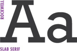
Figure 8-16: Typewriters used slab serif fonts such as Courier and Courier New.
Sans-Serif Typefaces
Sans-serif typefaces are typefaces that don’t contain serifs. They didn’t become very popular until the 1950s, at which point they were deemed inappropriate for body text. Today, however, sans-serifs have become very popular for setting body text.
Humanist
Appropriately named, humanist typefaces have a handcrafted, “human-touched” quality. Even though technically the Humanist style dates back all the way to the 1400s, this style is worth noting because it’s sort of like the great-grandparent of today’s type.
Humanist serif typefaces are rarely seen today, but the Humanist style influenced many popular sans-serif fonts over the few last decades These tend to be the most calligraphic of the sans-serif typefaces. Humanist typefaces can feel modern but not industrial, warm, and can be very readable.
Examples include sans-serif, Gill Sans (see Figure 8-17), Frutiger, Myriad, Verdana, and Segoe.
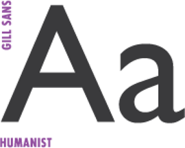
Figure 8-17: Humanist typefaces are used in everything from corporate logos to movie posters.
Realist Sans-Serif
The letterforms found in a realist sans-serif typeface land somewhere between the Humanist and Geometric sans-serif. They are relatively straight in appearance and have less line-width variation than Humanist style typefaces. Sometimes realist sans-serif fonts are considered to be “ordinary” or “anonymous” because of their relatively plain appearance.
Examples include Helvetica (see Figure 8-18), Univers, and Arial.
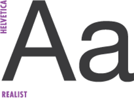
Figure 8-18: Helvetica is so popular that it even has its own movie (Helvetica, 2007)
Geometric Sans-Serif
Geometric sans-serif typefaces are based on geometric shapes. Mostly distinguished by the circular O and bare-bones lowercase a. The individual letters tend to have uniform stroke widths and have a very minimalist nature. Geometric typefaces lend themselves to a very modern and clear look and feel. In fact, the cover of this book uses Futura.
Examples include Futura (see Figure 8-19), ITC Avant Garde, Century Gothic, Gotham, and Eurostile.
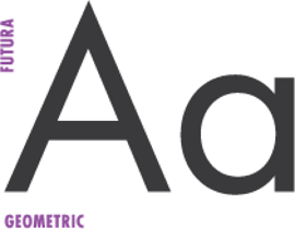
Figure 8-19: Geometric sans-serif typefaces have a very modern, sleek look. They are often used for studio logos and artist portfolios.
Eight Ways to Improve Your Typography
Like I mentioned at the beginning of this chapter, typography is a big topic, too big to be taught in a single chapter. And so far, we’ve looked at a very brief history and some of the terminology. This basic knowledge should get you through most of the discussions you’ll ever have about typography. That said, it is only the tip of the iceberg, and there’s a rich rabbit hole of typographic history out there for you to discover.
At this point, I’ve probably spent too much time on typography 101, so let’s get into the good stuff. Over the years, there have been a particular handful of typography-related questions that I’ve frequently been asked. So the remaining section of this chapter focuses on how to approach these common typographic problems. In other words, these are the eight techniques you can use to kick-start the typography in your own projects.
1. Pick a Scale and Stick with It
Unfortunately for most people, choosing font sizes is a matter of eye-ballin’ it, which leads to a design riddled with inconsistencies and poor composition. This is the number one thing that applications and websites suffer from. The good news is that picking good, consistent font sizes is actually quite easy—it’s just a matter of remembering to do so.
Scale in typography is akin to scale in music. Choosing notes in the correct scale results in harmonious chords and tones. The same is true for choosing a scale for typographic elements; randomly picking sizes can result in a discordant visual harmony.
In general, devising a typographic scale is a matter of picking a set of harmonious proportions. For example, size values can be produced by using the golden ratio: multiplying a base font size by 1.6 and then multiplying its sum by 1.6, which results in resonant values.
The golden ratio is just one example of how to generate harmonious font size values. Luckily, you don’t need to generate a custom modular scale for every project to arrive at a set of good type sizes. Figure 8-20 shows two very common typography scales. The first of the two scales is a classic diatonic scale, and the second scale is based on the Fibonacci sequence. These scales can be used as they are and are well suited for most digital typography needs.
Once you’ve picked the scale that works for you, select a modest set of sizes to work with (three to four). Rarely, will you need to use the full scale of values. Start by picking a good body size for the font you’re using and then pick a size for titles, headers, and subtext.
KEY POINT
When you’re deciding what size to make your headers, remember this formula: multiply your body size text by 2 and then find the nearest value in your scale.
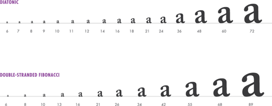
Figure 8-20: Two common type scales that are suited for virtually any digital design task.
2. Use Consistent Spacing
Being consistent with your font sizes is a good start, but its only part of the equation. If using proper font sizes is akin to the scale in music, then spacing is to fonts what timing is to music. In designer-speak, when the spacing, font size, and line length are calculated correctly, a design is said to have good visual rhythm.
Visual rhythm is crucial for keeping the readers’ eyes flowing effortlessly across the content as they digest the page. More specifically, the leading value plays a key role in achieving good spacing and rhythm. By tweaking the leading value, you’re essentially breaking up the density of text, making it easier to read and more aesthetically pleasing. In CSS and most programming languages, leading corresponds to the line-height property.
The primary characteristic of good vertical rhythm is when the spacing between paragraphs and headers are equal or related to the leading value. In other words, use equal spacing between lines of text and a multiple of that size for spacing paragraphs and headings. Figure 8-21 shows some sample text that has consistent vertical rhythm. Notice that regardless of the font size, the baseline of the text is consistent down the page.
KEY POINT
To calculate a good line-height value, multiply the body font size by 1.5 or 2. Then when calculating the spacing between headlines and body text use a multiple of the line-height value. For example, my usual thought process works like this: Pick body font size
Leading = body size * 1.5
Header Spacing = leading || leading *2
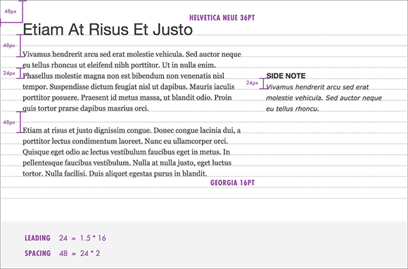
Figure 8-21: Consistent spacing enhances readability and is aesthetically pleasing.
3. Consider the Measure
The measure is the length of a line of type and is the last fundamental “ingredient” of good rhythm (see Figure 8-22).
In general, avoid a very long measure or a very narrow measure. A long measure fatigues the reader’s eye and should be avoided for long, lengthy reading scenarios. According to classic typography, books with 45 to 75 characters per line present a comfortable line width. The ideal is 66 characters.
KEY POINT
An easy way to calculate line width in pixels (although it will vary by typeface) is to multiply the body text size by 30 to 35.
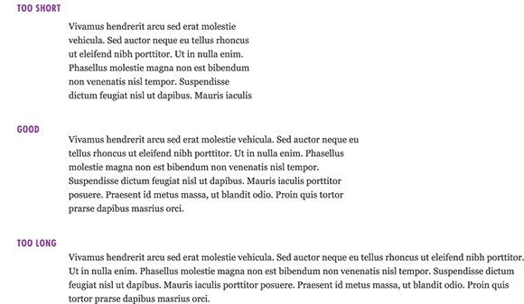
Figure 8-22: Using a comfortable measure is crucial to keeping the eye flowing down the page effortlessly.
4. A Little Can Go a Long Way
On websites and apps, I see a lot of HUGE font sizes for titles and headings that are used for no apparent reason. You don’t need to use an unsightly font size for headers and subheads to distinguish it from the body content. Using a heavier weight or color is usually enough.
But let’s take a step back. The whole point of varying the size and weight of a font is to represent text hierarchy in a clean and uncluttered way. Establishing a strong typography hierarchy in your design will help your user quickly navigate and consume the page in a logical way. When establishing hierarchy for a website, a list of items, or a point of sale system, it can be helpful to create a set of typography roles.
For example, in the case of a blog article, the “roles” are the title, description, author, date, and body. Each of these roles has a font-family, font size, and font weight assigned to it. And these roles should communicate their text properly—the title is the lead man, then the description and the body content, and finally the author and date.
Figure 8-23 shows an example of a blog post set with a single font using variations to communicate the hierarchy clearly without being unsightly.
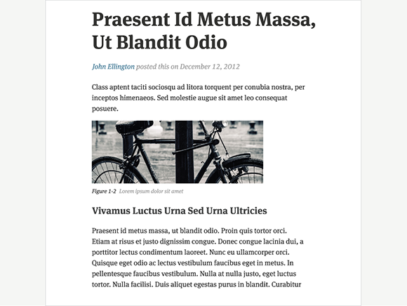
Figure 8-23: A single font family with thoughtful weight variations can be very flexible.
5. Pick a Good Body Font
Whether you’re creating a blog, website, reader, or mobile app, picking a good body font is crucial. The following can help you make more meaningful decisions about body text.
Serif or Sans-Serif?
Using serif or sans-serif fonts for body text is highly discussed among designers. For a long time, it was believed that sans-serifs were best suited for headline text and that serif fonts were the most “readable” and should be used exclusively for body content. On the other hand, most screen resolutions are pretty low (72 ppi) compared to print (300 dpi) and don’t do a good job of rendering the small details found in serif fonts. As a result, text becomes muddy and difficult to read at smaller text sizes. For that reason, over the past ten years, sans-serif typefaces have become very popular for body text.
Regardless, font support in most modern development platforms has been significantly enhanced, which enables better clarity and crisp rendering of fonts. Additionally, the high-resolution screen technology like Retina can render even the most delicate serifs with ease. Which makes me think as screens become higher resolution we will see a trend back to serifs in web and app design. That said, serif and sans-serif fonts seem to be split in terms of popularity. As for which is more readable, the sans-versus-serif debate appears to be unsettled. As a rule of thumb, I choose sans-serif for body text and serif for headlines.
KEY POINT
Pick a font with a tall x-height. It seems universally accepted—regardless of serif or sans—that a taller x-height is associated with better legibility and overall readability (see Figure 8-24).
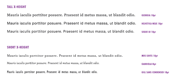
Figure 8-24: Fonts with taller x-heights are more legible than those with short x-heights.
Larger or Smaller?
In general, larger is better. Don’t be afraid to set your body text in 16 px or 18 px sizes. As monitor resolutions increase, your reader will welcome a larger text size. Of course, applications that don’t have a ton of screen real estate will have to make compromises between font size and quantity of information. Before going with whatever the default font size is, consider your audience. Are they leaning back in a chair far away from the monitor? Are they in extreme lighting conditions that would benefit from larger font sizes? Is the average age of your users over 40 years old? If any of these things are true, 16 px for body content is a good candidate.
Font Hinting?
As I mentioned, printed typography prints at a very high DPI and because of the high resolution it renders curves and subtleties found in typefaces with no problem. This means the text is clear and readable even at font sizes as small as 10pt. Unfortunately, screen rendering of fonts still remains jagged and distorted (see Figure 8-25). And not until recently have displays with 220+ ppi made their way into the average person’s home. Regardless, for the masses, most fonts still render poorly at small sizes.
So what do you do? Font hinting is the next best thing to high monitor resolution. Font hinting is basically a set of mathematical instructions that computers use to align letterforms to the pixel grid for the smoothest rendering possible. This method of forcing fonts to render more accurately has become so popular that many typefaces have been rereleased with a hinted version.

Figure 8-25: Aliasing can help fonts appear smoother on low-resolution screens.
However, it’s unlikely that we, as designers and developers, will be hinting our own fonts. Also, we don’t have much control over how the type is ultimately rendered by the OS and seen been the user. But when you’re choosing a typeface for your body text try to find one that has been hinted, because that can dramatically increase legibility. Figure 8-26 shows hinted fonts that won’t let you down.
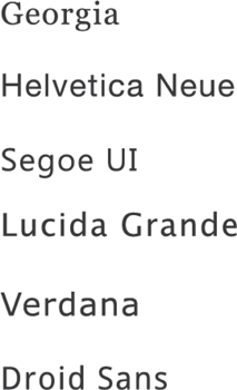
Figure 8-26: Common fonts that have been enhanced for screen legibility.
6. Use a Single Family
When it comes to picking the right typeface, you may quickly become overwhelmed with over 100,00 fonts to chose from, and pairing your chosen font with a worthy complement can be even more daunting. One of the safest and easiest ways to ensure good font selection is to rely on a single family with multiple weights and variations. A large type family containing multiple weights and italics and with extended variations will provide the versatility needed to accomplish most typographic tasks. Most of the time, simply varying the weight and size of a font is enough to create contrast and communicate text effectively. Figure 8-27 shows some fonts that offer enough variation to stand on their own.
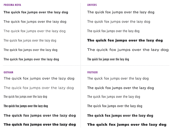
Figure 8-27: A few font families that offer several variations.
7. Combine Two to Three Typefaces
Choosing a single typeface family can be a great way to go for many design tasks, but sometimes doing so leaves something to be desired. By pairing two or three typefaces, you can add another dimension of personality to the aesthetic of your design. Unfortunately, pairing typefaces is perhaps the most difficult and most subjective part of typography. At their best, good type combinations are unique and provide the perfect complement to the tone or emotion you’re trying to evoke. At their worst, the typography will be noticeably out of place or misleading. Regardless, I can’t even come close to doing this topic justice, so here’s one simple rule that I’ve found invaluable when pairing fonts (courtesy of Jonathan Hoefler and Tobias Frere-Jones):
“Keep one thing consistent, and let one thing vary.”
This advice might not mean much at first, so take a look at what it looks like in practice.
Keep One Thing Consistent
When typefaces share a similar trait, they are said to have concordance, and in general, fonts that share similar characteristics usually pair well together. When looking for these similarities in fonts, keep an eye out for the following concepts.
Use Serif and Sans-Serifs from the Same Family
In many font families, a sans font is accompanied by its serif counterpart. Any time a typeface is available in both sans and serif, using them is usually a safe bet (see Figure 8-28).
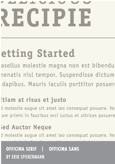
Figure 8-28: Officina Serif and Officina Sans are both created by Erik Spiekermann and are designed to work together.
Use Typefaces Created by the Same Designer
Typefaces created by the same designer often share similarities of the artist’s personal style and also make for good candidates when pairing typefaces (see Figure 8-29). Some good typeface designers to check out include Eric Gill, Adrian Frutiger, Erik Spiekermann, Herman Zapf, Jonathan Hoefler, Tobias Frere-Jones, and Matthew Carter.
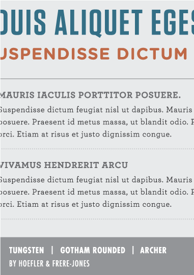
Figure 8-29: Tungsten, Gotham Rounded, and Archer are all designed by Hoefler and Frere-Jones and make great companions to one another.
Use Similar X-Height
Much about pairing fonts is about achieving balance. To help with this, take a look at a typeface’s x-height, which serves as a good measure for proportions of a typeface. Fonts with a similar x-height will flow seamlessly together and give the page some variety (see Figure 8-30). In addition to x-height, look for similarities in stroke width and aperture to find fonts that play nice together.
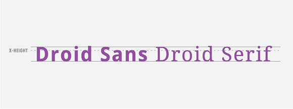
Figure 8-30: Fonts that share similar x-heights often make good candidates for pairing.
Use Good Contrast
Another thing to look for when pairing fonts is good contrast. Pairing fonts with good contrast will create order, reinforce the visual hierarchy, and break up the flow of the overall design. In this section, we’ll look at a few ways you can ensure good contrast when pairing typefaces.
Serif + Sans-Serif
This is an easy and classic way to pair fonts. Use a serif with character for headings and a crisp and clear sans-serif for your body. Or use a strong sans-serif for headings and a classy, legible serif for the body (see Figure 8-31). Both scenarios work well, but for lower-resolution screens, sans-serif body text usually works a little better.

Figure 8-31: Pairing a serif font with a sans-serif font is an easy way to ensure good typographic contrast.
Weight
Another way to ensure good contrast is to pick typefaces that have clear differences in font weights. Doing so helps to break up the density of information and guides your reader’s eye effectively around the page. Try to avoid typefaces that are too similar because they’ll just appear muddy or cause the user’s eye to focus on content in the wrong order. Figure 8-32 shows an example of poor contrast (on the left) and good contrast (on the right).
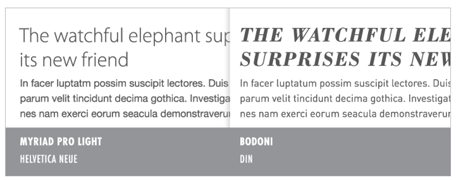
Figure 8-32: Myriad Pro Light and Helvetica Neue light are very similar and thus have a weak contrast. On the other hand, Bodoni and Din have a strong contrast and create good page hierarchy.
Style
You can examine many other stylistic qualities for creating contrast between typefaces—tall and short, round and sharp, thick and thin. But one sure-fire way to make a good font pairing is to start with a neutral typeface, say, for body text, and add another one with personality for headings and titles. Many successful pairings will feature a typeface with a lot of personality and a secondary typeface that serves a neutral role. Figure 8-33 shows a couple of different moods created by using a relatively neutral typeface with one that has a unique personality.
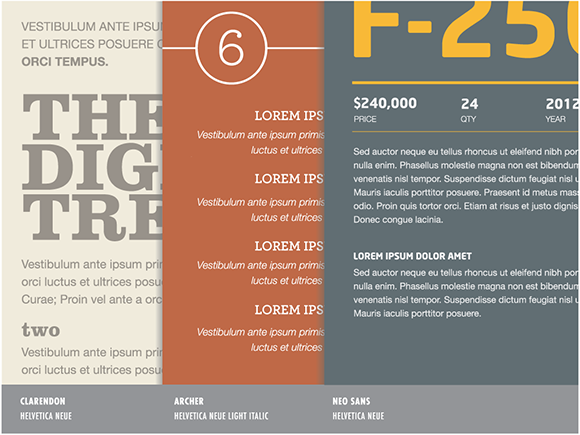
Figure 8-33: Another easy way to create good typographic contrast is to pair a neutral typeface with one that has a lot of personality.
8. Use a Good Ampersand
This is a bit gratuitous, but it’s an easy and subtle way to improve the elegance of your typography. In The Elements of Typographic Style, one of Bringhurst’s typography principles states
“In heads and titles, use the best available ampersand.”
This tactic has been around in print forever, but I rarely see a good-looking ampersand in digital work. A good ampersand used for titles or headings just looks elegant and interesting. I love it when I see a great ampersand used on the cover of a book or magazine, especially when it’s an ampersand I haven’t seen before. Figure 8-34 shows 12 of my favorite ampersands.
I know this is probably the last thing that most people care about—since, you know, you have to make the software meet all the requirements and actually work. I get that, but this kind of thing is all about taking pride in the details and craftsmanship of the design. Nobody is going to call you out if you don’t use a good ampersand, but I’ll give you a high-five if you do.
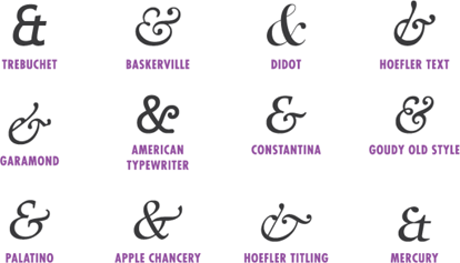
Figure 8-34: Use the best ampersand possible. These are a few of my favorites.
Summary
Phew! This chapter covered a lot of ground! Typography is such a beautiful and intricate discipline. Having even a basic understanding will be to your advantage for improving the overall appearance and usability of your application. Simply being consistent about your choices for font family, size, weight, and spacing will go a long way. You might not know it yet but typography is addictive.
Once you embrace the basics, you’ll start finding sloppy typography mistakes in everyday items, such as signage, restaurant menus, and even web forms. Inevitably, you’ll want to strive for good typography in your designs—and you’ll be better for it. Check out the following resources to dig deeper. Next up, you’ll be exploring communication principles. I know the topic sounds pretty dry, but it will be super exciting, I promise. I was going to name the chapter “The Most Crucial and Super Awesome Design Techniques You’ll Ever Need to Know,” but I thought that might be overselling things a bit. Regardless, if you have never used a grid to align your layouts, or didn’t know you should, the next chapter will have some useful tactics for you.