Chapter 10: Motion
“Animations . . . those are nice to have”
WATCHING A MOVIE, playing a video game, or enjoying a Sunday morning cartoon are all highly engaging activities, and as viewers, we’re fully immersed in the illusory world in front of us. Wouldn’t it be nice if our day-to-day applications could engage us the same way cartoons and video games do? Just imagine how nice it would be to be completely focused while our apps quickly and smoothly guide us through our tasks. Unfortunately, that is not how I describe most applications today. Instead, most apps are unresponsive, jarring, and unpredictable, leaving users to guess at what to do next.
So what is it about a Disney movie or Triple-A game title that keeps us so engaged? Without a doubt, the animation and motion tactics play a critical role in connecting us with the visuals onscreen. In fact, Disney has been successfully employing a set of tried and true animation principles for more than 50 years, which has manifested itself in nearly every blockbuster hit they’ve had. And here’s the best part—those same principles translate really well to UI design, giving ideal guidance for creating UI-bound animation. Motion in software is crucial for instilling confidence and capturing the engagement of the user. Motion is what makes the UI feel . . . well, right. So let’s start making things move!
In this chapter, you explore the basic principles of motion and dive into examples of how to implement key concepts into your own projects. Here are some of the topics this chapter covers:
• Ideal timing for transitions and animations
• Cognitive benefits of animation
• Making things look good with fade, slide, and scale
• Disney animation principles and how they relate to good UI design
• Effectively using easing functions
• How to create a snappy UI with elegant animations
Animations Look Cool, but Can They Actually Make It Work Better?
I spend a lot of my time working with folks who don’t have a formal design background, and I’m forever justifying the need for a two-pixel nudge, a color tweak, or a subtle fade animation. More often than not, someone tries to convince me that animations are merely “nice-to-have” and if time allows, they’ll be added later. If this is your approach to animation when designing software, stop.
Everything in the real world is in motion. On a daily basis, motion is keeping us aware of the task at hand and providing context to where we are at any given time. Imagine waiting for a train. While you wait, you look down the tracks anticipating the train’s arrival. As the train arrives, it swoops in demanding your attention. You acknowledge it, step aboard, and continue on your way. But imagine that the train just appears out of thin air? That would be startling and disorienting, and you wouldn’t know which direction it came from or which direction it’s going. Frustrating right? This is what it’s like when applications are void of motion—abrupt flashes of content on the screen that leave users disoriented and wondering what to do next.
Applying motion to your application provides many benefits. Motion introduces a realistic and delightful dimension to the UI that makes the user feel connected with the elements on screen. Not only does animation delight, it also has positive cognitive effects on the user. By using short animations and transitions in your application, you give users a context for where things are coming from and where they’re going, keeping users engaged along the way. Motion creates a sense of continuity and credibility and provides the necessary visual cues to understanding what’s happening.
So, yes, animation can actually make the product more understandable and simply work better. However, although motion can be delightful, it can also be cumbersome. Let’s see how.
Transitions, Animations, and Timing Guidelines
Transitions, animations, and timing are critical for communicating the personality and tone of an application. Using fast, snappy transitions or bouncy, squishy animations will have a big impact on the “feel” of your application. Motion needs to be used carefully; just a couple of milliseconds can be the difference between a delightful UI and a frustrating one.
What’s the Difference Between an Animation and a Transition?
This is one question I’m asked a lot when discussing motion treatments. The terms animation and transition mean much the same thing in that they both describe an object or an object’s property that’s progressively changing over time. I think of transitions as a way to orient the user and animation as a way to enhance or get attention.
For example, say that a mobile device has a list of items, and when an item is clicked, the entire screen slides over and transitions to an item detail page. The motion here literally transitions users from one location in the app to another, cognitively solidifying the user’s virtual location. In contrast, you can use animations to facilitate a call to action or for aesthetic delight. For example, in a first-use scenario, an application might use a pulse animation to visually cue the user to touch a specific button. Or while the application is loading, a clever logo animation might be used to enhance the brand identity or simply add a wow factor to the app.
Not Too Fast, Not Too Slow, Not Too Many
The timing used for animations and transitions is absolutely critical for ensuring a great user experience. A UI with obnoxiously long transitions or one full of gratuitous animations will create friction between the app and the user. If you use an iPhone, the first time you notice the smooth transitions between each screen, they are eye-catching and pleasant. And over time as you become very efficient at navigating the phone, the animations are timed just right so that you never feel held back waiting for the transitions to complete. If those transitions were even 100 milliseconds (ms) longer, they would make the entire UI feel clunky and cumbersome. A well-written article found on Microsoft’s MSDN summarizes this concept nicely:
“When designing animations, make sure that they don’t affect users’ ability to use your program efficiently. Generally, make your animations slow enough to fulfill their purpose, but fast enough that they don’t interfere with responsiveness, demand too much attention, or become tiresome.”
So what is the ideal timing for transitions? Generally, I recommend keeping major screen transitions between 150ms and 350ms. Keeping full-screen transition below 350ms will ensure that you maintain a snappy UI that won’t become cumbersome as users become more advanced.
KEY POINT
Keep full-screen transitions between 150 and 350ms.
Although 350ms might not seem like much time to do anything interesting, you can stagger and chain together animations to create complex and compelling motion treatments (which I cover in the Motion Principles section later in this chapter). The main takeaway from this section is that animations that are too fast will appear choppy and jarring, and animations that are too slow will become frustrating and cumbersome over time. And, lastly, keep them consistent—try to keep the same timings and motion characteristics uniform, and once you use a transition for a specific purpose, don’t use it for any other purpose.
When Should I Use Motion?
When you’re starting out, it may not be obvious when to use animations and transitions. Here are some good scenarios for when to use motion in your applications:
• Communicating status: When information useful to the user has been changed or updated, use animation to communicate that to the user.
• Providing feedback: Most actions should have reactions. A button click, a hover, or touch should provide a short responsive visual cue that an action has occurred.
• Showing changes in state: If an object has different states, you can use animation to grow and shrink, expand or collapse to communicate the change in state.
• Attracting attention: If there is a need to refocus the user’s attention, you can use animation to shift focus.
• Orienting the user: Use transitions between major scenes or pages in your application to create a sense of location.
• Indicating progress: If there’s a long-running operation in your application, use motion to indicate that something is happening. Users will be much more tolerant of waiting when an progress loader is shown.
• Adding or removing list items: If new items appear in a list, subtle motion helps the user understand the addition or deletion has happened.
• Sorting, filtering, or reordering items: When a collection of items is modified, showing the appropriate visual cues creates a sense of credibility that helps the user feel confident using the application.
When Should I Avoid Motion?
Once you get the hang of adding motion, it’s easy to get carried away. In fact, animation is one of the easiest things to get wrong in an application. Whether you’re creating applications for OS X, Windows, or any other platform, you can usually find best-practices documentation that describes the appropriate use of motion for that specific platform. As a rule, try to make animations consistent with built-in animations. In other words, after users become familiar with a platform, they start to expect and anticipate the native transitions and animations. And creating animations that are unexpected or unpredictable can be disruptive or disorienting. With that said, here are some guidelines for when to avoid animation:
• Avoid gratuitous animations: Don’t create animations unless they serve a purpose or support the primary task or goal.
• Avoid animations that demand attention: Animations and transitions should be “invisible” to the user. They should be noticed only in their absence.
• Avoid animating everything: It may seem logical to animate everything to make it clear and usable, but in practice this approach has the opposite effect. An animation is most noticeable when it is surrounded by static content.
• Avoid animating text: Reading moving text is really hard to do. It’s okay to animate the entry and departure of text elements, but avoid moving the text when the user is trying to read it.
• Avoid disrupting the user: Animating something on a relatively static page will certainly draw the user’s attention to it. Consequently, this will break the user’s train of thought, so as a rule of thumb, use animation only when it warrants attention.
• Avoid animations that make the user wait: Animations that run too long force users to watch and wait for them to complete. People hate this. I know I do.
These guidelines are written in the context of productivity and generally task-oriented applications. Like any guidelines, there can always be exceptions. For example, games are one type of software that actually benefits from everything in the aforementioned list. My point is, while these are good starting points, context is always king. In other words, the context of your application should dictate when to follow or break these guidelines.
Fade, Slide, and Scale—Animation’s Super Tools
As long as you have fade, slide, and scale, you can make anything look good. These tools are the basic building blocks of motion for UI design and are relatively easy to pull off in most programming languages. So, now that you know the ideal timing, you can start layering up different effects to create nice lightweight motion treatments.
Fade
Let’s start with fade. Fade is the most valuable and most often used tool you have in your motion toolset. A simple fade between screens or states will do wonders for softening the overall feel of the application (see Figure 10-1). A fade in or out can be used for almost anything —hover feedback, a transition between screens, or a change in the state of an object.

Figure 10-1: A simple fade between control states can help give a more premium “feel.”
Slide
In addition to fade, slide is another super-flexible technique that is used all the time in UI design. Short slides on the X- or Y-axis is a very high performance, lightweight motion technique that can be used for many scenarios. When an object enters or exits the scene, sliding it in will help give the user the visual cues necessary to understand what is happening. I like to use slide in conjunction with fade in short bursts to keep the UI feeling snappy. For example, say that you want to slide a pop-up to the middle of the screen; you can offset the pop-up from the center by 100px and set its opacity to 0%. Then with a short 300ms animation, you can slide it into position and fade it in at the same time (see Figure 10-2). This creates the illusion that the pop-up came from the edge of the screen without actually having to move it the full distance. This technique will help you shave some milliseconds off your animations and keep the performance from getting bogged down. The fade-slide combo works really well for adding/removing things from lists, transitioning entire screens, animating text, pop-up menus, and callouts.
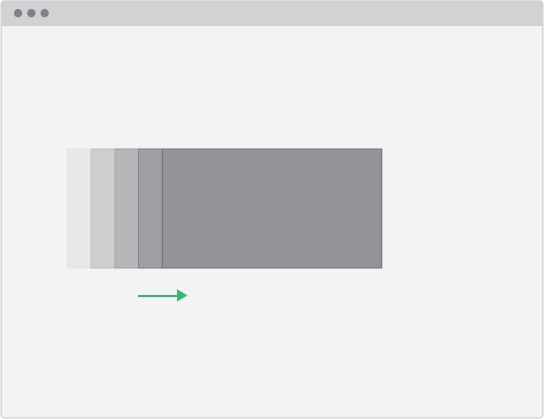
Figure 10-2: You don’t have to animate an element across the entire screen to ensure it helps make sense of what is happening. Short bursts of animation on the X- or Y-axis will keep your animations short and sweet.
Scale
Just like slide, when used in conjunction with fade, scale can be an excellent choice for transitions and animations. I mostly use scale when transitioning from one level of hierarchy to another. For example, say you’re designing a calendar app with two views—a month view and day view. The month view will be the topmost level of the app’s hierarchy, and the day view would be below it. Transitioning from month to day, you scale up the month view (from 1 to 1.3 on both the x and y) and also scale up day view (from .7 to 1). This creates the sense that you are literally “zooming” into the day (see Figure 10-3). Then the reverse animation, scaling down the day view (from 1 to .7) and month view (from 1.3 to 1), creates the sense that you’re zooming out of the day back to the top of the hierarchy. In addition to navigating levels of hierarchy, scale works well for button states, hover feedback, item selection, and showing callouts.

Figure 10-3: Scale can be used to transition between layers of hierarchy, creating a “zoom” effect.
Remember, using fade, scale, and slide together in deliberate short bursts is key for creating responsive, lightweight motion. If you get overzealous, you’ll likely end up with a cheesy PowerPoint rip-off.
Motion Principles
In the introduction to this chapter, I mentioned that back in the 1930s, Disney established a set of vetted animation principles that have guided its animators to producing some of the greatest animated films over the past 50 years. These principles were made public in a classic animation book called The Illusion of Life: Disney Animation that focuses deeply on guidelines for creating realistic character animations. The beauty of these animation principles is not only that they’ve proven to be successful for traditional animation, but also that they’re very relevant for creating UI animations.
There are 12 animation principles in total, and they focus on things like how the human body reacts to laws of physics and how to depict complex emotion. Of the 12 principles, I’ve picked a few that I think any UI animation can benefit from. With these basic principles in mind, you will be well equipped to create convincing animations that are appealing to the eye.
Slow In and Slow Out
If there were only one animation principle to remember, this would be the one. This principle is dedicated to the fact that most objects don’t instantaneously accelerate or decelerate in the real word. Objects need time to accelerate and decelerate as they move along a path (see Figure 10-4). And for this reason, easing an object from its starting position to its ending position creates a more realistic and aesthetically pleasing animation compared to a linear animation.
In UI animation, this effect can be achieved by implementing an easing function. Easing functions are mathematic functions that describe the value of a property given the percentage of completeness. In other words, easing functions allow you to achieve realistic acceleration and deceleration effects. Applying easing functions to your animations is one of the easiest ways to enhance the motion of your application. The only caveat is knowing which easing function to use and when to use it. No worries; in the “Easing Function” section coming up, you find out how to effectively use the various properties of easing functions.
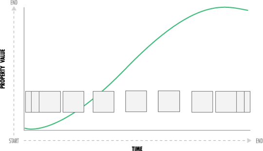
Figure 10-4: In real life, objects typically accelerate and decelerate slowly. The curve in this illustration represents the animation’s non-linear rate of change over time.
Squash and Stretch
According to famous Disney animators Ollie Johnston and Frank Thomas, the squash and stretch principle is the most important one in the animators’ toolbox. The purpose of this principle is to convey a sense of weight and flexibility. In addition, a key aspect to this principle is the fact that an object’s volume doesn’t change when squashed or stretched. Wikipedia gives the following example:
“If the length of a ball is stretched vertically, its width (in three dimensions, also its depth) needs to contract correspondingly horizontally.”
In UI animation, this principle is most commonly used for click, touch, or hover effects. For example, a button can stretch in its hover state and squash in its down state (scale up and scale down) see Figure 10-5. Depending on what kind of UI you’re animating, squash and stretch can help add a subtle element of playfulness and realism.
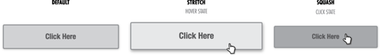
Figure 10-5: Stretch and squash effects support the feeling of direct manipulation in UI design.
Anticipation
Anticipation is most often used in traditional animation as a means to prepare the audience for an action, which adds to the realism and effectiveness of the action. In the real world, when you jump, you bend your knees in anticipation of the leap upward. When spectators see the bent knees, they can anticipate the jump before it even happens. This is a subconscious thing that happens in our brain, but when there’s no anticipation, an action or movement may be unexpected and jarring. Anticipation can add an element of character and personality to an object.
If you keep an eye out for it, anticipation shows up in UI animation all the time. For example, in Apple’s Keynote, when you click and drag a slide to reorder it, the neighboring slides will gently move out of the way in anticipation of you dropping it. There are many ways to implement anticipation in UI animation, but one easy way is to animate the object with a brief contrary movement followed by the full animation (see Figure 10-6). For example, say that you have a panel that will grow to reveal more information. Before it grows, it can very subtly shrink and then quickly expand to the expanded state. You can use this technique for just about any movement, and it’s easily implemented with Back EaseIn (see the “Easing” section later in this chapter). Anticipation is a subtle effect, but an important one for communicating a particular style or tone.

Figure 10-6: Anticipation effects can be easily created with a Back easing function.
Follow-Through and Overlapping Action
Both follow-through and overlapping action are principles dedicated to simulating the realistic movement of objects. Follow-through describes how separate parts of an object will continue to move after the main object has come to a halt. And overlapping action describes the concept that parts attached to an object tend to move at different rates (arms attached to a body move at a different pace than legs). This is usually seen when attached parts, like hair or arms, take a few frames to catch up to the torso.
These are two of my favorite animation principles; together they can create complex yet elegant motion treatments that are sure to delight any user. In UI animation, implementing follow-through is almost identical to anticipation, except it’s the opposite. Instead of using Back EaseIn, use Back EaseOut, which will gently overshoot the animated object past its destination and settle it into place. Easing functions can be used to manipulate an object’s movement over time and are found in many programming frameworks like jQueryUI (see the easing function section below for a deeper look). Overlapping action or stagger is an awesome and relatively simple technique that can be created by giving your animated objects different timings (see Figure 10-7).
For example, say that you have a collection of items on the screen and you want them to fan out in a circular formation (like a radial menu). You could animate them all at the same time, which would be typical, or you could vary each object’s start time to create a nice stagger effect. This technique works by staggering the start time, the duration, or the distance of each object by some interval. The interval can be fixed if you have a small number of items, say 33ms, but if you have a long list of items, after the first few, staggering every item onto the page will be cumbersome. For animating many objects, it’s best to scale the interval value down over time. Examples of this technique are shown on this book’s website (http://designsforsoftware.com).
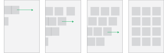
Figure 10-7: Varying the start time of a collection of animations creates a nice stagger effect.
Arcs
This principle is based on the concept that most natural actions tend to follow an arched trajectory. For example, in basketball, when a player shoots a ball, it doesn’t travel in a straight line to the hoop; it moves along an arc between its start and end points. This is true not only for balls but also for almost everything, ranging from pointing fingers, to airplanes, to speeding bullets. The arc will relish the movement, giving it a more realistic appeal than a simple linear animation will.
This animation principle makes a lot of sense, yet I haven’t noticed many applications that implement it. One that comes to mind is the Mail application built into Mac OSX. When you press the Reply button on a message, a duplicate message literally jumps out of the window (on an arced path) into a new window. Another good use for arcs would be as an alternative to the overused spinning carousel; instead of revolving the product around in space, you could present the items along a curved path (see Figure 10-8). Regardless, one easy way to implement arcs is by using a different easing function for the X and Y movements of an object. For example, to animate an object from (0,0) to (50,50) on a curved path, use a Sine easing function for the X movement and a Cubic easing function for the Y movement.
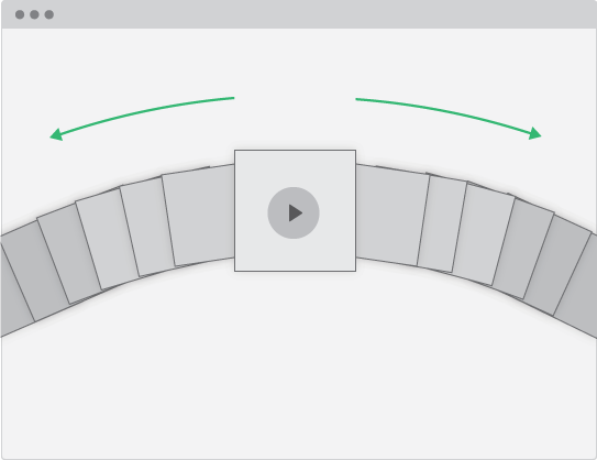
Figure 10-8: Using arcs for presenting items can create fun and interesting layouts.
You may have to experiment a little to wrap your mind around all of these principles and how to use them. But understanding these core motion concepts gives a huge payback in the wide variety of animations you can create.
Easing
In the real world, an object doesn’t suddenly spring to life with instant velocity—it takes time to accelerate and decelerate. One example is the driver behind of one of the most important Disney animation principles, the Slow in Slow out. In addition, eased motion has an aesthetic quality. Most things in nature have some type of organic easing, making their movement very fluid and attractive. In UI design, eased motion is typically something that is easily produced with easing functions, or tweens. However, there are quite a few easing functions and some tricky lingo I’d like to explain in this section.
Ease-In
By using the Ease-In property, motion will start slow and gradually speed up (see Figure 10-9). Initially, this may seem backward, because the object doesn’t ease into its final position; rather, it eases into the movement.
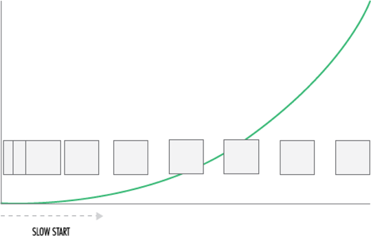
Figure 10-9: The Ease-In property produces motion that starts slow and ends abruptly.
Ease-Out
With Ease-Out—the opposite of Ease-In—the motion starts fast and gradually comes to a stop (see Figure 10-10). In practice, I set Ease-Out as the default property for animation in my applications. Ease-Out is my preference when creating short, lightweight motion with a nice natural finish.

Figure 10-10: The Ease-Out property produces motion that starts fast and ends softly.
Ease-In-Out
If you can’t decide between Ease-Out or Ease-In, Ease-In-Out might be the one for you. This easing property produces the most natural-looking motion, because it mimics the realism of true acceleration and deceleration (see Figure 10-11).
Other Types of Eases
In addition to the In-Out properties of easing functions, there are a bunch of eases that can be used to simulate a variety of movement. I won’t try to explain the subtle differences and the math behind each easing function, but this section covers the ones I use the most.

Figure 10-11: The Ease-In-Out property produces motion that starts slow and finishes slow, which is similar to how things move in nature.
Back
A Back ease will gently overshoot or create a short contrary movement to your animation. Used in conjunction with the Ease-Out property, you can use the Back ease to produce the Disney follow-through animation principle. Additionally, using a Back Ease-In, you can create anticipation.
Elastic
By using the Elastic ease, you can create a compelling spring effect without having to implement a full physics-based spring model. This ease works well as an attention-getter, but shouldn’t be overused in applications that focus on productivity.
Bounce
Similar to Elastic, the Bounce ease can simulate the bounce of an object without having to write physics code to simulate mass, gravity, force, and so on.
Cubic
The Cubic ease is my go-to ease for animating UI elements. I personally think it has the right balance of speed and grace to make animated objects look fluid and natural.
Linear
The Linear ease doesn’t actually produce eased motion, but it can be useful for simulating robotic or machine-like movements.
NOTE
Quite a few other easing functions are worth checking out, some very dramatic and others very subtle. I recommend experimenting with them to determine which ones best fit your purposes. For a deeper dive into easing functions, check out the free chapter on easing available on Robert Penner’s website (www.robertpenner.com/easing).
Advanced Motion Techniques
At this point, I’ve eased (pun intended) into basic motion concepts, and I’d like to finish the chapter with two of my favorite techniques. These techniques are slightly more advanced than those explored so far, but the sheer number of times they’ve come in handy for me makes me think they’re worthy of mention.
Follow
Follow is one animation gem that I constantly find different uses for. This technique could also be considered a simple easing function, but I call it the follow because of the visual effect it creates. This technique is mostly used in cases where you need to deliberately move an object to a target. For example, say that you want an object to follow the mouse. Most of the time, you don’t want that object to stop dead when it arrives at its target. It’s more pleasing to see the object gradually slow down as it gets closer to its target. This concept of smoothly interpolating between two values can be applied to almost anything—Tracking hand movements , simulating smooth camera movement, animating between two numbers, animating between colors, and much more. The formula looks like this:
object.x += (targetX - object.x) * easing;
object.y += (targetY - object.y) * easing;
The basic idea is that an object’s velocity is a function of the total distance from the target. The easing number is usually a decimal between 0 and 1. The lower the number, the slower the follow will be; the higher the number, the more quickly it will arrive at the target. I’ve used this simple easing concept in all types of applications ranging from games to line-of-business apps. Because the concept is a little difficult to articulate without an interactive demo, I’ve included a fully implemented example on the book’s website.
Cognitive Tomfoolery
I can’t remember exactly when I learned about this technique, but I’ve been using it ever since. Earlier in this chapter, I mentioned that the ideal timing for animations is generally between 150-350ms. Keeping your animations short and focused is essential for maintaining a UI that’s snappy and efficient to use. With that said, often it can be challenging to stay within that timing range. Luckily, cognitive tomfoolery is here to help.
This concept is based on the fact that your eyes don’t need to see a fully completed movement to understand what is happening. For example, say that you have an object onscreen that you want to flip (rotate 180 degrees in 3D space). You don’t actually have to make the object rotate the full 180 degrees to communicate to the user that it’s flipping. You can rotate the front of the card 45 degrees and then rotate the backside from 135 degrees to 180 degrees to achieve the flip effect (see Figure 10-12). And even though you don’t spin the card a full 180 degrees, the user’s brain will actually fill in the blanks, and the animation will still be effective.
This concept is very versatile and can be used for many types of animation and transition, such as slide, opacity, and scale. If your UI contains a lot of motion, this technique can shave a few milliseconds off your animations and keep everything smooth and consistent

Figure 10-12: Activating the flip effect.
Summary
The static nature of a printed book doesn’t lend itself to be a great medium for demonstrating motion concepts. So I created an animation section on the book’s website that demonstrates many of the concepts in this chapter with full code samples for use in your own applications. Be sure to check it out.
Motion is a beastly topic, one that you can base an entire career on. Regardless, motion should be considered a first-class citizen in any modern application design, and you now know everything you need to start creating motion in your next project. The bit of work it takes to understand the concepts in this chapter will give you a big return in the overall polish and usability of your software.
This chapter successfully wraps up the visual design part of the book. Phew! If you’ve hung in there, be proud. You’ve explored some fairly deep design concepts and now have a good understanding of the level of detail that’s associated with creating high-quality software designs. Even if you don’t fully understand how to perfectly pair typefaces, pick the perfect shade of color, or choose the appropriate animation easing function, that’s okay. Having a baseline knowledge of the various disciplines of design will help you not only tackle these design challenges yourself, but also give you a serious advantage over your dev-only, or design-only counterparts.
But you’re not done yet! The next part of this book is dedicated to the psychology behind well-designed applications. You explore what it takes to really engage your user’s mind to create an optimal experience. Understanding how information leaves the screen and enters your user’s consciousness is something that should be controlled, not left to chance. By doing so, you can dramatically improve the behavior and usability of any digital product or service. So, stay tuned for Part III!