BIG IDEA 5
Reasoning with Proportions
There’s an instructional strategy I really like, one that I now use in all of my teaching and that can be put to good use in this big idea. I show students a visual of a mathematical idea—which can be as simple as a collection of dots (https://www.youcubed.org/resources/jo‐teaching‐visual‐dot‐card‐number‐talk/)—and ask them what they see. I then collect all of the students’ ideas on a board at the front, no matter how good or correct they seem to be, usually putting the student’s name onto the idea for later reference. In the activities in this Big Idea we encourage you to engage students in similar ways, collecting their ideas and naming them so that they feel ownership for them. In this big idea, we are encouraging quantitative literacy by asking students to, at first, make sense of a complex and interesting graph. The students are asked to make sense of data that is shown through multiple representations in the first two activities in the big idea. This is a good time to encourage students to come up with their own ideas of what they see in the graphs, and to accept those ideas without judgment, using them as a source for discussion. Being able to read and make sense of complex data shown through different representations is one of the most important areas of mathematical literacy that students need to develop.
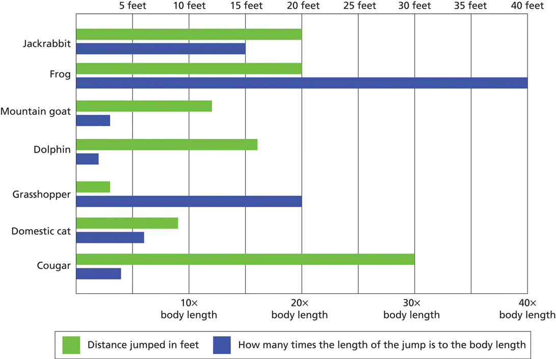
In the Visualize activity, students are invited to read a graph of animals’ jumping distances, which we think they will find really interesting. The graph presents data in a way that students are likely to be unfamiliar with, and this is an excellent time to invite students to tell you what they see. You can lead a class discussion on what the graph is showing. We intend that after an initial opening, students read the graph in pairs, annotate it so that they can think and write, and then discuss what they see as a class. Once they have worked out what the graph shows, they can, if they want to, add their own data to the graph.
In the Play activity, students are presented with task cards that show two different pieces of data for some animals. They are then invited to make their own proportion from the data they choose and create a graph illustrating the data—similar to the graph they saw in the Visualize activity. This will give students an opportunity to make choices—an important part of mathematics—and create a graph with information that they have decided, together, to show and collect. We expect that this activity may prompt interesting conversations because some groups may choose the same task card but present the data in different ways.
In the Investigate activity, we ask students to consider a pattern based on a square table with four seats around it. In the previous lessons, students have looked at unit rates and proportions. In this activity, they will consider a unit rate that they develop for the tables and chairs in a restaurant. Students will be making and exploring patterns, and they will need to pay attention to certain constraints; both exploring patterns and considering constraints are intrinsically mathematical acts. The constraint in this investigation is that there is only one chair for each square side of the table. Instead of focusing on a single answer, they will be asked what they think is the most efficient way of seating people. Different table arrangements will yield different results. Students will be asked to justify their reasoning. We conclude by asking students to think about the ways this activity is connected to the ideas of area and perimeter.
Jump! Jump!
Snapshot

Students visualize proportions by exploring a graph of animal jump length in proportion to body length. As they make sense of the data, students explore how proportions change the way they understand the animals the data represents.
Agenda
| Activity | Time | Description/Prompt | Materials |
| Launch | 10 min | Show students the Animal Jump Graph sheet and ask, What does this graph show? Discuss students’ interpretations and be sure they understand the different information being communicated by the two kinds of bars. Tell students that comparing body length to jump length is a rate called a proportion. | Animal Jump Graph sheet, to display |
| Explore | 25–30 min | Partners explore the Animal Jump Graph sheet and annotate it with their observations. Students explore how the proportion data changes their thinking about the animals. Students add themselves to the bar graph, collecting the length and height data they need. |
|
| Discuss | 15–20 min | Discuss what students noticed in the graph and annotate a class copy of the graph with all observations. Discuss the way the proportion data changed their thinking about the animals and what they discovered when they added themselves to the graph. |
|
To the Teacher
The double bar graph of animal jump lengths that is the focus of this lesson is based on one created by Steve Jenkins (2016) in his spectacular book Animals by the Numbers. We’ve included some less accomplished jumpers than he did to encourage interesting comparisons and to help students see how humans fit into the animal jumping world. This book is an outstanding resource for data about animals, presented in novel infographics, and if you have the book on hand, consider making it available to students as you explore proportions, ratios, and rates.
When you present the Animal Jump Graph sheet to students, resist the urge to tell them how to read the graph. Let them make some observations and struggle with it in their groups. It is important that they understand that the two different types of bars communicate different kinds of information, and that the pairs of bars are each about a single animal. But they may not understand all of the kinds of data embedded in the graph, the kinds of comparisons they can make, or why having these two kinds of bars is useful. As you circulate while students grapple with the graph, you may find it useful to simply point at individual bars and ask, What is this bar saying? Students will need to examine individual data points before they can make sense of the whole.
Activity
Launch
Launch the activity by showing students the Animal Jump Graph sheet on the document camera. Ask, What does this graph show? Give students a chance to turn and talk to a partner about what they notice and how they interpret what they see. Collect a few student ideas and make sure students understand what the two bars represent. You may want to specifically point to the two bars for one animal and ask what each bar shows. Point out that the bars that compare jump length to body length are a kind of rate that we call a proportion. This discussion is not meant to be exhaustive. Rather you want to make sure students have enough understanding to explore the graphs further.
Explore
Provide each partnership with a copy of the Animal Jump Graph sheet. Students explore the question, What observations can you make about this graph? Students annotate the graph with observations, comparisons, and questions. As students explore the information in the graph, they try to answer the following questions:
- What does this graph mean? What does it tell us?
- What statements can you make about the data?
- How do the proportions change the way you think about comparing the animals?
- What does the graph teach you about the animals?
Once partners have explored the data in the graph, ask them, Can you add yourself to the graph? Invite students to collect whatever data they need to figure out what their human jump would look like on the graph.
Discuss
Gather students together to discuss the following questions. Be sure to display a copy of the Animal Jump Graph sheet as a shared reference.
- What did you notice in the graph that helped you make sense of it? Did you make mistakes in reading it? What did you learn?
- What observations did you make? (Annotate the class copy of the graph.)
- What’s the most surprising thing you noticed?
- How did the proportion data change the way you thought about the data and comparisons?
- What did you find when you added yourself? How do you compare to other animals?
Look‐Fors
- Are students making observations, or are they stuck? As long as students can make sense of the graph, allow them to work. But if students seem stuck or overwhelmed by the data, focus attention on one bar, one animal, or one comparison. Ask, What does this bar mean? What does this part of the graph tell us? How can this help you read the rest of the graph? For each bar students interpret, encourage them to write down next to the bar what they think it means. This will help them compare different bars and see patterns.
- Are students noticing contrasts in the graph? The graph shows some interesting contrasts, in which an animal’s jump appears either long or short in absolute length, but then has an opposite appearance in proportion to its body length. Interpreting these competing meanings requires students to understand each of the individual bars, see that they are in conflict, and then make sense of that conflict. You might simply ask, Why are these bars so different? What does that mean?
- How are students finding the proportion between their own body length and jump length? Regardless of individual variation in both body and jump lengths, your students should be noting that they can jump approximating one body length. However, students may get so absorbed in measuring with precision and trying to achieve the longest jump they can that they lose the proportional thinking necessary. In fact, less precision is better in this circumstance, because it makes little difference in the graph whether a student can jump 0.89 or 1.04 body lengths. At the level of precision of the graph, these are both equivalent to 1 body length. Similarly, if students use calculators to determine the rate of body lengths per jump, they may see an answer with a long string of decimals that immediately confuses. You might simply ask, About how many body lengths did you jump? Focusing students’ attention on the body length as a unit, rather than inches or feet, may help them simplify the comparison.
Reflect
What do proportions help us see? When might a proportion help you see something new?
Reference
- Jenkins, S. (2016). Animals by the numbers. Boston, MA: HMH Books.

 Animal Jump Graph
Seeing Animals in a New Way
Snapshot

Building on the Animal Jump Graph in the Visualize activity, students play with ways to represent animal data that use proportions and help readers see the animals in a new way.
Agenda
| Activity | Time | Description/Prompt | Materials |
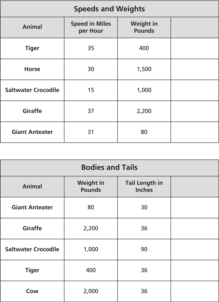
| Launch | 10 min | Remind students of the work they did with the Animal Jump Graph sheet and how the observations they made using proportion data changed their thinking about the animals. Tell students that today they will develop ways to display proportion data about animals. Show them the Animal Data Task Cards, and invite them to choose one to work with. |
|
| Play | 40–45 min | Partners choose one Animal Data Task Card and work together to develop a visual way of presenting proportion data based on the information on the task card. Students find proportions based on the data, create a display that illuminates the data, and present their findings on a chart. |
|
| Discuss | 20+ min | Partners post their charts and the class does a gallery walk, focusing on the ways the data displays change their thinking about the animals and on the connections they see between displays. Discuss what students noticed. Debrief how students designed their displays, what challenges they faced, and how they thought about precision. |
To the Teacher
This lesson builds on the work students did to interpret the Animal Jump Graph in the Visualize activity. We encourage you to use the artifacts you and the class created during that lesson as a jumping‐off point for this activity. Students will likely want to refer back to the Animal Jump Graph to think about how it was constructed to convey the proportion data or how two kinds of bars can be placed side by side. We ask students in this activity to think creatively about a data set, find proportions, and then display that data. Students may want to make a display that mimics the structure of the Animal Jump Graph, or they may want to create something different, simpler, or more innovative. If possible, we encourage you to have a copy of Steve Jenkins’s book available for students to browse the different ways he chooses to display animal data. Once students have found the proportions they want to display, they’ll need to make decisions about how to display that data for clarity. Jenkins’s book provides useful ideas that students may not have encountered and can spark creative ways to communicate data. Be sure to celebrate the ways students try, even if they are not successful. Ask students to talk about what they were trying and what made displaying the data challenging. Do not expect beautiful graphs like Jenkins’s; rather, expect and spotlight students’ messy attempts and the risks they took.
Activity
Launch
Launch the activity by reminding students of the work they did with the Animal Jump Graph in the Visualize activity. Show the class the annotated graph from that activity. Tell students that this was a visual way of displaying animal data and a proportion that allowed us to see jumping in a new way. You may want to remind students of the interesting observations they made using the proportions, and the things that surprised them.
Tell students that today they are in charge of creating a display to show animal data. These displays could be similar to the Animal Jump Graph or they could be a new way of seeing the data, but they need to include some proportional data that will help us see the animals in a new way.
Show students the four Animal Data Task Cards on the document camera. Invite them to turn and talk to their partner about which data they would like to work with today.
Play
Students work in partners with the task card of their choice. Invite students to create a way to display the data that includes proportions and helps us see the animals in a new way. Each task card contains a blank column for students to add proportion data.
Students will need to think about what proportion they want to display. For instance, the data would look different if students found the number of tongue lengths per body length, versus the number of body lengths per tongue length. Finding this data will require some rounding, and students will need to reason about how precise they need or want to be in this kind of data display.
Partners discuss how to display their data and how they want to organize it to draw attention to surprises or interesting contrasts. For instance, does it make sense to organize the animals from greatest to least in some measure? What measure matters?
Partners make a chart to show what data they have found and how the data can be made visual. Provide students access to charts, markers and colors, grid and dot paper (see appendix), rulers, calculators, and tape. Students may want to make their graphs on grid or dot paper and tape them onto a larger chart, or they may want to draw their graphs much larger, directly on the chart.
Discuss
Ask partnerships to post their charts around the room. You may want to cluster them by the data they display. Invite the class to do a gallery walk, and as they walk students should discuss with a partner the following questions:
- What surprises you about the animals?
- How do the displays help you see new things?
- How do the proportions change your thoughts about comparisons?
- What do you wonder now?
- Where do you think you would fit on the graphs?
- What connections do you see across the graphs?
Discuss with the class the questions they considered as they examined the different charts. Then focus the conversation on the following questions:
- What did you have to do to design your displays?
- How did you find your proportions?
- How precise do you think the proportion data needs to be to communicate differences accurately and effectively?
- What was challenging and why?
Look‐Fors
- Are students thinking about iterating units to find proportions? When thinking about proportions, students will need to consider what unit they want to iterate. For instance, in the tongue length data, students could use body length as the core unit and iterate tongue lengths to ask, How many tongue lengths make one body length? It is conceptually useful for students to be thinking about iterating units, rather than simply thinking about the rate as division. When students focus on dividing numbers, the numbers often lose their meaning, and students simply read the digits on the calculator display as the answer. Students can lose sight of what they are dividing, why, and what it means. Encourage students to think about the units they are using and what they are imagining. You might ask, So, are you thinking about how many tongue lengths make a body length, or how many body lengths make a tongue length? When you look at the data, about how many tongue lengths would you expect make a body length for this animal? Encourage students to estimate, imagining iterating the tongue length repeatedly down the length of the animal’s body, before they use the calculator. Estimating with meaning before calculating will help students make sense of the precise answer when it is displayed.
- Are students rounding data? The proportion data that students find will include many decimal places, as naturally occurring data often does. Although students could choose to display data with all its decimal places, it does not make sense to do so when comparing different kinds of animals. Students will need to determine how to round the data so that it is still reasonably accurate, but it also makes it simpler for the reader to make comparisons between the animals presented. Ask students, How will you round this data to make it easier for the reader? If you round it in that way, is it still accurate? How do you know? Students often want to present the most accurate picture and may refuse to round, because in their view, rounding makes the data less correct. It can be difficult for students to see why presenting less accurate data is advantageous. You might ask, What’s the big idea you want the reader to understand from this data? How accurate does your data need to be for your reader to see this idea?
- What innovative ways are students creating to display their data? Students may want to emulate the Animal Jump Graph, and we think this is a fine entry point for displaying proportion data. This graph can serve as a useful model for students, and you may want to give students access to this graph again so that they can see how it is constructed. However, this is not the only way to display this kind of data. Students may want to orient bars vertically, show only the proportion data, or turn the display into a pictograph. Draw attention to innovations that students design in their data displays, even if they are only modestly different from the model. Ask, Why did you make this choice? How do you think it helps the reader? What were you trying to help the reader see? In the class discussion, you may want to specifically highlight the differences among displays and what they allow the reader to see in the data. Ask the class what features helped them most or what made it easier for them as a reader to understand the data.
Reflect
What do proportions help us see? When might a proportion help you see something new?
Animal Data Task Cards

Animal Data Task Cards
A Seat at the Table
Snapshot

Students investigate the relationship between seats and tables at a restaurant, developing ways to communicate this relationship using proportions, ratios, and unit rates.
Agenda
| Activity | Time | Description/Prompt | Materials |
| Launch | 10 min | Show students the Restaurant Table Unit sheet and explain that a restaurant uses these tables to seat customers. Ask, If each person needs one side length, how many people can be seated at two tables pushed together? Discuss what this will look like, what students notice, and why doubling the number of tables does not double the number of seats. | Restaurant Table Unit sheet, to display |
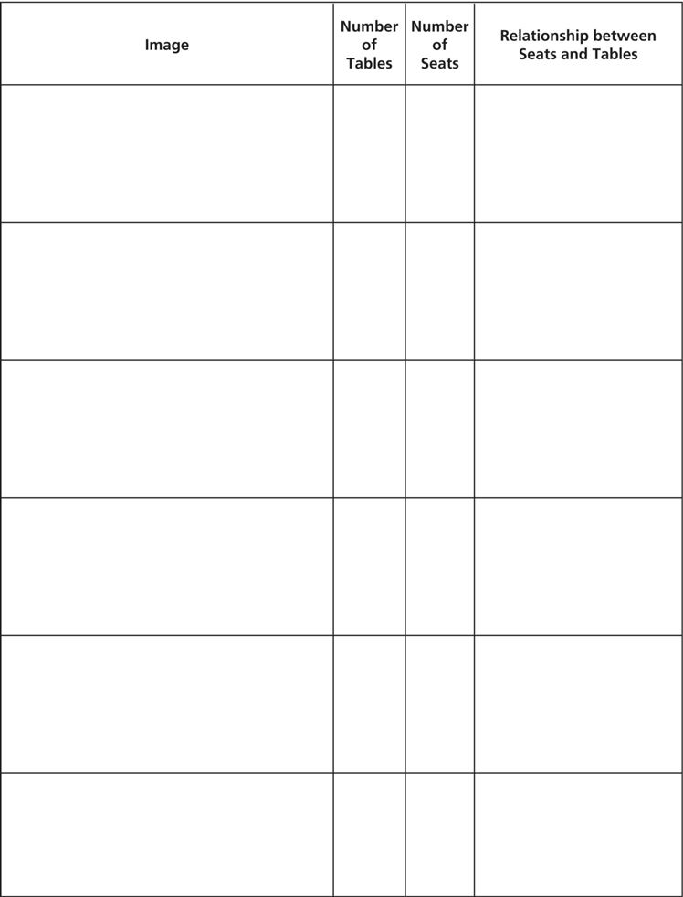
| Explore | 30–40+ min | Partners explore how many people can be seated at different numbers of tables, and what arrangements are possible. They record their findings in a Table Table sheet and develop ways of communicating the relationship between seats and tables. Students work to answer, What is the most efficient way of seating customers? |
|
| Discuss | 15+ min | Discuss the class’s findings, the patterns they observed, and what makes the most efficient arrangement of tables. Ask, What ways did you develop to communicate the relationship between seats and tables? Name these methods using the language of proportion, ratio, and unit rate. Discuss the connection between the seats and tables and perimeter and area. | |
| Extend | 20–30 min | Partners investigate how many people could be seated at a restaurant that had 36 square tables, generating all the possible combinations and looking for the most and least efficient ways. | Make available: square tiles, grid paper (see appendix), and colors |
To the Teacher
In this activity, we shift from animal data to other ways proportions are seen in the world, to encourage students to see that rates are everywhere. At this point, students have had experience with both unit rates and the concept of proportions, so in this investigation of seats around tables at a restaurant, we invite students to develop ways of communicating that relationship. Students may develop a unit rate, such as 4 chairs/table, 3 chairs/table, 2 chairs/table, and so on. Students may develop a proportion, as with the animal data, such as that chairs are 4× the number of tables. Alternatively, students may invent a relationship that could be called a ratio, in which two quantities are compared, such as that the relationship between chairs and tables is  and so on. Ratios can be communicated like this, as fractions, or as a comparison using a colon (such as 4:1) or words (such as 4 to 1). In your closing discussion, highlight all the ways students developed to communicate this relationship, and name each of these using the terms proportion, rate, unit rate, and ratio, so that students can see how all of these conventions could be used to communicate the same data in different ways.
In the closing discussion, we invite students to consider the connection this investigation has to area and perimeter. Each table can be considered an area unit of 1, with a perimeter of 4. As the number of tables increases, the perimeter increases, but at different rates depending on the arrangement. For instance, four tables arrayed in a line have a perimeter of 10 units (or seats); the same number of tables arrayed in a square has a perimeter of 8 units (or seats). In previous grades, students have explored the relationship between perimeter and area, and this investigation gives students an opportunity to draw connections between those concepts and proportions, rates, and ratios. By making these connections, students develop these concepts of proportional reasoning as simply extensions of previous thinking, rather than new, isolated ideas.
Activity
Launch
Launch the activity by showing students the Restaurant Table Unit sheet on the document camera and telling them that at a restaurant, there are a large number of these square tables that can seat four people. At a table, each person needs one side length of space to have enough room to eat. The restaurant can put tables together to seat larger groups.
Ask students, What do you think will happen if the restaurant puts two tables together? What will it look like, and how many seats will there be? Give students a chance to turn and talk to a partner, then invite students to come up and draw what two tables together could look like. Use this opportunity to make sure students understand that each chair needs a side length of space and that the two tables must adjoin along a side. This means that the only solution for joining two tables will look like the image shown here.
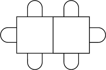
Arrangement of two tables and six chairs
Ask students, What happened to the number of chairs? What do you notice? Collect some student observations, and draw attention to the idea that doubling the number of tables did not double the number of chairs. Ask students why they think that happened. You may want to have students turn and talk or to discuss this question as a class.
Tell students that today they are going to be exploring what happens when the restaurant puts tables together to seat larger groups and what different arrangements can be made.
Explore
Students work in partners to investigate the different arrangements of tables possible at a restaurant. Provide students with square tiles, grid paper (see appendix), colors, and a copy of the Table Table sheet for recording what they find. Students investigate the following questions:
- For any number of tables, what different arrangements of the tables are possible?
- How many chairs will fit for each arrangement?
- What is the relationship between the number of tables and the number of chairs?
- What patterns do you notice?
- The restaurant wants to be able to seat people as efficiently as possible, getting the most chairs per table. What is the most efficient arrangement possible?
For each arrangement of tables students find, they record it in the Table Table sheet. Students sketch the tables and chairs, record the number of tables and chairs, and develop a way of communicating the relationship between the tables and chairs in the arrangement. Note that while one and two tables have only one possible arrangement, three or more tables can be arranged in multiple ways, not all of which seat the same number of people. Encourage students to consider all the ways of arranging these tables.
Discuss
Gather students together to discuss what they have found. You may want to collect the data students have generated into a class table so that you have a shared document to discuss and use for pattern seeking. Discuss the following questions:
- What patterns did you notice as you put tables together?
- How can you see those patterns in your table?
- What ways did you develop for expressing the relationship between the number of tables and number of chairs?
- What is the most efficient way of seating people? How can you tell?
During this discussion, draw attention to and name the different ways students thought about the relationship between tables and chairs. For instance, some students may have used unit rates to make comparison easier, while others may have written theirs as a proportion or ratio. These are related but different ways of thinking about the relationships, and it will be useful to have names for each as they emerge.
Finally, ask the class to consider how this investigation is connected to area and perimeter. Some students may have already made some connections during the investigation. You may want to give groups time to talk about the connection before discussing this as a whole class. Discuss the following questions:
- How are the tables and chairs connected to area and perimeter?
- What does our investigation of tables and chairs tell us about area and perimeter?
Extend
If the restaurant has 36 tables, how many people could it seat? How would the tables be arranged to seat the greatest number of people? How would the tables be arranged to seat the fewest number of people? How do you know? Explore the combinations possible. How could you record your thinking so that others can see your evidence and patterns?
Look‐Fors
- Are students seeing multiple ways of arranging tables? Students may be tempted to simply array the tables in an ever‐growing line. However, once students have three or more tables to connect, a line is not the only way of arranging the tables. Ask students, Is this the only way the restaurant could join the tables together? What else could they do? Do different arrangements of the same number of tables seat the same number of people? How could you find out?
- What ways of communicating the relationship between seats and tables have students developed? We have left this column of the Table Table sheet open to different ways of communicating the relationship between seats and tables so that students can develop ways to represent this idea. As discussed in the To the Teacher section, students may draw on the work with animal data to use a proportion, or on the work in the previous big idea to use a unit rate. Both of these are appropriate and could be used with accuracy to communicate and compare relationships. However, some students may develop new ways that could be called rates or ratios, and students are likely not to use conventional ways to do so. They may simply want to say that there are “8 seats for 3 tables” or “8 seats/3 tables” or “8 to 3.” Encourage students to be consistent within their own data, and ask how they chose this particular way of capturing the relationship. Ask questions that prompt them to think about using these to compare, such as, How can you tell which is the most efficient way to arrange the tables using these relationships? It is not necessary that students revise their methods or all use the same method. In fact, a diversity of methods will give the class more to discuss and help them form conclusions about what methods seem to be the most useful in this context.
- Are students connecting seats and tables to perimeter and area? Each table can be seen as 1 unit of area, with a perimeter of 4 units. Students may use the language of seats and tables as they work through this investigation, but you may also hear some students using language that connects to the concepts of perimeter, such as how many seats we can place “around the table,” or that an arrangement has more or fewer edges. Listen for language that connects to area and perimeter so that you can highlight and draw on these ideas in the class discussion.
Reflect
Where do you see proportions, rates, or ratios in the classroom right now? Draw pictures to help explain your thinking.
Restaurant Table Unit

Table Table