BIG IDEA 6
Visualizing the Center and Spread of Data
Mean, mode, and median are three measures of central tendency; if you think back to your learning of them in school, you will probably remember different numbers and calculations that had one correct answer. In our designing of tasks for this big idea, we have chosen tasks that focus on the meaning of the three measures and that ask students either to see them visually or to work with the measures conceptually. We have again chosen to present data in different ways to help students develop quantitative literacy. It is ideal if students approach any data set knowing they have learned a set of tools and a mathematical mindset that they can bring to the data, exploring them to see what they mean and what they reveal.
Mean, mode, and median are three tools that can be applied to any set of data to reveal different, interesting properties of the data set. Often the mean is the best average to use, and it is one that many people use in their lives when they want to work out an average, but it isn’t always the best average to use. Sometimes there are numbers in a data set that are wildly out of synch, and when that happens, the mean may give a value that is unlike the other data in the set. The median and the mode do not get thrown off by unusual data values. The mode—the number that occurs most frequently—is a term used in life, often in fashion. When something is “in mode,” it means it is regularly seen, as with the modal numbers in the data set. One time that the mode is really useful is when the data are not numbers but names. For example, if we looked at the most common baby names in the US, we might say that the mode is Emma. Mode is also used with sets of numbers, when the mean and the median do not make as much sense. The median value is the one in the middle of the data set when it is ordered, and the average of the two in the middle when there is an even number of data points. It is good to have students think about the meaning of the three different averages, or measures of central tendency, and consider when one is more appropriate than the others.
In our Visualize activity, students will be given real data on hurricanes in the Atlantic Ocean to analyze. The opening activity starts with the 2017 data, which it shows in a line plot. Students will discuss the shape of the data in small groups and then in pairs. After the class discussion, groups will choose from four different data sets of hurricanes in the Atlantic for different years so that they can analyze the data and share their findings. The different representations of data we are focusing on are line plots, bar graphs, a data table, and a list. Different groups may be analyzing the same data set but displaying it in different ways. In the final discussion, they analyze the different ways they have displayed the data as well as analyze the data across the years for 1977, 1987, 1997, 2007, and 2017. The time frame shows the way the weather is changing, which connects to the idea of climate change.
In the Play activity, students will get an opportunity to see the concept of the mean visually. So many times, students only see concepts numerically, missing an important time to develop brain connections and to understand more deeply through visual engagement. In this activity, students will also be able to move with their hands and use models, which has also been shown to enhance understanding of mathematics at all grade levels. They will be asked to build a representation of different data sets with snap cubes and then represent the mean. We anticipate that students will balance out the cubes by moving different ones so that the representation shows a rectangle. After the class has discussed this, they will collect their own data by rolling a die and seeing how they can average out the representation when they roll the die a different number of times. Students will get a lot of opportunities to think physically and visually about averages and what they look and can feel like.
The Investigate activity gives students an opportunity to think conceptually about the three averages and the differences between the three ways of measuring central tendency. I really like that this activity asks students to think deeply about the relationships between the three measures and not just perform a calculation. It is an open investigation, which means that students will be able to explore patterns, and the patterns they explore can extend to the sky, as students can keep moving onward with different sets of numbers. The investigation is conceptually difficult, as students have to consider different constraints at once; that is good, as it will give them important times of struggle and will offer opportunities for the teacher to give positive messages about the benefits of struggle for brain growth. Teachers can also remind students that looking for patterns is a mathematical act; it is really the essence of what mathematics is.
The Shape of Data
Snapshot

Students explore the shape, center, and spread of data by examining hurricane data sets and describing what they see.
Agenda
| Activity | Time | Description/Prompt | Materials |
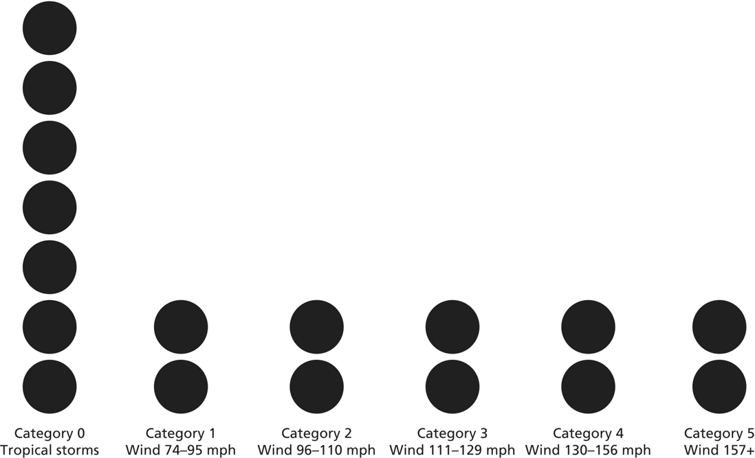
| Launch | 10 min | Show students the Atlantic Hurricanes of 2017 line plot and ask, What do you notice? Collect students’ observations and annotate the graph. Tell students that today they will be exploring the shape of data. | Atlantic Hurricanes of 2017 sheet, to display |
| Explore | 20 min | Partners explore the Atlantic Hurricanes of 2017 line plot to determine the shape, center, and spread of the data. Students explore what this shape tells us about hurricanes that season. | Atlantic Hurricanes of 2017 sheet, one per partnership |
| Discuss | 15 min | Discuss the shape, center, and spread of the data students explored. Annotate the graph as students offer observations. Create a chart called Ways We Describe the Shape of Data to capture vocabulary that arises in the discussion. |
|
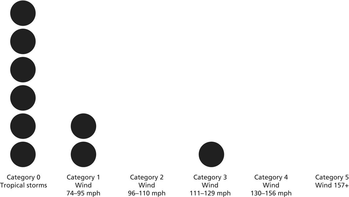
| Explore | 20–30 min | Partners choose from four different data sets, each from a different year and displayed differently, to explore the shape, center, and spread of the data. Students can transform the data into a different display to help them see these features. Partners compare this data set to the 2017 data. | Atlantic Hurricanes of 2007, 1997, 1987, and 1977 sheet, multiple copies for partnerships to choose from |
| Discuss | 20 min | Each group presents their conclusions about the graphs, from 1977 to 2007. Looking at all of the data, compare the data sets and how different displays allow or inhibit seeing the shape of data. Discuss the conclusions the class can draw or questions that can be posed based on the five years of data. |
To the Teacher
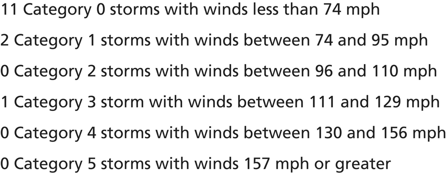
For this activity, we have drawn on actual hurricane data from five years spread across four decades. If your students are not familiar with hurricane categories, it will make sense to spend some time addressing what the categories mean in the broadest sense, particularly that a larger number means a more powerful hurricane. For the sake of the data presentation, we have added a Category 0, which refers to tropical storms and depressions, or storms that could have become hurricanes but did not reach sufficient intensity. Naming these as 0 will allow students to use measures of central tendency, such as median, mode, and mean, which can only be used with quantitative data. However, this is not a standard naming of these storms, and students familiar with hurricane naming conventions will likely want to understand what this invented term means.
The goal of students’ exploration of these data is to create a need to express qualities related to the shape and spread of data, in order to describe and compare data sets. Students are often asked to find measures of center but without those measures being needed, useful, or well understood. In this activity, students may use these terms, or they may use the ideas without the language, such as describing one category as being the most common rather than the mode. Capitalize on opportunities to label the features of the data using the language of statistics, but focus on the meaning of these terms and what they tell us about the data set. The big idea here is that the data sets have a shape and that these shapes communicate something about a phenomenon in a way that helps us understand it. Rather than having students generate a rote report on the data set’s measures, encourage them to simply describe what the data shows and what it might be telling us about hurricane seasons across time.
Activity
Launch
Launch the activity by showing students the Atlantic Hurricanes of 2017 line plot. Ask, What do you notice about this data set? Give students a chance to turn and talk to a partner about their observations. Collect student observations and annotate the graph. If students are unfamiliar with the ways hurricanes are categorized, this is a good moment to discuss the meaning of this system. When you collect observations, students may make statements about what is most common, or what kinds of hurricanes there are few of. Students may ask questions of the data, such as, Why are there so many Category 0 hurricanes? We encourage you to record these, too, as they may inspire interesting comparisons later in the lesson. Tell students that today they are going to explore the shape of data.
Explore
Students work in partnerships to explore the data. Provide each partnership with a copy of the Atlantic Hurricanes of 2017 line plot. Students explore the following questions, annotating on and writing statements about the graph:
- How would you describe the shape of this data?
- Where is the center of the data? How do you know?
- How far does it spread?
- What does that tell you about Atlantic hurricanes in 2017?
Discuss
Gather students together and show the class version of the Atlantic Hurricanes of 2017 line plot that you began to annotate in the launch. Discuss the questions students explored, and continue to annotate the evidence for their observations on the graph:
- How would you describe the shape of this data?
- Where is the center of the data?
- How far does it spread?
- What does that tell you about Atlantic hurricanes in 2017?
When discussing the data, students may use either formal or informal language to describe the center and spread of the data set. As students name these ideas in whatever words they choose, begin a chart called Ways We Describe the Shape of Data. Terms that may come up include range, mode, median, and possibly mean or average. It is not necessary that all of these terms be defined at this point. Rather, if an opportunity presents itself to name that the highest bar, or the most common, is called the mode, then we encourage you to seize that moment.
Explore
Provide students with the choice of four different data sets: Atlantic Hurricanes of 2007, 1997, 1987, and 1977. Each of these data sets is displayed differently. Invite students to explore the shape of the data set using the same questions:
- How would you describe the shape of this data?
- Where is the center of the data?
- How far does it spread?
- What does that tell you about the data?
To explore these questions, students can transform the data set into another form. For instance, students looking at a list may prefer to see the data in a line plot, while students looking at a line plot may want to explore what they can see if the data were in a table.
Ask students to compare the shape of this data set to the 2017 data they explored at the beginning of this activity. Ask, What do you notice about the shapes of the two data sets? How are they alike or different?
Discuss
Focusing on each data set one at a time, invite groups to share what they noticed about the shape of the data. Invite students to show on the document camera how they transformed the data and what that allowed them to see. You may want to ask students to arrange these data sets in chronological order to make comparisons over time easier.
As a whole class, look at the five data sets—the 2017 hurricane data and the four years students have just explored—and discuss the following questions:
- How are the shapes of these data sets similar? Different?
- How can you see the similarities and differences in the data sets in different data representations (line plot, bar graph, list, and table)? Which makes it easiest to see the shape of the data? Why?
- What conclusions can you make about hurricanes based on these different data sets?
- What questions do the shapes of the data sets raise? What do you wonder now?
If any additional vocabulary for describing the shape, center, or spread of data arises in this discussion, be sure to add it to your Ways We Describe the Shape of Data chart.
Look‐Fors
- Are students attending to shape, center, and spread? Students may focus on one of these dimensions, particularly shape, to the exclusion of the others. Students may describe shape in ways that don’t help draw conclusions or comparisons. For instance, saying that the data looks “like a house” doesn’t tell us much about what is happening, but saying that the data is “all bunched up on one side” does help provide insight into a particularly weak or powerful year. You may want to ask, Where is the center of the data? How do you know? How is the data clustered? Colloquial terms, such as bunched or flat, can help describe what is going on. You may also want to prompt students by asking, What does that shape mean about the hurricanes that year? For instance, if the graph is flat, what does that mean about the kinds of hurricanes that occurred that year?
- Are students transforming the data to better visualize it? Some of the measures of spread and center are easier to visualize in different forms. For instance, shape is easiest to see in graphs, but the median is best visualized in a list. In order to see multiple dimensions of data, students may need to transform the data into different forms. In the second half of this activity, we open the door for students to do just that, and it is critical that you observe whether students recognize the need to see the data in different forms to draw conclusions. You might say to a group, “I notice that you can see several things about the data when it is displayed this way. What do you think you might see if the data was displayed differently? What could you try?”
- Are students considering the number of data points represented? One dimension of the data that is worthy of comparison is the number of data points that are represented. In this case, such an observation would allow students to compare how many hurricanes occurred in each of the five years under investigation, and this quantity does vary. Depending on the form in which the data is represented, determining the number of data points could be simple or far less obvious. Students may not even consider this a question to ask. If anyone does count, be sure to draw attention to this in the discussion and ask the class how the number of hurricanes compares across years. If no one does, you might pose the question, How come all the bars are low for 1997? What does that mean?
- Are students making larger statements about what the shape of the data communicates? We don’t want students to go so far down the path of analyzing the data that they lose sight of what it means. For instance, students might catalog the median, mode, and range, and describe the shape, but in the end the question is, What do these tell us about the data? Encourage students to return to the idea that this data represents hurricanes during one year on the Atlantic and that higher category numbers indicate more powerful storms. Students will not be able to make comparative statements until the second half of the activity, but they can say things like, “Most of the hurricanes this season were not strong” or “There were hurricanes in every category this season.” Later, when students can look at the data from five years, they may be able to make conjectures about what constitutes a bad or mild hurricane year, or whether they perceive any trends across the 40‐year period. Encourage students to keep making these connections by asking, What does this tell us about the hurricanes that year?
Reflect
What do the shape, center, and spread of data tell you?
 Atlantic Hurricanes of 2017
Atlantic Hurricanes of 2007
Atlantic Hurricanes of 1997
Atlantic Hurricanes of 1987
Atlantic Hurricanes of 1977
What Does Mean Mean?
Snapshot
Students explore the meaning of mean by evening out data represented in stacks of cubes.
Agenda
| Activity | Time | Description/Prompt | Materials |
| Launch | 5–10 min | Tell students that a women’s hockey team wants to determine their average, or mean, score from their first six games. Show students the goals scored in the first six games represented in stacks of cubes and ask how they might use these cubes to find the average. | Cubes in six colors, stacked to replicate the data set (1, 6, 3, 2, 4, and 2 goals) |
| Explore | 20 min | Partners work together to reconstruct the data using cubes and figure out how to use the cubes to find the mean number of goals scored in the six games. | Cubes, six in each of six colors, per partnership |
| Discuss | 15 min | Discuss the strategies that students developed and what the mean means. Ask students to develop conjectures for how to find the mean of any set of data. |
|
| Play | 20–30 min | Students test the conjectures they developed for finding the mean of any set of data by generating their own data with dice. Partners explore what to do when they cannot even out the number of dots exactly. |
|
| Discuss | 15 min | Discuss whether students’ conjectures for finding the mean worked and how to find the mean for any set of data. Discuss the meaning of extra dots or cubes that cannot be evened out. What do these mean for the mean? |
To the Teacher
At the heart of this activity is building a physical and intuitive sense of what mean, or average, represents. Too often mean is reduced to a formula: finding the sum of the data and dividing that by the number of data points. But what does that actually mean? What does such a procedure represent? In action, mean is the value if you evened out all the data and made each data point the same. This means that any data set with six data points and a total value of 18, such as the one presented here, will have a mean of 3, because if all six data points were the same, each would have a value of 3. This evening out of the data is precisely what we are encouraging students to do in this activity so that they can imagine what is happening when they find the mean of any data set.
We’ve selected a context for thinking about the mean that we think many students will find engaging, but the same data could be used in a variety of contexts. We encourage you to consider what contexts for the data your students might find most compelling and adapt this task to their interests. For instance, this data could represent
- The number of letters in people’s first names
- Scores for a soccer, softball, or baseball team
- The number of people in different families
- The number of pencils in kids’ backpacks
- The number of puppies or kittens in different litters or eggs in nests
- Rolls of a die in a game
You may have other ideas based on your students’ interests. While we have written this lesson to discuss a women’s hockey team, you can revise the language to suit whatever context will most engage your students.
Activity
Launch
Launch the activity by telling students that a women’s hockey team is trying to improve their scoring. They want to look at their scores over their first six games of the season to see what their average number of goals scored in a game is. Using blocks or snap cubes, make six towers to represent the scores for each of the first six games: 1, 6, 3, 2, 4, and 2 goals. Be sure that each stack is made from a different color of cube. You may also want to record this data on a board or chart as a shared reference.
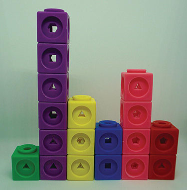
Data illustrated by snap cubes. How would you evenly distribute them?
Ask, How could we use these cubes to figure out what the average number of goals scored per game is? Give students a chance to turn and talk to a partner about what they could do with the cubes to find the average, or mean, number of goals scored by the hockey team.
Explore
Provide partners with enough cubes of different colors to model the data set: 1, 6, 3, 2, 4, and 2. Using the cubes, students explore the following questions:
- How can you use the cubes to figure out the average number of goals scored per game?
- How can you see the average, or mean, using the cubes?
- What does mean (or average) mean?
- How could you find the mean of any data set?
Discuss
Gather students together to discuss the following questions:
- How did you use the cubes to help you see the mean?
- What is the mean number of goals scored by the women’s hockey team? How do you know?
- What does mean mean? (Record a class definition of mean on a chart, along with your previous definitions of other measures of center from the Visualize activity.)
- How could we find the mean of any data set? (Record student ideas publicly so they can test them.)
There are several ways that students might even out the cubes. Two such examples are shown here. Regardless of the way students distributed the cubes into even stacks, all stacks will be three cubes high.
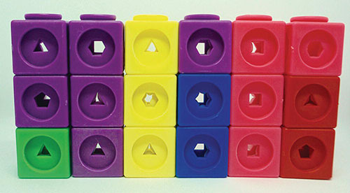
Two different ways to evenly distribute the snap cubes
Play
Partners test their ideas about how to find the mean of any data set by creating their own sets to play with. Provide each partnership with a die. Students roll the die to create a set of six data points. Students can again use cubes, if they want, to help them explore the following questions:
- What is the mean number of dots per roll in your data?
- How do you know?
- What do you do if the number of dots can’t be evened out? What happens to the leftovers? Why?
As students work, they should record their data sets and draw pictures or show in numbers or words how they are finding the mean. Once students have developed a strategy, ask them, Will your strategy for finding mean work if you roll the die five times? Or eight? Or four?
Discuss
Gather students together to discuss the following questions:
- What strategies for finding the mean did you develop? What patterns did you notice?
- How did you organize your data to help you see the mean? What was helpful? Not helpful? Why?
- Did you have any data set where you couldn’t even out the number of cubes [or dots]? How did you deal with the leftovers? What do these extra dots mean?
Pay specific attention in this discussion to instances in which the values could not be evened out, leaving extras or groups with uneven numbers. Making sense of what to do with these values will help students understand what it means when we say that, for example, the mean number of goals scored in a set of soccer games is 3.5, when it is not actually possible to score half a goal.
Look‐Fors
- How are students representing the data? In the first part of this activity, you will have modeled with the cubes in the launch how to represent the hockey data. When students head off to represent this data, the first challenge they will face is replicating this representation. It is important that students interpret each cube as a goal (or point) scored and each stack as a game. If students’ representations do not match the data, you may start by asking, What does each cube represent? What does each stack represent? They could be struggling with meaning or have simply made a counting error. When students generate their own data, they may represent it with stacks of cubes again. In this case, the stacks each represent a roll of the die, and the cubes each represent a dot on the face of the die. Again, if students are not representing their rolls accurately, ask them what the stacks and cubes represent. If students do not use cubes, ask questions about how they have decided to represent their data so they can find the mean.
- How are students using the cubes to find the mean? The cubes allow students to see physically and concretely what is happening when we find the mean, but students may not know how to represent averaging the data with the cubes. If they are struggling to model the mean physically, ask questions about what the average means to help students find language that might describe what to do with the cubes. For instance, ask, What does it mean to find the average number of goals scored in each game? Or, When we say we found the average number of goals scored, what does that mean? Students may say that the average is what’s “typical” or “normal,” to which you might reply, How could you move the cubes so that you could see what’s typical or normal for the team to score in a game?
- How are students dealing with extra cubes or dots when trying to find the mean? It is particularly challenging to deal with extra data that cannot be shared equally as a whole number when fraction units don’t make practical sense, as with our data. It is not possible to score a fractional goal, have a fractional number of people in a household, have a fractional number of puppies in a litter, or roll a fractional value on a die. So, when students end up with extra dots, it can be difficult to interpret what to do with these or what they represent. Students may be tempted to simply disregard them, but they do have meaning. Even if students simply want to conclude that the mean is “more than 3 but less than 4 dots per roll,” then this conclusion maintains the meaning of the dots. More precisely, students can divide or represent the extra dots as decimals or fractions, such as 3.17 or 3 dots per roll. To encourage students to think in this way, you might ask, We know we cannot cut these cubes, but if we could, how many would end up in each stack?
Reflect
What does mean mean?
When Does Mean = Median = Mode = Range?
Snapshot

Students investigate and create data sets where the mean, median, mode, and range have particular relationships.
Agenda
| Activity | Time | Description/Prompt | Materials |
| Launch | 10–15 min | Show students the following data set: 2, 5, 5, 6, 7. Ask, What do you notice about the center and spread of this data set? Discuss the center and spread of the data until the class notices that the mean, median, mode, and range of this data set are the same: 5. |
|
| Explore | 30+ min | Partners explore the question, What other sets of five positive whole numbers can you find where the mean, median, mode, and range are all equal? Students use tools to create and justify data sets that satisfy these criteria. | Make available: cubes, square tiles, grid paper (see appendix), and colors |
| Discuss | 15–20 min | Students share the data sets they created and their justifications. Discuss the strategies students developed for creating and revising data sets so that they met the criteria. Discuss the patterns students noticed and used as they worked. | |
| Explore | 30+ min | Partners investigate and create data sets in which the mean, median, and mode have different relationships, each provided on a different task card. Students post the data sets they create for each set of criteria in a different spot in the classroom, along with evidence to support their claim. |
|
| Discuss | 15–20 min | Discuss the strategies students developed or adapted to find data sets meeting different criteria. Discuss which criteria were more or less challenging to meet and any patterns students noticed along the way. | |
| Extend | 30+ min | Partners investigate how their strategies change when they try to satisfy the same criteria they have already explored, this time with a data set of four or six data points. | Make available: cubes, square tiles, grid paper (see appendix), and colors |
To the Teacher
This investigation challenges students to juggle several data constraints at once and leans on an understanding of the measures of center and spread that we have been developing in the previous activities in this big idea. We encourage you to have available for reference the Ways We Describe the Shape of Data chart the class has been building.
Creating data sets that meet criteria is difficult work, particularly because each measure requires a different kind of strategy. For instance, if you focus on the median, you might place a value in the center and build out from there by adding values on either side until you have five in total. But focusing on the mode means attending to repeated values, and the mean requires thinking about how the data gets transformed when evening it out. Embrace the struggle and frustration inherent in this investigation and focus students on how they can revise data sets that meet some, but not all, criteria. This is an opportunity to encourage students to make the data sets visual so that they can manipulate, check, and revise them, whether that representation is with cubes, line plots, lists, tables, or square tiles.
Activity
Launch
Launch the activity by showing students the following set of numbers on a chart, board, or document camera: 2, 5, 5, 6, 7. Be sure to have your Ways We Describe the Shape of Data chart available for reference. You may also want to model this data set as stacks of cubes, as in the Play activity.
Ask students, What do you notice about the center and spread of this data set? Give students a chance to turn and talk to a partner. Collect student observations and record them for all to see. Allow students enough time to think and discuss for the class to notice that this data set has a range, median, mode, and mean of 5.
Explore
Students work in partnerships to investigate data sets where the mean = median = mode = range. Partners work to answer the question, What other sets of five positive whole numbers can you find where these measures are all equal? Provide students with tools to model and investigate sets of data, such as cubes, square tiles, grid paper (see appendix), and colors. Encourage students to find as many sets of five positive whole numbers that fit the criteria as possible and to record evidence to support each.
Discuss
Gather the class together to discuss the following questions:
- What sets of five numbers did you find in which the mean = median = mode = range? How do you know they satisfy these criteria? (Create a space to display all the data sets that students share.)
- What strategies did you use for creating these data sets?
- What patterns or structures in the data did you use to help you?
- What made creating these sets challenging? What mistakes did you make? What did you learn from those mistakes?
Focus attention in this discussion on the strategic thinking students developed to find data sets that satisfy the criteria. Be sure to probe how students took a data set that satisfied some, but not all, of the criteria and revised it so that all measures were equal.
Explore
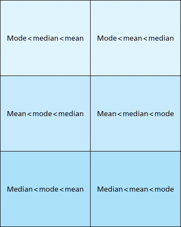
Ask students to create data sets of five positive whole numbers that satisfy the criteria on a task card. There are six task cards provided, each of which is a challenge, so we suggest that you distribute the cards one at a time; teams may spend the entire investigation period on one card. You may decide to distribute all six to different groups, or the same card to all groups. We leave this up to you. The six relationships students might explore are as follows:
- Mode < median < mean
- Mode < mean < median
- Mean < mode < median
- Mean < median < mode
- Median < mode < mean
- Median < mean < mode
Create a display space around your classroom for each set of criteria you choose to distribute. This space may be a chart for each or a part of a board, where students can record the data sets they find as they go. Students should also post evidence that their set satisfies the criteria. For each data set students find, ask them to create an “evidence page,” or a sheet of paper with the data set and their evidence or visual proofs for the relationship between the mean, mode, and median that they found.
Discuss
Gather the class together to discuss the following questions:
- What patterns did you notice as you worked to create data sets?
- What strategies did you develop?
- Were there criteria that were easier or harder to satisfy? Why?
- What did you learn about the relationship between these different measures of center?
Extend
Students investigate the question, What would happen if you tried to create data sets to satisfy the criteria the class has just explored, but with only four numbers in the set? Or six numbers? How does changing the number of data points change the strategies you use to create the sets? Why?
Look‐Fors
- How are students getting started? While some students may dive right in, creating a set and seeing what its properties are, others may try to begin strategically by assigning a value they want all of the measures to have, such as 4. If students seem stuck, struggling to enter this task, you might encourage them to model the data set that the class examined together and explore it. First, students might explore, How does this data set work so that all of the measures of center and spread are equal? Then they might consider, How could we revise this set to find another set where these measures are all equal?
- Are students attending to all the criteria? The mode is the easiest value to visualize in the many different forms students might use to construct their data, whether they use cubes, a line plot, or a list. The median can be seen in a small set of five values, provided they are in order. But seeing the mean requires transforming the data set. Attending to the range means focusing on the difference between the lowest and highest value. These represent many different ideas to juggle simultaneously. Ask students, What measures are you focusing on? How will you test the other measures once you create a set?
- How are they finding the mean? In the Play activity, students built an understanding of mean as the value when the data is evened out among all data points. Students may have found ways to calculate mean by adding up all the values and then dividing to redistribute these evenly among the data points, or they may have focused on a concrete meaning of mean that involved redistributing the data physically. Either will work for this activity, but finding mean concretely requires representing the data with objects. If students are not representing their data with objects, ask, How will you find the mean of this data? Students may have figured out that they only need to determine the total necessary to start with and work backward, a key strategic notion. For instance, students may realize that for a data set of five points to have a mean of 6, it needs to have a total value of 30, or 5 × 6. If students know the total, they can distribute that total in any way they want. If students find a fractional mean, you might ask, How many more (or fewer) cubes would you need to make that mean a whole number?
- How are students visualizing the data sets? Students may choose a variety of ways to make the data sets visual and manipulable. They may represent them with cubes or square tiles so that they can move the data around and add or subtract value easily. They may draw a graph, such as a line plot or bar graph. They may decide to create numerical representations in lists or tables. Each of these makes parts of the data visible and may obscure other aspects of the data or make revision more challenging. Ask students about how they are choosing to display the data for themselves and why they have chosen this method. You might encourage them to consider what this method allows them to see or do, and what will be harder to see or do if they use only this method. You might ask, What other way might you like to see the data so that you can see all the measures we’re working with?
Reflect
What did you discover about the relationships between mean, median, and mode?
 Data Set Challenge Task Cards