

Heathen II
I wanted to capture the movement and energy of a lively street character. In this tutorial you will learn how to use masks to simplify a composition, how and when to upsize an image, and how to scale multiple images to matching sizes.
 Flypaper Textures
 Photogene
 Snapseed
 Superimpose
 Filterstorm
 PhotoSize
 Juxtaposer
 ProCreate
I stumbled upon this fellow as he was miming street preachers in front of St. Louis Cathedral in New Orleans during Mardi Gras. The preachers were standing behind him, broadcasting with bullhorns that just about every-body—Catholics, drunkards, educated people, environmentalists, hippie capitalists (whatever they are), sports fans, gays, and general heathens—will burn in hell. This guy, complete with green body paint, pink beads, and a corset, was miming every word and took a break only to go kiss another guy. I immediately knew I just had to get pictures of him. The movement, the energy, and the costume were simply irresistible |1|.
|1|
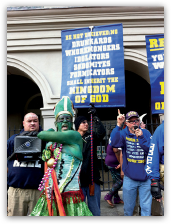
Ordinarily I look for three things when I am shooting: good light, a good background, and an interesting subject. In this case, however, I knew that I had to shoot the subject any way I could, even with dull light and a distracting background. I wound up shooting about 40 pictures of him, many of which were a blur from his constant motion. Figure 1 is an example from that series.
When I figure out how to edit an image, I look for something in the original that speaks to me, then I eliminate anything that distracts from my artistic vision. In this case, I wanted to juxtapose the street preachers’ signs with the green guy’s costume. Unfortunately the signs were so big that they overwhelmed him. I decided that the final image would be more effective if I focused on the subject’s movement and energy alone. I also decided that a triptych would be an effective way to communicate that movement and energy.
I selected three images that were reasonably sharp and clear: one of the subject facing left, one facing forward, and one facing right. I then identified specific visual elements—shape, color, texture (or light and shadow patterns)—that spoke to me. In figure 1 the subject does not have any strong shadow patterns on his face, so I decided to focus on the shape and color of the figure.
Before I start editing I also look for technical challenges I am likely to face. I was not quite as close to the subject as I would have liked, so I decided to take a painterly and grungy approach because I knew I would need to upsize the images.
 Step 1: Preparing the Background Texture
The background distracted from my story about movement and energy, so I decided to eliminate it altogether and replace it with a texture. I selected one from Flypaper Textures, a set of more than 200 JPEG files that I purchased online and keep in a folder on my iPhone and iPad.
In selecting a texture, I looked for two things: the overall value or tonality, and one that would blend well with my subject. I looked for a texture with a light background to make the shape of the figure stand out, and I wanted a painterly feel to augment the mood I was looking for. I settled on Citron Vert from Flypaper’s Spring Painterly set.
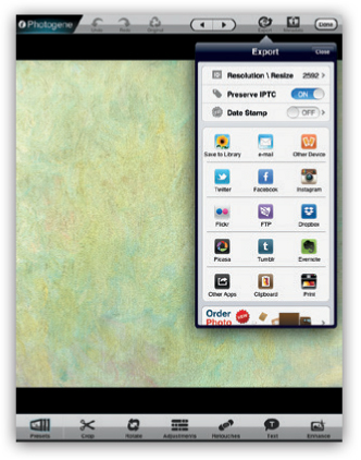
Keeping the textures in a separate folder outside my camera roll is great for organization, but it presents a problem for image resolution. Most apps read the files at no more than 2048 × 2048. I used Photogene to select and export the texture at full resolution |2|.
|2|
 Step 2: Cropping, Aligning, and Sizing the Images
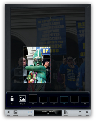
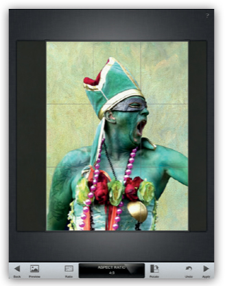
First I used Snapseed to crop the center image to the size I wanted. Because of the triptych format, I decided on a vertical crop, and I constrained the crop to a graceful 3:4 proportion |3|.
|3|
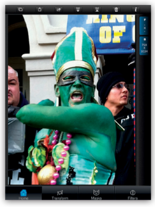
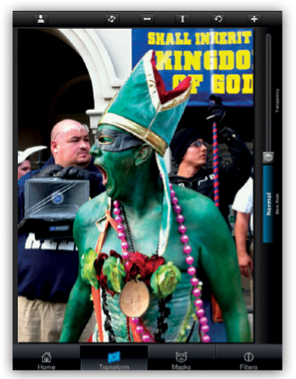
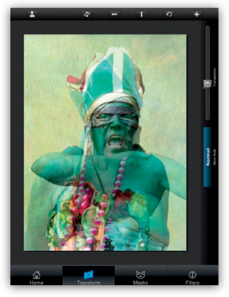
Next I opened Superimpose to align the right and left triptych images to match the center image. First I loaded the center image from Snapseed as the background image |4|. I loaded one of the other images as the foreground image. I hit the Transform button and adjusted the transparency to about 50 percent—enough so I could see both images simultaneously |5|.
|4|
|5|

I pinched the foreground image to expand it until it matched the size of the background image as closely as possible. I tried to make the size of the face and the hat the same, and I attempted to position the shoulders at approximately the same height. I set the transparency to zero so that only the top image was visible, then I saved it |6|. I then repeated the same process for the third image in the series.
|6|
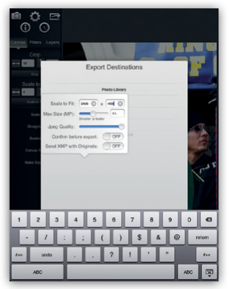
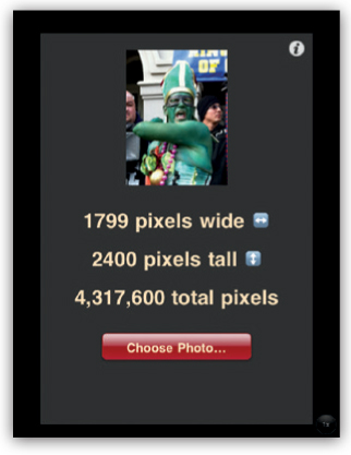
At this point I had three images that were approximately the same size. However, the resolution was not nearly what I needed to print the final piece at a reasonable size. As a general rule, if I have to upsize an image, I try to do so early in the process so I can hide some of the pixelation with textures later on. I loaded each of the images into Filterstorm and saved them with the longest side set to 2400 pixels. This would allow me to output at least a 9×12-inch print of each image. When I saved the file, I selected Settings under Export Destinations and entered the maximum size of my image |7|. I repeated this process for the other two images. I opened each image in PhotoSize to make sure they were the size I wanted |8|. It is a good idea to get in the habit of periodically checking the image size during the editing process.
|7|
|8|
 Step 3: Merging the Foreground and Background
I returned to Superimpose and loaded the Flypaper Texture as the background image, and I loaded the center image for the triptych, which I had just saved in Filterstorm, as the foreground image. I expanded the image of the figure to match the height of the background |9|.
|9|

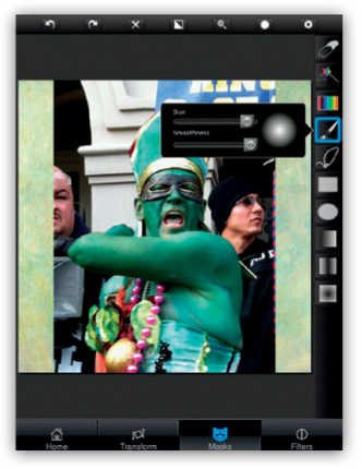
Then I began to mask the image. With the Brush tool set to its smoothest setting, I began with a rough mask and then zoomed in to work on the details until I was satisfied with the result |10–12|.
|10|
|11|
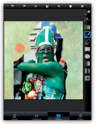
|12|
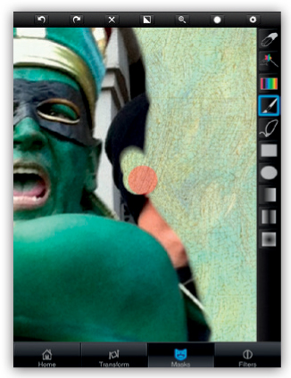
In case I might want to make modifications later, I saved the final image as a stamp by clicking the mask icon with the upward-pointing arrow at the top of the screen |13|. I also saved the image twice: once as a standard JPEG image to my camera roll and again as a transparent PNG file so I could import the masked image into other apps later. I repeated the masking and saving process for the other two images.
|13|
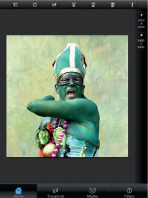
 Step 4: Refining the Crop to Correct an Error
Somehow in the masking process I lost the original 3:4 proportion that I wanted for each image, so I returned to Snapseed to crop my images again. This second round of cropping also gave me an opportunity to center the images.
I recropped the right-facing image because I didn’t like the way the figure’s right arm was cropped off |14|. I cropped the image to a 3:4 proportion, just as I did in the original image |15|.
|14|
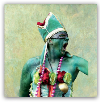
|15|
I returned to Superimpose and loaded my newly cropped image as the background and one of the other images as the foreground. Just as I did in step 2, I adjusted the transparency of the foreground image so I could align it over the background image |16|. I repeated this process for the third image.
|16|
 Step 5: Refining the Edges in Juxtaposer
I now had three images that were cropped and masked. I noticed that the edges were much too hard, which gave the image a flat appearance, and also took away from depicting the motion and energy of the figure. On the iPhone, Juxtaposer is a great app for softening edges. I loaded my original texture as the base layer and one of my masked images as the top layer into Juxtaposer. I double tapped twice to fit the top image to the base image. At the top of the screen, I selected the softest brush |17|.
|17|
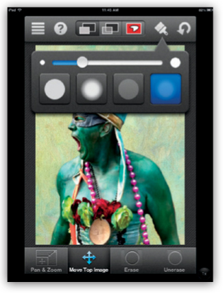
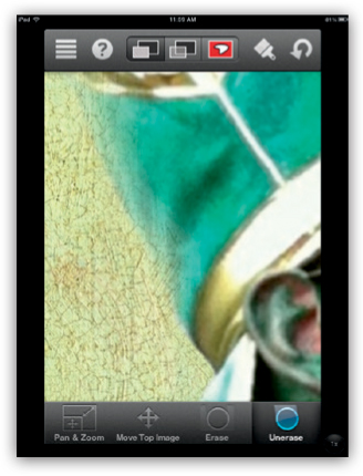
Hard edges on both sides tend to flatten an image, so I selectively softened alternating sides of the image. I kept hard edges where I wanted to draw the viewer’s attention, such as around the subject’s face, and I softened the edges around the areas that were not as important to my story. For example, I made some parts of the hat fade into the background |18|. These subtle changes were important to the effectiveness of the final image. I also refined a few areas that I had missed in the initial mask. I repeated the softening process for the other two images.
|18|
 Step 6: Smudging in ProCreate
I had softened some of the edges, but I didn’t think I had fully captured the sense of motion that I wanted |19|.
|19|
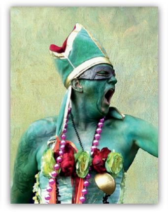
I decided to open the images in one of my favorite painting apps—Pro Create—and use some of the smudge tools to further integrate the background and foreground. Even though ProCreate’s resolution is a little lower than I would have liked (the maximum resolution is a little more than 1400 × 1900), I thought it would give me the effect I wanted, even if I had to upsize the images one more time.
I created a new canvas in ProCreate then tapped the Wrench tool and the Canvas button to select my image |20|. I selected the Smudge tool at the top of the screen (it looks like a finger), then I selected the Wet Round Brush and set the size to 6 percent |21|. I selectively smudged a few areas—just enough to give a sense of motion. Then I saved the image as a JPEG and repeated the process for the other two images.
|20|
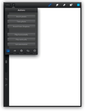
|21|
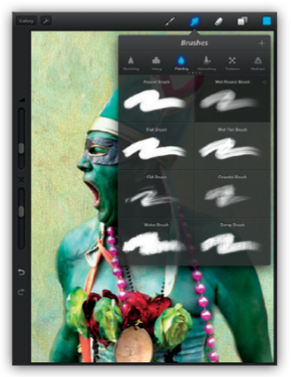
 Step 7: Upsizing One Final Time
I wanted to bring my images back up to 2400 pixels, so I imported them into Filterstorm again and saved them at the higher resolution, just as in step 2. This also prepared the images for more textures and other refinements.
 Step 8: Making Final Refinements
I was now approaching the final stage of the edit. I had masked my images and softened and smudged the figures, but I was still not quite satisfied |22–24|.
|22|
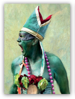
|23|
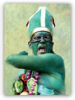
|24|
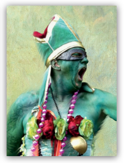
As often happens when I assemble an image from different sources, the foreground and background were not integrated as much as I would have liked. The image still looked a little cobbled together. When this happens, I apply what I call a final polish filter—most frequently in Snapseed or Photo-Copier—to unify the colors and textures. I almost always generate multiple variations of the image and project the possibilities on my Apple TV before I make a final selection.
I chose to work in Snapseed and played around with several tools. I wanted to add some extra polish to the image, but I had to be careful not to get too carried away. I settled on using Center Focus. I set the center size to about 25, the inner brightness to +20, the outer brightness to –80, and the blur to +60. Finally, I added Vintage Filter #4 with the style strength set to 0.
I often use Superimpose to integrate textures within my images. Because of my preference for candid shots, I often end up with backgrounds that need to be replaced. I keep several folders of textures—some from Flypaper Textures and some of my own—on my iPhone. The Flypaper Textures are a little pricey but beautiful. If you are on a budget, you can easily make your own textures. Just open an image and adjust the brightness and contrast until the image disappears. Then use any of the grunge apps to apply one or more textures. Vintage Scene, Grungetastic, Pic Grunger, and Modern Grunge are some of my favorites.
I sort my textures by type—paint, paper, cloth, urban/industrial, antique, and nature—and I choose a texture that matches the feel I want to project in my image. For example, if I am aiming for a painterly feel, I usually pick one of the paint textures. Choosing a texture with the right feel is more important than choosing a texture with a matching color. After I bring the texture into Superimpose I can easily adjust the color and the brightness to match my image.
To create this image I relied heavily on Superimpose to mask and align the images. In addition, I used Photogene to import the background, Filterstorm to upsize the images, PhotoSize to monitor the image sizes during the editing process, Juxtaposer to refine the edges, ProCreate to smudge parts of the images, and Snapseed to crop the images and apply the final filters. I used Flypaper Textures for the background.
Marie Matthews (Kaphinga)

As a longtime mainstay of iPhoneArt.com, Marie Matthews is noted for her painterly portraits of street characters. She has been voted Artist of the Month on iPhoneArt.com and has exhibited her work at the LA Mobile Arts Festival and at P1xels at an Exhibition’s Third Wave exhibition. Her images have been featured on CNET, in the Los Angeles Times and Business Insider, and on a number of well-known iPhoneography websites, including iPhoneogenic, iPhoneography.com and iPhoneographyCentral.com, and. Marie’s images were selected as some of the best images of 2012 on iPhoneogenic.com and TheAppWhisperer.com. When she is not creating images with her iPhone, Marie teaches painting and figure drawing in Atlanta, Georgia. http://www.iphoneart.com/kaphinga