
#if#each#awaitThere are three common approaches to adding conditional and iteration logic in the markup of various web frameworks. React uses JSX ( JavaScript XML) where logic is implemented by JavaScript code in curly braces (https://reactjs.org/docs/ introducing-jsx.html). Angular and Vue support framework-specific attributes for logic. For example, Angular supports ngIf and ngFor, while Vue supports v-if and v-for. Svelte supports a Mustache-like (https://mustache.github.io/) custom syntax that wraps HTML and the components to render.
There are only three kinds of block structures in Svelte:
if is used to specify conditional logic that determines whether something should be rendered.
each is used to iterate over a collection of data, rendering something for each piece of data.
await waits for a promise to resolve and renders something using that data.
Each of these defines blocks of HTML to render. They begin with {#name}, end with {/name}, and can contain {:name} intermediate markers. The # character indicates a block opening tag. The / character indicates a block ending tag. The : character indicates a block continuation tag. Read on to learn how to use these block structures.
Conditional logic in the HTML section of a Svelte component begins with {#if condition}, where the condition is any valid JavaScript expression. The end is marked with {/if}. The markup to be conditionally rendered goes between these. Other block tags that can be included between these are {:else if condition} and {:else}.
For example, we can render an assessment of a color as follows:
{#if color === 'yellow'}
  <div>Nice color!</div>
{:else if color === 'orange'}
  <div>That's okay too.</div>
{:else}
  <div>Questionable choice.</div>
{/if}
While this syntax may seem odd at first, it does have the benefit of being able to conditionally render multiple elements without specifying a common parent element.
The Angular/Vue approach of adding special attributes to elements requires specifying a common parent element in order to render multiple elements. In Angular this can be the special <ng-container> element, which does not produce a corresponding DOM element, as in the following listing.
Listing 4.1 Conditional logic in Angular using ng-container
<ng-container *ngIf="isMorning">
  <h1>Good Morning!</h1>
  <p>There is a lot on your plate today.</p>
</ng-container>
In Vue the common parent element can be a div element, but that element will appear in the rendered output, as in the following listing.
Listing 4.2 Conditional logic in Vue using a div
<div v-if="isMorning">
  <h1>Good Morning!</h1>
  <p>There is a lot on your plate today.</p>
</div>
React requires a common parent element or a React-specific “fragment.” Fragments do not produce a corresponding DOM element.
Listing 4.3 Conditional logic in React using a fragment
{isMorning && (
  <>
    <h1>Good Morning!</h1>
    <p>There is a lot on your plate today.</p>
  </>
)}
Svelte does not require any wrapping element to conditionally render multiple elements. Its block syntax is used instead.
Listing 4.4 Conditional logic in Svelte
{#if isMorning}
  <h1>Good Morning!</h1>
  <p>There is a lot on your plate today.</p>
Iteration in HTML begins with {#each array as item}. The end is marked with {/each}. The markup to be rendered for each item goes between these.
The expression that follows #each can be any JavaScript expression that results in an array or array-like object. This includes literal values, variables, and function calls.
Optionally {:else} can be used before {/each}. Content after {:else} is rendered when the array is empty.
For example, suppose the variable colors is set to ['red', 'green', 'blue']. The following example outputs each color on a separate line using the color.
{#each colors as color}
  <div style="color: {color}">{color}</div>
{/each}
The next example outputs each color on a separate line preceded by its 1-based position followed by a parenthesis:
{#each colors as color, index}
  <div>{index + 1}) {color}</div>
{/each}
The following example uses destructuring to get specific properties of the objects in the array people:
{#each people as {name, age}}
  <div>{name} is {age} years old.</div>
{:else}
  <div>There are no people.</div>
{/each}
Another option is to iterate over the keys and values of an object using Object.entries as follows:
<script>
  const person = {
    color: 'yellow',
    name: 'Mark',
    spouse: {
      color: 'blue',
      name: 'Tami'
    }
  };
</script>

{#each Object.entries(person) as [key, value]}
  <div>found key "{key}" with value {JSON.stringify(value)}</div>
{/each}
found key "color" with value "yellow"
found key "name" with value "Mark"
found key "spouse" with value {"color":"blue","name":"Tami"}
If the items in an array will be added, removed, or modified after they are initially rendered, a unique identifier should be supplied for each element. Svelte refers to this as a “keyed each block,” and it allows Svelte to optimize updating the DOM. It is similar to the need for the key prop in React and Vue.
In Svelte, the unique identifier is supplied as part of the #each syntax, not as a prop. In the following example, the unique identifier for each person is their id property.
{#each people as person (person.id)}
  <div>{person.name} is {person.age} years old.</div>
{/each}
To iterate a given number of times rather than over all the elements in an array, you can create an array with that number of elements. For example,
{#each Array(rows) as _, index}      ❶
  <div>line #{index + 1}</div>
{/each}
❶ Array(rows) creates an array of length rows where all the elements are undefined.
Svelte provides a block structure to wait for promises to resolve or reject. It can render different output based on whether the promise is still pending, has resolved, or has rejected.
For example, suppose we have a getDogs function that calls an API service, perhaps using the Fetch API, to retrieve a list of dog descriptions. Calling an API service is an asynchronous operation, so a JavaScript Promise object is returned. It will resolve to an array of objects that describe dogs. Each has a name and breed property.
Note Using the Fetch API is described in appendix B.
Any variable name can be used after :then and :catch to receive the resolved or rejected value.
{#await getDogs()}
  <div>Waiting for dogs ...</div>
{:then dogs}
  {#each dogs as dog}
    <div>{dog.name} is a {dog.breed}.</div>
  {/each}
{:catch error}
  <div class="error">Error: {error.message}</div>
{/await}
The next example omits the markup to be rendered while waiting for the Promise to resolve. The :catch portion can also be omitted, but it’s typically best to render something to let the user know if the promise was rejected.
{#await getDogs() then dogs}
  {#each dogs as dog}
    <div>{dog.name} is a {dog.breed}.</div>
  {/each}
{:catch error}
  <div class="error">Error: {error.message}</div>
{/await}
If a component needs to trigger re-evaluating data from a promise, you can store the promise in a top-level variable, use that variable after #await (eg., {#await myPromise}), and modify the variable in a function.
Figure 4.1 Dog breed image app
Let’s demonstrate this using a publicly available API service that returns images of a given dog breed (see figure 4.1). Copy this code to a REPL and try it!
Listing 4.5 Dog breed image app
<script>
  let breed = 'Whippet';                             ❶

  async function getDogs() {                         ❷
    const url =
      'https://dog.ceo/api/breed/' +
      `${breed.toLowerCase()}/images/random/1`;
    const res = await fetch(url);
    if (!res.ok || res.status === 404) return [];
    const json = await res.json();
    return json.message;
  }

  let dogsPromise = getDogs();
</script>

<label>
  Breed
  <input bind:value={breed}>
</label>
<button on:click={() => dogsPromise = getDogs()}>    ❸
  Get Image
</button>

{#await dogsPromise}
  <div>Waiting for dogs ...</div>
{:then imageUrls}
  {#each imageUrls as url}
    <div><img alt="dog" src={url}></div>
  {:else}
    <div>Not found</div>
  {/each}
{:catch error}
  <div>Error: {error.message}</div>
{/await}
❸ Changing the value of dogsPromise causes the #await to be evaluated again.
Listing 4.6 shows one more example of using #await that uses a publicly available API service intended for demonstration purposes, and the results are shown in figure 4.2. The service returns a JSON object containing two properties, status and data. The status property is set to the string “success” when the call is successful. The data property holds an array of objects describing employees at a company.

Listing 4.6 Component that renders the employee table
<script>
  let employees = [];
  let message;

  async function getEmployees() {
    const res = await fetch(
      'http://dummy.restapiexample.com/api/v1/employees');
    const json = await res.json();
    if (json.status === 'success') {
      return json.data.sort(                                             ❶
        (e1, e2) => e1.employee_name.localeCompare(e2.employee_name));
    } else {
      throw new Error(json.status);
    }
  }
</script>

{#await getEmployees()}
  <div>Loading employees ...</div>
{:then employees}
  <table>
    <caption>Employees</caption>
    <tr><th>Name</th><th>Age</th></tr>
    {#each employees as employee}
      <tr>
        <td>{employee.employee_name}</td>
        <td>{employee.employee_age}</td>
      </tr>
    {/each}
  </table>
{:catch message}
  <div class="error">Failed to retrieve employees: {message}</div>
{/await}

<style>
  caption {
    font-size: 1rem;
    font-weight: bold;
    margin-bottom: 0.5rem;
  }
  .error {
    color: red;
  }
  table {
    border-collapse: collapse;
  }
  td, th {
    border: solid lightgray 1px;
    padding: 0.5rem;
  }
❶ This sorts the employees on their name, first before last.
Let’s apply what you have learned about Svelte block structures to the Travel Packing app. The finished code can be found at http://mng.bz/vxBM.
We need to walk through a lot of code here, but it should all be understandable given what you have learned so far. This will set the stage for adding more features to the app in subsequent chapters.
The Item component uses #if to render the item name in an HTML input when in editing mode and in an HTML span otherwise. The Category component does the same for its name. It also uses #each to iterate over the items in a category. The Checklist component uses #each to iterate over the categories in a checklist.
Eventually we will create all the files shown in figure 4.3. The arrows point to files that are imported by a given file.

Figure 4.3 Travel Packing app source files
First we need a component to represent an item to be packed. Items belong to a category, and categories have an ID. The Item component takes one prop, item, whose value is an object. An item object has the properties id (string), name (string), and packed (Boolean).
An item is represented by an li element that contains three children:
The first child of the li is a checkbox that indicates whether the item has been packed. Clicking this toggles the packed property of the item object.
The second child of the li is either a span element containing the name of the item or an input element that is used to edit the name. To edit the name of an item, the user clicks the text. This changes the value of the Boolean editing to true, which causes an input element to be rendered instead of a span. The editing Boolean is changed back to false when the user moves focus out of the input or presses the Enter key.
The third child of the li is a button containing a trash can icon. In the future, clicking this will delete the item, but this is not implemented yet.
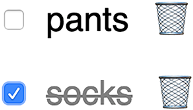
When an item is packed, its name is displayed in gray and with line-through, as shown in figure 4.4.
Listing 4.7 Item component defined in src/Item.svelte
<script>
import {blurOnKey} from './util';
export let item;
let editing = false;
</script>
<li>
<input type="checkbox" bind:checked={item.packed}>
{#if editing}
<input
autofocus
bind:value={item.name}
on:blur={() => (editing = false)}
on:keydown={blurOnKey}
type="text" />
{:else}
<span class="packed-{item.packed}" on:click={() => (editing = true)}>
{item.name}
</span>
{/if}
<button class="icon">🗑</button>
</li>
<style>
button {
background-color: transparent;
border: none;
}
input[type='checkbox'] {
--size: 24px; ❶
height: var(--size);
width: var(--size);
}
input[type='text'] {
border: solid lightgray 1px;
}
li {
display: flex;
align-items: center;
}
.packed-true {
color: gray;
text-decoration: line-through;
}
span {
margin: 0 10px;
}
</style>
Some components use functions defined in util.js, shown in listing 4.8.
The getGuid function returns a unique ID. This is used to assign IDs to items to be packed. It requires the uuid npm package, which you can install by entering npm install uuid.
The sortOnName function is used to sort items within a category in a case-insensitive way.
Listing 4.8 Utility functions defined in src/util.js
import {v4 as uuidv4} from 'uuid';

export function getGuid() {
  return uuidv4();
}

export function blurOnKey(event) {
  const {code} = event;
  if (code === 'Enter' || code === 'Escape' || code === 'Tab') {
    event.target.blur();
  }
}

export function sortOnName(array) {
  array.sort((el1, el2) =>
    el1.name.toLowerCase().localeCompare(el2.name.toLowerCase())
  );
  return array;
Next we need a component to represent a category of items, such as “Clothing.” The Category component renders the following (see figure 4.5):
An input for entering the name of a new item to be added to the category
A list of Item components, one for each item in the category
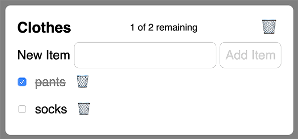
A category object has the properties id (string), name (string), and items (array of item objects).
The Category component takes three props: categories (array of category objects), category (object), and show (string). The categories prop is used to determine whether an item to be added already exists in another category. The category prop describes the category being rendered. The show prop is a string with a value of all, packed, or unpacked. It indicates which of the items should be displayed.
Clicking the name of the category changes it to an input so it can be edited. Moving focus out of the input or pressing the Enter key finalizes the change.
Listing 4.9 Category component defined in src/Category.svelte
<script>
import Item from './Item.svelte';
import {getGuid, blurOnKey, sortOnName} from './util';
export let categories;
export let category;
export let show;
let editing = false;
let itemName = '';
let items = [];
let message = '';
$: items = Object.values(category.items);
$: remaining = items.filter(item => !item.packed).length;
$: total = items.length;
$: status = `${remaining} of ${total} remaining`;
$: itemsToShow = sortOnName(items.filter(i => shouldShow(show, i)));
function addItem() {
const duplicate = Object.values(categories).some(cat =>
Object.values(cat.items).some(item => item.name === itemName)
);
if (duplicate) {
message = `The item "${itemName}" already exists.`;
alert(message); ❶
return;
}
const {items} = category;
const id = getGuid();
items[id] = {id, name: itemName, packed: false};
category.items = items;
itemName = ''; ❷
}
function shouldShow(show, item) {
return (
show === 'all' ||
(show === 'packed' && item.packed) ||
(show === 'unpacked' && !item.packed)
);
}
</script>
<section>
<h3>
{#if editing}
<input
bind:value={category.name}
on:blur={() => (editing = false)}
on:keypress={blurOnKey} />
{:else}
<span on:click={() => (editing = true)}>{category.name}</span>
{/if}
<span class="status">{status}</span>
<button class="icon">🗑</button>
</h3>
<form on:submit|preventDefault={addItem}>
<label>
New Item
<input bind:value={itemName}>
</label>
<button disabled={!itemName}>Add Item</button>
</form>
<ul>
{#each itemsToShow as item (item.id)}
<!-- This bind causes the category object to update
when the item packed value is toggled. -->
<Item bind:item /> ❸
{:else}
<div>This category does not contain any items yet.</div>
{/each}
</ul>
</section>
<style>
button,
input {
border: solid lightgray 1px;
}
button.icon {
border: none;
}
h3 {
display: flex;
justify-content: space-between;
align-items: center;
margin: 0;
}
section {
--padding: 10px;
background-color: white;
border: solid transparent 3px;
border-radius: var(--padding);
color: black;
display: inline-block;
margin: var(--padding);
padding: calc(var(--padding) * 2);
padding-top: var(--padding);
vertical-align: top;
}
.status {
font-size: 18px;
font-weight: normal;
margin: 0 15px;
}
ul {
list-style: none;
margin: 0;
padding-left: 0;
}
</style>
❶ This will be replaced by a dialog in chapter 7.
❸ This is equivalent to <Item bind:item={item} />.
Now we need a component to render all the categories. The Checklist component renders the following (see figure 4.6):
A set of radio buttons that determine whether to show all items, only those that have been packed, or only those that still need to be packed (unpacked items)
A button to click that clears all the item checkboxes, which is useful when starting to pack for a new trip

Figure 4.6 Checklist component
The Checklist component does not take any props.
Listing 4.10 Checklist component defined in src/Checklist.svelte
<script>
  import Category from './Category.svelte';
  import {getGuid, sortOnName} from './util';

  let categoryArray = [];
  let categories = {};
  let categoryName;
  let message = '';
  let show = 'all';

  $: categoryArray = sortOnName(Object.values(categories));

  function addCategory() {
    const duplicate = Object.values(categories).some(
      cat => cat.name === categoryName
    );
    if (duplicate) {
      message = `The category "${categoryName}" already exists.`;
      alert(message);                                                ❶
      return;
    }

    const id = getGuid();
    categories[id] = {id, name: categoryName, items: {}};
    categories = categories;                                         ❷
    categoryName = '';                                               ❸
  }

  function clearAllChecks() {                                        ❹
    for (const category of Object.values(categories)) {
      for (const item of Object.values(category.items)) {
        item.packed = false;
      }
    }
    categories = categories;
  }
</script>

<section>
  <header>
    <form on:submit|preventDefault={addCategory}>
      <label>
        New Category
        <input bind:value={categoryName}>
      </label>
      <button disabled={!categoryName}>Add Category</button>
      <button class="logout-btn">
        Log Out
      </button>
    </form>
    <p>
      Suggested categories include Backpack, Clothes,
      <br />
      Last Minute, Medicines, Running Gear, and Toiletries.
    </p>

    <div class="radios">                                                ❺
      <label>Show</label>
      <label>
        <input name="show" type="radio" value="all" bind:group={show}>  ❻
        All
      </label>
      <label>
        <input name="show" type="radio" value="packed" bind:group={show}>
        Packed
      </label>
      <label>
        <input name="show" type="radio" value="unpacked" bind:group={show}>
        Unpacked
      </label>

      <button class="clear" on:click={clearAllChecks}>Clear All Checks</button>
    </div>
  </header>

  <div class="categories">
    {#each categoryArray as category (category.id)}
      <Category bind:category {categories} {show} />
    {/each}
  </div>
</section>

<style>
  .categories {
    display: inline-flex;
    flex-wrap: wrap;
    justify-content: center;
  }

  .clear {
    margin-left: 30px;
  }

  input[type='radio'] {
    --size: 24px;
    height: var(--size);
    width: var(--size);
    margin-left: 10px;
  }

  .logout-btn {
    position: absolute;
    right: 20px;
    top: 20px;
  }

  .radios {
    display: flex;
    align-items: center;
  }

  .radios > label:not(:first-of-type) {
    display: inline-flex;
    align-items: center;

    margin-left: 1em;
  }

  .radios > label > input {
    margin-bottom: -3px;
    margin-right: 5px;
  }

  section {
    display: flex;
    flex-direction: column;
    align-items: center;

    font-size: 24px;
    margin-top: 1em;
  }
</style>
❶ This will be replaced by a dialog in chapter 7.
❹ Consider adding a confirmation here to avoid accidentally clearing all the checks.
❺ There are accessibility issues here that will be fixed in chapter 12.
❻ Using bind:group with a set of related radio buttons makes the value a single string.
For now we will render this component in the App component instead of the Login component created in the previous chapter. Later we will add logic to render only one of them at a time, depending on the state of the app.
Comment out the import of the Login component at the top of the script element.
Import the Checklist component at the top of the script element.
import Checklist from './Checklist.svelte';
In the HTML section, comment out <Login /> and add <Checklist />.
To specify global styling for the app that can affect any component, replace the contents of public/global.css with the following:
Listing 4.11 Global CSS defined in public/global.css
body {
  font-family: sans-serif;
  height: 100vh;
  margin: 0;
  padding: 0;
}

button:not(:disabled),
input:not(:disabled) {
  cursor: pointer;
}

button:disabled {
  color: lightgray;
}

button.icon {
  background-color: transparent;
  border: none;
  margin-bottom: 0;
}

input:disabled {
  color: #ccc;
}

label {
  display: inline-block;
}

input,
button,
select,
textarea {
  --padding: 10px;

  border-radius: var(--padding);
  border: none;
  box-sizing: border-box;
  color: gray;
  font-family: inherit;
  font-size: inherit;
  margin: 0;
  padding: var(--padding);
Run the app by entering npm run dev and browsing to localhost:5000. You should now see the page shown in figure 4.7.

Try adding some categories and adding items in each category. Click category and item names to modify them. Check some items to mark them as packed. Click the Show radio buttons to switch between showing all items, only packed items, or only unpacked items.
Clicking the trash can icons will not delete categories and items just yet. We will implement those in chapter 5, and you will also learn about all the ways in which Svelte components can share data.
Svelte component HTML uses Mustache-inspired syntax for specifying conditional logic, iteration, and promise handling.
Conditional logic is specified using the syntax {#if condition}.
Iteration is specified using the syntax {#each collection as element}.
Promise handling is specified using the syntax {#await promise}.