svelte/animate packagesvelte/motion packagesvelte/transition packageAdding animation to a web application can make it more enticing to users and can make some operations more intuitive. There are libraries for many web frameworks that add animation support, but in Svelte this is a built-in feature.
Svelte provides many transition directive values and functions that make it easy to add CSS-based animation to elements. The fact that they are CSS-based rather than JavaScript-based means they do not block the main thread, which is good for performance. This chapter describes each of the provided animations and concludes with showing how custom transitions can be implemented.
Svelte supports two kinds of animations: adding/removing an element, and changing a value.
When elements are added to or removed from the DOM, animation allows a special effect to occur over a given number of milliseconds. For example, added elements can fade in, and removed elements can slide out of the browser window. This is more visually appealing than abruptly adding or removing an element.
Animated value changes enable a variable’s value to gradually change from its current value to a new value over a given number of milliseconds. When the variable is part of the state of a component, the DOM is updated for each intermediate value. For example, the value of a given bar in a bar chart can be changed from a value of 0 to a value of 10 over a duration of 500 milliseconds. Rather than the bar jumping from a height of 0 to, say, 300 pixels, it gradually increases, resulting in an animated change.
Let’s get started in our journey through Svelte animations. Each of the following sections will focus on an important animation topic or package provided by Svelte.
Animations can proceed at varying rates over their duration. This is specified with easing functions. Each animation has a default easing function that can be overridden with the easing option.
The svelte/easing package currently defines 11 easing functions. Custom easing functions can also be defined. They are simply functions that take a number between 0 and 1 and return a number in that same range.
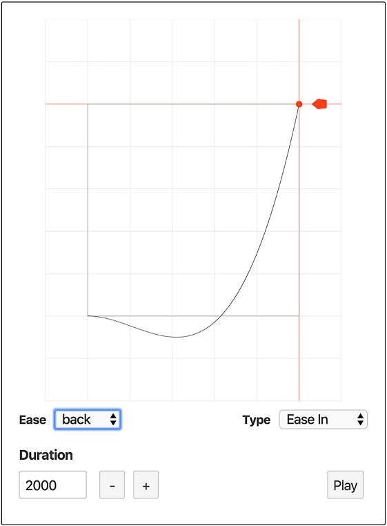
A great way to learn about the provided easing functions is to browse the Ease Visualizer at https://svelte.dev/examples#easing (see figure 10.1). After selecting an Ease and a Type (Ease In, Ease Out, or Ease In Out), it displays a curve that describes its effect and animates the movement through the duration.
The linear easing function is the most basic. It provides a smooth, constant rate of animation. The easing functions sine, quad, cubic, quart, quint, expo, and circ are all simple curves with only minor differences in their acceleration in the middle of an animation. The most extreme of these is expo.
The easing functions back, elastic, and bounce are more interesting because they move forward and backward. bounce changes direction seven times, and elastic changes direction five times. back changes direction only once and so is the least bouncy.
The actual names of all of these easing functions end with In, Out, or InOut. For example, bounceIn, bounceOut, and bounceInOut.
Easings ending in In are applied when components are added to the DOM. Easings ending in Out are applied when components are removed from the DOM. Easings ending in InOut are applied for both.
Figure 10.1 The Ease Visualizer
The svelte/animate package provides the flip function, which stands for first, last, invert, play. It doesn’t actually flip anything. Instead, it determines the new position of an element and animates changes to its x and y values from the old to the new position. A common use is to animate the changing location of items in a list.
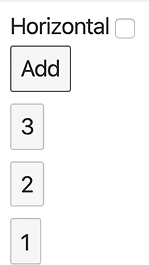
Figure 10.2 flip animations in vertical orientation
In the following example, the Add button adds a new number to a list of numbers that are each displayed in buttons (see figure 10.2). New numbers are added to the beginning of the list so that each one must move to make room. Clicking a number button removes it, causing all the buttons after it to slide toward the beginning of the list to close up the vacated space. The list can be toggled between horizontal and vertical, and this change is also animated (see figure 10.3).
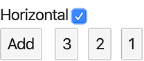
Figure 10.3 flip animations in horizontal orientation
Copy this code to the Svelte REPL and try it.
Listing 10.1 flip animation demo
<script>
  import {flip} from 'svelte/animate';

  let horizontal = false;
  let next = 1;
  let list = [];

  function addItem() {
    list = [next++, ...list];                                        ❶
  }

  function removeItem(number) {
    list = list.filter(n => n !== number);
  }

  const options = {duration: 500};
</script>

<label>
  Horizontal
  <input type="checkbox" bind:checked={horizontal}>
</label>

<button on:click={addItem}>Add</button>

{#each list as n (n)}                                               ❷
  <div animate:flip={options} class="container" class:horizontal>   ❸
    <button on:click={() => removeItem(n)}>{n}</button>
  </div>
{/each}

<style>
  .container {
    width: fit-content;                                             ❺
  }

  .horizontal {
    display: inline-block;
    margin-left: 10px;
  }
</style>
❶ This adds the next number to the beginning of the list.
❸ The flip animation is specified here.
❹ Animating between the vertical and horizontal layout of the buttons only works well if the container knows its width, so this line is critical for proper animation.
Toggling the Horizontal checkbox before the animation completes cancels the in-progress animations and starts new animations that cause the elements to return to their previous locations.
The animate directive that’s used to request a flip animation in listing 10.1 must be applied to an HTML element. Applying it to a custom component has no effect.
The flip animation supports several options:
delay specifies how long to wait in milliseconds before beginning the animation. It defaults to 0.
duration specifies how long it should take in milliseconds to complete the animation. The value can also be a function that takes the distance to move in pixels and returns the duration to use. It defaults to the function d => Math .sqrt(d) * 120.
easing is an easing function that defaults to cubicOut. Many more easing functions can be imported from the svelte/easing package.
Here is an example of specifying options for the flip animation:
<script>
  import {bounceInOut} from 'svelte/easing';
</script>
...
<div animate:flip={{delay: 200, duration: 1000, easing: bounceInOut}}>
The svelte/motion package provides the spring and tweened functions. These create writable stores whose values animate from old to new values. As with all writable stores, the stored value can be changed by calling the store’s set and update methods. The set method is passed a new value. The update method is passed a function that computes the new value based on the current value.
Typically these functions are used to interpolate between two numbers. However, they can also be used to interpolate between multiple numbers held in two arrays or between two objects that have the same shape and only have number values in their primitive properties (properties whose values are not objects).
For example, the spring and tweened functions are useful for rendering changes in a pie chart. When the value changes from say 10% to 90%, we might want the pie chart to animate showing many values in between. Rather than changing immediately, the value changes smoothly.
The spring and tweened functions both take an initial value and an options object. Supported options include delay, duration, easing, and interpolate. The first three have the same meaning as previously described for the flip function. The interpolate function is used to interpolate between values that aren’t numbers or dates and is discussed a little later in this section.
Let’s implement an SVG-based pie chart component that displays a given percentage value (see figure 10.4). As you learned in geometry class, 0 degrees corresponds to 3 o’clock on a clock face, and angles increase counterclockwise from there. It does not use animation, but components that use it can animate its value. For details on creating pie charts with SVG, see Kasey Bonifacio’s “How to Create an SVG Pie Chart”: https://seesparkbox.com/foundry/ how_to_code_an_SVG_pie_chart.
Figure 10.4 A pie chart component
Listing 10.2 Pie component in src/Pie.svelte
<script>
  export let size = 200;
  export let percent = 0;
  export let bgColor = 'cornflowerblue';
  export let fgColor = 'orange';

  $: viewBox = `0 0 ${size} ${size}`;

  $: radius = size / 2;
  $: halfCircumference = Math.PI * radius;
  $: pieSize = halfCircumference * (percent / 100);
  $: dashArray = `0 ${halfCircumference - pieSize} ${pieSize}`;
</script>

<svg width={size} height={size} {viewBox}>
  <circle r={radius} cx={radius} cy={radius} fill={bgColor} />     ❶
  <circle                                                          ❷
    r={radius / 2}
    cx={radius}
    cy={radius}
    fill={bgColor}
    stroke={fgColor}
    stroke-width={radius}
    stroke-dasharray={dashArray}
  />
</svg>
❶ This renders the background circle.
❷ This renders a pie wedge whose size is a percentage of the circle.
The following component renders a number input and a Pie component using that value. It uses the tweened function to animate the value.
Listing 10.3 App that uses Pie component
<script>
  import {tweened} from 'svelte/motion';
  import Pie from './Pie.svelte';

  let percent = 0;
  const store = tweened(0, {duration: 1000});
  $: store.set(percent || 0);                   ❶
</script>

<label>
  Percent
  <input type="number" min="0" max="100" bind:value={percent}>
</label>
<Pie size={200} percent={$store} />
❶ This updates the store every time the value of percent changes. If the input is empty, percent will be undefined, but we want the store to always contain a number.
Copy these files to the REPL and try it!
The spring function is similar to the tweened function, but it uses stiffness, damping, and precision parameters to give a spring-like effect to the animations. It does not use the duration parameter.
The previous pie chart example can be changed to use spring animation by simply replacing the call to tweened with a call to spring. For example, this makes it quite springy:
const store = spring(0, {stiffness: 0.3, damping: 0.3});
Make this change in the REPL, and also change the import of tweened to spring to try it!
One of the options accepted by the spring and tweened functions is an interpolate function. It supports interpolating between values that are not numbers, dates, arrays of them, or objects whose properties only have number or date values.
An interpolate function takes starting and ending values. It returns another function that takes a number between 0 and 1 and returns a value of the same type as the starting and ending values that is “between” them.
For example, we can use an interpolate function to tween over hex color values in the format “rrggbb”. When changing from one color to another, such as red to green, we want to pass through colors that are in a sense between them (see figure 10.5 and listing 10.4).
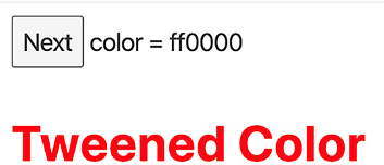
Figure 10.5 App that demonstrates using tweened
Listing 10.4 App that demonstrates using tweened
<script>
  import {tweened} from 'svelte/motion';

  let colorIndex = 0;
  const colors = ['ff0000', '00ff00', '0000ff']; // red, green, blue

  // This converts a decimal number to a two-character hex number.
  const decimalToHex = decimal =>
    Math.round(decimal).toString(16).padStart(2, '0');

  // This cycles through the indexes of the colors array.
  const goToNextColor = () => colorIndex = (colorIndex + 1) % colors.length;

  // This extracts two hex characters from an "rrggbb" color string
  // and returns the value as a number between 0 and 255.
  const getColor = (hex, index) =>
    parseInt(hex.substring(index, index + 2), 16);

  // This gets an array of red, green, and blue values in
  // the range 0 to 255 from an "rrggbb" hex color string.
  const getRGBs = hex =>
    [getColor(hex, 0), getColor(hex, 2), getColor(hex, 4)];

  // This computes a value that is t% of the way from
  // start to start + delta where t is a number between 0 and 1.
  const scaledValue = (start, delta, t) => start + delta * t;

  // This is an interpolate function used by the tweened function.
  function rgbInterpolate(fromColor, toColor) {
    const [fromRed, fromGreen, fromBlue] = getRGBs(fromColor);
    const [toRed, toGreen, toBlue] = getRGBs(toColor);
    const deltaRed = toRed - fromRed;
    const deltaGreen = toGreen - fromGreen;
    const deltaBlue = toBlue - fromBlue;

    return t => {                                           ❶
      const red = scaledValue(fromRed, deltaRed, t);
      const green = scaledValue(fromGreen, deltaGreen, t);
      const blue = scaledValue(fromBlue, deltaBlue, t);
      return decimalToHex(red) + decimalToHex(green) + decimalToHex(blue);
    };
  }

  // Create a tweened store that holds an "rrggbb" hex color.
  const color = tweened(
    colors[colorIndex],
    {duration: 1000, interpolate: rgbInterpolate}
  );

  // Trigger tweening if colorIndex changes.
  $: color.set(colors[colorIndex]);
</script>

<button on:click={goToNextColor}>Next</button>
<span>color = {$color}</span>
<h1 style="color: #{$color}">Tweened Color</h1>             ❷
❷ The color of this h1 changes when the Next button is clicked.
Copy this file to the REPL and try it!
The svelte/transition package provides the crossfade function and the transition directive values blur, draw, fade, fly, scale, and slide.
These are specified using the directives in, out, and transition. An in effect is applied when an element is added to the DOM. An out effect is applied when an element is removed from the DOM. A transition effect is applied in both cases.
Like the animate directive, the in, out, and transition directives must be applied to an HTML element. Applying them to a custom component has no effect.
We will begin by looking at each of the provided transitions and their options. Then we will look at an example that demonstrates all of them, side by side, for comparison.
The fade transition animates a change in opacity between 0 and the current opacity value, which is typically 1. It goes from 0 to the current opacity when an element is added to the DOM, and from the current opacity to 0 when an element is removed from the DOM. It accepts the options delay and duration. The delay option is the number of milliseconds to wait before starting the transition. The duration option is the number of milliseconds over which the transition should occur.
The blur transition is like fade, but it also animates an amount of blur in pixels. In addition to the delay and duration options, it accepts the easing, opacity, and amount options. The easing option is an easing function described earlier in section 10.1. The opacity option specifies the starting opacity value. This defaults to 0, which is typically the desired value. The amount option specifies the size of the blur in pixels and defaults to 5.
The slide transition is like a window shade. It animates hiding and showing an element by gradually changing its height. When hiding an element, it is removed from the DOM after the height reaches 0. Elements below it in the normal DOM flow will move up to occupy the vacated space. It accepts delay, duration, and easing options.
The scale transition animates the size and opacity of an element. It accepts delay, duration, easing, start, and opacity options. The start option specifies the smallest scale to use before the element is removed. It defaults to 0, which is typically the desired value.
The fly transition animates the x and y location of an element. It accepts delay, duration, easing, opacity, x, and y options. The x and y options can be set to negative values to slide the element off the left and top sides of the page. By default, it also animates opacity to 0, but this can be changed by specifying the opacity option. To slide an element off the screen without changing its opacity during the slide, set this to 1.
The draw transition animates the stroke of an SVG element. It accepts delay, duration, easing, and speed options. The speed option is an alternate way to specify the duration, computed based on the SVG path length using length / speed.
The following example (figure 10.6 and listing 10.5) demonstrates each of these transitions. Copy the following code to the REPL to try it. Click the Toggle button to toggle between hiding and showing each of the h1 elements, which triggers their transitions. Focus your eyes on one element at a time to get a clear understanding of the effect of a particular transition.
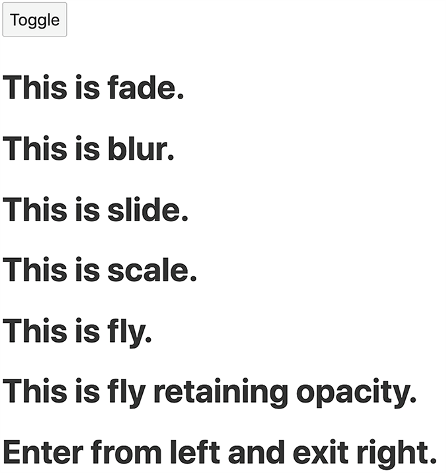
Figure 10.6 Transitions demo app
Listing 10.5 Transitions demo app
<script>
  import {linear} from 'svelte/easing';                               ❶
  import {blur, fade, fly, scale, slide} from 'svelte/transition';
  let show = true;
  let options = {duration: 1000, easing: linear};
</script>

<button on:click={() => show = !show}>
  Toggle
</button>
{#if show}
  <h1 transition:fade={options}>This is fade.</h1>
  <h1 transition:blur={options}>This is blur.</h1>
  <h1 transition:slide={{...options, x: -150}}>This is slide.</h1>
  <h1 transition:scale={options}>This is scale.</h1>
  <h1 transition:fly={{...options, x: -150}}>This is fly.</h1>
  <h1 transition:fly={{...options, opacity: 1, x: -400}}>
    This is fly retaining opacity.
  </h1>
  <h1
    in:fly={{...options, opacity: 1, x: -400}}
    out:fly={{...options, opacity: 1, x: 500}}
  >
    Enter from left and exit right.
  </h1>
{/if}
❶ Setting the easing function to linear makes it more obvious that all the animations are happening simultaneously.
Only transitions specified with the transition directive can be canceled. Canceling a transition means the element returns to its previous state of either being in the DOM or not being in the DOM. Transitions specified using the in and out directives cannot be canceled. This makes sense because, for example, it would be odd to stop the addition of an element with a blur transition partway through, and to remove the element using a fly transition.
The following example moves buttons between left and right lists as each button is clicked (see figure 10.7). It uses the fade transition, so the clicked button fades out of its current list and fades into its new list. It also uses the flip animation so buttons below the button being moved slide up to fill the vacated space.
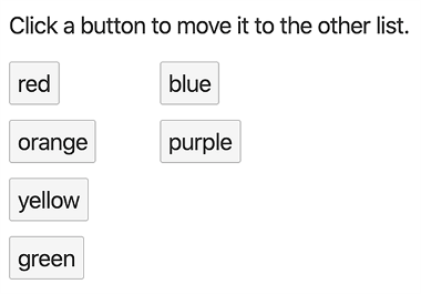
Figure 10.7 Moving buttons with fade and flip
We will implement this using two components to avoid duplicating code. The following listing shows the ButtonList component that is used for both the left and right lists.
Listing 10.6 ButtonList component in src/ButtonList.svelte
<script>
  import {flip} from 'svelte/animate';
  import {fade} from 'svelte/transition';

  export let list;                    ❶
  export let moveFn;                  ❷

  const options = {duration: 1000};
</script>

<div class="list">
  {#each list as item (item)}
    <button
      class="item"
      on:click={moveFn}
      animate:flip={options}
      transition:fade={options}>
      {item}
    </button>
  {/each}
</div>

<style>
  .item {
    display: block;
    margin-bottom: 10px;
    padding: 5px;
  }

  .list {
    display: inline-block;
    vertical-align: top;
    width: 100px;
  }
</style>
❶ This is an array of button text values.
❷ This is a function that moves the clicked button to the other list.
The next listing shows a component that uses two instances of the ButtonList component.
Listing 10.7 App that uses the ButtonList component
<script>
  import ButtonList from './ButtonList.svelte';

  let left = ['red', 'orange', 'yellow', 'green'];
  let right = ['blue', 'purple'];

  function move(event, from, to) {
    const text = event.target.textContent.trim();        ❶
    to.push(text);                                       ❷
    return [from.filter(t => t !== text), to];           ❸
  }

  function moveLeft(event) {
    [right, left] = move(event, right, left);            ❹
  }

  function moveRight(event) {
    [left, right] = move(event, left, right);            ❹
  }
</script>

<p>Click a button to move it to the other list.</p>
<ButtonList list={left} moveFn={moveRight} />
<ButtonList list={right} moveFn={moveLeft} />
❶ trim is needed because ButtonList includes whitespace in the button text.
❷ This adds the text to the “to” list.
❸ This removes the text from the “from” list.
❹ New values must be assigned to left and right to trigger updates.
Copy these files to the REPL and try it!
The crossfade transition creates send and receive transitions. These are used to coordinate the movement of an element from one parent to another. This is also referred to as a deferred transition (see https://svelte.dev/ tutorial/deferred-transitions).
One example of using crossfade is to move items between lists (see figure 10.8). An item is sent out of one list and received into another. The send transition defers to see if the element is being received in the other location. Then it animates a transition of the element from its current location to its new location. This provides a much nicer visual effect than what we achieved earlier using the fade transition.
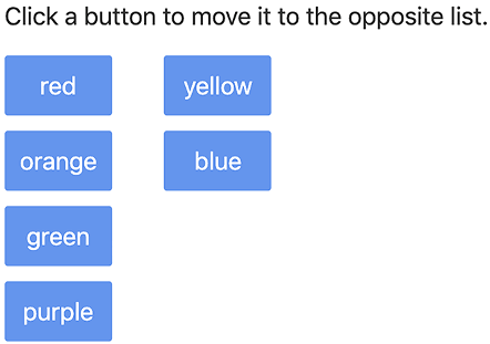
Figure 10.8 crossfade demo app
The following listing shows an example of using crossfade. Like before, this example also uses the flip animation so that the remaining list items animate closing up the vacated space.
Listing 10.8 crossfade demo app
<script>
  import {flip} from 'svelte/animate';
  import {crossfade} from 'svelte/transition';
  const [send, receive] = crossfade({});              ❶

  let left = ['red', 'orange', 'green', 'purple'];
  let right = ['yellow', 'blue'];

  function move(item, from, to) {
    to.push(item);
    return [from.filter(i => i !== item), to];
  }

  function moveLeft(item) {
    [right, left] = move(item, right, left);
  }

  function moveRight(item) {
    [left, right] = move(item, left, right);
  }
</script>

<main>
  <p>Click a button to move it to the opposite list.</p>
  <div class="list">
    {#each left as item (item)}
      <button
        animate:flip
        in:receive={{key: item}}
        out:send={{key: item}}
        on:click={() => moveRight(item)}
      >
        {item}
      </button>
    {/each}
  </div>

  <div class="list">
    {#each right as item (item)}
      <button
        animate:flip
        in:receive={{key: item}}
        out:send={{key: item}}
        on:click={() => moveLeft(item)}
      >
        {item}
      </button>
    {/each}
  </div>
</main>

<style>
  button {
    background-color: cornflowerblue;
    border: none;
    color: white;
    padding: 10px;
    margin-bottom: 10px;
    width: 100%;
  }

  .list {
    display: inline-block;
    margin-right: 30px;
    vertical-align: top;
    width: 70px;
  }
</style>
❶ The crossfade function must be passed an options object, but it can be an empty object to use the defaults.
Copy this code to the REPL and try it. It’s amazing!
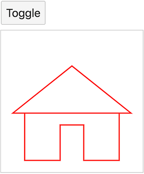
The draw transition animates the stroke of an SVG element.
The example in listing 10.9 draws a house with a single SVG path element that uses transition:draw. Click the Toggle button to cause the drawing and erasing of the house to be animated (see figure 10.9).
<script>
  import {draw} from 'svelte/transition';
  const commands =
    'M 2 5 v-4 h3 v3 h2 v-3 h3 v4 h-9 l 5 4 l 5 -4 h-1';       ❶
  const max = 12;
  let show = true;
</script>

<div>
  <button on:click={() => show = !show}>
    Toggle
  </button>
</div>

{#if show}
  <svg width={200} height={200} viewBox="0 0 {max} {max}">     ❷
    <g transform="translate(0 {max}) scale(1 -1)">             ❸
      <path transition:draw={{duration: 1000}}
        d={commands}
        fill="none"
        stroke="red"
        stroke-width="0.1px"                                  ❹
      />
    </g>
  </svg>
{/if}

<style>
  svg {
    outline: solid lightgray 1px;
  }
</style>
❷ This gives a coordinate system that goes from 0 to max on both the x and y axes.
❸ The scale function flips the coordinate system.
❹ In the coordinate system we have configured, 1px is very wide.
Implementing custom transitions is easy. All that is required is to write a function that follows a few basic rules. The function should take two arguments: the DOM node to be transitioned and an options object. Examples of options include
delay--This is the number of milliseconds to wait before the transition begins.
duration--This is the number of milliseconds over which the transition should occur.
easing--This is an easing function that takes a value between 0 and 1 and returns a value in that same range.
Options that are specific to a given transition can also be provided. For example, the fly transition accepts x and y options.
The function must return an object whose properties include the transition options and a css method. The css method must return the appropriate CSS string for the number between 0 and 1 that is returned by calling the easing function. Svelte takes care of honoring the delay and duration options.
The transition options returned can be given default values that are used when options are not passed to the custom function. For example, default values for duration and easing can be provided.
The css method is passed a time value between 0 and 1. It must return a string containing CSS properties to be applied to the DOM node for that time value. Examples of CSS properties that might vary over time include opacity, size, font size, position, rotation, and color.
Listing 10.10 is an example of a custom transition. It animates the scale and rotation of an element to make it appear to spiral down a drain when removed from the DOM. We will apply this to a div element containing the text “Take me for a spin!” sized to wrap to two lines (see figure 10.10). Click the Toggle button to toggle between hiding and showing the div element. Check the “Springy” checkbox to use the backInOut easing function instead of the linear easing function.
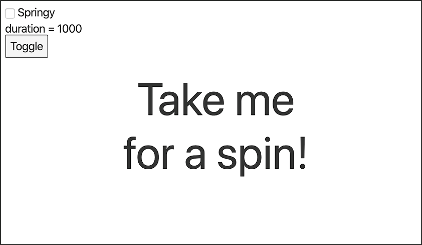
Figure 10.10 Custom transition app
Copy this code to the REPL to try it.
Listing 10.10 Custom transition app
<script>
  import {backInOut, linear} from 'svelte/easing';

  let springy = false;
  $: duration = springy ? 2000 : 1000;
  $: easing = springy ? backInOut : linear;
  $: options = {duration, easing, times: 2};

  let show = true;
  const toggle = () => show = !show;

  function spin(node, options) {
    const {easing, times = 1} = options;
    return {
      ...options,
      css(t) {                                                 ❶
        const eased = easing(t);                               ❷
        const degrees = 360 * times;                           ❸
        return `transform: scale(${eased}) rotate(${eased * degrees}deg);`;
      }
    };
  }
</script>

<label>
  <input type="checkbox" bind:checked={springy} /> Springy
</label>
<div>duration = {duration}</div>
<button on:click={toggle}>Toggle</button>

{#if show}
  <div class="center" in:spin={options} out:spin={options}>    ❹
    <div class="content">Take me for a spin!</div>
  </div>
{/if}

<style>
  .center {                                                    ❺
    position: absolute;
    left: 50%;
    top: 50%;
    transform: translate(-50%, -50%);
  }

  .content {
                                                               ❻
    position: absolute;
    transform: translate(-50%, -50%);

    font-size: 64px;
    text-align: center;
    width: 300px;
  }
</style>
❶ The value of t passed to the css method varies between 0 and 1 during an “in” transition and between 1 and 0 during an “out” transition.
❷ Recall that easing functions return a value between 0 and 1 inclusive.
❸ This is the degrees through which to spin.
❹ The reasons for using in and out instead of transition is explained in the next section.
❺ This has a width and height of 0 and is only used to center the content on the page.
❻ These CSS properties give rotation about the center.
Recall that we can specify separate in and out transition props instead of specifying a transition prop that is used for both the “in” and “out” portions. There is a difference between these approaches even if the same transition is specified for in and out. When the transition prop is used, the same transition options will be used for the “out” portion as the “in” portion even if the options are changed after the “in” portion occurs. To allow option changes made after the “in” portion occurs to be honored by the “out” portion, use the in and out props instead of the transition prop.
In the previous example, the transition options are changed when the “Springy” checkbox is changed. This is why we use in:spin={options} out:spin={options} instead of transition:spin={options}.
Events are dispatched at specific points in a transition. An introstart event is dispatched when an “in” transition begins. An introend event is dispatched when an “in” transition ends. An outrostart event is dispatched when an “out” transition begins. An outroend event is dispatched when an “out” transition ends.
Like with other events, the on directive can be used to register a function to be called when these events are dispatched. For example, to run a function when the transition for an element being removed from the DOM completes, use on:outroend={someFunction}. These functions can trigger changes to the affected component or to other components. For example, focus can be moved to a particular input element after the transition for an element being added to the DOM completes using on:introend.
Let’s apply what you have learned about animation to the Travel Packing app. The finished code can be found at http://mng.bz/rrlD.
We want to add four animations:
Animate adding and deleting items in a category so they slide to their new positions.
Animate adding and deleting categories so they slide to their new positions.
Animate deleting a category by rotating and scaling it so it appears to spin down a drain.
In Category.svelte, do the following:
import {flip} from 'svelte/animate';
Wrap the Item component and the comment that precedes it with the following div:
<div animate:flip>
  ...
</div>
The first animation for adding and deleting items is now complete.
In Checklist.svelte, do the following:
import {flip} from 'svelte/animate';
const options = {duration: 700};
Wrap the Category component with the following div:
<div class="wrapper" animate:flip={options}>
  ...
</div>
Note In Safari, items are not visible while they are being dragged if the <Category> in Checklist.svelte is wrapped in a div element. Removing the div fixes it, but then we lose animation of Category components.
style element:
.animate {
  display: inline-block;
}

.wrapper {
  display: inline;
}
The second animation for adding and deleting categories is now complete.
In Category.svelte, do the following:
Import the linear easing function and the scale transition:
import {linear} from 'svelte/easing';
import {scale} from 'svelte/transition';
options constant:
const options = {duration: 700, easing: linear};
Add the following attribute to the section element that wraps all the HTML for a category:
in:scale={options}
The third animation for scaling new categories from 0 to full size is now complete.
In Category.svelte, do the following:
Add the times property, which specifies the number of times to spin, to the options constant to match the following:
const options = {duration: 700, easing: linear, times: 2};
Add the custom transition function spin, which scales and rotates a given DOM node over the duration of an animation:
function spin(node, options) {
  const {easing, times = 1} = options;
  return {
    ...options,
    css(t) {
      const eased = easing(t);
      const degrees = 360 * times;             ❶
      return 'transform-origin: 50% 50%; ' +
        `transform: scale(${eased}) ` +
        `rotate(${eased * degrees}deg);`;
    }
  };
}
Add the following attribute to the section element that wraps all the HTML for a category:
out:spin={options}
The fourth animation for making categories appear to spin down a drain when they are deleted is now complete.
That was really a small amount of code to add in order to gain all those animations! In the next chapter you will learn some tips for debugging Svelte applications.
Svelte has great built-in support for CSS-based, rather than JavaScript-based, animation, which means the animation won’t block the main thread.
Easing functions control the rate of change in an animation over its duration. Many easing functions are provided, and custom easing functions can be defined.
Animation is supported by the provided packages svelte/easing, svelte/ animate, svelte/transition, and svelte/motion.