Now that we’ve covered most of the features of Svelte, it’s time to turn our focus to testing. We want to feel confident that our applications have properly implemented their intended functionality in a way that is accessible to a variety of users and that will remain that way through repeated updates. Three primary kinds of tests to consider are unit, end-to-end, and accessibility.
Unit tests are intended to test a piece of code in isolation from the rest of an application. These are great for testing individual functions and components. We will cover implementing unit tests using the Jest testing framework.
End-to-end tests are intended to test an application in the same way that a user would interact with it. This includes logging in (if the app requires it), navigating to each page within the app (if there are multiple pages), and generally putting the app into each of the states a user would encounter. We will cover implementing end-to-end tests using the Cypress testing framework.
Accessibility tests verify that users with special needs will be able to successfully use the application. Often they focus on supporting users with vision impairments that require more color contrast or the use of screen readers. We will cover implementing accessibility tests using the Svelte compiler, Lighthouse, axe, and WAVE.
Storybook is a tool that catalogs and demonstrates individual components that are used by an app. It works with many web frameworks, including Svelte.
Proper use of the tools described in this chapter can help developers identify issues in their Svelte and Sapper applications. These tools can also help reduce the issues users might encounter when apps are released for production use.
This chapter is a bit longer than previous ones due to the many code examples and screenshots. But it’s well worth working through them all to get better at testing Svelte apps, which results in better apps overall!
Jest (https://jestjs.io) bills itself as “a delightful JavaScript Testing Framework with a focus on simplicity.” It can be used to implement unit tests for many web frameworks, including Svelte.
By default, Jest tests are run in jsdom (https://github.com/jsdom/jsdom), which supports headless execution of DOM-based tests. This enables us to run Jest tests from a command prompt and in continuous integration (CI) environments.
Jest can watch source and test files and automatically rerun the tests if any of these files are modified. This is a convenient feature when debugging test failures.
Jest supports snapshot tests. These are simple tests that assert that some output should be the same as it was the last time the test was run. They make implementing many tests much easier, but they require extra diligence in examining test failures.
Jest test suites are defined by functions that are passed to the describe function . These functions can
Declare constants and variables used by all the tests in the suite
Call the test function once for each test in the suite, passing it a function that contains the code for the test. Note that it is an alias for test.
Typically each test suite is defined in a separate file with an extension of .spec.js. These files can be colocated with the .js and .svelte source files they test, or they can be placed in the _ _tests_ _ directory at the same level as the src directory.
Note Recall that Svelte bundles only include code that is actually used. This means that test code will not be included.
The functions passed to the test function can
Render a Svelte component, optionally providing prop values.
Simulate user interactions by firing events that can trigger DOM updates.
Make assertions about what should be found in the DOM using the expect function.
For details on using the expect function and “matchers” that specify what to expect, see the Jest documentation for “Using Matchers” (https://jestjs.io/docs/en/using-matchers). Many examples are provided in this section.
The Svelte Testing Library (https://testing-library.com/docs/svelte-testing-library/ intro) can be used in conjunction with Jest to make implementing tests of Svelte components easier. It is built on the DOM Testing Library (https://testing-library.com/ docs/dom-testing-library/intro), which provides functions for implementing tests that are not specific to any web framework.
The most important functions provided by the Svelte Testing Library are render and fireEvent.
The render function takes a Svelte component and an object containing props to pass to the component. It returns an object containing a container property and query functions that can be called to find nodes in the DOM created by the component. The container property value is the topmost DOM element of the rendered component. Tests can find DOM nodes inside this using the DOM methods querySelector and querySelectorAll.
For details on the query functions returned by the render function, see the DOM Testing Library’s “Queries” documentation (https://testing-library.com/docs/dom-testing-library/api-queries). Some of the most commonly used query functions are getByText, getByLabelText, and getByTestId.
The fireEvent function fires a given event on a specific DOM node. This can trigger a Svelte component to update the DOM. Calls to the expect function that follow can verify that the expected DOM updates were made.
To install everything needed to implement unit tests for Svelte components, cd to the project directory and enter npm install -D name, where name is each of the following:
Babel compiles modern JavaScript code to JavaScript that runs in current browsers. Configure the use of Babel by creating the following file in the top project directory.
Listing 12.1 Babel configuration in babel.config.js
module.exports = {
  presets: [
    [
      '@babel/preset-env',
      {
        targets: {
          node: 'current'       ❶
        }
      }
    ]
  ]
};
❶ This setting avoids the error message “regenerator-runtime not found.”
Configure the use of Jest by creating the following file in the top project directory.
Listing 12.2 Jest configuration in jest.config.js
module.exports = {
  bail: false,                              ❶
  moduleFileExtensions: ['js', 'svelte'],
  transform: {
    '^.+\\.js$': 'babel-jest',
    '^.+\\.svelte$': 'svelte-jester'
  },
  verbose: true                             ❷
};
❶ This tells Jest not to exit a test suite when one of its tests fails, which allows you to get results for other tests in the suite.
❷ This causes Jest to show the result of each test rather than just a summary of the results for each test suite.
Add the following npm scripts in package.json.
"test": "jest src",
"test:watch": "npm run test -- --watch"
To run the unit tests once, enter npm test. To run the unit tests in watch mode so they are automatically rerun when code changes are detected, enter npm run test:watch.
Here is a Jest test suite for the Todo component shown at the end of chapter 2.
Listing 12.3 Jest test for Todo component in src/Todo.spec.js
import {cleanup, render} from '@testing-library/svelte';

import Todo from './Todo.svelte';

describe('Todo', () => {
  const text = 'buy milk';
  const todo = {text};

  afterEach(cleanup);                 ❶

  test('should render', () => {
    const {getByText} = render(Todo, {props: {todo}});
    const checkbox = document.querySelector('input[type="checkbox"]');
    expect(checkbox).not.toBeNull(); // found checkbox
    expect(getByText(text)); // found todo text
    expect(getByText('Delete')); // found Delete button
  });
});
❶ This unmounts any components mounted in the previously run test.
There is no easy way to test that events are fired when the checkbox state is changed or when the Delete button is clicked. These are covered by tests for the TodoList component.
The following listing shows a Jest test suite for the TodoList component from the end of chapter 2.
Listing 12.4 Jest test for TodoList component in src/TodoList.spec.js
import {cleanup, fireEvent, render, waitFor} from '@testing-library/svelte';

import TodoList from './TodoList.svelte';

describe('TodoList', () => {
  const PREDEFINED_TODOS = 2;                                ❶

  afterEach(cleanup);

  function expectTodoCount(count) {                          ❷
    return waitFor(() => {                                   ❸
      const lis = document.querySelectorAll('li');           ❹
      expect(lis.length).toBe(count);
    });
  }

  test('should render', async () => {
    const {getByText} = render(TodoList);
    expect(getByText('To Do List'));
    expect(getByText('1 of 2 remaining'));
    expect(getByText('Archive Completed')); // button
    await expectTodoCount(PREDEFINED_TODOS);
  });

  test('should add a todo', async () => {
    const {getByTestId, getByText} = render(TodoList);

    const input = getByTestId('todo-input');                 ❺
    const value = 'buy milk';
    fireEvent.input(input, {target: {value}});
    fireEvent.click(getByText('Add'));

    await expectTodoCount(PREDEFINED_TODOS + 1);
    expect(getByText(value));
  });

  test('should archive completed', async () => {
    const {getByText} = render(TodoList);
    fireEvent.click(getByText('Archive Completed'));
    await expectTodoCount(PREDEFINED_TODOS - 1);
    expect(getByText('1 of 1 remaining'));
  });

  test('should delete a todo', async () => {
    const {getAllByText, getByText} = render(TodoList);
    const text = 'learn Svelte';                            ❻
    expect(getByText(text));

    const deleteBtns = getAllByText('Delete');
    fireEvent.click(deleteBtns[0]);                         ❼
    await expectTodoCount(PREDEFINED_TODOS - 1);
  });

  test('should toggle a todo', async () => {
    const {container, getByText} = render(TodoList);
    const checkboxes = container.querySelectorAll('input[type="checkbox"]');

    await fireEvent.click(checkboxes[1]);                   ❽
    expect(getByText('0 of 2 remaining'));

    await fireEvent.click(checkboxes[0]);                   ❾
    expect(getByText('1 of 2 remaining'));
  });
});
❶ This is the number of todos that are automatically added in the TodoList component.
❷ This is used by many of the test functions below.
❸ This waits for the DOM to be updated; it returns a Promise.
❹ Each Todo component has an li root element.
❺ This requires adding the following attribute to the input element in src/TodoList.svelte: data-testid="todo-input":.
❻ This is the text in the first todo.
❼ This deletes the first todo.
❽ This toggles the second todo.
❾ This toggles the first todo.
Let’s add some unit tests in the Travel Packing app. The finished code can be found at http://mng.bz/QyNG.
Change the button element in src/Item.svelte to include a data-testid attribute to make it easier to find this button in a test.
Listing 12.5 Change to Item component in src/Item.svelte
<button class="icon" data-testid="delete"
on:click={() => dispatch('delete')}>
🗑
</button>
The following listing shows a Jest test suite for the Item component.
Listing 12.6 Jest test for Item component in Item.spec.js
import {cleanup, render} from '@testing-library/svelte';

import Item from './Item.svelte';

describe('Item', () => {
  const categoryId = 1;
  const dnd = {};                                                       ❶
  const item = {id: 2, name: 'socks', packed: false};

  afterEach(cleanup);

  test('should render', () => {
    const {getByTestId, getByText} = render(Item, {categoryId, dnd, item});
    const checkbox = document.querySelector('input[type="checkbox"]');
    expect(checkbox).not.toBeNull();                                    ❷
    expect(getByText(item.name));                                       ❸
    expect(getByTestId('delete'));                                       ❹
  });
});
❶ The Item component requires this prop, but it won’t be used in the test, so an empty object suffices.
❷ Tests that the checkbox can be found
❸ Tests that the item name can be found
❹ Tests that the Delete button can be found
The preceding test simply verifies that the Item component renders the expected DOM elements. This can also be accomplished using a “snapshot” test. The first time snapshot tests are run, a _ _snapshots_ _ directory is created, and files containing rendered output are saved in this directory. In subsequent runs the rendered output is compared to these files. Any differences are reported as failed tests.
Relying on snapshot tests requires attention to detail on the part of the developers who run them. When tests are run the first time, developers should verify that components are currently rendering correctly. In subsequent test runs, if any tests fail, developers should carefully examine the differences reported and determine whether they are expected based on recent code changes. If they are expected, press the “U” key to update all the snapshot files that differ. Otherwise, fix the errors and rerun the tests.
The following listing shows a snapshot test for the Item component. Note how much simpler this is to write than the previous “should render” test.
Listing 12.7 Snapshot test for Item component in Item.spec.js
test('should match snapshot', () => {
  const {container} = render(Item, {categoryId, dnd, item});
  expect(container).toMatchSnapshot();
});
Tests for the Category component need to be able to find the input element that binds to the variable itemName. To simplify this, change the input element to include a data-testid attribute.
Listing 12.8 Adding data-testid attribute to input in src/Category.svelte
<input data-testid="item-input" required bind:value={itemName} />
The following listing shows a Jest test suite for the Category component.
Listing 12.9 Jest tests for Category component in Category.spec.js
import {cleanup, fireEvent, render, waitFor} from '@testing-library/svelte';

import Category from './Category.svelte';

describe('Category', () => {
  let itemCount = 0;                                           ❶

  const category = {id: 1, name: 'Clothes', items: {}};
  const categories = [category];
  const dnd = {};                                              ❷
  const props = {categories, category, dnd, show: 'all'};

  beforeEach(() => {
    category.items = {
      1: {id: 1, name: 'socks', packed: true},
      2: {id: 2, name: 'shoes', packed: false}
    };
    itemCount = Object.keys(category.items).length;
  });

  afterEach(cleanup);

  test('should match snapshot', () => {
    const {container} = render(Category, props);
    expect(container).toMatchSnapshot();
  });

  function expectItemCount(count) {
    return waitFor(() => {
      const lis = document.querySelectorAll('li');             ❸
      expect(lis.length).toBe(count);
    });
  }

  test('should render', async () => {
    const {getByText} = render(Category, props);
    expect(getByText('Clothes'));
    expect(getByText('1 of 2 remaining'));
    expect(getByText('New Item'));
    expect(getByText('Add Item'));
    await expectItemCount(itemCount);
  });

  test('should add an item', async () => {
    const {getByTestId, getByText} = render(Category, props);

    const input = getByTestId('item-input');
    const value = 't-shirts';
    fireEvent.input(input, {target: {value}});
    fireEvent.click(getByText('Add Item'));

    await expectItemCount(itemCount + 1);
    expect(getByText(value));
  });

  test('should delete an item', async () => {
    const {getAllByTestId} = render(Category, props);

    const deleteBtns = getAllByTestId('delete');
    fireEvent.click(deleteBtns[0]); // deletes first item
    await expectItemCount(itemCount - 1);
  });

  test('should toggle an item', async () => {
    const {container, getByText} = render(Category, props);

    const checkboxes = container.querySelectorAll('input[type="checkbox"]');
    expect(checkboxes.length).toBe(2);

    const [shoesCheckbox, socksCheckbox] = checkboxes;         ❹

    expect(socksCheckbox.nextElementSibling.textContent).toBe('socks');
    await fireEvent.click(socksCheckbox);
    expect(getByText('2 of 2 remaining'));                     ❺

    expect(shoesCheckbox.nextElementSibling.textContent).toBe('shoes');
    await fireEvent.click(shoesCheckbox);
    expect(getByText('1 of 2 remaining'));                     ❻
  });
});
❶ This will be set to the number of items that are added to the category inside the function that is passed to beforeEach.
❷ The Category component requires this prop, but it won’t be used in the test, so an empty object suffices.
❸ Each Item component has an li root element.
❹ The items are sorted so that “shoes” comes before “socks”.
❺ Now nothing in this category is packed.
❻ Now one item in this category is packed.
When the Jest tests for the Travel Packing app are run, DialogPolyfill, which is used in the custom Dialog component, will not be defined. To account for this, modify the call to onMount in src/Dialog.svelte to match the following:
DListing 12.10 ialog component onMount in src/Dialog.svelte
onMount(() => {
  if (dialogPolyfill) dialogPolyfill.registerDialog(dialog);
});
You might be tempted to wrap an if around the call to onMount instead of placing the if inside the function passed to onMount. However, that would not be correct because lifecycle functions cannot be called conditionally.
To temporarily skip running certain test suites, change their describe function to describe.skip. To temporarily skip running certain tests within a suite, change their test function to test.skip. To temporarily run only certain tests in a suite, change their test function to test.only.
We are now ready to run the Jest tests using the npm scripts added earlier in package.json.
When tests fail, output similar to the following will appear in the terminal where the tests ran. This test failure is caused by searching for “SOCKS” instead of “socks”.
Listing 12.11 Failed Jest output
FAIL  src/Item.spec.js
  Item
    ✘ should render (32ms)
    ✔ should match snapshot (4ms)

  ● Item › should render

    Unable to find an element with the text: SOCKS.
    This could be because the text is broken up by multiple elements.
    In this case, you can provide a function for your
    text matcher to make your matcher more flexible.

    <body>
      <div>
        <li
          class="svelte-ft3yg2"
          draggable="true"
        >
          <input
            class="svelte-ft3yg2"
            type="checkbox"
          />

          <span
            class="packed-false svelte-ft3yg2"
          >
            socks
          </span>

          <button
            class="icon svelte-ft3yg2"
            data-testid="delete"
          >
            🗑
          </button>
        </li>
      </div>
    </body>

      15 |     const checkbox = document.querySelector('input[type="checkbox"]');
      16 |     expect(checkbox).not.toBeNull(); // found checkbox
    > 17 |     expect(getByText(item.name.toUpperCase())); // found item name
         |            ^
      18 |     expect(getByTestId('delete')); // found delete button
      19 |   });
      20 |

      at getElementError (node_modules/@testing-library/dom/dist/query-helpers.js:22:10)
      at node_modules/@testing-library/dom/dist/query-helpers.js:76:13
      at getByText (node_modules/@testing-library/dom/dist/query-helpers.js:59:17)
      at Object.<anonymous> (src/Item.spec.js:17:12)

Test Suites: 1 failed, 1 passed, 2 total
Tests:       1 failed, 6 passed, 7 total
Snapshots:   2 passed, 2 total
Time:        1.964s, estimated 2s
Ran all test suites matching /src/i.

Watch Usage: Press w to show more.
When tests are successful, output similar to the following will appear in the terminal where the tests ran.
Listing 12.12 Successful Jest output
PASS  src/Item.spec.js
  Item
    ✔ should render (22ms)
    ✔ should match snapshot (5ms)

 PASS  src/Category.spec.js
  Category
    ✔ should match snapshot (48ms)
    ✔ should render (16ms)
    ✔ should add an item (14ms)
    ✔ should delete an item (32ms)
    ✔ should toggle an item (11ms)

Test Suites: 2 passed, 2 total
Tests:       7 passed, 7 total
Snapshots:   2 passed, 2 total
Time:        1.928s, estimated 2s
Ran all test suites matching /src/i.

Watch Usage: Press w to show more.
Cypress (www.cypress.io/) bills itself as “fast, easy and reliable testing for anything that runs in a browser.” It supports end-to-end testing of web applications written using any framework (including Svelte) or even no framework. This means that the tests can exercise the functionality of a web application without focusing on specific components as is done in unit tests.
All the functionality of Cypress is accessed through the global variable cy. Queries to find elements on the page can search by text and CSS selectors. By default they wait 4 seconds for elements to appear.
Suppose a web application renders a button containing the text “Press Me” that when clicked renders the text “Success”. The following code finds this button, clicks it, and verifies that “Success” is found.
cy.get('button').contains('Press Me').click();
cy.contains('Success');
The following code finds an input and types text into it. It assumes that the input has a data-testid attribute that can be used in tests to find it.
cy.get('[data-testid=some-id]').type('some text');
Cypress tests benefit greatly from you writing and using utility functions that navigate to various application states and make assertions. For example, a function that navigates to the login page, enters a username and password, and clicks the Login button is useful in nearly all tests of a web app that requires logging in. You will see several examples of these kinds of functions shortly, in tests for the Travel Packing app.
To install Cypress in a Svelte app, enter npm install -D cypress. Then add the following npm scripts in package.json:
"cy:open": "cypress open",     ❶
"cy:run": "cypress run",       ❷
❶ This runs Cypress in interactive mode.
❷ This runs Cypress in command-line mode.
To launch the Cypress test tool in interactive mode, enter npm run cy:open. The tests are automatically rerun if any source files or test files are modified. This command also creates a cypress directory, if it doesn’t already exist, containing the following subdirectories:
fixtures--Fixtures can hold data used by tests. The data is typically in .json files that are imported into tests. Using fixtures is optional.
integration--Test implementation files (a.k.a. specs) go here, either at the top of this directory or in subdirectories.
plugins--Plugins extend the functionality of Cypress. For examples of Cypress plugins, see https://github.com/bahmutov/cypress-svelte-unit-test. Cypress automatically runs the code in the index.js file in this directory before running each spec file. Using plugins is optional.
screenshots--This subdirectory holds screenshots produced by calling cy.screenshot(). These are useful when debugging tests.
support--Files in this subdirectory add custom Cypress commands, making them available in tests. Cypress automatically runs the code in the index.js file in this directory before running each spec file. Using custom Cypress commands is optional.
These subdirectories are populated with sample files, all of which can be deleted. Create your test files under the cypress/integration directory with extensions of .spec.js.
Here are some end-to-end tests for the Todo application shown at the end of chapter 2.
Listing 12.13 Cypress tests for the TodoList component in cypress/integration/TodoList.spec.js
const baseUrl = 'http://localhost:5000/';

describe('Todo app', () => {
  it('should add todo', () => {
    cy.visit(baseUrl);
    cy.contains('1 of 2 remaining');
    cy.contains('Add')                                   ❶
      .as('addBtn')                                      ❷
      .should('be.disabled');

    const todoText = 'buy milk';                         ❸
    cy.get('[data-testid=todo-input]')
      .as('todoInput')
      .type(todoText);

    const addBtn = cy.get('@addBtn');
    addBtn.should('not.be.disabled');
    addBtn.click();

    cy.get('@todoInput').should('have.value', '');
    cy.get('@addBtn').should('be.disabled');
    cy.contains(todoText);
    cy.contains('2 of 3 remaining');
  });

  it('should toggle done', () => {
    cy.visit(baseUrl);
    cy.contains('1 of 2 remaining');

    cy.get('input[type=checkbox]')                       ❹
      .first()                                           ❹
      .as('cb1')                                         ❹
      .click();                                          ❹
    cy.contains('2 of 2 remaining');                     ❹

    cy.get('@cb1').check();                              ❺
    cy.contains('1 of 2 remaining');                     ❺
  });

  it('should delete todo', () => {
    cy.visit(baseUrl);
    cy.contains('1 of 2 remaining');

    const todoText = 'learn Svelte'; // first todo
    cy.contains('ul', todoText);

    cy.contains('Delete').click();                      ❻
    cy.contains('ul', todoText).should('not.exist');    ❻
    cy.contains('1 of 1 remaining');                    ❻
  });                                                   ❻

  it('should archive completed', () => {
    cy.visit(baseUrl);

    const todoText = 'learn Svelte'; // first todo
    cy.contains('ul', todoText);

    cy.contains('Archive Completed').click();           ❼
    cy.contains('ul', todoText).should('not.exist');    ❼
    cy.contains('1 of 1 remaining');                    ❼
  });
});
❶ The Add button should be disabled until text is entered.
❷ This saves a reference to found elements for later use.
❹ This finds the first checkbox and toggles it.
❺ This toggles the same checkbox again to show that status text returns to its previous value.
❻ This clicks the first Delete button.
❼ This clicks the Archive Completed button.
To run the tests in interactive mode, start the local server with npm run dev, enter npm run cy:open, and click the Run All Specs button in the upper-right corner of the Cypress tool. This opens a browser window where all the tests are run. When you’re finished running the tests, close this browser window and the Cypress tool.
To aid in debugging, add console.log calls in the application code. When there are several of these in the code, it is helpful if they identify the source file and function where they are located. For example, console.log('TodoList.svelte toggleDone: todo =', todo);. To see their output, open the DevTools Console in the browser window where the tests are running.
To run the tests in command-line mode, start the local server with npm run dev, open another terminal, and enter npm run cy:run. This outputs test results in the terminal window, records an MP4 video of the test run, and outputs the file path of the video, which is in the cypress/videos subdirectory. Double-click the video file to watch it.
Let’s add end-to-end tests in the Travel Packing app. The finished code can be found at http://mng.bz/eQqQ.
In another terminal, enter npm run cy:open to create the cypress directory and starting files inside it.
Move the cypress/integration/examples directory to cypress/examples so these example tests don’t appear in the Cypress app but can be referred to later for examples.
Add a data-testid attribute to the input element that binds to the categoryName variable in src/Checklist.svelte so the input element is easy to find in a test:
<input
  data-testid="category-name-input"
  required
  bind:value={categoryName}
/>
Create a travel-packing.spec.js file in the cypress/integration directory containing the code in listing 12.14.
Listing 12.14 Cypress tests for the Travel Packing app in cypress/integration/travel-packing.spec.js
const baseUrl = 'http://localhost:5000/';

function login() {
  cy.visit(baseUrl);
  cy.contains('Username')
    .children('input')
    .type('username');
  cy.contains('Password')
    .children('input')
    .type('password');
  cy.get('button')
    .contains('Login')
    .click();
}

function addCategories() {
  login();                                              ❶

  cy.get('[data-testid=category-name-input]')
    .as('nameInput')
    .type('Clothes');
  cy.get('button')
    .contains('Add Category')
    .click();

  cy.get('@nameInput').type('Toiletries{enter}');       ❷
}

function addItems() {
  addCategories();                                      ❸

  cy.get('[data-testid=item-input]')
    .first()                                            ❹
    .as('item-input-1')
    .type('socks');
  cy.get('button')
    .contains('Add Item')
    .first()
    .click();
  cy.get('@item-input-1').type('shoes{enter}');
  verifyStatus('Clothes', '2 of 2 remaining');

  cy.get('[data-testid=item-input]')
    .last()                                             ❺
    .type('razor{enter}');
  verifyStatus('Toiletries', '1 of 1 remaining');
}

function deleteCategory(categoryName) {
  cy.contains(new RegExp(`^${categoryName}$`))
    .siblings('button')
    .click();
}

function deleteItem(itemName) {
  cy.contains(new RegExp(`^${itemName}$`))
    .siblings('button')
    .click();
}

function togglePacked(itemName) {
  cy.contains(new RegExp(`^${itemName}$`))
    .siblings('input[type="checkbox"]')
    .click();
}

function verifyStatus(categoryName, expectedStatus) {
  cy.contains(new RegExp(`^${categoryName}$`))
    // This is useful to verify that the correct element is found.
    // It draws a red outline around all the matching elements.
    //.then(el => el.css('outline', 'solid red'))
    .siblings('span')
    .contains(expectedStatus);
}

describe('Travel Packing app', () => {
  it('should login', login);

  it('should add categories', addCategories);

  it('should add items', addItems);

  it('should toggle packed', () => {
    addItems();
    verifyStatus('Clothes', '2 of 2 remaining');

    togglePacked('shoes');
    verifyStatus('Clothes', '1 of 2 remaining');

    togglePacked('shoes');
    verifyStatus('Clothes', '2 of 2 remaining');
  });

  it('should delete item', () => {
    addItems();
    verifyStatus('Clothes', '2 of 2 remaining');

    deleteItem('shoes');
    verifyStatus('Clothes', '1 of 1 remaining');
  });

  it('should delete category', () => {
    addItems();
    verifyStatus('Toiletries', '1 of 1 remaining');

    deleteItem('razor');                                   ❻
    verifyStatus('Toiletries', '0 of 0 remaining');

    const categoryName = 'Toiletries';
    // Verify that the category exists.
    cy.get('.categories h2 > span').contains(categoryName);
    deleteCategory(categoryName);
    // Verify that the category no longer exists.
    cy.get('.categories h2 > span')
      .contains(categoryName)
      .should('not.exist');
  });

  it('should logout', () => {
    login();
    cy.get('button')
      .contains('Log Out')
      .click();
    cy.contains('Login');
  });
});
❶ We must log in before adding categories.
❷ Including “{enter}” in a string passed to the type method simulates a user pressing the Enter key.
❸ We must add categories before adding items.
❹ This finds the input item in the “Clothes” category.
❺ This finds the input item in the “Toiletries” category.
❻ We must delete all items in a category before the category can be deleted.
To run these end-to-end tests, enter npm run cy:open. This renders the results shown in figure 12.1. Note the green check marks next to the successful tests.
To run these end-to-end tests in command-line mode, enter npm run cy:run. This outputs listing 12.15 in the terminal window.
Listing 12.15 Cypress command-line output
(Run Starting)

  ┌────────────────────────────────────────────────────────────────────────────┐
  │ Cypress:    3.8.1                                                          │
  │ Browser:    Electron 78 (headless)                                         │
  │ Specs:      1 found (travel-packing.spec.js)                               │
  └────────────────────────────────────────────────────────────────────────────┘

───────────────────────────────────────────────────────────────────────────────

  Running:  travel-packing.spec.js                                      (1 of 1)

  Travel Packing app
    ✓ should login (888ms)
    ✓ should add categories (1196ms)
    ✓ should add items (1846ms)
    ✓ should toggle packed (2057ms)
    ✓ should delete item (1973ms)
    ✓ should delete category (2037ms)
    ✓ should logout (1938ms)

  7 passing (13s)

  (Results)

  ┌────────────────────────────────────────────────────────────────────────────┐
  │ Tests:        7                                                            │
  │ Passing:      7                                                            │
  │ Failing:      0                                                            │
  │ Pending:      0                                                            │
  │ Skipped:      0                                                            │
  │ Screenshots:  0                                                            │
  │ Video:        true                                                         │
  │ Duration:     12 seconds                                                   │
  │ Spec Ran:     travel-packing.spec.js                                       │
  └────────────────────────────────────────────────────────────────────────────┘

  (Video)

  ●  Started processing:  Compressing to 32 CRF
  ●  Finished processing: /Users/mark/Documents/programming/languages/ (0 seconds)
                          javascript/svelte/book/svelte-and-sapper-in-action/
                          travel-packing-ch11/cypress/videos/
                          travel-packing.spec.js.mp4

================================================================================

  (Run Finished)

       Spec                          Tests  Passing  Failing  Pending  Skipped
  ┌────────────────────────────────────────────────────────────────────────────┐
  │ ✓  travel-packing.spec.js  00:12     7        7        -        -        - │
  └────────────────────────────────────────────────────────────────────────────┘
    ✓  All specs passed!       00:12     7        7        -        -        -
There are many tools for detecting web UI accessibility issues, such as the following.
Svelte compiler --The Svelte compiler flags some accessibility issues. These are described in the following section.
Lighthouse (https://developers.google.com/web/tools/lighthouse)--This is a free tool. It is used by Chrome DevTools on the Audits tab and can also be run from a command line or a Node application. Lighthouse audits many aspects of a web app, including performance, progressive web app metrics, accessibility, and search engine optimization (SEO).
axe (www.deque.com/axe/)--This is a free Chrome extension. axe PRO is an enterprise version of axe that identifies even more issues.
WAVE (https://wave.webaim.org/)--This is a free Chrome and Firefox extension. Pope Tech (https://pope.tech/) is an enterprise-level accessibility tool built on WAVE.
These tools can identify different issues, so it is recommended that you use more than one. As you will see below, sometimes it is not desirable to address all the identified issues.
The Svelte compiler detects some accessibility issues and outputs warning messages that begin with “A11y:”. You will see a list of the messages, along with their codes, in table 12.1. Note that some codes are used for more than one message.
Table 12.1 Svelte accessibility warning codes and messages
In some cases it may be desirable to suppress certain warnings. To do this, add a special comment above the offending lines. For example, to suppress the warning “Avoid using autofocus,” add the following line before all input elements that use it:
The easiest way to use Lighthouse to identify accessibility issues is as follows:
To keep current test results and open a new tab for the next test, press the “+” in the upper-left corner of the Audits tab.
Repeat steps 6 to 8 for each page or state of the site, noting the reported accessibility issues for each.
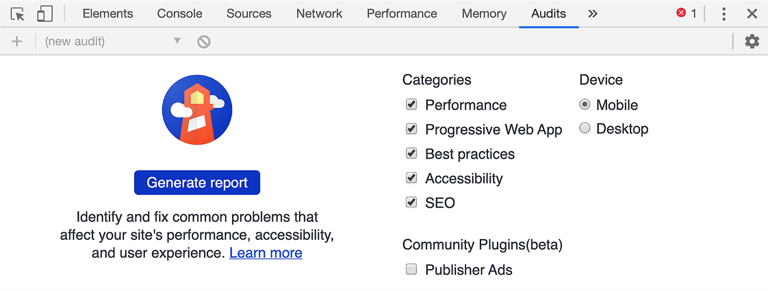
Figure 12.2 Lighthouse setup in Chrome DevTools
Note The issues have already been fixed in this chapter’s version of the Travel Packing app. To see these issues, run Lighthouse on the chapter 11 version.
To rerun tests after code changes, click the Clear All icon (a circle with a diagonal line) and then click the Run Audits button.
Lighthouse reported two issues for the Login page. The color contrast on the Login and Sign Up buttons, gray on white, is insufficient. These can be fixed by changing gray to black in public/global.css.
Lighthouse only reported one issue for the Checklist page of the Travel Packing app after adding a category and an item in it. It was “Background and foreground colors do not have a sufficient contrast ratio,” as shown in figures 12.3 and 12.4. The color contrast between the white text and the orange and cornflowerblue backgrounds is not sufficient from an accessibility standpoint. These color contrast issues can be fixed by choosing a color other than orange for .hero in src/App.svelte and choosing a color other than cornflowerblue for main in src/App.svelte and header in src/Dialog.svelte.

Figure 12.3 Lighthouse results in Chrome DevTools (top of page)
Figure 12.4 Lighthouse results in Chrome DevTools (bottom of page)
One way to discover acceptable colors is to use the Contrast Checker tool at https:// webaim.org/resources/contrastchecker/. Current colors can be entered, and a Lightness slider can be moved until the contrast ratio reaches at least 4.5.
To fix the contrast issues reported by Lighthouse, change all uses of the color cornflowerblue (#6495ed) to #3f6fde and all uses of the color orange (#ffa500) to #a3660a. A good way to do this is to assign the new colors to CSS variables and refer to the variables wherever the colors are needed. We can define global CSS variables in src/App.svelte using the :root syntax, as follows:
:root {
  --heading-bg-color: #a3660a;
  --primary-color: #3f6fde;
  ...
}
Then we can refer to the CSS variables wherever needed, as follows:
background-color: var(--heading-bg-color);
background-color: var(--primary-color);
To install axe in Chrome, follow these steps:
Browse to https://www.deque.com/axe/.
To run axe on a website, follow these steps:
To navigate between multiple instances of the same issue type, click the “<” and “>” buttons in the upper-right. To see the rendered element associated with the issue, click Highlight. To see the DOM element associated with the issue, click “</> Inspect Node”. To rerun the tests after code changes, click Run Again.
When axe is run on the Checklist page of the Travel Packing app after adding a category and an item in it, you’ll see the results shown in figures 12.5, 12.6, and 12.7.

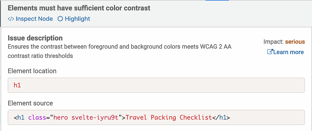
Figure 12.6 axe detail for an issue

Figure 12.7 axe fix suggestion for an issue
Let’s walk through the issues.
Elements must have sufficient color contrast --These are the same color contrast issues that were reported by Lighthouse.
Document must have one main landmark --This is caused by both App.svelte and Dialog.svelte rendering a main element. One fix is to change Dialog.svelte to use a section element instead of a main element.
Form elements must have labels --This is reported for two elements in src/Item/ svelte. The first is the checkbox input for marking an item as packed. The second is the text input for editing an item name that is rendered when the name of an item is clicked. Both of these omit a label. We don’t want to display label elements in these cases. One fix is to add an aria-label attribute to these input elements as follows:
<input
  aria-label="Toggle Packed"
  type="checkbox"
  bind:checked={item.packed}
/>
{#if editing}
  <input
    aria-label="Edit Name"
    autofocus
    bind:value={item.name}
    on:blur={() => (editing = false)}
    on:keydown={blurOnKey}
    type="text"
  />
<ul> and <ol> must only directly contain <li>, <script> or <template> elements --This issue is in Category.svelte where Item components that render an li element are wrapped in a div with the attribute animate:flip. We cannot remove the div and move this attribute to the li in Item.svelte because doing so causes the Svelte error “An element that use the animate directive must be the immediate child of a keyed each block.” So it seems we have to live with this accessibility issue if we want to keep this particular animation.
<li> elements must be contained in a <ul> or <ol> --This identifies the same issue as the previous one.
Heading levels should only increase by one --This issue is caused by using an h3 for the name of a category when the previous heading is an h1 in the “hero” at the top of the page. One fix is to change all occurrences of h3 in Category.svelte to h2. CSS can be used to reduce the font size of the h2 elements if desired.
To install WAVE in Chrome, follow these steps:
Browse to https://wave.webaim.org/.
To run WAVE on a website, follow these steps:
Browse to the website to be tested.
Click the WAVE icon ( ) to the right of the browser’s address bar.
An accessibility report will open on the left side of the page.
WAVE reports both issues and the good things it finds (such as having alt text for images). Click an icon for an issue to scroll to it on the web page.
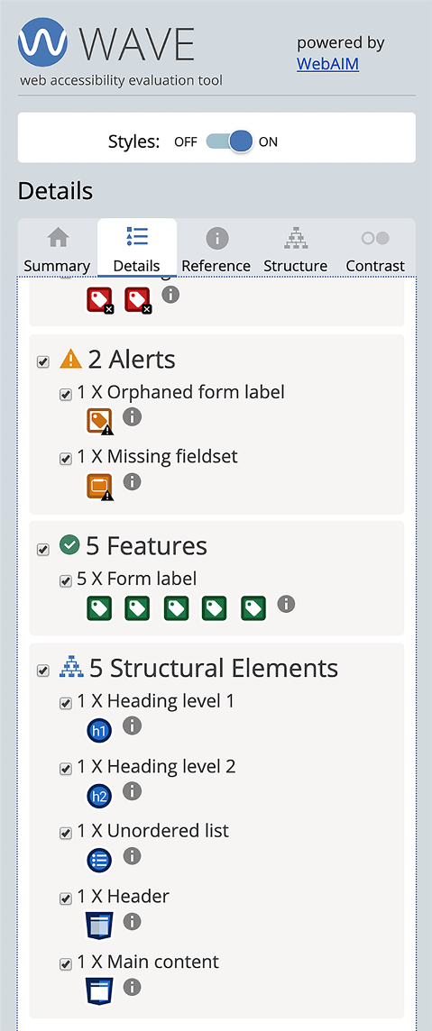
WAVE reported the issues shown in figures 12.8 and 12.9 for the Checklist page of the Travel Packing app after adding a category and an item in it.
Let’s walk through the issues.
Missing form label --These are the same issues that axe reported as “Form elements must have labels.”
Very low contrast --These are the same color contrast issues that were reported by Lighthouse.
Orphaned form label --This means that a form label is not associated with a form control. It refers to the Show label in Checklist.svelte. A fix is shown after the next issue because they are related.
Missing fieldset --This means that a group of checkboxes or radio buttons is not enclosed in a fieldset element.
One fix for the last two issues is to edit Checklist.svelte and use a fieldset element to surround the radio buttons. We want the radio buttons to be laid out in a row. But there is a browser issue where flexbox layout is not honored on fieldset elements.
|
|
|
A workaround is to wrap all the fieldset children in a div and apply flexbox layout to that. Here is a replacement for the <div class="radios"> element that fixes the accessibility issues.
<fieldset>
  <div>
    <legend>Show</legend>
    <label>
      <input name="show" type="radio" value="all" bind:group={show} />
      All
    </label>
    <label>
      <input name="show" type="radio" value="packed" bind:group={show} />
      Packed
    </label>
    <label>
      <input name="show" type="radio" value="unpacked" bind:group={show} />
      Unpacked
    </label>
    <button class="clear" on:click={clearAllChecks}>Clear All Checks</button>
  </div>
</fieldset>
Replace the CSS rules for .radios with the following:
fieldset {
  border: none;
  margin: 0;
  padding: 0;
}

fieldset > div {
  display: flex;
  align-items: center;
}

fieldset input {
  margin-left: 1.5rem;
}

fieldset legend {
  padding: 0;
}
Storybook (https://storybook.js.org) bills itself as “an open source tool for developing UI components in isolation.” It works with many web frameworks including React, Vue, Angular, Svelte, and more.
Storybook displays a list of components in specific states in its left nav (see figure 12.10). Selecting a component or state renders it in the main area of the UI. It also allows interaction with the component in all ways supported by the component. For example, if a Category component from the Travel Packing app is rendered, it can be renamed, and items can be added, renamed, marked as packed, and deleted.
Storybook has many uses. One is for showcasing the set of components that have been developed. Another is for testing and debugging components separately from web apps that use them. This is much faster than having to navigate to the use of a particular component in a web app.
Detailed instructions for using Storybook with Svelte components can be found in the Storybook documentation at https://storybook.js.org/docs/guides/guide-svelte/.

Figure 12.10 Storybook before adding components
To add the use of Storybook to an existing Svelte application, cd to the top application directory and enter the following:
npx -p @storybook/cli sb init --type svelte
This takes a couple of minutes to complete and results in the following changes:
It installs all the development dependencies needed by Storybook.
It adds the following npm scripts in package.json:
"storybook": "start-storybook",
"build-storybook": "build-storybook"
It creates the .storybook directory, which contains the addons.js file that registers the use of Storybook actions and links. Actions provide a way to log user interactions, such as a certain button being pressed. Links provide a way to add links in stories that can be clicked to navigate to other stories, as an alternative to clicking a link in the left nav.
This directory also contains the config.js file that configures the use of Storybook to automatically import all files found in the stories directory whose names end with .stories.js.
It creates the stories directory, which contains the button.svelte file that defines a simple Svelte component. It also contains the index.stories.js file that registers the Button component with Storybook. These files just provide an example of registering a component with Storybook. Typically source files for the components being demonstrated are found in the src directory rather than the stories directory.
The supplied Button component dispatches an event when it is clicked. The index.stories.js file listens for the event and calls the action function that it imports from @storybook/addon-actions. Strings passed to the action function are logged at the bottom of the main section of the Storybook UI. The Clear button in the lower-right corner of the Actions area clears the list of logged actions.
To run Storybook locally, enter npm run storybook.
To add components to Storybook, add one .stories.js file for each component in the stories directory. These files should be similar to the provided index.stories.js file.
Each story renders a component in a different state. It is common for a .stories.js file to define multiple stories that render the same component in different states. Each state has a name that is displayed in the left nav below the component name. The two states for the provided Button component are “Text” and “Emoji”.
When new .stories.js files are created, refresh the browser where Storybook is running to see them in the left nav. When an existing .stories.js file is modified, Storybook automatically detects the changes and displays the modified story at the bottom of the left nav.
Let’s define Storybook stories for the Travel Packing app components. The finished code can be found at http://mng.bz/pBqz.
The following listing shows stories for the Item component (see figure 12.11).

Figure 12.11 Item component in Storybook
Listing 12.16 Storybook stories for the Item component in stories/Item.stories.js
import {action} from '@storybook/addon-actions';
import Item from '../src/Item.svelte';
import '../public/global.css';                        ❶

export default {title: 'Item'};

const getOptions = packed => ({
  Component: Item,
  props: {
    categoryId: 1,
    dnd: {},
    item: {id: 2, name: 'socks', packed}
  },
  on: {delete: action('item delete dispatched')}      ❷
});
                                                      ❸
export const unpacked = () => getOptions(false);
export const packed = () => getOptions(true);
❶ This applies global styles from the Travel Packing app.
❷ This writes to the Actions area of the Storybook UI to indicate that the action occurred.
❸ Each story is defined by an exported function that returns an object describing the component to be rendered, props to be passed to it, and handling of events dispatched by the component.
Now that we have developed stories of our own, we no longer need the provided example files. The files button.svelte and index.stories.js can be deleted so they no longer appear inside Storybook.
The following listing shows stories for the Category component (see figure 12.12).
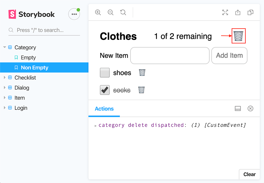
Figure 12.12 Category component in Storybook
Listing 12.17 Storybook stories for the Category component in stories/Category.stories.js
import {action} from '@storybook/addon-actions';
import Category from '../src/Category.svelte';
import '../public/global.css';

export default {title: 'Category'};

function getOptions(items) {
  const category = {id: 1, name: 'Clothes', items};
  return {
    Component: Category,
    props: {
      category,
      categories: {[category.id]: category},
      dnd: {},
      show: 'all'
    },
    on: {delete: action('category delete dispatched')}       ❶
  };
}

export const empty = () => getOptions({});
export const nonEmpty = () =>
  getOptions({
    1: {id: 1, name: 'socks', packed: true},
    2: {id: 2, name: 'shoes', packed: false}
  });
❶ This writes to the Actions area of the Storybook UI to indicate that the action occurred.
In the Travel Packing app, the App component provides some styling that will be missing in Storybook when we render components not nested in an App component. But we can simulate this by defining a StyleWrapper component that renders a given component in a div with specified styling applied to the div. The StyleWrapper component is used in a couple of the stories that follow.
Some of the components dispatch events to which their parent component listens. Recall that events only go to parent components. Inserting the StyleWrapper component between them breaks the ability of parent components to receive the events. To fix this, the StyleWrapper component must forward the events. The events in question are login and logout, so those are the events that are forwarded.
Listing 12.18 StyleWrapper component in stories/StyleWrapper.svelte
<script>
  export let component;
  export let style;
</script>

<div style={style}>
  <svelte:component this={component} on:login on:logout />     ❶
</div>
❶ This forwards login and logout events.
The following listing shows stories for the Checklist component (see figure 12.13). Each story has a name that is specified by the name of the function that defines it. These should be as descriptive as possible. The stories for the Item component were given the names unpacked and packed. The stories for the Category component were given the names empty and nonEmpty. However, sometimes there is no obvious name, and a generic name such as basic is used to indicate that basic use of the component is being demonstrated.

Figure 12.13 Checklist component in Storybook
SListing 12.19 torybook stories for the Checklist component in stories/Checklist.stories.js
import {action} from '@storybook/addon-actions';
import Checklist from '../src/Checklist.svelte';
import StyleWrapper from './StyleWrapper.svelte';
import '../public/global.css';

export default {title: 'Checklist'};

export const basic = () => ({
  Component: StyleWrapper,             ❶
  props: {
    component: Checklist,
    style: `
      background-color: cornflowerblue;
      color: white;
      height: 100vh;
      padding: 1rem
    `
  },
  on: {logout: action('logout dispatched')}
});
❶ This wraps the component being demonstrated in the StyleWrapper component.
The following listing shows stories for the Login component (see figure 12.14).
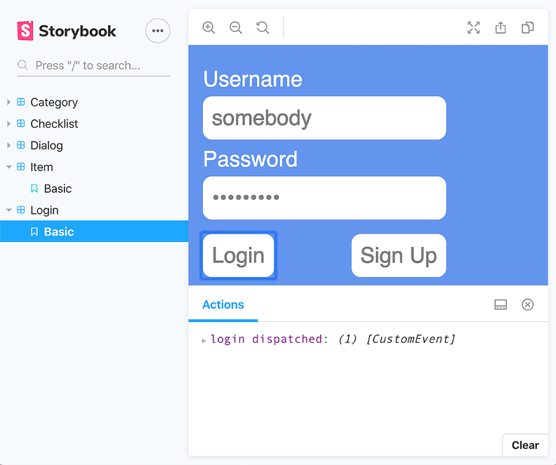
Figure 12.14 Login component in Storybook
Listing 12.20 Storybook stories for the Login component in stories/Login.stories.js
import {action} from '@storybook/addon-actions';
import StyleWrapper from './StyleWrapper.svelte';
import Login from '../src/Login.svelte';
import '../public/global.css';

export default {title: 'Login'};

export const basic = () => ({
  Component: StyleWrapper,
  props: {
    component: Login,
    style: `
      background-color: cornflowerblue;
      height: 100vh;
      padding: 1rem
    `
  },
  on: {login: action('login dispatched')}
});
We want to allow Storybook users to configure the title and content of a Dialog component. To enable this, we can define the following DialogWrapper component that provides inputs for the title and content. This component is only used by Storybook, not the Travel Packing app.
Listing 12.21 DialogWrapper component in stories/DialogWrapper.svelte
<script>
  import Dialog from '../src/Dialog.svelte';
  let content = 'This is some\\nlong content.';
  let dialog;
  let title = 'My Dialog Title';

  $: lines = content.split('\\n');       ❶
</script>

<section>
  <label>
    Title
    <input bind:value={title} />
  </label>

  <label>
    Content
    <textarea bind:value={content} />
    Insert \n to get multi-line content.
  </label>

  <button on:click={() => dialog.showModal()}>Show Dialog</button>

  <Dialog {title} bind:dialog={dialog} on:close={() => dialog.close()}>
    {#each lines as line}
      <div>{line}</div>
    {/each}
  </Dialog>
</section>

<style>
  input, textarea {
    margin: 0 1rem 1rem 1rem;
  }

  label {
    color: white;
    display: flex;
    align-items: flex-start;
  }

  section {
    background-color: cornflowerblue;
    height: 100vh;
    padding: 1rem;
  }
</style>
❶ The content string is split on occurrences of \n, which is the escape sequence for a newline character, to support multiline content.
The following listing shows stories for the Dialog component (see figure 12.15).

Figure 12.15 Dialog component in Storybook
Listing 12.22 Storybook stories for the Dialog component in stories/Dialog.stories.js
import DialogWrapper from './DialogWrapper.svelte';
import '../public/global.css';

export default {title: 'Dialog'};

export const basic = () => ({Component: DialogWrapper});
We have now added all the components in the Travel Packing app to Storybook.
It may be desirable to generate and deploy a static version of Storybook, including all the registered components, to allow others to view the components. To generate a static version of Storybook, enter npm run build-storybook. This creates the storybook-static directory containing all the required HTML and JavaScript files. All required CSS rules are compiled into the JavaScript. This directory can be copied to a web server. To view it locally, simply open the index.html file in a web browser.
Storybook provides a quick way to see a list of all the components used by an app and to interact with them. If a bug is discovered in a component, it can be debugged in the context of Storybook, which is easier than debugging in an app that uses it.
In the next chapter you’ll see options for deploying Svelte applications.
Jest is a good choice for implementing unit tests for Svelte applications, and using the Svelte Testing Library in conjunction with it makes this even easier.
Cypress is a good choice for implementing end-to-end tests for Svelte applications.
Lighthouse, axe, and WAVE are good choices for testing the accessibility of Svelte applications. The Svelte compiler also identifies many accessibility issues.
Storybook is a good tool for demonstrating Svelte components and debugging issues in them.