The Colour of the Cards
For the printing of the “original” deck, therefore, five large lithographic
stones were used: yellow, hazelnut, turquoise, red and black.
–Pietro Alligo, “Waite-Smith: The First Edition,” in Twenty Years of Tarot:
The Lo Scarabeo Story (Torino: Lo Scarabeo, 2007), 39
One of the first adverts for this “delightful experiment” appeared in the back of Ralph Shirley’s A New God (1911). Marketed as “without question, the finest and most artistic pack that has ever been produced,” it notes that the cards have been “exquisitely drawn and coloured, from new and original designs by Pamela Colman Smith.”
We can see in Waite’s own descriptions of the images that little colour symbolism is mentioned. This perhaps points to the certain fact his notes were written before the deck was published, not afterwards—or certainly not modified much afterwards to refer to the colouring, when the revised and illustrated Pictorial Key was published a year later.
In fact, we know from Waite’s second tarot that his design notes again referred only to the images and their significance, not the colouring in any specific manner. We suspect that the colour design of the cards was of little interest to Waite; Pamela’s only comment was that her images would probably be coloured “very badly.” That she was resigned to this and did not appear to have any further involvement in their publishing is testament to her overall lack of relationship to this contractual piece of work in her artistic life.
Whilst the cards were likely coloured by Pamela separately, on copies rather than the originals, they provided the scheme for the printers to emulate in a lithographic process. The lines and colouring of the deck show “the same strong colouring she used for The Broad Sheet and her illustrations to Widdicombe Fair, while some of the human figures, such as the Hermit and the Three of Staves [Wands], suggest the persistent influence of Gordon Craig’s stage designs.”148
There is only one place in Pictorial Key where Waite notes the colouring of the deck, in the Sun card: “The naked child mounted on a white horse displaying a red standard” (PKT, 144). He elsewhere mentions that the cards have been “drawn and coloured” by Pamela, so we presume the colouring was dictated more by her than Waite.
Having said that, in the absence of any surviving notes from Smith, we must draw instead upon Waite’s version of colour symbolism, which can be found clearly listed in several places in his Manual of Cartomancy. He also provides the planetary correspondences to these colours that can be used in our tarot reading as we will see here.
Several of these colours carry a secondary meaning when negative, applied to reversed cards. If no negative is given, the meaning is the same whether upright or reversed.
White (Moon): Innocence, virginity, candour, purity of heart. Neg. Sterility,
weakness, indifference.
Red (Mars): Floral red is the symbol of love in its highest sense, and in its lowest sense, sensuality and luxury. It has the planetary correspondence of Mars, which
to Waite signified that “true love has the strength and courage of Galahad.” Neg.
Gross physical passion.
Yellow (Sun): Generosity, wealth, fertility, plenty. Neg. Distrust and jealousy.
Blue (Jupiter): Elevation of the soul, piety, refined feeling, wisdom. Also religion. Neg. Injustice.
Black (Saturn): Dole, tears, death. The mystery beyond death. Neg. Hypocrisy,
falsehood, treason.
Purple (Mars in conjunction with Jupiter): Ambition, power, high estate. Science, beauty, art, poetry.
Rose (Venus): Youth, elegance, tender love.
Green (also Venus): Hope, growth, assurance, reliance, confidence, expectation.
These qualities of the colours can be used in a tarot reading by observing the location of particular colours and interpreting them in that context. As an example, yellow is the colour of the sun, and symbolises generosity and plenty. If we were reading a card where there is the figure of a person running and he has yellow shoes, the yellow “generosity” is moving quickly towards us (or the querent if reading for someone.) Another example might be in the case of the Strength card, where a white-robed woman holds an orange-red lion. Here we are being told that we must remain pure white to hold back the more sensuous red. In the case of a relationship, it is warning us that our reflective mind (the white moon) must rule the hot sun!
Let us look at a reading and see how Waite’s colour symbolism can assist us in deepening our interpretation. We have drawn three cards for a question about a couple’s new business venture. We are going to read them together with no particular positional meaning. The third card was drawn reversed (i.e., upside-down) so we will use this to show how the colours change meaning in reversals.
|
|
|
|

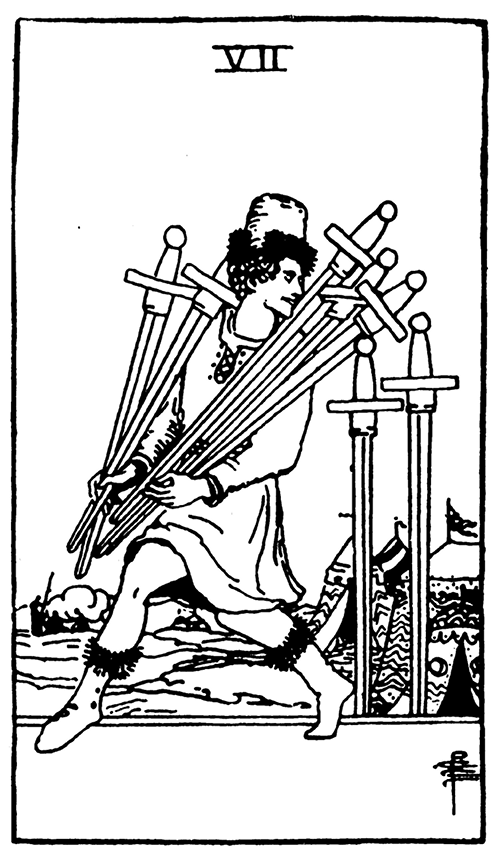
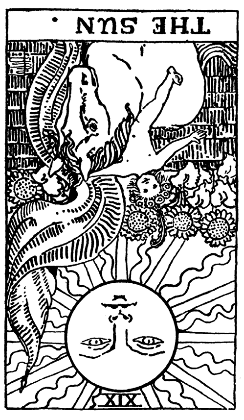
104. 6 of Wands, 7 of Swords, the Sun reversed. Reprinted with permission of U.S. Games Systems.
The interpretation of these three cards shows a very negative reading. The first card is described by Waite as “a plan that may fail,” the second as “expectation crowned with its own desire,” and the third card of the Sun reversed as “contentment … in a lesser sense.” This is a reading of high expectations and dashed hopes.
With regard to the colour, we see that there is a bright yellow background on the 7 of Swords, and the reversed Sun is the same yellow, as are the sunflowers. The yellow is “plenty” but it is only on the background of the first card; it is a “pie in the sky” idea. Now the yellow on the Sun is upside-down and gives us a clue to the problem here; Waite has this as “distrust and jealousy.” We look back at the image on the 7 of Swords seen as someone sneakily taking your resources and the upside-down yellow of the Sun makes sense!
Where else can we see yellow? In the leftmost card, we see that the rider is wearing a coverlet over a yellow undershirt. In colour terms, he is covering his gains, his “plenty.” This gives us advice—we must ensure that the couple who have asked about their business do not give away their success. They must keep things to themselves, as otherwise jealous people will sneak their resources or trade secrets away. In real terms, this may affect their marketing plan, any financial decisions, and much more. Everything must be underplayed rather than put out there.
So if the couple then asked about where growth could come from in this situation, given they will have to mute their trumpet a little, we could look for the colour green. This signifies reliable and steady growth—natural growth. It appears mainly on the central 7 of Swords—on the tabard upon the horse, the cover of the reins, and the victory wreaths on the rider’s head and his wand. This shows us that growth—victory in the long term—will come from reining in progress. Everything must be protected (the horse) and slowed down, kept under tight control. This is an obvious reading for budget constraint in a new business.
You can now look at other colours within the three cards to get a little bit more detail, for example the red on the 7 of Swords character’s shoes and hat. Does that tell us if it is one person who may cause a problem, or a group?
Practice tip: Try using just colours rather than your usual reading methods. Particularly try three-card readings with reversals. You may also want to look at how much of a particular colour is present in the complete reading, and which colours are missing. Build up your own personal correspondences to colours as you discover them.