Foxtrots and Other Dances
I
In 1929, Mondrian painted Fox Trot B, Composition N°III with Black, Red, Blue, and Yellow. It has the taut lines and precise angles, the “equilibrated relationships” Mondrian favored in every aspect of his life. For all its exactitude, however, Fox Trot B is infused with great freedom. The colors dance around a white square that holds the center. In Composition with Yellow, Blue, Black, and Light Blue, painted at about the same time, a comparable white square floats on its own, on the upper right of the equally square canvas, but the gyrations are less energetic. In both works, the white form dominates the whole, yet “dominate” is too strong a word, because in Mondrian’s world there are no power plays, no issue of one entity overtaking another, any more than there was in his life. Still, Composition with Yellow, Blue, Black, and Light Blue is a shade less balanced—its two whites overwhelming—and therefore less dynamic, while in Fox Trot B, the colors—here four rather than three—encased in black scaffolding integrated with the whites, provide a supercharge of energy.
As usual, the artist kept his personal self absent. His was not the distance of an emperor but, rather, the remove of a free person, one who believed that everyone else was entitled to the same liberties as he. The white square in this composition occupies far more of the canvas than does any other single form, being about 32 by 32 centimeters unimpeded in a canvas that is 45 by 45 centimeters in its totality, but there is no imbalance, only a sense of universal coherence, as with the relationship of sea to land on the surface of the earth.
Composition with Yellow, Blue, Black, and Light Blue makes a totally different impression than does Fox Trot B. It is a form of halt, a floating but stable form. Fox Trot B, by contrast, is on the ground, feet gliding, physicality, and peppiness. In both works, the leaner, more static composition and the allegretto one, are absent all rules or guidelines, paeans to liberty; it is just that Fox Trot B realizes its freedom with whirlwind force. Mondrian at his ultimate used leanness to celebrate endlessness and in so doing transport the viewer into paradise.
After it left his studio, this “summa” of Mondrian’s work was shown in important exhibitions in Zurich and Munich, and then, in the United States, New York City; Buffalo, New York; Chicago; Black Mountain College in rural North Carolina; Springfield, Massachusetts; Hartford, Connecticut; and a number of smaller, unexpected cities, like Durham, North Carolina. This was because Mondrian consigned this gem to the spirited Katherine Dreier. She would eventually buy it, which means that, unlike the work by Mondrian that disappeared during the Nazi era, it is usually available for all to see at the Yale University Art Gallery.
II
The press alternately deified or vilified Mondrian. In March 1930, Carola Giedion-Welcker wrote an article on twentieth-century art for Das Kunstblatt in which she describes Mondrian’s studio as “Experimentierzelle-Zeitseismograf” (an experimental cell-time seismograph) and uses a wonderful shot of it to bolster her point. That same month, Mondrian published his own text in the first edition of Cercle et Carré, where its inclusion was a point of pride to the editors of the new publication. But what thrilled some people as the epitome of experimentation and progress offended others.
Efstratios Eleftheriades, a publisher and critic who went by the name Tériade and who contributed regularly to Cahiers d’Art, was among the prominent critics who declared that Mondrian’s work and thinking betrayed all standards for beauty. Tériade would eventually become well known for the lavish art periodicals Minotaure and Verve and for his beautiful collaborative work with Matisse, but he did not yet have the vision to recognize Mondrian’s qualities. In the January 1930 Cahiers d’Art he laced into Mondrian, whose work he labeled “la jeune peinture.” For the thirty-three-year-old writer to call the mature work of a fifty-eight-year-old artist “jeune”—young—was a particularly snide way of denigrating it. He criticized Mondrian’s work for having taken Cubism in the wrong direction. Then, for the important intellectual journal L’Intransigeant, Tériade wrote a different version of the same piece, timed to appear on March 11, with the knowledge that on March 15, the first Cercle et Carré would be published, a few weeks prior to that organization’s inaugural exhibition. Called “Hygiène Artistique,” Tériade’s piece blames abstract art for destroying Cubism, and goes on to say that abstract art itself has died. Tériade takes Neo-Plasticism specifically to task. He describes it as “strictly decorative painting, reduced to a minimum” in service of “triumphant modern architecture” in the Netherlands. For Tériade, the connection to building design lessened the importance of painting, and art that did not fit into the French pictorial tradition was of secondary importance. He attacks Mondrian’s idea of “perfecting” Cubism by simplifying it, as well as Mondrian’s faith in a single aesthetic doctrine. “This is calculation, and nothing could be further removed from creation,” the critic writes.
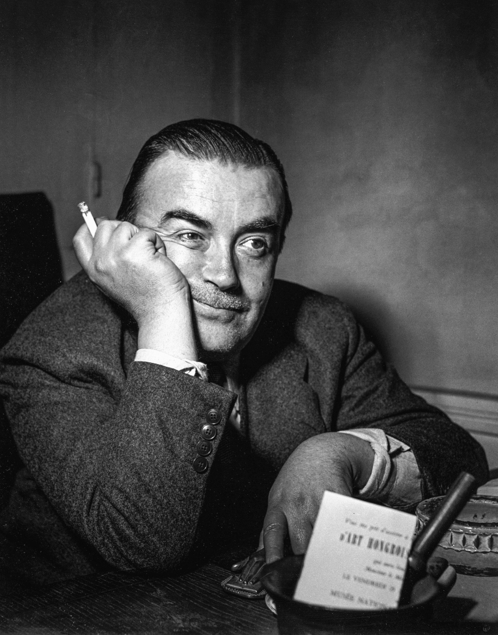
Efstratios “Tériade” Eleftheriades, photo by Gisèle Freund, 1953. A prominent critic and one of the most respected publishers of art periodicals, Tériade categorized Mondrian, because of his fealty to pure abstraction, as being alienated from “the warmth in life” and being “dead.”
The Cubists, Tériade writes, had “a sure instinct [which] stopped them well short of the abyss.” The pure abstractionists, on the other hand, had entered “an arid wilderness where they try to make something out of nothing.” Then Tériade lets loose with possibly the most hostile statement ever uttered against Mondrian: “Those who march relentlessly forward, their gaze fixed on a remote chimerical goal—they alienate themselves from the gifts, the needs, the warmth of life. They do not sleep; they are dead.”
Mondrian answered, although L’Intransigeant did not publish what he wrote. His dignified and temperate response did appear, however, at the start of the following year, in the January 1931 Cahiers d’Art. Mondrian attributed “M. Tériade’s views that Neo-Plasticism itself is not true painting” to a failure of understanding. He also explained that his approach was “neither decorative painting nor geometric painting. It only has that appearance.” Mondrian’s text was, as usual, too long, and it rehashed his usual points, but within the ramble he made a strong case for the idea that looking more closely at his painting would lead to wonderful discoveries. “One must become thoroughly familiar with Neo-Plastic work to know that, like all other painting, it expresses the rhythm of life, but in its most intense and eternal aspect.” Mondrian does not stoop to Tériade’s ad hominem vitriol. Rather, he turns it around:
To “march relentlessly on, intent on some distant and chimerical goal”—that is exactly what we must do. But this goal is not “chimerical,” and in this way we do not become “alienated from life with its gifts, its needs, its warmth.” On the contrary…Neo-Plastic work is deduced from life, from which it is also produced: from continuous life, which is “culture”—evolution.
Cahiers d’Art did not print Mondrian’s text in its entirety, but we know from the typescript that its intended closing sentence was “Finally, I would like to thank M. Tériade for having defended Cubism—and therefore Neo-Plasticism.” It was a clever tactic for dispatching someone who has slapped you in the face.
III
In any case, Mondrian had tougher battles to fight than with Tériade. In March 1930, he again declared a complete break with Van Doesburg. This time the schism would endure. Based on what Mondrian considered Van Doesburg’s heinous behavior toward others, it was different from their disputes about the use of diagonals.
Van Doesburg had resumed his habitual troublemaking, creating the sort of tangled web of human relationships Mondrian assiduously avoided. The differences in artistic philosophy between the two men were again an issue, but it was Van Doesburg’s treatment of Mondrian’s friends that Mondrian could no longer tolerate.
On March 30, Mondrian wrote Van Doesburg:
I was sorry to learn that even though I told you about Seuphor’s sympathetic attitude towards you and have tried to defend Cercle et Carré, you have made quite unfounded accusations against both in a letter to Garcia.
I can understand that you have an ideal of a highly homogeneous, beautifully produced, journal. But the circumstances should be taken into account, and as such I think C. et C. is very successful and I can’t help acknowledging Seuphor’s effort therein. No other journal has done more justice to Neo-Plasticism, and the other expressions are equally deserving of notice. Seuphor’s article is very good in my opinion, and since you have stooped to personal accusations which I do not share and also because Seuphor is my friend, I am sorry to say that relations between you and me have become impossible again—a great pity, in view of our friendship and our agreement on so many counts, and I also appreciate Pétro very much and have enjoyed her company.
I very much regret having to let you know about this renewed break between us. I console myself with the knowledge that contact cannot be maintained, despite all the friendship, if one party refuses to take the insights of the other into account.
Regards to you and to Pétro, from Piet.
Although Mondrian was calm but resolute, as with most breakups this one did not go according to plan. Van Doesburg kept trying to reconnect. Mondrian, unequivocal, was obliged to restate his case. Without being self-righteous, he had his father’s strong will about the movements with which he would or would not align himself. Right and wrong were as clear to him as his verticals and horizontals were straight. In midsummer, he needed to clarify, albeit politely, his position with regard to Van Doesburg’s “Art Concret,” to get beyond the sort of ambiguity that was anathema to him. Mondrian deliberately appeared to be responding to a recent letter Van Doesburg had written him, but what really prompted him had been a diatribe Van Doesburg had blasted at the young Michel Seuphor.
Dear Does, thank you for your letter. But there has been a mistake: I have not joined your society. I knew that I would be exhibiting with the rest of you, which is fine because we are all part of “abstract” (!) art—(or concrete art, depending on how we see it). But I can’t go along with some of your ideas as put forward in the first issue of A.C.—about mathematic art, among other things—so I can’t contribute to your journal.
Mondrian then explains that he, Mondrian, has a perfect right to be included in an exhibition in Stockholm, organized by his new colleagues, Otto Gustaf Carlsund and Jean Hélion, for it is not directly affiliated with the movement and its magazine, L’Art Concret, and its doctrinaire view, even if it has artists who in some ways fit in with its aesthetics. He simply had to differentiate his approach from one that constricted painting with a precise system. Mondrian allows him: “So I am entitled to regard this exhibition as separate from A.C. and to treat it as a general manifestation for A.C. and to see it as a general manifestation for l’art abstrait-concrète [sic].”
That declaration was the last word between them.
IV
One of the paintings Mondrian exhibited in the Cercle et Carré show at Galerie 23 at 23, rue de la Boétie was Composition N°1: Lozenge with Four Lines. It is almost identical to his 1926 Lozenge with Four Lines and Gray. Mondrian had returned to approximately the same conclusion as before, but with even greater boldness.
The ability to come back to his old truth in a new way puts him in the league of the small group of courageous, intelligent individuals—they range from philosophers to Supreme Court justices to scientists—who adhere to convictions that withstand all outside bombardment. No fad, no change in circumstance can alter the greater truths they have discovered and continue to pursue. They resist fashion and its relentless need for novelty.
The artist who devoted every day of the week to painting, taking time away from his primary pursuit only when illness forced him to, had certainly not forgotten, in 1930, the Lozenge he had painted in 1926. Almost as soon as its paint was dry, he had sent it to Brooklyn at the request of Katherine Dreier, but Mondrian kept photo albums of his own art, with a handwritten list of everything, and this pivotal artistic statement could not have escaped his memory. When in 1930 he again turned a square canvas by forty-five degrees, thus making it diamond-shaped, and then painted nothing but two horizontal and two vertical black lines on it, each cut off by the diagonal edges of the painting—or, if one prefers, each extending beyond those diagonal edges, as if wrapping itself around the sides and onto the back of the canvas—he knew he had come to a familiar idea in a new way.
What is uncertain, though, is whether Mondrian had in his mind the comparison and the difference between the works. The earlier one is larger—about 44 by 44 inches, as opposed to the approximate 30 by 30 inches of the 1930 painting. In the new, smaller version, the two verticals are visibly joined, on their inside boundaries, with the lower horizontal. This creates an interior white square, clearly articulated even though it is lopped off at its top two corners. However, as is always true with Mondrian, nothing is quite as it first appears. The left-hand bottom corner of the white square formed by the black lines just about touches the lower-left diagonal of the painting, because of the position in which Mondrian has placed and sliced two of the boundary lines. The lower right-hand corner is different. There he allows us to see a bit more of the meeting of the vertical and horizontal elements, although not the entire joint. In any case, while we never see any of the corners in full, we read the four lines as part of an invisible square.
It is so simple: a square white canvas, turned on its side, and four lines on it. But the more we look, the more we see. Initially, few people would have read the differences between the lower corners. And most would have accepted all four black lines as being of equal width, for the mind automatically wants to package things and requires coaxing to do otherwise. But then we discover that two of the black lines have the same width, while the left-hand vertical is slightly thicker and the top horizontal is a hair thicker still. The whites are not identical. In addition, what appeared initially to be a perfect square is not quite a square; it is slightly elongated, horizontally. This almost-but-not-quite square is, also, not accorded the central position in the perfectly square turned canvas it occupies, but is floating upward and away to the left. Out of habit and expectation, viewers are surprised once they perceive this deliberate quality of being off-kilter, and then are amazed again because they had not anticipated this and the other rhythmic irregularities.
Most people see what they expect to see. In a painting of such implicit simplicity and concentric balance, viewers instinctively, in their minds, imagine the elements to be parallel, and everything to be in “two plus two equal four” sort of order. The painting then beckons us, if we allow it, to take time. We engage in a purely visual process that empties us of other concerns and calms us. It replaces our usual personal mental gyrations—a hodgepodge of moods and emotions, of shifts between calculating our schedules and wondering about what we will have for lunch to rumination over an event that occurred years ago—with a very different experience. We go into the beautiful whiteness, and relish the crisp decisiveness of the lines. We flourish in the realm of subtle variations of measurement and the glorious new territory of beat and rhythm.
After a while, looking at the 1930 Lozenge, once we have noticed and accepted the surprising measures, we come to feel as if the lines have a life of their own. They take action; they move. They jump, or glide, and then they hold themselves. They have authority and power and clarity, yet they are without a hint of arrogance. While rigorously black and white, they are lighthearted in their irregularity, the way they accept being cut off, the way they demand nothing but to exist in a weightless state of freedom.

Composition No. I: Lozenge with Four Lines, 1930, Solomon R. Guggenheim Museum
Almost as soon as it was returned to Mondrian’s studio from the Cercle et Carré exhibition, Lozenge enjoyed a fate befitting its optimistic spirit. Initially, Mondrian learned that the show had been a commercial failure, with not a single work by any of the forty-six artists selling. Neither its lively opening, at which Seuphor recited phonetic poetry and Russolo performed his “bruitist music,” nor the catalogue of work by, among others, Kandinsky, Arp, and Léger, engendered positive press. But Mondrian had no expectations of selling his simple canvas, which he recognized as being too spare even for the most intrepid of collectors (the sole possible exception being Katherine Dreier, who had already stuck her neck out by taking its mate on consignment). Nor had he imagined enthusiasm from the critics. Then, after Lozenge was returned from the exhibition, Moholy-Nagy arranged for Mondrian to meet the Baroness Hilla von Rebay, the thirty-year-old art advisor to Solomon Guggenheim, the American heir to a mining fortune who was forming a collection of “Nonobjective art.” Rebay, herself a painter, was known for her strong opinions and general arrogance. But everything about her encounter with Mondrian was exceptional. Rebay went to Mondrian’s studio on June 3, with Félix Fénéon, at age sixty-nine a distinguished critic best known for his texts on Paul Signac and Georges Seurat. That evening, she wrote her lover, the painter Rudolf Bauer, to tell him she had been taken
to see Mondrian, the Dutch painter—do you know him? He partly paints, he constructs 2 or 4 lines or squares, but he is a wonderful man, very cultivated and impressive. He lives like a monk, everything is white and empty but for red, blue, and yellow painted squares all over the room of his studio and bedroom. He also has a small record player with Negro music. He is very poor and already 58 years old, resembles Kandinsky but is even better and more alone. Moholy loves him and venerates him in his quiet, intense way.
The Baroness von Rebay goes on to tell Bauer that she bought one of his paintings for herself:
(for nobody will like it), a white oil painting with four irregular lines. I love it, but it was mainly to keep the wolf from the door of a great, lovable man…I feel that Mondrian’s painting emanates something sacred, which is why I will gladly keep it.
Two days later, Mondrian wrote Rebay to describe a visit he made to Fénéon’s house the day after she and the critic had visited his studio. Mondrian emphasizes that Fénéon’s wife was as hospitable and pleasant as he was. The couple graciously showed him their collection; Mondrian very much liked the Seurats. Life was full of positive pleasure for these people.
On June 6, Moholy delivered Rebay’s payment. Mondrian wrote her, “I thank you so much for it; I can better continue my work.” The price was 6,000 francs. Within a week, Arp would write Giedion-Welcker about the sale and the price, and in the course of the summer Mondrian would write both Oud and Roth about it; this sort of information became public knowledge.
In October, Mondrian wrote Rebay that he had delivered the painting to Fénéon, and covered it with soft protective paper and sealed the corners because it was in a room with other artworks and he feared the nonchalance of the workers. As usual, he sent cleaning instructions. If the painting became dirty, all that was required was a little bit of water and white soap; the paint was thick enough to survive them. He also suggested that she be careful not to hang the work too low, and to avoid bright daylight.
Rebay died in 1967; the painting went to the Guggenheim Museum in 1971. Solomon Guggenheim was known to disdain Mondrian’s work for most of his life, so it is a good thing that Rebay made the 1930 Lozenge part of the collection of the museum he founded. It remains among the Guggenheim’s masterpieces, there to impart its radiant beauty and celebrative spirit to all of us.
V
In 1930, Mondrian met the rich, dilettantish, brilliant, unscrupulous American Philip Johnson. Oscar Wilde could not have crafted a more glib or more intelligent character.
With his taste and influence and wealth, Johnson would improve Mondrian’s situation immensely.
Johnson was rich enough never to need a paying job, while the artist who was twice his age was nearly destitute. But Johnson, who had turned twenty-four in 1930, had no lack of temerity. To buy a Mondrian before the Museum of Modern Art had sway showed a rare eye and courage. It would be another five years before his friend A. Everett Austin Jr. bought one for the museum in Hartford. Johnson’s acquisition of one of the latest canvases was pivotal to Mondrian’s vision making further inroads into the consciousness of American designers and architects.
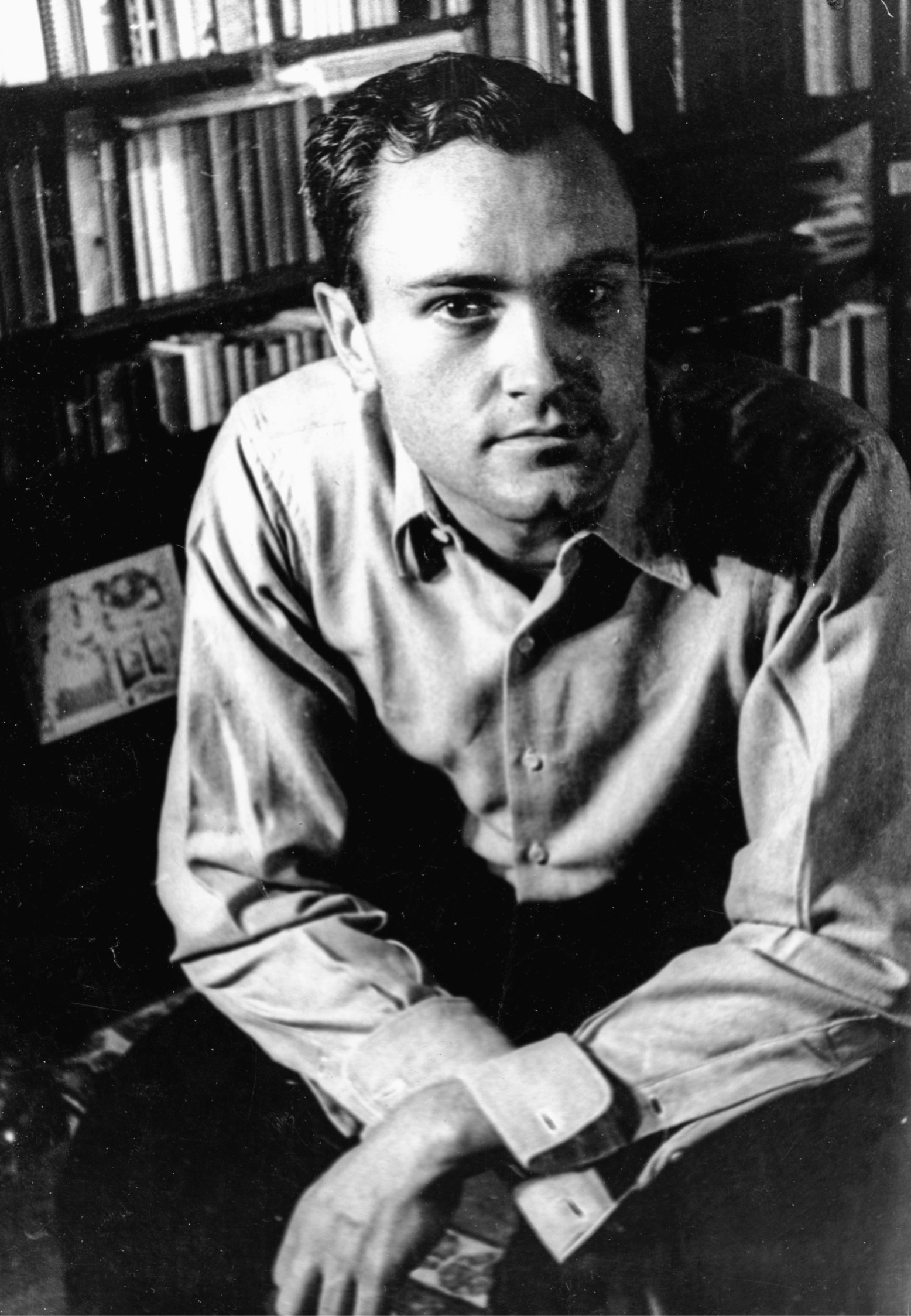
Philip Johnson, photograph by Carl Van Vechten, 1932. The rich young American architect bought a Mondrian painting in 1930, although he had Oud pick it out for him. He paved the way toward the discovery of Mondrian by important American museum directors.
Johnson, however, did not pick out the painting himself. Mondrian was in Paris and he was in Berlin when the purchase was made. Johnson had been in Paris that May, but now he was in Germany to look at the “international style” of architecture and write an exhibition catalogue about it. Johnson was absorbed in the new approach, with its abolition of ornament and exaltation of geometry in all its manifestations, and the book had to be ready in time for the exhibition, which was to take place at the new Museum of Modern Art two years later.
Johnson felt that the new architecture reflected the direct impact of Mondrian’s paintings. With that in mind, he wrote asking Oud to select a work for him.
Now that I have this book on my hands, I shall have no chance of going to Paris and buying the Mondrian. And yet it is important that I have one this year. Would it be too much trouble for you to pick out one and send it to me with the bill? I know one should buy one’s own pictures, and I should if it costs too much money, but as I remember it, you said they were not so expensive. If you can get me a good one that is reasonable enough, I shall be delighted to take it unseen.
After Oud wrote to Mondrian that the young American wanted a painting but would have someone else choose it, Mondrian wrote Oud:
I was glad to hear from you that Mr. Johnson wants to have one of my canvases. However, I hesitate to send one right away, because of the differences in my work: I have canvases with much color, with little color, and in simple black and white.
I sent a couple of sketches with prices, from 200 to 400 guilders. It’s true, my prices are now double what they were.
But money was not an issue, and the transaction began. Mondrian sent Johnson the sketches of the paintings on which he was currently working. It was, however, neither Johnson nor Oud who ultimately made the choice; it was Henry-Russell Hitchcock, Johnson’s coresearcher. Johnson asked Hitchcock to return to Paris and go to Mondrian’s studio. The heavyset architectural historian, a commanding presence, with his full red beard covering his face so that his features were almost invisible, made his way past the debris in the courtyard and up the two flights of dusty, half-broken, wooden stairs to Mondrian’s sanctuary. He selected Johnson’s acquisition with the authority that governed all his quality judgments, the only caveat being that he had to stay within the budget of the heir to aluminum company stock. Mondrian would eventually report to Oud that initially Hitchcock wanted a large canvas for Johnson, “But its price was too high, so he took the small one of 2000 francs.” Hitchcock also said he would like to buy one for himself as soon as he had the funds.
The painting with which Hitchcock walked out of the studio and sent to Johnson in Berlin was the 16-by-12½-inch Composition N°II, with Red and Blue, which Mondrian had completed the previous year. Of all the works of that period, this is one of the very simplest. A single vertical line spans the canvas top to bottom, off-center; a full-width horizontal, a hair thicker than the vertical, crosses it at the exact point requisite for a perfect white square to be formed in the upper right. A brilliant red fills in the space that remains on the top left; large and bold, that red rectangle is assurance itself. A second square is created below the white one by an ever-so-slightly-wider short horizontal which lies between the vertical spine and the right-hand edge; it is painted a celestial blue. The remaining areas are the same white except for an off-white crossbar, a sort of tail, at the bottom left, hugging the lower boundary.
The result is incomparable.
VI
More and more denizens of the East Coast of the United States appeared at 26, rue du Départ.
Alexander Calder had recently moved to Paris. The year before, his work had been a sensation at the Harvard Society for Contemporary Art, a modest exhibition space in Cambridge, Massachusetts, where three well-heeled and enterprising undergraduates—Lincoln Kirstein, Edward M. M. Warburg, and John Walker—organized art shows on a shoestring budget. They had arranged for him to perform his “circus” in Harvard Yard. The response was so positive that Calder, having taken the circus with him to Paris in 1930, decided to perform it there. The assemblages consisted of a lot of little circus figures—among them a sword swallower, a lion tamer, and assorted clowns—that could be moved in their dollhouse-sized tent. In the United States, Calder had handled the performance details himself. Now, in Paris, the young sculptor Isamu Noguchi would play music on a turntable during the performances Calder orchestrated in his apartment at 7, Villa Brune, not far from the rue du Départ.
Frederick Kiesler, a young architect/designer whom Calder described as “having a fling” with the circus, took charge of the event. For the presentation on Wednesday, September 10, Kiesler suggested that Calder invite the avant-garde artists and architects he considered most likely to take to it. Mondrian was among them. Kiesler had the vision to see the relationship of Calder’s sheer inventiveness and his use of primary colors to what Mondrian was doing. Calder’s art was deliberately comic, almost slapstick, while Mondrian’s reflected years of intellectual probing, but both artists were irreverent, spontaneous, and devoted to human happiness. Even though one of them worked with representation and active physical movement while the other consistently confined himself to verticals and horizontals locked at right angles, Kiesler recognized the rejection of tradition and embrace of what was new and direct as a point in common.

Alexander Calder in 1931. Mondrian went to see the first presentation in Paris of Calder’s “circus.” When the sculptor subsequently went to Mondrian’s studio and suggested that it would be fun to make his solid panels of color oscillate, Mondrian dismissed the idea scornfully and said his painting was already “very fast.”
Calder did as Kiesler advised. Besides Mondrian, he asked Léger, Le Corbusier, the critic Carl Einstein, and Van Doesburg to attend. The performance was to be at 5 p.m. precisely, and the guests were instructed to arrive with boxes on which to sit. Then, once he had invited everyone, Calder learned that he had made a faux pas, but here the story gets murky. He writes about this in his autobiography. Calder, new to the Parisian scene and not the sort of person either to align himself with one or another group or to make enemies with fellow artists, was told he should not have invited Van Doesburg. In writing about this, he explains that Mondrian and Van Doesburg were still a happy team, bosom buddies, and that the issue was that Van Doesburg and Carl Einstein were at war, and that possibly Léger was also uncomfortable around Van Doesburg. Calder also writes that Kiesler attacked him for putting incompatible people on the list—a claim that makes little sense since Kiesler was the one who came up with the names initially.
Calder published the memoir in 1966, thirty-six years after the fact, which may explain its various errors. The mistakes about who disliked whom, and who criticized Calder, are not that surprising; the world of these artists allegedly eager for equanimity in life as in their artworks was replete with schisms and controversy, and the winds often changed. The allies of one day were the enemies of the next. In any case, what is certain is that Calder subsequently visited Mondrian, and Mondrian made an unforgettable remark.
The day after the circus performance, a different Einstein from Carl—William Einstein, a young American painter from St. Louis who helped with the music for the circus—went to see Mondrian at the rue du Départ. He was so excited by what he saw there that he asked Mondrian if he might return with Calder. Kiesler had done well to arrange for Mondrian to see the circus, and Mondrian was sufficiently respectful of Calder to agree to Einstein’s suggestion. It was Kiesler who took Calder, thirty-one years old, with him to 26, rue du Départ. Calder was deeply impressed by Mondrian’s studio, and how much it was like Mondrian’s paintings.
In 1937, Calder would publish an account of that visit to 26, rue du Départ. “I was very much moved by Mondrian’s studio, large, beautiful, and irregular in shape as it was, with the walls painted white and divided by black lines and rectangles of bright colors, like his paintings.” Calder was generous in his account of the event. “This one visit gave me a shock that started things.” It is what made Calder go home and try to paint, although he found wire “an easier medium for me to think in.”
Calder next recalled:
I suggested to Mondrian that perhaps it would be fun to make these rectangles oscillate. And he, with a very serious countenance, said, “No, it is not necessary, my painting is already very fast.”
Almost thirty years later, Calder would again recall that visit to 26, rue du Départ. “It was very lovely, with a cross-light (there were windows on both sides), and I thought at the time how fine it would be if everything there moved; though Mondrian did not approve of this idea at all.” Mondrian was adamant that while Calder had to cut out forms in metal and wood, join them with wire, and suspend them, he could achieve all the same motion, tension, and interplay by the judicious placement of shapes on a flat surface.
VII
In January 1931, a revolutionary educational adventure in New York took a leap forward when a new building opened for the New School for Social Research on West 12th Street. The New School had been founded in 1919 by a group of progressive American intellectuals. Many of them had been teaching uptown at Columbia University when they publicly opposed the United States entering into the world war, an act for which they were censured by the university’s president. They resigned their positions in protest and created the New School as an alternative institution for higher education with the mission of fostering philosophical inquiry and an open exchange of ideas. It quickly attracted renowned intellectuals and exceptional students, among them Thorstein Veblen, John Dewey, Bertrand Russell, and Lewis Mumford.
The special exhibition organized for the opening of the New Building—with its deliberately anonymous name—included two paintings by Mondrian. A checklist titled Who’s Who that accompanied the exhibition provided, as information about Mondrian and his art, “Precision and simplification based on a deep philosophy. Living and working in Paris.” The two canvases bore names which were different from any he had previously used: Simplification and Simplification II. In fact they were the same wonderful compositions that we know as Fox Trot B, from 1929, and Fox Trot A: A Lozenge with Three Lines, from 1930, both consigned to Katherine Dreier, who had them conveniently in Brooklyn. Exactly how the temporary name change came about is unknown, but it put Mondrian’s work in the context of the New School philosophy.
That same month, on January 10, a raffle that had been put into motion the previous June by Carola Giedion-Welcker, Arp, Gropius, and Moholy-Nagy took place in Mondrian’s studio. It was Arp who made the draw. The imaginative Swiss painter/poet who alternatively used the French “Jean” or the German “Hans” as his first name was one of the colleagues for whom Mondrian had the most respect, and even if his work utilized almost entirely curved lines as opposed to Mondrian’s straight verticals and horizontals, it had in common with Mondrian’s its purely abstract forms, undiluted colors, and abundance of joy.
The people who had bought tickets, who, besides the organizers, included Charley Toorop and Sophie Taeuber-Arp—as well as other painters, designers, and architects all determined to ensure Mondrian’s ability to continue painting—eagerly awaited the announcement of the winner. Mondrian was watching as well, although the selection probably did not make much of a difference to him; these were all sympathetic people who had willingly paid a sufficient amount of money to participate so that he had been able to get through the year, which would have otherwise been impossible.
Arp called out the name of Jan Tschichold.
That happenstance had monumental impact. Tschichold was a graphic designer who gave new strength and clarity and a crisp elegance to the layout of printed matter all over the world. His acquisition of a small gem of a Mondrian—the 1930 Composition in Yellow—was a major event in the spread of the new aesthetic.
Jan Tschichold, like Philip Johnson, would wield great influence in forming a global approach to design. In the many years they both lived following their acquisitions of Mondrian’s sparkling, groundbreaking abstractions as young men, Mondrian’s rhythmic juxtapositions of color and line would become part of their lifeblood. Johnson altered the field of architecture, domestic and corporate. Aside from what he designed himself, he governed the taste of his influential friends and determined what would be seen by the larger public who visited the Museum of Modern Art, where, without pay, he ran the Department of Architecture and Design. Tschichold, with his development of new typefaces and the covers he created for some of the most widely disseminated books ever, affected almost everyone in the world who reads the Western alphabet.
The acquisition of these pivotal artworks by Johnson and Tschichold was a catalyst to the chain of events which caused Mondrian’s singular vision to spread worldwide. With the draw of a lottery ticket as with an acquisition selected by a friend, uniquely vibrant geometric design became seminal to building façades, shopping bags, newspaper layouts, computer websites, shoes, T-shirts, and whatever it is that people rich or poor now look at every day, as they will in the future.
Tschichold, born in Leipzig in 1902, was the son of a provincial sign painter. He was among those influential modern designers and artists who came from backgrounds with little intellectual sophistication and no family members having education past high school, but where technical skills and a sure knowledge of one’s handicraft were considered essential. These individuals who would explode the boundaries of the appearance of everyday objects were raised to respect the discipline requisite of craftsmen and to prize practical capability as much as aesthetics and theoretical exploration. Trained by their fathers to develop manual dexterity and knowledge of tools and materials, they retained their down-to-earth approach and their respect for know-how and efficacy, while cultivating advanced artistic visions. Mies van der Rohe (the son of a bricklayer), Le Corbusier (the son of a painter of enamel watchcases), and Josef Albers (the son of a modest general contractor)—all older than Tschichold and figures of importance to him—had had similar trajectories.

Jan Tschichold, c. 1930. This groundbreaking graphic designer, who would have vast influence through his 1935 book Asymmetric Typography, won a Mondrian abstraction in a lottery that had been organized to help the artist survive financially. When six SS storm troopers entered Tschichold’s home in Munich in 1933 in a search for Bolshevik propaganda and his cleaning lady told them that they should take the Mondrian, they did not believe her that it could be worth a lot of money and instead looked for a wall safe behind it.
In 1923, when he was twenty-two, Tschichold attended the great Bauhaus exhibition in Weimar. He was already sufficiently engaged in the new art to get himself there to see the creative outpouring from the four-year-old school. Visitors to this show of art and objects were greeted by striking entrance graphics by the audacious young Herbert Bayer. Their bold design, and the presentation of paintings by Klee and Kandinsky, glass constructions by Josef Albers, furniture by Marcel Breuer, streamlined metalwork, and textiles by Anni Albers (then still Annelise Fleischmann) and Gunta Stölzl and other pioneering weavers, intoxicated him. In 1928, Tschichold wrote The New Typography, in which he championed the use of sans serif type and graphic layout schemes locked into a geometric grid. The book articulated his philosophy eschewing traditional ornament and emphasizing functionalism, the values he first observed at the Bauhaus.
Tschichold would go on to write numerous books on graphic layout as well as the design of letters, and would create four typefaces, the best known being Sabon. He would be among the modernists to be disdained by the Nazis. His bloodlines suited them, but his aesthetics did not. He would be forced out of Germany in the late 1930s and, like Mondrian, would take refuge in London. But whereas Mondrian would leave London, Tschichold would remain. He would become the main designer for Penguin Books and would have tremendous influence with the more than five hundred books he created for them. By the time of his death in 1972, he was considered the most influential graphic artist of the century. Today his name remains the object of reverence for most everyone in the field, even if it is not familiar to the larger world.
In Asymmetric Typography, published in 1935, Tschichold would declare—and it is among his most famous statements, quoted ever since—“The works of ‘abstract’ art are subtle creations of order out of simple contrasting elements.” Those are the precise qualities he gleaned day and night from the Mondrian canvas he had won in that raffle four years earlier. The painting Tschichold acquired was nearly square. It measured 46 by 46.5 centimeters; in another artist’s work, the half-centimeter difference might have been irrelevant, but Mondrian’s sense of measure was so precise that the width being a tiny bit greater than the height was significant. What most people would read as black lines of equal width end up not being exactly the same; what appears to be a single white is many. Similarly, what looks like a perfect square is in fact not one. This was evidence of Mondrian playing with human expectations—a line appearing to span a canvas doesn’t reach its edges, and what seems to be a square is not a true square. The lack of predictability that makes reality different from what one anticipates is as fundamental to real life as it is to Mondrian’s art. Tschichold was another partisan of diversions from the so-called “perfect.” Like Mondrian, he recognized precision and formulas as the stuff of artifice, and enriched his work with conscious asymmetry.
In the Mondrian painting that Tschichold won, most of the surface area is white. On our initial viewing of the painting, that ambient, exhilarating whiteness flows inside us like the overture of an opera. Pure and impeccable, it is a fresh start and establishes our upbeat mood. We put behind us everything that preceded it.
That sense of rebirth parallels Mondrian’s own experience of creating it. When Mondrian made the painting, he was aware that it would ensure his own happy, new beginning. He knew it would be the reward for that lottery whereby his fellow artists, fiercely loyal to him and his life’s purpose, had enabled him to survive. When Moholy-Nagy and Gropius and others devised this means of procuring those lifesaving funds for him, they had not known what painting would be the prize, only that it would be one of his recent works. The one he created epitomizes optimism and possibility, as well as the idea of a tabula rasa. Composition with Yellow has a feeling of commencement, and is celebrative to the point of being euphoric.
This is another of Mondrian’s compositions that consists essentially of a single vertical and a single horizontal line, each spanning the entire canvas and crossing one another. The vertical is ever so slightly to the right of the center of the canvas. The horizontal, however, is significantly below the middle, nearly five-eighths of the way down from top to bottom. Wider than the vertical, it appears far shorter, while actually they are just about equal in length. The causes of that illusion are elusive, but Mondrian himself must have understood why it occurs. He made every dimension with a pervading sense of judgment to achieve his purpose of rhythm and movement.
The lower-right quadrant of the painting is where the action peaks. A horizontal band near the bottom of it, stemming to the right of the major vertical, and a vertical strip of the same width, dropping from the major horizontal, form a square—or at least what we assume is a square. A little yellow rectangle running along the right-hand border of the canvas, which convinces us that it belongs to a square that has been cut off by the edge, vibrates like the sound of a saxophone: queenly and radiant.
There is also a tiny bit of Mondrian’s usual bright primary red in this painting. He has used it for the pencil-thin letters and numbers of the “P.M. 30,” spaced out graciously, on the right side of the lower boundary of the small white square. Earlier in life, he had usually written his first initial and full last name when signing paintings—“P Mondriaan” first and then “P. Mondrian”—but now he used initials. Surely Jan Tschichold appreciated the perfect simplicity and airiness of these two delicate, sans serif letters and two finely drawn numbers. They sing out like a little joyous thank-you, resembling in spirit the minuscule signatures of Jan Van Eyck which translate to “Jan Van Eyck was here.” Once we know the story behind this painting, the red has the jubilance of the occasion when twenty-five intelligent and visionary artists came to the rescue of Piet Mondrian, who made this painting happily and appreciatively once he had enough money, thanks to them, to pay the rent and put food on his table.
There is a photograph of Jan Tschichold, taken after he won the lottery, with the painting propped at the back of a commode behind him. By not being hung on the wall or installed more definitively, Mondrian’s canvas exists like a talisman, a part of the space, a merging of art and everyday life the way Mondrian wanted.
That central role of visual beauty did not, however, have the power to prevent human evil from rearing its ugly head. Two years after Jan Tschichold won this painting, shortly after Hitler rose to power, six storm troopers from the SS entered and raided the Tschicholds’ apartment in Munich. The invaders were looking for pro-Communist and anti-fascist propaganda. They found such material and took it with them. The cleaning lady had informed the Third Reich’s thugs in advance that they would also discover a painting, one that resembled nothing natural and was in her eyes without merit, but was worth a significant amount of money.
When they saw the Mondrian, the soldiers knew this was what she meant. But they decided she could not possibly be right about its financial value. They looked behind the canvas to see if it was being used to cover a wall safe, which struck them as the only logical reason for its existence. They did not bother to take the work itself.
The violation was intolerable to the Tschicholds. Later in 1933, they fled to Basel. There, Tschichold included the little masterpiece in the important exhibition Konstruktivisme, which he organized at the Basel Kunsthalle in 1938. Subsequently, after Mondrian died and the war ended, he sold it to Ernst Beyeler, the renowned Basel art dealer, for sixty thousand Swiss francs. This enabled the designer to buy a pension he deemed essential.
Within two days, Beyeler sold the 1930 Mondrian to the Kunstsammlung Nordrhein-Westfalen in Düsseldorf for twice the amount he had paid Tschichold. The winnings of a raffle ticket that had been bought to enable a genius to survive had become a financial commodity that made a rich man wealthier still. It also had survived Nazi violence because of the blessed imperviousness to its beauty that prevented looters from seeing its value. As an object, it had been exposed to what Mondrian deemed the tragic in life. But it also surpassed the greed and ignorance that were part of its history. The small composition does what it has always done. Its white perpetually refreshes. Its clear and decisive lines exhilarate us; its yellow remains triumphant.
VIII
On March 7, 1931, Theo van Doesburg died at age forty-seven. At the end of February, he had traveled to Davos, where he had a severe episode of asthma which, a few days later, caused a fatal heart attack. The end was sudden, but his frailty was no surprise, for he had tuberculosis.
We will never know what Mondrian’s private reaction was to the death at a young age of the man who had once meant so much to him, but to others he appeared unmoved. When Oud asked Mondrian to contribute to a last edition of De Stijl dedicated to Van Doesburg’s memory, Mondrian consented, but grudgingly. Answering Oud’s request, he acknowledged Van Doesburg’s death only toward the end of a letter, concluding a sequence of other subjects in which he seemed to have prioritized a lot that mattered more to him. He avoided using Van Doesburg’s name, referring only to “he” and “him.”
Dear Bob and Annie,
Thank you for your letter. Good to hear you are well and that Bob has drafted a design. Wonderful that our work keeps going in spite of all the difficulties and downturn. I expect you have read my article in N.I. ’31 Cahiers d’art. At least they let us defend abstract art, which is nice!
I had a bad winter with two bouts of flu, which has now come back again in mild form. Sales are generally poor, but I can just manage. My expenses aren’t high, thank goodness. From time to time I heard, from friends or acquaintances who had spoken with you, that you were doing well. You will be coming here some time in the summer, won’t you? I will soon be sending you the little article for the Stijl: I hope it turns out all right. It’s not easy to avoid mention of anything unpleasant. He was a strange mix of good and bad, so you can’t judge him as one or the other. Well, bye now Bob and Annie, as always warm wishes from your friend Piet.
In a subsequent letter which he wrote the Ouds on May 14, he addressed the issue of the article in De Stijl that was to mention Van Doesburg:
Dear Bob and Annie,
I will send the article for the new Stijl issue a bit late, but before or on the 15th. I’ve been down with the flu again, the third time this winter. The weather is warm now, fortunately, so time to get better. I hope you are both alright. The article still needs correcting, but I assume you will take care of that. Do drop me a line some time.
Best regards from your friend Piet.
Please let me know what you think of my article—it was a difficult job!
His need to make a public statement on Van Doesburg plagued him. He wrote the Ouds a postcard with the usual updates on his health and art sales, but returned to the subject.
Dear Bob and Annie, I hope you are well. I sent you a little article for that Stijl issue, but haven’t heard from you since. I am almost completely recovered again, after all that flu, and hope to get back to work soon.
Sold nothing in Brussels, yet again. Bye, best regards from Piet.
It is possible that the Ouds had not mentioned “the little article” because what Mondrian wrote about Van Doesburg was too anodyne to elicit a response. In any case, Mondrian was now busy writing the book he would call The New Art—The New Life: The Culture of Pure Relationships. There more than ever, he equates human conduct with the composition of paintings: best served when the elements only converge briefly, and at inviolable ninety-degree angles. The space he placed, or tried to place, between himself and the death of his onetime soulmate resembled the artistic layout he extolled.
Mondrian’s “Homage to Van Doesburg,” when it appeared the following January in the final issue of De Stijl, is mainly about himself and the evolution of modern art in general. Van Doesburg only appears more than halfway through the piece, after Mondrian has amplified his own “research toward an art free of naturalistic appearances” with “means of nothing but the straight line in rectangular opposition” and celebrated his discovery of Van der Leck and the significance of his “exact technique.” Mondrian’s arrival at the subject of the man being memorialized is unintentionally comic. The younger artist was “sincerely appreciative of my work,” Mondrian reports, adding that Van Doesburg had asked him “to collaborate on a periodical he was planning to publish, named De Stijl. I was happy to publish the ideas on art that I was formulating; I saw the potentiality of contact with efforts consistent with my own.”
Mondrian does, toward the end, refer to “the joy of meeting Van Doesburg,” but qualifies the cause of the joy as being that Van Doesburg was “filled with vitality and zeal” for abstract art. When Mondrian extols “the ability and admirable courage of Van Doesburg,” it is specifically for Van Doesburg’s championing of Mondrian’s own work and Mondrian’s own credo. Even then, Mondrian insists on reining in his words by adding “I speak only of the period of my collaboration,” implying that at other times Van Doesburg was less worthy.
Mondrian concludes his “homily” describing “feelings of joy and friendship.” But those emotions were brought on thanks to other De Stijl collaborators, whom he names individually. Van Doesburg is excluded from the list.