Without further ado, let's put our hands on QML and create a Qt Quick application ourselves! For this example project, we are going to create a dummy login screen using Qt Quick Designer and a QML script. First, let's open up Qt Creator and create a new project by going to File | New File or Project...
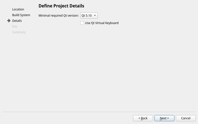
After that, select Qt Quick Application and press Choose.... After that, press Next all the way until the project is created. We are just going to use all the default settings for this example project, including the Minimal required Qt version:
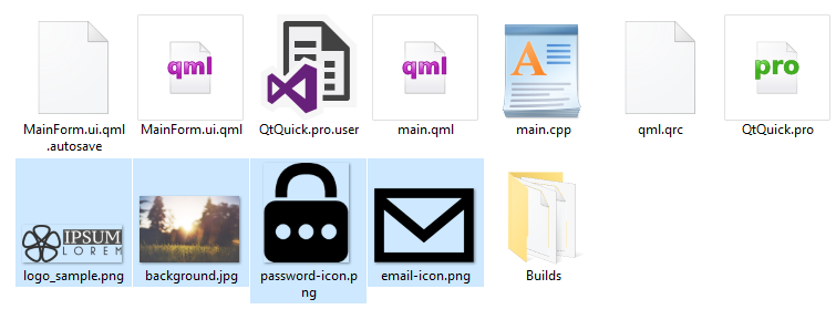
Once the project has been created, we need to add a few image files to our project, so that we can use them later:
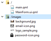
We can add these images to our project by right-clicking on the qml.qrc file in the Project pane and selecting Open in Editor. Add a new prefix called images, and add all the image files into that prefix:
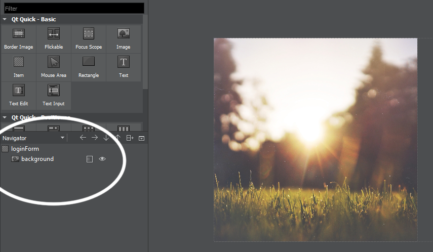
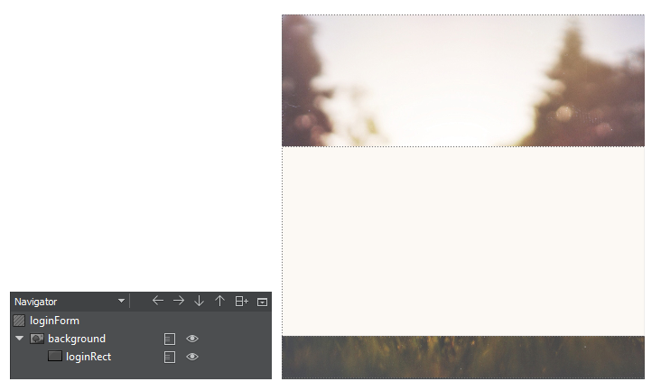
After that, open up MainForm.ui.qml, and delete everything in the QML file. We start all over by adding an Item type to the canvas, set its size to 400 x 400, and call it the loginForm. After that, add an Image type underneath it, and call it background. We then apply the background image to the Image type, and the canvas now looks like this:
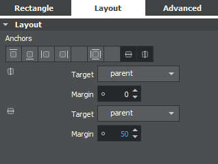
Then, add a Rectangle type under the Image type (background), and open up the Layout tab in the Properties pane. Enable both the vertical and horizontal anchor options. After that, set the width to 402, the height to 210, and the vertical anchor margin to 50:
Following that, we set the rectangle's color to #fcf9f4 and border color to #efedeb, then set the border value to 1. The user interface so far looks something like this:
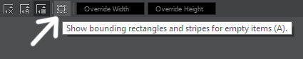
Next, add an Image QML type under the rectangle, and set its anchor settings to top anchor and horizontal anchor. We then set its top anchor margin to -110 and apply the logo image to its image source property. You can turn the QML type's bounding rectangle and stripes on and off by clicking on the little button located on top of your canvas, so that it's easier to look at the result, especially when your canvas is full of stuff:
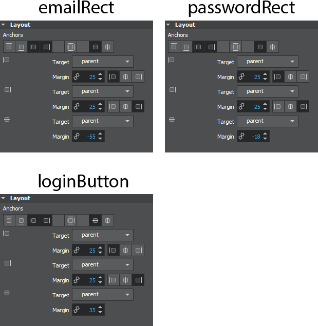
Then, we add three Rectangle types to the canvas under the loginRect rectangle, and call them emailRect, passwordRect, and loginButton. The anchor settings for the rectangles are shown as follows:
Then, we set the border value of both the emailRect and passwordRect to 1, the color to #ffffff and the bordercolor to #efedeb. As for the loginButton, we set the border to 0, the radius to 2 and the color to #27ae61. The login screen now looks like the following:

Looks good so far. Next, we're going to add a TextInput, Image, MouseArea, and a Text QML type to both the emailRect and the passwordRect. Since there are many QML types here, I will list the properties that need to be set:
- TextInput:
- Selection color set to #4f0080
- Enable left anchor, right anchor, and vertical anchor
- Left anchor margin 20, right anchor margin 40 and vertical margin 3
- Set echoMode to Password for password input only
- Image:
- Enable right anchor and vertical anchor
- Right anchor margin set to 10
- Set image source to email icon or password icon respectively
- Set image fill mode to PreserveAspectFit
- MouseArea:
- Enable fill parent item
- Text:
- Set the text property to E-Mail and Password respectively
- Text color set to #cbbdbd
- Text alignment set to Left and Top
- Enable left anchor, right anchor, and vertical anchor
- Left anchor margin 20, right anchor margin 40, and vertical margin -1
Once you're done, add a MouseArea and Text to the loginButton as well. Enable fill parent item for the MouseArea, and enable both vertical and horizontal anchors for the Text QML type. Then, set its text property to LOGIN.
You don't have to follow all my steps by 100%, they are just a guideline for you to achieve a similar result as the screenshot above. However, it's better for you to apply your own design and create something unique!
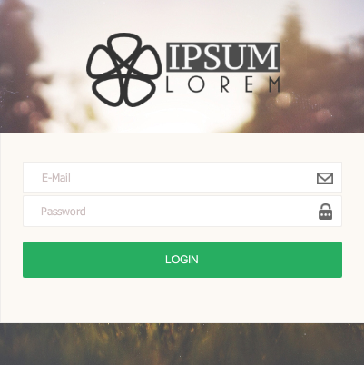
Phew! After the long process above, our login screen should now look something like this:
One last thing we need to do before moving on to main.qml is to expose some of the QML types in our login screen, so that we can link it to our main.qml file for logic programming. We can, in fact, do this directly on the designer tool. All you need to do is to click on the small rectangle icon located next to the object name, and make sure the three lines on the icon are penetrating the rectangular box, like this:
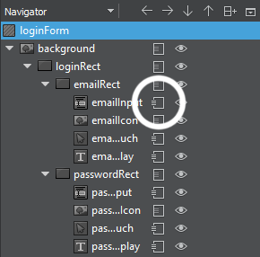
The QML types that we need to expose/export are emailInput (TextInput), emailTouch (MouseArea), emailDisplay (Text), passwordInput (TextInput), passwordTouch (MouseArea), passwordDisplay (Text), and loginMouseArea (MouseArea). Once you have done all that, let's open up main.qml.
At first, our main.qml should look something like this, which will just open an empty window:
import QtQuick 2.6
import QtQuick.Window 2.2

Window {
    id: window
    visible: true
    width: 800
    height: 600
    title: qsTr("My App")
}
After that, add in the MainForm object, and set its anchor setting to anchors.fill: parent. Then, print out a line of text, Login pressed, on the console window when the loginButton is clicked (or touched, if running on the touch device):
Window {
    id: window
    visible: true
    width: 800
    height: 600
    title: qsTr("My App")

    MainForm
    {
        anchors.fill: parent

        loginMouseArea.onClicked:
        {
            console.log("Login pressed");
        }
    }
}
After that, we are going to program the behavior when the MouseArea on the email input is clicked/touched. Since we are manually creating our own text field, instead of using the TextField QML type provided by the QtQuick.Controls module, we must manually hide and show the E-Mail and Password text displays, as well as changing the input focus when the user clicks/touches down on the MouseArea.
The reason why I chose not to use the TextField type is that I can hardly customize the TextField's visual presentation, so why don't I create my own? The code for doing manual focus for the email input looks like the following:
emailTouch.onClicked:
{
    emailDisplay.visible = false;      // Hide emailDisplay
    emailInput.forceActiveFocus();     // Focus emailInput
    Qt.inputMethod.show();       // Activate virtual keyboard
}

emailInput.onFocusChanged:
{
    if (emailInput.focus == false && emailInput.text == "")
    {
        emailDisplay.visible = true;   // Show emailDisplay if
        emailInput is empty when loses focus
    }
}
After that, do the same for the password field:
passwordTouch.onClicked:
{
    passwordDisplay.visible = false;   // Hide passwordDisplay
    passwordInput.forceActiveFocus();  // Focus passwordInput
    Qt.inputMethod.show();       // Activate virtual keyboard
}

passwordInput.onFocusChanged:
{
    if (passwordInput.focus == false && passwordInput.text == "")
    {
        passwordDisplay.visible = true;      // Show passwordDisplay if
        passwordInput is empty when loses focus
    }
}
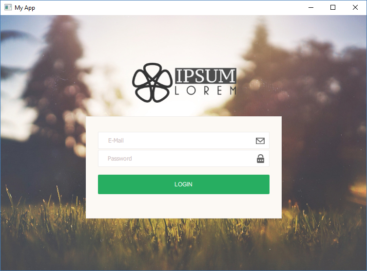
That's it; we're done! You can now compile and run the program. You should get something like this:
If you're not seeing the images, and are getting error messages that say Qt is unable to open the images, please go back to your MainForm.ui.qml and add in the prefix image/ to the front of the source property. This is because Qt Quick Designer loads the images without the prefix, while your final program needs the prefix. After you have added the prefix, you may realize you no longer see the images getting displayed on Qt Quick Designer, but it will work just fine in your final program.
I'm not sure if this is a bug or if they intended it like that. Hopefully, Qt's developers can get it fixed, and we won't have to do that extra step anymore. That's it; hopefully, you have understood the similarities and differences between Qt Widgets Application and Qt Quick Application. You can now pick the best option from the two to fit your project's needs!