Chapter 7
Best Practice #6
Focus on Descriptive Analytics for Data Literacy
“Over 85% of Data Analytics in the Industry is Descriptive Analytics.”
Gartner
As discussed in the preceding sections, businesses today originate and capture enormous amounts of data. But many companies struggle to become a data-driven enterprise. Research published in Harvard Business Review found that companies are failing in their efforts to become data-driven and the percentage of firms identifying themselves as being data-driven has declined in each of the past three years – from 37.1% in 2017 to 32.4% in 2018 to 31.0% in 2019 [Bean and Davenport, 2019]. Some alarming results from the research are:
- 72% of survey participants report that they have yet to forge a data culture
- 69% report that they have not created a data-driven organization
- 53% state that they are not yet treating data as a business asset
- 52% admit that they are not competing on data and analytics.
One of the main reasons that prevent companies from becoming data-driven is the lack of data literacy, which is the ability to understand and communicate data and insights. In fact, according to Gartner, data literacy is the second key reason that is preventing companies to become data-driven and by 2020, 50% of organizations will lack sufficient AI and data literacy skills to achieve business value [Gartner, 2019]. The key findings of Gartner’s CDO research are below.

So, how can data literacy be inculcated in the business enterprise? While there are many strategies to drive data literacy and one key strategy is leveraging the execution of descriptive analytics. But what exactly is descriptive analytics in the context of data literacy? Descriptive analytics is interpreting historical data to better understand past business performance. In simple words, descriptive analytics answers the question, “what happened?” using historical business data. Examples include, what were our sales last quarter? Who are the top five vendors based on dollar spend? Which product had the most defects? Questions like these form the foundation for the entire analytics strategy as these types of basic questions and the associated key performance indicators (KPIs) form the basis of enterprise business performance.
Descriptive analytics is the most common of the three types of analytics in business: the other two being predictive and prescriptive analytics. According to business analytics experts, Piyanka Jain and Puneet Sharma, 80% of the analytics reports used in enterprises are descriptive in nature [Jain and Sharma, 2014]. According to Gartner, just 13% of organizations are using predictive, and 3% are using prescriptive reports; just 16% of the reports are on advanced analytics; a combination of predictive and prescriptive analytics [Williamson, 2015].
A holistic analytics solution should address the insight needs of analysts, managers, and executives.
Descriptive analytics is technically realized with dashboards and reports using the MAD (Monitor-Analyze-Detail) framework, which is explained below.
- Monitor. The monitor type of insights is the dashboard‘ part of descriptive analytics. A business dashboard is not much different from the dashboard in a car. It visually conveys a quick snapshot of the required information or KPIs.
- Analysis. The analysis level provides the ability to dig a little deeper to understand the issue. For example, when using the sales reports, one can get details on sales managers, products, stores, and customers. The descriptive analytics in this category will typically have charts and KPIs at an aggregated and multi-dimensional level. In other words, it is mostly the BI reports.
- Detail. Once the information is drilled in, further details may be needed. For example, one sales area’s margin might be much lower on average than other regions, and one might want to view all the details of pertinent transactions. The descriptive analytics here is often the reports coming directly from the transactional systems.
Within the MAD framework, the monitor function is for the senior management, the analysis function is mainly for the managers, and the detail function is for the analysts. The MAD Insight consumption framework is in Figure 7.2.

The table below contains the mapping of the MAD framework to the user type and the three types of analytics.

Why is this a best practice?
So, how can descriptive analytics help with data literacy in the business? As discussed earlier, data literacy is enabling the business stakeholders to work with both data and insights for better business performance. So, if organizations can get reliable, quick, and easy access to both data and the insights and if they practice and work in that insights-based environment long enough, then data literacy can be potentially achieved. According to an article in HBR, it takes time and deliberate practice to become an expert [Ericsson et al., 2007]. According to the American Educator Edgar Dale, who developed the Cone of Experience or the Learning Pyramid, the more experiential is the learning, the greater is the retention by the individual of what they are learning. Malcolm Gladwell, in his bestselling book, Outliers, said one needs 10,000 hours of practice to gain expertise. The general premise is - systematic and constant exposure to data, and the insights will enhance data literacy in the organization, and descriptive analytics can offer that promise.
But how does descriptive analytics offer that promise? While data and insights can be provided by one of the three types of analytics – descriptive, predictive, and prescriptive, why is descriptive analytics preferred over others? The reason is descriptive analytics facilitates reliable, quick, and easy access to data and insights. There are five main reasons for this.
- Predictability. The data and insights in descriptive analytics are deterministic and factual. For example, the sales figures for the year 2018 are the same for everyone in the company; it is a fact coming from a descriptive analytics report. On the other hand, insights from the predictive analytics model bring uncertainty. For instance, in the regression model, an R-square value of 0.82 and a p-value of 0.0023 though statistically acceptable, might be unacceptable to a person if he or she has a low-risk appetite.
- Consistency. As there will be a single and consistent version of insights derived in descriptive analytics, the communication of the insights to the stakeholders becomes simpler. If the business can understand the insight or KPI well, the problem of transforming the insight into actions is much bigger. So, fundamentally, the insights or KPIs presented in descriptive analytics (reports and dashboards), can be the vehicle for communication to help build data literacy in the company.
- Reduced cost. The data used for deriving insights in descriptive analytics is easily and readily available in IT systems as the data is recorded on the past business events or transactions. This improves the speed of data acquisition, thereby reducing cost.
- Quicker insights. The capability or the technology to deliver insights in descriptive analytics is simple and fast compared to the insights derived using predictive and prescriptive analytics. The reports and dashboards in descriptive analytics are typically out-of-the-box solutions in most transactional and BI systems. In predictive and prescriptive analytics, there is uncertainty in the algorithm selected, the data used, and even the insights that are derived are probabilistic.
- Roadmap. Lastly, data literacy is also needed for advanced analytics, that is, predictive and prescriptive analytics. Descriptive analytics helps in assessing the current analytics maturity and identifies the gaps for the company to move up the analytics maturity curve or the analytics value chain. In other words, understanding the analytics maturity in the organization will help in preparing the roadmap for predictive and prescriptive analytics.
Research by IBM says that basic reporting and dashboarding capabilities, that is, descriptive analytics capabilities, can improve the return on investment (ROI) by 188%, and improving data quality can further boost the ROI to as high as 1209% [IBM, 2017]. For all these reasons, descriptive analytics can be a key enabler for building data literacy in the company.
Realizing the best practice
So, how can a business enterprise use descriptive analytics for data literacy? To implement descriptive analytics and build data literacy, a business enterprise must harness three key capabilities:
- Use data to build the data-driven culture
- Building data pipelines
- Implementing reports and dashboards
Use data to build the data-driven culture
The foundation for data literacy is a data-driven culture. Organizations need to promote a data-first culture that encourages data-driven decision making (3DM). But how can businesses realize the data-driven culture on the ground? One technique to build the data-driven culture is to use the data to do the talking, and this can be done by building quality data sets. In this regard, below are the three key steps for building a data-driven culture in the enterprise.
Profile the data and fix data quality issues
In chapter 4, we discussed data profiling in detail. Data profiling is the process of examining the existing data available and collecting statistics about that data. Given that business data is normally distributed, these statistics on the profile of the data should cover not only the database related parameters, but also metrics such as standard deviation (on data accuracy), standard error (on data precision), range (on variation in data), average (mean, median, and mode), and z-score (for outliers in the data set).
In addition, during profiling, there might be some data quality issues, specifically on the 12 data quality dimensions. Here are three key tactics to fix the data quality: especially in the “after-the-event” situation.
- Identify the data quality dimensions which are relevant as data quality is contextual. You don’t have to fix all the issues on all the 12 data quality dimensions. For example, as discussed earlier, often accurate data is acceptable over correct data.
- Fix data in the source system, that is, in the transactional system and not in the data warehouse. Often, data quality issues can be solved by cleaning up the original source. Data transfer and transpose (EAI and ETL) is a risk to data integrity and quality
- To prevent the data quality issue from reoccurring, define data ownership at the point of data collection or creation. Quality data is highly correlated with creating data correctly the first time.
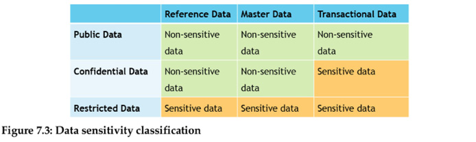
Once the data quality is improved, ensure that the right stakeholders have access to the right data. This can be done by classifying data according to the compliance view, which is of three main categories: public, confidential, and restricted data. If the data is sensitive, it must be protected, if not the access to the data can be opened.
Open the access to non-sensitive data
Once the enterprise data is profiled based on the compliance view, provide access to non-sensitive data to everyone in the company. When more data is available at the user’s disposal, the chances of building a data-driven culture and data literacy is enhanced. The public data in the business is usually non-sensitive data. In addition, reference data and master data are typically non-sensitive data when compared to transactional data, which is usually sensitive due to its contextual nature. For example, while the dollar value in the purchase order, which is transactional data is sensitive, the vendor and item data in the purchase order, which is master data is not very sensitive. The table below is the categorization of non-sensitive data and sensitive data.
Empower users to use data
One key strategy to empower business users is to leverage Self-Service Analytics (SSA). In SSA, business users perform queries and generate reports and dashboards on their own without relying much on the IT developers. SSA promises data democratization and faster data-based decisions. SSA does not eliminate IT-Business collaboration as some amount of training, governance, and change management is still required for the business from IT. The two main issues with SSA are data security and licensing of analytics tools.
Building data pipelines
A data pipeline is an extract of discrete and/or time-series data from multiple data sources and loading the data into the data warehouse or data lake for analytics. The data extract is with SQL stored procedures, which enables the data pipelines to quickly and efficiently extract data from the transactional source systems, transform it, and ingest it into data-warehouse or data-lake for deriving insights thereby improving the data literacy. Fundamentally, data pipelines bring reliability in the data integration process, thereby improving the trust in the way the data is sourced, transformed, and ingested.
The data pipeline architecture has three layers where each layer feeds into the next until data reaches its destination, which can be the data warehouse, data lake, or data hubs.
- Extraction. Data is extracted from transactional IT systems where the data is originated and captured.
- Transformation. Once data is extracted from source IT systems, its structure or format needs to be adjusted. Transformations include conversion, cleaning, populating, filtering, and aggregation of the extracted data.
- Ingestion. The ingestion layer reads data from each data source using application programming interfaces (APIs), and the data is ingested, either in batches or through streams into the data warehouse or data lake or data hubs.
Implementing reports and dashboards
Once the data is made available, the third capability in improving the data literacy in business is building reports and dashboards – the two pillars of descriptive analytics. Fundamentally, a report is a list of data attributes generated based on the criteria defined. Reports can be tabular reports where the data typically comes from the transactional IT systems like ERP or CRM system, or the reports can be from the BI systems where the data comes from a data warehouse or data lake. Fundamentally, tabular reports are presented as views in the data visualization layer; a view is the result set of a SQL query on the data. Tabular reports have four key characteristics.
- Granular. Tabular reports are granular, providing specific details of rows and even attributes as they are typically designed for the Analysts in the company. As the granular data is the lowest level of data, it can be molded in any way that the analyst requires. Apart from this, granular data can be easily merged with data from external sources and can be effectively integrated and managed.
- Static. Tabular reports have the data typically sourced from the transactional databases, and they display only certain fields of data within a specific domain.
- Canned. Tabular reports are usually canned reports which are pre-formatted and distributed to the whole organization or to specifically defined user groups. Canned reports allow the organization to generate scalable, print-ready reports for its users.
- Analyst Centric. Tabular reports are designed for analyst levels of users like an Accounts Payable (AP) Clerk or a Truck Dispatcher or a Trading Analyst to study or examine their respective functional areas in detail.
The second type of report is the BI report. BI reports provide features to sort, filter, group or aggregate, and visualize data across multiple dimensions. The data warehouses are denormalized databases in BI systems where the data extraction query does not have to go to multiple tables to get the right data. This saves a lot of querying time, thereby improving the speed of data rendering. BI reports are presented as cubes; a cube is stored data in a multi-dimensional form. Just like tabular reports which are on historical data, BI reports have four key characteristics.
- Aggregation. BI reports use aggregated data, that is, pre-calculated summary data, for key attributes or fields. Apart from data aggregation, BI reports also focus on the association between different variables.
- Multi-dimensionality. In the BI systems, data is stored in multiple dimensions or attributes as cubes enabling the user to look at the data holistically from many different perspectives. For example, with BI reports, the sales order data sets can be analyzed using different dimensions like region, year, amount, sales manager, and so on.
- Ad-hoc Reporting. With ad-hoc reporting, dynamic reports are generated by the user as and when needed. While the transactional reports have limited abilities to change the report, ad-hoc reports give users greater flexibility in querying the underlying data and how it should be presented.
- Manager Centric. BI reports usually cater to the manager level users as managers are entrusted with a leadership role with the responsibility of overseeing a department or group of employees within a specific department in the company. Managers need to analyze data quickly across various business dimensions, and BI reports give that capability.
So, when does one go for tabular reports, and when does one for go BI reports? If the requirements are for detailed or granular data, then the reports must be transactional, where the data is coming from the transactional systems. The need for transactional reports will usually come from the analysts. On the other hand, if the business users need aggregated and multi-dimensional data in a fast way or ad-hoc way, then BI reports are a good place to go! This need will usually come from middle and senior management. The image on the facing page shows the comparison between Transactional and BI reports.
While the reports (transactional and BI) are the presentation of the data on the database attributes, some users, especially the managers and the senior managers, require specific information to be presented quickly and visually as a KPI. To address the insight needs of these types of “monitor” users, the best practices are to go for dashboards. A dashboard fundamentally presents insights or KPIs in a visual manner. A typical dashboard will have four key types of insights, comparisons, trends, distribution, and relationships, and is visually presented using charts. The relationship between the four key types of dashboard insights and the 13 key visuals or charts is as shown below. The figure below is adapted from the work of Abela, A [Abela, 2009].


Conclusion
In the same way literacy has contributed to human progress, data literacy is essential in ensuring the progress or the growth of the organization in today’s data-centric world. What is even more important is that today understanding data and deriving insights in business operations is no longer the skill of just data scientists and IT experts. It is an essential or core skill for every knowledge worker if the company wants to leverage data for improved business performance and become data-driven.
References
- Abela, A, “Chart Suggestions—A Thought-Starter,” https://bit.ly/33Znj3t.
- Bean, Randy and Davenport, Thomas, “Companies Are Failing in Their Efforts to Become Data-Driven,” Harvard Business Review, Feb 2019.
- Ericsson, Anders; Prietula, Michael; Cokely, Edward, “Making of an Expert,” Harvard Business Review, Jul 2007.
- Gartner, “A Data and Analytics Leader’s Guide to Data Literacy “, https://gtnr.it/39yRShA, Feb 2019.
- IBM, “Descriptive, predictive, prescriptive: Transforming asset and facilities management with analytics,” https://ibm.co/2JwQzFi, 2017.
- Jain, Piyanka and Sharma, Puneet “Behind Every Good Decision: How Anyone Can Use Business Analytics to Turn Data into Profitable Insights,” AMACOM, 2014.
- Williamson, Jason, “Getting a Big Data Job For Dummies,” Wiley, 2015.