By now you have a solid foundation in writing style sheets. You can style text and element boxes, float and position objects, create responsive page layouts using Flexbox and Grid, and even add subtle animation effects to your designs. But there are a few more common techniques that you should know about.
If you look over at the “In This Chapter” list, you’ll see that this chapter is a grab bag of sorts. It starts with general approaches to styling forms and the special properties for table formatting. We’ll cover other tricks of the trade including clearing out browser styles with a CSS reset, using images in place of text (only when necessary!), reducing the number of server requests with CSS sprites, and checking whether a browser supports a particular CSS feature. Let’s dig in!
Styling Forms
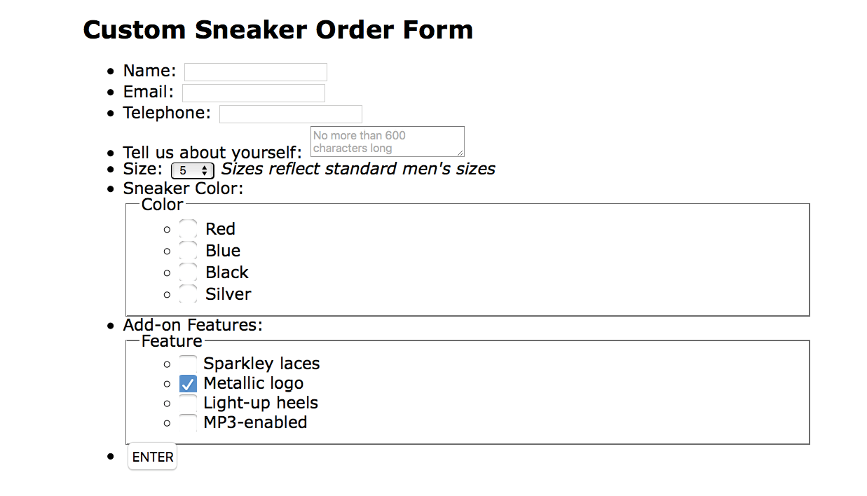
Web forms can look a bit hodgepodge right out of the box with no styles applied (Figure 19-1), so you’ll certainly want to give them a more professional appearance using CSS. Not only do they look better, but studies show that forms are much easier and faster to use when the labels and inputs are lined up nicely. In this section, we’ll look at how various form elements can be styled.
Now, I’m not going to lie: styling forms is somewhat of a dark art because of the variety of ways in which browsers handle form elements. And for really slick, custom forms, you will generally need to turn to JavaScript. But the efforts are well worth it to improve usability.
There aren’t any special CSS properties for styling forms; just use the standard color, background, font, border, margin, and padding properties that you’ve learned in the previous chapters. The following is a quick rundown of the types of things you can do for each form control type.
Text inputs (text, password, email, search, tel, url)
Change the appearance of the box itself with width, height, background-color, background-image, border, border-radius, margin, padding, and box-shadow. You can also style the text inside the entry field with the color property and the various font properties.
The textarea element
This can be styled in the same way as text-entry fields. textarea elements use a monospace font by default, so you may want to change that to match your other text-entry fields. Because there are multiple lines, you may also specify the line height. Note that some browsers display a handle on the lower-right corner of the textarea box that makes it resizable, but you can turn it off by adding the style resize: none. Text areas display as inline-block by default, but you can change them to block with the display property.
Button inputs (submit, reset, button)
Apply any of the box properties to submit and reset buttons (width, height, border, background, margin, padding, and box-shadow). It is worth noting that buttons are set to the border-box sizing model by default. Most browsers also add a bit of padding by default, which can be overridden by your own padding value. You can also style the text that appears on the buttons.
Radio and checkbox buttons
The best practice for radio and checkbox buttons is to leave them alone. If you are tenacious, you can use JavaScript to change the buttons altogether.
Drop-down and select menus (select)
You can specify the width and height for a select element, but note that it uses the border-box box-sizing model by default. Some browsers allow you to apply color, background-color, and font properties to option elements, but it’s probably best to leave them alone to be rendered by the browser and operating system.
Fieldsets and legends
You can treat a fieldset as any other element box, adjusting the border, background, margin, and padding. Turning the border off entirely is one way to keep your form looking tidy while preserving semantics and accessibility. By default, legend elements are above the top border of the fieldset, and, unfortunately, browsers make them very difficult to change. Some developers use a span or b element within the legend and apply styles to the contained element for more predictable results. Some choose to hide it in a way that it will still be read by screen readers (legend {width: 1px; height: 1px; overflow: hidden;}).
Now we know what we can do to style individual controls, but the grander goal is to make the form more organized and easier to use. Figure 19-2 shows the “after” shots of the unstyled form from Figure 19-1. There color, font, border, and spacing changes, and the labels and input elements are nicely aligned as well. And not only that, the form is responsive! I’ve used Flexbox to make the labels stack on top of their respective inputs and fieldsets on narrow screens so there is no wasted space.
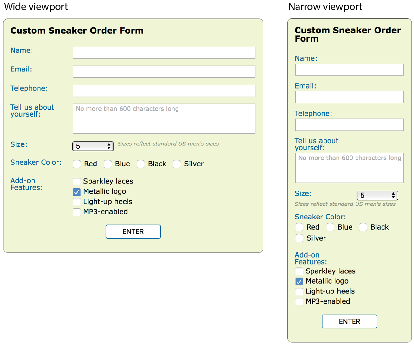
If you’d like to take a look at the actual markup and styles, the document sneakerform.html is available with the materials for this chapter (learningwebdesign.com/5e/materials). I’ve left careful and thorough comments throughout that explain exactly what each style is for. My approach to styling the Custom Sneaker Order Form can be summarized as follows:
- Set the box-sizing to border-box for the whole document. This makes sizing form elements more predictable.
- Give the form a max-width (so it can shrink to fit smaller viewports) and optional decorative styling like the green background and rounded border in the example.
- Get rid of the bullets and spacing around the unordered lists that were used to mark up the form semantically.
- Turn list items (each containing a label and some sort of input or fieldset) into flex containers by setting their display to flex (see Note). Turn on wrapping, which is what allows the input to shift below the labels on small screens.
- Give the labels fixed widths (flex: 0 0 8em;) so they are sized the same regardless of screen size. Because labels on checkboxes and radio buttons work differently, set them to override the 8em width (flex: 1 1 auto;).
- Allow the input, textarea, and fieldsets to grow to fill the remaining space (flex: 1 1 20em;). When the screen is too narrow for them to fit next to the labels, they wrap below.
- Set the text input fields’ font-family to inherit so they use the same font as the rest of the document instead of whatever font the browser uses for forms. Text inputs also get heights, borders, and a little padding.
- Fieldsets and legends are tricky to style. Turn off the border and padding on the fieldset, and then hide the legend in a way that it will still be read aloud before each checkbox or radio button option. Because there is both a label and a legend for each fieldset, I made sure they are not exactly the same so they won’t be redundant when read aloud by a screen reader. The legend should be shorter because it is repeated for each option.
- The submit button has a rounded border, background color, and font styling. Set the side margins to auto so it will always be centered in the width of the form.
This is a very simple example, but it should give you a general idea of how forms can be styled. You may also want to add highlight styles for interactivity, such as :hover styles on the buttons and :focus styles for text inputs when they are selected.
Styling Tables
Like any other text content on a web page, content within table cells can be formatted with various font, text, and background properties.
You will probably want to adjust the spacing in and around tables. To adjust the amount of space within a cell (cell padding), apply the padding property to the td or th element. Spacing between cells (cell spacing) is a little more complicated and is related to how CSS handles cell borders. CSS provides two methods for displaying borders between table cells: separated or collapsed. These options are specified with the table-specific border-collapse property with separate and collapse values, respectively.
border-collapse
Values: separate | collapse
Default: separate
Applies to: table and inline-table elements
Inherits: yes
Note
In the past, cell padding and spacing were handled by the and attributes in the element, respectively, but they have been made obsolete in HTML5 because of their presentational nature.
Separated Borders
By default, borders are separated, and a border is drawn on all four sides of each cell. The border-spacing property lets you specify the space between cell borders.
border-spacing
Values: horizontal-length vertical-length
Default: 0
Applies to: table and inline-table elements
Inherits: yes
The values for border-spacing are two length measurements. The horizontal value comes first and applies between columns. The second measurement is applied between rows. If you provide one value, it will be used both horizontally and vertically. The default setting is 0, causing the borders to double up on the inside grid of the table (see Note).
The table in Figure 19-3 is set to separate with 15 pixels of space between columns and 5 pixels of space between rows. A purple border has been applied to the cells to make their boundaries clear.
NOTE
Although the default is 0, browsers generally add 2 pixels of space for the obsolete attribute by default. If you want to see the borders double up, you need to set the attribute to 0 in the element.

For tables with separated borders, you can indicate whether you want empty cells to display their backgrounds and borders by using the empty-cells property. For a cell to be “empty,” it may not contain any text, images, or non-breaking spaces. It may contain carriage returns and space characters.
empty-cells
Values: show | hide
Default: show
Applies to: table cell elements
Inherits: yes
Figure 19-4 shows the previous separated table-border example with its empty cells (what would be Cell 14 and Cell 15) set to hide.
Collapsed Borders
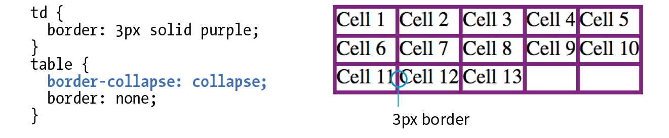
In the collapsed border model, the borders of adjacent borders “collapse” so that only one of the borders is visible and the space is removed (Figure 19-5). In the example, although each table cell has a 3-pixel border, the borders between cells measure a total of 3 pixels, not 6. In instances where neighboring cells have different border styles, a complicated pecking order is called in to determine which border will display, which you can read in the spec.
The advantage to using the collapsed table-border model is that you can style the borders for tr, col, rowgroup, and colgroup elements. With the separated model, you can’t. Strategic use of horizontal and vertical borders improves the readability of complicated tables, making the collapsed model an attractive choice.
Table Layout
table-layout
Values: auto | fixed
Default: auto
Applies to: table or inline-table elements
Inherits: yes
The table-layout property allows authors to specify one of two methods of calculating the width of a table. The fixed value bases the table width on width values provided for the table, columns, or cells. The auto value bases the width of the table on the minimum width of the contents of the table. Auto layout may display nominally more slowly because the browser must calculate the default width of every cell before arriving at the width of the table.
That covers basic form and table formatting. I know this is a beginner’s book, but in the next section, I’m going to introduce you to a few intermediate CSS techniques that may make your work easier and your pages faster.
A Clean Slate
(Reset and Normalize.css)
As you know, browsers have their own built-in style sheets (called user agent style sheets) for rendering HTML elements. If you don’t supply styles for an h1, you can be certain that it will display as large, bold text with space above and below. But just how much larger and how much space may vary from browser to browser, giving inconsistent results. Furthermore, even if you do provide your own style sheet, elements in your document may be secretly inheriting certain styles from the user agent style sheets, causing unexpected results.
There are two methods for getting a consistent starting point for applying your own styles: a CSS reset or normalize.css. They take different approaches, so one or the other may be the best solution for what you need to achieve.
CSS Reset
The older approach is a CSS reset, a collection of style rules that overrides all user agent styles and creates a starting point that is as neutral as possible. With this method, you need to specify all the font and spacing properties for every element you use. It’s a truly from-scratch starting point.
The most popular reset was written by Eric Meyer (the author of too many CSS books to list). It is presented here, and I’ve also included a copy of it in the materials folder for this chapter for your copy-and-paste pleasure (see Note). If you look through the code, you’ll see that the margins, border, and padding have been set to 0 for a long list of block elements. There are also styles that get typography to a neutral starting point, clear out styles on lists, and prevent browsers from adding quotation marks to quotes and blockquotes.
/* http://meyerweb.com/eric/tools/css/reset/
v2.0 | 20110126 License: none (public domain)*/
html, body, div, span, applet, object, iframe,
h1, h2, h3, h4, h5, h6, p, blockquote, pre,
a, abbr, acronym, address, big, cite, code,
del, dfn, em, img, ins, kbd, q, s, samp,
small, strike, strong, sub, sup, tt, var,
b, u, i, center, dl, dt, dd, ol, ul, li,
fieldset, form, label, legend,
table, caption, tbody, tfoot, thead, tr, th, td,
article, aside, canvas, details, embed,figure, figcaption, footer, header, hgroup,menu, nav, output, ruby, section, summary,
time, mark, audio, video {
margin: 0;
padding: 0;
border: 0;
font-size: 100%;
font: inherit;
vertical-align: baseline;
}
/* HTML5 display-role reset for older browsers */
article, aside, details, figcaption, figure,footer, header, hgroup, menu, nav, section {
display: block;
}
body {
line-height: 1;
}
ol, ul {
list-style: none;
}
blockquote, q {
quotes: none;
}
blockquote:before, blockquote:after,
q:before, q:after {
content: '';
content: none;
}
table {
border-collapse: collapse;
border-spacing: 0;
}
To use the reset, place these styles at the top of your own style sheet so your own styles override them. You can use them exactly as you see them here or customize them as your project requires. I also recommend reading Eric’s posts about the thinking that went into his settings at meyerweb.com/eric/tools/css/reset/ and meyerweb.com/eric/thoughts/2007/04/18/reset-reasoning/. A web search will reveal other, potentially smaller, CSS reset options.
Normalize.css
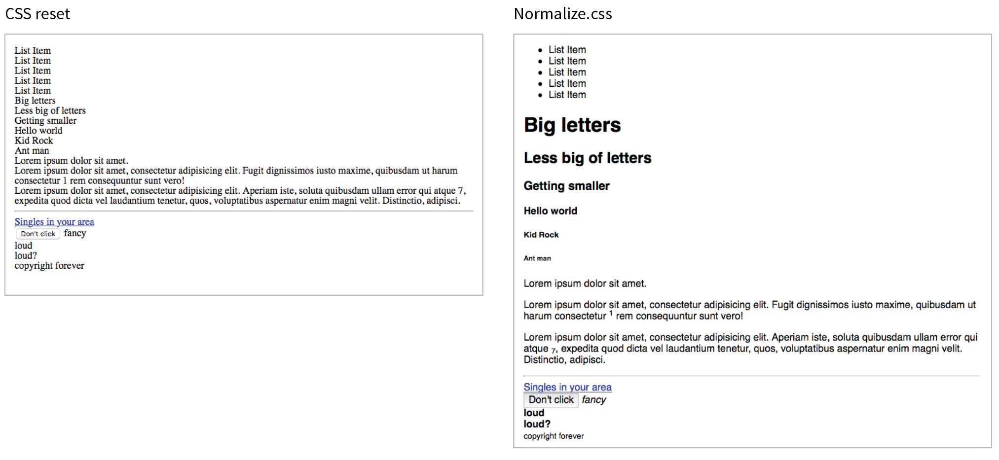
A more nuanced approach is to use Normalize.css, created by Nicolas Gallagher and Jonathan Neal. They painstakingly combed through the user agent styles of every modern browser (desktop and mobile) and created a style sheet that tweaks their styles for consistency, rather than just turning them all off. Normalize.css gives you a reasonable starting point: paragraphs still have some space above and below, headings are bold in descending sizes, lists have markers and indents as you would expect. It also includes styles that make form widgets consistent, which is a nice service. Figure 19-6 shows the difference between CSS reset and Normalize.css starting points.
You can download Normalize.css at necolas.github.io/normalize.css/ and include it before your own styles. It is too long to print here, but you will find that it is well organized and includes comments with clear explanations for each section. For Nicolas’s thoughts on the project, see nicolasgallagher.com/about-normalize-css/.
Normalize.css is considered a superior successor to the cruder CSS reset, but I think it is important to be aware of both options. Or, if slight differences from browser to browser are just fine with you (as they are for a lot of professional developers), you don’t need to use either.
Image Replacement Techniques
Before web fonts were a viable option, we needed to use an image anytime we wanted text in a font fancier than Times or Helvetica. Fortunately, that is no longer the case, but every now and then, it may still be necessary to replace a text element with an image in a way that is still accessible to screen readers. One common scenario is using a stylized logo in place of a company name in a heading (see Note).
Note
Before going through the effort of an image replacement technique, consider whether the text in an element is all you need. In the case of a logo, the text could represent the company name should the image of the logo not be seen. Frankly, the logo example in this section could probably be handled that way. That said, there may be instances in which you need to replace an actual string of text with an image, in which case an image replacement technique might be a good thing to have in your CSS toolbox.
Removing the text altogether and replacing it with an img element is a bad idea because the text content is gone forever. The solution is to use a CSS-based image replacement technique that uses the image as a background in the element, then shifts the text out of the way so that it is not rendered on the page. Visual browsers see the background image, while the text content stays in the file for the benefit of search engines, screen readers, and other assistive devices. Everybody wins!
Many image replacement techniques have been developed over the years (see Note), but the most popular is the Phark technique created by Mike Rundle. It uses a large negative indent to move the text off to the left of the visible page.
In the example in Figure 19-7, I use the Phark technique to display the Jenware logo in place of the h1 “Jenware” text in the HTML source. The markup is simple:
<h1 id="logo">Jenware</h1>
The style rule is as follows:
#logo {
width: 450px;
height: 80px;
background: url(jenware.png) no-repeat;
text-indent: -9999px;}
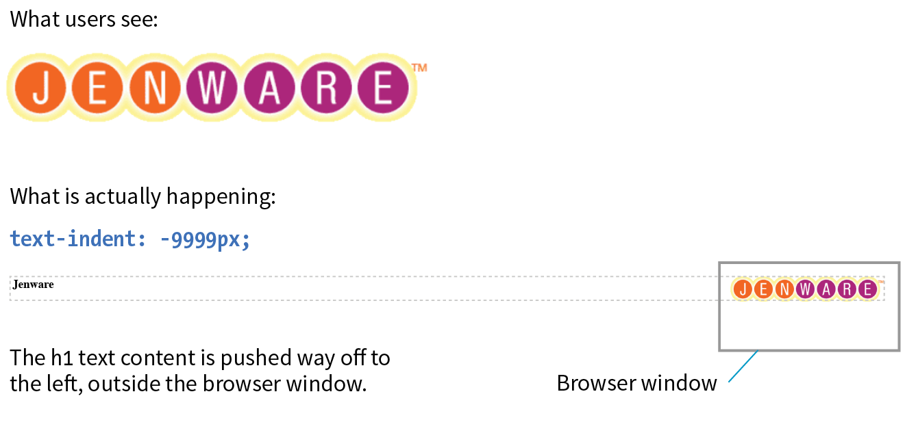
There are a few things of note here. First, the h1 element displays as a block by default, so we can just specify its width and height to match the dimensions of the image used as a background. The text-indent property pushes the word Jenware over to the left by 9,999 pixels. This requires the browser to render a very wide element box, but the performance hit is minimal.
The downside to any image replacement approach is that it means an extra request to the server for every image used. It can also be more work creating graphics every time a heading changes. Again, before you reach for an image replacement, consider whether a web font or inline image with alt text may do the trick. In the next section, we’ll look at a way to curb unnecessary server requests.
CSS Sprites
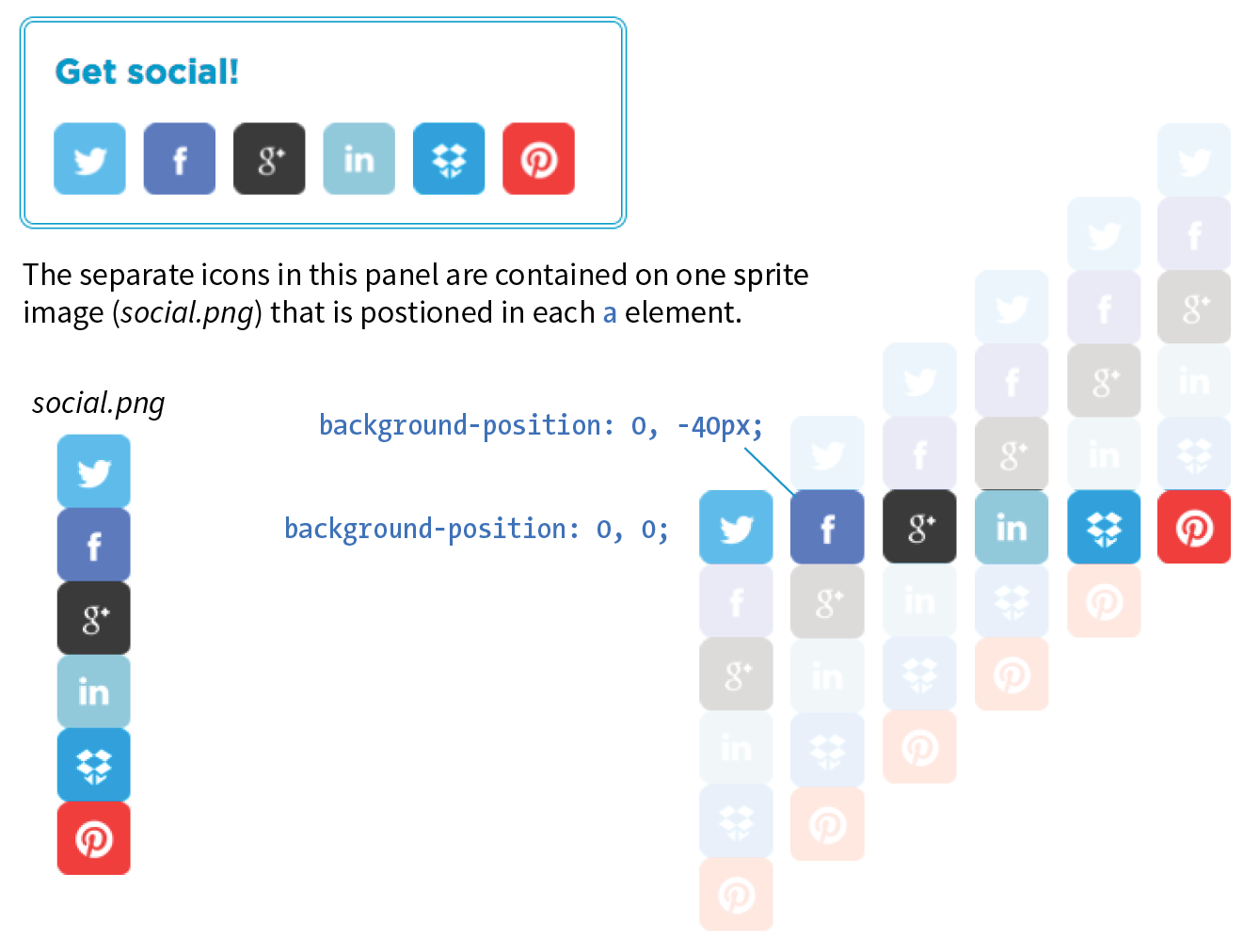
When I talked about performance back in Chapter 3, Some Big Concepts You Need to Know, I noted that you can improve site performance by reducing the number of requests your page makes to the server (a.k.a. HTTP requests). One strategy for reducing the number of image requests is to combine all your little images into one big image file so that only one image gets requested. The large image that contains multiple images is known as a sprite, a term coined by the early computer graphic and video game industry. That image gets positioned in the element via the background-position property in such a way that only the relevant portion of it is visible. An example should make this clear.
If I want to show a collection of six social media icons on my page, I can turn those six graphics into one sprite and reduce the number of HTTP requests accordingly (Figure 19-8). You can see in the figure that the icons have been stacked into one tall graphic (social.png). This example also uses an image replacement technique so the text for each link is still available to screen readers.
The markup
<ul>
<li><a href="" class="hide twitter">Twitter</a></li>
<li><a href="" class="hide fb">Facebook</a></li>
<li><a href="" class="hide gplus">Google+</a></li>
<li><a href="" class="hide linkedin">LinkedIn</a></li>
<li><a href="" class="hide dropbox">Dropbox</a></li>
<li><a href="" class="hide pinterest">Pinterest</a></li>
</ul>
The styles
.hide {text-indent: 100%;
white-space: nowrap;
overflow: hidden;
}
li a {
display: block;
width: 40px;
height: 40px;
background-image: url(social.png);
}
li a.twitter { background-position: 0 0; }
li a.fb { background-position: 0 -40px; }
li a.gplus { background-position: 0 -80px; }
li a.linkedin { background-position: 0 -120px; }
li a.dropbox { background-position: 0 -160px; }
li a.pinterest { background-position: 0 -200px; }
In the markup, each item has two class values. The hide class is used as a selector to apply an image replacement technique. This one was developed by Scott Kellum and uses a left indent of 100% to move the text out of sight. The other class name is particular to each social network link. The unique class values allow us to position the sprite appropriately for each link.
At the top of the style sheet you’ll see the image replacement styles. Notice in the next rule that all link (a) elements use social.png as their background image.
Finally, we get to the styles that do the heavy lifting. The background-position is set differently for each link in the list, and the visible element box works like a little window revealing a portion of the background image. The first item has the value 0,0; this positions the top-left corner of the image in the top-left corner of the element box. To make the Facebook icon visible, we need to move the image up by 40 pixels, so its vertical position is set to –40px (its horizontal position of 0 is fine). The image is moved up by 40-pixel increments for each link, revealing image areas farther and farther down the sprite stack.
In this example, all of the icons have the same dimensions and stack up nicely, but that is not a requirement. You can combine images with a variety of dimensions on one sprite. The process of setting a size for the element and then lining the sprite up perfectly with the background-position property is the same.
CSS Feature Detection
One of the dominant challenges facing web designers and developers is dealing with uneven browser support. Useful new CSS properties emerge regularly, but it takes a while for them find their way into browsers, and it takes much longer for the old non-supporting browsers to fade into extinction.
Fortunately, we have a few methods for checking to see if a browser supports a particular feature so we can take advantage of cutting-edge CSS while also providing thoughtful fallbacks for non-supporting browsers. Using feature detection with fallbacks sure beats the alternatives of a) not using a property until it is universally supported, or b) using it and letting users with non-supporting browsers have a broken experience.
We’ll look at two ways to detect whether a feature is supported: feature queries with a new CSS at-rule (@supports) and a JavaScript-based tool called Modernizr.
CSS Feature Queries (@supports)
The CSS3 Conditional Rules Module Level 3 (www.w3.org/TR/css3-conditional/) introduces the @supports rule for checking browser support of a particular property and value declaration. Commonly referred to as a feature query, it works like a media query in that it runs a test, and if the browser passes that test, it applies the styles contained in the brackets of the at-rule. The syntax for @supports is as follows:
@supports (property:value) {
/* Style rules for supporting browsers here */
}Note that the query is for an entire declaration, both the property and a value. It was designed this way because sometimes you may test for a new property (such as initial-letter), and sometimes you may need to test for a new value for an existing property. For example, the display property is universally supported, but the newer grid keyword value is not. Note also that there is no semicolon at the end.
Let’s look at a more specific example. I think it would be cool to use the new mix-blend-mode property to make a photo of watermelons blend in with the background (similar to a Layer Blending Mode in Photoshop). As of this writing, it is supported only in Firefox, Chrome, and Safari. As a fallback for non-supporting browsers, I create a somewhat less interesting blended effect using the opacity property (Figure 19-9).

As of this writing, the best practice is to specify the fallback styles first, and then override them with a set of styles targeted at browsers that support the feature. Note that I also need to set the opacity back to 1 so it overrides my fallback style.
The markup
<div id="container">
<figure class="blend">
<img src="watermelon.jpg" alt="">
</figure>
</div>
The styles
#container {
background-color: #96D4E7;
padding: 5em;
}
.blend img {
opacity: .5;
}
@supports (mix-blend-mode: multiply) { .blend img { mix-blend-mode: multiply; opacity: 1; }}Warning
The browser has to report for itself whether it has implemented the feature. If the feature is implemented in a buggy way, you may still encounter problems even when using feature queries.
Operators
The @supports rule can be used with three operators to refine the feature test: not, and, and or:
not
The not operator lets us test for when a specific property/value pair is not supported.
@supports not (mix-blend-mode: hue) {
/* styles for non-supporting browsers */
}
Someday, this will be useful for supplying fallback styles, but with the current browser support, you risk non-supporting browsers skipping everything in the @supports rules, including the fallbacks. That’s why I used the override method in the previous example.
and
Applies styles only when all of the conditions in a series of two or more are met.
@supports (border-radius: 10em) and (shape-outside: circle()) {
/* styles that apply only when the browser supports
shape-outside AND border-radius */
}
or
Use the or operator to apply styles when any of a series of conditions are met. This one is particularly useful for vendor-prefixed properties.
@supports (-webkit-transform: rotate(10deg)) or
(-ms-transform: rotate(10deg)) or
(transform: rotate(10deg))
/* transform styles */
}
Browser support
Feature queries began working in Chrome, Firefox, and Opera back in 2013, and they are supported by every version of Microsoft Edge. Safari added support in version 9 in 2015. Unfortunately, no version of Internet Explorer supports feature queries, which leaves a big hole in the support picture until those old browsers go away.
Non-supporting browsers use your fallback design, so make sure that it is usable at the very least. Beware, however, of browsers that do not support @supports but may support newer CSS features that you might be inclined to test. Flexbox is a great example. Safari 8 recognizes the Flexbox properties, but does not recognize @supports, so if all of your Flexbox layout rules are tucked away inside a feature query, Safari 8 won’t see them. That’s why feature queries aren’t the best tool for detecting Flexbox or any property that has better support than @supports itself. Grid Layout, on the other hand, is a great place to put feature queries to work because every browser that supports display: grid also supports @supports. Again, CanIUse.com is a good resource for comparing support.
Pros and cons
Feature queries are an exciting new tool for web development. They allow us to take advantage of new CSS properties sooner in a way that doesn’t rely on JavaScript (we’ll look at Modernizr, a JavaScript solution, next). Downloading and running a script (even a small one) is slower than using CSS alone.
On the downside, limited browser support (for now) means @supports is not as far-reaching as Modernizr. However, if it accomplishes your goals, it should be your first choice. Fortunately, the browser environment will only continue to improve, giving CSS feature queries the advantage over a script-based solution in the long run.
So what is this “Modernizr” you’re hearing so much about?
Modernizr
Modernizr is a lightweight JavaScript library that runs behind the scenes and tests for a long list of HTML5 and CSS3 features when the page is loaded in the browser. For each feature it tests, it stores the result (supports/doesn’t support) in a JavaScript object that can be accessed with scripts and optionally as a class name in the html root element that can be used in CSS selectors. I’m going to focus on the latter CSS method.
How it works
When Modernizr runs, it appends the html element with a class name for each feature it detects. For example, if it is configured to test for Flexbox, when it runs on a browser that does support Flexbox, it adds the .flexbox class name to the html element:
<html class="js flexbox">
If the feature is not supported, it adds the feature name with a .no- prefix. On a non-supporting browser, the Flexbox test would be reported like this:
<html class="js no-flexbox">
With the class name in place on the root element, everything on the page becomes part of that class. We can use the class name as part of a selector to provide different sets of styles depending on feature support:
.flexbox nav { /* flexbox styles for the nav element here */
}
.no-flexbox nav { /* fallback styles for the nav element here */
}
This example is short and sweet for demonstration purposes. Typically, you’ll use Modernizr to test for many features, and the html tag gets filled with a long list of class names.
How to use it
First, you need to download the Modernizr.js script. Go to Modernizr.com and find the Download link. From there you can customize the script to contain just the HTML and CSS features you want to test, a nice way to keep the file size of the script down. Click the Build button, and you will be given several options for how it can be saved. A simple click on Download saves the script in a .js file on your computer.
Once you have your script, put it in the directory with the rest of the files for your project. Add it to the head of your HTML document, before any linked style sheets or other scripts that need to use it:
<head>
<script src="modernizr-custom.js"></script> <!--other scripts and style sheets -->
</head>
Finally, open your HTML document and assign the no-js class name to the html element.
<html class="no-js">
Modernizr will change it to js once it detects that the browser supports JavaScript. If JavaScript (and therefore Modernizr) fails to run, you will not know whether or not features are supported.
Pros and cons
Modernizr is one of the most popular tools in web developers’ arsenals because it allows us to design for particular features rather than whole browsers. It is easy to use, and the Modernizr site has thorough and clear documentation to help you along. Because it’s JavaScript, it works on the vast majority of browsers. The flip side to that, however, is that because it relies on JavaScript, you can’t be 100% certain that it will run, which is its main disadvantage. It will also be slightly slower than using CSS alone for feature detection.
Wrapping Up Style Sheets
That concludes our whirlwind tour of Cascading Style Sheets. You’ve come a long way since styling an h1 and a p back in Chapter 11, Introducing Cascading Style Sheets. By now, you should be comfortable formatting text and even doing basic page layout. While CSS is easy to learn, it takes a lot of time and practice to master. If you get stuck, you will find that there are many resources online to help you find the answers you need. The nice thing about CSS is that you can start with just the basics and then build on that knowledge as you gain proficiency in your web development skills.
In the next chapter, I’ll introduce you to tools that web developers use to improve their workflow, including tools for writing CSS more efficiently and optimizing the results. But if you’re feeling overwhelmed with CSS properties, you can breathe a sigh of relief. We’re done!
Test Yourself
See how well you picked up the CSS techniques in this chapter with these questions. As you may have guessed, the answers are available in Appendix A.
- What is the purpose of a CSS reset?
- To override browser defaults
- To make presentation more predictable across browsers
- To prevent elements from inheriting unexpected styles
- All of the above
- What is the purpose of a CSS sprite?
- To improve site performance
- To use small images in place of large ones, reducing file size
- To reduce the number of HTTP requests
- a and c
- All of the above
- What is the purpose of an image replacement technique?
- To achieve really big text indents
- To use a decorative graphic in place of text
- To remove the text from the document and replace it with a decorative image
- To maintain the semantic content of the document
- b and d
- All of the above
- Name two approaches to aligning form controls and their respective labels without tables. A general description will do here.
- Match the style rules with their respective tables in Figure 19-10.
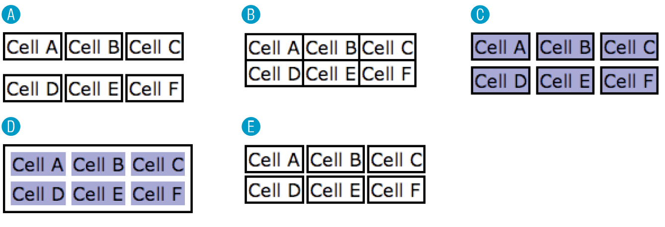
Figure 19-10. Match these tables with the code examples in Question 5. table { border-collapse: collapse;}td { border: 2px black solid; }table { border-collapse: separate; }td { border: 2px black solid; }table {border-collapse: separate;border-spacing: 2px 12px; }td { border: 2px black solid; }table {border-collapse: separate;border-spacing: 5px;border: 2px black solid; }td { background-color: #99f; }table {
border-collapse: separate;order-spacing: 5px; }td { background-color: #99f;border: 2px black solid; } - Using Modernizr to test for border-radius, say whether the div will display with rounded corners based on the following generated class results:
.border-radius div {}
<html class="js .no-border-radius"><html class="js .border-radius"><html class="no-js">
- As of this writing, what advantage does Modernizr have over CSS feature detection? What long-term advantage will CSS feature detection have over Modernizr?
CSS Review: Table Properties
The following is a summary of the properties covered in this chapter.