SVGs (Scalable Vector Graphics) have made several guest appearances in this book, but in this chapter they finally get to be the star.
When rendered in a browser window, an SVG graphic may look like an image in any other format, but it’s what’s under the hood that makes it truly unique and versatile. First, as the name says, it is a vector format, meaning shapes within SVGs are defined by coordinates and lines, not grids of pixels. That’s what makes them scalable—they can resize infinitely without loss of quality.
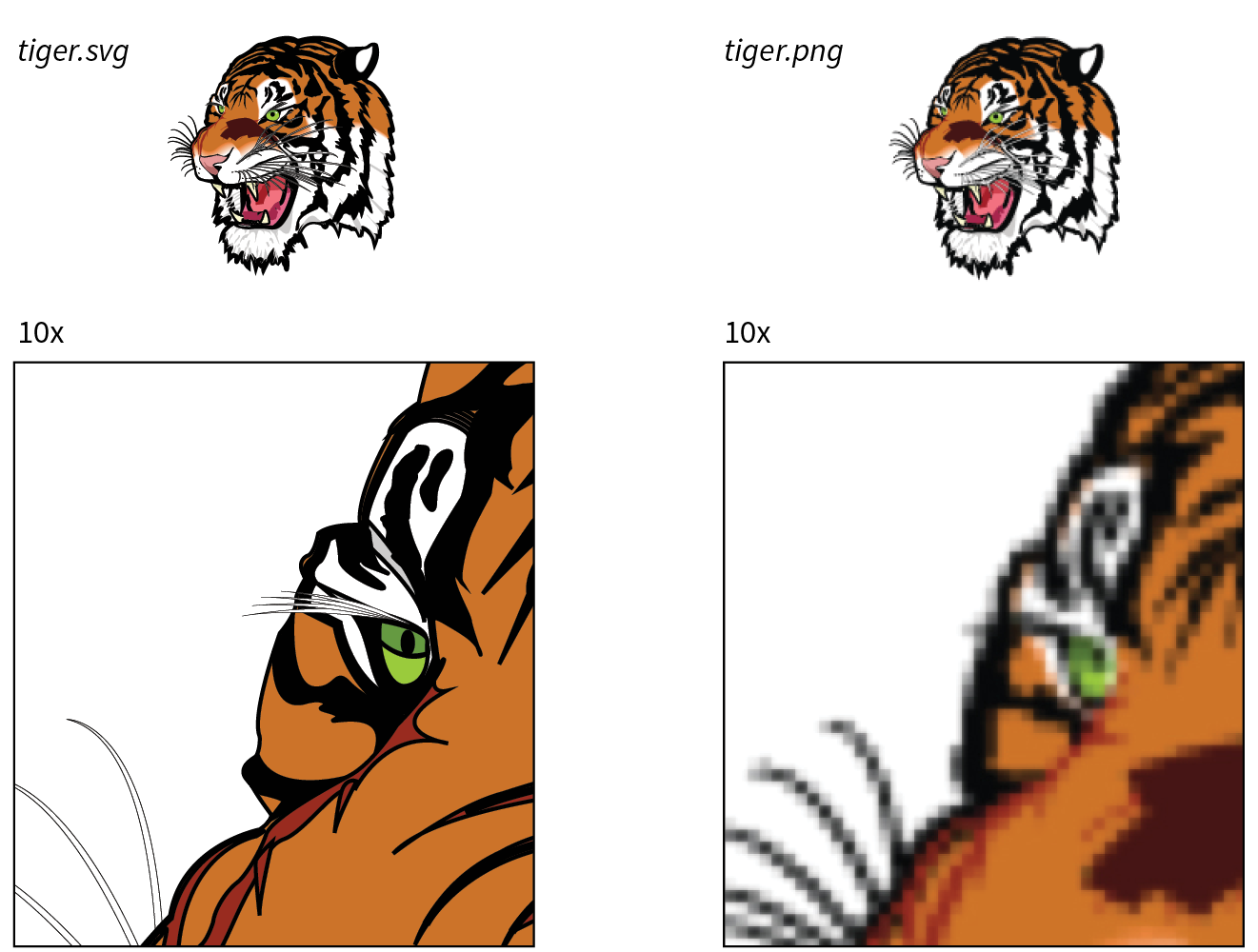
Figure 25-1 shows the same tiger image saved as an SVG and a PNG. The SVG can scale very large without any change in quality. Lines and text stay sharp, regardless of whether the image is viewed at 100 pixels or 10,000 pixels—try doing that with a bitmapped image! Now that our web pages and interfaces must work on all devices of all scales, from smartphones to high-density monitors and large-screen televisions, the ability to create a single image that looks great in all contexts is an epic win.
The vector nature of SVG makes it a good choice for icons, logos, charts, and other line drawings (Figure 25-2). And because these drawings are made up of shapes and paths, the file size is often significantly smaller than the same image made up of a grid of pixels.

SVGs may contain raster image content as well—in fact, you can do some pretty cool effects with them, but you miss out on the file size savings. SVGs are also an attractive choice for adding animation and interactivity to an interface. We’ll review all of these capabilities throughout this chapter.
Drawing with XML
That takes care of the “scalable” and “vector” aspects of SVG. What really sets SVG apart from other formats, though, is that it is an XML language (see the sidebar “A Quick Introduction to XML”) for describing two-dimensional graphics, including shapes, paths, text, and even special filter effects. Bitmapped graphics are stored as largely unintelligible code (should you care to peek inside), but SVG images are generated by text files that are fairly human-readable. In fact, it is possible to create SVG graphics by typing out the code directly in a code editor instead of using a graphics program.
SVG Elements
SVG is a markup language, just like HTML, only it includes elements for two-dimensional graphics, such as the following:
- Elements for drawing lines and shapes: circle, rect, ellipse, path, line, polyline, and polygon
- A text element for adding text content
- Elements for organization, such as g for grouping shapes together, and use and symbol for reusing drawings
- Elements for clipping (clipPath) and masking (mask) image areas into interesting shapes
- Elements for raster effects such as linearGradient and filter for Photoshop-like filter effects
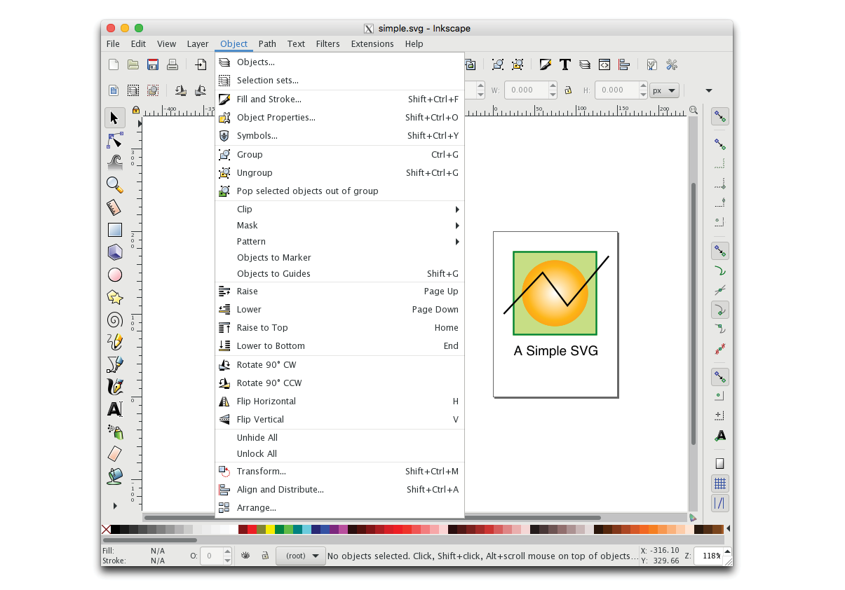
Of course, this is by no means an exhaustive list (see Note), but it should give you the general idea of what SVG is about. A simple example should make it even clearer. Figure 25-3 shows an SVG image, simple.svg, that contains a sampling of simple SVG elements. It’s not a masterpiece, I know, but it will introduce you to some common SVG elements.
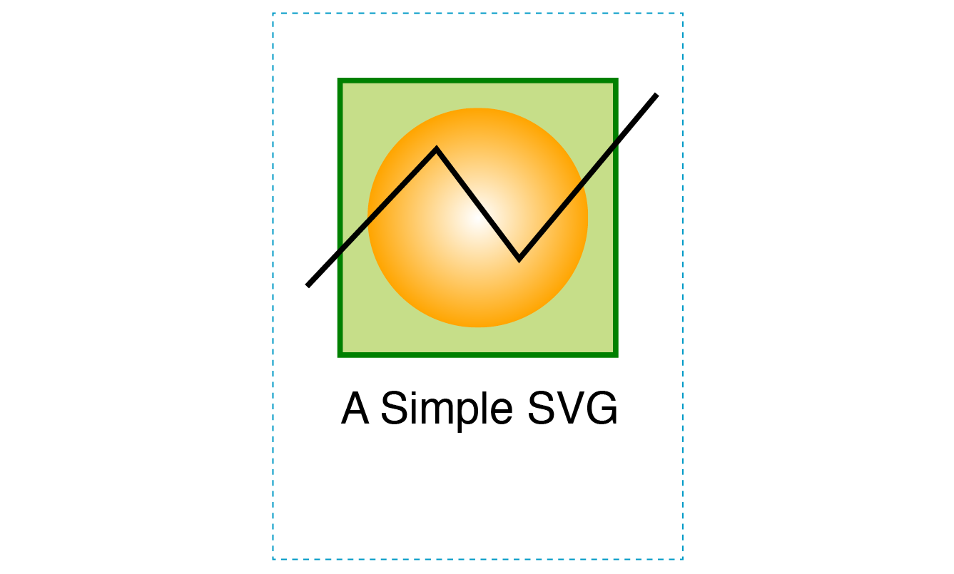
Here are the contents of the simple.svg file that generates the image in Figure 25-3. If you read through it closely, I think you’ll find it’s fairly intuitive, but my annotations follow.
<?xml version="1.0" encoding="utf-8"?> A
<svg version="1.1" B
xmlns="http://www.w3.org/2000/svg"
xmlns:xlink="http://www.w3.org/1999/xlink"
width="150" height="200" viewBox="0 0 150 200"> C
<defs> D
<radialGradientid="fade"> E
<stop offset="0" stop-color="white"/>
<stop offset="1" stop-color="orange"/>
</radialGradient>
</defs>
<g id="greenbox"> F
<rectx="25" y="25" width="100" height="100" fill="#c6de89"
stroke-width="2" stroke="green"/> G
<circlecx="75" cy="75" r="40" fill="url(#fade)"/>
<path d="M 13 100 L 60 50 L 90 90 L 140 30" stroke="black" stroke-width="2" fill="none"/> H
</g>
<text x="25" y="150" fill="#000000" font-family="Helvetica" font-size="16">A Simple SVG</text> I
</svg>
Let’s take a closer look at the various parts of simple.svg:
- Because this is an XML file, it starts off with some XML business. The first line is an XML declaration that identifies the file as XML. For web SVGs, this declaration is not necessary unless you are using a character encoding other than the default UTF-8, but you are likely to see it in code exported by graphics programs.
- The entire document is contained in the svg root element. Drawing programs generally include the version number (1.1), although it is not necessary. The two xmlns attributes declare the XML namespace, which tells the browser to interpret this document by using the vocabulary defined in SVG (see Note). The xmlns:xlink attribute allows you to put links and references to external files in the SVG document. Namespaces help keep element names straight, especially when there is more than one XML language used in a document.
Note
The and attributes are not required when the SVG is placed inline in an HTML5 document.
- The width and height attributes in the root svg element establish a drawing area (viewport) that is 150 pixels wide by 200 pixels tall. The viewport is indicated in Figure 25-3 by a dotted line, but this is for illustration purposes only and wouldn’t appear in the browser. Pixels are the default measurement unit in SVG, so you don’t need the “px.” The viewBox attribute controls the size of the drawing itself and enables the graphic to scale neatly if you change the width and height later. (See Note.)
Note
The viewport and viewbox are discussed in more detail in the section later in this chapter.
- Next we get to the defs element, which defines elements and effects that will be referenced later in the document by their id values. Elements in the defs section are created but not immediately rendered. Here we are using defs to store a radial gradient pattern, but it could also be used for shapes (like circle) or symbols that get rendered in the document via the use element. Defining a shape, drawing, or effect once, then reusing it, is a good way to eliminate redundancy in your SVG code.
- This radialGradient element is made up of two color stop elements, one for white, and one for orange. It is given an id of "fade".
- Finally, we get to the elements that describe the drawing itself. The rectangle (rect), circle (circle), and path (path) that make up the drawing are grouped together with the g element and given the name "greenbox". This makes it easy to access in CSS or a script later.
- The square is created using the rect (for “rectangle”) element with its width and height set to 100 pixels. Notice that this and other empty element are closed (terminated) with a slash (/) before the closing bracket, as is required in XML languages.
The x and y attributes position it on the pixel grid within the viewport (see Figure 25-4 in the “SVG Coordinates” sidebar). You can see that attributes are used to provide the dimensions, fill color, stroke width, and stroke color (see Note). The center of the circle element is positioned with the cx and cy attributes, and its radius is set with r. This circle is filled with the radial gradient we defined earlier, which is called by its id “fade” in the url() notation.
SVG Coordinates
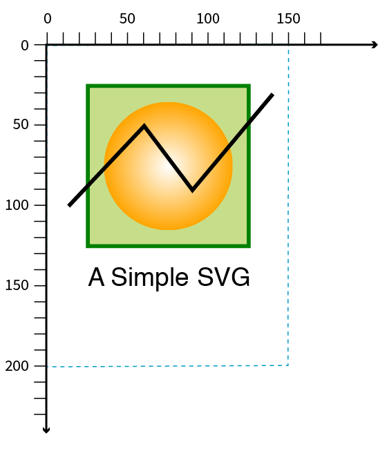
Figure 25-4. In SVG, x coordinates start on the left and increase to the right, and y coordinates start at the top and increase downward. The 0,0 origin point is in the top-left corner of the viewport. Note
“Stroke” is what SVG calls the line or border around a shape.
- The crooked line is defined by a path element. The d (data) attribute provides a series of x, y coordinates that make up the points along the path. All paths start with M (“moveto”), which sets the starting position. Each L draws a “lineto” the next set of coordinates. Coordinates can be separated by a character space (as shown) or a comma.
- Finally, we have a bit of text defined with the text element. You can see that it is styled with attributes like font-size and font-family, which should look familiar now that you’ve learned about CSS. There are many similarities between SVG attributes and CSS styles.
Beyond Simple Shapes
SVGs have some cool image features in addition to drawing lines and shapes.
Embedded bitmap images
SVGs aren’t limited to vector drawings; you can embed bitmap images in them too. You might do this in order to apply special effects or add some sort of behavior or interactivity that a PNG or JPEG can’t do on its own. Images are embedded with the image element.
<image xlink:href="kangaroo.jpg" x="45" y="0" width="100" height="150"/>
Note that because SVG is an XML format, it requires the xlink:href attribute to point to the external image file.
Clipping and masking
SVG lets you selectively show parts of an image and hide others by clipping and masking.
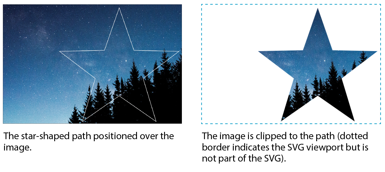
In clipping, a vector path is used to “cut out” a section of an image. The parts of the image that fall outside the clipping path are hidden completely. Figure 25-5 uses a path in the shape of a star to clip the starry sky image. Clipping paths are defined with the clipPath element.
<defs>
<clipPath id="star">
<polygon points="390,12 440,154 590,157 470,250 513,393 390,307 266,393 310,248 189,157 340,154 390,12" style="fill: none"/>
</clipPath>
</defs>
<image xlink:href="starrysky_600.jpg" width="600" height="400" style="clip-path: url(#star)"/>
Masking works similarly but is a pixel-based effect. Varying levels of darkness in the mask result in varying amounts of transparency at each point, similar to an alpha channel. In SVG masks, pure white areas correspond to 100% opacity, and pure black corresponds to 0% opacity (fully transparent). Levels of gray in between result in levels of semitransparency.
You can play with the fill color of the mask to reveal more or less of the object it is masking. The effect is more interesting when the mask contains gradients rather than solid fill colors. You can even use an image as a mask (see Note).
Note
If the mask is a color image, it is converted to grayscale based on its luminance (brightness) using a formula that interprets yellows and greens as lighter than reds and blues.
Figure 25-6 shows the same star shape filled with a gradient and used as a mask over the starry sky photograph. Note that the areas of the image that fall outside the mask object are completely transparent, just like the clipping path.
<defs>
<linearGradient id="blend">
<stop offset="0%" stop-color="#ffffff"/>
<stop offset="100%" stop-color="#000000"/>
</linearGradient>
<mask id="star" x="0" y="0" width="400" height="381">
<polygon points="390,12 440,154 590,157 470,250 513,393 390,307 266,393 310,248 189,157 340,154 390,12" style="fill: url(#blend)"/>
</mask></defs>
<image xlink:href="starrysky_600.jpg" width="600" height="400" style="mask: url(#star);"/>

WARning
Masking is not supported in Android versions 4.3 and earlier.
Filter effects
You might be surprised to learn that a vector-based graphic format includes Photoshop-like filters for manipulating images. SVG features more than a dozen filter effects that can be used alone or layered and combined for all sorts of effects, such as simple Gaussian blurs, color shifting, mosaic-like patterns, and good ol’ drop shadows.
The nice thing about filters is that the original image is untouched; all the messing around happens when the browser renders the image with the filters applied. Figure 25-7 shows just a few SVG filters to give you an idea of what can be done.

To give you a brief taste of how filters work, here is an example that puts a blur effect on an ellipse element. The filter is defined with a filter element, which contains one or more filter primitives (a very specific effect that can be combined with other effects). The filter is given an id and then is called in as a style on the element that uses it. Figure 25-8 shows the ellipse without and with the blur filter.
Note
This example and the next use the attribute (the same one we use in HTML) to add inline styles to elements. We’ll talk about options for styling SVGs in the next section.
<defs>
<filter id="blurry">
<feGaussianBlur in="SourceGraphic" stdDeviation="4"/> </filter></defs>
<ellipse cx="200" cy="50" rx="150" ry="100" style="fill: orange;"/>
<ellipse cx="200" cy="300" rx="150" ry="100" style="fill: orange; filter: url(#blurry);"/>
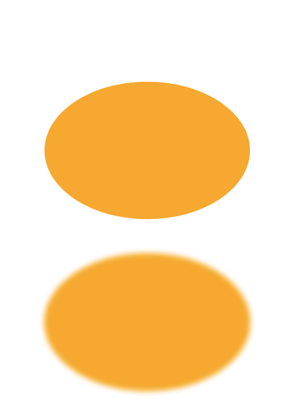
To make a drop shadow, the blur filter is defined and then merged with an offset that moves it down and to the right. Figure 25-9 shows the result.
<defs>
<filter id="shadow">
<feGaussianBlur in="SourceAlpha" stdDeviation="4" result="blur"/>
<feOffset in="blur" dx="7" dy="5" result="offsetBlur" />
<feMerge>
<feMergeNode in="offsetBlur"/>
<feMergeNode in="SourceGraphic"/>
</feMerge>
</filter>
</defs>
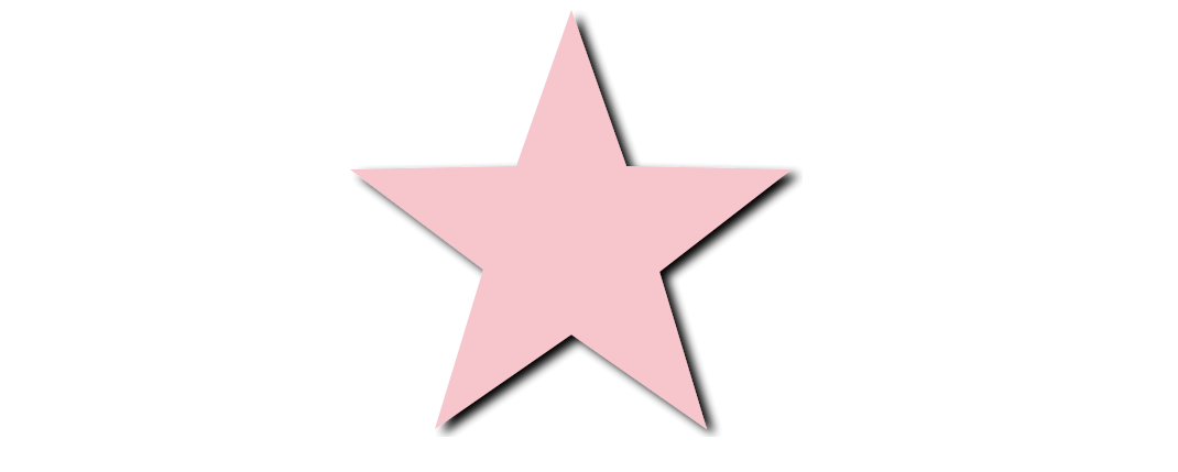
<polygon points="390,12 440,154 590,157 470,250 513,393 390,307 266,393 310,248 189,157 340,154 390,12" style="fill: pink; filter: url(#shadow)"/>
Of course, there is a lot more to SVG filters than I can cover here, but I hope that I’ve provided a good introduction.
Reuse and recycle
A powerful feature in SVG is the ability to define a shape or effect once and then reuse it wherever you need it, as many times as you need it. This keeps the file small by removing redundant code and is a good example of DRY (Don’t Repeat Yourself) coding.
The trick is defining the element you want to repeat, such as an icon, in a symbol. The symbol element does not get rendered; it just sets up a drawing for future use (see Note).
Note
Because symbols won’t render, you don’t need to put them in a section, but it’s a good practice because it is a logical container for elements you’re defining for later use.
<symbol id="iconA" viewBox="0 0 44 44">
<!-- all the paths and shapes that make up the icon -->
</symbol>
When you want to use the symbol on the page, call it up with the use element, which triggers the symbol to render. The following is a minimal use element example. The reused symbol scales to whatever dimensions are set on svg.icon in the web page’s style sheet.
<svg class="icon">
<use xlink:href="#iconA" />
</svg>
You could include other attributes with instructions such as x,y coordinates for positioning, width and height dimensions, and styles that override styles inherited by the copy of the symbol.
The use element doesn’t work only with symbol. You can use it to reuse any basic SVG shape, image, or group in a similar manner. The advantage to making the initial SVG a symbol is you can include the viewBox attribute to enable proportional scaling.
The symbol and use elements are the tools behind SVG sprites. Sprites are a technique in which multiple SVG drawings (such as an icon set, to use the most popular example) are defined in one SVG, either in the HTML document or as an external .svg file. In the HTML document, the use element (inside an inline svg) pulls a particular icon symbol onto the page. It is a powerful tool for managing SVG icons. You will find plenty of tutorials for SVG sprites online, and Chris Coyier includes a nice how-to in his book Practical SVG (A Book Apart).
So far you’ve seen SVG used to draw basic shapes, embed images, clip and mask selected areas, and add some pretty groovy special effects. The SVG drawing features are core to the SVG format; however, if we focus only on what gets drawn in the browser window, we would be missing out on some of the best features of SVG. Let’s look at them now.
Features of SVG as XML
Now you know that behind every SVG that renders on a screen is a structured text document. In that respect, it’s pretty much the same as HTML. Furthermore, SVG, as a structured document language, has a DOM that includes objects, properties, and methods related to manipulating graphic elements. This opens up some really exciting possibilities that make SVG more flexible and useful than its static-image counterparts.
Styling
You can target elements in an SVG (or the svg element itself if it’s inline) to change their presentation with CSS—for example, applying the same color or border style to HTML elements on the page as well as shapes within the SVG.
Styles are added to SVG in four ways:
Presentation attributes
The earlier “Simple SVG” example in Figure 25-3 uses presentational attributes defined in the SVG language, such as fill and stroke-width, to control how shapes should appear. Presentation attributes are always overridden by styles applied with CSS rules.
<rect x="25" y="25" width="100" height="100"fill="#c6de89"
stroke-width="2"stroke="green"/>
Inline styles
SVG elements may use the inline style attribute, which works the same as it does in HTML elements. Many developers prefer this approach. The same rect element could also be written as follows:
<rect x="25" y="25" width="100" height="100"style="fill:#c6de89; stroke-width:2; stroke:green;"/>
Internal style sheet
As in HTML, you can include a style element at the top of the svg (or in the defs section if there is one) that contains all the styles used in the SVG document:
<svg> <!-- XML business omitted for brevity -->
<style>
/* styles here */
</style> <!--drawing here -->
</svg>
External style sheet
If your SVG is inline or placed on the page with the object or iframe elements, you can import an external style sheet with the @import rule in the style element. Remember that external files won’t work for standalone SVGs embedded with the img element. That includes the style sheet itself as well as references to external resources using the url() notation within style rules.
<svg>
<style type="text/css">
@import "svg-style.css";
/* more styles */
</style>
<!-- drawing here -->
</svg>
For inline SVGs, you can also style elements with a style sheet linked to the HTML document with the link element:
<head>
<!-- additional head elements -->
<link href="svg-style.css" rel="stylesheet" type="text/css">
</head>
<body>
<svg>
<!-- drawing here -->
</svg>
</body>
Interactivity with JavaScript
SVGs aren’t just pretty pictures—SVGs are images you can program! You can add interactivity to the elements in an SVG with JavaScript because all of its element and attribute nodes are accessible in the DOM. It is worth noting that SVGs may also include simple a links, are a basic kind of interactivity.
For example, because an SVG can listen for mouseovers, you can create fun hover effects that add personality to UI elements. You can also trigger changes in the SVG on a click or a tap. JavaScript can do everything from adding a little motion to an icon to creating whole Flash-like game interfaces and multimedia presentations, as shown in Figure 25-10.
If your SVG is inline, scripts in the HTML document can access elements within the SVG. For standalone SVGs, you can use SVG’s script element. Because it is an XML document, the code needs to be wrapped in an XML Character Data Block (<![CDATA[ ]]>) so <, >, and & symbols are parsed correctly, as shown in this example:
<script><![CDATA[
//script here
]]></script>Animation
SVG is a popular choice for adding animated elements to a web page. Figure 25-11 is my attempt to capture some charming animation in a still image. For more inspiration, I recommend going to codepen.io and searching for “SVG animation.”

There are a number of ways to animate an SVG: animation elements in SVG, CSS animation, and JavaScript:
SVG/SMIL
The SVG specification includes animation effects based on SMIL (Synchronized Multimedia Integration Language), an XML language for creating synchronized audio, video, and animated elements. Each animation effect is defined by an element, with attributes for fine-tuning. Although the built-in SVG/SMIL animation elements provide good tools for all sorts of animation tasks, lack of browser support means that it’s not a great option if animation is critical to your message.
Browser support note
No Microsoft browser (Internet Explorer or Edge) supports SVG/SMIL animation. Chrome temporarily deprecated it, which sent a message to other browser vendors to stop active development of SVG/SMIL support. With CSS and JavaScript offering better animation options, this part of the SVG spec may wither on the vine.
CSS animation
SVG elements can also be animated with CSS transitions and keyframes. It should be noted that CSS can animate only CSS properties, not attribute values, which may be limiting for SVG, which uses attributes for most of the geometry and layout. This technique is also hampered by limited browser support (see Note), although that continues to improve. CSS animation is good for simple, non-critical animation effects.
Browser support note
CSS animation is not supported in Internet Explorer 9 and earlier (at all, not just for SVGs), and there is no SVG support (at all) in IE8 and earlier. IE 10 and 11 support animation of CSS properties, but not SVG-specific properties (, , etc.). In MSEdge and Firefox browsers released prior to 2017, CSS animation won’t work if the SVG is added with the element. Older Chrome and Safari browsers require the prefix.
JavaScript
With JavaScript, you can create complex, interactive animations that compete with the functionality Flash once offered. There is much better browser support, although there is always the possibility that some users don’t have JavaScript enabled and will miss out. If you don’t want to reinvent the wheel, you can take advantage of the many SVG Animation JavaScript libraries (see the “SVG Animation JS Libaries” sidebar).
If you’d like to learn more about SVG animation, I recommend SVG Animations by Sarah Drasner (O’Reilly) and Creating Web Animations by Kirupa Chinnathambi (O’Reilly).
Data Visualization
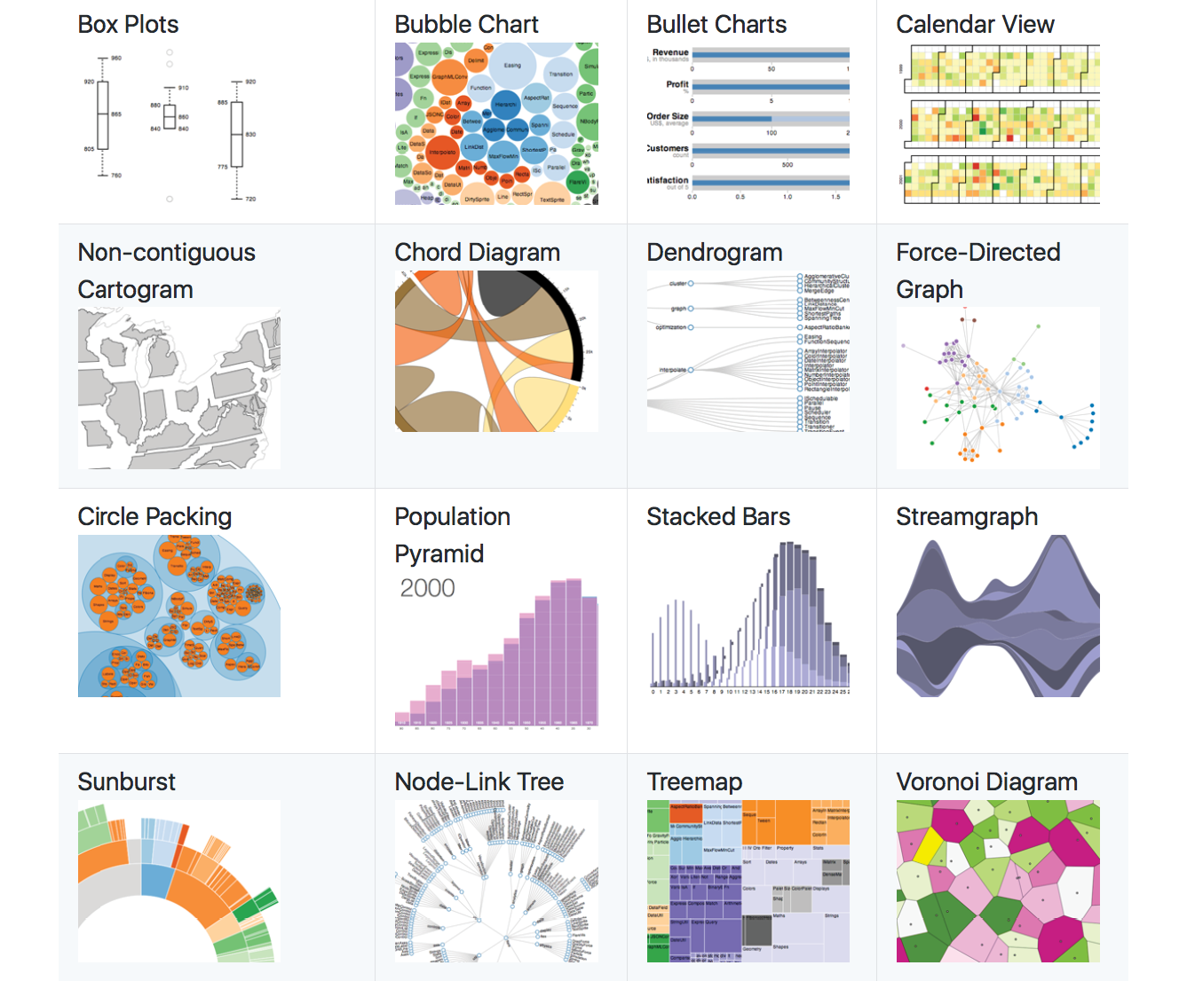
SVGs have become a go-to tool of the data visualization (“dataviz”) world because they can be generated dynamically with real data. For example, you could make the temperature level on an SVG thermometer illustration rise and fall with real weather data gathered in the user’s location, or you could change progress bars or pie charts as data updates in real time. Figure 25-12 shows examples of SVG used for dataviz from the D3.js Gallery. D3.js is a JavaScript library created specifically for “data-driven documents.” Find out more at d3js.org.
The methods for generating SVGs with data are dependent on the type of data and the programming language used. One option is to translate the XML document that contains the data into the SVG by using XSLT. XSLT (eXtensible Stylesheet Language Transformations) is an XML language that provides structured instructions for translating one XML language into another. Clearly, that is some advanced XML mojo that we will not be delving into here, but I thought you ought to know. Other options include JavaScript and server-side template languages (also more than we’ll take on here).
If you are eager to know more about data-generated SVGs, the book Interactive Data Visualization for the Web by Scott Murray (O’Reilly) is a good place to start.
Accessibility
Unlike text in bitmapped image formats, the text in SVGs can be accessed by search engines and read by screen readers when labeled properly. There are a few things you can do to make your SVGs more accessible to screen readers:
- Use the SVG title element to provide a short name for the svg element itself or any container (such as g) or element it contains. The title element should be the first child element of its parent.
- Use the SVG desc element to provide long text descriptions for elements.
- Add ARIA roles to the svg element and its components to ensure that screen readers interpret them correctly and efficiently. Recommendations include the following:
- Add role="img" to the svg element, but only if you want it to be treated as a single, non-interactive image. The child elements will not be accessible separately.
- Add aria-labelledby="title desc" to the svg element to improve support for title and desc.
- If parts of the SVG should be accessible (text, links, interactive elements, etc.), do not set a role on svg, but add role="presentation" to shapes (such as circle) and paths to prevent screen readers from announcing the occurrence of every shape in the graphic.
SVG Tools
Technically, all you need to create SVG graphics is a text editor (and genius visualization skills plus heroic patience!), but you’ll be much happier having a graphics program do the heavy lifting for you. It is also common for designers to create the complex illustrations in a graphics program, and then bring them into a text editor to clean up the code and add scripts and styles manually. It’s a matter of preference based on your skills and interests.
Vector Illustration Tools
The most appropriate tool for creating SVGs is a vector drawing tool such as Adobe Illustrator, although even image editors like Photoshop and GIMP use shapes that can be exported as SVG. These days, there are many vector software options, ranging from pricey to free, and full-featured to bare-bones.
Adobe Illustrator
Illustrator is the granddaddy of vector illustration tools and is available today as part of Adobe’s Creative Suite for a monthly fee. Illustrator is a vector tool, but it uses PostScript natively and needs to translate those vectors to SVG. Although it is possible to “Save” a drawing in SVG format, the better option is to “Export As” because the resulting SVG will be web-optimized. If you use Illustrator, it is worth doing a search for how to create optimized SVGs in Illustrator because people have published all sorts of tips that will help your design and production process.
Inkscape
Inkscape (inkscape.org) is an open source image editor made specifically for SVG (SVG is its native format). It is available for Windows, Mac (see Note), and Linux. Inkscape’s interface has evolved quite a bit over the last few years (Figure 25-13), but if you are accustomed to Adobe tools, it may take a little getting used to. You definitely can’t beat the price (free)!
SVG-specific tools
There are a number of nifty little SVG-specific drawing tools available for little or no investment. Because they are designed just for SVG, they have a manageable number of tools and settings that map to SVG capabilities (no wading through hundreds of tools you don’t need). Some of them allow you to view and edit the underlying SVG code as well. Here are a couple of SVG editors of note:
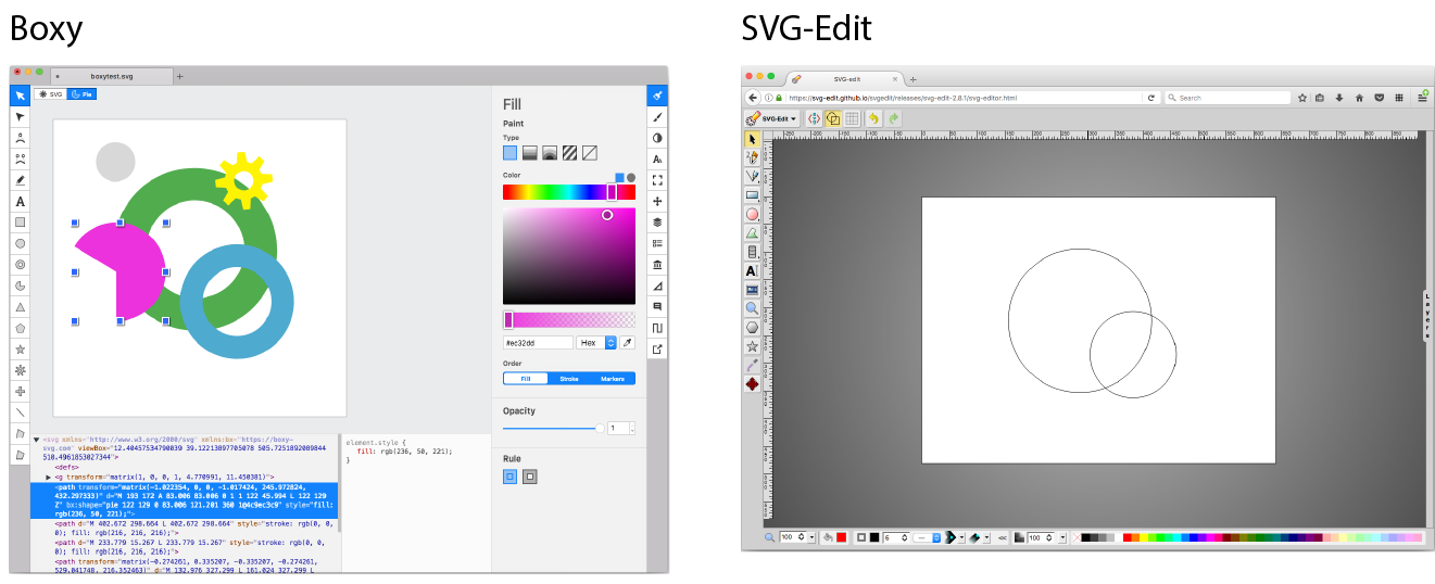
Boxy (boxy-svg.com)
Boxy is a full-featured graphics program available for Mac, Windows, and Linux for a modest US$10 (as of this writing). It has an easy-to-use interface as well as a code inspector (Figure 25-14).
SVG-Edit (github.com/SVG-Edit/svgedit)
SVG-Edit works right in the browser (svg-edit.github.io/svgedit/releases/svg-edit-2.8.1/svg-editor.html) or as a downloaded program. It provides all the basic drawing tools, layers, and the ability to view and edit the SVG source (Figure 25-14). You can also export to PNG, JPEG, BMP, and WebP. And it’s free, so there’s no reason not to give it a try.
Interface design tools
A whole slew of tools have recently emerged for designing web page and app interfaces, such as Sketch, AdobeXD, and Affinity Designer. All of them are vector-based and make it easy to export components in SVG format. As with many visual design tools that export code, the results are not always as well constructed as you might like, particularly if you intend to use the SVG programmatically with JavaScript, CSS, and animation.
Code Editors
If writing SVG by hand is your thing, or if you need to tinker with preexisting SVGs, you should look to see if your code editor of choice has an SVG preview extension that renders your code as you write. SVG previews are available for these editors:
- Atom Editor (free from GitHub): Get the SVG Preview package at atom.io/packages/svg-preview.
- Brackets (free from Adobe): Get the SVG extension by Peter Flynn at github.com/peterflynn/svg-preview.
SVG Production Tips
When you create an SVG drawing in a graphical tool, keep in mind that the end result is a text file. As with any file that is being delivered on a web page, you want that file to be as small as possible. If you have plans to style the SVG with CSS or manipulate it with JavaScript, you want the markup to be structured as well as possible.
The downside to using graphical tools is that you don’t have much control over the code they output. Most of them export SVG code that is inefficient, redundant, and full of proprietary cruft. There are measures you can take while designing and after you export the SVG to ensure it is as lean and mean as possible. Many a blog post has been written about SVG optimization, but the following tips, although not comprehensive, should point you in the right direction. In the end, you will need to get familiar with your chosen tool’s quirks to anticipate and correct its shortcomings.
Pre-Export Best Practices
Decisions you make in the design space can improve your SVG output in terms of organization and file size. Again, keeping in mind that the final product is a text file is useful for optimization. Here are some production tips that will help you create SVGs with the best quality at smallest file sizes:
Define the artboard or drawing size in pixels
The artboard dimensions correspond to the viewport (width and height attributes) of the svg element.
Use layers to group elements logically
If you plan on animating or scripting your SVG, keeping your design document well organized as you work will help with accessing the pieces you need later. In Illustrator and most other tools, layers are converted to group (g) elements, and nested layers are stored as nested groups.
Give elements and layers meaningful names
The names you give elements and layers are used as class and id values in the SVG code, so make sure they are descriptive. Names should be all lowercase and with no character spaces so they are appropriate as attribute values.
Simplify paths
The more points and handles used to define a path, the more coordinates appear in the SVG source. More coordinates means more characters and a larger file size. Take advantage of any “simplify path” function your tool offers. Also consider using methods that reduce the number of elements in the file, such as merging objects that always appear as one unit and using one wide stroke instead of two strokes and a fill. If possible, ensure your tool uses shape elements like circle and rect instead of multipoint paths for simple shapes. If your tool does not provide a way to do this, it is possible to replace the path code with the simple shape element manually.
Be aware of decimal places
Keeping in mind that more characters results in a larger file size, you can shave bytes off your file by limiting the number of characters after the decimal points in your designs. For example, an x, y coordinate “100.3004598, 248.9998765” requires more data than simply “100.3, 249”. Many tools allow you to limit the number of decimal places on export. You may also choose to “snap to pixels” when you set up the document so that points always fall on even integers. The general rule of thumb is that the smaller the image, the more decimal places are required to accurately define the points in objects. Large images can tolerate lower accuracy without compromising quality. You may need to experiment to find the right balance of decimal places and quality for the type of image.
Avoid raster effects inside the SVG
SVG’s efficiency lies in the fact that it is vector-based. When you introduce raster (bitmapped) image material to the SVG, that file size advantage is lost. In some cases, you may be adding a raster image deliberately for manipulation in the SVG, which is fine. But be aware that certain effects in drawing programs—such as blurs, drop shadows, glows, and so on—often generate a raster image area when you may not be expecting it, adding greatly to the file size. Some filter effects, such as drop shadows, can be done in code after export more efficiently. If you find that your .svg file is unusually large, unexpected raster image material is a likely suspect.
Pay attention to fonts
Like any font style suggestion on the web, there is no guarantee that your chosen font will be available on the user’s machine, so the font you use in your SVG may not display. Be sure to test and provide fallbacks. If there is a small amount of text, and it doesn't need to be searchable or read aloud by an assistive device, consider whether converting the text to paths is a better option.
Use centered strokes
Although not related to file size, you will achieve better results if you design with strokes set to be centered over the path because that is how SVG handles strokes natively. Some tools, like Sketch, make adjustments to compensate for an outside or inside stroke, but just centering your strokes is a better starting point.
Of course, there are many tool-specific tips that I am not able to cover here. Adobe offers tips for optimizing SVGs in Illustrator on its “About SVG” page (helpx.adobe.com/illustrator/using/svg.html). If you use Sketch, you may want to invest in Peter Nowell’s “SVG Workflows in Sketch” video course at Sketchmaster.com.
Post-Export Optimization
Even with careful planning up front, exported SVGs have a lot of redundant code, unnecessary metadata, hidden elements, and other fluff that can be safely removed without affecting the way the SVG renders. It is a good idea to run your SVGs through an optimizer to strip all that out and slim down the file size.
SVGO
The best SVG optimizer in town as of this writing is SVGO (github.com/svg/svgo). It uses plug-ins that affect individual tweaks—such as removing empty attributes, removing the xmlns attribute (just fine if the SVG is used inline), removing comments, and dozens more—so you can pick and choose how you want to squeeze down the file depending on its end use.
The best thing about SVGO is that there are so many ways to use it! It is Node.js-based, so you can use it as a Node.js module or incorporate it in a Grunt or Gulp task. There are SVGO plug-ins for Illustrator (SVGNow), Inkscape (SVGO-Inkscape), and Sketch (SVGO Compressor). It’s also available as a macOS folder action, whereby optimization is performed when you drag files into it. The full list of options is listed on the SVGO site.
The easiest way to see SVGO in action is to use the web-based SVGOMG tool, created by Jake Archibald, which provides a graphical user interface (GUI) for SVGO (jakearchibald.github.io/svgomg/). SVGOMG lets you toggle the various optimization plug-ins individually and view the results in the live preview (Figure 25-15), which is a handy feature during development.

File compression
Because they are text files, SVGs can be compressed with tools such as Gzip or Brotli.
Gzip is a utility on the server that compresses text files with fancy algorithms. Gzipped SVGs may result in files that are a mere 16–25% of their original size. A gzipped SVG file uses the suffix .svgz. In order to use Gzip for SVG, you must configure it on the server, which is beyond the scope of this chapter, but you can find plenty of tutorials online. The file savings are well worth the effort.
Brotli is an open source compression algorithm released by Google in 2015 that is giving Gzip a run for its money in terms of compression and performance. Like Gzip, Brotli must be configured on the server. Browsers began supporting Brotli content encoding in 2017. There is a nice explanation of Brotli on the MaxCDN site at www.maxcdn.com/one/visual-glossary/brotli/. The official Brotli GitHub page is at github.com/google/brotli.
Responsive SVGs
I’ve talked a lot about how the scalable nature of SVGs makes them great for use in responsive layouts, where they can scale to fit changing element widths with no loss of quality. Although that is absolutely true, the reality is that there are a few hoops to jump through to ensure SVGs scale predictably across all browsers.
In Responsive Web Design, we often want graphics to stretch or shrink to fit the width of a text container. With bitmap images, this is easy. Just set the width of the img to 100%, and its height is set to auto by default. The browser automatically calculates the auto height based on the width you specify and determines the aspect ratio (the ratio of its width to height) of the image based on its dimensions in pixels. That allows the image to scale proportionally, without being stretched or distorted.
With SVG, it’s a little more complicated. First, you have to give your graphic an explicit aspect ratio. SVGs can be drawn at any size, and do not have intrinsic aspect ratios by default. Second (in some cases), you have to work around browser bugs involving automatic height calculations.
The Viewport and Viewbox
To understand how SVGs scale, you need to have a good grasp of the SVG viewport and its viewbox. The viewport, defined by the width and height attributes on the svg element (see Note), is like a window through which you can see the drawing area. You can think of the viewport as a little browser window (which we’ve also been referring to as the “viewport” throughout this book) or an iframe element displaying an HTML document. Just as there is no guarantee that the entire HTML document will fit inside the browser window or iframe, there is no guarantee that the entire SVG drawing will fit perfectly within its viewport. It might be smaller; it might be bigger and get cropped off. The dimensions of the drawing space (also called user space) and the viewport dimensions are independent of one another.
Note
When the SVG is embedded with , , or , the and attributes on those elements set up the viewport size.
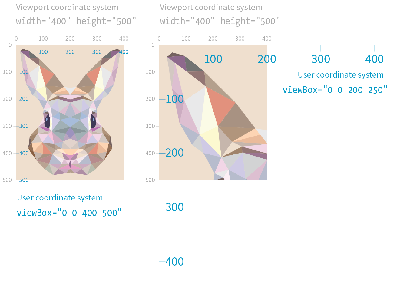
Earlier in this chapter, we saw that the viewport uses a set of coordinates (the viewport coordinate system) that start at 0 in the top-left corner and increase to the right and downward. The drawing space has its own set of coordinates, the user coordinate system, which is established with the viewBox attribute in the svg element and works the same way. This viewBox attribute is the key to making responsive scaling possible while preserving the aspect ratio of the drawing.
The syntax for the viewBox attribute is as follows:
viewBox="x y width height"
The x and y values determine the position of the top-left corner of the viewbox within the viewport. The width and height attributes give it dimensions and establish its aspect ratio. Values may be separated by space characters, as shown, or by commas. The x and y coordinates may have negative values, but width and height must always be positive integers.
The SVG in this example has both its viewport (width and height) and its viewbox (viewBox) set to 400×500 pixels:
<svg width="400" height="500" viewBox="0 0 400 500">
<!-- drawing content here -->
</svg>
The viewbox matches the viewport in this example (this is the default behavior if viewBox is omitted), but let’s see what happens when we change the viewbox dimensions. Keeping the viewport the same size, we can reduce the size of the viewbox by half (viewBox="0 0 200 250"). The result is the drawing scales up in the viewport by twice its size (Figure 25-16). The two coordinate systems (user and viewport), which are the same by default, now have different scales: one user unit is now equal to two viewport units. The point of this example is merely to demonstrate that the dimensions and coordinate systems of the viewport and the viewbox work independently of one another and can be used to adjust scale.
I could fill half a chapter describing the full capabilities and effects of the viewBox attribute. I want you to know everything about it, but for the sake of space, I will refer you to this wonderful tutorial by Sara Soueidan: “Understanding SVG Coordinate Systems and Transformations (Part 1)—The viewport, viewBox, and preserveAspectRatio” (www.sarasoueidan.com/blog/svg-coordinate-systems/). You will also find thorough explanations in the SVG books recommended at the end of the chapter.
For the purposes of this responsive SVG discussion, however, just keep in mind that the viewBox attribute is the key to establishing the width and height and the resulting user coordinate system of the SVG drawing itself, independent of the viewport “window” it will be displayed in.
The preserveAspectRatio Attribute
The preserveAspectRatio attribute in the svg element is responsible for making sure the drawing maintains its aspect ratio, so it is important to our goal of creating a proportional responsive SVG. Conveniently, it is turned on by default, which means you don’t need to include it if that is your desired effect. Setting it to none means you can stretch and squish the drawing however you like, just as you can a bitmapped image.
The preserveAspectRatio attribute also takes keyword values for how the viewbox should be aligned in its viewport. They work a lot like percentage values for the background-image-position CSS property.
<svg viewBox="0 0 300 200" preserveAspectRatio="xMaxYMax meet">
In this example, xMaxYMax places the viewbox all the way to the right and against the bottom axis of the viewport (“Max” is equivalent to 100%). The meet keyword says to size it until it meets either the height or the width of the viewport (similar to contain for background images). The alternative is slice, which sizes the drawing so that it covers the entire viewport, even if some of the drawing is cut off (like cover for background images).
Again, I recommend you get to know the capabilities of preserveAspectRatio on your own, but for now, know that it is the attribute that does the work of keeping the aspect ratio intact, even if we take advantage of the default setting and don’t include it explicitly.
Now that you have some familiarity with the SVG scaling mechanisms at work behind the scenes, let’s look at the techniques for making SVGs in web pages scale proportionally within a changing container size.
Responsive SVGs Embedded with img and object
If you embed your SVG in the source document with the img or object elements, the process for making it scale automatically is pretty straightforward.
First, in the SVG file itself, make sure the svg element includes the viewBox attribute to establish the dimensions of the drawing. By default, the aspect ratio will be preserved even if you don’t include the preserveAspectRatio attribute. If you want the graphic to completely fill the width of its container, omit the width and height attributes for the svg element because they default to 100%, which is the behavior we are after (see Note).
Note
The and attributes should be included when you want to set an initial size for the SVG, such as for icons that should stay icon-sized regardless of the layout.
Now let’s look at the img or object element that embeds it. The width and height applied to the embedding element determines the size at which the SVG appears in the layout. Because width and height properties are auto by default, if you omit them, the dimensions of the SVG (100%) will be used. If you specify just width or just height, the browser uses the aspect ratio of the viewbox to calculate the unspecified dimension.
Relying on the default sizing of the img or object elements works in current browsers, but you’ll get better results in older browsers (particularly Internet Explorer; see Warning) if you explicitly set the width and height of the embedding element. For example:
img {
width: 100%;
height: auto;}
warning
When and values for the embedding object are omitted, Internet Explorer makes the SVG fill the container width, but gives it a height of 150 pixels. The HTML5 specification defines the default size of embedded media such as , , and elements to be 300 pixels wide by 150 pixels high. So IE’s 150-pixel height on SVGs is not entirely random; they honored the value from the HTML5 spec.
This approach leaves nothing to chance. The result is an SVG file with its default width and height of 100% filling an img element set to fill the width of its container proportionally.
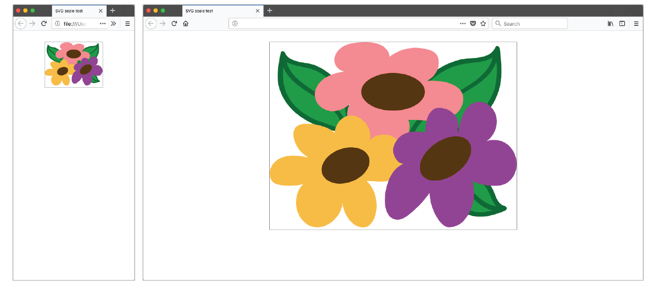
In the following example, I embedded an SVG with an img element in a div that is always set to 50% of the browser window width, as might occur in a responsive layout (Figure 25-17). Note that there are no width and height attributes in the SVG source, and the viewBox defines the aspect ratio. As the window gets larger and smaller, the SVG scales with it, maintaining that crisp, vector quality at all scales. An outline on the div reveals its boundaries, and I’ve set its side margins to auto to keep it centered in the browser window:
The SVG markup (flowers.svg)
<?xml version="1.0" encoding="utf-8"?>
<svg version="1.1" viewBox="0 0 160 120">
<!-- flower drawing -->
</svg>
The HTML markup
<div class="container">
<imgsrc="flowers.svg"alt="flowers">
</div>
The styles
.container {
width: 50%;
outline: 1px solid gray;
margin: 2em auto;
}
/* IE fix */
img {
width: 100%;
height: auto;
}
Responsive Inline SVGs
I’ll just let you know up front that preserving the aspect ratio of inline SVGs placed in the source with the svg element is not as simple as the previous example. You need to employ an interesting hack to get many browsers to comply. I will explain the technique here as efficiently as possible.
First, as with embedded media, include the viewBox attribute and omit the width and height attributes on the svg element if you want the width to be 100% of the container (taking advantage of their default values).
In the absence of a style rule specifically overriding the svg defaults, the width will be 100%, and its aspect ratio will be preserved. Current browser versions support this as expected—scaling the SVG in its container proportionally. However, older browsers (including all versions of Internet Explorer) do not, so we need to employ the “padding hack” to maintain the proportions of the inline SVG.
The padding hack is a little tricky, but the steps are as follows (Figure 24-18):
- Put the svg in a container div.
- Set the height of that div to 0 or 1 pixel.
- Apply an amount of padding to the top of the div that gives it the same aspect ratio as the SVG (there is a bit of math involved here).
- Once the div is expanded to the proper proportions with padding, absolutely position the svg element in the top-left corner of the container div.
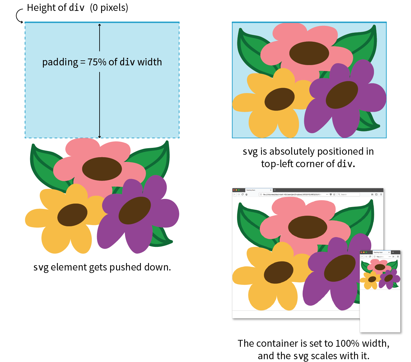
Warning
Both the padding hack and normal aspect ratio auto-height scaling can break inside Grid and Flexbox layouts. As of early 2018, there are important differences between browsers, so be sure to test your designs thoroughly.
It’s a little convoluted (they don’t call it a “hack” for nothing!), but it works. The foundation of this hack is the defined behavior of padding. Padding, when specified in percentage values, is always based on the width of the element (even top and bottom values). That means that as the width of the container div changes, so too does the amount of padding, always maintaining the same relationship. That sets up a constant aspect ratio for the SVG to fill.
Here’s an example that shows how the padding hack works:
The markup
<div class="container">
<svg version="1.1" viewBox="0 0 160 120">
/* drawing contents */
</svg>
</div>
The styles
.container {
width: 100%;
height: 0;
padding-top: 75%; /* (120/160)*100% */
position: relative;
}
svg {
position: absolute;
top: 0; left: 0;width: 100%;
height: 100%;
}
In the markup, you see the svg element in its #container div and its viewbox dimensions set to 160 × 120 pixels. The width of the container is set to 100% (it could also be set to a different percentage) with a 0 height. The padding-top declaration expands the div to the proper aspect ratio, which is calculated by dividing the height of the SVG by its width, and multiplying the result by the percentage width of the div:
(svg-height / svg-width) * div-width%
In our example, the padding is set to 75% [(120 / 160) × 100% = 75%], which matches the 4:3 aspect ratio of the SVG. Notice also that the container is relatively positioned to create the positioning context for the svg child element (do you remember turning elements into positioning contexts with position: relative from Chapter 15, Floating and Positioning?)
Additional Resources
This section cut to the chase and provided just what you need to know to make SVGs scale in responsive layouts. Of course, there is a lot more to the story, so I recommend these articles for additional background information and techniques:
- “How to Scale SVG” by Amelia Bellamy-Royds for CSS-Tricks
(css-tricks.com/scale-svg/) - “Making SVGs Responsive with CSS” by Sara Soueidan for Codrops
(tympanus.net/codrops/2014/08/19/making-svgs-responsive-with-css/)
To provide an even more customized SVG experience in your user interface, go beyond simple scaling and change the design of the icon with an adaptive SVG (see the sidebar “Adaptive Icons”).
Adaptive Icons
Further SVG Exploration
Obviously, I could only scratch the surface of Scalable Vector Graphics in this chapter. When you are ready to use SVG on your site, you’ll have more brushing up to do. There are many volumes and online tutorials written about SVG, but these are the resources that helped me the most in my own exploration. I recommend them heartily.
- SVG Essentials, 2nd Edition by J. David Eisenberg and Amelia Bellamy-Royds (O’Reilly)
- Using SVG with CSS3 and HTML5 by Amelia Bellamy-Royds, Kurt Cagle, and Dudley Storey (O’Reilly)
- Practical SVG by Chris Coyier (A Book Apart)
- Developer and SVG expert Sara Soueidan has written many useful SVG articles on her blog at www.sarasoueidan.com.
Test Yourself
I just threw a lot of SVG info at you. Try taking this quiz to see what stuck. The answers appear in Appendix A.
The first four questions refer to this SVG element:
<rect x="0" y="0" width="600" height="400" />
- What is rect?
- What do x and y do?
- What do width and height do?
- Explain the / character.
Now back to our regularly scheduled questions:
- What is the primary difference between SVG clipping and masking?
- Name three ways to reduce the file size of an SVG.
- What is the most widely supported version of SVG?
- SVGTiny
- SVG 1.1
- SVG 2
- SVG, Electric Boogaloo
- Name three of the five ways you can style elements in an SVG.
- Which of the following can be used to animate elements in an SVG?
- Special SVG elements for animation
- JavaScript
- CSS transitions and keyframe animation
- All of the above
And...We’re Done!
Hey! Here we are at the end of the book! I hope that you’ve enjoyed this detailed tour through HTML, CSS, JavaScript, and image production. I know the content here is pretty dense, but remember that you don’t have to learn it all at once, and you don’t need to keep it all in your head. Heck, I wrote this book, and I still go back to it to look up attributes, properties, and values. With practice, however, a lot of it will become second-nature to you.
I hope that you will find plenty of opportunities to put your new knowledge to use. Best of luck in your web endeavors!