Chapter 4
Interior Wayfinding and the Circulation System
Interior circulation systems typically consist of corridors, elevators, and stairways that connect the floors and areas of the facility, providing avenues for the movement of people and materials. Circulation areas are also places where patients and visitors spend time waiting, gathering information, and talking. They are places where equipment is stored. They are places where members of the medical staff confer. And they are also places where patients, visitors, and staff can become disoriented or lost (Carpman and Grant, 1989).
This chapter begins by examining how people find their way around large, complex buildings—the kinds of buildings that often house healthcare services. We will describe various components of a wayfinding system, such as floor numbering, sign terminology, and You-Are-Here (YAH) map design, and emphasize that these elements need to work in a mutually reinforcing way to make sense to first-time and other unfamiliar users. We then look at design features within the circulation system, discussing how corridors, stairways, and elevators can be designed to meet the needs of patients and visitors.
Finding One's Way through a Health Facility
For patients and visitors, time spent in a healthcare facility is often filled with anxiety. With the demands of illness or a family crisis occupying their minds, people may not be able to pay attention to their routes through the corridors of a complex environment. When patients and visitors are under stress and preoccupied with their own concerns, they cannot necessarily rely on previous knowledge about how to make their way through an unfamiliar facility. Consequently, what might otherwise be considered annoying inconveniences, such as mazelike corridors, may tax the emotional strength of a patient facing surgery or a visitor concerned about a critically ill relative (Carpman, Grant, and Simmons, 1984; Shumaker and Reizenstein, 1982). (See also chapter 9.)
The term wayfinding refers to what people perceive, what they think about, and what they do to find their way from one place to another. Wayfinding involves five deceptively simple steps: knowing where you are, knowing your destination, knowing and following an effective route to your destination, recognizing your destination upon arrival, and finding your way back or on to your next destination (Carpman, 1991a, 1991b, 1991c).
Unfortunately, many healthcare environments are not designed for easy navigation by unfamiliar patients, visitors, and staff. Healthcare facilities are often housed in large, complex buildings. These are often built over time, with the inadvertent result that common patient and visitor destinations are not necessarily near one another. A single trip to see a physician, and its associated diagnostic tests, may seem like a tour of the entire medical complex. Wayfinding difficulties may be made worse by the physical limitations of illness. Confusing signs that use unfamiliar medical terminology can make the customer experience even more challenging.
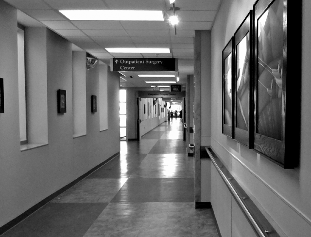
Wayfinding signs at decision-points, including intersections, will reassure unfamiliar patients and visitors that they are on the right path as they traverse long hallways.
Photo credit: Courtesy of St. Joseph Mercy Ann Arbor
As unfamiliar patients and visitors make their way through a health facility, they will be hindered or helped by the availability of a variety of environmental cues. Effective wayfinding systems use a combination of signs, maps, directories, landmarks, artificial and natural lighting, and site and building layouts to help guide people to their destinations (Carpman, 1991a; Eubanks, 1989). The close proximity of common destinations, the availability of visual cues that provide landmarks (such as windows, plants, artwork, or changes in floor coverings), the use of easily understood terminology, clear systems for floor and room numbering, and the availability of understandable directions provided by well-trained staff, should all work together, along with wayfinding signs, as an integrated system (Carpman, 1991a; Weisman, 1982).
Costs of Unsuccessful Wayfinding
Successful wayfinding experiences—say, easily navigating from the main Information Desk to an inpatient room—are seldom thought about. On the other hand, when patients and visitors become disoriented or lost, they are likely to remember it, and not in a good way. When they are disoriented or lost, patients and visitors may take extra time to get places and may be late for appointments. In confusing buildings, work time may be lost when employees give directions or escort patients and visitors (Christensen, unpublished report; Carpman et al., 1984a; Corlett, Manenica, and Bishop, 1972; Zimring, 1982).
And there are other costs associated with disorientation. Disorientation is disruptive and causes stress: the amount depends on the individual's ability to cope with uncertainty and varies with specific situations, such as the need to be on time for an appointment (Best, 1967; Weisman, 1981; Wener and Kaminoff, 1983). Stress caused by disorientation may result in feelings of helplessness, raised blood pressure, headaches, increased physical exertion, and fatigue (Shumaker and Reizenstein, 1982). In addition, patients may be affected by the wayfinding troubles of their visitors who, because they became lost, may have less time to spend with patients. In one study of visitor stress, it was found that the largest source of stress for visitors was trying to find their way around the hospital (Reizenstein and Vaitkus, 1981; Wayfinding design research, 1987).
Wayfinding in healthcare facilities often requires unfamiliar patients and visitors to make complex, potentially confusing journeys comprising multiple steps, as in this example (St. Joseph's Health Care London, 2015):
- – Enter from the Main Building's entrance.
- – Walk into Main Lobby area (past Information Desk and General Store in centre).
- – Take Elevator 1 or 2 (on the left) or Elevator 5 or 6 (on the right) up to Level 5.
- – Exit elevator.
- – From Elevator 1 or 2 turn right, from Elevator 5 or 6 turn left.
- – Walk through double doors.
- – Walk down this corridor.
- – Pass two corridors on left.
- – Check in at the nursing station at the end of the hall on the left.
Stress brought about by disorientation may lead to anger, hostility, discomfort, indignation, or even panic. Disorientation felt by those visiting a particular facility may surface as a generalized hostility toward the organization (Berkeley, 1973). Health facilities may even experience indirect wayfinding costs such as personnel turnover and absenteeism because of the stress brought about by employees continually trying to find their way (Christensen, unpublished report; Zimring, 1982). (See Research Box 4.1.)
For older patients and visitors, problems with spatial orientation may have a significant, long-term effect. One study suggests that problems with wayfinding may affect an older person's sense of control (Weisman, 1982). Special simulation techniques have been developed to familiarize older people about to move to a care facility with the layout of their new environment. The premise for this work is that having wayfinding information prior to moving may partially diminish the negative effects of relocation, such as increased incidence of illness and death (Hunt, 1984). Digital technology makes it relatively easy to develop images, maps, photos, and videos to assist with transitions to new and unfamiliar environments.
The importance of the link between stress and wayfinding is reinforced by additional empirical evidence. One study found that wayfinding aids, such as directional signs, decrease reported stress levels (Wener and Kaminoff, 1983). However, another study showed that large numbers of signs may be an indication of a confusing environment. In such cases, signs may be used as an attempt to remedy a fundamentally disorienting building (Weisman, 1979).
It's important to remember that simple buildings, as well as complex ones, can be confusing to unfamiliar users.
Building Layout and Landmarks
Navigating in complex buildings requires spatial problem-solving (Passini and Arthur, 1992). To find their way, people use previous experience in conjunction with directions and/or environmental cues. They make choices about where to turn and where not to turn, based on these cues (Downs, 1979; Kaplan, 1976; Weisman, 1981). However, to make the necessary choices, patients and visitors must be able to recognize where they are in relation to their destinations. Without this sense of location, they may become disoriented or lost.
It would be easy to assume that signs and directories are the most effective elements of a wayfinding system. But in a study of university buildings, the form of the building (including the number of corridors, the placement of decision-points, and the symmetry of the building) constituted the strongest predictor of successful wayfinding (Weisman, 1979). The availability of environmental cues and architectural features, such as visual distinctiveness, well-differentiated spaces, and easily recognized landmarks (plants, artwork, and furniture arrangements, for example), all provide useful information (Appleyard, 1969; Kaplan, 1976; Weisman, 1981). Instead of simply moving sequentially from one sign or spot along the path to another, with no idea of how it all connects, patients and visitors moving through a building with effective landmarks, views to the outside, and easily differentiated spaces can more easily understand the building's layout and how its spaces fit together. For example, one clinic made extensive use of columns, varied patterns in flooring, and natural lighting to direct patients and visitors from “public zones” to reception areas (Taylor, 1995). Another study showed that maps sent to patients and visitors before their arrival at a healthcare facility improved their ability to navigate to their destinations (Wright, Hull, and Lickorish, 1993).
General considerations for developing a coherent health facility wayfinding system include the following:
- Consider first-time users as the “least common denominator” for wayfinding decision-making. They will be unfamiliar with every aspect of the setting and most likely to be disoriented. If the wayfinding system works for first-time users, it will work for all users (Baskaya, Wilson, and Özcan, 2004; Carpman et al., 1984a).
- Keep in mind that the way to reduce the maze-like quality of healthcare facilities is not to rely on a single device such as signage, but instead to design or implement a mutually reinforcing group of aids to create a wayfinding system. Such a system may include the basic layout of the building and site, landscaping, architectural differentiation, interior and exterior landmarks, signs, maps, lighting, terminology, floor and room numbering, spoken directions, and technology (Weisman, 1982).
- When possible, locate related functions (those that patients and visitors are likely to use during the same visit) in close proximity (for instance, Admitting, Laboratory, and Radiology) (Carpman et al., 1984a; Hauff, 1988).
- When designing health facilities, consider the impact of the building's form and appearance on wayfinding for first-time users (Weisman, 1979). Consider corridor layout, views to the outside, location of decision-points such as corridor intersections, and interior design treatments.
- Develop interior landmarks by using such design elements as architectural details, lighting, color, texture, artwork, and plants to make different areas of the hospital unique, noticeable, and memorable (Carpman et al., 1984a).

Noticeable landmarks, such as this internally lit glass sculpture, can help unfamiliar patients and visitors find their way around a health facility.
Photo credit: Courtesy of St. Joseph Mercy Ann Arbor
Floor Numbering
To arrive at a healthcare facility, patients and visitors have had to negotiate city streets, parking areas, and pathways to the facility's entrance. For the most part, such exterior travel remains within the same plane; route decisions primarily involve which way to turn. But once people are inside the facility, an additional level of complexity is added: floor choice. Moreover, floor choice is made more complex when potential destinations are located below grade level, when buildings are linked by corridors or overhead walkways, and when floors are labeled in ways not understandable to first-time users. (See Research Box 4.2.)
From the user's point of view, finding the right floor may prove more troublesome than finding a destination on a particular floor. This was illustrated by a study of people trying to find their way in a town hall: the majority of wayfinding errors related to floor choice (Best, 1967). Similarly, studies have found getting off on the wrong floor to be a common and frustrating experience for older users (Devlin, 1980).
Floor number confusion can be reduced in several ways:
- Logically relate floor-number designations to the Main Entrance floor and indicate whether floors are above or below grade.
- Consider the relationship between floor numbers of buildings that are linked; avoid situations in which, for example, Floor 2 of one building links to Floor 4 of another (Carpman et al., 1984b).
- Plan floor-number designations that can be easily used in the room-numbering system (for example, rooms in Floor 5 could all begin with the number 5) (Carpman et al., 1984b).
- Begin room numbers on floors below the entrance level with a prefix likely to be widely understood by first-time users (Carpman et al., 1984b). (See Research Box 4.2.)
Room Numbering
Once patients and visitors reach the appropriate floor, they continue to search for their destinations. Although some rooms will be identified by name (for example, the Surgery Waiting Area), patients, visitors, and staff may need to find a room or office with only a room number to guide them. The logic and placement of room numbers along a corridor facilitates their search. At corridor intersections, room numbers help patients and visitors decide whether to turn left or right or to go straight. Monitoring room numbers they pass by and watching for a specific room number lets them know when they have reached their destination.
Although there is no foolproof way to ensure the usefulness of room-numbering systems to first-time users, there are ways to make systems effective. Simplicity, consistency, flexibility, and visibility should be major criteria.
A numbering scheme should be simple. For instance, in buildings with a single long corridor, rooms could be numbered sequentially, beginning at one end of the facility and continuing to the other. In this example, odd numbers would be located on one side of the hall and even numbers on the other. Adjacent numbers such as 12 and 13 should be roughly across the hall from one another. Or in a building area with “racetrack” corridors, patient rooms could be numbered consecutively along the outside of the corridor, with staff rooms located along the inside of the corridor and having a different numbering system. Simplicity also suggests a correspondence between the room number and the floor number; for instance, all rooms on the fifth floor would begin with the number 5.
Another consideration related to simplicity is to avoid using a combination of letters and numbers to identify a space (such as NIB416), because complex sequences are difficult to read and remember. The letters I, O, Q should be avoided since they can cause confusion with the numerals 1 and 0.
Room-numbering schemes should be used consistently from floor to floor, especially when floors have similar layouts. Again, the system should begin with the lowest number at one end and should progress in the same direction on each floor.
One seemingly pervasive characteristic of health facilities is that they undergo frequent renovation (McLaughlin, 1976). A side effect of renovation is that corresponding room numbers come and go. Consequently, the room-numbering system needs to be flexible enough to allow for future renovation without unduly disrupting its logic. Leaving out (“skipping”) a few numbers at planned intervals is one approach.
Efforts to create a room-numbering system that is simple, consistent, and flexible should be supplemented by attention to the visibility of the actual room numbers. For rooms that patients and visitors will identify primarily by number, numbers need to be large and should contrast well enough with the background so they can be easily recognized. It's important to keep in mind the needs of older users and people with vision limitations.
Room-numbering schemes for successful wayfinding cannot be a design afterthought, but should be planned from the earliest stages of the design process. When buildings are designed, rooms are labeled (numbered) on floor plans in order to keep track of each room during design, construction, and activation. The logic of these architectural numbering systems often has little to do with wayfinding clarity. Yet in the absence of other room-numbering schemes, clients often simply adopt these architectural room numbers as actual room numbers for wayfinding purposes. This practice can lead to wayfinding confusion. Patients and visitors are better served if the architectural numbering system is designed for its ultimate use as a wayfinding aid or, failing that, if owners understand that a separate wayfinding-related room-numbering system is needed. Wayfinding room-number planning is best dealt with before room numbers appear on architectural drawings. Changing room numbers after the building is activated is likely to be difficult and costly.
When developing a room-numbering system:
- Design the room-numbering system to be flexible enough to allow for future expansion and renovation without disrupting the sequence (Carpman et al., 1984a).
- Use the numbering system consistently on floors having similar uses and layouts (Carpman et al., 1984a).
- Within the numbering system, differentiate between the appearance of those numbers needed by patients and visitors (such as patient rooms and exam rooms) and those used only by staff. One way is to use a larger room number on signs indicating patient or visitor destinations (Carpman et al., 1984a).
- With the exception of inpatient rooms, provide a name and a number for rooms that are primary patient and visitor destinations. Use numbers alone or numbers and names for rooms used primarily by staff (Carpman et al., 1984a).
- Place inpatient room number signs so they are visible when the door is open.
- Avoid using a combination of letters and numbers to identify a space, such as NIB407.
- If letters and numbers must be used in the same sign, avoid letters that may be interpreted as numbers, such as I, O, and Q (Carpman et al., 1984a).
- Start numbering systems at one end or corner of a building and carry the system through to the other end (American Hospital Association, 1979).
- Whenever possible, use a simple numbering system, such as a continuous series with odd numbers on one side of the hall and even numbers on the other (American Hospital Association, 1979).
- Plan the room-numbering system to include skips in the number sequence at various locations along a floor, in order to allow for renovations or rooms that may be added in the future.
- In new construction projects, consider wayfinding-related room numbering before room numbers appear on architectural drawings.
- Consider coordinating inpatient room numbers and telephone numbers (Carpman et al., 1984a).
Sign Messages
Messages on wayfinding signs should be targeted to their audiences, but selecting wording is not always easy (Salmi, 2007). As described in chapter 3, many groups will use wayfinding signs in a health facility, including medical staff; patients; visitors; administrators; medical, nursing, and allied health students; and others. Users may not be literate, or may not read or speak English.
Healthcare facilities with significant numbers of customers speaking languages other than English should consider bilingual signs, translators, technology, and other ways to communicate. Health facilities that provide information in a customer's native language convey an important message of sensitivity and respect. This may be an important marketing strategy. In addition, the Department of Health and Human Services has stated that Title VI of the 1964 Civil Rights Act prohibits discrimination on the basis of having a primary language other than English (US Department of Health and Human Services, 1980). Research shows that the absence of limited English proficiency (LEP) services can create a barrier to care (Principles for Health Reform, 2015).
Signs that include more than one language will have more words per sign or more signs per location and will be more costly to produce (Selfridge, 1979). Some healthcare facilities employ or outsource interpreters to work with LEP and non-English-speaking patients and visitors, while others may offer incentives for assistance by employees who are proficient in additional languages (Derose and Baker, 2000).
Although wording used on wayfinding signs and in spoken directions represents an important way in which health facilities communicate with consumers, some technical and medical terms in the patient's own language may not be widely understood by patients and visitors (see Research Box 4.3). Problems stemming from use of technical terms are illustrated by the following anecdote:
An older woman was spotted in the hospital by a hospital staff member who thought she looked lost. He asked the woman where she was trying to go and she said, “Gerontology?” The staff member started to give detailed directions, but because the Institute of Gerontology was located several blocks away, he asked whether she was sure that this was her destination. “Oh, yes,” she said, “I have it right here on this slip of paper.” On the slip of paper was written “Gastroenterology.”
Confusion caused by misreading or misunderstanding technical or medical terminology increases the likelihood that some people, like the older woman in the earlier anecdote, may have a difficult time finding their way and wind up being late for, or even missing, appointments. Patients or visitors may refrain from asking questions because they think they understand a term when they really do not. Or the term may cause needless worry about their illness. For example:
A patient told one hospital staff member that earlier in his treatment he had been scheduled to go to Nuclear Medicine for some tests. He became so frightened at the thought of being bombarded with radiation that he almost canceled his appointment. To him, Nuclear Medicine meant radiation. He also assumed it meant that he had a terminal disease for which there would be little hope. To his surprise and joy, his fears on both counts were unfounded.
Patients interviewed in one study did not think there would be a difference in the quality of medical care at a hospital using lay terms as compared with one using medical terms. But they did say that the terminology used would influence their choice of a hospital. In other words, all things being equal, the majority of these patients said they would choose to go to a hospital that used lay terms on its wayfinding signs (Carpman et al., 1984a).
The following are some guidelines for selecting understandable messages on wayfinding signs:
- Use plain and simple wording in English and/or other languages when selecting terminology (Kearney, Rice, and Parks, 1987).
- Decide what wording will be used for naming each department or service and base these decisions on patients' and visitors' comprehension (Carpman et al., 1984a).
- Use consistent wording on signs and in written and verbal communications with patients and visitors (American Hospital Association, 1979; Marks, 1979).
- Develop messages that will be interpreted similarly by all users. Avoid using ambiguous wording, such as “Patient Access Center” for an admitting area.
- Use consistent wording on wayfinding signs throughout a health facility. For instance, avoid using “Imaging” on one sign and “Radiology” on another when these terms identify the same area (American Hospital Association, 1979; Marks, 1979).
- Avoid using words and phrases on signs that are beyond a sixth-grade reading level (American Hospital Association, 1979).
Symbols and Pictograms
Symbols (also known as icons or pictograms) are sometimes used in conjunction with written messages on wayfinding signs. Symbols for accessibility, male and female restrooms, and no-smoking areas are commonplace in most public buildings. They provide an easily recognizable form of information patients can use even if they don't read or have knowledge of a particular language. When a subject lends itself to graphic representation and when properly designed, symbols can make it easier for users to understand how to proceed.
However, pictograms don't always provide a benefit. Many health-facility terms cannot be easily translated into pictograms, and a pictogram system can quickly become contrived. In addition, pictograms used in conjunction with wording on directional signs can create complexity and diminish overall legibility. In order to be useful for wayfinding, pictograms need to make immediate, intuitive sense to the viewer.
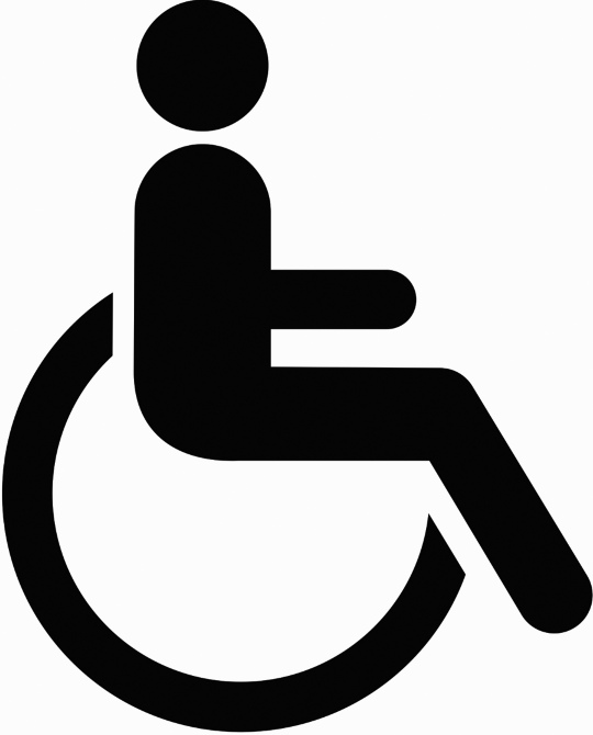
The universal symbol of accessibility identifies features of the environment—including routes, bathrooms, and parking areas—designed to accommodate everyone, regardless of ability or disability.
Consider the following when choosing pictograms for health-facility wayfinding signs:
- Test pictograms for comprehension by patients and visitors (Carpman et al., 1984a).
- Evaluate the effect of pictograms on overall sign legibility.
- Coordinate pictogram design so styles, colors, shapes, and backgrounds are consistent (Follis and Hammer, 1979).
- Limit the number of pictograms used (Follis and Hammer, 1979).
- Unless pictograms are widely used and recognized, use them only as a supplement to written information (Follis and Hammer, 1979).
- Avoid using arrows for non-directional signs (Selfridge, 1979).
Sign Updating
Healthcare facilities, especially hospitals, undergo frequent renovations and relocations (McLaughlin, 1976). Such changes can wreak havoc with an otherwise finely-tuned sign system. When destinations move, related signs need to be changed.
There are several ways health facilities can approach sign updating. To facilitate consistency and accuracy, sign-related information and decisions should be the responsibility of a single staff member. Sign data (number of signs, location, messages, arrows, and the like) are typically part of a database. In this way, when a destination moves or its name changes, all signs that mention that destination can be easily identified, allowing the sign system to be proactively managed.
Signs can be designed so that individual messages can be altered or replaced easily. Healthcare facilities with in-house sign fabrication and installation will reduce out-of-pocket costs and turnaround time (MacKenzie and Krusberg, 1996). However, in order to mitigate unintentional damage or vandalism, signs should not be too easy to alter.
In order to ensure that the sign system continues to be functional, periodic evaluation is needed, similar to a regularly scheduled car tune-up. Each sign in the system needs to be inspected for accuracy, legibility, and condition.
Sign Spacing and Location
Patients, visitors, and staff attempting to make their way around an unfamiliar building require a great deal of information. They “read” the environment, not only in the literal sense of reading signs and maps, but also in terms of gathering information from other cues, including corridors, windows, stairways, doors, and lighting, among others. Patients and visitors use these visual cues to decide whether particular pathways are likely to lead to their destinations.
To the person trying to find a particular destination, everything on signs is critical: fonts, color, contrast between text and background, letter size, and wording. But no matter how good the sign is or how legible or clearly worded, the sign's usefulness is drastically diminished if it is not in the right location. Paying attention to the placement and spacing of signs is essential to reducing disorientation in health facilities.
In determining where signs should be placed, a common rule of thumb is to place them at decision-points: places along a path or corridor where users decide whether to continue in the same direction or turn (Daniel, 1979; Kamisar, 1979; Selfridge, 1979). The purpose of the study, reported in Research Box 4.4, was to determine where signs should be placed along hospital corridors and to develop a design-relevant definition of the concept of decision-point (Downs, 1979).
Consider the following guidelines for locating wayfinding signs in healthcare facilities:
- Coordinate sign location planning with the planning of mechanical and electrical fixtures (such as lights, sprinkler nozzles, and air vents) so that prime sign locations are not blocked (Carpman et al., 1984a).
- Place signs at decision-points. Decision-points are places along a corridor where people must decide whether to continue in the same direction or turn (such as at intersections or at destinations), or where a single environmental cue or a series of such cues indicates that they are moving into a new area (Carpman et al., 1984a).
- Consider placing reassurance signs 150–250 feet (~45.7–76.2 meters) after decision-points when another decision-point is not nearby (Carpman et al., 1984a; Downs, 1979).
- Locate directional signs, You-Are-Here maps, and identification signs consistently so people learn to look for signs in certain places (Levine, 1982; Wechsler, 1979; Weisman, 1982; Wilt and Maienschien, 1979).
- Locate directional signs perpendicular to the flow of foot traffic.
Interior You-Are-Here Maps
In chapter 3, we described ways in which exterior You-Are-Here (YAH) maps can help people orient themselves outside a building and find their way from one building to another. Similarly, interior YAH maps can help patients and visitors gain an overall understanding of a building's (or smaller area's) layout. However, the map must be well designed if it is to be a useful addition to the overall wayfinding system. (See Research Box 4.6 and Research Box 4.7.) People who use YAH maps should be able to locate themselves accurately in relation to their destinations and gain enough information from the maps to select an effective route.
Consider the following when designing interior You-Are-Here maps:
- Make sure map labels use terminology consistent with signs and other components of the wayfinding system (Levine, 1982).
- Align the map so that “forward is up” (that is, the direction the person is facing while looking at the map should be at the top of the map) (Aubrey and Dobbs, 1994; Levine, 1982).
- Incorporate landmarks into the map (Levine, 1982).
- Simplify the map area and highlight public corridors and destinations.
- If the map does not include the entire floor of the facility, provide an inset or some other graphic device to show the relation of the mapped portion of the building to the rest of the healthcare facility on that floor (Carpman and Grant, 1984).
- Draw the YAH arrow pointing in the direction and at the spot the viewer is facing while looking at the map (Levine, 1982).
Color Coding
Successful wayfinding depends, in part, on reading the physical environment as well as on reading and comprehending signs and other wayfinding cues. As individuals make their way, they will be helped or hindered by available cues.
In the past, colored lines on the floor were often used in hospitals as easy ways to guide patients and visitors to their destinations. Although this component of a wayfinding system was favored by patients and visitors, colored lines on floors or walls are no longer considered a good solution to wayfinding confusion in most facilities. In large healthcare facilities with many destinations, it is impossible to have colored lines leading to each patient-and-visitor destination without creating a multi-colored spaghetti of wall or floor lines. A system of floor lines might work in such facilities if they lead to only one or two destinations that are difficult to find using conventional wayfinding strategies. However, floor lines have some downsides, including sometimes being covered by carpeting, disappearing due to renovations, having colors that are hard to distinguish, having unclear starting and ending points, and the like. Similarly, lines on the wall may conflict with signs, artwork, doorways, or other design features (Shumaker and Reizenstein, 1982). (See Research Box 4.8.)
Color coding is often wrongly thought to be an easy solution to wayfinding problems (Fusillo, Kaplan, and Whitehead, unpublished report). For example, in large, complex buildings there will be more floors and potential destinations than any simple color scheme can accommodate. Because many people (and certainly those under stress) may not be able to distinguish or remember a particular shade within a large number of colors, colored floor lines may add to, rather than mitigate, feelings of confusion.
Another drawback of color coding, even in relatively simple, small-scale facilities, is that it is not used solely for wayfinding purposes. Color may be used for decoration in the same area where it is supposed to have wayfinding meaning. If people cannot tell when color has meaning and when it does not, color is ineffective as a wayfinding cue.
Consider the following guidelines for color coding:
- When using colored floor lines, use highly contrasting colors. Use colored floor lines to lead to no more than two destinations.
- Avoid using color for decoration in the same way it is being used as a color-coded wayfinding cue (American Hospital Association, 1979; Reizenstein and Vaitkus, 1981).
Signage and the Americans with Disabilities Act
The Americans with Disabilities Act (ADA) was enacted to provide equal access, opportunities, and employment to Americans with disabilities. The ADA seeks to end discrimination against an estimated 54 million Americans (2008 American Community Survey, 2008). The most relevant sections related to wayfinding are contained within the ADA Standards for Accessible Design. (See chapter 9 for a general discussion of the ADA's requirements. Information may also be found at www.ada.gov.)
Directions Given by Staff
Some people need human reassurance regardless of the extent and quality of the overall wayfinding system. Although trained staff at Information Desks may be available, other staff and volunteers should be prepared to answer requests for directions (Carpman et al., 1984a). However, untrained staff may not have the skills necessary to give directions well. Large healthcare facilities should consider instituting an ongoing staff training program in giving consistent, accurate directions.
For example, before occupancy of more than 1 million square feet (~92,903 square meters) of new facilities, the University of Michigan Medical Center recognized the need to train its 800+ staff members about details of the new wayfinding system, with special emphasis on direction giving. Training sessions were designed for three groups:
- Staff whose duties involved giving directions, such as Information Desk attendants, diagnostic and treatment department receptionists, and inpatient unit clerks
- Staff whose duties involved traversing the facilities, including messengers, transporters, and phlebotomists
- Staff, such as maintenance and security personnel, whose duties involved quickly locating specific rooms (Carpman, unpublished reports, 1985; Carpman, 1985).
Wayfinding during Periods of Construction
During periods of construction or renovation, familiar circulation patterns are often interrupted, and patients, visitors, and staff cope with construction-related confusion. However, when mitigating wayfinding strategies are well planned, users should be able to find their way during periods of construction. Maintaining order in the face of significant change is challenging, possible, and necessary, as the following guidelines suggest:
- Keep alternative routes as simple as possible.
- Keep wayfinding instructions as simple as possible.
- Make sure that accurate wayfinding information is conveyed to patients and visitors.
- Use a good-humored approach to graphics and signage that acknowledges the user's experience of wayfinding challenges (Jacobson, 1986).
- Consider employing distinctive, noticeable graphics for wayfinding elements used during the construction period.
- Assign wayfinding-related management responsibilities to a single staff member during the construction period.
Wayfinding Technology
The technology revolution has reached the realm of wayfinding. Systems and devices that utilize sound, touch, and geographic sensing are available. They can help individuals select destinations, personalize selected routes, generate maps (and voice guidance) they can take with them, and provide constantly updated maps and directions en route. Interactive wayfinding, including websites, kiosks, and GPS capability in cars, handheld devices, smartphones, and tablets, is now common and can often assist first-time users and those with vision or hearing limitations to find their way (Baldwin, 2003). Although such wayfinding technology may not yet be affordable to all healthcare facilities, the availability of such systems highlights the need to consider a variety of wayfinding elements in addition to traditional signs and maps. Wayfinding technology will continue to evolve and be relied upon by an increasingly large segment of patients and visitors.
Corridor Functions and Amenities
Corridors in healthcare facilities are often long, with few distinctive or visually interesting features (Spivak, 1967). Since inpatients and others may need to get up and walk around for therapeutic reasons, corridors need to be safe and inviting.
Consider the following guidelines:
- Define wall and door boundaries by selecting door trim and baseboard colors that contrast with their surroundings.
- Create contrast between wall and floor surfaces of at least two digits on the gray scale.
- Use non-glare surfaces on walls. (Behar, unpublished paper)
Corridors with windows or other visual features are likely to attract more use than will plain hallways. However, the simple layout of the corridor should not be sacrificed in order to add visual complexity and richness (Weisman, 1982). (See also chapter 9.) Corridor interest can be increased in a number of ways:
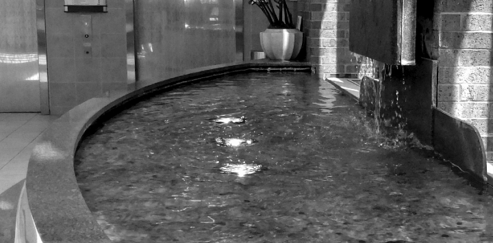
Unique landmarks that feature sound, like this fountain, can be effective wayfinding elements.
Photo credit: Courtesy of St. Joseph Mercy Ann Arbor
- Create visual interest with artwork, such as posters, photographs, paintings, and murals. Artwork may also function as wayfinding landmarks (D'Alessio, 1986; Weisman, 1982).
- Consider placing art on the ceiling at particular locations, such as staff elevator lobbies, to provide focal points for patients on gurneys (Shaw, 1976).
- Provide views to the outside along corridors, providing respite and a focus for attention and wayfinding (Bobrow and Thomas, 1976; Calderhead, 1975).
- Locate windows along corridors rather than at the ends of corridors, in order to avoid glare.
Carpeting
Carpeted corridors and patient rooms are a way to soften a harsh-seeming healthcare environment. In general, carpeting is considered more comfortable and psychologically warm than hard-surface flooring and has even been associated with longer visits by family and friends (Cheek, Maxwell, and Weisman, 1971; Counsell et al., 2000; Eagle, 2010; Harris, 2000). Carpeting has also been found to reduce ambient noise levels and injuries from falls (Philbin and Gray, 2002; Pierce, 1973; Spivak, 1967; Willmott, 1986). Due to infection-control concerns, carpet must be carefully selected and maintained. With proper care, carpeting should pose no microbiological hazard to the typical patient (Lankford et al., 2006; Simmons, Reizenstein, and Grant, 1982; Skoutelis et al., 1994). In 1985, the Centers for Disease Control lifted their recommendations against use of carpets in patient-care areas, stating that “there is no epidemiologic evidence to show that carpets influence the nosocomial infection rate in hospitals” (Selhulster et al., 2004; Wise, 1994).
Along with its benefits, carpeting in corridors has a few drawbacks. Carts, beds, gurneys, diagnostic equipment, and wheelchairs are more difficult to move on carpeted surfaces than on hard floors, although special casters and a low-pile, unpadded carpet can alleviate the problem (Deschambeau, 1965). The ADA mandates a maximum pile height of ½ inch, as measured from the bottom of the tuft (US Department of Justice, 2010). Carpeting specifications that need to be carefully considered include fire safety, stain resistance, static-electricity resistance, friction resistance, and the presence of a permanent antimicrobial finish (Conductive Carpet Tile, 2013; Facility Guidelines Institute, 2010; Gulwadi and Calkins, 2008; Odell, 2007).
Consider the following guidelines when selecting carpeting and other floor coverings:
- Select a resilient carpet for ease of wheelchair handling. Specify a pile height of less than ½ inch (~0.64 centimeter) (less than ¼ inch [~0.32 centimeter] for people with less than normal strength), with an uncut or tip-sheer high-density pile, so that wheelchairs are not pulled in another direction by the carpeting.
- Choose a stain-resistant carpet with an added biological guard to prevent bacterial growth and resulting odors.
- Consider static-resistant carpet or treat carpet to be static resistant to reduce electrical interference for people with hearing aids.
- Permanently install area rugs, if they are used at all, in order to reduce patient falls.
- Select floor colors that contrast with the colors of walls and furniture.
- Limit contrast between adjacent carpet areas so that the carpet seams are not mistaken for stairs.
- Avoid cushioned floors because they can be permanently dented and are not durable for high-traffic use.
- Avoid using paving materials, such as brick, that produce an irregular surface.
- Avoid using flooring materials that may cause tripping (Behar, unpublished paper).
Lighting
Lighting can significantly influence the overall ambience of corridors and the effectiveness of a variety of wayfinding elements. The use of task and mood lighting is hardly new, but lighting can serve a number of other functions, especially in areas where the accurate assessment of patients' skin tones is less important. Corridors should be illuminated in a way that facilitates safe and comfortable movement. For example, lighting can be used to signal changes such as the beginning of a ramp or a different floor surface. Variations in corridor illumination can also become an element of the wayfinding system when the variations indicate turns, distinguish the circulation path from other spaces, and highlight meaningful spaces and important information along the way. Lighting can also help define areas along a hallway and visually break up a long corridor into segments, helping to avoid a tunnel effect.
Consider the following guidelines for improving corridor lighting:
- Avoid over-lighting the corridor. One approach is to use a continuous band of low-intensity light rather than periodic bright lights, which can cause glare (Facility Guidelines Institute, 2010; Hayward, 1982; Souhrada, 1989).
- Avoid corridor lighting that shines in patients' eyes as they are transported on gurneys. This can be accomplished by using linear fluorescents mounted on one side of the ceiling or wall (Facility Guidelines Institute, 2010; Hayward, 1982; Souhrada, 1989).
- Mitigate a tunnel effect by mounting linear fluorescents on opposite sides of the corridor, at regular intervals. Switch sides at corridor intersections, but no more frequently than approximately every 75–100 feet (~23–30.5 meters) (Facility Guidelines Institute, 2010; Hayward, 1982; Souhrada, 1989).
- Use special lighting color or intensity to highlight meaningful spaces, such as reception areas, nursing stations, or major intersections (Fong, 2003; Hayward, 1982).
- Use conventional fluorescent fixtures or specially designed lights to illuminate ceiling-hung signs (Fong and Nichelson, 2006).
- Plan, locate, and direct lighting so as to effectively illuminate wayfinding signs and You-Are-Here maps (Facility Guidelines Institute, 2010; Hayward, 1982; Souhrada, 1989).
- In situations where directional signs, YAH maps, or identification signs are dimly lit, provide spot lighting or additional ambient lighting along the corridor (Facility Guidelines Institute, 2010; Hayward, 1982; Souhrada, 1989).
Handrails and Seating
For some patients, a walk down the hall may feel like a major expedition. Frail from surgery, illness, or age, some patients (and some visitors) need physical support while walking and places to sit and rest along the way. Handrails positioned along a corridor can give patients and visitors the psychological and physical support they need to get up and walk. Patients unsure of their strength may be encouraged to venture down a hallway when handrails are available. Strategically placed benches or seating alcoves provide needed rest stops for patients and visitors.
In some facilities, handrails are incorporated into the design of wall bumper guards. Although this allows one design feature to serve two purposes, it is important to make sure that these bumper guards perform effectively as handrails. To ensure that patients and visitors can firmly grasp handrails, the handrail portion of the bumper guard should be rounded to fit a hand, with a sizable indentation on the back to allow the fingers to grip. It should be ~1¼–1½ inches (~3.2–3.8 centimeters) in diameter. The handrail should be mounted ~1½ inches (~3.8 centimeters) from the wall and ~32–34 inches (~81.3–86.4 centimeters) from the floor. This clearance allows gripping without the chance of a person's arm becoming lodged between the wall and the handrail in the event of a fall (American National Standards Institute, 1980; Carpman and Grant, 1983; Harkness and Groom, 1976).
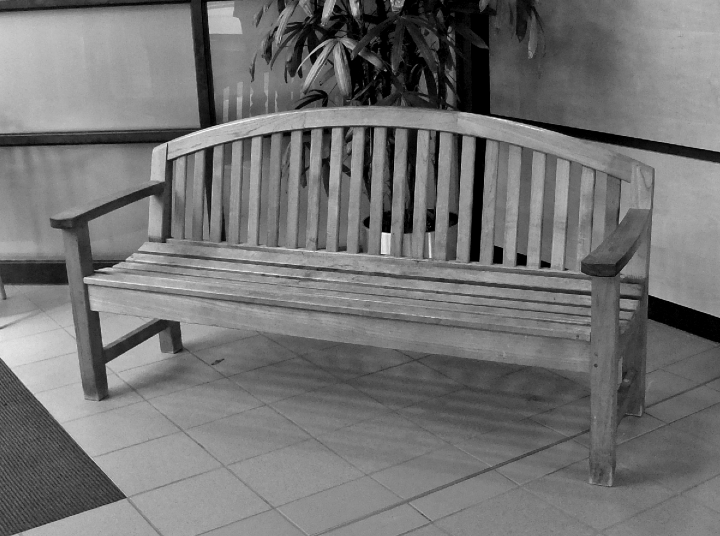
Patients and visitors appreciate being able to sit along corridors in a health facility. Benches featuring armrests and space under the seat make it easier for customers to sit and rise.
Photo credit: Courtesy of St. Joseph Mercy Ann Arbor.
Traveling from Floor to Floor
Just as corridors are used to get from one part of the same floor to another and from one building to another, elevators and stairways are used to travel from floor to floor. In many ways, the related design and behavioral issues are similar: patients and visitors need to travel comfortably and safely and they need to find their way without difficulty.
Elevators
Patients and visitors need to be able to easily enter elevators, reach elevator control panels, and understand how to use them. Consider the following guidelines:
- Install elevators with doors wide enough to accommodate a stretcher and associated personnel and equipment.
- Because elevators are used by patients who may move and respond slowly, adjust doors to close slowly.
- Indicate elevator floor designations with raised numerals and Braille, as required by ADA or other regulations (Harkness and Groom, 1976).
- Consider placing small signs on the control panel to provide redundant cues for certain call buttons, such as Cafeteria, Floor 1 (Main), and so on.
- When call buttons inside elevator cabs use letters to identify floors, display easily understood explanations next to the buttons: for example, the word Mezzanine next to MZ and the words Plaza Level next to PL.
- Use understandable pictograms and words to indicate buttons used for door opening, door closing, and emergency (Carpman and Grant, 2012).
- Arrange call buttons vertically inside elevator cabs to reflect floor-to-floor relationships.
- Install elevator controls within the easy reach of wheelchair users, as required by ADA and other regulations (Harkness and Groom, 1976).
- Provide an understandable and easy-to-read display that indicates the present floor location.
- Design elevator lighting to minimize reflective glare on the floor-number display.
- Use materials in the elevator cab that resist unintentional damage and vandalism.
- Locate floor-number identification in the elevator lobby, opposite the elevator and in clear view of those exiting the elevator.
- Provide metal tactile numbers for floor designations on each floor, ~60 inches (~1.5 meters) above the floor on the fixed point at the open side of the elevator door or, when center-opening doors are used, on both sides, or as required by code (Michigan Department of Labor, 1985).
- Outside the elevator, provide call buttons with understandable symbols or pictograms indicating Up and Down.
- Provide easily understood indicators in each elevator lobby, showing the direction an elevator is moving.
- Provide an elevator directory located near the call buttons, listing major destinations on each floor served by the elevator.
- Provide a smaller version of the elevator directory inside the elevator cab.
- In elevator lobbies, provide a place for patients and visitors to sit while waiting for the elevator.
- In large hospitals, consider designating certain elevators for the public and outpatients, and others for staff and inpatients.
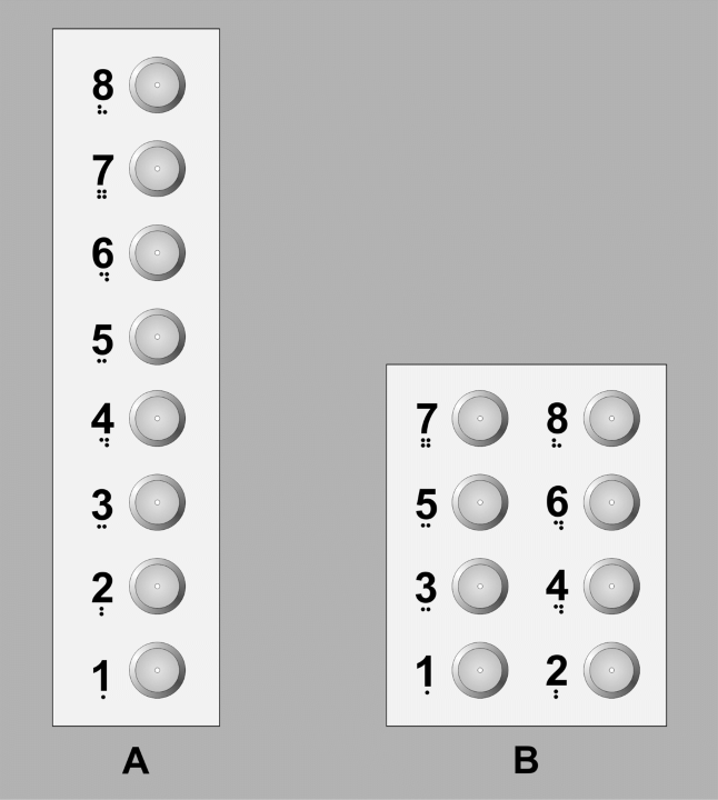
Inside elevator cabs, call buttons are easier to understand when they are arranged vertically, to represent floor-to-floor relationships (as in option A), rather than horizontally (as in option B).
Stairways
In 1974, the US Consumer Product Safety Commission called stairs the most hazardous consumer product. Eight years later, it estimated that there were over twice as many injuries resulting from stairway use as from the next-greatest hazard, bicycles, and that about 4,000 people die each year as a result of stair-related injuries. A later study indicates that older people account for 85 percent of those deaths (Hunt and Ross, 1989).
In hospitals, stairways are potentially dangerous places. Frail patients under the influence of medication, distracted visitors, and rushing staff are potential victims of stairway accidents that can result in anything from bumps and bruises to broken bones and fatal injuries.
Yet in addition to their usefulness in emergencies, when elevators are not in use, stairways fill a necessary role as a vertical circulation alternative to slow or crowded elevators. Stairs can also provide exercise. One study showed that the inclusion of “motivational” signage and music may successfully attract more stair users, but may also pose safety risks (Hölscher et al., 2006; Kerr et al., 2004).
According to reviews of stairway accident research, safety researchers in several countries have videotaped the successes and failures of tens of thousands of stair users in many types of public settings (Archea, 1985; Pauls, 1985; Templer and Archea, 1983).The goal of the research was to determine optimal stairway design characteristics. Researchers found that successful stair use depends on navigating the first two or three steps, that is, on making the transition from a level surface to the circumscribed foot placement necessary to go down or up. In descent, where most accidents occur, users make a series of rapid visual and kinesthetic tests, first estimating where to place their feet and then verifying that estimate by getting a feel of the treads. In this context, stair accidents occur when the user's testing process is disrupted. Distractions—such as other people, noise, loose handrails, and visual changes in stair and wall placement or design—often cause accidents. Unanticipated hazards such as trash or loose treads are other typical causes of falls on stairs (Templer and Archea, 1983).
A singular and unambiguous indication of the edge of each tread is essential information for users as they look down (or up) a flight of stairs (Archea, 1985). Treads should not seem to merge together like a ramp; rather, adjoining treads should contrast with one another through the use of contrasting colors or lighting (Hunt and Ross, 1989).The chances of overstepping are increased when the design of stair coverings uses repetitive, random, or geometric patterns with vivid colors, stripes running parallel to the tread edge, or subtle dimensional irregularities and three-dimensional textures, which can all obscure the visual information needed to distinguish the edge of each tread (Pauls, 1985).
Consider the following guidelines with regard to stairway coverings such as carpeting, in order to achieve maximum clarity:
- Provide contrast with walls and other vertical surfaces.
- Provide effective contrast between stair treads and risers.
- In order to clearly differentiate floor and wall surfaces at stairways, use a band of color that contrasts with both floor and wall colors (Hunt and Ross, 1989).
One researcher notes that codes and standards in the United States do not always conform well to human ergonomics. For example, stairwells may be so wide and handrails placed so low that users in the center area of any stair cannot reach the handrail if they happen to stumble. Similarly, one study analyzing videotaped accidents found that the maximum effective stair-riser height should be 6 inches (~15.2 millimeters), not the commonly used 7-inch (~17.8 centimeters) standard (Pauls, 1985).
Given the needs of healthcare facility users, it is important to optimize these sorts of dimensions, rather than just meeting minimum criteria. As a starting point for effective stairway design, researchers offer three conditions for creating safe stair use: steps should be readily visible, treads should be large enough to provide effective footing, and handrails should be easily reached and grasped.
Consider the following guidelines for safe stairway design:
- Avoid obscuring tread edges with optical illusions or “visual noise,” such as vivid floral or geometric patterns, stripes running parallel to the tread edge, and three-dimensional textures that may create visual confusion (Archea, 1985).
- Provide visual cues that accentuate and correspond with the conditions on a stairway. All colors, edges, lines, alignments, patterns, and textures should interact to produce a true representation of the extent and position of the treads (Archea, 1985).
- Provide easily discernible tread edges by using surface and edge to create a figure–ground relationship where each tread edge appears as a figure and the riser surface below appears as the background (Archea, 1985).
- Use light to clarify the tread edge, but plan lighting locations carefully to prevent shadows, which may be mistaken as the edge of a tread (Archea, 1985).
- Provide a strong, easily grasped, and easily seen handrail, as many people use handrails to pull themselves up from one tread to the next and also as compensation for vision limitations (Archea, 1985).
- Avoid stairs with protruding treads or open risers because they are difficult to navigate by people with vision or mobility disabilities (Harkness and Groom, 1976).
- Consider round handrails (~1¼–1½ inches, ~3.2–3.8 centimeters in diameter) with sufficient clearance between the handrail and the wall (~1½ inches, ~3.8 centimeters). These can be easily gripped without the chance that a person's arm will become lodged in the gap, in the event of a fall (Harkness and Groom, 1976).
- Consider placing handrails at a height that allows users to glide from elbow to wrist, thus using the arm as a “third foot” for better stability and greater mobility (Hiatt, 1991).
- Provide handrails for short inclines (one- to three-step differences) (Baier and Shumaker, 1989).
- Provide handrails on both sides of a staircase (Harkness and Groom, 1976).
- Extend handrails beyond the first and last steps of a staircase (Harkness and Groom, 1976).
- Avoid constructing stairways out of slippery materials (Harkness and Groom, 1976).
- Avoid the simultaneous change of several environmental factors (such as lighting, view, floor surface) on a stairway (Templer, Mullet, and Archea, 1978).
- Provide effective illumination in stairways. Eliminate glare and shadows so that patients and visitors with vision disabilities are not hindered (Templer, Mullet, and Archea, 1978).
- Provide visual cues that distinguish stairway treads from risers (Templer, Mullet, and Archea, 1978).
- Consider providing artwork in stairwells to make them visually interesting and to encourage their use.
Unplanned Uses of Corridors, Elevators, and Stairways
Corridors, elevators, and stairways are often the unclaimed territories of a health facility. They are not always attended to by departmental managers and may receive less day-to-day attention than they need. Circulation areas may become ad hoc storage areas for wheelchairs, linens, and gurneys; impromptu conference rooms for physicians and other medical personnel; and informal waiting areas for patients and visitors. With all of their unplanned uses, corridors can become cluttered and noisy.
These unplanned uses affect patients, visitors, and staff by reducing privacy and creating a poor image of the facility. When staff members confer in hallways or elevators, patient information may be overheard by unauthorized people. Not only may this breach the standard of confidentiality, it may also cause unnecessary alarm in those overhearing the information.
Although it is probably unrealistic to assume that all unplanned corridor use can be eliminated, clutter and noise can often be reduced. Constructing alcoves and other storage areas, providing ample conference room space, and designing comfortable waiting areas and lounges can go a long way toward solving the problem.
Summary
- Healthcare facilities are typically large and complex, with numerous patient/visitor destinations often widely separated. Patients and visitors may be preoccupied and physically and/or emotionally stressed, making it difficult for them to navigate. Spatial disorientation adds to stress, can take extra time and cause patients to be late for or miss appointments. It can produce feelings of helplessness, anger, and even panic, as well as generalized hostility toward the institution. Disorientation may also have physiological effects, such as increased heartrate. Staff, as well as patients and visitors, can experience negative effects of disorientation.
- Well-placed and easy-to-read signage must be supplemented by other components of a wayfinding system such as building layout, architectural differentiation, landmarks like plants and artwork, lighting, maps, terminology, room and floor numbering, spoken directions, and technology.
- When possible, related functions should be located close to one another.
- Decision-points occur on a given route when a person is moving from one area into another, as at intersections or destinations. Decision-points also occur at places where environmental features indicate changes in lighting, flooring, color schemes, and the like. Signs should be located at these decision-points, rather than at arbitrary intervals along the path. If there are no key decision-points along a route, reassurance signs should be placed approximately every 150 to 250 feet (~45.7–76.2 meters).
- Avoid creating corridors that are uninviting and disorienting by incorporating design features such as well-defined wall and door boundaries, non-glare surfaces, views to the outdoors, and visual interest from artwork. Lighting and carpeting should facilitate safe and comfortable movement. Handrails can provide psychological and physical support. Strategically placed seating offers needed rest stops.
- For movement from floor to floor, elevators must be designed so that patients and visitors are able to enter easily, reach elevator control panels, and understand how to use them.
- Stairways—necessary but potentially dangerous places—need to be designed to facilitate the transition from level surface to circumscribed tread by a complete, correct, and consistent pattern of cues, and by handrails that are easily reached and gripped.
Design Review Questions
Finding One's Way through a Health Facility
Building Layout and Landmarks
 Will the wayfinding system be designed to satisfy the orientation needs of first-time users? (Carpman et al., 1984a; Hauff, 1988)
- Will the wayfinding system include such components as the basic layout of the building and site, interior and exterior landmarks, views to the outside, signs, wording, floor numbers, room numbers, spoken directions, You-Are-Here maps, handheld maps, directional signs, identification signs, directories, and technology? (Weisman, 1982)
- Will related healthcare-facility functions be located close to one another? (Carpman et al., 1984a; Hauff, 1988)
- If a new healthcare facility is being designed, will decision-makers consider the impact of the building's appearance and form on wayfinding? (Weisman, 1979)
- Will interior landmarks include architectural details, lighting, color, texture, artwork, and plants? (Carpman et al., 1984a)
Floor Numbering
- Will floor-number designations relate to the Main Entrance floor and indicate whether floors are above or below ground?
- Will floor-number relationships between linked buildings be considered so that, for example, Floor 2 of one building does not link to Floor 4 of another? (Carpman et al., 1984b)
- Will floor numbers be used in the room-numbering system (for example, rooms on Floor 5 would all begin with the number 5)? (Carpman et al., 1984b)
Room Numbering
- Will room numbers on the floors below the entrance level begin with a prefix likely to be understood by first-time users? (Carpman et al., 1984a)
- Will the room-numbering system be designed to facilitate wayfinding ease?
- Will the room-numbering system provide gaps in the numbering sequence to allow for future expansion and renovation? (Carpman et al., 1984a)
- Will the room-numbering system be used consistently on floors having similar uses and layouts? (Carpman et al., 1984a)
- Will room numbers on signs be legible to patients and visitors? (Carpman et al., 1984a)
- Will the appearance of room numbers on signs identifying patient and visitor destinations (such as patient rooms and exam rooms) be differentiated from room numbers on signs identifying staff destinations? (Carpman et al., 1984a)
- With the exception of inpatient rooms, will patient and visitor destinations be clearly identified by common-language names as well as numbers? (Carpman et al., 1984a)
- If the number of a room is its primary means of identification by patients and visitors, will the numbers be legible? (Carpman et al., 1984a)
- Will patient room-identification signs be visible when doors are open?
- Will combinations of letters and numbers, such as NIB407, be avoided?
- If letters and numbers must be combined to create a room number, will letters be avoided that may be interpreted as numbers (such as I, O, and Q)? (Carpman et al., 1984a)
- Will the room-numbering system begin at one end or corner of a floor and flow sequentially through to the other end? (American Hospital Association, 1979)
- Will a simple room-numbering system be used, such as a continuous series with odd numbers on one side of the hall and even numbers on the other? (American Hospital Association, 1979)
- In new construction projects, will wayfinding-related room numbering be considered early in the design process, prior to showing room numbers on architectural plans?
- Will patient room numbers and telephone numbers be coordinated? (Carpman et al., 1984a)
Sign Messages
- Will plain and simple wording in English and/or other languages be used? (Kearney, Rice, and Parks, 1987)
- Will wayfinding wording be tested for comprehension by patients and visitors? (Carpman et al., 1984a)
- Will consistent wayfinding wording be used throughout the facility? (American Hospital Association, 1979; Marks, 1979)
- Will ambiguous wording be avoided? (Follis and Hammer, 1979; Marks, 1979)
- Will each department use consistent wayfinding wording on its signs and in written and verbal communications with patients and visitors? (American Hospital Association, 1979; Marks, 1979)
- Will wayfinding wording be within a sixth-grade reading level? (American Hospital Association, 1979)
Symbols and Pictograms
- Will symbols and pictograms under consideration—other than those universally used—be tested for comprehension by patients and visitors? (Carpman et al., 1984a)
- Will the effect of symbols and pictograms on sign legibility be evaluated?
- Will symbol and pictogram styles, colors, shapes, and backgrounds be used consistently? (Follis and Hammer, 1979)
- Unless they are widely recognized, will symbols and pictograms be used only to supplement verbal information? (Follis and Hammer, 1979)
- Will arrows be used only as direction indicators? (Selfridge, 1979)
Sign Updating
- Will there be a staff member responsible for managing and maintaining the wayfinding system?
- Will there be a database developed to catalogue wayfinding signs and their locations and messages?
- Will the sign system be managed proactively?
- Will the design of wayfinding signs allow easy wording changes without inviting unintentional damage or vandalism?
- Will the wayfinding sign system be regularly reviewed for damage, as well as wording accuracy and consistency?
Sign Spacing and Location
- Will overhead sign locations be planned in conjunction with mechanical, electrical, and lighting fixtures so views to prime sign locations are not obstructed? (Carpman et al., 1984a)
- Will signs be placed at decision-points? (Carpman et al., 1984a)
- Will reassurance signs be placed approximately 150–250 feet (~45.7–76.2 meters) after major decision-points if another decision-point has not already occurred? (Carpman et al., 1984a; Downs, 1979)
- Will wayfinding signs and You-Are-Here maps be placed in consistent locations? (Levine, 1982; Wechsler, 1979; Weisman, 1982; Wilt and Maienschien, 1979)
- Will directional signs be located perpendicular to the flow of foot traffic?
Interior You-Are-Here Maps
- Will the wording used to identify destinations on YAH maps be consistent with wording used on directional and identification signs? (Levine, 1982)
- Will YAH maps be oriented so that “forward is up” (that is, the direction the person is facing while viewing the map is at the top of the map)? (Levine, 1982)
- Will distinctive architectural or interior design elements, such as landmarks, be incorporated into YAH maps? (Levine, 1982)
- Will YAH maps be kept simple by emphasizing public corridors and destinations and by deemphasizing staff areas?
- Will an inset be used on YAH maps to show the relation of the mapped portion of the building to the rest of the facility? (Carpman and Grant, 1984)
- Will the You-Are-Here arrow be drawn so it points in the direction and at the spot the viewer is facing while looking at the map? (Levine, 1982)
Color Coding
- If a system of colored floor lines is used as part of an overall wayfinding system, will it consist of contrasting colors leading to no more than two destinations?
- If color coding is necessary, will it be used logically and consistently throughout the facility? (American Hospital Association, 1979; Reizenstein and Vaitkus, 1981)
- If color is used as a wayfinding cue, will it be used only in that way and not also “for decoration”? (American Hospital Association, 1979; Reizenstein and Vaitkus, 1981)
Wayfinding during Periods of Construction
- Will alternative routes be as simple as possible?
- Will wayfinding instructions be as simple as possible?
- Will all information be accurately conveyed to patients and visitors?
- Will construction-related signs and graphics use a good-humored and empathetic approach? (Jacobson, 1986)
- Will a distinctive, noticeable graphic image be considered for wayfinding elements used during construction?
- Will wayfinding-related responsibilities be assigned to a single staff member during the construction period?
Wayfinding Technology
- Will wayfinding technology be considered as a way to supplement essential elements of the wayfinding system, such as directional signs and You-Are-Here maps?
Corridor Functions and Amenities
- Will wall and door boundaries be defined by door trim and baseboard colors that contrast with their surroundings?
- Will the color of adjacent wall and floor surfaces provide contrast of at least two digits on the gray scale?
- Will walls have non-glare surfaces?
- Will artwork be used to create visual interest? (D'Alessio, 1986; Weisman, 1982)
- Will artwork be located on the ceiling in places where patients wait on gurneys? (Shaw, 1976)
- Will corridors have outside views? (Bobrow and Thomas, 1976; Calderhead, 1975)
- In order to avoid glare, will windows be provided along corridors, rather than at the ends?
Carpeting
- Will the following carpet attributes be considered: fire safety, stain resistance, static-electricity resistance, friction resistance, and the presence of a permanent antimicrobial finish?
- Will resilient carpet be selected with a very short pile height for ease of wheelchair handling? (Behar, unpublished; U.S. Department of Justice, 2010)
- Will stain-resistant carpet be selected with features that prevent bacterial growth and resulting odors? (Behar, unpublished; Lankford et al., 2006; Skoutelis et al., 1994)
- Will static-resistant carpet be considered in order to reduce electrical interference for people with hearing aids? (Behar, unpublished)
- If area rugs will be used, will they be permanently installed? (Behar, unpublished)
- Will floor colors be selected to contrast with walls and furniture? (Behar, unpublished)
- Will contrast be limited between adjacent carpets so they are not mistaken for stairs? (Behar, unpublished)
- Will cushioned floors be avoided in high-use areas, since they can become permanently dented and are not durable? (Behar, unpublished)
- Will irregular paving and flooring materials not be selected? (Behar, unpublished)
Lighting
- Will over-lighting be avoided? (Facility Guidelines Institute, 2010; Hayward, 1982; Souhrada, 1989)
- Will corridor lighting be designed so it does not shine in the eyes of patients on gurneys? (Facility Guidelines Institute, 2010; Hayward, 1982; Souhrada, 1989)
- Will a lighting “tunnel effect” be avoided? (Facility Guidelines Institute, 2010; Hayward, 1982; Souhrada, 1989)
- Will special lighting color or intensity be used to highlight meaningful spaces? (Fong, 2003)
- Will light fixtures be used to illuminate ceiling-hung wayfinding signs? (Fong and Nichelson, 1976)
- Will lighting be planned, located, and directed to effectively illuminate wayfinding signs and You-Are-Here maps? (Facility Guidelines Institute, 2010; Hayward, 1982; Souhrada, 1989)
- In situations where directional signs, YAH maps, or identification signs will not be effectively lit by standard corridor lighting, will spot lighting or additional ambient lighting be provided? (Facility Guidelines Institute, 2010; Hayward, 1982; Souhrada, 1989)
Handrails and Seating
- Will handrails or bumper guards with incorporated handrails be used along corridors? (American National Standards Institute, 1980; Carpman and Grant, 1983; Fong, 2003)
- Will the handrail (or the handrail portion of a bumper guard) be rounded on top and behind to fit a hand and designed to be ~1¼–1½ inches (~3.2–3.8 centimeters) in diameter? (American National Standards Institute, 1980; Carpman and Grant, 1983; Fong, 2003)
- Will the handrail be mounted ~1½ inches (~3.8 centimeters) from the wall? (American National Standards Institute, 1980; Carpman and Grant, 1983; Fong, 2003)
- Will the handrail be mounted ~32–34 inches (~81.3–86.4 centimeters) from the floor? (American National Standards Institute, 1980; Carpman and Grant, 1983; Fong, 2003)
- Will benches and seating alcoves be provided where inpatients and outpatients need them? (American National Standards Institute, 1980; Carpman and Grant, 1983; Fong, 2003)
Traveling from Floor to Floor
Elevators
- Will elevator doors be wide enough to accommodate a stretcher and the associated personnel and equipment?
- Will elevator doors close slowly?
- Will floor designations be indicated with raised numerals and Braille, as required by ADA or other regulations? (Harkness and Groom, 1976)
- On control panels inside elevator cabs, will redundant cuing (such as a label for Cafeteria) be used for related call buttons?
- If call buttons use letters to identify floors, will easily-understood explanations be displayed next to the buttons?
- Will understandable symbols (pictograms) and words be used on call buttons for door opening, door closing, and emergency?
- Will call buttons in elevator cabs be arranged vertically, in order to reflect floor-to-floor relationships?
- Will elevator controls be installed within easy reach of wheelchair users, as required by ADA and other regulations? (Harkness and Groom, 1976)
- Will elevator lighting be designed so as not to cause reflective glare on the floor number display?
- Will there be an understandable and easy-to-read display indicating the present floor location?
- Will the elevator cab be constructed of damage-resistant materials?
- Will floor number signs be placed in the elevator lobby, directly opposite the elevator and in clear view of those exiting the elevator?
- Will metal tactile floor numbers be installed on each floor, 60 inches (~1.5 meters) above the floor on the fixed point at the open side of the elevator door or, when center-opening doors are used, on both sides, or as required by code? (Michigan Department of Labor, 1985)
- Will call buttons in elevator lobbies use understandable symbols or pictograms indicating Up and Down?
- Will elevator directories be provided near call buttons in elevator lobbies?
- Will downsized versions of elevator directories be provided inside elevator cabs?
- Will there be a place for patients and visitors to sit while waiting for the elevator?
- Will elevators for the public and outpatients be separate from elevators for staff and inpatients?
Stairways
- Will stair treads be large enough, front to back, to provide effective footing? (Pauls, 1985)
- Will protruding stair treads or open risers be avoided? (Harkness and Groom, 1976)
- Will stairway treads be constructed of non-slippery materials? (Harkness and Groom, 1976)
- Will visual cues such as colors, edges, lines, alignments, patterns, and textures interact to make stair treads and risers clear? (Archea, 1985)
- Will stairway carpeting contrast with walls and other vertical surfaces? (Hunt and Ross, 1989)
- Will a band of color that contrasts with both floor and wall colors be used to clearly differentiate floor and wall surfaces at stairways? (Hunt and Ross, 1989)
- Will stair-tread edges be free from optical illusions, such as vivid floral or geometric patterns, stripes running parallel to the tread edge, or three-dimensional textures? (Archea, 1985)
- Will stair-tread edges be easily discernible from adjacent risers through figure–ground relationships where the edge appears as a figure and the riser below appears as the background? (Archea, 1985)
- Will there be effective illumination (without glare or shadows) in and around stairways? (Templer, Mullet, and Archea, 1978)
- Will lighting be used effectively to clarify stair-tread edges and prevent shadows? (Archea, 1985)
- Will handrails in stairways and along corridors be strong and easy to see, reach, and grasp? (Archea, 1985)
- Will handrails be provided on short (one- to three-step) stairways? (Templer et al., 1978)
- Will handrails be ~1¼–1½ inches (~3.2–3.8 centimeters) in diameter and mounted ~1½ inches (~3.8 centimeters) from walls and ~32–34 inches (~81.3–86.4 centimeters) from the floor? (Harkness and Groom, 1976)
- Will handrails be provided on both sides of staircases? (Harkness and Groom, 1976)
- Will handrails extend beyond the first and last steps of staircases? (Harkness and Groom, 1976)
- Will handrails be located at a height that allows users to glide from elbow to wrist, using one arm as a “third foot” for better stability and greater mobility? (Hiatt, 1991)
- Will artwork be provided in stairwells to encourage use and make them visually interesting?
- Will the situation be avoided in which several environmental factors (such as illumination, view, or floor covering) change simultaneously on the stairway? (Templer et al., 1978)
Unplanned Uses of Corridors, Elevators, and Stairways
- Will effective, easily accessible storage areas be planned so corridors will not be cluttered with equipment?
- Will ample conference room space be provided where physicians and other medical personnel can hold impromptu meetings?
- Will a sufficient number of consultation rooms be provided in which medical staff can meet privately with families?
References
- American Hospital Association. Signs and Graphics for Health Care Facilities. Chicago: AHA, 1979. [Out of print.]
- American National Standards Institute. American National Standards Specifications for Making Buildings and Facilities Accessible to and Usable by Physically Handicapped People (A117.1–1980). New York: ANSI, 1980.
- Appleyard, D. Why buildings are known: A perspective tool for architects and planners. Environment and Behavior 1(2):131–56, December 1969.
- Archea, J. C. Environmental factors associated with stair accidents by the elderly. Clinics in Geriatric Medicine 1(3):555–69, August 1985.
- Aubrey, J., Li, K., and Dobbs, A. Age differences in the interpretation of misaligned “You-Are-Here” Maps. Journal of Gerontology 49 (1): 29–31, January 1994.
- Baier, S., and Shumaker, M. Z. Bed Number 10. Boca Raton, FL: CRC Press, 1989.
- Baldwin, D. Wayfinding technology: A road map to the future. Journal of Visual Impairment and Blindness 97 (10):612–20, 2003.
- Baskaya, A., Wilson, C., and Özcan, Y. Wayfinding in an unfamiliar environment: Different spatial settings of two polyclinics. Environment and Behavior 36(6): 839–67, November 2004.
- Behar, S. Attractive products for independence. Unpublished paper. [No further information available.]
- Berkeley, E. P. More than you want to know about the Boston City Hall. Architecture Plus 1(1):72–77, 98, February 1973.
- Best, G. Direction-finding in large buildings. Master's thesis, University of Manchester, Manchester, England, 1967.
- Bobrow, M. L., and Thomas, J. Achieving quality in hospital design. Hospital Forum 19(4):4–6, September 1976.
- Calderhead, J., ed. Hospitals for People. London: King Edward's Hospital Fund for London, 1975.
- Carpman, J. R. Creating hospitals where people can find their way. Joint Commission on Accreditation of Healthcare Organizations Plant, Technology, and Safety Management Series, No. 1, 1991 series, pp. 25–29. Oakbrook Terrace, IL: JCAHO, 1991a.
- _______. Wayfinding in health care: Six common myths. Health Facilities Management 4(5):24, 26, 28, May 1991b.
- _______. Wayfinding: The sign of the times. Group Practice, 42–44.[3], July–August 1991c.
- _______. Description of the wayfinding training program for the new University of Michigan Hospital and Health Care Center. Unpublished report, Ann Arbor, October 1985.
- _______. You Can Get There from Here: Wayfinding System for the New University Hospital and Health Care Center. Ann Arbor: Office of Planning and Marketing, Office of Human Resource Development, University of Michigan Hospitals, November 1985.
- Carpman, J. R., and Grant, M. A. Directional Sense: How to Find Your Way Around. Boston: Institute for Human Centered Design, 2012.
- _______. Executive summary: Color, cubicle curtains, handrails. Unpublished research report No. 23, Patient and Visitor Participation Project, Office of Hospital Planning, Research and Development, University of Michigan, Ann Arbor, 1983.
- _______. Executive summary: Design of interior “You-Are-Here” maps. Unpublished research report No. 29, Patient and Visitor Participation Project, Office of the Replacement Hospital Program, University of Michigan, Ann Arbor, 1984.
- _______. Lost in space. ID/Industrial Design, 66–67, 88, January–February 1989.
- Carpman, J. R., Grant, M. A., and Simmons, D. A. No more mazes: Research about design for wayfinding in hospitals. Patient and Visitor Participation Project, Office of the Replacement Hospital Program, University of Michigan, Ann Arbor, 1984a.
- _______. Wayfinding in the hospital environment: The impact of various floor numbering alternatives. Journal of Environmental Systems 13(4):353–64, May 1984b.
- Cheek, F. E., Maxwell, R., and Weisman, R. Carpeting the ward: An exploratory study in environmental psychology. Mental Hygiene 55(1):109–18, January 1971.
- Christensen, K. An impact analysis framework for calculating the costs of staff disorientation in hospitals. Unpublished report, University of California at Los Angeles, n.d.
- Conductive carpet tile cannot meet NFPA 99 healthcare standard. Staticworx. Static Electricity Professionals Blog. 2013. http://static-electricity-blog.typepad.com/static_electricity_profess/2011/10/conductive-carpet-tile-cannot-meet-nfpa-99-healthcare-standard.html.
- Corlett, E. N., Manenica, I., and Bishop, R. P. The design of direction-finding systems in buildings. Applied Ergonomic 3(2):66–69, June 1972.
- Counsell, S. R., Holder, C. M., Liebenauer, L. L., Palmer, R. M., Fortinsky, R. H., Kresevic, D. M., et al. Effects of a multicomponent intervention on functional outcomes and process of care in hospitalized older patients. Journal of the American Geriatrics Society 48(12):1572–81, 2000.
- D'Alessio, A. Marshall Erdman's art program: Art as medicine. Group Practice, 72–80, September–October 1986.
- Daniel, E. H. Signs and the school media center. In D. Pollet and P. Haskell, editors. Sign Systems for Libraries, 127–35. New York: R. R. Bowker, 1979.
- Derose, K., and Baker, D. Limited English proficiency and Latinos' use of physician services. Medical Care Research and Review 57(1):76–91, March 2000.
- Deschambeau, G. L. More effort needed to move cart on carpet than tile study finds. Modern Hospital 105(1):30, July 1965.
- Devlin, A. Housing for the elderly: Cognitive considerations. Environment and Behavior 12(4):451–66, December 1980.
- Downs, R. Mazes, minds, and maps. In D. Pollet and P. Haskell, editors. Sign Systems for Libraries, 17–32. New York: R. R. Bowker, 1979.
- Eagle, A. Rolling it out. Health Facility Management 23(5):32–34, May 2010.
- Eubanks, P. Wayfinding: More than just putting up signs. Health Facilities Management 2(6):20, 22, 25, June 1989.
- Facility Guidelines Institute. Guidelines for Design and Construction of Health Care Facilities, 2010 edition. Chicago: ASHE (American Society for Healthcare Engineering of the American Hospital Association), 2010.
- Follis, J., and Hammer, D. Architectural Signing and Graphics. New York: Watson Guptill, 1979.
- Fong, D. B. Illuminating thoughts: Devising lighting strategies for clinical spaces. Health Facilities Management, 24–29, July 2003.
- Fong, D. B., and Nichelson, K. Evidence-based lighting design. Healthcare Design 6(5): 50–53, September 2006.
- Fusillo, A. E., Kaplan, S., and Whitehead, B. Human environmental considerations in health facility design. Unpublished report, Systems Science Institute, University of Louisville, Louisville, KY, n.d.
- Gulwadi, G. B., and Calkins, M. P. The Impact of Healthcare Environmental Design on Patient Falls. Concord, CA: The Center for Health Design, 2008.
- Harkness, S. P., and Groom, J. N. Building without Barriers for the Disabled. New York: Watson Guptill, 1976.
- Harris, D. D. Environmental quality and healing environments: A study of flooring materials in a healthcare telemetry unit. Doctoral dissertation, Texas A&M University, College Station TX, 2000. [Available from ProQuest, 789 E. Eisenhower Parkway, Ann Arbor, MI 48108.]
- Hauff, W. Physical plant efficiency: Evaluating the use of space. Health Progress, 19–20, November 15, 1988.
- Hayward, D. G. Working notes, Office of Hospital Planning, Research and Development, University of Michigan, Ann Arbor, 1982.
- Hiatt, L. Breakthroughs in long term care design. Journal of Health Care Interior Design 3:205–15, 1991.
- Hölscher, C., Meilinger, T., Vrachliotis, G., Brösamle, M., and Knauff, M. Up the down staircase: Wayfinding strategies in multi-level buildings. Journal of Environmental Psychology 26:284–299, 2006.
- Hunt, M. Environmental learning without being there. Environment and Behavior 16(3):307–34, May 1984.
- Hunt, M. E., and Ross, L. E. Stairway carpet design: A simple preconstruction evaluation approach. Journal of Applied Gerontology 8(4):481–91, December 1989.
- Jacobson, J. Patient relations program eases construction's inconvenience. Health Progress, 101, December 1986.
- Kamisar, H. Signs for the handicapped patron. In D. Pollet and P. Haskell, editors. Sign Systems for Libraries, 99–103. New York: R. R. Bowker, 1979.
- Kaplan, S. Adaptation, structure, and knowledge. In G. Moore and R. Golledge, editors. Environmental Knowing: Theories, Research and Methods, 32–45. Stroudsburg, PA: Dowden, Hutchinson and Ross, 1976.
- Kearney, M., Rice, J., and Parks, D. Creating hospital signs—practical design tips. Hospital Guest Relations Report 2(4):10–12, April 1987.
- Kerr, N., Yore, M., Ham, S., and Dietz, W. Increasing stair use in a worksite through environmental changes. American Journal of Health Promotion 18(4):312–15, March, April 2004.
- Lankford, M. G., Collins, S., Youngberg, L., Rooney, D. M., Warren, J. R., and Noskin, G. A. Assessment of materials commonly utilized in health care: Implications for bacterial survival and transmission. American Journal of Infection Control 34(5):258–63, 2006.
- Levine, M. You-Are-Here maps: Psychological considerations. Environment and Behavior 14(2):221–37, March 1982.
- Levine, M., Marchon, I., and Hanley, G. The placement and misplacement of You-Are-Here maps. Environment and Behavior 16(2):139–57, March 1984.
- MacKenzie, S., and Krusberg, J. Can I get there from here? Wayfinding systems for healthcare facilities. Leadership, 42–46, September/October, 1996.
- Marks, B. The language of signs. In D. Pollet and P. Haskell, editors. Sign Systems for Libraries, 89–97. New York: R. R. Bowker, 1979.
- McLaughlin, H. The monumental headache: Overtly monumental and systematic hospitals are usually functional disasters. Architectural Record 160(1):118, July 1976.
- Michigan Department of Labor. Barrier-Free Design Codes. Lansing: Michigan Department of Labor, 1985.
- Moeser, S. D. Cognitive mapping in a complex building. Environment and Behavior 20(1):21–49, January 1988.
- Odell, S. Finish line: Selecting attractive and hygienic interior surfaces. Health Facilities Management, 25–30, January 2007.
- Olsen, R. V., and Pershing, A. Environmental evaluation of the interim entry to Bellevue Hospital. Unpublished report, Environmental Psychology Department, Bellevue Hospital, New York City, 1981.
- Passini, R., and Arthur, P. Wayfinding: People, Signs, and Architecture. New York: McGraw-Hill, 1992.
- Pauls, J. L. Review of stair-safety research with an emphasis on Canadian studies. Ergonomics 28(7): 999–1010, 1985.
- Philbin, M. K., and Gray, L. Changing levels of quiet in an intensive care nursery. Journal of Perinatology 22(6):455–60, 2002.
- Pierce, G. Carpeting cuts maintenance costs. Canadian Hospital 50(4):55–60, April 1973.
- Principles for Health Reform and Language Access. 2015. www.socialworkers.org/advocacy/healthcare reform/documents/language access and health reform principles.pdf.
- Reizenstein, J. E., and Vaitkus, M. A. Hospital visitors and environmental stress. Patient and Visitor Participation Project, Office of the Replacement Hospital Program, University of Michigan, Ann Arbor, 1981.
- Salmi, P. Wayfinding design: Hidden barriers to universal access. Implications 5(8):1–6, 2007. www.informedesign.org.
- Selfridge, K. M. Planning library signage systems. In D. Pollet and P. Haskell, editors. Sign Systems for Libraries, 49–67. New York: R. R. Bowker, 1979.
- Selhulster, L. M., Chinn, R. Y., Arduino, M. J., Carpenter J., Donlan, R., Ashford, D., et al. Guidelines for Environmental Infection Control in Healthcare Facilities. Recommendations from CDC and the Healthcare Infection Control Practices Advisory Committee. Chicago: American Society for Healthcare Engineering/American Hospital Association, 2004.
- Shaw, H. Anti-stress art. Nursing Times 72(25):960–61, June 24, 1976.
- Shumaker, S., and Reizenstein, J. E. Environmental factors affecting inpatient stress in acute care hospitals. In G. W. Evans, editor. Environmental Stress, 179–223. New York: Cambridge University Press, 1982.
- Simmons, D. A., Reizenstein, J. E., and Grant, M. A. Considering carpets in hospital use. Dimensions in Health Service 59(6):18–21, June 1982.
- Skoutelis, A. T., Westenfelder, G. O., Beckerdite M., and Phair, J. P. Hospital carpeting and epidemiology of Clostridium difficile. American Journal of Infection Control 22(4):212–17, 1994.
- Souhrada, L. Lighting decisions affect image, morale, efficiency. Health Facilities Management 2(5):19–27, May 1989.
- Spivak, M. Sensory distortions in tunnels and corridors. Hospital and Community Psychiatry 18(1):12–18, January 1967.
- St. Joseph's Health Care London. 2015. www.sjhc.london.on.ca/your-visit/parkwood-hospital/program-and-service-detailed-directions/. Accessed November 2015.
- Taylor, K. Wayfinding. Health Facilities Management 8(8):66–69, August 1995.
- Templer, J., and Archea, J. Stairway Design for Reducing Fall Injuries in Industry. Atlanta: Georgia Institute of Technology, Pedestrian Research Lab, 1983.
- Templer, J. A., Mullet, G. M., and Archea, J. An Analysis of the Behavior of Stair Users. Springfield, VA: National Technical Information Service, 1978.
- 2008 American Community Survey. 2008. http://factfinder.census.gov.
- US Department of Health and Human Services. 45 Fed. Reg. 82972 (December17, 1980) (Notice). Quoted in Chen, A. H., Youdelman, M. K., and Brooks, J. The legal framework for language access in healthcare settings: Title VI and beyond. Journal of General Internal Medicine 22(Supplement 2):362–67, November 2007. Published online October 24, 2007. doi:10.1007/s11606–007–0366–2. www.ncbi.nlm.nih.gov/pmc/articles/PMC2150609/.
- US Department of Justice. 2010 Standards for Accessible Design, Chapter 3 Building Blocks, 302.2 Carpet. September 15, 2010. www.access-board.gov/ada-aba/comparison/chapter3.htm.
- Wayfinding design research: Respecting the needs of patients and visitors. Signs of the Times, October 1987, pp. 58–60.
- Wechsler, S. Perceiving the visual message. In D. Pollet and P. Haskell, editors. Sign Systems for Libraries, 33–46. New York: R. R. Bowker, 1979.
- Weisman, G. D. Wayfinding and architectural legibility: Design considerations in housing environments for the elderly. In V. Regnier and J. Pynoos, editors. Housing for the Elderly: Satisfaction and Preferences, 441–64. New York: Garland, 1982.
- Weisman, G. D. Wayfinding in the built environment. Environment and Behavior 13(2):189–204, March 1981.
- Weisman, G. D. Way-finding in the built environment: A study in architectural legibility. PhD dissertation, University of Michigan, Ann Arbor, 1979. [Available from ProQuest, 789 E. Eisenhower Parkway, Ann Arbor, MI 48108.]
- Wener, R. E., and Kaminoff, R. D. Improving environmental information: Effects of signs on perceived crowding and behavior. Environment and Behavior 15(1):2–20, January 1983.
- Willmott, M. The effect of vinyl floor surface and a carpeted surface upon walking in elderly hospital patients. Age and Aging 15:119–120, 1986.
- Wilt, L., and Maienschien, J. Symbol signs for libraries. In D. Pollet and P. Haskell, editors. Sign Systems for Libraries, 105–13. New York: R. R. Bowker, 1979.
- Wise, K. O. Carpet choices for healthcare facilities. Journal of Healthcare Materiel Management 12(7):34–39, July 1994.
- Wright, P., Hull, A., and Lickorish, A. Navigating in a hospital outpatients' department: The merits of maps and wall signs. Journal of Architectural and Planning Research 10(1):76–89, Spring 1993.
- Zimring, C. M. The built environment as a source of psychological stress: Impacts of buildings and cities on satisfaction and behavior. In G. W. Evans, editor. Environmental Stress, 151–78. New York: Cambridge University Press, 1982.