Chapter 6. Making Fancier Posts
You know what a basic WordPress post looks like—it starts with a title, followed by one or more paragraphs of text. And there’s nothing wrong with that. If you pick a good theme, your WordPress site can look great, even if it holds nothing more than plain text content.
However, there are plenty of good reasons to make fancier posts with more formatting. For example, long posts are easier to read if you break up your text with subheadings and spacers. Pictures, lists, links, and pull quotes can transform your writing from a drab wall of text to a professional product, whether you’re making a chatty blog or a buttoned-down business site. To add details like these, you need to take charge of WordPress’s post editor. You’ll learn how to do that in this chapter.
Simple Paragraph Formatting
Before you plunge deep into the world of WordPress formatting, it’s worth taking a quick look at a few simple styling tricks you’ll use every day. These are basic formatting touches, like applying bold and italics. WordPress scatters these settings in a few different places, so it’s easy to lose track of them when you’re starting out.
If it’s not already obvious, all of these tricks and techniques happen in the post editor. So before you continue to the next section, start with the standard Post→Add New command to create a new post. That way you have somewhere to test out these techniques.
Applying Bold and Italics
Here’s the executive summary: you can bold and italicize text in WordPress in the same way you do in any word processing program. Just select your text and hit the handy Ctrl+B or Ctrl+I keyboard shortcut. Presto!
But if you want to go a little deeper, you should take a look at WordPress’s tiny formatting toolbar, which holds these basic formatting commands. The toolbar appears just above the paragraph you’re editing (Figure 6-1).
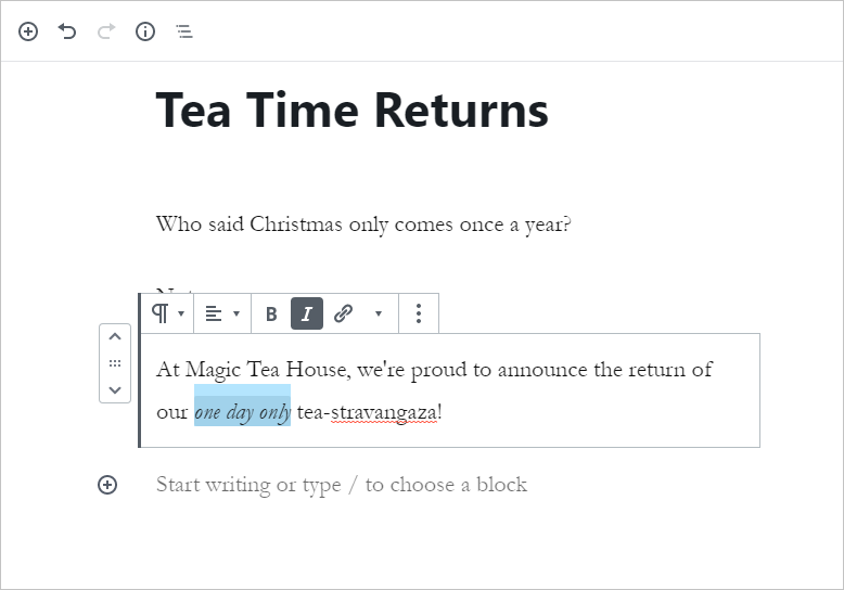
Figure 6-1. The first button in the toolbar indicates that this is a paragraph. (It also lets you change the paragraph into something else—an operation you’ll consider later in this chapter.) The next command is a rarely used text alignment button, followed by the familiar bold and italic commands, and finally another button for adding a link.
To change the formatting of your text with the toolbar, begin by selecting your text. (Mouse lovers can click and drag to make a selection. Keyboarders can hold down Shift while using the arrow keys.) Then, click the corresponding formatting button in the toolbar.
The bold and italic buttons are easy to spot. But there are also a few less common choices tucked away behind the down-pointing triangle icon. For example, you can choose Strikethrough to get crossed-out text like this, or Inline Code to get a typewriter-like font that’s useful for writing code commands like timeWasted=timeWasted+1;
The toolbar’s text alignment setting is less useful. It lets you switch between text that’s lined up on the left margin, centered, or lined up against the right margin. There’s no option for full justification, which fits each line to the full margin space (like what you see in this book). You might use the alignment button to tweak a subheading, but usually you’ll stick with the standards enforced by your theme.
Adding Links
The Web wouldn’t amount to much without links, those blue underlined bits of text that let you jump from one web page to another. You can easily add links to a post. For example, imagine you have this sentence:
This story was reported in The New York Times.
To turn “The New York Times” into a link, first select the text. Then, click the Link button in the toolbar (or just use the handy Ctrl+K keyboard shortcut). A text box pops up, asking you to fill in the full web address, starting with http:// (Figure 6-2).
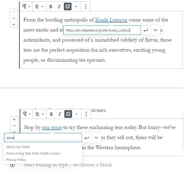
Figure 6-2. There are two ways to add a link. If it’s on another site, you must type in the full website address (top). But if it’s on your current WordPress site, you should search for it by typing in part of its title, instead (bottom)
Often you’ll want to make a link to one of the posts or pages you’ve made on your site. This is a special case where you don’t need to type in the full link. Instead, you can quickly search for the post you need by typing in part of its title.
The only other detail you can change is the “Open in New Tab” setting. Switching this to “on” means the person clicking your link won’t leave your site—instead, their browser will open a new tab with the linked page. That sounds convenient, but it’s actually a less common design choice, because it can irritate people and cause problems with ad blockers.
Note
If you want to link to a file—for example, a document that your guest can download or a picture they can view—you need to store that file in WordPress’s media library first, and then create a link. You’ll get the full details on page xx.
To change a link, click on it in the post editor (at which point the linked address appears), and then click the tiny pencil icon next to the address. To remove a link and return your text to normal, click anywhere inside the link text and then click the toolbar’s Link button.
Dropcaps, Size, and Background Color
WordPress has a few more formatting frills tucked away into its sidebar. To see these, start by making sure that the sidebar is visible on the right side of the post editor. (If you don’t see a sidebar, click the gear icon in the top-right corner of the post editor to make it appear.) Then, click on the paragraph you want to format. If you keep your eyes on the sidebar, you’ll see a few miscellaneous settings appear in the Block tab (Figure 6-3).
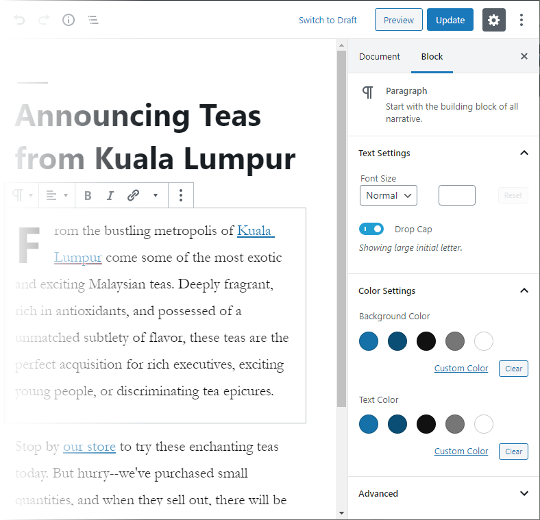
Figure 6-3. These settings apply to any paragraph. They’re carefully limited by the design decisions of the current theme, but still useful. Here, there are three sections of settings: Text settings, Color settings, and Advanced (for using custom styles, a feature described in Chapter 13).
As you’ll see a little later in this chapter, WordPress supports different types of text-based design elements, called blocks. The sidebar allows you to format the current block, whatever it is. So far, you’ve only worked with paragraph blocks, which give you a small number of settings to emphasize text:
Change text size. You can increase or decrease the size of all the text in your paragraph by picking an option in the Font Size box. The idea is to use this feature sparingly to distinguish certain design elements. For example, you might decide to start each post with a single large-text paragraph. You should never use this technique to change all your paragraphs. If you want everything to be a bit larger or smaller, you’re better off editing your theme to ensure consistency (and to avoid the hassle of endless formatting). You’ll learn about theme editing in Chapter 13.
Change the background color. Different themes give you different colors, which you pick by clicking the colored circle you like. For example, Twenty Nineteen provides dark blue and dark gray backgrounds, while Twenty Twenty includes a customizable dark red. These colors are chosen to mesh with the style of the overall theme, and WordPress switches your text from black to white based on the background you use, so your text remains visible. Once again, the goal is to highlight specific, occasional design elements. For example, you could add a summary paragraph at the bottom of every post with a red background.
Add a drop cap. That’s the stylized jumbo-sized letter that starts a paragraph, and is usually reserved for the first paragraph of your post. To add a drop cap to the beginning of a paragraph, just turn on the Drop Cap setting. But be aware, you won’t see the drop cap while you’re editing the paragraph. Instead, click on a different paragraph to see the result of your change, or just publish the post.
Understanding Blocks
To unlock all the full capabilities of the WordPress post editor, you need to learn a new concept: blocks, the rich, customizable, and rearrangeable building blocks of every post.
So far, you’ve concentrated on typing your content into paragraphs. But in the eyes of WordPress, paragraphs are just one type of block. In fact, WordPress has several dozen different block types. You can add a new block using the Add Block button, which looks like a small plus sign. It appears in the margin area at the end of your post (Figure 6-4).
Figure 6-4. The Add Block button (a plus sign in a circle) appears when you hover over a blank paragraph (an empty line of text) and next to blank space at the end of your post. Click it to insert a new block.
To take a quick peek at all the blocks WordPress provides, click Add Block. You’ll pop open the long, subdivided list shown in Figure 6-5.
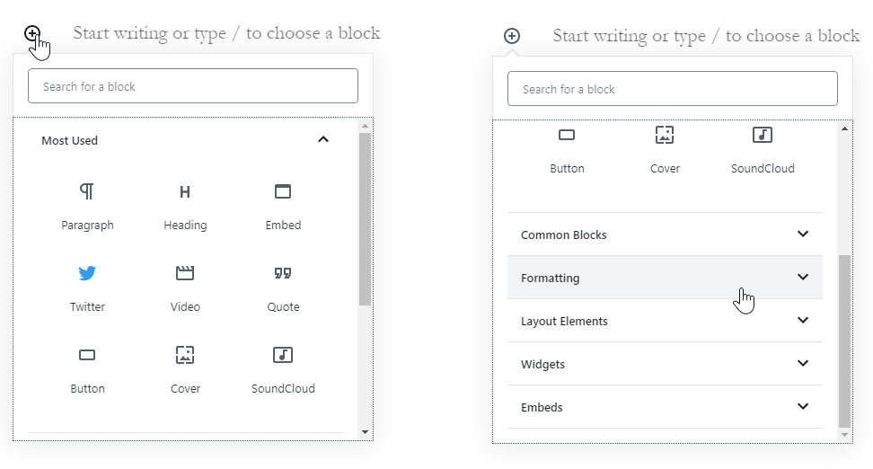
Figure 6-5. WordPress has a massive list with dozens of blocks that it supports. At the top are a few of the most common choices (left). Scroll down and you’ll see several more groups, each of which is stocked with many more block choices (right). To open a group and see the blocks inside, click it.
Tip
If you know the name of the block you want to use, but you don’t know exactly where it is, just type its name into the search box at the top of the list.
So what does WordPress offer in its overflowing selection of blocks? Table 6-1 gives you a quick preview of each group.
| BLOCK GROUP | WHAT IT’S FOR |
| Most Used | WordPress keeps track of the blocks you use the most, and adds them to this list for easy access. |
| Common Blocks | Includes some of the most popular and useful blocks, like paragraphs, headings, quotes, and lists, all of which you’ll see in this chapter. It also includes pictures and audio, which you’ll get to in Chapter 7. |
| Formatting | Includes some specialized formatting blocks, like big, eye-catching pull quotes, code listings, and tables. You’ll learn about all of these blocks later in this chapter. |
| Layout Elements | Includes blocks that let you split posts up with visual breaks and paginate them, which you’ll learn about in this chapter. This group also includes the blocks you use for columns (covered in the Chapter 7) and—weirdly—buttons (page XX). |
| Widgets | Includes blocks that let you take any widget and put it in a post. Widgets were covered in Chapter 5. |
| Embeds | Includes blocks that lets you put in rich content from another site, like a YouTube video, Twitter tweet, Spotify playlist, and so on. You’ll learn about embeds in Chapter 7. |
| Reusable | You can add your own personalized blocks to this section so you can reuse them whenever you need. You’ll learn how to do that on page XX. |
Using the Essential Blocks
The best way to get familiar with WordPress’s sprawling catalog of blocks is to try using some of them. The following sections will lead you through the most popular types, and by the end of this book you’ll have seen them all.
Subheadings
Every blog post starts with a heading—the title of your post—which sits above the post content. But if you’re writing a long post, it’s a good idea to subdivide your writing into smaller units using subheadings.
To create a subheading, click Add Block to show the list of blocks, and pick Heading. (It’s stashed in the Common Blocks group, but usually appears in the Most Used group at the top.) Then type away.
Technically, when you add a heading, WordPress uses a level-2 heading (known to HTML nerds as an <h2>). This makes sense, because the title of your post is a level-1 heading (or <h1>). It’s important to use the right headings to structure your posts. Otherwise, you may confuse search engines and cause formatting problems if you switch to another theme.
However, sometimes you want to further subdivide your posts. For example, you might start a new section with a level-2 heading (“Visiting France”), and then decide to make level-3 subheadings inside (“Paris” and “Nice”). And then, if you’re feeling particularly crazy, you might decide to subdivide a level-3 section with level-4 subheadings. Before you know it, you’ll have an epically long post filled with fine-grained subdivisions.
To change the heading level, you can use the toolbar or Level setting in the sidebar. Either way, look for the level (H2) and change it to something else (Figure 6-6).
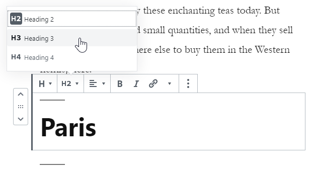
Figure 6-6. Every heading begins as a level-2 heading. If you use the sidebar, you can go right down to a tiny level-6 heading (not recommended; it looks weird).
Usually, level-2 headings are enough. If they aren’t, level-3 headings are good. But it rarely makes sense to go any deeper, because the formatting may become inconsistent (for example, becoming smaller than your text) and readers probably won’t be able to distinguish the different levels of headings anyway.
Much as you can format text (just a bit), you can also tweak your headings (just a bit). The size, typeface, and exact appearance of a heading depend on your theme. But sometimes you might want to emphasize a specific heading, or distinguish one type of heading from another. To see what you can do, check out the formatting options in the sidebar. Most themes allow you to change the color of the heading text, but your choices may be limited to theme-approved shades like Twenty Twenty’s dark crimson accent color. Some themes also allow you to change the background color of the heading. For most themes (and all of the WordPress year themes), that’s all you get.
Separators and Spacers
Subheadings aren’t the only way to split up a post. You can also break up posts with lines, a series of dots, or just some extra space in the right place. All of these divisions help to space out long content without dicing it up into separate sections (Figure 6-7).
Figure 6-7. Here’s a formatted post that benefits from two different spacers.
To get a graphical divider, you use the Separator block. Click the Add Block button, open the Layout Elements section, and click Separator.
The exact appearance of your separator depends on the theme. (Twenty Twenty, for instance, uses a stylized line with a break in the middle.) Usually, you’ll be able to choose between a narrow line, an extra wide line, and a sequence of three dots. You make your pick from the Styles section in the sidebar. You may also be able to alter the color of the separator in the Color Settings section.
WordPress also includes a Spacer block, which appears in the same Layout Elements section. However, spacers are only able to add extra space. Once you’ve added the spacer, you can drag its bottom edge down (to make it bigger) or up (to make it thinner). The most common reason to use a spacer is to add a bit of breathing room in a dense post with lots of pictures or other types of rich media content. For example, if you have a post with videos (which you’ll learn to add in the next chapter), you might not want your heading to show up right underneath the video. By using the spacer, you can fill in exactly the gap that you want without resorting to blank paragraphs.
Lists
Another handy block is the list, which lets you make a bulleted list (for example, to list recipe ingredients) and a numbered list (say, for recipe steps). Using lists is easy: click the Add Block button and choose List, either from the Most Used section or the Common Blocks setting.
You always start with a bulleted list, but you can switch to a numbered list using the toolbar buttons (Figure 6-8).
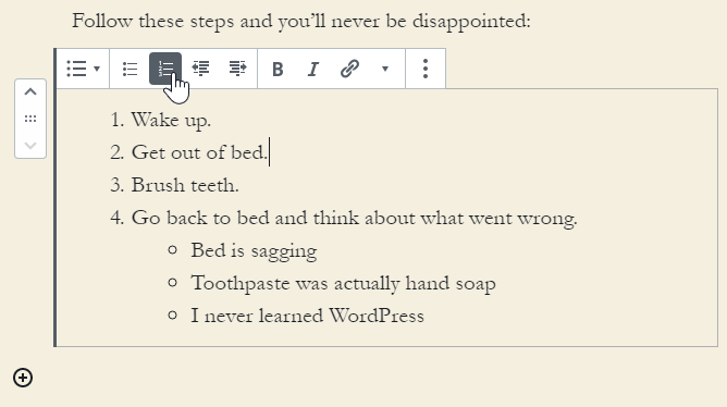
Figure 6-8. A single click switches this bulleted list to a numbered list.
You can also use the toolbar to create a sublist—a list inside another list. You can see an example with the bulleted list under step 4 in Figure 6-8. To create a sublist, add a new item to the list, then click the indent button in the toolbar. If you click the indent button while you’re on the first list item, it has no effect. But if you add a second item and then click indent, you’ll start a new indented list underneath the first item.
If you like weird and exotic formatting, you can add another entry and indent it to make a sub-sublist. In fact, there’s no limit to how many levels deep you can indent, although ordinary people stop at the first indent.
However, you can’t change the visual styling of your lists. If you’re creating a numbered list, you can use the Ordered List Settings section of the sidebar to start on a different number (3, 4, 5, 6) or reverse the order (4, 3, 2, 1). But that almost never makes sense.
Fancy Quotes
The first thing you need to know about quotes is that there are actually two quote blocks: Quote and Pullquote. A Quote block is the simpler of the two. It simply separates a small section of text where, presumably, you’re quoting someone else’s words. Quotes are often italicized, indented, and enlarged to distinguish them from the surrounding text, but their exact appearance is determined by the theme you’re using (Figure 6-9).
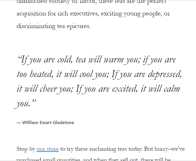
Figure 6-9. Here’s a quote in between two paragraphs. The Quote block has two details. First is the quote text, which is often italicized. Under that is an optional citation line, which you can use to identify the source of the quote.
To create a quote, click Add Block, and choose Quote. You’ll see it in the Most Used section at the top, but it also appears in the Common Blocks group.
Every quote has two parts. First you type in the quote itself (that’s the italicized text in Figure 6-9). Then, you can enter citation information underneath, if you wish. If you don’t enter a citation line, WordPress just skips that part in the final, published post.
Tip
To move from the quote text to the citation line (and to move from the citation line to the next block), you can use the arrow keys or click with the mouse. Hitting Enter won’t take you there—it just adds extra blank lines.
Most themes support two quote styles: default and large. You can choose the one you want from the sidebar, in the Styles section. In the case of the Twenty Nineteen theme, for example, the large style uses the italics shown in Figure 6-9, while the default style uses ordinary text, slightly indented and with a red line in the margin. In Twenty Twenty, the large style uses large bold text.
Now that you’re comfortable with quotes, let’s take a look at their fancier sibling, pull quotes. The name pull quote comes from the fact that the quote is pulled out of your layout and blown up, so it can command attention (Figure 6-10). Unlike quotes, pull quotes usually aren’t quotations from other people. Instead, a pull quote repeats something that’s written in the post itself—something you want to emphasize in jumbo letters. Essentially, you’re quoting yourself.
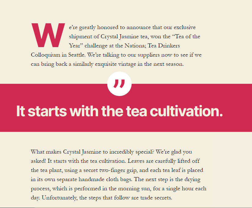
Figure 6-10. Here’s a pull quote in the Twenty Twenty theme, using the Solid Color style with a red accent background. The quotation mark icon is a style detail that’s baked into Twenty Twenty.
To create a pull quote, click Add Block, and choose Quote. You’ll see it in the Most Used section at the top, but it also appears in the Formatting group.
Modern themes give you some powerful formatting options for pull quotes. In the sidebar, you can use the Styles section to switch your pull quote to white text on a colored background. You can change the color of the background or text in the Color Settings section underneath. Remember, if you don’t see these choices, it’s simply because your theme doesn’t support them. (That’s not a problem with any of the WordPress year themes.)
Some themes let your pull quote burst out of the usual layout. The secret is changing the alignment setting, which appears in the toolbar while you edit your pull quote. (You might expect to see it in the sidebar too, but for some reason it doesn’t appear there.) Figure 6-10 shows a “full alignment” pull quote in Twenty Twenty. You can also use left alignment or right alignment to float your quote to one side of your text. Figure 6-11 shows the setting you need, and Figure 6-12 shows its effect.
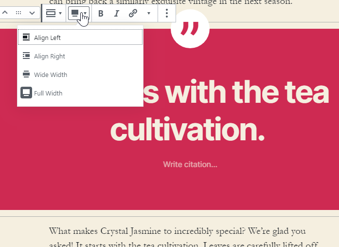
Figure 6-11. Use the alignment setting to make a pull quote float to the side or expand into the margins, depending on how the theme uses this setting.
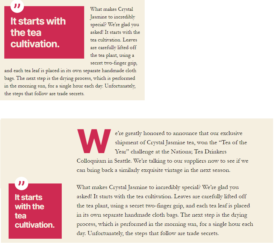
Figure 6-12. The Twenty Twenty theme has some the fanciest pull quote formatting features to date. If you give your quote left alignment, it may display normally (on narrow windows), on the left side with text wrapping around it (on medium-sized windows), or completely in the left margin (on wide windows).
More Exotic Blocks
WordPress also has some less-common blocks—ones you might use for certain types of content, or never need at all. Here are a few to try, if you’re interested:
Code. Code blocks are meant for listings of code in a computer programming language. Code blocks use a fixed-width font, so every letter is just as wide. Code blocks also keep your spaces, which makes it easier to indent lines. But code blocks don’t have any fancy features like colorization.
Verse. The verse block is meant for poetry. Like the code block, it keeps your spaces. In fact, the similarity doesn’t end there—the Verse block also uses a fixed-width typewriter-like font. In fact, on Twenty Twenty the Code, Verse, and Preformatted blocks all look the same.
Table. Tables are meant for displaying tabular data—for example, a list of countries and their populations, or a record of weight measurements in your thirty-day calorie challenge. When you create a table, you pick the number of columns, but you can’t control anything else about the formatting. Each column gets the same width.
Warning
You might think you could use tables to arrange blocks of content into columns, but don’t do that. WordPress has much more flexible layout blocks that you’ll learn about in Chapter 7.
Button. Think of a button as a fancy way to make a link. But instead of having the usual blue underline text, you have a colorful button (you pick the color) that, when clicked, heads off to the new page. If that’s what you want, just add the Button block. You can customize the button text the link address, same as you would with a linked bit of text (page XX).
You can figure out when you might need one of these specialized blocks. But WordPress also has a couple of blocks that plug into two often-overlooked WordPress features: the Page Break block and the More block. Both of them are interesting, occasionally useful, but a bit dated. You can read about them in the next two sections (or just skip ahead if they don’t suit your site).

Dividing a Post into Multiple Pages
WordPress has a little-used Page Break block that lets you split a single post into as many pages as you want. When someone reads the post, they can only see one page at a time. To go from one page to another, they need to click the navigation links to the bottom of the post. These navigation links look different depending on the theme, but Figure 6-14 gives you an idea of what you can expect.
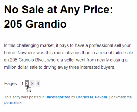
Figure 6-14. These page-navigation links let you split a long article into more manageable pieces. But use it sparingly—readers will resent being forced to click without a very good reason.
The page break feature seems pretty nifty at first glance, but most people ultimately decide not to use it. In the distant past, downloading a big page with lots of pictures took time, and even scrolling through a long post was slow. These days, people are accustomed to zooming down through lengthy pages with a quick flick of a finger. If you ask them to keep clicking, they’re likely to get bored and go somewhere else.
Managing Your Blocks
Now that you’ve settled in with the post editor and gotten familiar with its most useful blocks, it’s a good time to learn some tips and tricks to make working with them more efficient. In this section, you’ll see some shortcuts for adding and rearranging blocks, a way to peek at the HTML inside a block, and a handy trick for reusing a block in different posts.
Jumping From Block to Block
The post editor has an easily overlooked tool - the “block navigation” button - that lets you see an outline of all the blocks in your post. You can find this button in the toolbar at the top of the editor, and it looks like a small indented list (Figure 6-15). Click it and you’ll see an ordered list of all the blocks in your post.
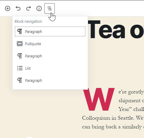
Figure 6-15. This post has five blocks: a paragraph, a pull quote, then another paragraph, and so on. You can jump straight to any one of these blocks by clicking it.
Note
Here’s a handy way to focus on one block at a time. Click the three dots in the top-right corner of the post editor to see a menu with additional settings, and choose Spotlight Mode. Now, the current block (the one you’re currently positioned on in the post editor) shows up normally, but the other blocks become lighter and slightly transparent. The goal is to make it easier for you to focus on the content you’re writing, without getting distracted by everything else. To turn off spotlight mode, pop open the settings menu and choose Spotlight Mode again.
Moving Blocks
If you want to shuffle things around in your post, you can use the standard cut and paste operations (select your text and use Ctrl+X to cut and Ctrl+V to paste). But if you want to move a complete block from one spot to another, there’s a faster way to work. To try it out, click on the block you want to move and look in the left margin. You’ll see a tiny strip with two arrows (Figure 6-16). You can click these arrows to move your block around.
Figure 6-16. If you click the up arrow, the entire block shifts up, jumping above the previous block. Click the down arrow, and the block jumps one step down. And if you want to move the block a greater distance, click on the grip dots in between the two arrows and drag the block wherever you want it.
See the HTML for a Block
So far you’ve used WordPress’s visual designer. That means when you edit your blocks they look more or less the same way that they’ll when you publish the post. Apply a bit of italic or bold formatting, and that shows up in the editor. Add a link, and you see the familiar underlined blue text. And so on.
But if you’ve got any sort of web design background, you know that pages on the web are actually built out of HTML, a markup language that uses code in pointing brackets to control spacing and formatting. For example, to show a bold word like Fire! you need to use the HTML markup <b>Fire!</b>. The opening <b> tag turns on the bold formatting, and the ending </b> tag turns it off.
WordPress lets you see the HTML that it’s generating for each block. If you’re savvy in the ways of the web, you can even decide to edit that markup directly instead of using the visual designer. There are a few reasons you might choose to take this step. Maybe you’ve got an HTML special character to type in (like © for the copyright symbol ©). Maybe you’re pasting in a block of HTML content from another web page. Or maybe you need to alter a hidden detail in a picture you’ve added or some special content you’ve embedded.
Here’s how to switch to HTML view:
-
Click on your block in the post editor.
-
In the toolbar above the block, click the three dots (that’s the More Options button on the far right side).
-
Choose Edit as Html
When you switch a block into HTML mode it stays that way, even if you click over to another block (Figure 6-17). You can return a block to its normal appearance by clicking the More Options button again and choosing Edit Visually.
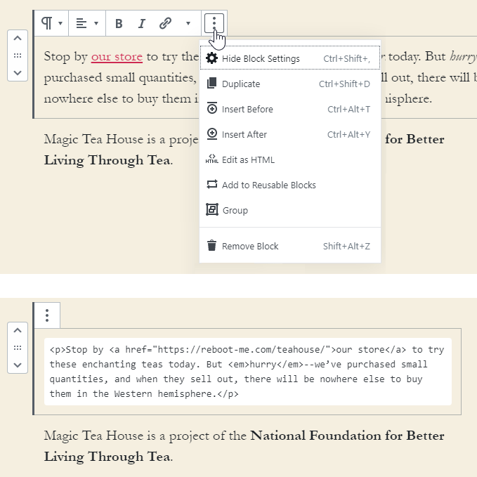
Figure 6-17. Here’s the same paragraph block shown visually (top) and as HTML markup (bottom). Even when you change the way you look at one block, the other blocks (like the paragraph underneath, in this example) stay the same.
Tip
There’s another way to get HTML content in your post. You can add the Custom HTML block, which is a part of the Formatting group. The Custom HTML block starts out showing a text box with markup, just like the “Edit as HTML” option shown in Figure 6-15. Two buttons appear in the toolbar: HTML and Preview, and you can jump back and forth between the HTML markup and the formatted text by clicking the corresponding button.
The HTML edit mode isn’t built for serious editing work, though. There’s none of the features you’d have in a dedicated HTML editor (like, say, Brackets or Visual Studio Code). If you need to make anything more than small changes, you’ll probably want to write your HTML first in an HTML editor, and then copy-and-paste it over. But be warned, you need to know exactly what you’re doing or you run the risk of introducing wonky formatting or making it more difficult to change themes.
Most people won’t use the HTML editing feature often—or even at all. But if you need it, WordPress has you covered.
Personalized Blocks
Here’s a neat trick. Let’s say you make the perfect block in one post, and you need to have the same thing in another. For example, maybe you have a little “about me” blurb that you want to use all over the place. Or maybe you have a call to action—a blurb that asks the reader to follow your social media accounts or sign up for a newsletter, and you want to slap that important information at the bottom of all your posts.
You could do this by editing your first post, copying what you want (Ctrl+C), then editing the second post and pasting the copied stuff (Ctrl+V). But there’s an easier option that lets you identify a favorite block and use it again and again, whenever you need it. The trick is making a reusable block.
Making a Reusable Block
Here’s how to create your own reusable block:
-
Type in all your content and format it however you want.
-
When your block is ready to be shared with other posts, click the More Options button (the three dots at the right side of the block toolbar) and choose Add to Reusable Blocks.
-
Type in a descriptive name for your block (Figure 6-18). This is how it will appear in the list of blocks.
-
Click Save.
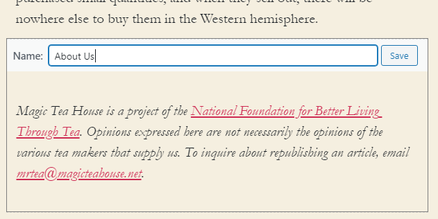
Figure 6-18. Here we’re about to save a paragraph of text about the Magic Tea House as a reusable block named About Us.
Once you’ve created a reusable block, you can add it the same way you add any other block. Click the Add Block button, scroll down to the Reusable Blocks section at the bottom, and then give your block a click. You’ll get a perfect copy.
Note
Reusable blocks copy everything—that includes your formatting and your text. You might think it would be nice to make a custom formatted block for a design element you want to reuse (like a pull quote with a specific color scheme). But custom blocks won’t work for this idea, because they’ll turn each quote into the same text.
Editing a Reusable Block
It’s important to understand that there is only a single copy of every reusable block. In other words, if you use a reusable block on all your posts, all those posts will have the exact same content. If you edit a reusable block, every single copy of that block is updated, in every post that uses it. (There’s no need to edit or republish each post.)
So how do you edit a reusable block? The most obvious option appears when you click a reusable block (or any one of its copies). You’ll see the block’s name appear at the top (as in Figure 6-18), with an Edit button. To change your block, click Edit, tweak away, and then click Save. Remember, this changes every copy of the reusable block.
Tip
There’s another way to edit all of your reusable blocks. Click the Add Block button, scroll down to the Reusable Blocks section, and click Manage All Reusable Blocks. You’ll be taken to a Blocks page that lists all your blocks, in much the same way that the Posts page lists all the posts you’ve written. You can then review what you’ve made and make your changes.
If you decide you don’t want a reusable block any longer, click the More Options button and choose Remove from Reusable Blocks. But don’t take this step lightly, because the block will disappear from every page that uses it.
Even More Advanced Reusable Blocks
A reusable block is a single block. But what if you want to create something a bit more elaborate, like a reusable block that includes a heading and a list, or a reusable block that consists of three full paragraphs?
The trick is to use the Group block, which is simply a container for holding more blocks. You make your Group block into a reusable block, and then you can put whatever you want inside, whether it’s one block or a dozen.
Here’s the exact sequence of steps
-
Click the Add Block button, choose the Layout Elements section, and click Group.
-
The Group block starts out as an empty container—it’s just an invisible box. To put something there, click the Add Block button (the plus sign that shows up inside the group box).
-
Pick the first block you want. Enter all the content and apply all the formatting you want.
-
When you’re finished, press the Enter key to add a new block underneath the first one. (Or, hover over the bottom edge of the box until a plus sign appears, and click that.)
-
Repeat this process until you’ve filled your group with all the blocks you want.
-
When you’re finished, click on the faint border around the entire group box (not the blocks inside).
-
Now you can turn that group into a reusable block in the usual way. Click the More Options dots in the toolbar, choose Add to Reusable Blocks, and give your masterpiece a name.
The Last Word
In this chapter we looked at the key WordPress concept: blocks. When you are more comfortable with blocks, you don’t need to treat your posts like a wall of text. Instead, you can assemble them out of ready-made ingredients, like headings, lists, separators, and more.
There are many advantages to this design. For one thing, you can build your own reusable blocks with important bits of content and reuse those design elements wherever you need (as you saw at the end of this chapter). But perhaps the most important part of this design is that you get to treat every section of content as something separate. If you want to drag a bit of content somewhere else, adjust its formatting, or peek inside at the HTML that makes it, you can do that, without affecting the rest of your post. Everything’s modular, like Ikea furniture.
In the next chapter, you’ll build on this model by learning how to work with a special type of blocks: those that hold rich content like pictures, videos, and stuff embedded from other sites.