A day in drawing class is like the Big Bang backward: we move toward center. The model is a distant, frustratingly capricious speck at first. Students form a wide, tightening loop of easel legs and hands and eyes. The shoulder of one bumps the drawing board of another with the occasional clatter and dropped chalk. We become something akin to the multicolored rings of planets or belts of spiraling stones. As we get closer to the model, her movements slow until she is finally, monumentally still.
A seated figure, the model is no longer a body seen in the round. She is the press of an arm against a chair’s curve, the weight of a thigh upon folds of cloth. Though she sits motionless, she—as all celestial centers—has a latent movement that we discover as we draw. She extends impossibly off the page, needing to be drawn larger than we initially imagine. The class, we realize, is not cosmically inverted after all. We scatter at the end of the day, leaving our circle of easels in the empty room. — AMBER CHAPIN
From Rietveld to Le Corbusier to Eames to Gehry to Hejduk, noted modern architects have famously designed chairs. In the cases of Gaudí, Macintosh, and Wright, it is inconceivable to imagine their architecture furnished by another’s designs. From throne rooms to lecture halls to parlors to barber shops, chairs have assumed a variety of forms. In a broad array of cultures and eras, chairs have reflected the aesthetic aims of the architecture that houses them.
The body, in a standing posture, distributes its weight through the lower limbs to the ground plane. In a recumbent position, weight is distributed downward through those portions of the body that touch the plane upon which it reclines. The chair is a human mediation between the standing and the supine figure. Depending on the structure of the chair and the posture of its occupant, weight is distributed in various and complex ways. It is common that many architectural careers at some point encompass furniture and chair design. For the student of architecture the chair and its occupant possess a special significance as subject matter for drawing.
To take a load off your feet—as the phrase goes—and place that load on the plane of a chair’s seat redistributes the weight of the mass of the torso, head, and arms to the chair’s structure. The seated figure then becomes a six legged, two- or four-armed creature. (Of course, different arithmetic applies to the three-legged stool and the pedestal chair.)
Thought of in this light, the newly conceived chair/person must be drawn all together—at least in the initial stages of the work. The common beginners’ strategies—drawing the person and then adding lines for the chair—or a more sophisticated approach—drawing the chair first and then inscribing the body within its framing—each are ill-fated tactics. In either case the figure and chair are destined for malproportion and a lack of the illusion of gravity. When drawing the figure seated in a chair, bear in mind that each takes the measure of the other. Drawing the two together at once implies understanding them as an interdependent system.
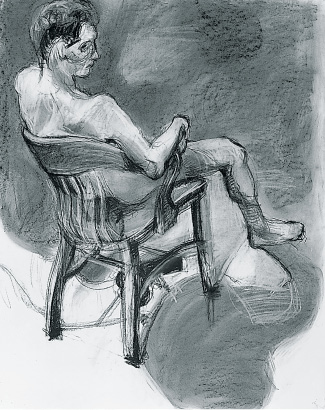
FIGURE 1
EXERCISES
Begin sessions with rapid drawings of the figure in a chair. (Chairs that are fairly open— with fretted backs or other see-through attributes—are best for the beginning of this exercise.) Move the model and chair in a snaking path along the studio floor at ten- to fifteen-minute intervals. Change the pose incrementally—the model might raise or lower the head, move a hand from chair arm to knee, slide a foot further out along the floor. Request that the model make only one change per posture, not several. Overlap poses on the same sheet to chart the figure/chair’s progress along the floor. Vine charcoal. 24" x 36" newsprint or large sheets of brown kraft paper. 30 minutes to 1 hour.
Long studies of 2 to 2½ hour duration follow.
Over a few subsequent weeks, attempt the following variations:
Close-up View/High Vantage Point. Make a tight ring around the model, as close as the number of students and expanse of the easel bases will permit. (If two models are engaged, the class may be divided in half so that the two circles can draw closer to the model.) The resulting high, close vantage point gives fresh insight to point of view. For instance, a hip may appear to emerge beneath a shoulder, an ear lobe might punctuate the shape of a thigh. The drawing eye is in for surprises, thus the drawing that results will provide a refreshing spatial variation on the standard view of the seated pose. (A low vantage point—the student seated close to the model on the floor—is another variation on this theme.)
Collaboration. Since an assessment of relationships between figure, chair, and negative space is crucial in effecting a solid-looking work, it is useful to build in a critique of how well the eye is measuring. After the initial 15 or 20 minutes of working from the pose, move to the easel on your right and continue to draw, now on your neighbor’s drawing, reassessing the drawing’s measurements. Check on the negative space and overall relationships—chair legs to human legs, arms, etc. Continue this remeasuring/redrawing for approximately 15 minutes. Then return to your own drawing and remeasure the previous person’s critique of it. At first this may prove to be a frustrating exercise. (You feel reluctant to mark up your colleague’s drawing, and your own drawing has just been attacked.) However, great gains are often made from this exercise, both in learning to remeasure and alter initial efforts and in increasing assertiveness. Once the drawing has been “corrected,” its author is forced to make bolder marks to inscribe new intentions.
Double Figures (and Chairs) Placed in Close Proximity. This creates a tangle of chair and human legs. Negative space plays a key role in sorting out legs, rungs, and chair locations as well as in assessing the two-headed, multilimbed creature before you. It should be stressed that drawing everything all together is of critical importance.
Note: Any of the above studio assignments may be combined with one another—Collaboration with High Vantage Point or these two with Double Figure—or all three together.
Long studies of 2 to 2½ hour duration follow. Any mutable drawing medium may be used: vine charcoal, soft charcoal pencil, pastel, conté crayon. Attempt oil bar if the initial marks are light; follow with bolder assertive marks as the drawing progresses.
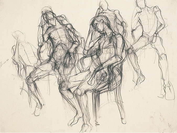
FIGURE 2
Several quick figure/chair studies are distributed across the page. The model’s pose remains constant, but for each pose interval the chair is repositioned incrementally. In the top right study the chair is only slightly noted, and the figure almost appears to levitate. In the central studies, the deeper investigation of the figure/chair increases the illusion of gravity. Note also the weight of the model’s head leaning against his supporting arm and the slump of his torso into the contours of the chair. The chair legs are as fully reported as the human legs, acknowledging their structural necessity.
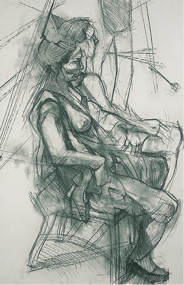
FIGURE 3
The drawing reveals evidence of remeasurement in the markings along the model’s back and at her foreground knee. These markings, together with reworked dark areas (sometimes not coinciding with the figure/chair’s contours), lend a boldness and vibration to the work. The student stood close to the model, and the high vantage point serves to pivot the two heads outward in front of the picture plane. The pivot point of the combined figures is at the toe of the foreground shoe. A web of lines in the background locates the legs of easels and a drawing pad, tilting the perspective of the floor plane forward.
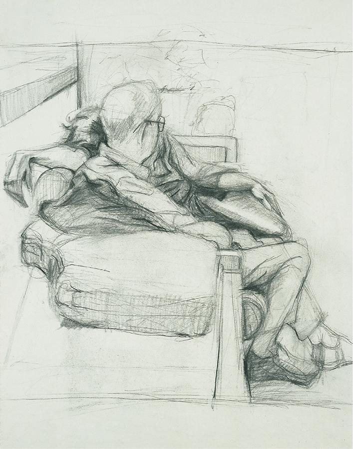
FIGURE 4
Two figures nest in close proximity in the center portion of the page. Furnishings and architectural notations contain the figures in physically and psychologically differentiated postures. The left foreground table top, supporting a cushion taken from a sofa, counters their central location. While not a structural device in reality, the cushion’s cut-out curve and the shadow cast upon it echo and support the woman’s hand, suspended loosely at the wrist from her outthrust arm. The man’s darkened horizontal shoe supports and emphasizes his more upright posture.
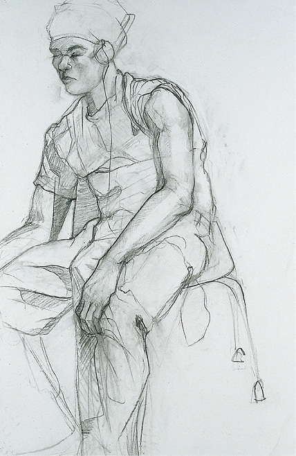
FIGURE 5
The chair’s understated wire legs contrast with the sitter’s weighted posture, creating an intriguing tension. A vertical seam, starting at the bottom right edge of the model’s left trouser leg jumps to the vertical edge of the chair back and is picked up again as a fabric fold just under the chin. This vertical cut counters the figure/chair’s tilted thrust toward the left edge of the page. Given the inward focus of the model—eyes closed, intent on his own music—the off-kilter posture is psychologically accurate.
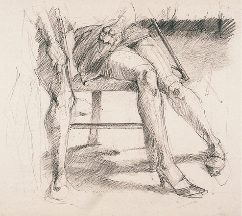
FIGURE 6
The drawing is a witty riff on legs and framing. The top edge of the frame cuts off the two figures at about elbow height. All that appears of the standing figure at left is one leg and a portion of arm and hand. That leg obscures and substitutes for a chair leg. Similarly, the right leg of the seated woman conceals a second chair leg. What is created is a four-legged creature, three of whose legs are human. Dark horizontal bands echo the composition’s framing; the distant baseboard links up with the miniskirt across the model’s lap, repeated again by vertical strips that represent the chair seat and rung. At the base the dark shadow shape mirrors the triangle created by the woman’s legs, also echoed by the smaller triangle her high-heeled shoe creates meeting the floor.