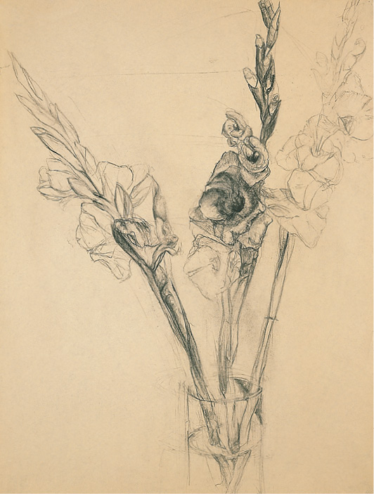
FIGURE 1
FLOWERS, PLANTS, AND MONDRIAN
If a single artist’s work and philosophy could be cited as essential to the geometric aesthetic of twentieth-century Modernism, that artist would surely be Piet Mondrian (1872–1944), best known for his spare rectilinear compositions. Less known is that during the same period Alberto Giacometti employed the plane to reinvent the human form, Mondrian drew and painted—usually a blossom at a time—a folio of flowers that were a bouquet to observation. “I never painted... romantically, but from the very beginning I was always a realist,” he wrote.1
A significant influence in Mondrian’s early work was his Dutch countryman Vincent van Gogh (1853–1890). In van Gogh’s flowers there is a fevered—yet structured—exuberance. Mondrian’s flowers become increasingly ephemeral, yet structure persists. In the flowers of each of these artists a curved line is rarely encountered: sunflowers, irises, curly-headed dahlias, all are treated with the planed geometric slice. It is in Mondrian’s fascination with dying flowers—his drawings of the angularity of their shriveling petals—that his use of the plane is most evident. For the student beginning to project structural language onto the delicacy of flowers, the preceding weeks’ studies from Giacometti’s cubed forms provide an invaluable guide to the parallel geometric inclinations in the flowers of Mondrian and his antecedent, van Gogh.
Note: In introducing the flower sequence, slides and reproductions of these three artists are shown.
ASSIGNMENTS
WEEK I (HOMAGE TO GIACOMETTI)
Obtain three stems of flowers with blossoms whose structural reading is evident—lilies, gladioli, tulips, daisies, dahlias are all good for this purpose. Consider the gesture of each stem and the gesture the stems make as a group. Draw the gestalt of stems and blossoms rapidly, not focusing on any single flower. Consider placement on the page so that the entire page is activated—though it need not be filled. Keep in mind that dead center is a conventional, although not necessarily the most compelling, choice. Vine charcoal or any easy-to-erase medium. 24" x 36" newsprint. Four drawings, each 15 minutes.
Giacometti Collaboration and Negative-space Study. Select the most compelling design from the initial exercise. In placing the underlying web of light marks that begins the page, give negative spaces the same attention you employ to draw the stems and blossoms. These negative shapes will lend variety and rhythm to the two-dimensional pattern created on the paper and will significantly aid in the measurement of each flower’s spatial relation to the others. In analyzing the bends and turns of petals, leaves, and stems, employ planar slices. Charcoal pencil, carbon pencil, or HB-4B pencil. 24" x 36" white paper. 1 hour.
Freestyle drawing. Synthesize the drawing issues stated in the two problems given above. Also address the issue of focus by selecting an individual blossom area or passageway to elaborate with greater detail. Any medium. Any paper. 1 hour.
WEEK II (THE DYING BLOSSOM: HOMAGE TO MONDRIAN)
Begin as above with fresh flowers. Then record how the flowers wither over the span of a week. Draw every two days: notice the change in the stem and its posture as well as the decay of the blossoms. Pay attention to the manner in which negative space varies—between petals, between leaves. To promote drying remove water from the container or remove the flowers from the water. A minimum of three drawings. Any medium on any paper. 45 minutes to 1 hour (or longer).
Note: At times potted plants may also serve as subject matter for these assignments.
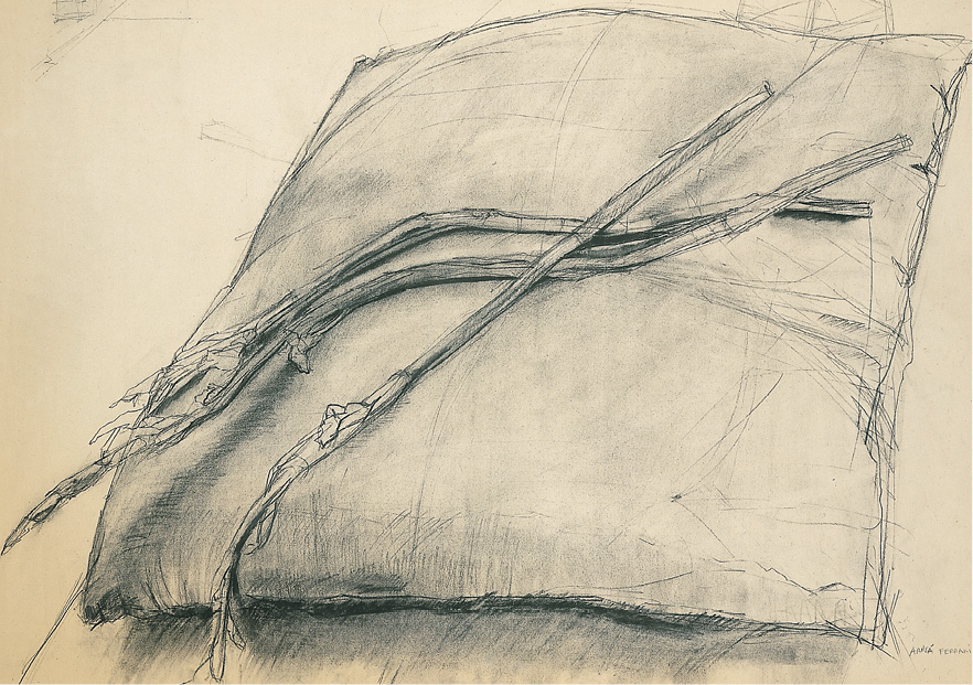
FIGURE 2
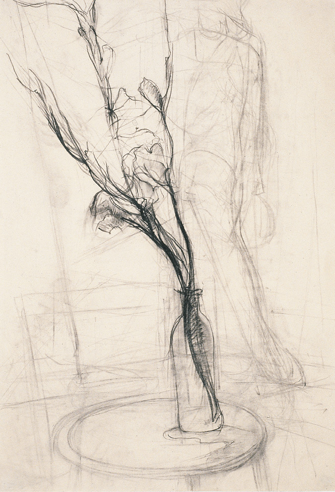
FIGURE 3
A fluid rapid study of the shared gesture of three gladioli stems is set in the foreground. Their gesture is echoed and answered by the lightly sketched figure in the background. The water jar’s left edge creates a central seam, picked up again above by the right stem’s top line. The gladioli’s shared leftward inclination is anchored back onto the page by the figure at the right.
Figures 4 and 5 each employ planar analyses in individual fashion.
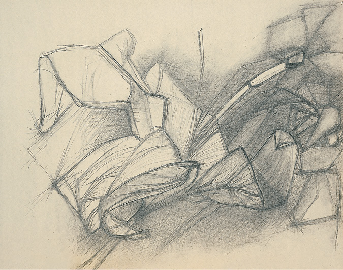
FIGURE 4
The negative space is emphasized by tonal hatching, which occasionally enters the space of the petals and thereby attaches the petals to the ground of the paper plane. This tonal area is fairly rectilinear in shape and serves to halt the strong diagonal thrust that the lilies make toward the right upper corner.
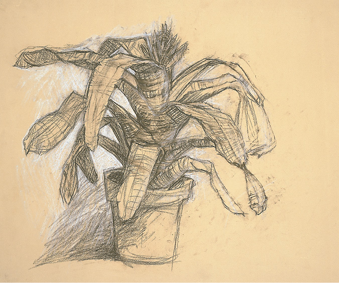
FIGURE 5
Gridlike lines mark the spatial twists and turns of the plant’s sturdy leaves, revealing an unexpected angularity at their points of bending. White chalk hatching at the left of the plant heightens the negative space. The same white highlights planes on the leaves to the right, linking the three-dimensional volume of the plant to the background flatness of the page. The shape of the white background enforces the suggestion of a rectilinear block defined by the plant’s leaf ends and edges.
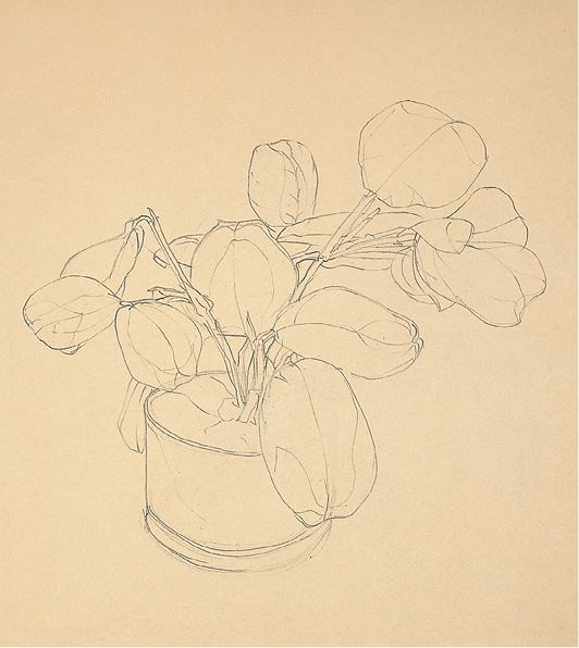
FIGURE 6
This is a quiet, elegant example of a negative-space/blind-contour drawing. Outer contours are more firmly defined while sparely used lighter lines trace the veining and bending of the leaves’ surfaces, lending them a convincing dimensionality. Small interstices between stems and leaves are carefully examined.
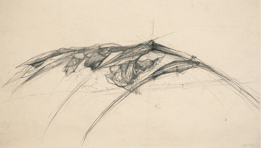
FIGURE 7
A drooping gladiolus stem bends leftward from its water container. The paper frames its long-necked arc, while the container is somewhere offstage to the right. The bend of the stem’s arc, articulated by dependent leaf spears, buds, and a wilting blossom, suggest a spine and ribcagelike grasp of the space at the bottom region of the page. Moving from the left tip of the stalk, tightly closed buds appear, then buds about to open, followed by the blossom to the right. The stalk’s downward droop, the page’s chief topic, speaks of decline. The drawing reads as a metaphor of the span from life to death.
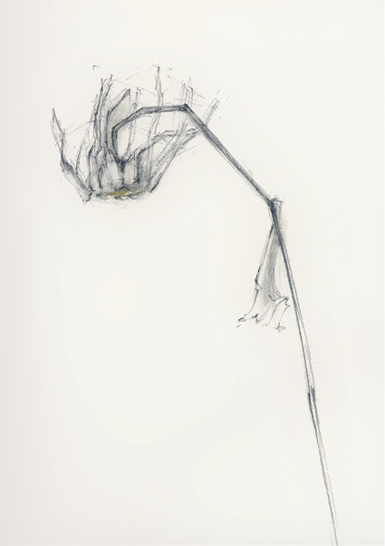
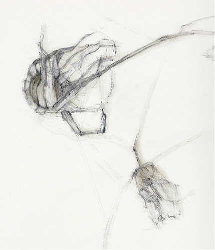
FIGURES 8 and 9
The drawings attentively record the shriveling and dying of a lone daisy (or two) with a subtly nuanced line. The student draws with an empathetic response to the bent, twisted, and arched gestures of the fragile stems and sere petals. The analytic use of planes and space is entirely in the service of the drawings’ whispered poetry.
