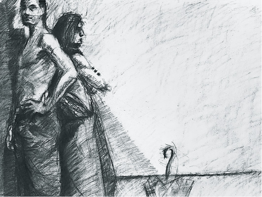
FIGURE 1
THE FIGURE IN THE STUDIO
It is the function of architecture to design structures that define spaces to enclose, protect, and celebrate the gamut of human activity. Just as the seated figure and chair set up a relationship of measurement, the body—seated, standing, and supine—responds to and measures the space defined by the structures it occupies. The soaring immensity of a cathedral’s inner space, the punitive narrow confines of a prison cell—these structures each consider the human body’s scale, movement, and needs. The body is the architect’s essential underlying module in conveying the implicit aesthetic and psychological intent of a structure. There is a reciprocity of measurement between body and building.
In weekly figure-drawing sessions, the models pose in a large studio cluttered with easels, stools, the odd chair, the detritus of other classes, and the scatter of clothing and supplies the students bring in with them. By the end of the first semester and certainly by the beginning of the second, the class has gained a measure of competence in drawing the human body, giving it gesture, volume, and stance and placing it on the page in a manner responsive to the shape made by the body’s posture.
On a parallel track, at about the time when the class engages in the Clutter and Frame, Window, Room assignments (see preceding pages and pp. 100–11), they also explore the body in relation to the space it occupies—the walls, corners, furnishings, mirrors—the density and openness of daily life. From the beginning of the course two models are booked for each studio session so that no drawing momentum is lost when one of the models rests. In the longer poses, the models are frequently positioned together so that students develop the practice of drawing both bodies all-but-simultaneously and of understanding the negative space between them as vital to the design of the page.
Placing the models together with fabric, furniture, props, screens, and with mirrors that reflect and multiply the visual density creates a situation for the student to sort out and translate into a drawing that makes visual sense. Within this density, space must be created.
Note: The lone figure, centered or placed strategically on the page, is a compelling image. In order to place this figure in an architectonic context, notate—at minimum—a single other shape that locates the figure in the space of the room. Lone figure studies as well as the exercises described below will be practiced over the course of both semesters.
EXERCISES
Place the model(s) in a dense situation with randomly placed objects and furniture and carelessly tossed and draped fabric. Avoid a tasteful aesthetic arrangement.
A Scribble Study of the Entire Setting. With vine charcoal draw a small rectangle on the page—approximately 9" x 12" or a little larger. Within this frame draw the entire situation rapidly, barely lifting the charcoal from the paper. Draw major shapes and pathways through the composition. Keep measurement in mind—not precise calibration but rapidly assessed and reassessed relationships. After the first 7 to 10 minutes, pause. Squint your eyes to see major shape configurations. Block in two to three major dark areas—no more. 3 to 5 minutes longer.
Framed Portions (Details) of the Entire Model/Prop Setting. Using two L-shaped cardboard pieces or the thumbs and index fingers of both hands, create a viewfinder. (See the Clutter assignments, pp. 86–91, for a detailed explanation.) Lightly mark a rectangle on the paper. This frame may be altered as the study progresses and as the composition demands more or less space. Do not merely frame head and shoulders as in a conventional portrait. Avoid placing one figure in the page’s center, unless it is a compelling design strategy. Use broadly geometric shapes in plotting the composition (even for the shapes of the figures). Mark in major shapes of dark areas early on. Details—facial features, garment folds, hardware, etc.—may be added later as the drawing becomes more fully established. These framed studies may be on one large sheet of paper, provided the frames are a few inches apart. Charcoal or any easy-to-alter medium. 24" x 36" (or larger) newsprint, though single studies may be drawn on smaller sheets. Three or four studies, 15 to 20 minutes each.
A Long Framed Study. Choose the best of the above studies as the basis for a longer study. As you work, reevaluate the composition. Does it need more open white space? Might the frame be expanded to include more empty floor or wall? Consider which portion of the drawing might be pulled into sharper focus by means of cleaner edges, increased tonal contrast, greater detail. Establish a few major dark areas, then begin to consider the play of more subtle gray tones. Create passageway through the drawing by means of adjacent tones or lines that continue from one form to the next. Any easily altered medium on any paper 24" x 36" (or larger). 1 hour or longer.
Long Study of the Entire Model/Prop Situation. Begin with the small scribble study of the entire situation described above. Next, very lightly inscribe vertical and horizontal center lines, dividing the paper into quadrants. Begin lightly to mark in roughly geometric shapes that place figures and objects in their locations in the four quarters of the paper. Use tone to establish two or three significant dark shapes early in the drawing process. Always work back and forth, continuing to measure figures, objects, and spaces in relation to one another. Avoid embellishment and detail until late in the drawing process. Detail will occur organically as an adjunct of focus. Focus is best established after the underlying structure and design of the drawing are mapped out. Any medium on any paper 24" x 36" (or larger). 1½ to 2½ hours.
Multiple and Mirrored Figures. Placing mirrors in the models’ setup not only expands the visual field, it also multiplies the number of figures. Reposition models from one place to another in 20- to 30-minute intervals to add to the dense configuration of the drawing. At the beginning of the time allotted for the drawing, pose the models in a setting together with two or more large (or varying sized) mirrors. As in the previous exercise, establish the entire composition on the page, avoiding the temptation to focus on one specific model. A spatial arena must be established on the page for staging the several additional poses. After 30 minutes one model takes a break and assumes another posture. The other model continues in place for an additional 15 to 30 minutes, then breaks and moves to another position. The fixed model adds a consistent frame of reference for measurement and may establish a focal point for the drawing. Clothed students may enter the setting for 20-minute poses. Models might put on or shed articles of clothing as they change poses. Any medium on any paper 24" x 36" (or larger). 2½ hours.
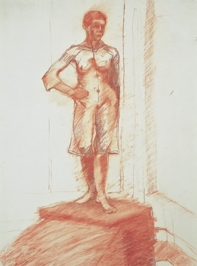
FIGURE 2
A lone model stands solidly and monumentally high, her waist at about eye level, an arm akimbo, her feet planted firmly on the allotted cube. Her slightly counterpoised posture is heightened by the alternating distribution of the tonal shapes on her body from her head to her left arm (right on the drawing) to her right leg. While the drawing reveals a solidly sculpted body (the robe’s fabric rendered transparent) the drawing also speaks boldly of location. At the bottom of the page the top plane of a cube enters the picture plane with an exaggerated tilt, creating a ramp upward to the centered cube supporting the model. Behind her, vertical panels enforce her classic stance and lightly but clearly locate her in a corner of the room, while the L shape of the baseboard at bottom echoes the ballet position of her feet.
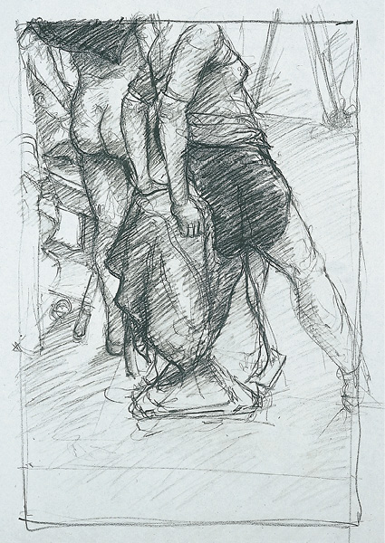
FIGURE 3
The visible portion of two models’ partly draped bodies and props employs two major shapes of dark local color that graphically punctuate the drawing. A series of echoing triangles create the drawing’s underlying structure. Note the triangle created by the female model’s right leg with the edge of falling fabric, a similar one above formed by the easel legs, and the sideways-turned triangle created by the male model’s bent arm, repeated by his calf and the leg of a chair. As a result of the frame’s cropping, a juxtaposition of triangles is pervasive in negative areas as well.
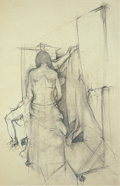
FIGURE 4
The model’s back presents a baffle the viewer must look beyond to discover the legs and an arm of two other figures, fabric, and fragments of objects. Although her back is only slightly modeled (notice the shoulder blades and the drapery describing the volume of the hips), the light marking and erasure keep her shape essentially flat and transparent and visually on the same plane with the page’s background flatness. She is defined and dismissed by the darkening of her contour edges and the prominence of the jagged fragment beyond her right edge. The shapes she partly obscures press forward toward the viewer’s eye. Through these means the drawing achieves an intriguing spatial ambiguity.
Figures 5 and 6 reveal the model, skeleton, and an occasional student in multiple postures.
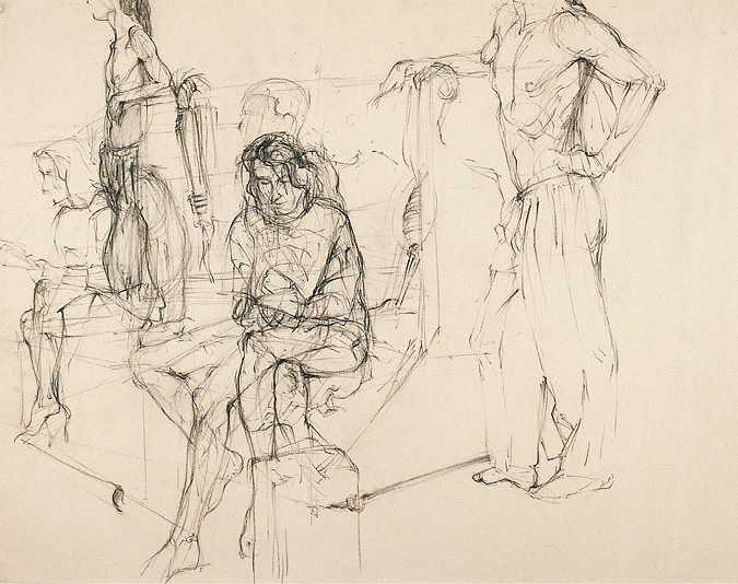
FIGURE 5
The drawing deals with the issues of spatial overlay and transparency. Some of the models’ positions occur in the same location just occupied in a previous posture. A darker marking necessary to carve out secondary and even tertiary changes in both model and position appears over a light underlay describing the positions taken earlier in the span of drawing. This lightness and subsequent density of line work describing the overlap of poses suggests a time-lapse image, an illusion of continuous movement.
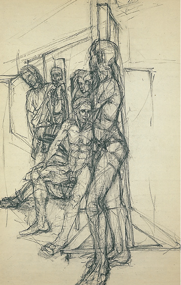
FIGURE 6
Lines that define the tall mirror’s framing appear through the seeming transparency of the foreground model’s body. Her crossed arms curiously disappear as the head of the male model seated behind her claims that space. The mirror frame’s edge (in its earlier, lightly marked version) defines the vertical axis of the page. This line creates a sheer cut against which the background group of figures move forward while the central figure standing in the foreground presses back against that dividing line.
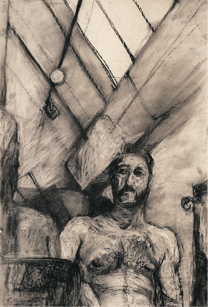
FIGURE 7
The model and the studio are each given equal billing. The angled skylight, its framing, and the student’s upward perspective suggest the studio as theater. The diagonal lines describing the skylight, lighting pole, and a baffle activate a backdrop that occupies more than half the page. At the far left is a fraction of the back view of another model; her head, shoulder, and the chair back provide a three-step scrim, beyond which the male model sits. The model directs his gaze both out at the audience and left toward the other model. The student’s upward point of view—a theatrical reference—is emphasized by the upward curving lines of the model’s abdominal wall.
THE STUDIO MOVES OUTDOORS
The spring semester begins in the dead of winter. As daylight lengthens and the caprices of early spring bring randomly splendid days, the class takes supplies and models and moves outdoors. This “open” studio presents a greatly expanded field of vision. It multiplies the visual density that must be framed and translated to the page. For the student of architecture, it provides the challenge of scaling the figure to the urban setting. Two locations at The Cooper Union with immediate eye-grabbing appeal are the rooftop of the Foundation Building and a small Engineering Building patio that sports a couple of trees and is home to the sculpted granite eagle salvaged from the demise of the old Penn Station.
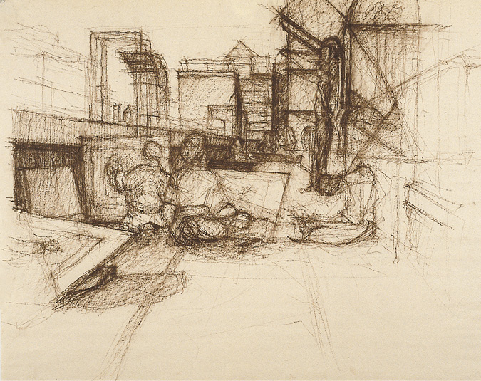
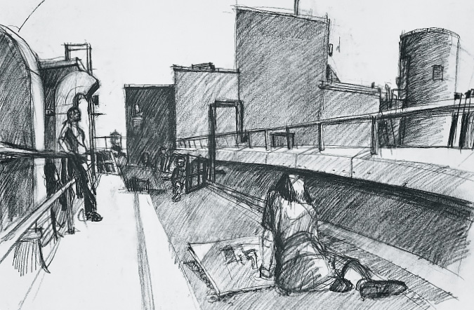
Figures 8, 9, and 10 weave into one tapestry the complexity of students engaged in drawing, a rooftop with its ductwork and housings, and more distant city view and sky.
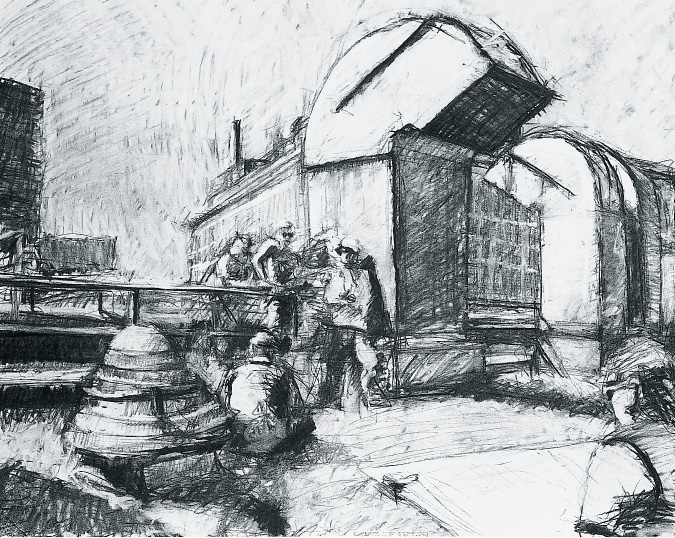
FIGURE 8
The foreground and middle-ground figures hunched over their drawing boards echo the blunted cone shape of the ventilation cap. The truncated arch of the large duct at the page’s center (mirrored by a second duct to the right) provides a dramatic foil for the group standing to its left. The pattern of strongly defined dark shadows created by the bright spring light ties the drawing together graphically. A distant building’s windowed front facade, framed by the two ventilation ducts, is visually pulled into the middle ground as the shadowed side of the center duct joins the gray of the building’s facade. The left edge of the same building’s adjacent side and the left edge of the center duct are lightly defined, somewhat blending their shapes together and opening them to the drawing’s background plane—the sky.
FIGURES 9 and 10
Figures 9 and 10 were drawn at the same time from opposite sides of the model, presented as a minor element in both of the two works. The model can be seen most clearly in figure 10, leaning, bare chested, against a rail. The back- and middle-grounds of figure 10 depict the propped-up drawing boards placed in the foreground in figure 9. Similarly, the foreground figure to the right in figure 10 appears small and lit against the darkened parapet in figure 9. Again, piecing together the blend of students, ducts, drawing boards, and the geometry of the roof’s furnishings provides the central impetus of each work. In each a compelling one-point perspective carries the viewer’s eye to the middle depth of the page, where the juxtaposition of the roof’s housings and distant buildings creates a visual plane that parallels and reasserts the flatness of the picture plane.
