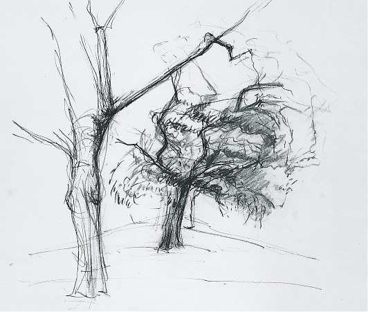
FIGURE 1
TREES
Trees surround us. They hold us captive to their season....Trees celebrate life and death. Their branches flare upward in the sky, attempting to offer perches to angels, and trees root down into the earth encompassing the remains of the long dead. — JOHN HEJDUK, Tree
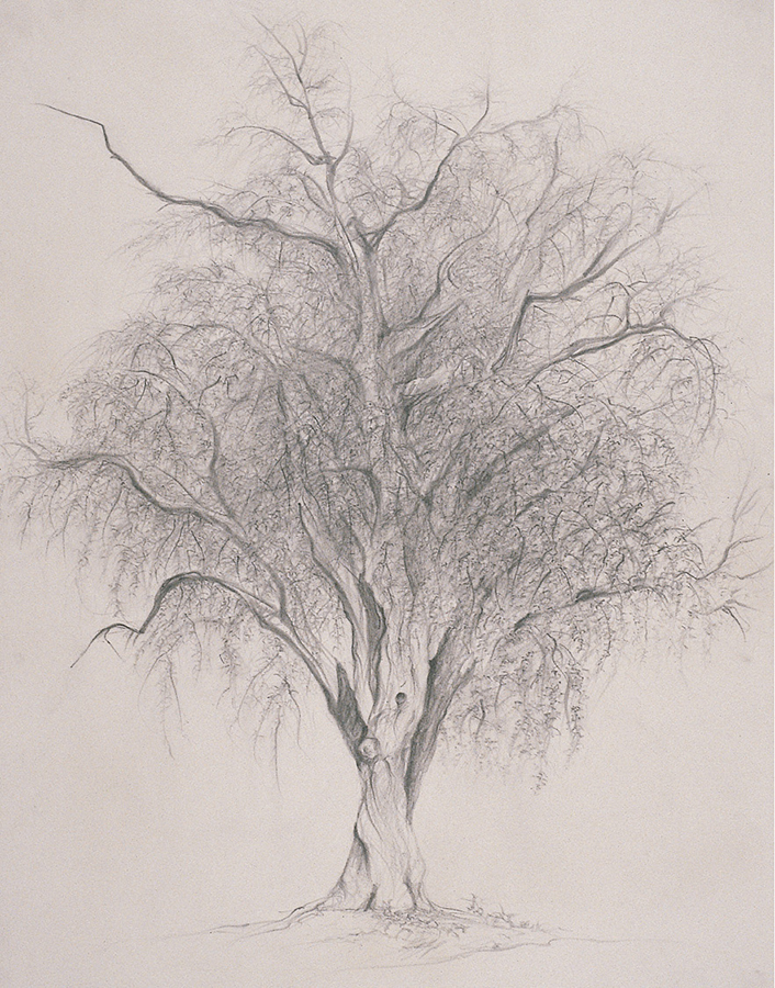
FIGURE 2
The botanist Colin Tudge gives a definition of a tree that a child might give: “a big plant with a stick up the middle.”1 Summing up some sixty thousand known species, this is a splendidly generic definition. It is entirely consonant with the manner in which most children will draw a tree—a large green lollipop atop its vertical stick. Such a pictogram harks back to the pea-pod drawings done from memory on the first day of Freehand Drawing. It also brings to mind the tree represented as a bundle of twigs, pervasive in architectural representation, and the deckle-edged circle with its center dot that is a standard icon for the tree-in-plan drawings. Such a convention is a convenient visual logo, but it does not enhance the architect’s individual imprimatur. Tudge’s further remarks are salutary, aiding the student of architecture in turning away from such conventions. He comments on the tree as “one of the wonders of the universe...remarkably complex...minutely structured...and infinitely various.”2 A compelling argument for the necessity and delight of observation.
Chief among the reasons that tree drawing is the final studio project of Freehand Drawing is simply that it is spring! There is new bright light and longer daylight hours; armed with a rack of folding chairs, drawing supplies, and models, the class marches to a small park just south of the Foundation Building. The park’s triangular plan is edged with an iron fence and perhaps a dozen trees. Mid-April is a good time to study trees—while they are still fairly bony and just beginning to show new life.
The academic year began with the pea pod, an object easily held both in memory and the hand. It is appropriate to stretch the skills and concepts acquired over the course of the two semesters by concluding with the tree—a form of such contrasting scale and complexity. Drawing it requires both observation of the particular and the ability to make larger abstractions to cope with the many branches, the multiplicity of twigs, the myriad leaves, and the complex irregularities of the bark that embraces the girth of the tree.
The interchangeable language often used to describe trees and human bodies—trunk, limbs, crown—adds a dimension of metaphor to the endeavor. Models (now clothed, of course) sometimes join the scene—leaning against the tree or seated at its base—to enforce the reference to the body and to add the dimension of scale. Drawing from the tree brings forward and challenges the concepts developed over the many weeks of drawing from the figure—those of volume, gesture, and the interpenetration of form and space. Further, the acquired editing skills—necessary, given the impossibility of rendering each branch, twig, and leaf—generate a new freedom to invent a handwriting that will abbreviate and abstract. While lopping off a limb or placing one in an inexact position is quite noticeable and disconcerting in representing the figure, a tree drawing is entirely forgiving of such indiscretions. The whole is decidedly greater than the sum of its parts, yet the parts demand attention.
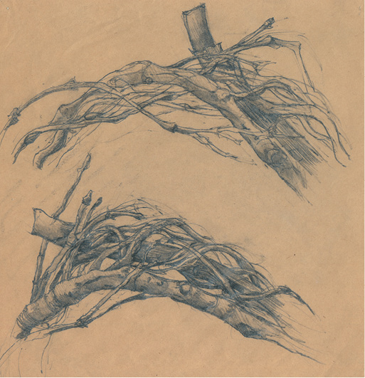
FIGURE 3
ASSIGNMENTS
Although the studio moves outdoors to study trees, the following preparatory and adjunct assignments aid in confronting the actual tree. While the human body is an invaluable metaphor in comprehending the tree’s gestalt and the jointed aspect of its limbs, the tree’s larger-than-life scale is daunting.
Master Studies of Trees. Examples of drawings of trees can be found in the work of the following artists—Leonardo, Titian, Dürer, Bosch, Bruegel, Rubens, van Dyck, Rembrandt, Lorrain, Ruisdael, Corot, van Gogh, Cézanne, and Mondrian. Look for reproductions where the handwriting is clear and comprehensible. For the following studies, refer back to methods described in the first semester’s master studies (see pp. 55–58).
In the first week or two of Master Tree Studies, draw only portions of the tree—draw the trunk alone, a portion of the trunk with some limbs emerging, then a portion of the trunk moving into the root system. Note that the limbs and roots do not join abruptly to the trunk like pieces of plumbing; they evolve from its mass in a gradual fashion. Draw each portion rapidly and repeatedly. Sharpened charcoal pencil, carbon pencil, pencil, or pen on any size white paper. ½ hour.
Entire-tree Study. Notice the tree’s gesture—whether leaning, upright, twisting. Take note of its proportions. What proportion is the mass of its leaves compared to its trunk? Again, draw rapidly. Do not be concerned with likeness, but rather with “live-ness.” Same materials as above. ½ hour.
During the second and third weeks, paralleling the season’s change and the budding and subsequent leafing of the bare branches, make studies of leaf “handwriting.” Examine the abstracting notations the masters have employed to sum up the mass and volume of the tree’s crown. Attempt a range of handwriting, drawing rapidly from one or several of the artists listed above. Use whatever medium seems fitting for all of the above studies—pencil, pen, ink wash, charcoal pencil, charcoal on any paper. ½ hour.
EXERCISES
WEEKS I–II
At this point in the semester, the mostly bare branches reveal the tree’s structure. Begin with rapid studies of portions of the actual tree—to resonate with studies from masters described above. Develop a handwriting that discusses the girth of the tree—not merely its outline or the texture of its bark. Varying with the species, the lines made by the bark’s texture may suggest a handwriting that describes the tree’s circumference. Again, it is best to draw this rapidly—not slavishly. Any medium on any paper. 30 minutes to 1 hour.
A negative-space study of the trunk’s moving into limbs and branches is an excellent way to discover the varied intricacies of patterning they create. This aids in avoiding generic spacing (where all negative space intervals are drawn at more or less the same size due to visual inattention). Any medium on any paper. 1 hour.
Draw a study of the entire tree. The model may be included in the scene, leaning against the tree or seated nearby. Incorporate classmates and other figures as desired. Note that the figure is a measure of the tree. Avoid the tendency to make the figure too large; the figure is no longer the star of the page but an element in the whole of the compositional structure. Any medium on any paper 24" x 36" or larger. 2 hours or longer.
WEEKS III–IV
Apply what has been learned from drawing foliage from master studies to drawing from direct observation of actual trees. The trees have begun to leaf and some are already in full foliage by this time. Show the massing of leaves in relation to the branches supporting them. Do this rapidly and repeatedly. Any media. Any paper. 20 to 30 minutes.
When mapping out the page, also include lines that indicate buildings, figures, and vehicles that appear in the spaces between the trunks, branches, and masses of leaves. Draw a quick underdrawing of the tree(s) first, then lightly mark in blocks of shape that will be the basis for buildings, fences, vehicles, etc. Establish your eye level early so that you will have a consistent perspectival reference throughout the drawing process.
Focus and negative space are critical issues. If the focus is the tree(s) in foreground or middle ground, minimize architectural notations or eliminate them altogether using geometric blocks of negative space. Use architectural detail judiciously as a counterpoint to the trees. Reduce the repetition of banks of windows to negative spaces when appropriate. When windows are attended to in detail, differentiate them so that each one is distinct. In drawing visually dense situations, negative space is an essential design ally. Areas left lightly marked or entirely blank serve as welcome visual oases. Any medium on any paper. 2½ to 3 hours.
Exploration of the hierarchy of trunk, limb, and branch is the primary theme in figures 4, 5, and 6.
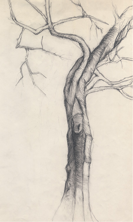
FIGURE 4
The drawing meticulously examines the evolution of the major limbs pulling and stretching upward and outward from the poised yet twisting trunk. The drawing displays its own hierarchy of values, focusing on a midsection of the trunk. The language of dense handwriting investigates the complexities of the trunk’s column, and the protuberances of knots and cut-off limbs are articulated with attention but still manage to keep their place in a well-orchestrated whole. The giraffe-neck shape of the upper trunk arches to the right of the page while another major limb curves backward, its smaller branches grasping at the left half of the page. The drawing emanates from the darkened region of the trunk, as the more lightly drawn, lesser branches and twigs observe each bend, articulation, and crossover.
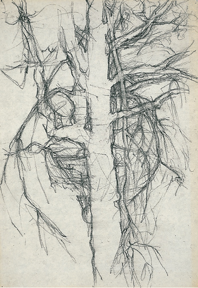
FIGURE 5
The centrally placed trunk assumes an all-but-ghostly presence in the negative space study of the intervals of the crossing limbs and branches. There is a remarkable flip between flatness and volume: volume is suggested by a very faint tracery that indicates markings on the bark encircling the trunk. In addition a light underlay of lines investigates the movement of branches surrounding the trunk, giving the impression of their vibration. Flatness is achieved by the equally inflected dark contours that emphasize the puncture of spaces between the branches.
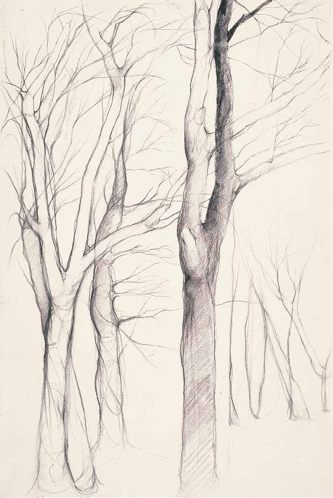
FIGURE 6
The drawing addresses the issue of scale. A foreground group of rounded trees share a rightward gesture, countered by the shared leftward motion of several lightly contoured trees in the distance. The page boasts a strikingly architectonic composition. The right edge of the most centrally located tree forms the boundary of the foreground grouping while its left edge serves as framing for the right-hand stand of trees. Each edge of the tree serves as a parameter for the different groupings, creating an ambiguous spatial overlap between the two vertical portions of the composition.
The urban setting assumes a role in figures 7 and 8.
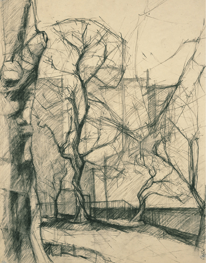
FIGURE 7
In the foreground the trunk of a tree is cut by the left edge of the page. The tree in its entirety is located in front of the picture plane. The strong carving of its protuberances (where limbs were severed) suggests a coat of armor as the tree appears to stand guardian to the side of the path that curves into the park from the right foreground. Along the path the more distant trees stand in dancelike postures. The trees’ skeletal branches transparently suspend planar slices, described by a network of lighter lines. They indicate the massing of leaves that will sprout from the many budding branches. Caught in this transparent scrim of lines, an orthogonal block of buildings defines the park’s parameters.
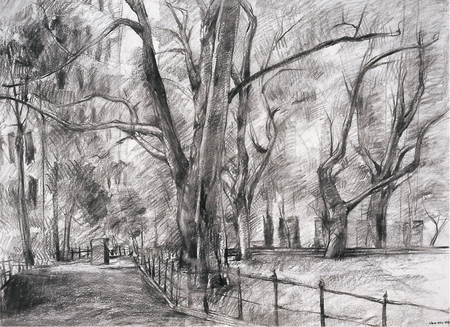
FIGURE 8
A path again introduces us to a small city park. The avenue of trees at center leads to a background wall of buildings that edge the park. Windows, roughly marked to indicate perspective, also serve to differentiate one building from another. These windows peek through branches that boast an array of light-to-dark clumps of charcoal hatching, simple groups of marks that successfully depict the massing of leaves and the penetration of the afternoon light. The light edges the columns of the tree trunks and cuts brighter slices across the dark area of the entering path.
Figures 9 and 10 each make advantageous use of negative space and focus.

FIGURE 9
This quiet drawing reveals an artist’s process—it is a study arrested at a certain stage of its evolution. Two trees rise from a mound, bounded by an embankment. The trunks are well developed, the emergence of their limbs and branches precisely articulated. The background lightly threads in a few buildings. Cars move or are parked in the middle ground. Dark lines that weave the brush in the center and the tree at the right hold one car in the foreground. Two more-distant cars, faintly marked and minimally detailed, merge with the whispered notations of the buildings beyond.
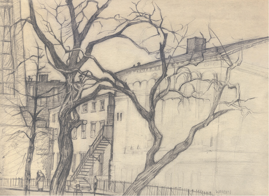
FIGURE 10
The area where major branches of the two center trees cross and form an arch is the compelling focus of this work. A darkened vertical line makes a seam between the adjacent buildings and bisects the arch. This seam divides the page into a positive and a negative portion: to the left is explicit detail—figures, fire escape, carefully differentiated windows—to the right, the faintest measuring lines. This oasis of space serves to buffer the strong diagonal thrust of the right-hand tree.
