#11 Add Meaning to Reports Using Data Visualizations
Three easy visualization tools were added to the Conditional Formatting dropdown in Excel 2007: Color Scales, Data Bars, and Icon Sets.
Consider this report, which has way too many decimal places to be useful.

Select the numbers in the report and choose Home, Conditional Formatting, Color Scales. Then click on the second icon, which has red at the top and green at the bottom.

With just four clicks, you can now spot trends in the data. Line 2 started out the day with high reject rates but improved. Line 3 was bad the whole day. Line 1 was the best, but even those reject rates began to rise toward the end of the shift.

The next tool, Data Bar, is like a tiny bar chart that fills a cell. In the following figure, select all of the Revenue cells except for the grand total.
Choose Conditional Formatting, Data Bar, Green. Each number now gets a swath of color, as shown below. Large numbers get more color, and small numbers get hardly any color.


Caution: Be careful not to include the grand total before selecting Data Bars. In the following example, you can see that the Grand Total gets all of the color, and the other cells get hardly any color.

With the third tool, Icon Sets, you can choose from sets that have three, four, or five different icons.

Most people keep their numbers aligned with the right edge of the cell. Icons always appear on the left edge of the cell. To move the number closer to the icon, use the Increase Indent icon, shown below.

All three of these data visualization tools work by looking at the largest and smallest numbers in the range. Excel breaks that range into three equal-sized parts if you are using an icon set with three icons. That works fine in the example below.

But in the following figure, Eddy scored horribly in Q1, getting a 30. Because Eddy did poorly, everyone else is awarded a gold star. That doesn‘t seem fair because their scores did not improve.

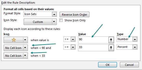
You can take control of where the range for an icon begins and ends. Go to Home, Conditional Formatting, Manage Rules and choose Edit Rule. In the following figure, the Type dropdown offers Percent, Percentile, Formula, and Number. To set the gold star so it requires 90 or above, use the settings shown below. Note that the two other icons have been replaced with No Cell Icon.